Cheat sheet: Data Visualisation in Python
Introduction
It is said ‘A visually presented data speaks for itself’. Data, served in the right visual form, brings out hidden trends and insights to enable faster decision making. The importance of right visualization is only set to increase with increasing data.
Python, popular for its ease of writing codes, offers some amazing set of libraries support to create visualization. Not only 2D, it has features to create jaw-dropping 3D visualisations & animations. Here is the cheat sheet for popular visualisation methods used for representing data. You can keep this handy for your use:
Coming up —> Data Hackathon Online (Win Rs.5000 Amazon Vouchers)
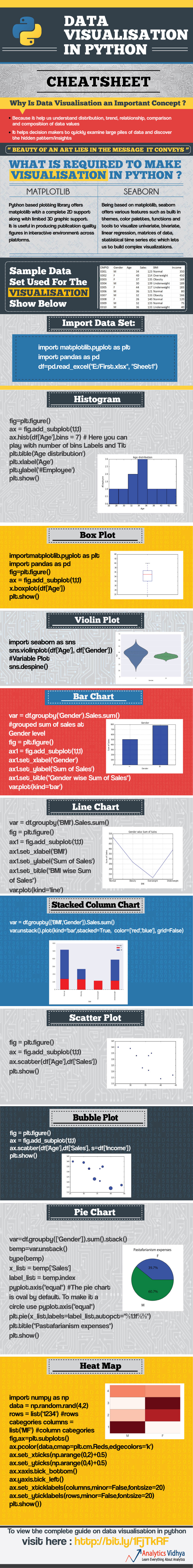
To view this complete article, visit 9 popular ways to perform data visualisation in Python
If you wish to gain a complete knowledge on data visualisation, here’s the ultimate guide on data visualisation.


Have a look at PyGal and GGPlot as well for visualization.
Hi Its an amazing post. I was wondering if we have a good library to create motion charts in Python. Thanks
[…] We are want to say thanks if you like to share this post to another people via your Facebook, Pinterest, Google Plus or Twitter account. To save infographic right click on this or tab and hold for seven seconds if you are using iPad or iPhone. Full size is 736X5991 Link to full-size image pixels. The source of this magnificent design from analyticsvidhya.com […]