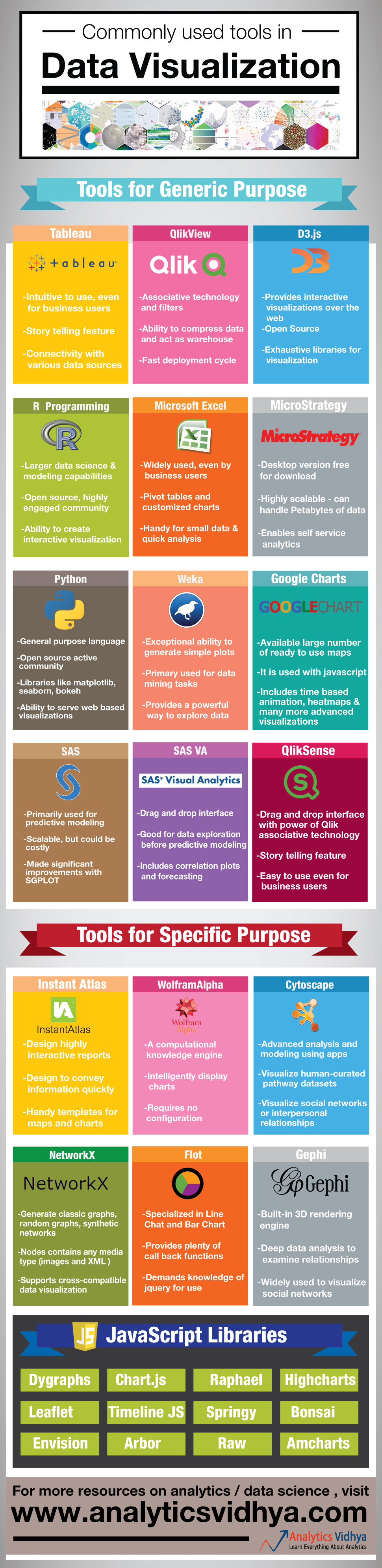
Infographic: Data Visualization Tools For Data scientists & analysts
Introduction
Here is a famous quote on learning:
We Learn . . .
10% of what we read
20% of what we hear
30% of what we see
50% of what we see and hear
70% of what we discuss
80% of what we experience
95% of what we teach others.
If we create a similar ordering on ability to interpret data in various forms – the order will surely look like this:
Text < Table < Charts < Interactive Charts
On the other hand, the amount of data which needs processing and interpretation is increasing by the second. Combined, these two factors are making data visualization an integral form of data science workflow – probably more important than ever before.
In order to address this need for creating simple, yet powerful visualization, there are multiple tools which can come in handy. However, a lot of analysts & data scientists are not aware of these tools. Hence, we have created an infographic, which provides high level overview of various tools people use for creating data visualization.
What do you think about the infographic? Do you think, there are other tools which should be part of this infographic? If yes, let us know through comments below
P.S. Online Data Hackathon 3.x coming up on 5th & 6th September. Register now
If you like what you just read & want to continue your analytics learning, subscribe to our emails, follow us on twitter or like our facebook page.
Kunal is a post graduate from IIT Bombay in Aerospace Engineering. He has spent more than 10 years in field of Data Science. His work experience ranges from mature markets like UK to a developing market like India. During this period he has lead teams of various sizes and has worked on various tools like SAS, SPSS, Qlikview, R, Python and Matlab.


You need to fix it - one of those libraries called Raphael, not Rapheal!
Thanks Sergey for highlighting it. We have fixed the error. Regards
How many of these tools are in open source domain ? I know R , python and Gephi are open ..what about others ?
Premsankar, You are right R, Python, Gephi and the JavaScript libraries - D3.js are open source. Other tools like QlikView and MicroStrategy, Google Charts provide a free personal edition, but charge for enterprise editions. SAS provides a base version in form of a University edition. Tableau offers a public version for free, but your data will be published in open. Regards, Kunal
A straight picture of perfection, just what we need is delivered :) :) Wonderful :D
Thanks Hemant
Hi Kunal What about SAP Lumira? Regards Nikhil
An excellent overview. One tool that I have recently added to my data analysis toolkit is Neo4j. There is a community edition of this graph database which comes with a query language cypher. This makes this, in my opinion, a powerful tool for analyzing any form of data that can be interpreted as (or converted to) a graph.
Hi Glenn, Thanks for bringing it out. I have been using Neo4j for some time as well. It is indeed a powerful graph database. The reason I had not included it here was because the focus of the article is visualization and for Graph visualization Gephi provides better features and is more widely used in industry. That might obviously change in future. Regards, Kunal
Hi this is ramulu,i gained a lot of knowledge so want date related scenarios for example YTD,LYTD,MTD,LMTD,MONTH VS LAST YEARM.....
TIBCO Spotfire is worth to be added in the list.
Thanks Aditya....good suggestion! We will add it shortly.
Excellent article, well laid out. Could SSRS (SQL Server Reprting services) be added here, it is used a lot in operational types of reporting and visualizations, also how about PowerBI from Microsoft?
Thanks Ramdas. The focus of the article is data visualization and not reporting. The tools you mentioned are useful from reporting perspective. Regards, Kunal
Thanks for sharing elaborated info graphics on Visualization/BI tools. The tool which I feel can be the part of this are as follows: 1) SAP Business Object 2) SAP Lumira 3) IBM Cognos 4) Oracle Business Intelligence Enterprise edition 5) SpotFire
Ash, The first 4 options you have mentioned are all BI tools and not necessarily for visualization. You need to create the cubes and the infrastructure to get the reports out of them. The focus of the article was to highlight tools which can be handy for data visualization independently. SpotFire should be added. Regards, Kunal
Very good article, nicely laid out. How about tools like PowerBI/SSRS?
What is your opinion about start working with Qlickview?
Jose, I have been using QlikView for more than 3 years now. It is a very powerful tool and can come in handy for its associative technology. You can read more about QlikView in our learning path here: http://www.analyticsvidhya.com/learning-paths-data-science-business-analytics-business-intelligence-big-data/qlikview-learning-path/ Thanks, Kunal
What about SPOTFIRE..? its the best tool still not there
Kunal i think SAP lumira is a tipical highly sofisticated visualization tool and from that it is different from generic BI tool like ibm cognos or business object, so it should have been part of infograhic may be next time
How about Processing? Is it part of data visualization tool? Anyone?