How to create Beautiful, Interactive data visualizations using Plotly in R and Python?
Introduction
The greatest value of a picture is when it forces us to notice what we never expected to see.
―John Tukey
Data visualization is an art as well as a science. It takes constant practice and efforts to master the art of data visualization. I always keep exploring how to make my visualizations more interesting and informative. My main tool for creating these data visualizations had been ggplots. When I started using ggplots, I was amazed by its power. I felt like I was now an evolved story teller.
Then I realized that it is difficult to make interactive charts using ggplots. So, if you want to show something in 3 dimension, you can not look at it from various angles. So my exploration started again. One of the best alternatives, I found after spending hours was to learn D3.js. D3.js is a must know language if you really wish to excel in data visualization. Here, you can find a great resource to realize the power of D3.js and master it.
But I realized that D3.js is not as popular in data science community as it should have been, probably because it requires a different skill set (for ex. HTML, CSS and knowledge of JavaScript).
Today, I am going to tell you something which will change the way you perform data visualizations in the language / tool of your choice (R, Python, MATLAB, Perl, Julia, Arduino).
Table of Contents
- What is Plotly?
- Advantages and Disadvantages of Plotly
- Steps for using Plotly
- Setting up Data
- Basic Visualizations
- Bar Charts
- Box Plots
- Scatter Plots
- Time Series Plots
- Advanced Visualizations
- Heat Maps
- 3D Scatter Plots
- 3D Surfaces
- Using plotly with ggplot2
- Different versions of Plotly
1. What is Plotly?
Plotly is one of the finest data visualization tools available built on top of visualization library D3.js, HTML and CSS. It is created using Python and the Django framework. One can choose to create interactive data visualizations online or use the libraries that plotly offers to create these visualizations in the language/ tool of choice. It is compatible with a number of languages/ tools: R, Python, MATLAB, Perl, Julia, Arduino.
2. Advantages and Disadvantages of Plotly.
Let’s have a look at some of the advantages and disadvantages of Plotly:
Advantages:
- It lets you create interactive visualizations built using D3.js without even having to know D3.js.
- It provides compatibility with number of different languages/ tools like R, Python, MATLAB, Perl, Julia, Arduino.
- Using plotly, interactive plots can easily be shared online with multiple people.
- Plotly can also be used by people with no technical background for creating interactive plots by uploading the data and using plotly GUI.
- Plotly is compatible with ggplots in R and Python.
- It allows to embed interactive plots in projects or websites using iframes or html.
- The syntax for creating interactive plots using plotly is very simple as well.
Disadvantages:
- The plots made using plotly community version are always public and can be viewed by anyone.
- For plotly community version, there is an upper limit on the API calls per day.
- There are also limited number of color Palettes available in community version which acts as an upper bound on the coloring options.
3. Steps for creating plots in Plotly.
Data visualization is an art with no hard and fast rules.
One simply should do what it takes to convey the message to the audience. Here is a series of typical steps for creating interactive plots using plotly
- Getting the data to be used for creating visualization and preprocesisng it to convert it into the desired format.
- Calling the plotly API in the language/ tool of your choice.
- Creating the plot by specifying objectives like the data that is to be represented at each axis of the plot, most appropriate plot type (like histogram, boxplots, 3D surfaces), color of data points or line in the plot and other features. Here’s a generalized format for basic plotting in R and Python:
In R:
plot_ly( x , y ,type,mode,color ,size )
In Python:
plotly.plotly( [plotly.graph_objs .type(x ,y ,mode , marker = dict(color ,size ))]
- Where:
- size= values for same length as x, y and z that represents the size of datapoints or lines in plot.
- x = values for x-axis
- y = values for y-axis
- type = to specify the plot that you want to create like “histogram”, “surface” , “box”, etc.
- mode = format in which you want data to be represented in the plot. Possible values are “markers”, “lines, “points”.
- color = values of same length as x, y and z that represents the color of datapoints or lines in plot.
4. Adding the layout fields like plot title axis title/ labels, axis title/ label fonts, etc.
In R:
layout(plot ,title , xaxis = list(title ,titlefont ), yaxis = list(title ,titlefont ))In Python:
plotly.plotly.iplot( plot, plotly.graph_objs.Layout(title , xaxis = dict( title ,titlefont ), yaxis = dict( title ,titlefont)))
- Where
- plot = the plotly object to be displayed
- title = string containing the title of the plot
- xaxis : title = title/ label for x-axis
- xaxis : titlefont = font for title/ label of x-axis
- yaxis : title = title/ label for y-axis
- yaxis : titlefont = font for title/ label of y-axis
- Plotly also allows you to share the plots with someone else in various formats. For this, one needs to sign in to a plotly account. For sharing your plots you’ll need the following credentials: your username and your unique API key. Sharing the plots can be done as:
In R
Sys.setenv("plotly_username"="XXXX")Sys.setenv("plotly_api_key"="YYYY")#To post the plots onlineplotly_POST(x = Plotting_Object)#To plot the last plot you created, simply use this.plotly_POST(x = last_plot(), filename = "XYZ")
In Python
#Setting plotly credentialsplotly.tools.set_credentials_file(username=XXXX, api_key='YYYY’)#To post plots onlineplotly.plotly.plot(Plotting_Object)
Since R and Python are two of the most popular languages among data scientists, I’ll be focusing on creating interactive visualizations using these two languages.
4. Setting up Data
For performing a wide range of interactive data visualizations, I’ll be using some of the publicly available datasets. You can follow the following code to get the datasets that I’ll be using during the course of this article :
4.1 Iris Data
In R
#Loading iris datasetdata(iris)#Structure of Iris datasetstr(iris)## 'data.frame': 150 obs. of 5 variables:## $ Sepal.Length: num 5.1 4.9 4.7 4.6 5 5.4 4.6 5 4.4 4.9 ...## $ Sepal.Width : num 3.5 3 3.2 3.1 3.6 3.9 3.4 3.4 2.9 3.1 ...## $ Petal.Length: num 1.4 1.4 1.3 1.5 1.4 1.7 1.4 1.5 1.4 1.5 ...## $ Petal.Width : num 0.2 0.2 0.2 0.2 0.2 0.4 0.3 0.2 0.2 0.1 ...## $ Species : Factor w/ 3 levels "setosa","versicolor",..: 1 1 1 1 1 1 1 1 1 1 ...
In Python
from sklearn import datasetsimport pandas as pdiris = datasets.load_iris()iris_df = pd.DataFrame(iris.data)iris_df.columns = ['Sepal.Length','Sepal.Width','Petal.Length','Petal.Width']iris_df.columnsiris_df['Species'] = iris.targetiris_df['Species'] = iris_df['Species'].astype('category')iris_df.dtypes#Sepal.Length float64#Sepal.Width float64#Petal.Length float64#Petal.Width float64#Species category#dtype: objectiris_df['Species'].replace(0,'setosa',inplace=True)iris_df['Species'].replace(1,'versicolor',inplace=True)iris_df['Species'].replace(2,'virginica',inplace=True)
4.2 International Airline Passengers Dataset
In R:
#Loading the datadata(AirPassengers)#Structure of International Airline Passengers Time series Datasetstr(AirPassengers)#Time-Series [1:144] from 1949 to 1961: 112 118 132 129 121 135 148 148 136 119 ...
In Python
You can get International airline passengers dataset here .
#Loading the dataairline_data = pd.read_csv('international-airline-passengers.csv')
4.3 Volcano Dataset
In R
#Loading the datadata(volcano)#Checking dimensionsdim(volcano)## [1] 87 61
In Python
You can get International airline passengers dataset here.
#Loading the datavolcano_data = pd.read_csv('volcano.csv')
5. Basic Visualization
To get a good understanding of when you should use which plot, I’ll recommend you to check out this resource. Feel free to play around and explore these plots more. Here are a few things that you can try in the coming plots:
- hovering your mouse over the plot to view associated attributes
- selecting a particular region on the plot using your mouse to zoom
- resetting the axis
- rotating the 3D images
5.1 Histograms
 ;
;
You can view the interactive plot here.
In R
library('plotly')#attaching the variablesattach(iris)#plotting a histogram with Sepal.Length variable and storing it in histhist<-plot_ly(x=Sepal.Length,type='histogram')#defining labels and title using layout()layout(hist,title = "Iris Dataset - Sepal.Length",xaxis = list(title = "Sepal.Length"),yaxis = list(title = "Count"))
In Python
import plotly.plotly as pyimport plotly.graph_objs as godata = [go.Histogram(x=iris.data[:,0])]layout = go.Layout(title='Iris Dataset - Sepal.Length',xaxis=dict(title='Sepal.Length'),yaxis=dict(title='Count'))fig = go.Figure(data=data, layout=layout)py.iplot(fig)
5.2 Bar Charts
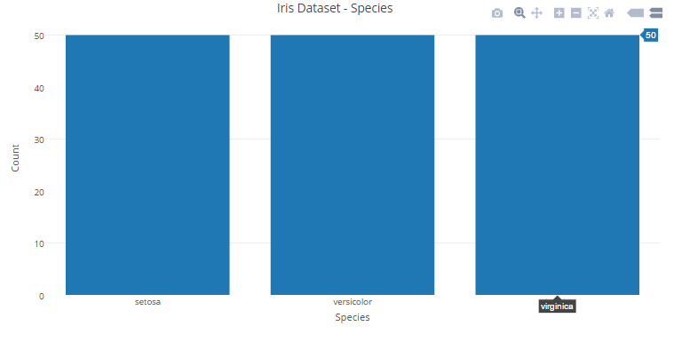
You can view the interactive plot here.
In R
#plotting a histogram with Species variable and storing it in bar_chartbar_chart<-plot_ly(x=Species,type='histogram')#defining labels and titile using layout()layout(bar_chart,title = "Iris Dataset - Species",xaxis = list(title = "Species"),yaxis = list(title = "Count"))
In Python
data = [go.Bar(x=['setosa','versicolor','virginica'],y=[iris_df.loc[iris_df['Species']=='setosa'].shape[0],iris_df.loc[iris_df['Species']=='versicolor'].shape[0],iris_df.loc[iris_df['Species']=='virginica'].shape[0]])]layout = go.Layout(title='Iris Dataset - Species',xaxis=dict(title='Iris Dataset - Species'),yaxis=dict(title='Count'))fig = go.Figure(data=data, layout=layout)py.iplot(fig)
5.3 Box Plots
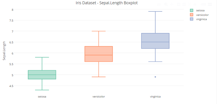
You can view the interactive plot here.
In R
#plotting a Boxplot with Sepal.Length variable and storing it in box_plotbox_plot<-plot_ly(y=Sepal.Length,type='box',color=Species)#defining labels and title using layout()layout(box_plot,title = "Iris Dataset - Sepal.Length Boxplot",yaxis = list(title = "Sepal.Length"))
In Python
data = [go.Box(y=iris_df.loc[iris_df["Species"]=='setosa','Sepal.Length'],name='Setosa'),go.Box(y=iris_df.loc[iris_df["Species"]=='versicolor','Sepal.Length'],name='Versicolor'),go.Box(y=iris_df.loc[iris_df["Species"]=='virginica','Sepal.Length'],name='Virginica')]layout = go.Layout(title='Iris Dataset - Sepal.Length Boxplot',yaxis=dict(title='Sepal.Length'))fig = go.Figure(data=data, layout=layout)py.iplot(fig)
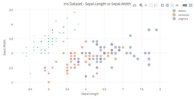
5.4 Scatter Plots
Let’s start with a simple scatter plot using iris dataset.
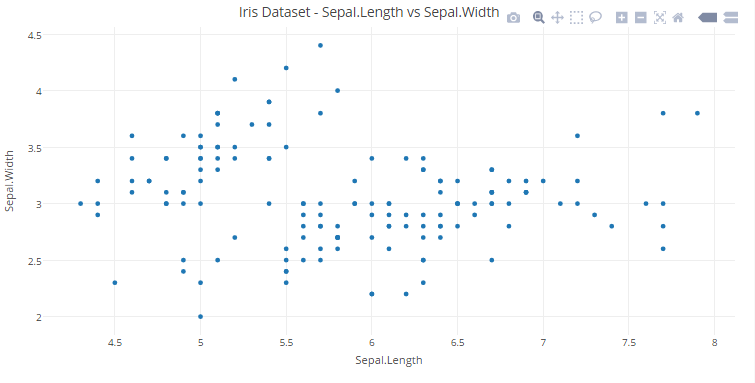
You can view the interactive plot here.
In R
#plotting a Scatter Plot with Sepal.Length and Sepal.Width variables and storing it in scatter_plot1scatter_plot1<-plot_ly(x=Sepal.Length,y=Sepal.Width,type='scatter',mode='markers')#defining labels and titile using layout()layout(scatter_plot1,title = "Iris Dataset - Sepal.Length vs Sepal.Width",xaxis = list(title = "Sepal.Length"),yaxis = list(title = "Sepal.Width"))
In Python
data = [go.Scatter(x = iris_df["Sepal.Length"],y = iris_df["Sepal.Width"],mode = 'markers')]layout = go.Layout(title='Iris Dataset - Sepal.Length vs Sepal.Width',xaxis=dict(title='Sepal.Length'),yaxis=dict(title='Sepal.Width'))fig = go.Figure(data=data, layout=layout)py.iplot(fig)
- Let’s go a step further and add another dimension (Species) using color.
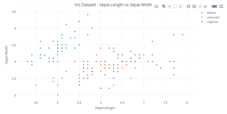
You can view the interactive plot here.
In R
#plotting a Scatter Plot with Sepal.Length and Sepal.Width variables with color representing the Species and storing it in scatter_plot12scatter_plot2<-plot_ly(x=Sepal.Length,y=Sepal.Width,type='scatter',mode='markers',color = Species)#defining labels and titile using layout()layout(scatter_plot2,title = "Iris Dataset - Sepal.Length vs Sepal.Width",xaxis = list(title = "Sepal.Length"),yaxis = list(title = "Sepal.Width"))
In Python
data = [go.Scatter(x = iris_df["Sepal.Length"],y = iris_df["Sepal.Width"],mode = 'markers', marker=dict(color = iris_df["Species"]))]layout = go.Layout(title='Iris Dataset - Sepal.Length vs Sepal.Width',xaxis=dict(title='Sepal.Length'),yaxis=dict(title='Sepal.Width'))fig = go.Figure(data=data, layout=layout)py.iplot(fig)
2. We can add another dimension (Petal Length) to the plot by using the size of each data point in the plot.
You can view the interactive plot here.
#plotting a Scatter Plot with Sepal.Length and Sepal.Width variables with color represneting the Species and size representing the Petal.Length. Then, storing it in scatter_plot3scatter_plot3<-plot_ly(x=Sepal.Length,y=Sepal.Width,type='scatter',mode='markers',color = Species,size=Petal.Length)#defining labels and titile using layout()layout(scatter_plot3,title = "Iris Dataset - Sepal.Length vs Sepal.Width",xaxis = list(title = "Sepal.Length"),yaxis = list(title = "Sepal.Width"))
In Python
data = [go.Scatter(x = iris_df["Sepal.Length"],y = iris_df["Sepal.Width"],mode = 'markers', marker=dict(color = iris_df["Species"],size=iris_df["Petal.Length"]))]layout = go.Layout(title='Iris Dataset - Sepal.Length vs Sepal.Width',xaxis=dict(title='Sepal.Length'),yaxis=dict(title='Sepal.Width'))fig = go.Figure(data=data, layout=layout)py.iplot(fig)
5.5 Time Series Plots
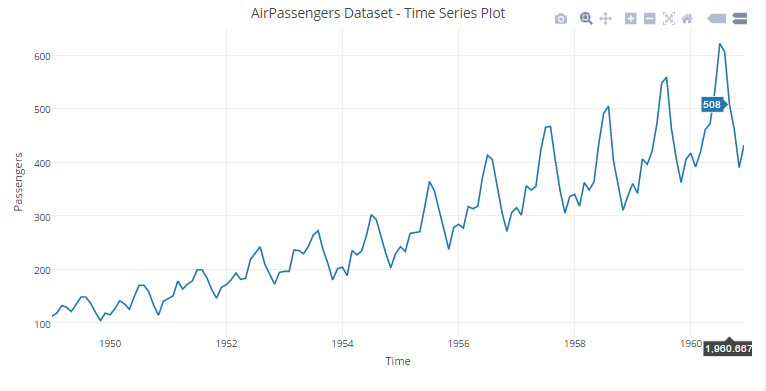
You can view the interactive plot here.
In R
#plotting a Boxplot with Sepal.Length variable and storing it in box_plottime_seies<-plot_ly(x=time(AirPassengers),y=AirPassengers,type="scatter",mode="lines")#defining labels and titile using layout()layout(time_seies,title = "AirPassengers Dataset - Time Series Plot",xaxis = list(title = "Time"),yaxis = list(title = "Passengers"))
In Python
data = [go.Scatter(x=airline_data.ix[:,0],y=airline_data.ix[:,1])]layout = go.Layout(title='AirPassengers Dataset - Time Series Plot',xaxis=dict(title='Time'),yaxis=dict(title='Passengers'))fig = go.Figure(data=data, layout=layout)py.iplot(fig)
6. Advanced Visualization
Till now, we have got a grasp of how plotly can be beneficial for basic visualizations. Now let’s shift gears and see plotly in action for advanced visualizations.
6.1 Heat Maps
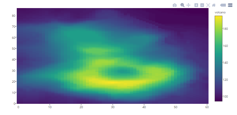
You can view the interactive plot here.
In R
plot_ly(z=~volcano,type="heatmap")In Python
data = [go.Heatmap(z=volcano_data.as_matrix())]fig = go.Figure(data=data)py.iplot(fig)
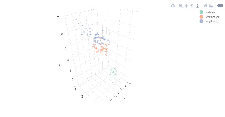
6.2 3D Scatter Plots
You can view the interactive plot here.
In R
#Plotting the Iris dataset in 3Dplot_ly(x=Sepal.Length,y=Sepal.Width,z=Petal.Length,type="scatter3d",mode='markers',size=Petal.Width,color=Species)
In Python
data = [go.Scatter3d(x = iris_df["Sepal.Length"],y = iris_df["Sepal.Width"],z = iris_df["Petal.Length"],mode = 'markers', marker=dict(color = iris_df["Species"],size=iris_df["Petal.Width"]))]fig = go.Figure(data=data)py.iplot(fig)
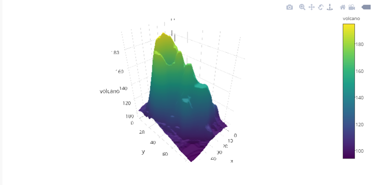
6.3 3D Surfaces
You can view the interactive plot here.
In R
#Plotting the volcano 3D surfaceplot_ly(z=~volcano,type="surface")
In Python
data = [go.Surface(z=volcano_data.as_matrix())]fig = go.Figure(data=data)py.iplot(fig)
7. Using plotly with ggplot2
ggplot2 is one of the best visualization libraries out there. The best part about plotly is that it can add interactivity to ggplots and also ggplotly() which will further enhance the plots. For learning more about ggplot, you can check out this resource.
Let’s better understand it with an example in R.
#Loading required librarieslibrary('ggplot2')library('ggmap')#List of Countries for ICC T20 WC 2017ICC_WC_T20 <- c("Australia","India","South Africa","New Zealand","Sri Lanka","England","Bangladesh","Pakistan","West Indies","Ireland","Zimbabwe","Afghanistan")#extractgeo locationof these countriescountries <- geocode(ICC_WC_T20)#map longitude and latitude in separate variablesnation.x <- countries$lonnation.y <- countries$lat#using ggplot toplot the world mapmapWorld <- borders("world", colour="grey", fill="lightblue")#add data points to the world mapq<-ggplot() + mapWorld + geom_point(aes(x=nation.x, y=nation.y) ,color="red", size=3)#Usingggplotly() ofployly toadd interactivity toggplotobjects.ggplotly(q)
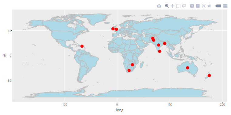 You can view the interactive plot here.
8. Different versions of Plotly.
Plotly offers four different versions, namely:
- Community
- Personal
- Professional
- On-Premise
Each of these versions is differentiated based on pricing and features. You can learn more about each of the versions here. The community version is free to get started and also provides decent capabilities. But one major drawback of community version is the inability to create private plots that to share online. If data security is a prominent challenge for an individual or organisation, either of personal, professional or on-premise versions should be opted based upon the needs. For the above examples, I have used the community version.
End Notes
After going through this article, you would have got a good grasp of how to create interactive plotly visualizations in R as well as Python. I personally use plotly a lot and find it really useful. Combining plotly with ggplots by using ggplotly() can give you the best visualizations in R or Python. But keep in mind that plotly is not limited to R and Python only, there a lot of other languages/ tools that it supports as well.
I believe this article has inspired you to use plotly for data visualization tasks. Did you
If you have any questions / doubts, do let me know in the comments below. If you enjoyed reading this article? Do share your views in the comment section below.
Learn, compete, hack and get hired!
Saurav is a Data Science enthusiast, currently in the final year of his graduation at MAIT, New Delhi. He loves to use machine learning and analytics to solve complex data problems.


The plots are no longer visible. Your plotly subscription might need a revisit.
Hi Akshat, The problem has been fixed. Thanks for your concern.
very nicely explained sir. got to know a new variety of visualization technique much simpler and easy to execute. thanks a lot.
Hi Prakhar, I'm glad that you liked it.
Very good article Saurav. In fact last week I was asked to plot a timeseries data using plotly. But I refused and did it using ggplot2. But looking at this it seems plotly graphics are very good looking compared to the one's done with ggplot2. Can you please include a plot that shows placing text in between of the plots using a time series data.
Hey Yash, I also feel that plotly is comparable if not better than than ggplots. In fact, why now use the best of both by adding interactivity to your ggplots by using ggplotly() of plotly as I mentioned in this article. Regarding your last query, You can simply add annotations at desired positions in the time series plotly graph. You can use these references: For adding annotations in R: https://plot.ly/r/text-and-annotations/ For adding annotations in Python: https://plot.ly/python/text-and-annotations/
Nice article and great job. please is there any site one can get a comprehensive tutorial on plotly. Thanks
Hey Lanre, Thank you. I believe, this article itself is sufficient to get started with plotly in whichever language you prefer: R or Python. In this article, one can learn from the generalized syntax for plotly in R and Python and follow the examples to get good grasp of possibilities for creating different plots using plotly. You can also refer to the official plotly site for more examples..
Hi Yash, great information! Thank you.
Ahh!!! This is awesome , i always wanted to plot interactive worldmap ,but was limited was ggmap/ggplot thanks Saurav
Hi Sambid, Glad you find it helpful!
Thank you for this awesome article. Is there any way we can get article in pdf format.
Hi Nageswara, Thank you but unfortunately the article might not be available in pdf format. My suggestion to you will be to bookmark this article instead for future reference.
I want to ask that currently I m doing CSE and doing specialisation in BA but I don't know how to start course in BA? can you suggest me some options!! Thank you..
Great article! It will be highly appreciated if you can share R code using plotly or ggplot2 to generate grouped vertical (or horizontal) bar charts similar to what was illustrated at http://www.jmp.com/support/help/Additional_Examples_of_the_Chart_Platform.shtml Thanks!
Very Nice article Saurav. Do you have an example of using a background image in a plotly Plot in R ? I believe it is the 'Images' property of the layout. I just don't know how best to use it.
Hello , I can't run it with python, there is the message: import plotly.plotly as py ModuleNotFoundError: No module named 'plotly' can you help me Thanks
Heya! I'm at work browsing your blog from my new iphone 3gs! Just wanted to say I love reading through your blog and look forward to all your posts! Keep up the outstanding work! maglia manchester united
Nice. Thanks
Good Article. Well explained. Basics to plotly visualization in Python.