12 Important Model Evaluation Metrics for Machine Learning Everyone Should Know (Updated 2023)
Introduction
The idea of building machine learning models or artificial intelligence or deep learning models works on a constructive feedback principle. You build a model, get feedback from metrics, make improvements, and continue until you achieve a desirable classification accuracy. Evaluation metrics explain the performance of the model. An important aspect of evaluation metrics is their capability to discriminate among model results.
This article explains 12 important evaluation metrics you must know to use as a data science professional. You will learn their uses, advantages, and disadvantages, which will help you choose and implement each of them accordingly.
Learning Objectives
- In this tutorial, you will learn about several evaluation metrics in machine learning, like confusion matrix, cross-validation, AUC-ROC curve, and many more classification metrics.
- You will also learn about the different metrics used for logistic regression for different problems.
- Lastly, you will learn about cross-validation.
Table of contents
- What Are Evaluation Metrics?
- Types of Predictive Models
- Here are 12 important model evaluation metrics commonly used in machine learning:
- Confusion Matrix
- F1 Score
- Gain and Lift Charts
- Kolomogorov Smirnov Chart
- Area Under the ROC Curve (AUC – ROC)
- Log Loss
- Gini Coefficient
- Concordant – Discordant Ratio
- Root Mean Squared Error (RMSE)
- Root Mean Squared Logarithmic Error
- R-Squared/Adjusted R-Squared
- Cross Validation
- Conclusion
- Frequently Asked Questions
If you’re starting out your machine learning journey, you should check out the comprehensive and popular Applied Machine Learning’ course that covers this concept in a lot of detail along with the various algorithms and components of machine learning.
What Are Evaluation Metrics?
Evaluation metrics are quantitative measures used to assess the performance and effectiveness of a statistical or machine learning model. These metrics provide insights into how well the model is performing and help in comparing different models or algorithms.
When evaluating a machine learning model, it is crucial to assess its predictive ability, generalization capability, and overall quality. Evaluation metrics provide objective criteria to measure these aspects. The choice of evaluation metrics depends on the specific problem domain, the type of data, and the desired outcome.
I have seen plenty of analysts and aspiring data scientists not even bothering to check how robust their model is. Once they are finished building a model, they hurriedly map predicted values on unseen data. This is an incorrect approach. The ground truth is building a predictive model is not your motive. It’s about creating and selecting a model which gives a high accuracy_score on out-of-sample data. Hence, it is crucial to check the accuracy of your model prior to computing predicted values.
In our industry, we consider different kinds of metrics to evaluate our ml models. The choice of evaluation metric completely depends on the type of model and the implementation plan of the model. After you are finished building your model, these 12 metrics will help you in evaluating your model’s accuracy. Considering the rising popularity and importance of cross-validation, I’ve also mentioned its principles in this article.
Types of Predictive Models
When we talk about predictive models, we are talking either about a regression model (continuous output) or a classification model (nominal or binary output). The evaluation metrics used in each of these models are different.
In classification problems, we use two types of algorithms (dependent on the kind of output it creates):
- Class output: Algorithms like SVM and KNN create a class output. For instance, in a binary classification problem, the outputs will be either 0 or 1. However, today we have algorithms that can convert these class outputs to probability. But these algorithms are not well accepted by the statistics community.
- Probability output: Algorithms like Logistic Regression, Random Forest, Gradient Boosting, Adaboost, etc., give probability outputs. Converting probability outputs to class output is just a matter of creating a threshold probability.
In regression problems, we do not have such inconsistencies in output. The output is always continuous in nature and requires no further treatment.
Illustrative Example
For a classification model evaluation metrics discussion, I have used my predictions for the problem BCI challenge on Kaggle. The solution to the problem is out of the scope of our discussion here. However, the final predictions on the training set have been used for this article. The predictions made for this problem were probability outputs which have been converted to class outputs assuming a threshold of 0.5.
Here are 12 important model evaluation metrics commonly used in machine learning:
Confusion Matrix
A confusion matrix is an N X N matrix, where N is the number of predicted classes. For the problem in hand, we have N=2, and hence we get a 2 X 2 matrix. It is a performance measurement for machine learning classification problems where the output can be two or more classes. Confusion matrix is a table with 4 different combinations of predicted and actual values. It is extremely useful for measuring precision-recall, Specificity, Accuracy, and most importantly, AUC-ROC curves.
Here are a few definitions you need to remember for a confusion matrix:
- True Positive: You predicted positive, and it’s true.
- True Negative: You predicted negative, and it’s true.
- False Positive: (Type 1 Error): You predicted positive, and it’s false.
- False Negative: (Type 2 Error): You predicted negative, and it’s false.
- Accuracy: the proportion of the total number of correct predictions that were correct.
- Positive Predictive Value or Precision: the proportion of positive cases that were correctly identified.
- Negative Predictive Value: the proportion of negative cases that were correctly identified.
- Sensitivity or Recall: the proportion of actual positive cases which are correctly identified.
- Specificity: the proportion of actual negative cases which are correctly identified.
- Rate: It is a measuring factor in a confusion matrix. It has also 4 types TPR, FPR, TNR, and FNR.
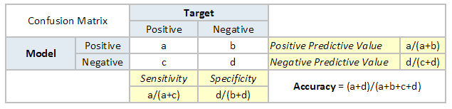

The accuracy for the problem in hand comes out to be 88%. As you can see from the above two tables, the Positive Predictive Value is high, but the negative predictive value is quite low. The same holds for Sensitivity and Specificity. This is primarily driven by the threshold value we have chosen. If we decrease our threshold value, the two pairs of starkly different numbers will come closer.
In general, we are concerned with one of the above-defined metrics. For instance, in a pharmaceutical company, they will be more concerned with a minimal wrong positive diagnosis. Hence, they will be more concerned about high Specificity. On the other hand, an attrition model will be more concerned with Sensitivity. Confusion matrices are generally used only with class output models.
F1 Score
In the last section, we discussed precision and recall for classification problems and also highlighted the importance of choosing a precision/recall basis for our use case. What if, for a use case, we are trying to get the best precision and recall at the same time? F1-Score is the harmonic mean of precision and recall values for a classification problem. The formula for F1-Score is as follows:

Now, an obvious question that comes to mind is why you are taking a harmonic mean and not an arithmetic mean. This is because HM punishes extreme values more. Let us understand this with an example. We have a binary classification model with the following results:
Precision: 0, Recall: 1
Here, if we take the arithmetic mean, we get 0.5. It is clear that the above result comes from a dumb classifier that ignores the input and predicts one of the classes as output. Now, if we were to take HM, we would get 0 which is accurate as this model is useless for all purposes.
This seems simple. There are situations, however, for which a data scientist would like to give a percentage more importance/weight to either precision or recall. Altering the above expression a bit such that we can include an adjustable parameter beta for this purpose, we get:

Fbeta measures the effectiveness of a model with respect to a user who attaches β times as much importance to recall as precision.
Gain and Lift Charts
Gain and Lift charts are mainly concerned with checking the rank ordering of the probabilities. Here are the steps to build a Lift/Gain chart:
- Step 1: Calculate the probability for each observation
- Step 2: Rank these probabilities in decreasing order.
- Step 3: Build deciles with each group having almost 10% of the observations.
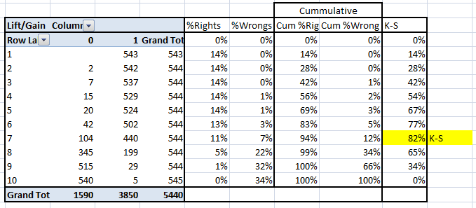
- Step 4: Calculate the response rate at each decile for Good (Responders), Bad (Non-responders), and total.
You will get the following table from which you need to plot Gain/Lift charts:
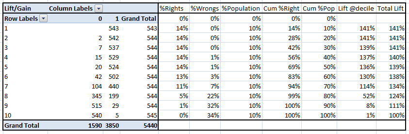
This is a very informative table. The cumulative Gain chart is the graph between Cumulative %Right and Cumulative %Population. For the case in hand, here is the graph:
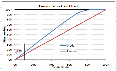
This graph tells you how well is your model segregating responders from non-responders. For example, the first decile, however, has 10% of the population, has 14% of the responders. This means we have a 140% lift at the first decile.
What is the maximum lift we could have reached in the first decile? From the first table of this article, we know that the total number of responders is 3850. Also, the first decile will contain 543 observations. Hence, the maximum lift at the first decile could have been 543/3850 ~ 14.1%. Hence, we are quite close to perfection with this model.
Let’s now plot the lift curve. The lift curve is the plot between total lift and %population. Note that for a random model, this always stays flat at 100%. Here is the plot for the case in hand:
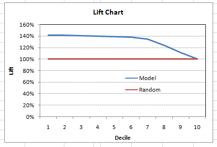
You can also plot decile-wise lift with decile number:
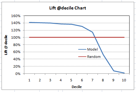
What does this graph tell you? It tells you that our model does well till the 7th decile. Post which every decile will be skewed towards non-responders. Any model with lift @ decile above 100% till minimum 3rd decile and maximum 7th decile is a good model. Else you might consider oversampling first.
Lift / Gain charts are widely used in campaign targeting problems. This tells us to which decile we can target customers for a specific campaign. Also, it tells you how much response you expect from the new target base.
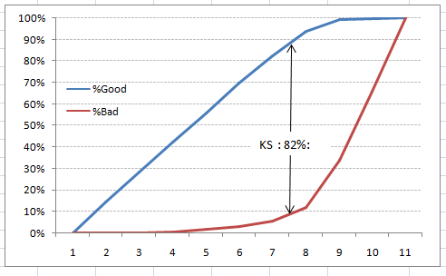
Kolomogorov Smirnov Chart
K-S or Kolmogorov-Smirnov chart measures the performance of classification models. More accurately, K-S is a measure of the degree of separation between the positive and negative distributions. The K-S is 100 if the scores partition the population into two separate groups in which one group contains all the positives and the other all the negatives.
On the other hand, If the model cannot differentiate between positives and negatives, then it is as if the model selects cases randomly from the population. The K-S would be 0. In most classification models, the K-S will fall between 0 and 100, and the higher the value, the better the model is at separating the positive from negative cases.
For the case in hand, the following is the table:
We can also plot the %Cumulative Good and Bad to see the maximum separation. Following is a sample plot:
The evaluation metrics covered here are mostly used in classification problems. So far, we’ve learned about the confusion matrix, lift and gain chart, and kolmogorov-smirnov chart. Let’s proceed and learn a few more important metrics.
Area Under the ROC Curve (AUC – ROC)
This is again one of the popular evaluation metrics used in the industry. The biggest advantage of using the ROC curve is that it is independent of the change in the proportion of responders. This statement will get clearer in the following sections.
Let’s first try to understand what the ROC (Receiver operating characteristic) curve is. If we look at the confusion matrix below, we observe that for a probabilistic model, we get different values for each metric.
Hence, for each sensitivity, we get a different specificity. The two vary as follows:
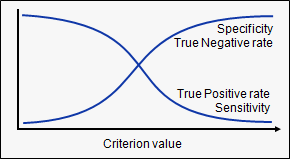
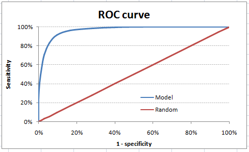
The ROC curve is the plot between sensitivity and (1- specificity). (1- specificity) is also known as the false positive rate, and sensitivity is also known as the True Positive rate. Following is the ROC curve for the case in hand.
Let’s take an example of threshold = 0.5 (refer to confusion matrix). Here is the confusion matrix:
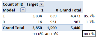
As you can see, the sensitivity at this threshold is 99.6%, and the (1-specificity) is ~60%. This coordinate becomes on point in our ROC curve. To bring this curve down to a single number, we find the area under this curve (AUC).
Note that the area of the entire square is 1*1 = 1. Hence AUC itself is the ratio under the curve and the total area. For the case in hand, we get AUC ROC as 96.4%. Following are a few thumb rules:
- .90-1 = excellent (A)
- .80-.90 = good (B)
- .70-.80 = fair (C)
- .60-.70 = poor (D)
- .50-.60 = fail (F)
We see that we fall under the excellent band for the current model. But this might simply be over-fitting. In such cases, it becomes very important to do in-time and out-of-time validations.
Points to Remember
1. For a model which gives class as output will be represented as a single point in the ROC plot.
2. Such models cannot be compared with each other as the judgment needs to be taken on a single metric and not using multiple metrics. For instance, a model with parameters (0.2,0.8) and a model with parameters (0.8,0.2) can be coming out of the same model; hence these metrics should not be directly compared.
3. In the case of the probabilistic model, we were fortunate enough to get a single number which was AUC-ROC. But still, we need to look at the entire curve to make conclusive decisions. It is also possible that one model performs better in some regions and other performs better in others.
Advantages of Using ROC
Why should you use ROC and not metrics like the lift curve?
Lift is dependent on the total response rate of the population. Hence, if the response rate of the population changes, the same model will give a different lift chart. A solution to this concern can be a true lift chart (finding the ratio of lift and perfect model lift at each decile). But such a ratio rarely makes sense for the business.
The ROC curve, on the other hand, is almost independent of the response rate. This is because it has the two axes coming out from columnar calculations of the confusion matrix. The numerator and denominator of both the x and y axis will change on a similar scale in case of a response rate shift.
Log Loss
AUC ROC considers the predicted probabilities for determining our model’s performance. However, there is an issue with AUC ROC, it only takes into account the order of probabilities, and hence it does not take into account the model’s capability to predict a higher probability for samples more likely to be positive. In that case, we could use the log loss, which is nothing but a negative average of the log of corrected predicted probabilities for each instance.

- p(yi) is the predicted probability of a positive class
- 1-p(yi) is the predicted probability of a negative class
- yi = 1 for the positive class and 0 for the negative class (actual values)
Let us calculate log loss for a few random values to get the gist of the above mathematical function:
- Log loss(1, 0.1) = 2.303
- Log loss(1, 0.5) = 0.693
- Log loss(1, 0.9) = 0.105
If we plot this relationship, we will get a curve as follows:

It’s apparent from the gentle downward slope towards the right that the Log Loss gradually declines as the predicted probability improves. Moving in the opposite direction, though, the Log Loss ramps up very rapidly as the predicted probability approaches 0.
So, the lower the log loss, the better the model. However, there is no absolute measure of a good log loss, and it is use-case/application dependent.
Whereas the AUC is computed with regards to binary classification with a varying decision threshold, log loss actually takes the “certainty” of classification into account.
Gini Coefficient
The Gini coefficient is sometimes used in classification problems. The Gini coefficient can be derived straight away from the AUC ROC number. Gini is nothing but the ratio between the area between the ROC curve and the diagonal line & the area of the above triangle. Following are the formulae used:
Gini = 2*AUC – 1
Gini above 60% is a good model. For the case in hand, we get Gini as 92.7%.
Concordant – Discordant Ratio
This is, again, one of the most important evaluation metrics for any classification prediction problem. To understand this, let’s assume we have 3 students who have some likelihood of passing this year. Following are our predictions:
A – 0.9
B – 0.5
C – 0.3
Now picture this. if we were to fetch pairs of two from these three students, how many pairs would we have? We will have 3 pairs: AB, BC, and CA. Now, after the year ends, we see that A and C passed this year while B failed. No, we choose all the pairs where we will find one responder and another non-responder. How many such pairs do we have?
We have two pairs AB and BC. Now for each of the 2 pairs, the concordant pair is where the probability of the responder was higher than the non-responder. Whereas discordant pair is where the vice-versa holds true. In case both the probabilities were equal, we say it’s a tie. Let’s see what happens in our case :
AB – Concordant
BC – Discordant
Hence, we have 50% of concordant cases in this example. A concordant ratio of more than 60% is considered to be a good model. This metric generally is not used when deciding how many customers to target etc. It is primarily used to access the model’s predictive power. Decisions like how many to target are again taken by KS / Lift charts.
Root Mean Squared Error (RMSE)
RMSE is the most popular evaluation metric used in regression problems. It follows an assumption that errors are unbiased and follow a normal distribution. Here are the key points to consider on RMSE:
- The power of ‘square root’ empowers this metric to show large number deviations.
- The ‘squared’ nature of this metric helps to deliver more robust results, which prevent canceling the positive and negative error values. In other words, this metric aptly displays the plausible magnitude of the error term.
- It avoids the use of absolute error values, which is highly undesirable in mathematical calculations.
- When we have more samples, reconstructing the error distribution using RMSE is considered to be more reliable.
- RMSE is highly affected by outlier values. Hence, make sure you’ve removed outliers from your data set prior to using this metric.
- As compared to mean absolute error, RMSE gives higher weightage and punishes large errors.
RMSE metric is given by:

where N is the Total Number of Observations.
Root Mean Squared Logarithmic Error
In the case of Root mean squared logarithmic error, we take the log of the predictions and actual values. So basically, what changes are the variance that we are measuring? RMSLE is usually used when we don’t want to penalize huge differences in the predicted and the actual values when both predicted, and true values are huge numbers.

- If both predicted and actual values are small: RMSE and RMSLE are the same.
- If either predicted or the actual value is big: RMSE > RMSLE
- If both predicted and actual values are big: RMSE > RMSLE (RMSLE becomes almost negligible)
R-Squared/Adjusted R-Squared
We learned that when the RMSE decreases, the model’s performance will improve. But these values alone are not intuitive.
In the case of a classification problem, if the model has an accuracy of 0.8, we could gauge how good our model is against a random model, which has an accuracy of 0.5. So the random model can be treated as a benchmark. But when we talk about the RMSE metrics, we do not have a benchmark to compare.
This is where we can use the R-Squared metric. The formula for R-Squared is as follows:


MSE(model): Mean Squared Error of the predictions against the actual values
MSE(baseline): Mean Squared Error of mean prediction against the actual values
In other words, how good is our regression model as compared to a very simple model that just predicts the mean value of the target from the train set as predictions?
Adjusted R-Squared
A model performing equal to the baseline would give R-Squared as 0. Better the model, the higher the r2 value. The best model with all correct predictions would give R-Squared of 1. However, on adding new features to the model, the R-Squared value either increases or remains the same. R-Squared does not penalize for adding features that add no value to the model. So an improved version of the R-Squared is the adjusted R-Squared. The formula for adjusted R-Squared is given by:

k: number of features
n: number of samples
As you can see, this metric takes the number of features into account. When we add more features, the term in the denominator n-(k +1) decreases, so the whole expression increases.
If R-Squared does not increase, that means the feature added isn’t valuable for our model. So overall, we subtract a greater value from 1 and adjusted r2, in turn, would decrease.
Beyond these 12 evaluation metrics, there is another method to check the model performance. These 7 methods are statistically prominent in data science. But, with the arrival of machine learning, we are now blessed with more robust methods of model selection. Yes! I’m talking about Cross Validation.
Though cross-validation isn’t really an evaluation metric that is used openly to communicate model accuracy, the result of cross-validation provides a good enough intuitive result to generalize the performance of a model.
Let’s now understand cross-validation in detail.
Cross Validation
Let’s first understand the importance of cross-validation. Due to my busy schedule these days, I don’t get much time to participate in data science competitions. A long time back, I participated in TFI Competition on Kaggle. Without delving into my competition performance, I would like to show you the dissimilarity between my public and private leaderboard scores.
Here Is an Example of Scoring on Kaggle!
For the TFI competition, the following were three of my solution and scores (the lesser, the better):

You will notice that the third entry which has the worst Public score turned out to be the best model on Private ranking. There were more than 20 models above the “submission_all.csv”, but I still chose “submission_all.csv” as my final entry (which really worked out well). What caused this phenomenon? The dissimilarity in my public and private leaderboards is caused by over-fitting.
Over-fitting is nothing, but when your model becomes highly complex that it starts capturing noise, also. This ‘noise’ adds no value to the model but only inaccuracy.
In the following section, I will discuss how you can know if a solution is an over-fit or not before we actually know the test set results.
The Concept of Cross-Validation
Cross Validation is one of the most important concepts in any type of data modeling. It simply says, try to leave a sample on which you do not train the model and test the model on this sample before finalizing the model.
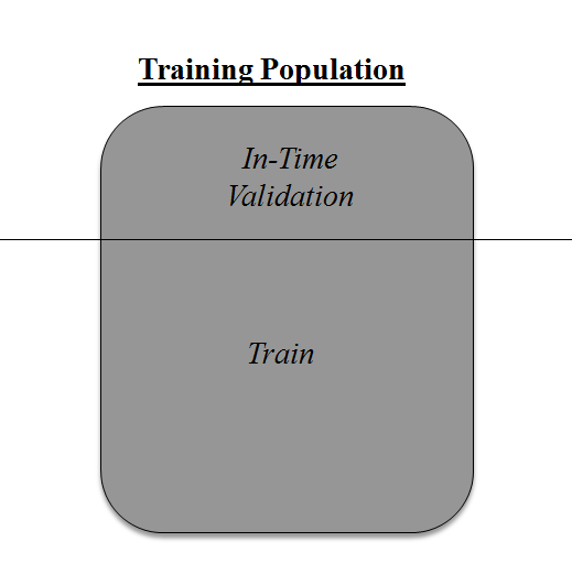
The above diagram shows how to validate the model with the in-time sample. We simply divide the population into 2 samples and build a model on one sample. The rest of the population is used for in-time validation.
Could there be a negative side to the above approach?
I believe a negative side of this approach is that we lose a good amount of data from training the model. Hence, the model is very high bias. And this won’t give the best estimate for the coefficients. So what’s the next best option?
What if we make a 50:50 split of the training population and the train on the first 50 and validate on the rest 50? Then, we train on the other 50 and test on the first 50. This way, we train the model on the entire population, however, on 50% in one go. This reduces bias because of sample selection to some extent but gives a smaller sample to train the model on. This approach is known as 2-fold cross-validation.
K-Fold Cross-Validation
Let’s extrapolate the last example to k-fold from 2-fold cross-validation. Now, we will try to visualize how a k-fold validation work.
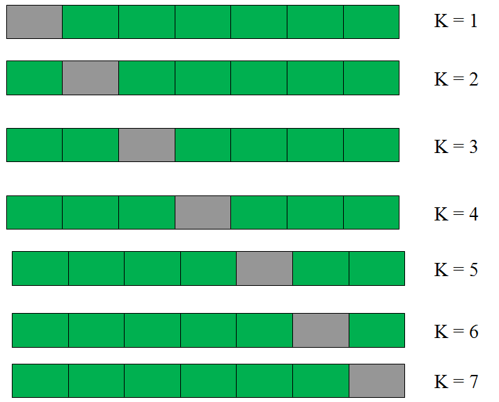
This is a 7-fold cross-validation.
Here’s what goes on behind the scene: we divide the entire population into 7 equal samples. Now we train models on 6 samples (Green boxes) and validate on 1 sample (grey box). Then, at the second iteration, we train the model with a different sample held as validation. In 7 iterations, we have basically built a model on each sample and held each of them as validation. This is a way to reduce the selection bias and reduce the variance in prediction power. Once we have all 7 models, we take an average of the error terms to find which of the models is best.
How does this help to find the best (non-over-fit) model?
k-fold cross-validation is widely used to check whether a model is an overfit or not. If the performance metrics at each of the k times modeling are close to each other and the mean of the metric is highest. In a Kaggle competition, you might rely more on the cross-validation score than the Kaggle public score. This way, you will be sure that the Public score is not just by chance.
How do we implement k-fold with any model?
Coding k-fold in R and Python are very similar. Here is how you code a k-fold in Python:
Try out the code for KFold in the live coding window below:
But how do we choose k?
This is the tricky part. We have a trade-off to choosing k.
For a small k, we have a higher selection bias but a low variance in the performances.
For a large k, we have a small selection bias but a high variance in the performances.
Think of extreme cases:
k = 2: We have only 2 samples similar to our 50-50 example. Here we build the model only on 50% of the population each time. But as the validation is a significant population, the variance of validation performance is minimal.
k = a number of observations (n): This is also known as “Leave one out.” We have n samples and modeling repeated n number of times, leaving only one observation out for cross-validation. Hence, the selection bias is minimal, but the variance of validation performance is very large.
Generally, a value of k = 10 is recommended for most purposes.
Conclusion
Measuring the performance of the training sample is pointless. And leaving an in-time validation batch aside is a waste of data. K-Fold gives us a way to use every single data point, which can reduce this selection bias to a good extent. Also, K-fold cross-validation can be used with any modeling technique.
In addition, the metrics covered in this article are some of the most used metrics of evaluation in classification and regression problems.
Which metric do you often use in classification and regression problems? Have you used k-fold cross-validation before for any kind of analysis? Did you see any significant benefits against using batch validation? Do let us know your thoughts about this guide in the comments section below.
Key Takeaways
- Evaluation metrics measure the quality of the machine learning model.
- For any project evaluating machine learning models or algorithms is essential.
Frequently Asked Questions
A. Accuracy, confusion matrix, log-loss, and AUC-ROC are the most popular evaluation metrics.
A. Evaluation metrics quantify the performance of a machine learning model. It involves training a model and then comparing the predictions to expected values.
A. Accuracy, confusion matrix, log-loss, and AUC-ROC are the most popular evaluation metrics used for evaluating classifier performance.
Tavish Srivastava, co-founder and Chief Strategy Officer of Analytics Vidhya, is an IIT Madras graduate and a passionate data-science professional with 8+ years of diverse experience in markets including the US, India and Singapore, domains including Digital Acquisitions, Customer Servicing and Customer Management, and industry including Retail Banking, Credit Cards and Insurance. He is fascinated by the idea of artificial intelligence inspired by human intelligence and enjoys every discussion, theory or even movie related to this idea.


I think adding multilogloss , in this would be useful. It is a good matrix to identify better model in case of multi class classification.
Very useful
Hi, Great post thanks. Just in number one confusion matrix you miscalculated the negative predicted value. It is not 1.7% but 98.3%. Same for specificity (59.81% instead of 40.19%). Since you reuse this example for ROC, your curve is actually better. But anyways your argument still holds. Nicely presented.
Its a good information
Very informative and useful article.Thank you..
Considering provided confusion matrix, negative predicrive value is 951/967 or not? Is there an error in confusion matrix example or in formulas?
Yes I agree with Tamara the negative predictive value should be 98.3454%. Can you please confirm Tavish
Hi Tavish, Thanks again , for this valuable article. It would be great , if along with this very informative explanation , you can also provide how to code it , preferably in R. Thanks.
Introduction p Predictive Modeling works on constructive feedback principle. You build a model. Get feedback from metrics, make improvements and …
Excellent article! thanks for the effort.
Excellent article! Thanks a lot!!
Can we all the list of Statistical Models and the application scenarios please for a novice person like me?
Are there metrics for non supervised models as k-means for example? Thanks!
Hi Jorge, We have updated the article with evaluation metrics for unsupervised learning as well.
Hi, can you further explain this "Lift is dependent on total response rate of the population"? Is this only applicable when you are able to correctly predict 100% of the 1st (or more) deciles?
Comments are Closed