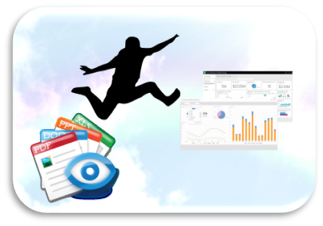
Move to Online Dashboards – 6 Things to remember before you choose a tool!
This article was published as a part of the Data Science Blogathon.
Introduction
“PowerPoint will die in the next 5 years” – just something I heard from a senior way back in 2005. 15 years on, PowerPoint is still one of the most popular tools for reporting. It’s abilities to form a narrative, add visuals and text, include animation, adding branding and templatization, etc. have made it a favorite for delivering insights to board rooms for years now.

However, PowerPoint comes with one massive drawback – It does not allow users to explore data. Hence, most reports have an additional version delivered to stakeholders who are hands-on with their data – An Excel workbook – to slice and dice the data.
Let’s look at a use case:
A Global project run in 10 countries, needs monthly country level reports both PPT and Excel. Imagine number of documents floating around in emails or FTP’s.
Add to this chaos, an updated data set – All of them need to be created once again – Could you imagine the drain on resources?
Let’s pause and ask – What if:
- What if, You could combine your PowerPoint and Excel deliverables in a single output – Allow users to explore their data & present their insights together
- In case of new data sets, you could just update the report that too directly from the source
- You could distribute all your reports – at one place at the same time to all users.
- You could restrict access based on roles and hierarchies
- You could ensure confidentiality using user authentication
- You could add automated insights and AI to make your reports cutting edge
The one-piece of the puzzle that gets us all of the above and more – ‘Online Interactive reports’ more colloquially known as ‘Online Dashboards’.
What are Online Dashboards?
By definition: An Online Dashboard is a web browser-based application that allows the user to look at his business KPIs in an aggregated form through interactive visualizations. These tools allow the user to drill down the data, slice & dice it by different segments and run further calculations.
There are numerous Business Intelligence and Data Visualization tools that help build such online reports. Tableau, Power BI, Datorama, Google Data Studio, QlikView, Market Sight, Dapresy, Looker, etc. are some of them. Over the years, each of these has developed amazing functionalities that empower data reporting and insights storytelling.
Benefits of using Online Dashboards
Apart from jazzy visualization and interactivity, there are other benefits to moving your reporting to Online Tools:
- Cost Benefits: Contrary to the myth, Online dashboards could be much more cost effective, especially if the reports have repeatability like monthly updates or multi country reports. While the initial set-up does incur efforts and hence costs, overtime, these costs get evened out. In many cases, where the repeat value of reports are high, Online Dashboards turn out to be cheaper
- Time to Table for Reports: Once an online dashboard is set up, the time taken to table reports reduces significantly, to a couple of days. This in turn, makes decision making faster.
- Accuracy: With lesser manual interventions, the chances of errors also reduces significantly. Online Dashboards can increase the accuracy levels of your reports
- Security: Online Dashboards can only be accessed via user authentication and are hosted on the cloud, bringing in considerable
However, for many users actually moving their offline PPT/Excel reporting to an Online Dashboard comes with its own set of hurdles that they have to surpass.
Challenges with selecting an Online Dashboarding Tool and moving:
- Fitting it in the project cost – Usually the project costs are already finalized at a bidding stage. Choosing a tool at a later stage, could drain the project profitability significantly, if not done right.
- Getting the required reporting indices – Each tool comes with its own strengths and limitations. They are after all just tools. If you need to show an average of summation of products of numbers dynamically, some tools may not be able to help you
- Working with large volume of data – If you are looking to create reports with high volumes of data (like historical datasets), not all tools can handle the volumes with speed
- Getting Offline Exports – The need for offline PPT/Excel reports do not go away. However, not all tools support exports to documents like PPT or Excel.
While it is definitely worthwhile to make the leap from offline reports to Online Dashboards, how can you make the jump easier?
Here are some quick pointers that could probably help you make that leap
- Plan upfront before you bid – If possible, before you bid on a project, reach out to the tools/ platforms to get pricing quotes. It may also help to reach out to consultants/vendors who leverage these tools daily to check what the possibilities are and at what price points. You can not only make sure you price it right but can also include write-ups in your proposal on the additional capabilities your reports will bring in using online dashboards.
- Tally what you need with what you will get – This is the most critical piece. Your reporting requirements have a set of requirements that are non-negotiable. For e.g :
- Multiple levels of calculations: For e.g getting a max of averages of sum of spends across products across months is not so easy in some tools.
- Levels of hierarchical users: How many levels of roles and hence access restrictions can the tool accommodate?
- Types of bench mark calculations: Do you have the benchmarks available or do you need the tool to calculate the same dynamically?
- Significance tests in the research world: T-Test or Z-test? What is programmed into the tool?
- The number of dimensions and metrics you need to work with; while advanced tools like Tableau cater to larger sets, some other tools come with limitations
- What technology will your audience need to use for accessing the dashboards: Will they need to license the tools?Different tools come with different strengths and drawbacks. List out all your non-negotiable requirements and compare this against the tools you are looking at. This may be tedious if you try doing this yourself. Try using experts who can get this done for you in a day & can also suggest workarounds within these tools to get what you need
- Invest time in User Experience & Design – When you move to online interactive reports, your focus moves from “Good looking charts” to an intuitive user experience and Design. You only have to set up your reports once – Let’s do that well. Such that even a new user with no technical know-how can navigate your reports
- Hang on to the good ol’ PowerPoint – Don’t spend time creating PPT’s. Just get it directly from the tool. Check if the tool you choose allows a PowerPoint export. And if they are Editable charts?
- Check the support available – How much support is available from the platform vendors or online in the form of communities, videos, forums ,etc.
- Don’t experiment with a live project – I have seen enough battle scars to say – never experiment with a live project. Always start with some historic dataset to know how far you can get on your own and if you need to involve experts. Almost all tools give you trial versions to check.
Making the actual jump from offline reporting like PPT/PDF to Online Dashboards may seem harder than it is. But it’s worth the effort once your reports are set up. The power of data at their fingertips, the amazing visualization options in tools like Tableau, makes it attractive to all stakeholders. Not to forget, you will definitely save yourself a lot of effort over time. Remember, you don’t have to do it all by yourself! There are plenty of consultants and experts out there who have been there, done that. Don’t re-invent the wheel!
While PowerPoint continues to live on, go on, give your reporting some more ammunition by making it more exploratory, smarter, faster, and definitely more efficient!
By Sonia Thakurani
Assistant Vice President – Data Visualization and BI
At Ugam, A Merkle Company


Great insights and useful tips. Explained in terms everyone can understand.