Transferable Skills for Building Data Application
This article was published as a part of the Data Science Blogathon.
Introduction:
You are done building your model, tuning it, and is ready for deployment but before that, you will have to showcase results to various stakeholders be it your immediate lead, data scientist, or customer. Generally, you build a deck (ppt) with all the visuals, data snapshots, pointers to key metrics, comparison of various factors, and a storyline on how your model will achieve its objective.
But most demos/presentations do not always go the way you planned, and you cannot be prepared for all possible scenarios as well – there are far too many factors/combinations to play with. Here is some situation that you will end up facing.
Business perspective: Customer asks you “what is the impact on model results if a particular variable/set of variables are not included in the model?” or “Can you exclude a particular data source as there are some issues with quality – will that change model results for good or bad?”
Technical perspective: Lead data scientists to ask you “What if the learning rate is decreased? Is it giving better results?” or “How is variable importance varying for different models?”
If you have prepared a deck with fixed results and a storyline then you will not be able to answer many of those queries. You need to go back to the drawing board, carry out analysis, build a deck, present your findings, and again it is possible that you might be asked more queries. Well, this is not an effective way to go about things especially when you are tight on timelines.
One way to handle this is by building data applications that is interactive, intuitive, easy to build & manage, and helps you answer queries on the fly. In this article, I have tried to explore libraries that make the process simpler, save our time on redundant tasks, and let us focus more on key aspects of the project rather than building a deck.
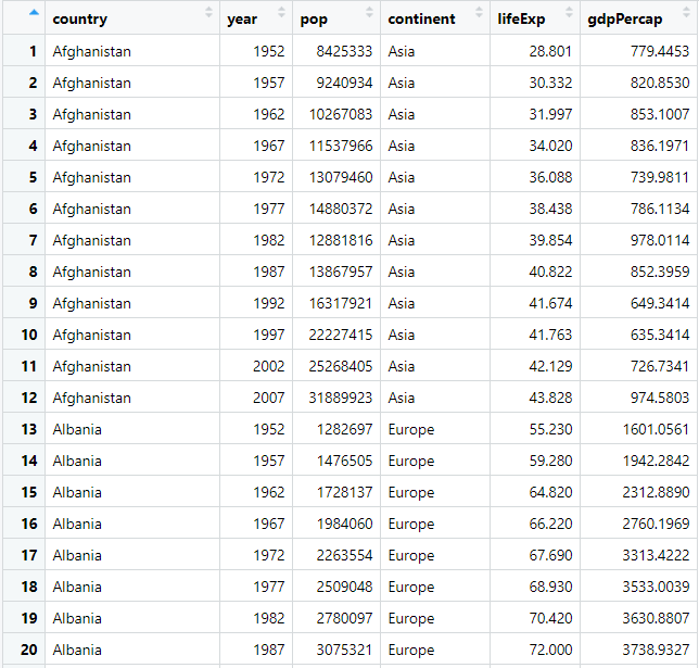
Data Source
We will be using gapminder dataset which has data from 143 countries measuring the life expectancy, population, etc over the years. Here is the quick view of the data. We will be using the same dataset for both our examples.
Let us take a look at high-level architecture without getting into technicalities.
User interface (UI): This is where you define your layout – place holders which will be populated at the runtime from processed data/plot from the server.
Server: This is where you write most of your logic, data wrangling, plotting, etc. Most heavy lifting is done here.
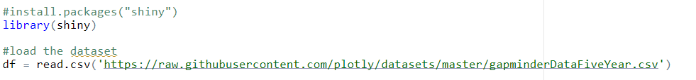
R Shiny
If you are R fanboy/girl, then shiny is the default choice for you to build a data application. Shiny applications have two components, a user interface object and a server function, that are passed as arguments to the shiny App function that creates a Shiny app object from this UI/server pair. Let’s take a closer look.
Load library and dataset:
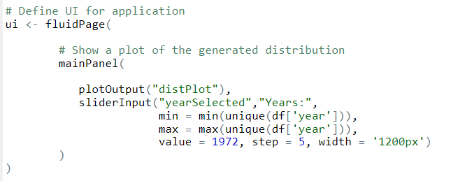
UI: Define app layout and in this case, we have two components (placeholders)
- A bar chart
- Slider input where users can select a year.
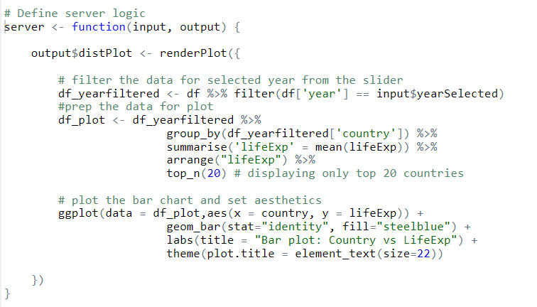
Server:
- Filter the data for the year selected by the user from the slider.
- We will aggregate the data using groupby() and select the top 20 records.
- Generate the plot using ggplot and define the aesthetics
Connect the UI and server:
Run the application:
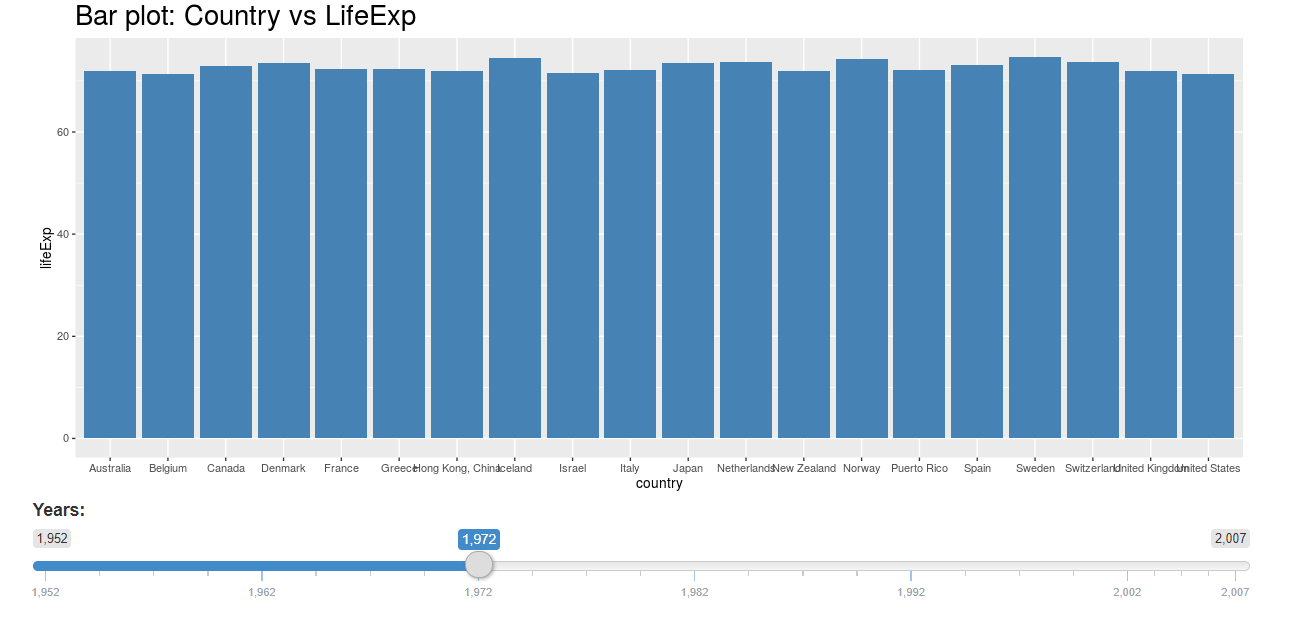
You can play with the slider and the chart would update instantly.
Now, let’s look at the second option for creating data apps. If you are a python fan – you will love it.
Dash
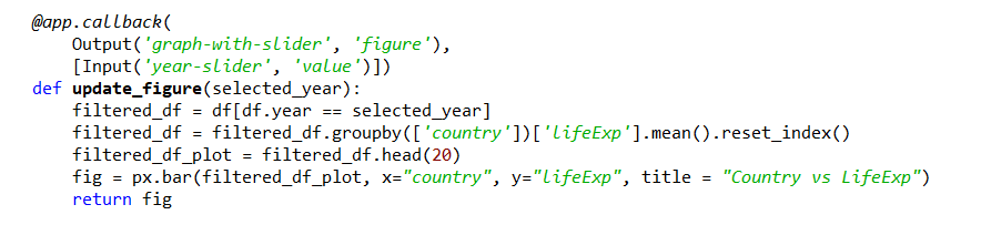
Dash is a productive Python framework for building web applications. It is written on top of Flask, Plotly.js, and React.js, Dash is widely used for building data visualization apps with highly custom user interfaces in pure Python.
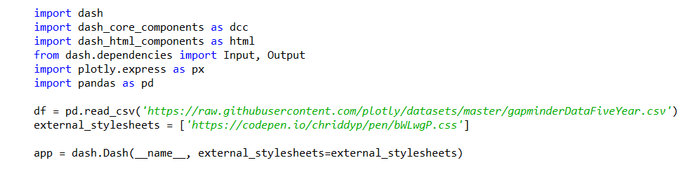
Load Libraries & dataset:
1. Load dash libraries. Install libraries if not already installed eg: pip install dash command.
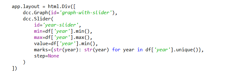
UI: We will define our layout which consists of a bar chart and slider similar to our Shiny example.
Server: In-dash, we will be using callback() functions to render the processed data/plot.
- Filter the data for the year selected by the user from the slider.
- We will aggregate the data using groupby() and select the top 20 records
- Generate the plot using plotly express and define the aesthetics
Connect:

Run the data application: Run the code in your editor/console, open browser, and hit http://127.0.0.1:8050/ to view the data application on the browser
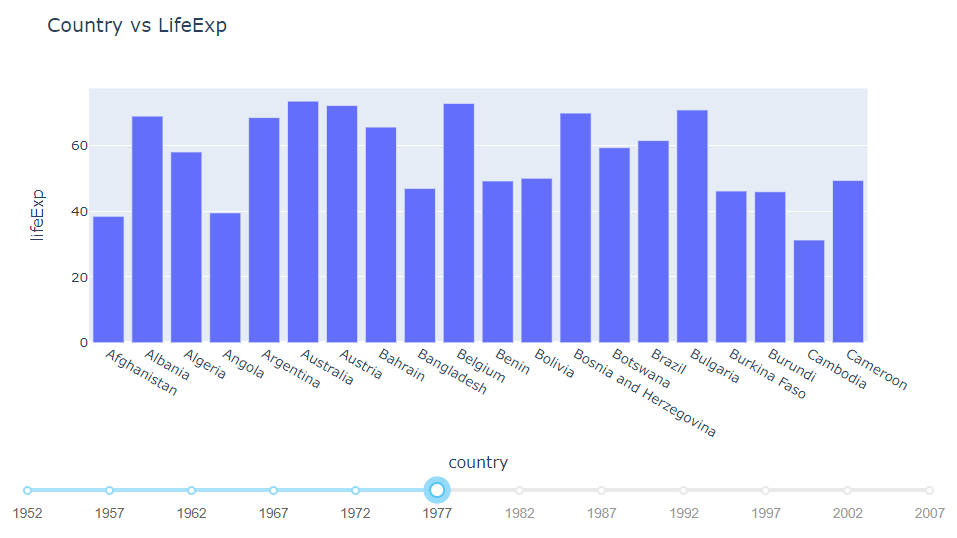
You can play with the slider and the chart would update instantly.
Observations
If you take a closer look at both examples, you will notice a lot of similarities at every stage which is listed below. So if you know one of the libraries, building an application on the other is fairly simple.
| Component | Shiny | Dash |
| Slider | SliderInput(…) | dcc.Slider(…) |
| Server | server <- function(input, output) {…} |
@app.callback(…)
|
| Data Wrangling | groupby() mean() |
groupby() mean() |
| Plots | ggplot | plotly express |
| libraries | shiny | Dash dash_core_components dash_html_components |
| Language | R | Python |
What next?
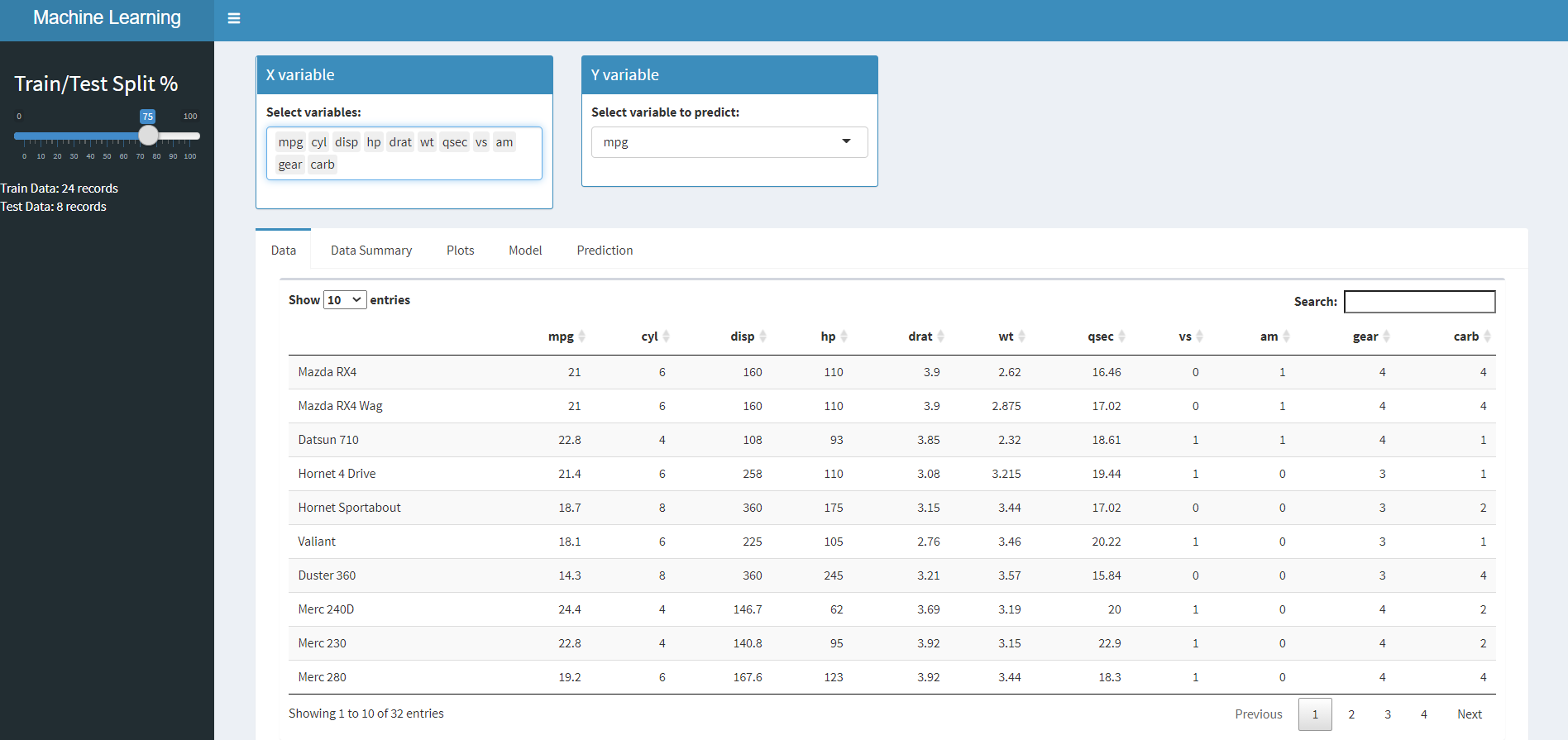
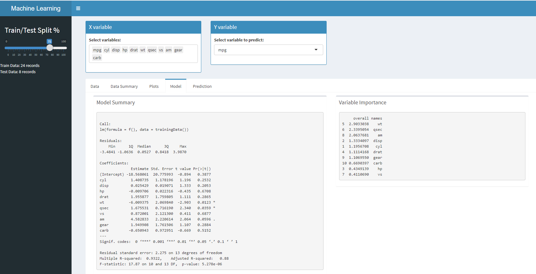
Now, that we know how to add controls, plots and make them user interactive, its time to check for more complex apps. As an example, here is the shiny application which builds a linear regression model based on user selection.
Here are the snaps of the data application. you can find it on Github for your reference.
Conclusion
The objective of this article was to map the similarities between both and to keep it as simple as possible. Whether you choose to go with Shiny or Dash, both are similar in terms of layout, generating plots, interactivity between components, etc. If you have reasonable knowledge in one of them it is easy to apply it to others. The only thing that changes is the language, function calls, and their arguments. So don’t shy away from trying your hands on both.
Happy Learning !!!!!


A good article on how to build a data application, in simple yet descriptive terms. Liked it!