Classification Model Simulator Application Using Dash in Python

Amit Kulkarni 01 Dec, 2020 • 8 min read

This article was published as a part of the Data Science Blogathon.

Introduction

Build an app and bring data to life !!!!

Dash as an open-source python framework for analytic applications. It is built on top of Flask, Plotly.js, and React.js. If you have used python for data exploration, analysis, visualization, model building, or reporting then you find it extremely useful to building highly interactive analytic web applications with minimal code. In this article, we will explore some key features including DCC & DAQ components, plotly express for visuals and build classification models with an app.


Here are various topics that this article explores

1. Quick look at plotly features & widgets
2. Build an interface for the user to experiment with parameters
3. Build models and measure metrics
4. Leverage Pytest for automated testing
5. Logging errors for debugging
6. Conclusion


Data

We will be using Analytics Vidhya’s dataset from Loan prediction. let’s create a separate file for loading data ‘definition.py’ and have created an object call obj_Data which is accessible across files within the project. Firstly, let’s look at the data.


Dash - Train Data
Dash Test Data


Front End – Add DCC & DAQ controls

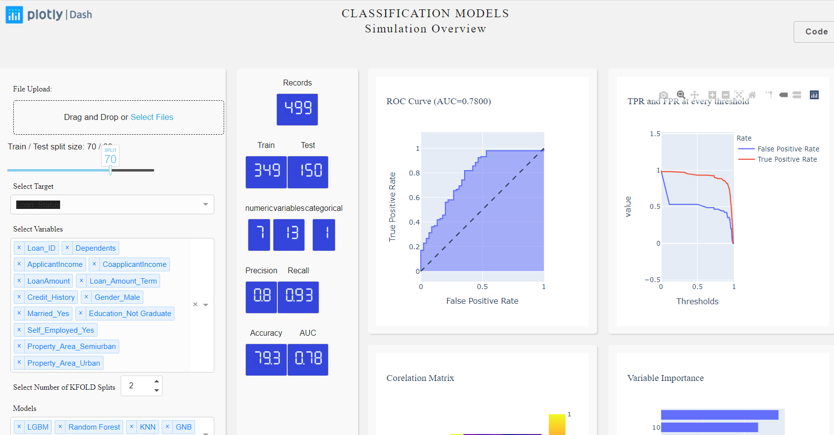
Before we begin, let’s take a look at what we will build by the end of this blog.

Dash Plotly - End Result


Slider:

To start with let’s build a slider which we will use to split our dataset into train and test. The train set will be used to train the model and test for validating our model results.

Splitting Data
    daq.Slider(
        id = 'slider',
        min=0,
        max=100,
        value=70,
        handleLabel={"showCurrentValue": True,"label": "SPLIT"},
        step=10
),

Dropdowns:

Next, let’s build two dropdowns, one for selecting the target variable and the other for independent variables. The only thing to note here is that the values are being populated from the dataset and not hardcoded.
options=[{'label':x, 'value':x} for x in obj_Data.df_train_dummies.columns],
html.P("Select Target", className="control_label"),
    dcc.Dropdown(
        id="select_target",
        options=[{'label':x, 'value':x} for x in obj_Data.df_train_dummies.columns],
        multi=False,
        value='Loan_Status',
        clearable=False,        
),

Numeric Input with DAQ:

Dash DQ K-Fold Split

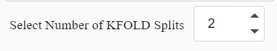
We also would like to have the user select a number of splits for model building. For more information refer KFOLD. let’s add a numeric field with min=1 and max=10.

   daq.NumericInput(
        id='id-daq-splits',
        min=0,
        max=10,
        size = 75,
        value=2
    ),

LED Display with DAQ:
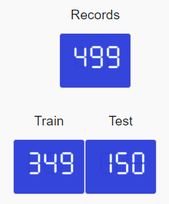
It would also be very useful to have certain standard metrics upfront like the number of records, a number of categorical & numeric fields, etc as part of basic information. For this, let’s make use of dash-daq widgets. We can change the font, color, and background depending on the layout/theme.
LED Display of Dash DQ
    daq.LEDDisplay(
        id='records',
        #label="Default",
        value=0,
        label = "Records",
        size=FONTSIZE,
        color = FONTCOLOR,
        backgroundColor=BGCOLOR
    )
We will use the same code snippet to generate a few more such cards/widgets making sure ids are unique. We will look at how to populate the values in the later segment but for now, let’s set the value to zero.


Now that all user enterable fields are covered, we will have placeholders for showcasing some of the model metrics plots such as AUC-ROC which is a standard curve for classification models. We will populate the chart once the model building is completed in a later segment.
html.Div(
    [dcc.Graph(id="main_graph")],
),

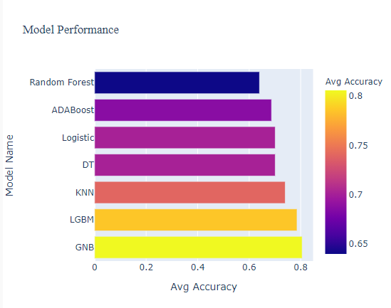
Back End – let’s build models and measure metrics:

There are two aspects to factor in-
1. Build all seven classification models and plot a bar chart based on accuracy. We will code this in a separate file named multiModel.py
2. Automatically select the best performing model and detail the relevant metric specific to the chosen model. We will code this in file models.py

Classification Model/s:

Let’s start with the first part – We will build seven classification models namely Logistic regression, light GBM, KNN, Decision Tree, AdaBoost Classifier, Random Forest, and Gaussian Naive Bayes. Here is the snippet for LGBM. As the article is about building an analytics app and not a model building, you can refer to the complete model building code for more details.
    ...
    ...
    clf = lgb.LGBMClassifier(n_estimators=1000,max_depth=4,random_state=22)
    clf.fit(X_trn,y_trn)
    predictions = clf.predict(X_val)
    fun_metrics(predictions, y_val)
    fpr, tpr, _ = roc_curve(y_val, predictions)
    fun_metricsPlots(fpr, tpr, "LGBM")
    fun_updateAccuracy(clf, predictions)
    ....
    ....
Now, for the second part where we will generate metrics specific to the best model among the seven. Here is the pseudo-code snippet – refer code for more details.
if bestModel == 'GNB':
            model = GaussianNB()
        elif bestModel == 'LGBM':
            model = lgb.LGBMClassifier()
        elif bestModel == 'Logistic':
            model = LogisticRegression()
        elif bestModel == 'KNN':
            model = KNeighborsClassifier()
        elif bestModel == 'Raondom Forest':
            model = RandomForestClassifier()
        elif bestModel == 'DT':
            model = tree.DecisionTreeClassifier()
        else:
            model = AdaBoostClassifier()

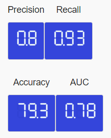
Measure Model Metrics:

We will track the metrics for the best model – precision, recall, and accuracy, and for this, we will be using sklearn.metrics library for deriving these numbers. These are the numbers that will be populating our dash-daq widgets.
Model Accuracy
from sklearn.metrics import roc_curve, roc_auc_score, recall_score, precision_score,accuracy_score
precision = round(precision_score(testy, yhat),2)
recall = round(recall_score(testy, yhat),2)
accuracy = round(accuracy_score(testy, yhat)*100,1)
testy has the actual value from the test set and yhat has predicted values.
Evaluation

Build an AUC-ROC plot with Plotly Express:
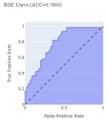
Similarly, build an AUC-ROC curve using plotly express and save it on fig object fig_ROC
ROC Curve
fig_ROC = px.area(
x=lr_fpr, y=lr_tpr,
title=f'ROC Curve (AUC={lr_auc:.4f})',
labels=dict(x='False Positive Rate', y='True Positive Rate')
)
fig_ROC.add_shape(
    type='line', line=dict(dash='dash'),
    x0=0, x1=1, y0=0, y1=1
)
fig_ROC.update_yaxes(scaleanchor="x", scaleratio=1)
fig_ROC.update_xaxes(constrain='domain')

Interaction with callbacks:

Now that we have designed the front end with widgets, place holders, and for the back end, wrote a function for building classification model/s which does the prediction and also generates model metrics. Now, these two should interact with each other every time user changes the input and this can be achieved using callbacks. The callbacks are Python functions that are automatically called by Dash whenever an input component’s property changes.


There are 3 sections to callbacks-
1. List of all the outputs (or just a single output)
2. List of all the inputs (or just a single input)
3. Function which takes the input, does the defined processing, and gives back the output.


Note: If there are multiple inputs or multiple outputs then the controls are wrapped under [ ] if not then it can be skipped.
[
    Output("main_graph", 'figure'),
    Output("recall", 'value'),
]
....
[
    Input("select_target", "value"),
    Input("select_independent", "value"),
...    
]
....
In the above code snippet for output, the first argument is the main_graph that we had set during UI design. The second argument is the object type which in this case is figure. Similarly, the recall control expects the object of type value which in this case is numeric. More information on callbacks can be found here. Bringing all our input/output controls together, the code would like this.
@app.callback(
    [
        Output("main_graph", 'figure'),
        Output("individual_graph", 'figure'),
        Output("aggregate_graph", 'figure'),
        Output("slider-output-container", 'children'),
        Output("precision", 'value'),
        Output("recall", 'value'),
        Output("accuracy", 'value'),
        Output("auc", 'value'),
        Output("trainset", 'value'),
        Output("testset", 'value'),
        Output('model-graduated-bar', 'value'),
        Output('id-insights', 'children'),
        Output("model-graphs", 'figure'),     
        Output("best-model", 'children'), 
        Output("id-daq-switch-model", 'on'),
        Output('auto-toast-model', 'is_open')
    ],
    [
        Input("select_target", "value"),
        Input("select_independent", "value"),
        Input("slider", "value"),
        Input("id-daq-splits", "value"),
        Input("select_models", "value")        
    ]
)
def measurePerformance(target, independent, slider, splits, selected_models):
    fig_ROC, Fig_Precision, fig_Threshold,precision, recall, accuracy, trainX, testX, auc, fig_model, bestModel = multiModel.getModels(target,independent, slider, splits, selected_models)
    auc_toast = True if auc < 0.5 else False
    return fig_ROC, Fig_Precision, fig_Threshold, 'Train / Test split size: {} / {}'.format(slider, 100-slider), precision, recall, accuracy,auc, trainX, testX, auc*100, f'The best performing model is {bestModel} with accuracy of {accuracy}, precision of {precision} and recall of {recall} with Area under curve of {auc}. Try for various K FOLD values to explore further.' ,fig_model, f'The top performaing model is {bestModel}', True, auc_toast

Write some testcases using PyTest:

Writing unit test cases for typical web development is normal but generally, for analytic apps with predictive models and visuals, there is a tendency to skip and just do a sanity check manually at the end. The pytest library makes it easier to configure the test cases, write functions to test for specific inputs & outputs. In short, write it once and keep running the test before pushing code to QA/Prod environment. Refer pytest document for more details.


As an example, let’s write a case to check for Precision value. We can use the same framework and extend it to many more cases – positive, negative, and borderline cases.
#pip install pytest 
import pytest
def test_buildModels():    
    fig_ROC, fig_precision, fig_threshold, precision, recall, accuracy, trainX, testX, lr_auc =  buildModel(target, independent, slider, selected_models)
    assert precision < 1
The assert keyword ensures that the specified criteria is met and designates the test case either as Pass or Fail.
Dropdown check

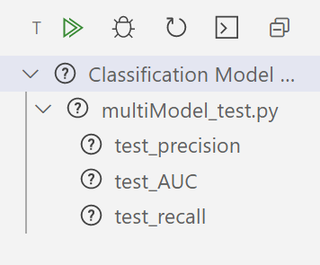
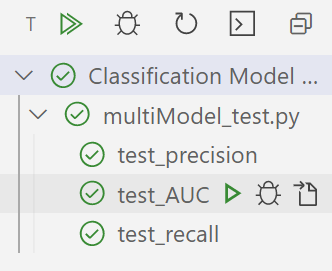
Configure test cases

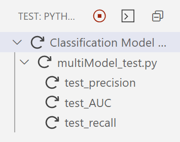
Test cases under execution

one test failed

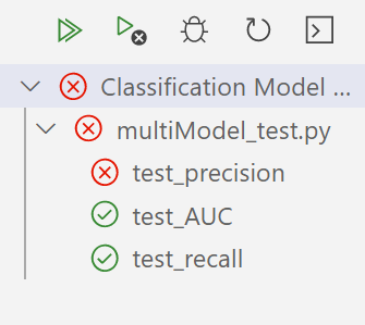
One test case failed

All test cleared
All test cases passed

Logging errors:

Logging errors/ warnings help us keep track of issues in our code and for this, we will use a logging library. We will create a separate file by name model.log. Logging is not only a good practice to follow but also helps immensely during the debugging process. Some prefer to use print() statement which logs output in the console for their reference but is recommended that one uses logging.


Create a file by name ‘model.log’ in your project directory and use the below code for logging errors in this file.
# install the library if you haven't already done
# pip install logging          
import logging
logging.basicConfig(filename= 'model.log',  level = logging.DEBUG,format='%(asctime)s:%(levelname)s:%(filename)s:%(funcName)s:%(message)s')

The errors can be tracked in the model.log file. Here is a sample error:

Model Log


Refer formats from LogRecord attributes for attribute names, their meanings, and the corresponding placeholder in a %-style format string. The log would look like the below format YYYY-MM-DD HH: MM filename.

Once all the UI components and models are successfully built. You can access the application in your localhost (http://127.0.0.1:8050) and can play with the train/test slider, splits, and variables to see the plots and metrics instantly get updated.


Conclusion:

Python with plotly Dash can be used to build some very complex analytics applications in a short time. I personally find it useful for rapid prototyping, client demos, proposals, and POC’s. The best part of the whole process is you only need to know the basics of python and you can create the front end, back end, visuals, and predictive models which are core to analytics apps. If you use your creative side and focus on the user experience, then you are sure to impress your team, client, or end-user.

What Next?:

The app can be extended to multi-class classification models, add more visuals & metrics as required, build a login page with user authentication, maybe save data to DB, and much more. Hope you learned something new today.

Happy learnings !!!!


You can connect with me – Linkedin
You can find the code for reference – Github

References:

https://dash.plotly.com/
https://scikit-learn.org/stable/getting_started.html
https://dash.plotly.com/dash-daq
https://unsplash.com/

Amit Kulkarni 01 Dec 2020

Frequently Asked Questions

Lorem ipsum dolor sit amet, consectetur adipiscing elit,

Responses From Readers

Clear