Introduction to Exploratory Data Analysis (EDA)
Introduction
Exploratory Data Analysis is a process of examining or understanding the data and extracting insights dataset to identify patterns or main characteristics of the data. EDA is generally classified into two methods, i.e. graphical analysis and non-graphical analysis.
EDA is very essential because it is a good practice to first understand the problem statement and the various relationships between the data features before getting your hands dirty.
This article was published as a part of the Data Science Blogathon.
Table of contents
Exploratory Data Analysis (EDA)
Technically, The primary motive of EDA is to
- Examine the data distribution
- Handling missing values of the dataset(a most common issue with every dataset)
- Handling the outliers
- Removing duplicate data
- Encoding the categorical variables
- Normalizing and Scaling
Note – Don’t worry if you are not familiar with some of the above terms, we will get to know each one in detail.
Understanding EDA
To understand the steps involved in Exploratory Data Analysis, we will use Python as the programming language and Jupyter Notebooks because it’s open-source, and not only it’s an excellent IDE but also very good for visualization and presentation.
Step 1
First, we will import all the python libraries that are required for this, which include NumPy for numerical calculations and scientific computing, Pandas for handling data, and Matplotlib and Seaborn for visualization.
Step 2
Then we will load the data into the Pandas data frame. For this analysis, we will use a dataset of “World Happiness Report”, which has the following columns: GDP per Capita, Family, Life Expectancy, Freedom, Generosity, Trust Government Corruption, etc. to describe the extent to which these factors contribute to evaluating the happiness.
You can find this dataset over here.
Step 3
We can observe the dataset by checking a few of the rows using the head() method, which returns the first five records from the dataset.
Step 4
Using shape, we can observe the dimensions of the data.
Step 5
info() method shows some of the characteristics of the data such as Column Name, No. of non-null values of our columns, Dtype of the data, and Memory Usage.
Python Code:
import numpy as np
import pandas as pd
import matplotlib.pyplot as plt
import seaborn as sns

happinessData = pd.read_csv('happiness.csv')
print(happinessData.head())
print("-------------------------")
print("-------------------------")
print(f"Shape of the data: {happinessData.shape}")
print("-------------------------")
print("-------------------------")
print(happinessData.info())
From this, we can observe, that the data which we have doesn’t have any missing values. We are very lucky in this case, but in real-life scenarios, the data usually has missing values which we need to handle for our model to work accurately. (Note – Later on, I’ll show you how to handle the data if it has missing values in it)
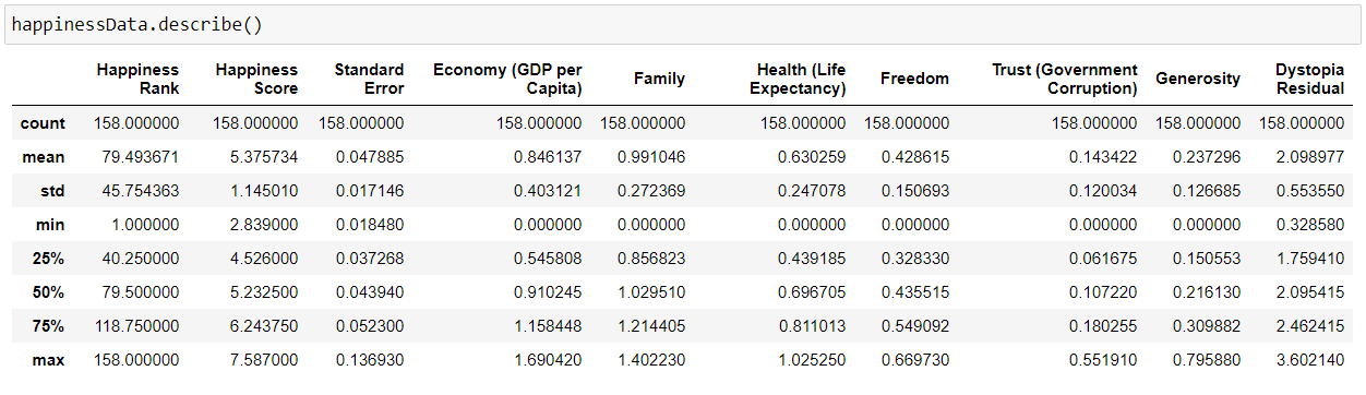
Step 6
We will use describe() method, which shows basic statistical characteristics of each numerical feature (int64 and float64 types): number of non-missing values, mean, standard deviation, range, median, 0.25, 0.50, 0.75 quartiles.
Step 7
Handling missing values in the dataset. Luckily, this dataset doesn’t have any missing values, but the real world is not so naive as our case.
So I have removed a few values intentionally just to depict how to handle this particular case.
We can check if our data contains a null value or not by the following command
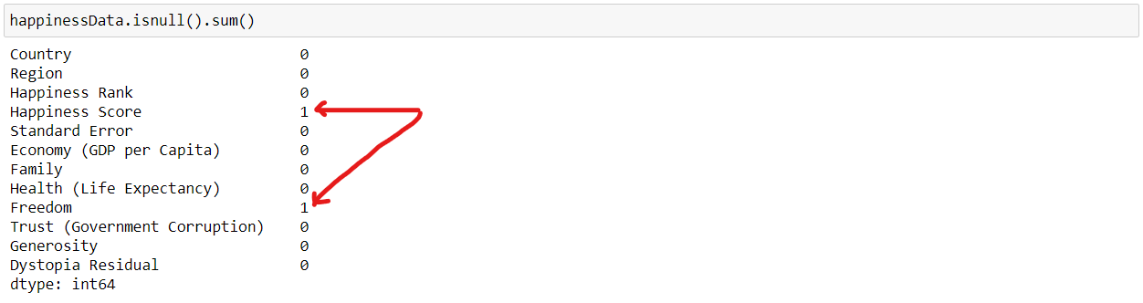
As we can see that “Happiness Score” and “Freedom” features have 1 missing values each.
How to handle the missing values by using a few techniques
- Drop the missing values – If the dataset is huge and missing values are very few then we can directly drop the values because it will not have much impact.
- Replace with mean values – We can replace the missing values with mean values, but this is not advisable in case if the data has outliers.
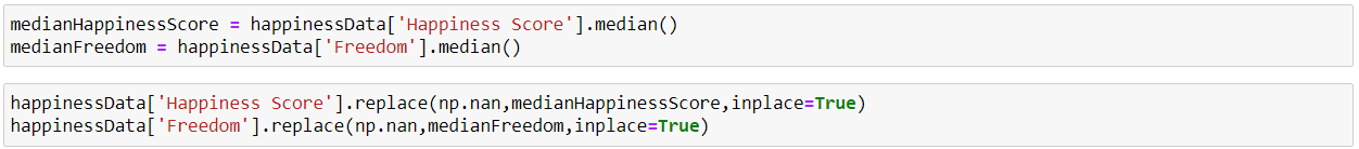
- Replace with median values – We can replace the missing values with median values, and it is recommended in case if the data has outliers.
- Replace with mode values – We can do this in the case of a Categorical feature.
- Regression – It can be used to predict the null value using other details from the dataset.
For our case, we will handle missing values by replacing them with the median value.
And, now we can again check if the missing values have been handled or not.
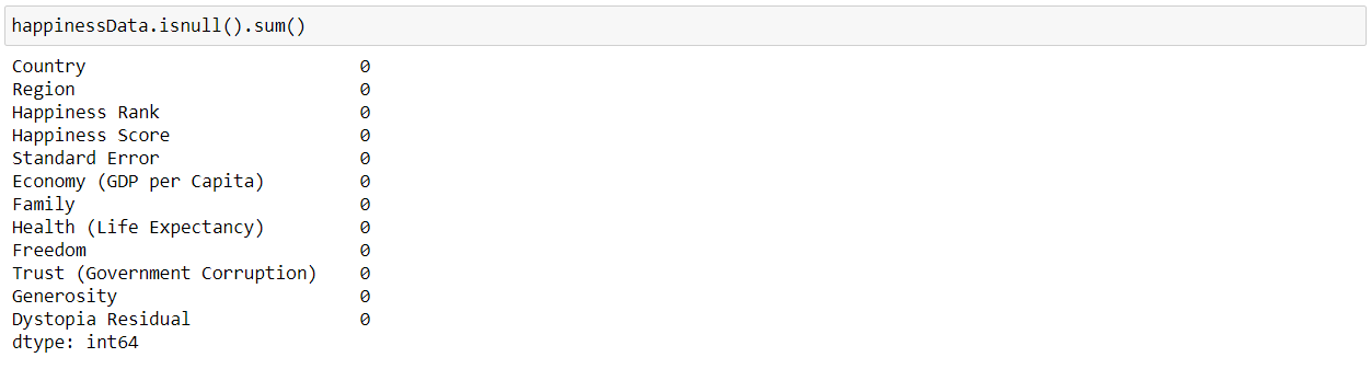
And, now we can see that our dataset doesn’t have any null values now.
Step 8
We can check for duplicate values in our dataset as the presence of duplicate values will hamper the accuracy of our ML model.
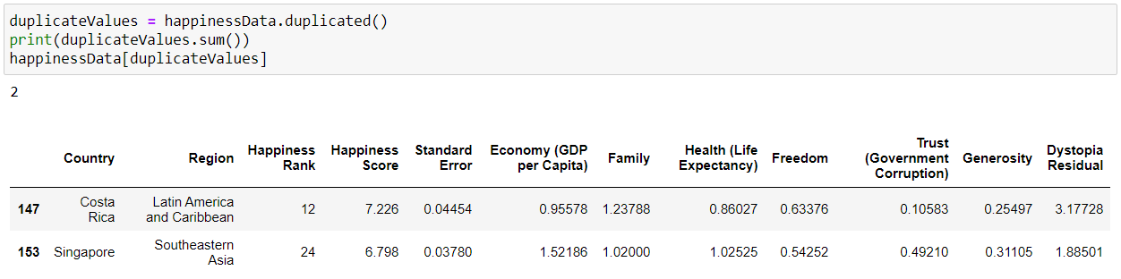
We can remove duplicate values using drop_duplicates()
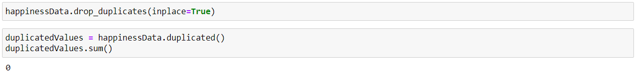
As we can see that the duplicate values are now handled.
Step 9
Handling the outliers in the data, i.e. the extreme values in the data. We can find the outliers in our data using a Boxplot.
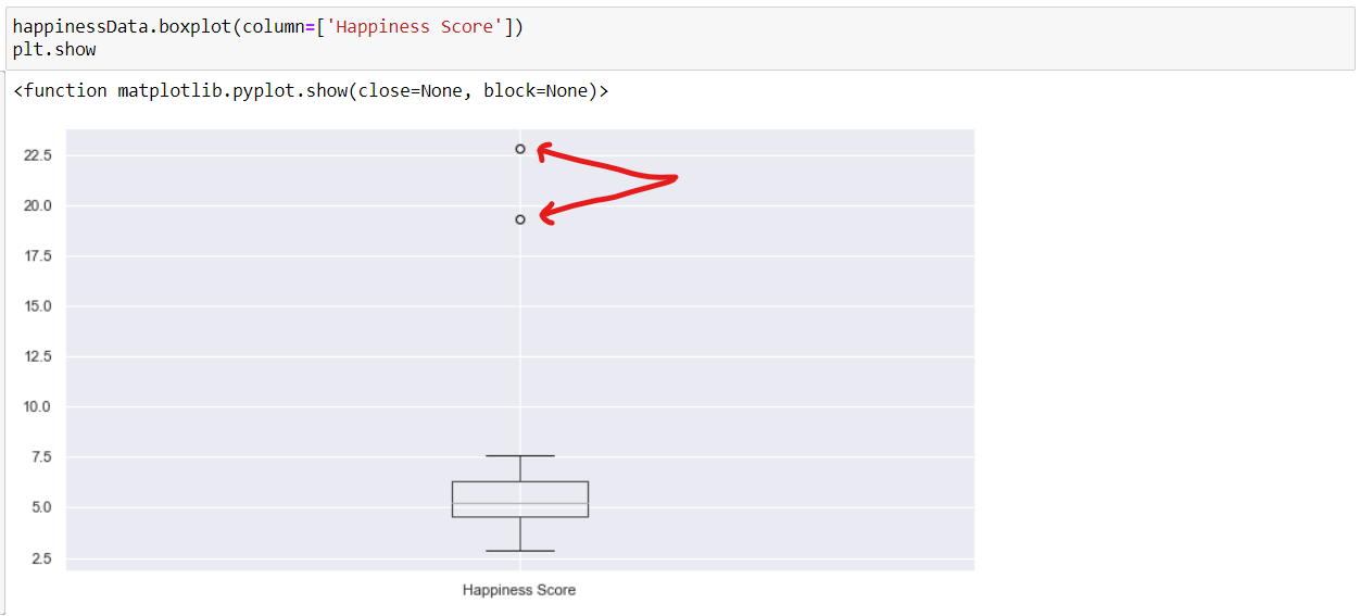
As we can observe from the above boxplot that the normal range of data lies within the block and the outliers are denoted by the small circles in the extreme end of the graph.
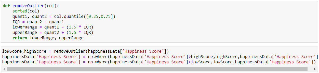
So to handle it we can either drop the outlier values or replace the outlier values using IQR(Interquartile Range Method).
In Exploratory Data Analysis dataset to identify patterns IQR is calculated as the difference between the 25th and the 75th percentile of the data. The percentiles can be calculated by sorting the selecting values at specific indices. The IQR is used to identify outliers by defining limits on the sample values that are a factor k of the IQR. The common value for the factor k is the value 1.5.
Now we can again plot the boxplot and check if the outliers have been handled or not.
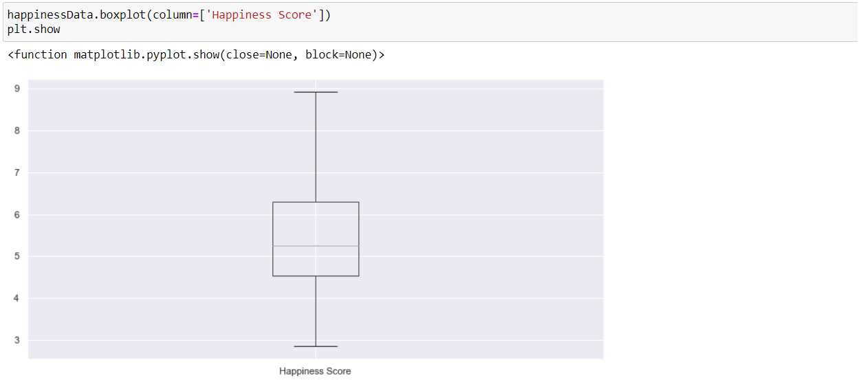
Finally, we can observe that our data is now free from outliers.
Step 10
Normalizing and Scaling – Data Normalization or feature scaling is a process to standardize the range of features of the data as the range may vary a lot. So we can preprocess the data using ML algorithms. So for this, we will use StandardScaler for the numerical values, which uses the formula as x-mean/std deviation.
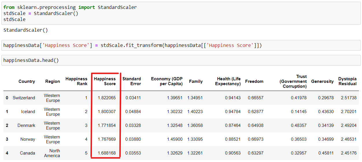
As we can see that the “Happiness Score” column has been normalized.
Step 11
We can find the pairwise correlation between the different columns of the data using the corr() method. (Note – All non-numeric data type column will be ignored.)
happinessData.corr() is used to find the pairwise correlation of all columns in the data frame. Any ‘nan’ values are automatically excluded.
The resulting coefficient is a value between -1 and 1 inclusive, where:
- 1: Total positive linear correlation
- 0: No linear correlation, the two variables most likely do not affect each other
- -1: Total negative linear correlation
Pearson Correlation is the default method of the function “corr”.
Now, we will create a heatmap using Seaborn to visualize the correlation between the different columns of our data:
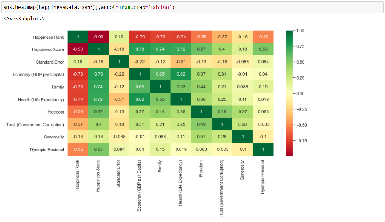
As we can observe from the above heatmap of correlations, there is a high correlation between –
- Happiness Score – Economy (GDP per Capita) = 0.78
- Happiness Score – Family = 0.74
- Happiness Score – Health (Life Expectancy) = 0.72
- Economy (GDP per Capita) – Health (Life Expectancy) = 0.82
Step 12
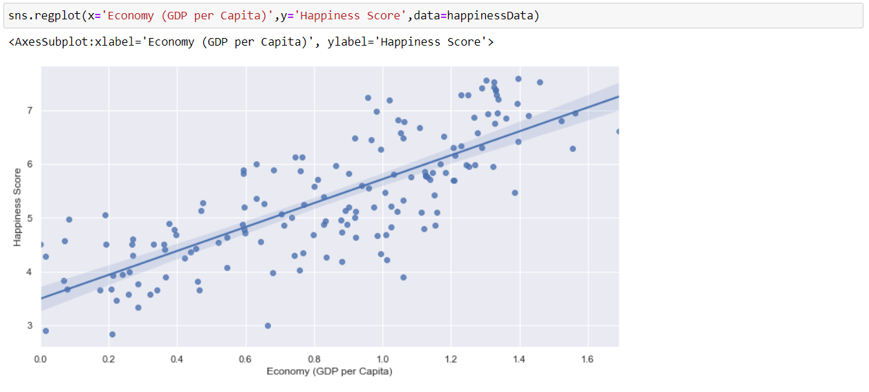
Now, using Seaborn, we will visualize the relation between Economy (GDP per Capita) and Happiness Score by using a regression plot. And as we can see, as the Economy increases, the Happiness Score increases as well as denoting a positive relation.
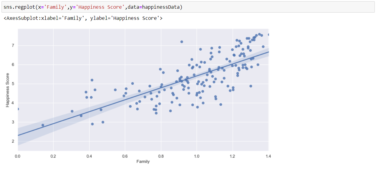
Now, we will visualize the relation between Family and Happiness Score by using a regression plot.
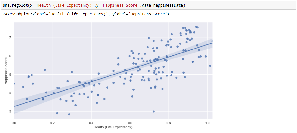
Now, we will visualize the relation between Health (Life Expectancy) and Happiness Score by using a regression plot. And as we can see that, as Happiness is dependent on health, i.e. Good Health is equal to More Happy a person is.
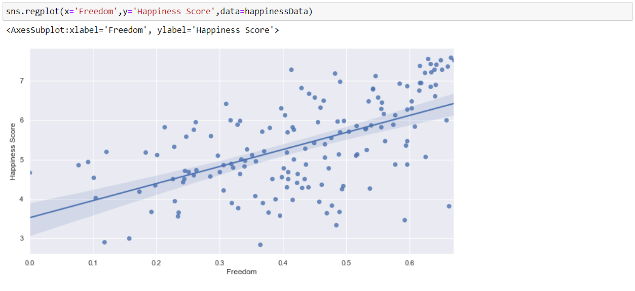
Now, we will visualize the relation between Freedom and Happiness Score by using a regression plot. And as we can see that, as the correlation is less between these two parameters so the graph is more scattered and the dependency is less between the two.
I hope we all now have a basic understanding of how to perform Exploratory Data Analysis(EDA).
Hence, the above are the steps that I personally follow for Exploratory Data Analysis, but there are various other plots and commands, which we can use to explore more into the data.
Thanks for Reading and Keep Learning.
You can get the complete notebook here.
Please follow me on LinkedIn by clicking here.
The media shown in this article are not owned by Analytics Vidhya and is used at the Author’s discretion.


