Guide to Data Visualization and Insights
This article helps in understanding the importance of data visualization and underlines few steps with which we can derive insights from a dataset.
Importance of visualization:
- Visual representation of data is easier to comprehend
- It helps in finding out the outliers in the data
- It is easier to convey the preliminary insights about data
- Multiple types of visualizations are available which help in representing the data in the most suitable format rather than using rows and columns to present the information.
- Visualization helps in understanding the data distributed over time.
Pre-requisites – Basic knowledge about Power BI (Importing Dataset, Plotting graphs, and creating a calculated column)
Creating Visualization using Power BI
Dataset Name: Students Performance
Dataset URL: https://www.kaggle.com/spscientist/students-performance-in-exams
After downloading the dataset from the above URL, open Power BI and import the dataset.
Let us consider that we are not provided any problem statement. Based on the columns in the dataset, we can assume that we need to study the various factors that may or may not impact the score of a student.
We are not provided with details of any candidate, instead, the scores for a candidate with a specific feature like gender, race/ethnicity, parental level of education, lunch, test preparation course, math score, reading score, writing score are provided.
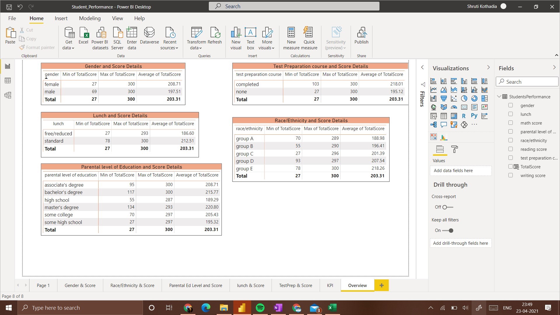
For the initial understanding of data and understanding the data available, we will first plot a matrix that contains details of Maximum score, Minimum score, and Average score.
Before proceeding with any visualization, it is helpful to know what you want to understand from that visualization. Since we want to understand the effect of various factors on the score, we will compare each feature with the total score.
To add Total Score attribute:
Create New Column and add the following expression to it,
TotalScore = StudentsPerformance[math score] + StudentsPerformance[reading score] + StudentsPerformance[writing score]
We have 3 different scores to consider. Hence we will need to check the effect of each feature on all the 3 scores individually and collectively (i.e. Total score). Also, here we assume that the score of a student depends on other factors hence score of a student will be on Y-axis(Dependent Variable) and all other factors will be on X-axis (Independent Variable)
Thus the different visualizations/graphs we will have will be,
- Gender and Score
- Race/Ethnicity and Score
- Parental level of Education and Score
- Lunch and Score
- Test preparation course and Score
These 5 types of visualizations will be created for a preliminary understanding of the data. After this, we will compare the effects of all the factors on the score. To keep the understanding simple, we will use only bar graphs and column graphs to represent this data. (We will be using these graphs as data is discrete, if we had continuous data – a line graph would have been suitable)
To get an overall view of the effect of a feature on the score, we will add one more column which contains the total score.
Preliminary Observations:
1. Gender and Score:
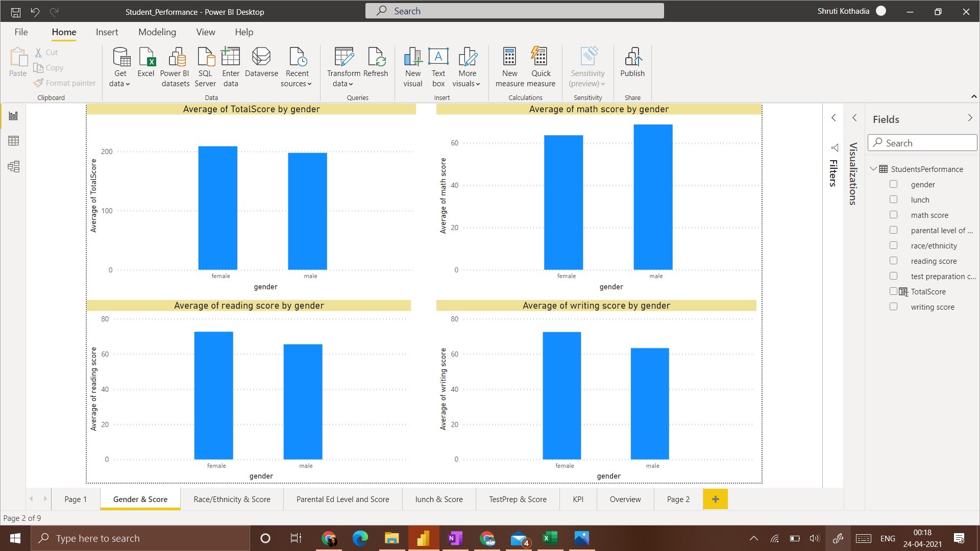
In this visualization, we plot a column chart that displays the average score of students with respect to their gender.
From the visualization, the average total score of Females is Higher than that of Males. A similar scenario is observed with Writing Score and Reading Score. Whereas with Math Score, the average score of Males is higher than that of Females.
2. Race/Ethnicity and Score:
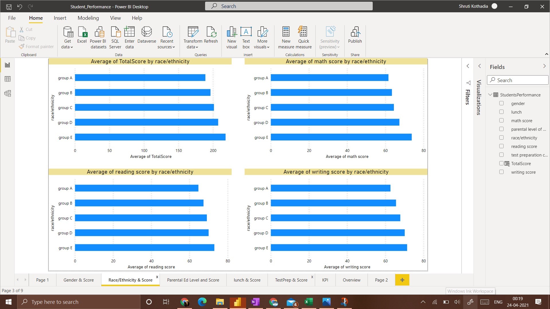
This visualization contains bar charts as we have 5 groups to present in the data. A bar chart is easier to understand and compare in this case.
The general observation for all 4 scenarios is that the Group E race/ethnicity has got the highest average score. Whereas Group A Race/Ethnicity has got the lowest average score.
3. Parental Level of Education and Score:
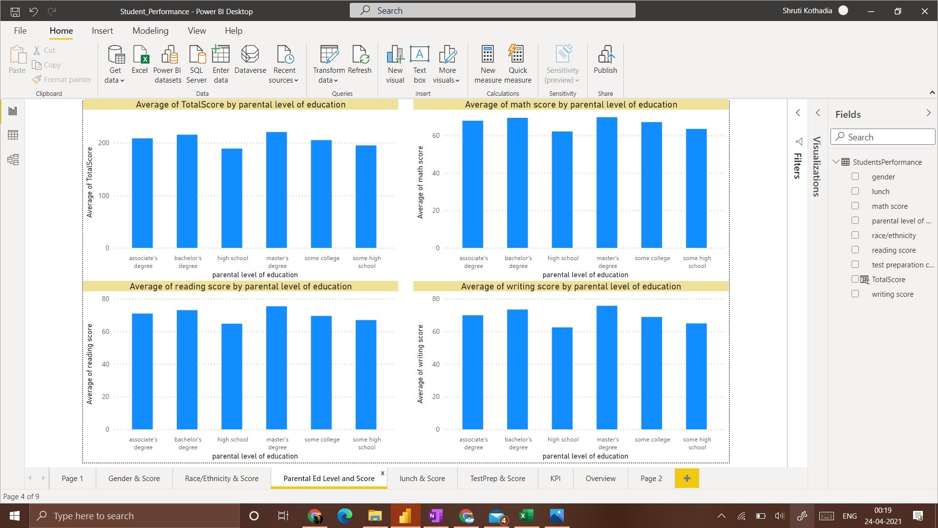
To represent the relationship between ‘Parental level of Education’ and ‘Score’ we use a column chart to plot all 4 scenarios of score obtained with respect to ‘Parental Level of Education’.
The observation from this visualization is, a student whose parents have a Master’s degree got the average highest score, followed by the students that have parents with Bachelor’s Degree. Students whose parents have ‘High School’ education got the lowest average score.
4. Lunch and Score:
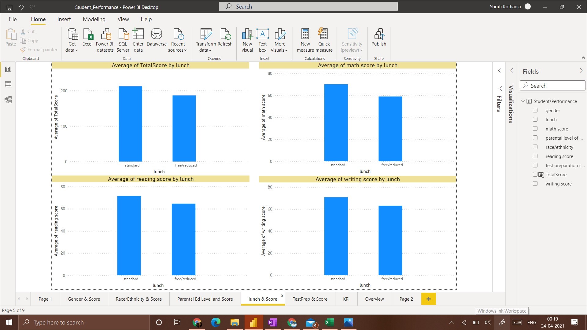
In this visualization, for all 4 categories of scores, a student that has ‘standard’ lunch got the average highest score
5. Test Preparation Course and Score
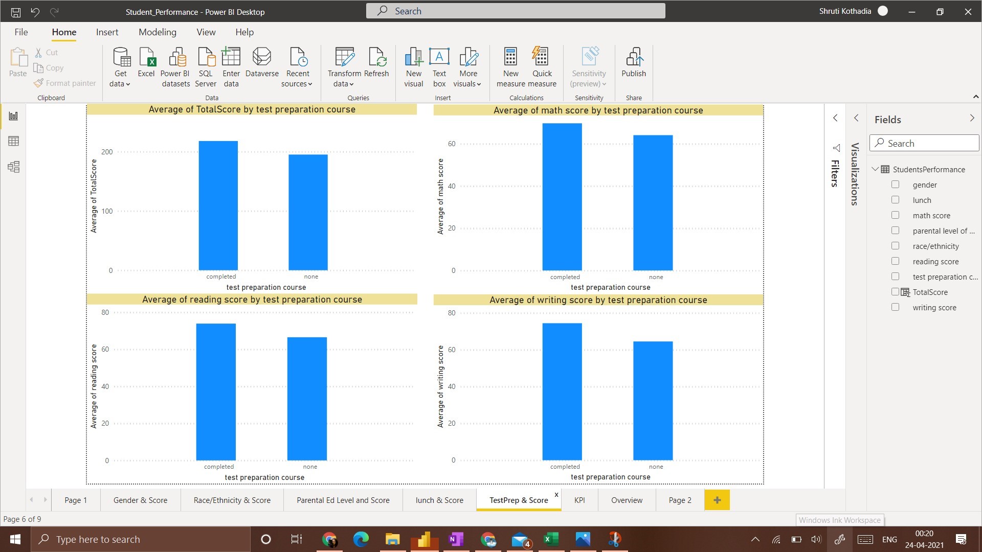
In this visualization, the average score of students who have taken the ‘Test preparation Course’ is higher than the students that have taken none.
After completing these 5 types of visualizations we can summarize the following insights,
1. Males have a higher average score only in Math whereas Females have a higher average score in all other 3 categories.
2. Group E has the highest average score in all categories whereas Group A has the lowest average score.
3. The highest average score is obtained by students whose parental education level is ‘masters’ and students whose parental education level is ‘high school’ got the lowest average score.
4. Students with a ‘standard’ lunch plan have the highest average score.
5. Students who have completed test preparations have a high average score.
All these observations are amongst one independent variable(Gender/Race/Lunch/Parental Level of Education/Lunch/ Test Preparation) and one dependent variable(Score).
This is a Univariate Analysis.
Thus, having a clear idea about what we want to achieve with visualization, it is easy to create meaningful dashboards and deduce insights from them.
It is critical to understand the dependent variable before starting any visualization. In this example, out of all the attributes, it was fair to assume that, all the efforts would be directed towards understanding the factors that affect the score of a student. Every other attribute was just a contributing factor that may or may not have affected the final score i.e. it was an independent variable.
About Me:
Data Visualization enthusiast. Business Analytics Student. E&TC Engineer.
LinkedIn: https://www.linkedin.com/in/kothadiashruti
Medium: https://kothadiashruti.medium.com/
The media shown in this article are not owned by Analytics Vidhya and is used at the Author’s discretion.


