Mastering Exploratory Data Analysis(EDA) For Data Science Enthusiasts
Overview
- Step by Step approach to Perform EDA
- Resources Like Blogs, MOOCS for getting familiar with EDA
- Getting familiar with various Data Visualization techniques, charts, plots
- Demonstration of some steps with Python Code Snippet
What is that one thing that differentiates one data science professional, from the other?
Not Machine Learning, Not Deep Learning, Not SQL, It’s Exploratory Data Analysis (EDA). How good one is with the identification of hidden patterns/trends of the data and how valuable the extracted insights are, is what differentiates Data Professionals.
1. What Is Exploratory Data Analysis
Exploratory Data Analysis is an approach in analyzing data sets to summarize their main characteristics, often using statistical graphics and other data visualization methods.
EDA assists Data science professionals in various ways:-
1 Getting a better understanding of data
2 Identifying various data patterns
3 Getting a better understanding of the problem statement
[ Note: the dataset in this blog is being opted as iris dataset]
2. Checking Introductory Details About Data
The first and foremost step of any data analysis, after loading the data file, should be about checking few introductory details like, no. Of columns, no. of rows, types of features( categorical or Numerical), data types of column entries.
Python Code Snippet
Python Code:
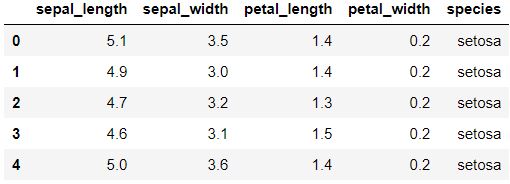
data.head() For displaying first five rows
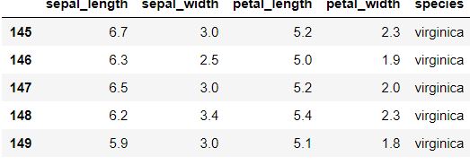
data.tail() For Displaying last Five Rows
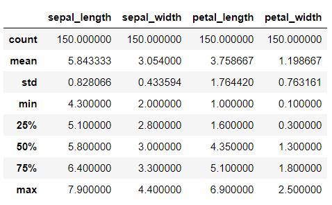
3. Statistical Insight
This step should be performed for getting details about various statistical data like Mean, Standard Deviation, Median, Max Value, Min Value
Python Code Snippet
data.describe()
4. Data cleaning
This is the most important step in EDA involving removing duplicate rows/columns, filling the void entries with values like mean/median of the data, dropping various values, removing null entries
Checking Null entries
Python Code Snippet
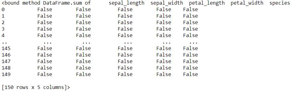
data.IsNull().sum gives the number of missing values for each variable
Removing Null Entries
Python Code Snippet
data.dropna(axis=0,inplace=True) If null entries are there
Filling values in place of Null Entries(If Numerical feature)
Values can either be mean, median or any integer
Python Code Snippet
data[“sepal_length”].fillna(value=data[“sepal_length”].mean(), inplace = True) if there’s a null entry
Checking Duplicates
Python Code Snippet
data.duplicated().sum() returning total number of duplicates entries
Removing Duplicates
Python Code Snippet
data.drop_duplicates(inplace=True)
5. Data Visualization
Data visualization is the method of converting raw data into a visual form, such as a map or graph, to make data easier for us to understand and extract useful insights.
The main goal of data visualization is to put large datasets into a visual representation. It is one of the important steps and simple steps when it comes to data science
You Can refer to the blog below for getting more details about Data Visualization
Various Types of Visualization analysis is:
a. Uni Variate analysis:
This shows every observation/distribution in data on a single data variable. It can be shown with the help of various plots like Scatter Plot, Line plot, Histogram(summary)plot, box plots, violin plot, etc.
b. Bi-Variate analysis:
Bivariate analysis displays are done to reveal the relationship between two data variables. It can also be shown with the help of Scatter plots, histograms, Heat Maps, Box Plots, Violin Plots, etc.
c. Multi-Variate analysis:
Multivariate analysis, as the name suggests, displays are done to reveal the relationship between more than two data variables.
Scatterplots, Histograms, box plots, violin plots can be used for Multivariate Analysis
Various Plots
Below are some of the plots that can be deployed for Univariate, Bivariate, Multivariate analysis
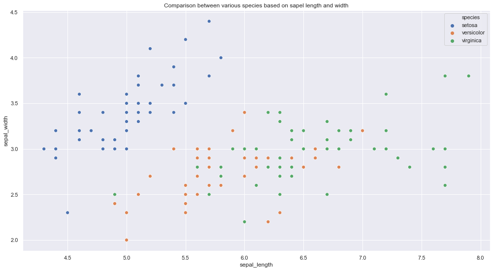
a. Scatter Plot
Python Code Snippet
plt.figure(figsize=(17,9))
plt.title(‘Comparison between various species based on sapel length and width’)
sns.scatterplot(data[‘sepal_length’],data[‘sepal_width’],hue =data[‘species’],s=50)
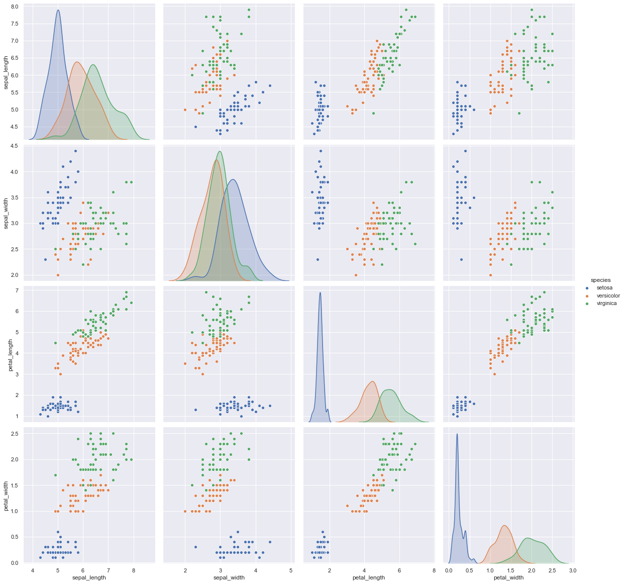
For multivariate analysis
Python Code Snippet
sns.pairplot(data,hue=”species”,height=4)
b. Box Plot
Boxplot to see how the categorical feature “Species” is distributed with all other four input variables
Python Code Snippet
fig, axes = plt.subplots(2, 2, figsize=(16,9))
sns.boxplot( y=”petal_width”, x= “species”, data=iris_data, orient=’v’ , ax=axes[0, 0])
sns.boxplot( y=”petal_length”, x= “species”, data=iris_data, orient=’v’ , ax=axes[0, 1])
sns.boxplot( y=”sepal_length”, x= “species”, data=iris_data, orient=’v’ , ax=axes[1, 0])
sns.boxplot( y=”sepal_width”, x= “species”, data=iris_data, orient=’v’ , ax=axes[1, 1])
plt.show()
.png)
c. Violin Plot
More informative, than box plot, and shows full distribution of data
Python Code Snippet
fig, axes = plt.subplots(2, 2, figsize=(16,10))
sns.violinplot( y=”petal_width”, x= “species”, data=iris_data, orient=’v’ , ax=axes[0, 0],inner=’quartile’)
sns.violinplot( y=”petal_length”, x= “species”, data=iris_data, orient=’v’ , ax=axes[0, 1],inner=’quartile’)
sns.violinplot( y=”sepal_length”, x= “species”, data=iris_data, orient=’v’ , ax=axes[1, 0],inner=’quartile’)
sns.violinplot( y=”sepal_width”, x= “species”, data=iris_data, orient=’v’ , ax=axes[1, 1],inner=’quartile’)
plt.show()
.png)
d. Histograms
It can be used for visualizing the Probability density function(PDF)
Python Code Snippet
sns.FacetGrid(iris_data, hue=”species”, height=5)
.map(sns.distplot, “petal_width”)
.add_legend();
.png)
With this I finish this blog.
Hello Everyone, Namaste
My name is Pranshu Sharma and I am a Data Science Enthusiast
Thank you so much for taking your precious time to read this blog. Feel free to point out any mistake(I’m a learner after all) and provide respective feedback or leave a comment.
Dhanyvaad!!
Feedback:
Email: [email protected]
You can refer to the blog being, mentioned below for getting familiar with Exploratory Data Analysis
The media shown in this article are not owned by Analytics Vidhya and is used at the Author’s discretion.


Great Article! Thank you for sharing this is a very informative post, and looking forward to the latest one