Are Indians Happy? Analyze World Happiness Data Using Python
This article was published as a part of the Data Science Blogathon
Introduction
Hello Readers!!
Check my latest articles here

Image Source
Table of Contents
- Problem Statement
- Import Libraries
- Read Data
- Useful Information From Data
- Dropping Columns
- Correlation
- India From 2006 to 2021
- Data Visualization
- India and its neighbours
- Conclusion
Problem Statement

Image Source
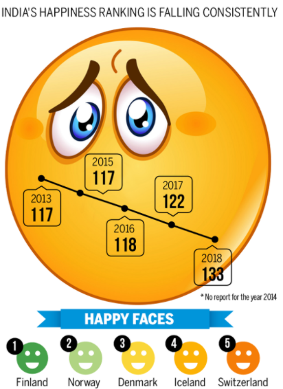
Image Source
Import Libraries
Let’s import all the required libraries for our further analysis. We are using NumPy, Pandas, matplotlib, and seaborn in this article. Check the below code for complete information.
# Import necessary libraries
import numpy as np
import pandas as pd
import matplotlib.pyplot as plt
%matplotlib inline
import seaborn as sns
sns.set_palette('RdYlGn_r')
import warnings
warnings.filterwarnings('ignore')
Read Data
For analysis, we need data. We are using world happiness report data 2021. For reading the data, use pandas read_csv() function. It will take the path of the file as a string. Check the below code for complete information.
happiness = pd.read_csv('world-happiness-report-2021.csv')
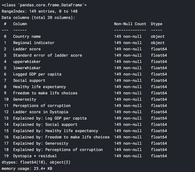
Useful Information From Data
To get the information about data like how many null values in each column, data type of each column, memory usage, we use the pandas’ info() function. Check the below code for complete information.
happiness.info()
Dropping Columns
There are some columns in the dataset which is not required for our analysis. We are using the pandas’ drop() function. In the drop() function, pass all the columns which you want to drop. Check the below code for complete information.
happiness_report = happiness.drop(['Standard error of ladder score', 'upperwhisker', 'lowerwhisker',
       'Explained by: Log GDP per capita', 'Explained by: Social support',
       'Explained by: Healthy life expectancy',
       'Explained by: Freedom to make life choices',
       'Explained by: Generosity', 'Explained by: Perceptions of corruption', 'Ladder score in Dystopia'], axis = 1)
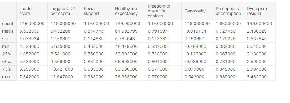
To get the broad statistics about the dataset like count, max, min, standard deviation, mean and median, use pandas describe() function. Check the below code for complete information.
happiness_report.describe()
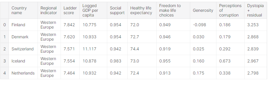
To get the top 5 rows from the dataset, use the pandas head() function. Check the below code for complete information.
happiness_report.head()
Correlation
In this section, we are going to check the correlation between different features of the dataset. To find the Pearson correlation, use the Pandas corr() function. We are drawing a heatmap using the seaborn heatmap() function. Check the below code for complete information.
cols = happiness_report[['Ladder score', 'Logged GDP per capita','Social support', 'Healthy life expectancy',
       'Freedom to make life choices', 'Generosity',
       'Perceptions of corruption']]
plt.figure(figsize=(20, 8))
sns.heatmap(cols.corr(), annot = True, cmap='RdYlGn_r', mask=np.triu(np.ones_like(cols.corr())));
plt.title('Correlations between factors', fontsize=20, fontweight='bold', pad=20);
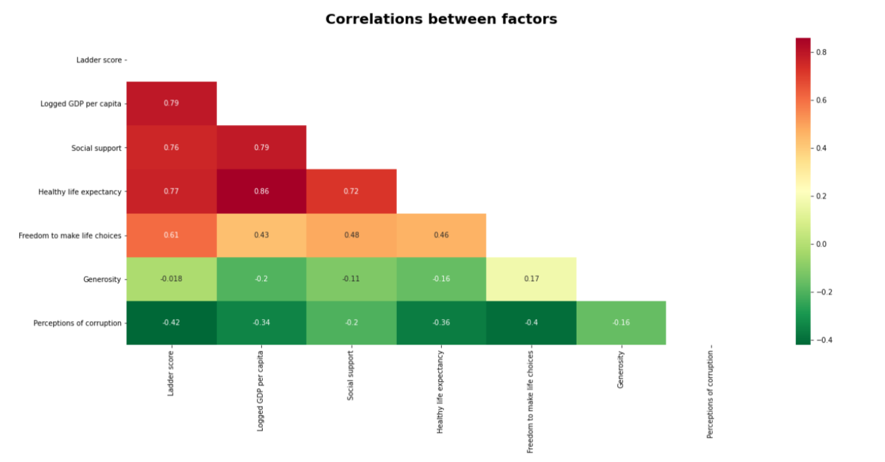
Observation
- The high correlation between logged GDP per capita and ladder score
- The high correlation between healthy life expectancy and social support
- Weak correlation between ladder score and generosity
Correlation between ladder score and generosity
We are going to check the correlation between ladder score and generosity. On the x-axis, the ladder score is labeled and on the y-axis, generosity is labeled. Check the below code for complete information.
plt.figure(figsize=(12, 6))
sns.regplot(x='Ladder score', y='Generosity', data=happiness_report, ci=None);
plt.title('Correlation between ladder score and generosity', fontsize=20, fontweight='bold', pad=20);
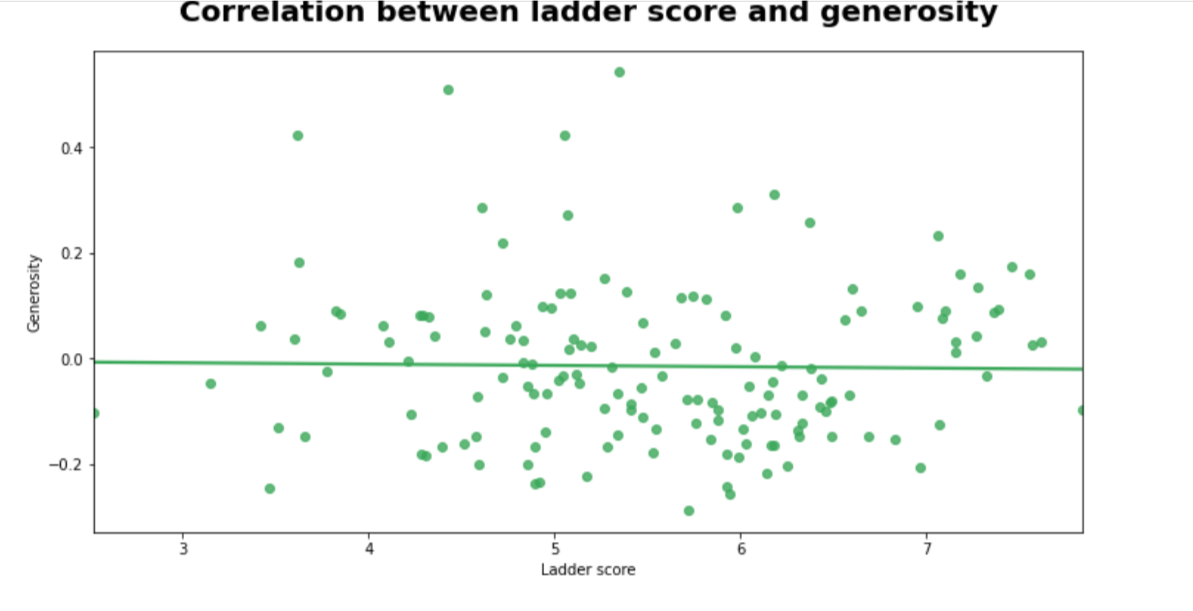
Observation
- Few outliers in low ladder scores and high generosity values and vice versa
- Little to no correlation between ladder score and generosity of the countries
Correlation between ladder score and perceptions of corruption
We are going to check the correlation between ladder scores and perceptions of corruption. On the x-axis, the ladder score is labeled and on the y-axis perceptions of corruption are labeled. Check the below code for complete information.
plt.figure(figsize=(12, 6))
sns.regplot(x='Ladder score', y='Perceptions of corruption', data=happiness_report, ci=None);
plt.title('Correlation between ladder score and perceptions of corruption', fontsize=20, fontweight='bold', pad=20);
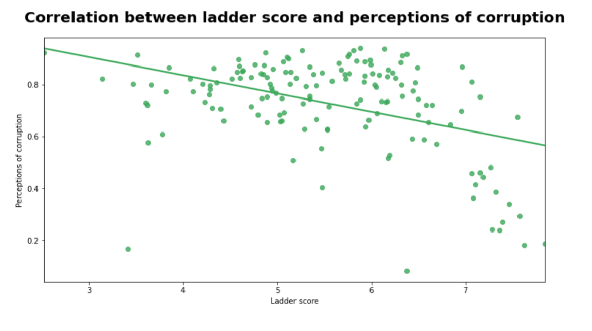
Observation
- Weak correlation between ladder score and perceptions of corruption
- Most data points have high perceptions of corruption
India From 2006 to 2021
In this section, we are going to see India from 2006 to 2011. We will see very features with the help of a line plot to see how things are changing over to over. So let’s get started!!
Steps involved
- Titles are changed for 2021
- Secondly, certain columns are removed from the data such as Negative effect and Positive Effect
- The year is added to the 2021 dataset
- Finally, Both datasets are joined or concatenated
happiness_report_older = pd.read_csv('../input/world-happiness-report-2021/world-happiness-report.csv')
india_1 = happiness_report_older[happiness_report_older['Country name'] == 'India'].reset_index(drop=True)
india_1 = india_1.drop(['Positive affect','Negative affect'], axis = 1)
india_1 = india_1.fillna(0)
happiness_report['year'] = 2021
india_2 = happiness_report[happiness_report['Country name'] == 'India']
india_2 = india_2.rename(columns = {'Ladder score':'Life Ladder',
'Logged GDP per capita':'Log GDP per capita',
'Healthy life expectancy':'Healthy life expectancy at birth'})
india_2 = india_2.drop(['Dystopia + residual', 'Regional indicator'], axis = 1)
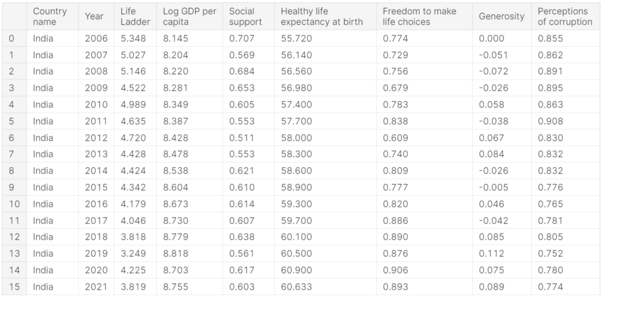
india = pd.concat([india_1, india_2])
india.reset_index(drop=True, inplace=True)
india.rename(columns = {'year':'Year'}, inplace=True)
india
The below table shows the various values like life ladder, social support, generosity, healthy life expectancy at births, and many more year to year, starting from 2006 to 2021
Data Visualization
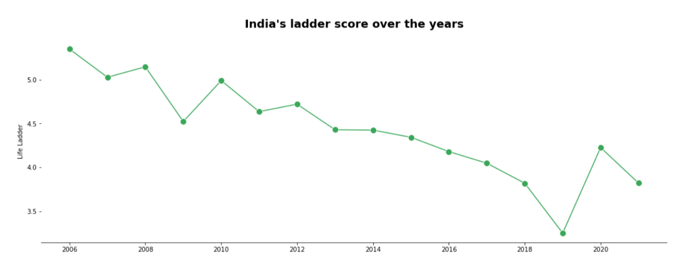
India’s Ladder Score Over the Years
plt.figure(figsize=(18, 6))
sns.lineplot(x='Year', y='Life Ladder', data=india, marker='o', markersize=10);
sns.set_style('whitegrid')
sns.despine(left=True)
plt.title('India's ladder score over the years', fontsize=18, fontweight='bold', pad=20)
plt.xlabel('')
plt.show()
Observation
There are some peaks with respect to India’s ladder score as found in the years 2008, 2010, 2012, and 2020. There are likewise sure drops as found in the years 2007, 2009, 2011, and a general low in 2019. A continuous reduction can be seen from 2012 to 2019. The general pattern for the ladder score is diminishing.
plt.figure(figsize=(18, 6))
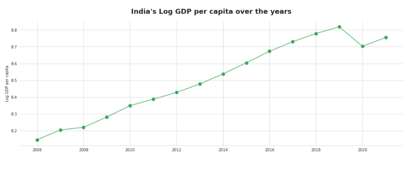
sns.lineplot(x='Year', y='Log GDP per capita', data=india, marker='o', markersize=10);
sns.set_style('whitegrid')
sns.despine(left=True)
plt.title('India's Log GDP per capita over the years', fontsize=18, fontweight='bold', pad=20)
plt.xlabel('')
plt.show()
Observation
India’s GDP is on an expanding pattern throughout the long term, except for 2020 because of the impacts of the COVID-19 pandemic.
plt.figure(figsize=(18, 6))
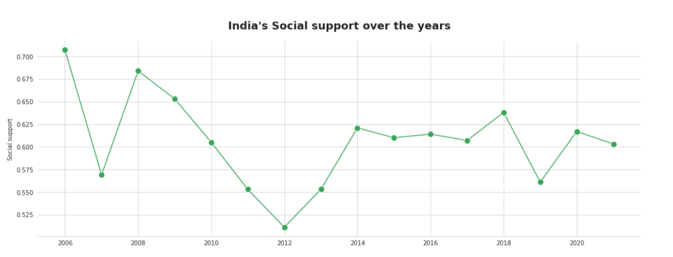
sns.lineplot(x='Year', y='Social support', data=india, marker='o', markersize=10);
sns.set_style('whitegrid')
sns.despine(left=True)
plt.title('India's Social support over the years', fontsize=18, fontweight='bold', pad=20)
plt.xlabel('')
plt.show()
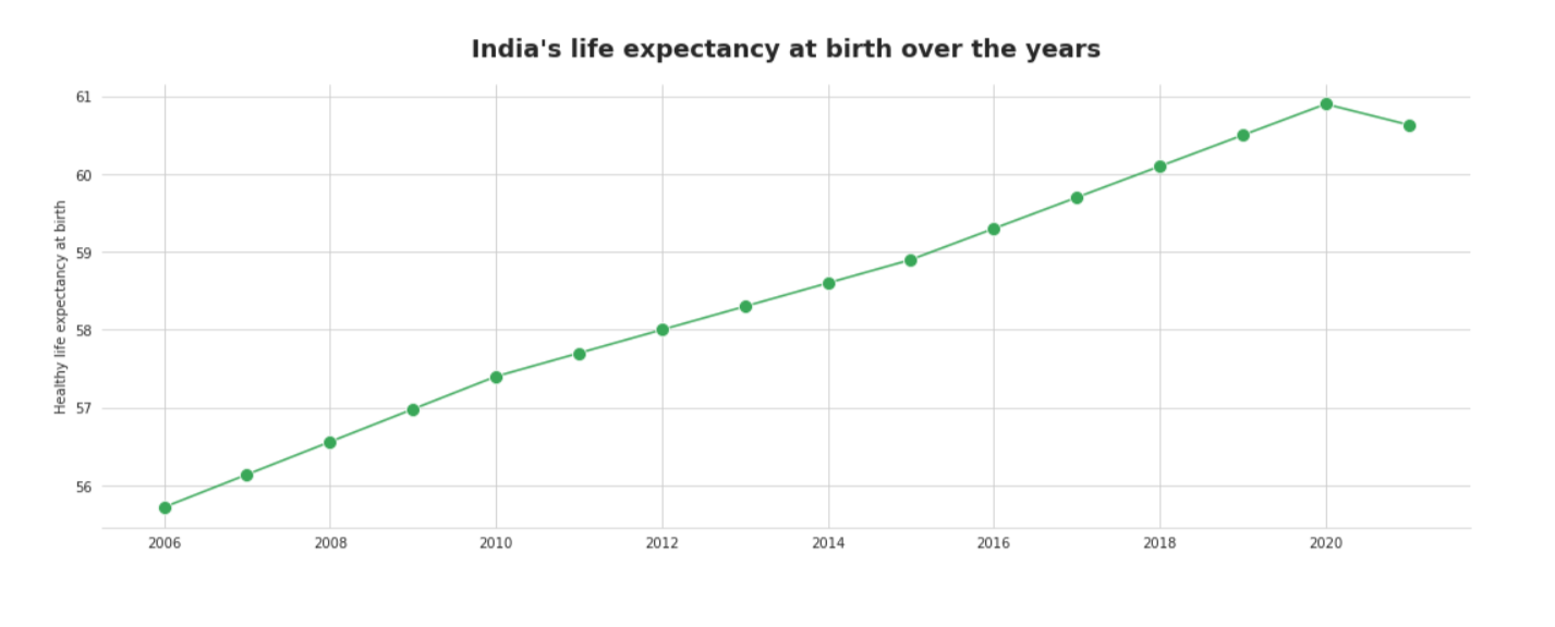
India’s Life Expectancy At Birth Over the years
plt.figure(figsize=(18, 6))
sns.lineplot(x='Year', y='Healthy life expectancy at birth', data=india, marker='o', markersize=10);
sns.set_style('whitegrid')
sns.despine(left=True)
plt.title('India's life expectancy at birth over the years', fontsize=18, fontweight='bold', pad=20)
plt.xlabel('')
plt.show()
Observation
An increasing pattern throughout the long term, with a light drop after 2020 here – however, it’s normal. Coronavirus had struck in 2020, and it would not be astounding that the future has marginally dropped.
plt.figure(figsize=(18, 6))
sns.lineplot(x='Year', y='Freedom to make life choices', data=india, marker='o', markersize=10);
sns.set_style('whitegrid')
sns.despine(left=True)
plt.title('India's Freedom to make life choices over the years', fontsize=18, fontweight='bold', pad=20)
plt.xlabel('')
plt.show()
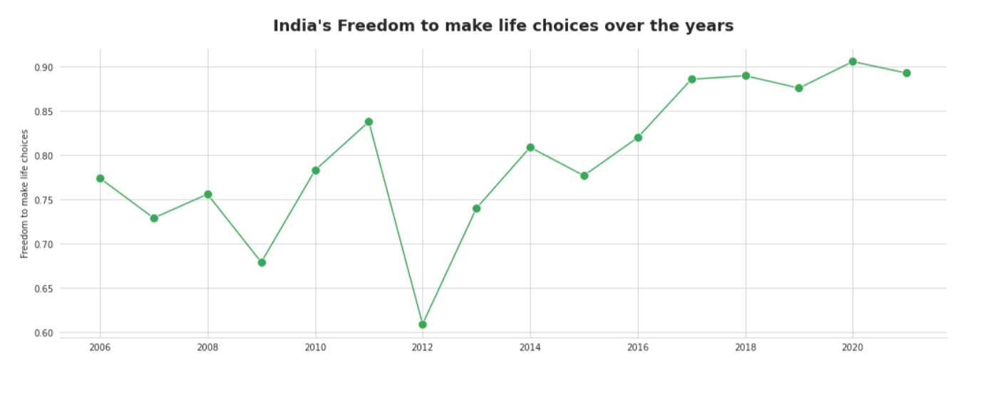
Observation
There’s a slight increasing pattern, yet there are distinct drops as found in the years 2008, 2012, 2015, and 2019. With an unsurpassed low in the year 2012.
plt.figure(figsize=(18, 6))
sns.lineplot(x='Year', y='Generosity', data=india, marker='o', markersize=10); sns.set_style('whitegrid')
sns.despine(left=True)
plt.title('India's Generosity over the years', fontsize=18, fontweight='bold', pad=20)
plt.xlabel('')
plt.show()
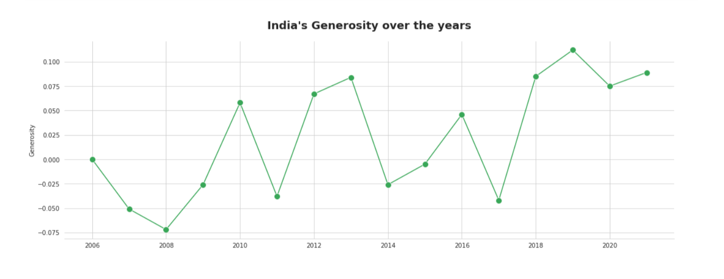
Observation
Generosity among Indians has expanded over the long run, with spikes in 2010, 2013, 2016, and 2019 and an untouched low in 2011.
plt.figure(figsize=(18, 6))
sns.lineplot(x='Year', y='Perceptions of corruption', data=india, marker='o', markersize=10);
sns.set_style('whitegrid')
sns.despine(left=True)
plt.title('India's Perceptions of corruption over the years', fontsize=18, fontweight='bold', pad=20)
plt.xlabel('')
plt.show()
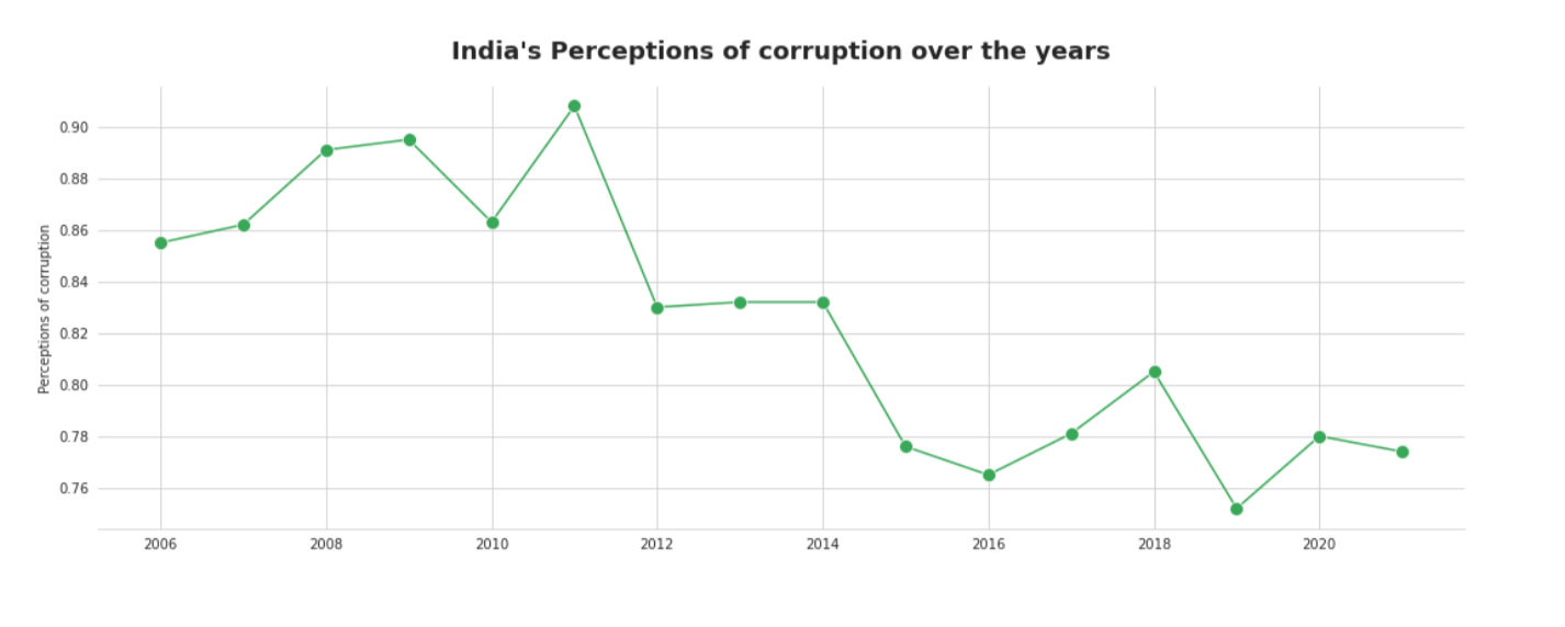
Observation
There were tops in 2011, 2014, and 2018, and the perception of corruption has diminished throughout the long term.
India and its neighbours
How Happy is In India Among Its Neighbors?
top = happiness_report[happiness_report['Country name'] == 'Finland']
south_asia = happiness_report[happiness_report['Regional indicator'] == 'South Asia']
top_bottom_neighbors = pd.concat([top, south_asia], axis=0)
top_bottom_neighbors['Rank'] = top_bottom_neighbors.index + 1
top_bottom_neighbors.reset_index(drop=True, inplace=True)
top_bottom_neighbors.drop(['Regional indicator', 'Dystopia + residual', 'year'], axis=1, inplace=True)
df_glob = happiness_report.sort_values('Ladder score', ascending=False)[['Country name', 'Ladder score', 'Regional indicator']].reset_index(drop=True)
top = df_glob[df_glob['Ladder score'] == df_glob['Ladder score'].max()]
neighbors = df_glob[df_glob['Regional indicator'] == 'South Asia']
top_bottom_neighbors = pd.concat([top, neighbors], axis=0)
top_bottom_neighbors['Rank'] = list(top_bottom_neighbors.index + 1)
top_bottom_neighbors.reset_index(drop=True, inplace=True)
top_bottom_neighbors.drop('Regional indicator', axis=1, inplace=True)
mean_score = happiness_report['Ladder score'].mean()
rank = list(top_bottom_neighbors['Rank'])
fig, ax = plt.subplots(figsize=(12, 6))
bar = sns.barplot(x='Country name', y='Ladder score', data=top_bottom_neighbors, palette='summer_r')
sns.set_style('whitegrid')
sns.despine(left=True)
for i in range(1, len(top_bottom_neighbors)):
bar.text(x=i, y=(top_bottom_neighbors['Ladder score'][i])/2, s=str(rank[i])+'th',
            fontdict=dict(color='white', fontsize=12, fontweight='bold', horizontalalignment='center'))
bar.text(x=0, y=(top_bottom_neighbors['Ladder score'][0])/2, s=str(rank[0])+'st', fontdict=dict(color='white', fontsize=12, fontweight='bold', horizontalalignment='center'))
bar.axhline(mean_score, color='grey', linestyle='--')
bar.text(x=len(top_bottom_neighbors)-0.4, y = mean_score, s = 'GlobalnAverage: {:.2f}'.format(mean_score),
        fontdict = dict(color='white', backgroundcolor='grey', fontsize=10, fontweight='bold'))
plt.title('How Happy is India Among its Neighbors?', fontsize=18, fontweight='bold', pad=20)
plt.xlabel('')
plt.show()
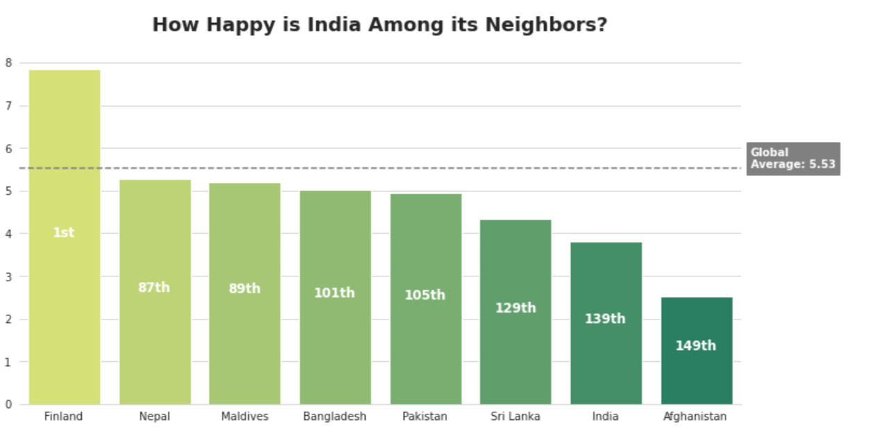
Observation
Among South Asian nations, India positions sixth in the happiness index. In a world setting, India positions 139th, far less than average.
df_glob = happiness_report.sort_values('Logged GDP per capita', ascending=False)[['Country name', 'Logged GDP per capita', 'Regional indicator']].reset_index(drop=True)
top = df_glob[df_glob['Logged GDP per capita'] == df_glob['Logged GDP per capita'].max()]
neighbors = df_glob[df_glob['Regional indicator'] == 'South Asia']
top_bottom_neighbors = pd.concat([top, neighbors], axis=0)
top_bottom_neighbors['Rank'] = list(top_bottom_neighbors.index + 1)
top_bottom_neighbors.reset_index(drop=True, inplace=True)
top_bottom_neighbors.drop('Regional indicator', axis=1, inplace=True)
mean_score = happiness_report['Logged GDP per capita'].mean()
rank = list(top_bottom_neighbors['Rank'])
plt.figure(figsize=(12, 6))
bar = sns.barplot(x='Country name', y='Logged GDP per capita', data=top_bottom_neighbors, palette='summer_r');
sns.set_style('whitegrid')
sns.despine(left=True)
for i in range(1, len(top_bottom_neighbors)):
bar.text(x=i, y=(top_bottom_neighbors['Logged GDP per capita'][i])/2, s=str(rank[i])+'th',
            fontdict=dict(color='white', fontsize=12, fontweight='bold', horizontalalignment='center'))
bar.text(x=0, y=(top_bottom_neighbors['Logged GDP per capita'][0])/2, s=str(rank[0])+'st', fontdict=dict(color='white', fontsize=12, fontweight='bold', horizontalalignment='center'))
bar.axhline(mean_score, color='grey', linestyle='--')
bar.text(x=len(top_bottom_neighbors)-0.4, y = mean_score, s = 'GlobalnAverage: {:.2f}'.format(mean_score),
        fontdict = dict(color='white', backgroundcolor='grey', fontsize=10, fontweight='bold'))
plt.title('Where does India's Log GDP Ranks?', fontsize=18, fontweight='bold', pad=20)
plt.xlabel('')
plt.show()
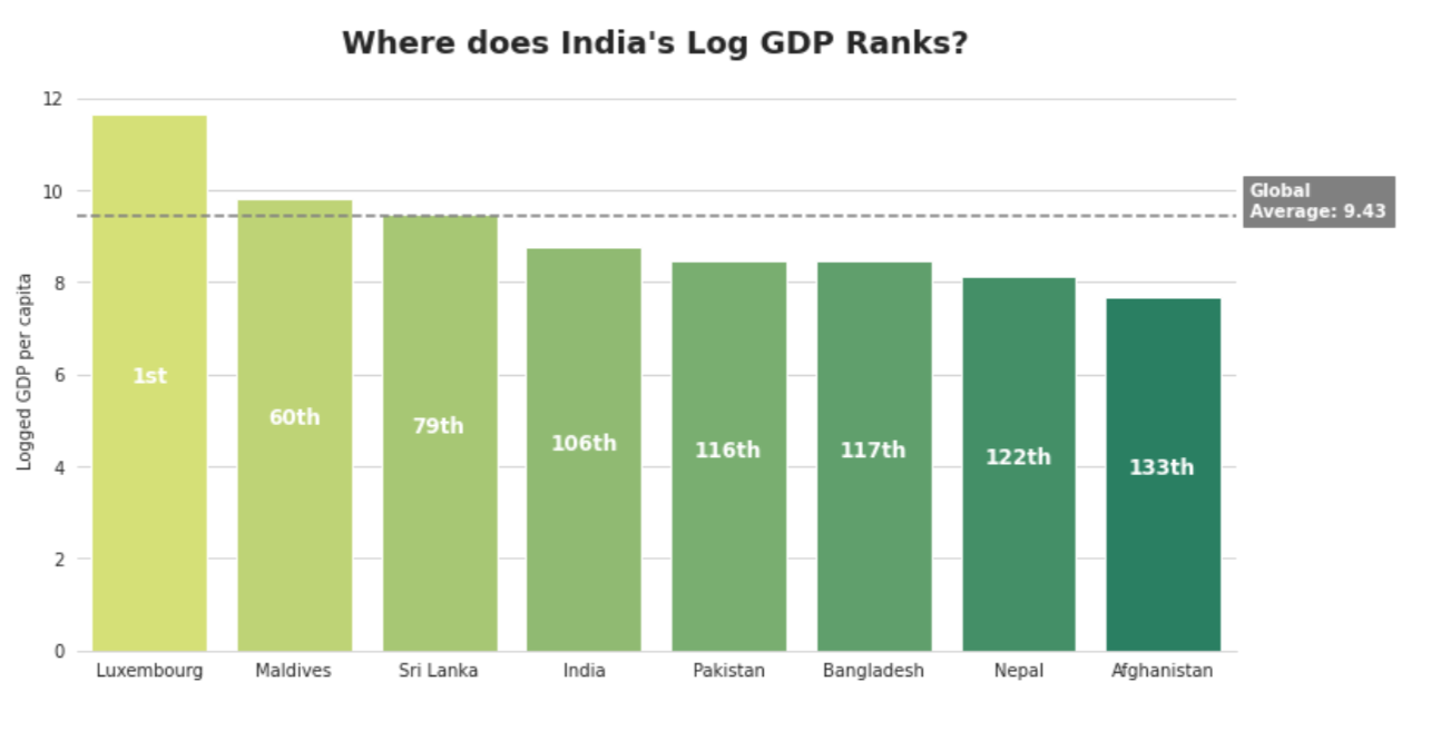
Observation
Among South Asian nations, India positions third in Log GDP per Capita scores. In a world setting, India positions 106th.
df_glob = happiness_report.sort_values('Healthy life expectancy', ascending=False)[['Country name', 'Healthy life expectancy', 'Regional indicator']].reset_index(drop=True)
top = df_glob[df_glob['Healthy life expectancy'] == df_glob['Healthy life expectancy'].max()]
neighbors = df_glob[df_glob['Regional indicator'] == 'South Asia']
top_bottom_neighbors = pd.concat([top, neighbors], axis=0)
top_bottom_neighbors['Rank'] = list(top_bottom_neighbors.index + 1)
top_bottom_neighbors.reset_index(drop=True, inplace=True)
top_bottom_neighbors.drop('Regional indicator', axis=1, inplace=True)
mean_score = happiness_report['Healthy life expectancy'].mean()
rank = list(top_bottom_neighbors['Rank'])
plt.figure(figsize=(12, 6))
bar = sns.barplot(x='Country name', y='Healthy life expectancy', data=top_bottom_neighbors, palette='summer_r');
sns.set_style('whitegrid')
sns.despine(left=True)
for i in range(1, len(top_bottom_neighbors)):
bar.text(x=i, y=(top_bottom_neighbors['Healthy life expectancy'][i])/2, s=str(rank[i])+'th',
            fontdict=dict(color='white', fontsize=12, fontweight='bold', horizontalalignment='center'))
bar.text(x=0, y=(top_bottom_neighbors['Healthy life expectancy'][0])/2, s=str(rank[0])+'st', fontdict=dict(color='white', fontsize=12, fontweight='bold', horizontalalignment='center'))
bar.axhline(mean_score, color='grey', linestyle='--')
bar.text(x=len(top_bottom_neighbors)-0.4, y = mean_score, s = 'GlobalnAverage: {:.2f}'.format(mean_score),
        fontdict = dict(color='white', backgroundcolor='grey', fontsize=10, fontweight='bold'))
plt.title('Where does India's Healthy life expectancy Ranks?', fontsize=18, fontweight='bold', pad=20)
plt.xlabel('')
plt.show()
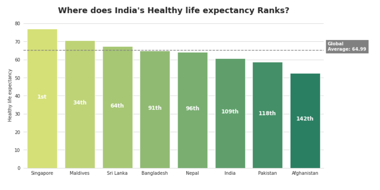
Observation
Where Does India’s Perceptions of corruption Ranks?
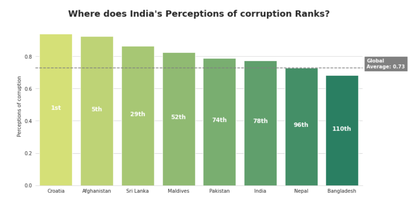
df_glob = happiness_report.sort_values('Perceptions of corruption', ascending=False)[['Country name', 'Perceptions of corruption', 'Regional indicator']].reset_index(drop=True)
top = df_glob[df_glob['Perceptions of corruption'] == df_glob['Perceptions of corruption'].max()]
neighbors = df_glob[df_glob['Regional indicator'] == 'South Asia']
top_bottom_neighbors = pd.concat([top, neighbors], axis=0)
top_bottom_neighbors['Rank'] = list(top_bottom_neighbors.index + 1)
top_bottom_neighbors.reset_index(drop=True, inplace=True)
top_bottom_neighbors.drop('Regional indicator', axis=1, inplace=True)
mean_score = happiness_report['Perceptions of corruption'].mean()
rank = list(top_bottom_neighbors['Rank'])
plt.figure(figsize=(12, 6))
bar = sns.barplot(x='Country name', y='Perceptions of corruption', data=top_bottom_neighbors, palette='summer_r');
sns.set_style('whitegrid')
sns.despine(left=True)
for i in range(1, len(top_bottom_neighbors)):
bar.text(x=i, y=(top_bottom_neighbors['Perceptions of corruption'][i])/2, s=str(rank[i])+'th',
            fontdict=dict(color='white', fontsize=12, fontweight='bold', horizontalalignment='center'))
bar.text(x=0, y=(top_bottom_neighbors['Perceptions of corruption'][0])/2, s=str(rank[0])+'st', fontdict=dict(color='white', fontsize=12, fontweight='bold', horizontalalignment='center'))
bar.axhline(mean_score, color='grey', linestyle='--')
bar.text(x=len(top_bottom_neighbors)-0.4, y = mean_score, s = 'GlobalnAverage: {:.2f}'.format(mean_score),
        fontdict = dict(color='white', backgroundcolor='grey', fontsize=10, fontweight='bold'))
plt.title('Where does India's Perceptions of corruption Ranks?', fontsize=18, fontweight='bold', pad=20)
plt.xlabel('')
plt.show()
Observation
Among South Asian nations, India positions fifth in Perceptions of corruption scores. In a world setting, India positions 78th
Conclusion
- Among South Asian nations, India positions sixth in the happiness index. In a world setting, India positions 139th, far less than average.
- Among South Asian nations, India positions third in Log GDP per Capita scores. In a world setting, India positions 106th.
- Among South Asian nations, India positions fifth in Healthy life expectancy scores. In a world setting, India positions 103th.
- Among South Asian nations, India positions fifth in Perceptions of corruption scores. In a world setting, India positions 78th
- Among South Asian nations, India positions sixth in Social support scores. In a world setting, India positions 141th
- Among South Asian nations, India positions first in Freedom to make life choices scores. In a world setting, India positions 31st.
- Among South Asian nations, India positions third in Generosity scores. In a world setting, India positions 32nd.
End Notes
So in this article, we had a detailed discussion on the Indian Happiness Report. Hope you learn something from this blog and it will help you in the future. Thanks for reading and your patience. Good luck!
You can check my articles here: Articles
Email id: [email protected]
Connect with me on LinkedIn: LinkedIn.
The media shown in this article are not owned by Analytics Vidhya and are used at the Author’s discretion.


