Guide to Data Visualization with Python: Part 1
This article was published as a part of the Data Science Blogathon
Hey Guys, Hope You all are doing well.
This article is going to be awesome. We are going to learn about various data visualization techniques used by a data scientist for storytelling.
I have divided the methods into 3 categories depending upon the importance and level.
So Section-1 will contain the most common techniques that you should know for sure. In Section-2 we will see some beginner-intermediate techniques that can help you share your thoughts of data in a better way. Then at last in Section-3 we will see some advanced techniques used by an intermediate-pro data scientist for conveying their idea. The article will be completely python focused.
Note: This series of articles will not be covering all the methods for data visualization but will cover mostly used techniques.
I will be providing a link to my Kaggle notebook so don’t worry about the coding part.
Table of Content
Introduction
1. SECTION – 1
1.1 Scatter Plot
1.2 Line Plot
1.3 Histograms
1.4 Bar Chart
1.5 Heat Map
1.6 Box Plot
1.7 Word Cloud.
2. SECTION – 2
2.1 Box Plot
2.2 Bubble Plot
2.3 Area Plot
2.4 Pie Charts
2.5 Venn Diagrams
2.6 Pair Plot
2.7 Joint Plot / Marginal Plots
3. SECTION – 3
3.1 Violin plot
3.2 Dendrograms
3.3 Andrew Curves
3.4 Treemaps
3.5 Network Charts
3.6 3-d Plots
3.7 Geographical maps
Kaggle Notebook
Introduction
Data Visualization: It is a way to express your data in a visual context so that patterns, correlations, trends between the data can be easily understood. Data Visualization helps in finding hidden insights by providing skin to your raw data (skeleton).
In this article, we will be using multiple datasets to show exactly how things work. The base dataset will be the iris dataset which we will import from sklearn. We will create the rest of the dataset according to need.
Let’s import all the libraries which are required for doing
import math,os,random
import pandas as pd
import numpy as np
import seaborn as sns
import scipy.stats as stat
import matplotlib.pyplot as plt
from mpl_toolkits.mplot3d import Axes3D
Reading the data (Main focused dataset)
iris = pd.read_csv('../input/iris-flower-dataset/IRIS.csv') # iris dataset
iris_feat = iris.iloc[:,:-1]
iris_species = iris.iloc[:,-1]
Let’s Start the Hunt for ways to visualize data.
Note: The combination of features used for illustration may/may not make sense. They were only used for demo purposes.
SECTION -1
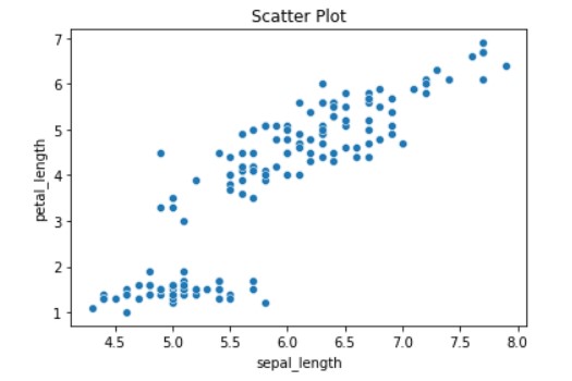
Scatter Plot
Scatter Plot with Matplotlib
plt.scatter(iris_feat['sepal_length'],iris_feat['petal_length'],alpha=1)  # alpha chances the transparency
#Adding the aesthetics
plt.title('Scatter Plot')
plt.xlabel('sepal_length')
plt.ylabel('petal_length')
#Show the plot
plt.show()
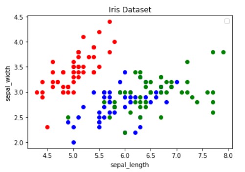
Scatter plot for Multivariate Analysis
colors = {'Iris-setosa':'r', 'Iris-virginica':'g', 'Iris-versicolor':'b'}
# create a figure and axis
fig, ax = plt.subplots()
# plot each data-point
for i in range(len(iris_feat['sepal_length'])):
ax.scatter(iris_feat['sepal_length'][i], iris_feat['sepal_width'][i],color=colors[iris_species[i]])
# set a title and labels
ax.set_title('Iris Dataset')
ax.set_xlabel('sepal_length')
ax.set_ylabel('sepal_width')
ax.legend()
plt.show()
Two common issues with the use of scatter plots are – overplotting and the interpretation of causation as correlation.
Overplotting occurs when there are too many data points to plot, which results in the overlapping of different data points and make it hard to identify any relationship between points
Correlation does not mean that the changes observed in one variable are responsible for changes in another variable. So any conclusions made by correlation should be treated carefully.
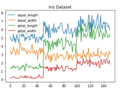
Line Plot
Line plots is a graph that is used for the representation of continuous data points on a number line. Line plots are created by first plotting data points on the Cartesian plane then joining those points with a number line. Line plots can help display data points for both single variable analysis as well as multiple variable analysis.
Line Plot in Matplotlib
# get columns to plot
columns = iris_feat.columns
# create x data
x_data = range(0, iris.shape[0])
# create figure and axis
fig, ax = plt.subplots()
# plot each column
for column in columns:
    ax.plot(x_data, iris[column], label=column)
# set title and legend
ax.set_title('Iris Dataset')
ax.legend()
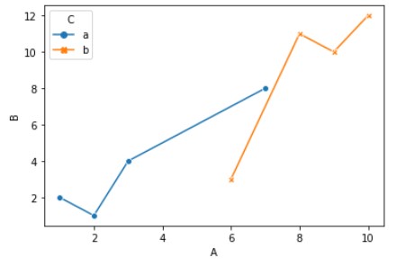
Seaborn Implementation Line Graphs
# Seaborn Implementation
df = pd.DataFrame({
    'A': [1,3,2,7,9,6,8,10],
    'B': [2,4,1,8,10,3,11,12],
    'C': ['a','a','a','a','b','b','b','b']
})
sns.lineplot(
    data=df,
    x="A", y="B", hue="C",style="C",
    markers=True, dashes=False
)
Histograms
Histograms are used to represent the frequency distribution of continuous variables. The width of the histogram represents interval and the length represents frequency. To create a histogram you need to create bins of the interval which are not overlapping. Histogram allows the inspection of data for its underlying distribution, outliers, skewness.
Histograms in Matplotlib
fig, ax = plt.subplots()
# plot histogram
ax.hist(iris_feat['sepal_length'])
# set title and labels
ax.set_title('sepal_length')
ax.set_xlabel('Points')
ax.set_ylabel('Frequency')
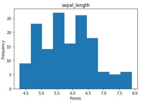
The values with longer plots signify that more values are concentrated there. Histograms help in understanding the frequency distribution of the overall data points for that feature.
LINE HISTOGRAMS (MODIFICATION TO HISTOGRAMS)
Line histograms are the modification to the standard histogram to understand and represent the distribution of a single feature with different data points. Line histograms have a density curve passing through the histogram.
Matplotlib Implementation
#Creating the dataset
test_data = np.random.normal(0, 1, (500, ))
density = stat.gaussian_kde(test_data)
#Creating the line histogram
n, x, _ = plt.hist(test_data, bins=np.linspace(-3, 3, 50), histtype=u'step', density=True)
plt.plot(x, density(x))
#Adding the aesthetics
plt.title('Title')
plt.xlabel('X axis')
plt.ylabel('Y axis')
#Show the plot
plt.show()
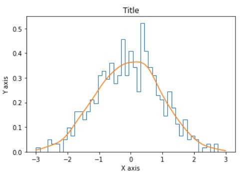
Normal Histogram is a bell-shaped histogram with most of the frequency counts focused in the middle with diminishing tails. Line with orange color passing through histogram represents Gaussian distribution for data points.
Bar Chart
Bar charts are best suited for the visualization of categorical data because they allow you to easily see the difference between feature values by measuring the size(length) of the bars. There are 2 types of bar charts depending upon their orientation (i.e. vertical or horizontal). Moreover, there are 3 types of bar charts based on their representation that is shown below.
1. NORMAL BAR CHART
Matplotlib Implementation
df = iris.groupby('species')['sepal_length'].sum().to_frame().reset_index()
#Creating the bar chart
plt.bar(df['species'],df['sepal_length'],color = ['cornflowerblue','lightseagreen','steelblue'])
#Adding the aesthetics
plt.title('Bar Chart')
plt.xlabel('Species')
plt.ylabel('sepal_length')
#Show the plot
plt.show()
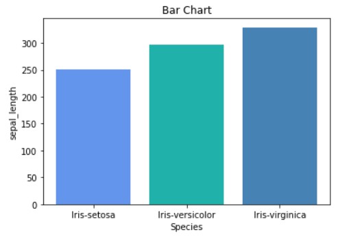
With the above image, we can clearly see the difference in the sum of sepal_length for each species of a leaf.
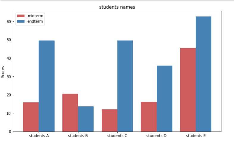
GROUPED BAR CHART
These bar charts allows us to compare multiple categorical features. Lets see an example.
Matplotlib Implementation
mid_term_marks=[ random.uniform(0,50) for i in range(5)]
end_term_marks=[ random.uniform(0,100) for i in range(5)]
fig=plt.figure(figsize=(10,6))
students=['students A','students B','students C','students D','students E']
x_pos_mid=list(range(1,6))
x_pos_end=[ i+0.4 for i in x_pos_mid]
graph_mid_term=plt.bar(x_pos_mid, mid_term_marks,color='indianred',label='midterm',width=0.4)
graph_end_term=plt.bar(x_pos_end, end_term_marks,color='steelblue',label='endterm',width=0.4)
plt.xticks([i+0.2 for i in x_pos_mid],students)
plt.title('students names')
plt.ylabel('Scores')
plt.legend()
plt.show()
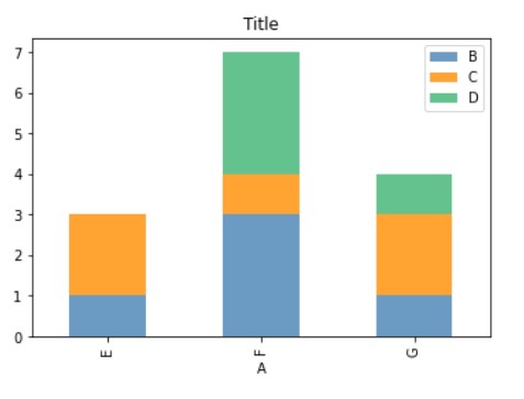
STACKED BAR CHART
Matplotlib Implementation
                  data=[["E",1,2,0],
                        ["F",3,1,3],
                        ["G",1,2,1]])
df.plot.bar(x='A', y=["B", "C","D"],  stacked=True, alpha=0.8 ,color=['steelblue','darkorange' ,'mediumseagreen'])
plt.title('Title')
#Show the plot
plt.show()
Heatmap
Heatmaps are the graphical representation of data where each value is represented in a matrix with different color coding. Mostly heatmaps are used to find correlations between various data columns in a dataset.
Matplotlib Implementation
corr = iris.corr()
fig, ax = plt.subplots()
img = ax.imshow(corr.values,cmap = "magma_r")
# set labels
ax.set_xticks(np.arange(len(corr.columns)))
ax.set_yticks(np.arange(len(corr.columns)))
ax.set_xticklabels(corr.columns)
ax.set_yticklabels(corr.columns)
cbar = ax.figure.colorbar(img, ax=ax ,cmap='')
plt.setp(ax.get_xticklabels(), rotation=30, ha="right",
         rotation_mode="anchor")
# text annotations.
for i in range(len(corr.columns)):
    for j in range(len(corr.columns)):
        if corr.iloc[i, j]<0:
            text = ax.text(j, i, np.around(corr.iloc[i, j], decimals=2),
                       ha="center", va="center", color="black")
        else:
            text = ax.text(j, i, np.around(corr.iloc[i, j], decimals=2),
                       ha="center", va="center", color="white")
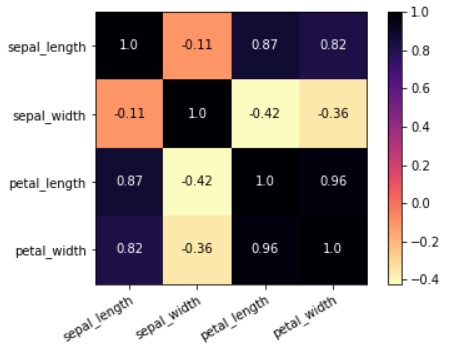
You can see in the above heatmap that values high value that is close to 1 are represented with dark color and values with smaller value are represented with light color. This observation will always be the same for the heatmap. Dark values will always be greater than light-colored values.
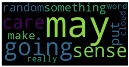
Word Cloud
This was too much of integer and float data. How to get insight from the data containing text. So in this part, we will see a technique to visualize text data. For that, we will be using the most popular technique WordCloud.
Word Cloud: Word Cloud or Tag Cloud is a technique that is used to visualize the tags or keywords from a string. These keywords or tags are generally a single word that can help get the context of the text. The word which occurs more in the sentence will appear to be bigger in a word cloud. The size of the word in word-cloud depends on its frequency in the corpus. Word Cloud contains each word that occurs in the corpus.
To use this word cloud you need to install mentioned package.
pip install wordcloud
Code for Visualizing Word Cloud
from wordcloud import WordCloud, ImageColorGenerator
text = '''I have just put something random that may or may not going to make some sense
        but are we really going to care about sense or we care about word cloud.'''
wordcloud = WordCloud().generate(text)
# Display the generated image:
plt.imshow(wordcloud, interpolation='bilinear')
plt.axis("off")
plt.show()
So this method marks the end for Section – 1.
EndNote
Link for Kaggle Notebook
Kaggle: Click Here
Hopefully, by learning at least these many visualization techniques you will be able to ace machine learning competition and be able to present your data story in a better manner. If you want to get better at visualization with python libraries you can give a read to other sections of this series.
At the end of this article, the reader will be able to perform all basic level visualizations. If you want to level up you can find its Second and Third Part Here –> Click here
I Hope You liked the liked.
Thank You for giving this article your precious time.
Happy Leaning!
If you think this article contains mistakes, please let me know through the below links.
Contact Author:
LinkedIn: Click Here
Github: Click Here
Also, check out my other article here.
My Github Repository for Deep Learning is here.
The media shown in this article are not owned by Analytics Vidhya and are used at the Author’s discretion.


