Customer Segmentation Using RFM Analysis
This article was published as a part of the Data Science Blogathon
Overview:
In this blog, we will be exploring some concepts and analyses around RFM. we will be covering what is RFM and how we can use these factors to segment the customers and target our marketing campaigns based on these RFM values
Before starting, let’s see what is RFM and why is it important.
Introduction:
What is RFM?
RFM is a method used to analyze customer value. RFM stands for RECENCY, Frequency, and Monetary.
RECENCY: How recently did the customer visit our website or how recently did a customer purchase?
Frequency: How often do they visit or how often do they purchase?
Monetary: How much revenue we get from their visit or how much do they spend when they purchase?
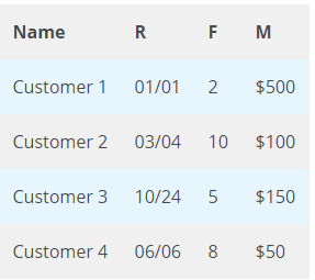
For example, if we see the sales data in the last 12 months, the RFM will look something like below
Why is it needed?
RFM Analysis is a marketing framework that is used to understand and analyze customer behaviour based on the above three factors RECENCY, Frequency, and Monetary.
The RFM Analysis will help the businesses to segment their customer base into different homogenous groups so that they can engage with each group with different targeted marketing strategies.
RFM on Adventure works database:
Now, let’s start the real part. For this, I chose the Adventure works database that is available publicly
Release AdventureWorks sample databases · microsoft/sql-server-samples (github.com)
Adventure Works Cycles a multinational manufacturing company. The company manufactures and sells metal and composite bicycles to North American, European, and Asian commercial markets.
The database contains many details. But, I am just concentrating on the Sales details to get RFM values and segment the customers based on RFM values.
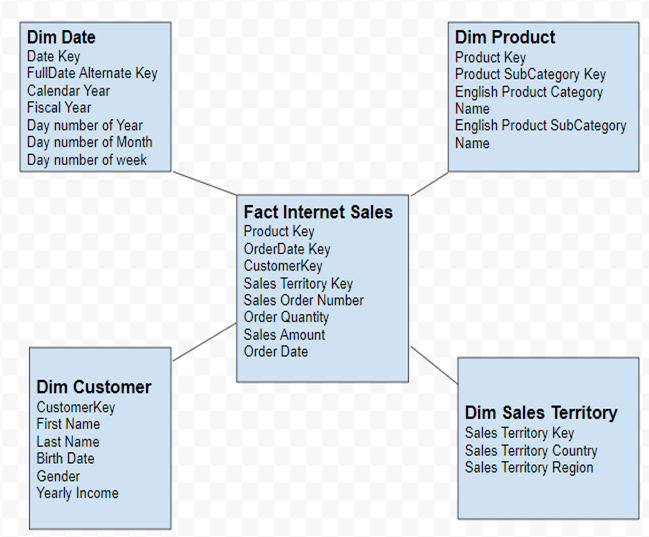
5NF Star Schema:
We have to identify the dimension tables and fact tables from the database based on our requirements.
I have prepared 5NF Star Schema (Fact, Customer, Product, Date, Location) from the database imported
Join the tables :
From the above tables, we can write an SQL query to Join all the tables and get the necessary data.
   SELECT pc.[EnglishProductCategoryName]
        ,Coalesce(p.[ModelName], p.[EnglishProductName])
        ,CASE
            WHEN Month(GetDate()) < Month(c.[BirthDate])
                THEN DateDiff(yy,c.[BirthDate],GetDate()) - 1
            WHEN Month(GetDate()) = Month(c.[BirthDate])
            AND Day(GetDate()) < Day(c.[BirthDate])
                THEN DateDiff(yy,c.[BirthDate],GetDate()) - 1
            ELSE DateDiff(yy,c.[BirthDate],GetDate())
        END
        ,CASE
            WHEN c.[YearlyIncome] < 40000 THEN 'Low'
            WHEN c.[YearlyIncome] > 60000 THEN 'High'
            ELSE 'Moderate'
        END
        ,d.[CalendarYear]		,f.[OrderDate]        ,f.[SalesOrderNumber]
        ,f.SalesOrderLineNumber        ,f.OrderQuantity         ,f.ExtendedAmount
    FROM
        [dbo].[FactInternetSales] f,        [dbo].[DimDate] d,		[dbo].[DimProduct] p,
		[dbo].[DimProductSubcategory] psc,		[dbo].[DimProductCategory] pc,
		[dbo].[DimCustomer] c,		[dbo].[DimGeography] g,		[dbo].[DimSalesTerritory] s
		where
         f.[OrderDateKey] = d.[DateKey]
        and f.[ProductKey] = p.[ProductKey]
        and p.[ProductSubcategoryKey] = psc.[ProductSubcategoryKey]
        and  psc.[ProductCategoryKey] = pc.[ProductCategoryKey]
        and f.[CustomerKey] = c.[CustomerKey]
        and c.[GeographyKey] = g.[GeographyKey]
        and g.[SalesTerritoryKey] = s.[SalesTerritoryKey]
		order by c.CustomerKey
Pull the table to an excel sheet or CSV file. Bingo. Now you have the data to do RFM Analysis in python.
That’s all about SQL. 🙂
Calculating R, F, and M values in Python:
From the sales data we have, we calculate RFM values in Python and Analyze the customer behaviour and segment the customers based on RFM values.
I will be doing the analysis in the Jupyter notebook.
Read the data
aw_df = pd.read_excel('Adventure_Works_DB_2013.xlsx')
aw_df.head()
It should look something like below.
|
Check for Null Values or missing values:
aw_df.isnull().sum()
Exploratory Data Analysis:
Once you are good with the data, we are good to start doing Exploratory Data Analysis aka. EDA
Now, let’s check how much are sales happened for each product category and how many quantities each category is being sold.
we will check them using barplot.
product_df = aw_df[['EnglishProductCategoryName','Amount']]
product_df1 = aw_df[['EnglishProductCategoryName','Quantity']]
product_df.groupby("EnglishProductCategoryName").sum().plot(kind="bar",ax=axarr[0])
product_df1.groupby("EnglishProductCategoryName").sum().plot(kind="bar",ax=axarr[1])
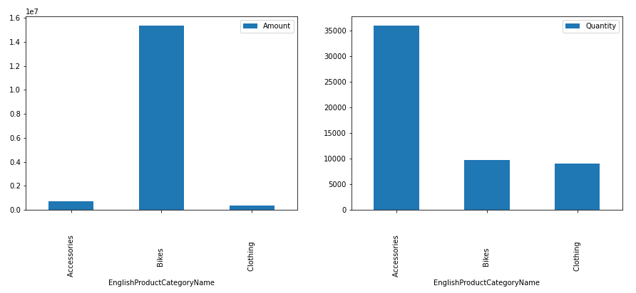
We can see, Bikes account for huge revenue generation even though accessories are being sold in high quantity. This might be because the cost of Bikes will be higher than the cost of Accessories.
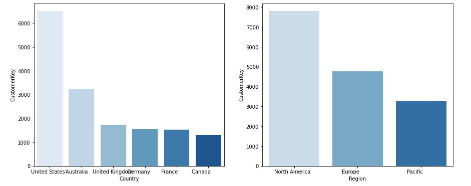
Similarly, we can check which region has a higher customer base.
fig, axarr = plt.subplots(1, 2,figsize = (15,6))
Customer_Country = aw_df1.groupby('Country')['CustomerKey'].nunique().sort_values(ascending=False).reset_index().head(11)
sns.barplot(data=Customer_Country,x='Country',y='CustomerKey',palette='Blues',orient=True,ax=axarr[0])

Customer_Region = aw_df1.groupby('Region')['CustomerKey'].nunique().sort_values(ascending=False).reset_index().head(11)
sns.barplot(data=Customer_Region,x='Region',y='CustomerKey',palette='Blues',orient=True,ax=axarr[1])
Calculate R, F, and M values:
Recency
The reference date we have is 2013-12-31.
df_recency = aw_df1
df_recency = df_recency.groupby(by='CustomerKey',as_index=False)['OrderDate'].max()
df_recency.columns = ['CustomerKey','max_date']
The difference between the reference date and maximum date in the dataframe for each customer(which is the recent visit) is Recency
df_recency['Recency'] = df_recency['max_date'].apply(lambda row: (reference_date - row).days)
df_recency.drop('max_date',inplace=True,axis=1)
df_recency[['CustomerKey','Recency']].head()
We get the Recency values now.
| CustomerKey | Recency | |
| 0 | 11000 | 212 |
| 1 | 11001 | 319 |
| 2 | 11002 | 281 |
| 3 | 11003 | 205 |
Recency plot
plt.figure(figsize=(8,5))
sns.distplot(df_recency.Recency,bins=8,kde=False,rug=True)
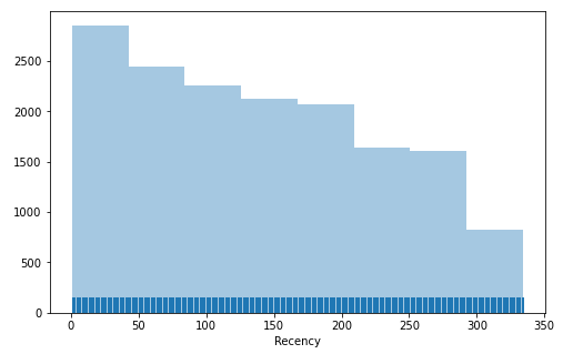
We can see the customers who come within last 2 months are more and there are some customers that didn’t order more than a year. This way we can identify the customer and target them differently. But it is too early to say with only Recency value.
Frequency:
We can get the Frequency of the customer by summing up the number of orders.
df_frequency = aw_df1
#df_frequency = df_frequency.groupby(by='CustomerKey',as_index=False)['OrderNumber'].nunique()
df_frequency.columns = ['CustomerKey','Frequency']
df_frequency.head()
They should look something like below
|
Frequency plot
plt.figure(figsize=(8,5))
sns.distplot(df_frequency,bins=8,kde=False,rug=True)
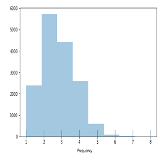
We can see the customers who order 2 times are more and then we see who orders 3 times. But there is very less number of customers that orders more than 5 times.
Monetary:
Now, it’s time for our last value which is Monetary.
Monetary can be calculated as the sum of the Amount of all orders by each customer.
df_monetary = aw_df1
df_monetary = df_monetary.groupby(by='CustomerKey',as_index=False)['Amount'].sum()

df_monetary.columns = ['CustomerKey','Monetary']
df_monetary.head()
|
Monetary Plot
plt.figure(figsize=(8,5))
sns.distplot(df_monetary.Monetary,kde=False,rug=True)
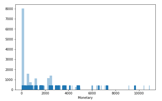
We can clearly see, the customers spend is mostly less than 200$. This might be because they are buying more accessories. This is common since we buy Bikes once or twice a year but we buy accessories more.
We cannot come to any conclusion based on taking only Recency or Frequency or Monetary values independently. we have to take all 3 factors.
Let’s merge the Recency, Frequency, and Monetary values and create a new dataframe
r_f_m = r_f.merge(df_monetary,on='CustomerKey')
|
Scatter Plot:
When we have more than two variables, we choose a scatter plot to analyze.
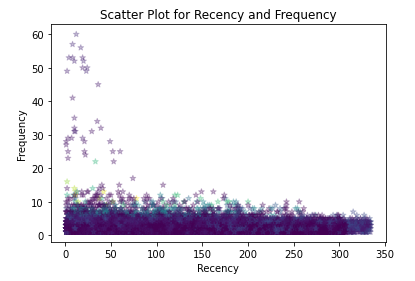
Recency Vs frequency
plt.scatter(r_f_m.groupby('CustomerKey')['Recency'].sum(), aw_df1.groupby('CustomerKey')['Quantity'].sum(),
            color = 'red',
            marker = '*', alpha = 0.3)

plt.title('Scatter Plot for Recency and Frequency')
plt.xlabel('Recency')
plt.ylabel('Frequency')
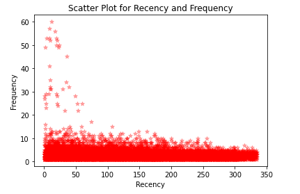
We can see the customers whose Recency is less than a month have high Frequency i.e the customers buying more when their recency is less.
Frequency Vs Monetary
market_data = aw_df.groupby('CustomerKey')[['Quantity', 'Amount']].sum()

plt.scatter(market_data['Amount'], market_data['Quantity'],
            color = 'red',
            marker = '*', alpha = 0.3)

plt.title('Scatter Plot for Monetary and Frequency')
plt.xlabel('Monetary')
plt.ylabel('Frequency')
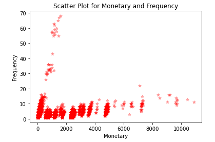
We can see, customers buying frequently are spending less amount. This might be because we frequently buy Accessories which are less costly.
Recency Vs Frequency Vs Monetary
Monetary = aw_df1.groupby('CustomerKey')['Amount'].sum()
plt.scatter(r_f_m.groupby('CustomerKey')['Recency'].sum(), aw_df1.groupby('CustomerKey')['Quantity'].sum(),
            marker = '*', alpha = 0.3,c=Monetary)

plt.title('Scatter Plot for Recency and Frequency')
plt.xlabel('Recency')
plt.ylabel('Frequency')
Now, in the above plot, the color specifies Monetary. From the above plot, we can say the customers whose Recency is less have high Frequency but less Monetary.
This might vary from case to case and company to company. That is why we need to take all the 3 factors into consideration to identify customer behavior.
How do we Segment:
We can bucket the customers based on the above 3 Factors(RFM). like, put all the customers whose Recency is less than 60 days in 1 bucket. Similarly, customers whose Recency is greater than 60 days and less than 120 days in another bucket. we will apply the same concept for Frequency and Monetary also.
Depending on the Company’s objectives, Customers can be segmented in several ways. so that it is financially possible to make marketing campaigns.
The ideal customers for e-commerce companies are generally the most recent ones compared to the date of study(our reference date) who are very frequent and who spend enough.
Based on the RFM Values, I have assigned a score to each customer between 1 and 3(bucketing them). 3 is the best score and 1 is the worst score.
To achieve this, we can write a simple code in python as below
Bucketing Recency:
def R_Score(x):
    if x['Recency'] 60 and x['Recency'] <=120:
        recency = 2
    else:
        recency = 1
    return recency

r_f_m['R'] = r_f_m.apply(R_Score,axis=1)
Bucketing Frequency
def F_Score(x):
    if x['LineNumber'] 3 and x['LineNumber'] <=6:
        recency = 2
    else:
        recency = 1
    return recency

r_f_m['F'] = r_f_m.apply(F_Score,axis=1)
Bucketing Monetary
M_Score = pd.qcut(r_f_m['Monetary'],q=3,labels=range(1,4))
r_f_m = r_f_m.assign(M = M_Score.values)
Once we bucket all of them, our dataframe looks like below
|
R-F-M Score
Now, let’s find the R-F-M Score for each customer by combining each factor.
def RFM_Score(x):
    return str(x['R']) + str(x['F']) + str(x['M'])
r_f_m['RFM_Score'] = r_f_m.apply(RFM_Score,axis=1)
|
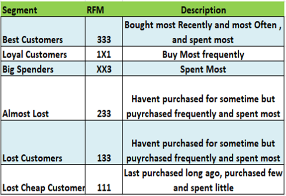
Now, we have to identify some key segments.
If the R-F-M score of any customer is 3-3-3. His Recency is good, frequency is more and Monetary is more. So, he is a Big spender.
Similarly, if his score is 2-3-3, then his Recency is better and frequency and monetary are good. This customer hasn’t purchased for some time but he buys frequently and spends more.
we can have something like the below for all different segments
Now, we just have to do this in python. don’t worry, we can do it pretty easily as below.
segment = [0]*len(r_f_m)

best = list(r_f_m.loc[r_f_m['RFM_Score']=='333'].index)
lost_cheap = list(r_f_m.loc[r_f_m['RFM_Score']=='111'].index)
lost = list(r_f_m.loc[r_f_m['RFM_Score']=='133'].index)
lost_almost = list(r_f_m.loc[r_f_m['RFM_Score']=='233'].index)

for i in range(0,len(r_f_m)):
    if r_f_m['RFM_Score'][i]=='111':
        segment[i]='Lost Cheap Customers'
    elif r_f_m['RFM_Score'][i]=='133':
        segment[i]='Lost Customers'
    elif r_f_m['RFM_Score'][i]=='233':
        segment[i]='Almost Lost Customers'
    elif r_f_m['RFM_Score'][i]=='333':
        segment[i]='Best Customers'
    else:
        segment[i]='Others'
r_f_m['segment'] = segment
|
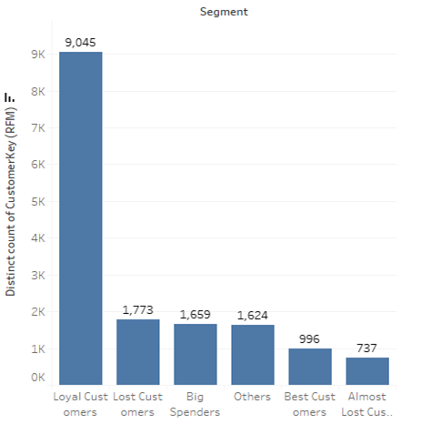
Now, lest plot a bar plot to identify the customer base for each segment.
Recommendations:
Based on the above R-F-M score, we can give some Recommendations.
Best Customers: We can Reward them for their multiples purchases. They can be early adopters to very new products. Suggest them “Refer a friend”. Also, they can be the most loyal customers that have the habit to order.
Lost Cheap Customers: Send them personalized emails/messages/notifications to encourage them to order.
Big Spenders: Notify them about the discounts to keep them spending more and more money on your products
Loyal Customers: Create loyalty cards in which they can gain points each time of purchasing and these points could transfer into a discount
This is how we can target a customer based on the customer segmentation which will help in marketing campaigns. Thus saving marketing costs, grab the customer, make customers spend more thereby increasing the revenue.


Can you please give me full access to this code.It will be your kindness