How to Build A Price Recommender App With Python
“The moment you make a mistake in pricing, you’re eating into your reputation or your profits.” – Katharine Paine
Overview:
Price optimization is using historical data to identify the most appropriate price of a product or a service that maximizes the company’s profitability. There are numerous factors like demography, operating costs, survey data, etc that play a role in efficient pricing, it also depends on the nature of businesses and the product that is served. The business regularly adds/upgrades features to bring more value to the product and this obviously has a cost associated with it in terms of effort, time, and most importantly companies reputation.
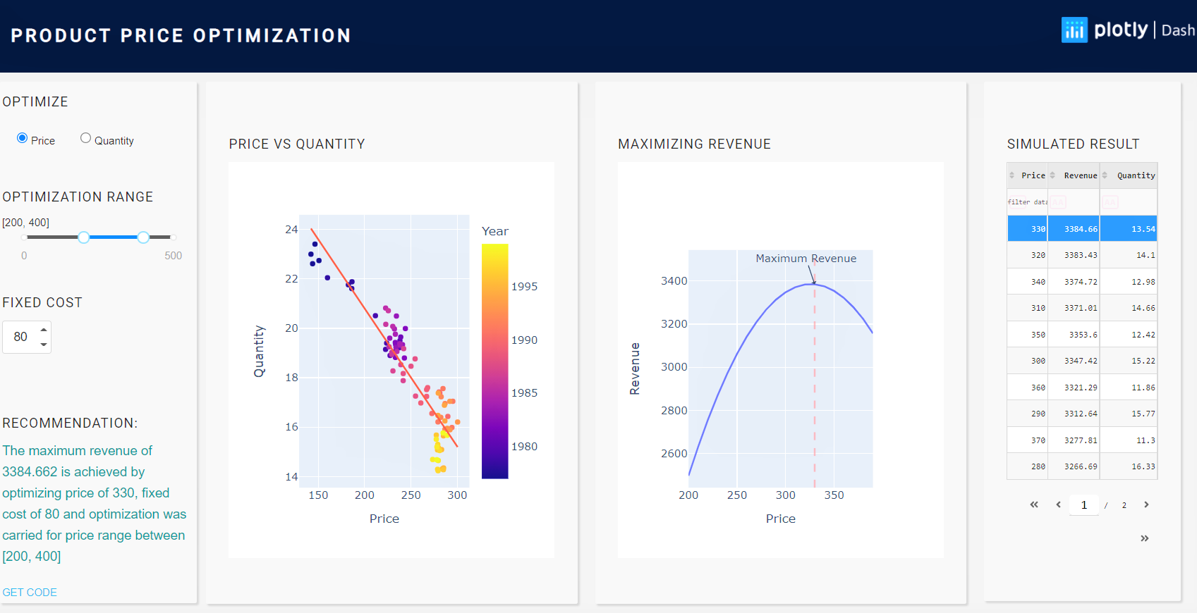
Figure 1: Snapshot of the price recommender app
Challenges in optimizing pricing:
Price optimization for a single product: Price optimization for a single product is to predict changing demand in response to different prices. It helps the business to fix prices that customers are ready to pay and maximize profits. E.g.: In the smartphone market, it is a fine balance of new features and price.
Price optimization for a product family: Any changes in the pricing of one product, may trigger a chain reaction across a product family. Hence, the pricing of product family becomes a daunting task. E.g.: In the ice-cream market, there can be different flavors, sizes as in cups, candy, cones, family packs, or tubs. It’s the same product with varying sizes and prices.
Benefits of optimizing pricing:
Immediate financial benefits: The businesses can reap instant results by targeting multiple KPI’s whether it is margin, sales conversions, the addition of new customers, or penetrating a new market space, etc., and then review the results to make suitable changes on pricing.
Quick response to changing market trends: The market demand and trend change quite often and sometimes when a competitor launches a similar product at a lower price bracket, it eats into shares of others. In such a scenario, optimizing product prices in a particular product segment or geography helps businesses to tackle this challenge.
Objectives:
We will explore the following steps and by the end of this blog, build the Price Optimization Simulator app with plotly dash.
- Overview of pricing optimization
- Challenges and benefits of optimization
- Data exploration
- Optimization and model building
- App development with Plotly dash
- Challenges in building & deploying pricing optimization model and app
Getting Started:
Data: We will be using a toy data Price.csv and here is a quick snapshot of data. As the dataset is small and clean, there is no need for any kind of pre-processing.
Year  Quarter	Quantity	Price
1977	1	22.9976	        142.1667
1977	2	22.6131	        143.9333
1977	3	23.4054	        146.5000
1977	4	22.7401	        150.8000
1978	1	22.0441	        160.0000
1978	2	21.7602	        182.5333
1978	3	21.6064	        186.2000
1978	4	21.8814	        186.4333
1979	1	20.5086	        211.7000
1979	2	19.0408	        231.5000
Project Structure: Here is our project structure.
Loading Libraries: Let’ create a file by name optimize_price.py and load all the required libraries.
import pandas as pd
import numpy as np
from pandas import DataFrame
import matplotlib.pyplot as plt
import seaborn as sns
from statsmodels.formula.api import ols
import plotly.express as px
import plotly.graph_objects as go
Let’s look at the relation between Price & Quantity and we expect to see a linear trend.
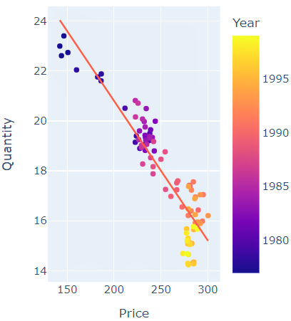
Figure 2: Price Vs Quantity
Building a basic model: In our case, we will build a very basic OLS (Ordinary Least Square) model.
# fit OLS model
model = ols("Quantity ~ Price", data=df).fit()
Optimization Range: In most cases, we have a rough idea of the minimum and maximum prices based on past experience. As we are in the process of identifying the best price, it will be a good starting point and we refine it further with multiple iterations.
  Price = list(range(var_range[0], var_range[1], 10))
    cost = int(var_cost)
    quantity = []
    Revenue = []
    for i in Price:
        demand = model.params[0] + (model.params[1] * i)
        quantity.append(demand)
        Revenue.append((i-cost) * demand)
We will create a data frame with the 3 columns Price, Revenue, and Quantity which will let us easily access these values during the app development phase.
profit = pd.DataFrame({"Price": Price, "Revenue": Revenue, "Quantity": quantity})

max_val = profit.loc[(profit['Revenue'] == profit['Revenue'].max())]
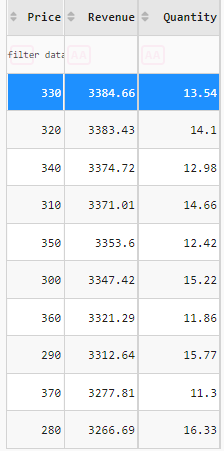
Optimization Line Chart: Here are the feature we will plan to have on the chart.
- The chart should update based on user selection of a range of price/quantity or maybe fixed cost.
- The chart should point out the exact point where the revenue is at maximum
fig_PriceVsRevenue = go.Figure()
    fig_PriceVsRevenue.add_trace(go.Scatter(
        x=profit['Price'], y=profit['Revenue']))
    fig_PriceVsRevenue.add_annotation(x=int(max_val['Price']), y=int(max_val['Revenue']),
                                      text="Maximum Revenue",
                                      showarrow=True,
                                      arrowhead=1)
    fig_PriceVsRevenue.update_layout(
        showlegend=False,
        xaxis_title="Price",
        yaxis_title="Revenue")
    fig_PriceVsRevenue.add_vline(x=int(max_val['Price']), line_width=2, line_dash="dash",
                                 line_color="red", opacity=0.25)
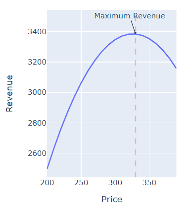
Figure 3: Price Vs Revenue
Putting it all together: The logic of the price optimization will be in the file optimize_price.py
import pandas as pd
import numpy as np
from pandas import DataFrame
import matplotlib.pyplot as plt
import seaborn as sns
from statsmodels.formula.api import ols
import plotly.express as px
import plotly.graph_objects as go
def fun_optimize(var_opt, var_range, var_cost, df):
    fig_PriceVsQuantity = px.scatter(
        df, x="Price", y="Quantity", color="Cost", trendline="ols")
    # fit OLS model
    model = ols("Quantity ~ Price", data=df).fit()
    Price = list(range(var_range[0], var_range[1], 10))
    cost = int(var_cost)
    quantity = []
    ......................
    ......................

    return [profit, fig_PriceVsRevenue, fig_PriceVsQuantity, round(max_val['Price'].values[0],2),round(max_val['Revenue'].values[0],3)]
Optimization For Quantity: We’ll follow a similar approach for optimizing the quantity for a given constraint to gain maximum revenue. For sake of brevity and not to make the blog long—I’m not placing the code on the blog, but please feel free to access the code from optimize_quantity.py
App development:
We’ll develop a price optimization app with Plotly Dash, which is a python framework for building data applications. Let us create a file by name app.py and start with loading libraries.
Step 1: Loading Libraries:
import dash
import pandas as pd
import numpy as np
import dash_table
import logging
import plotly.graph_objs as go
import plotly.express as px
import dash_core_components as dcc
import dash_html_components as html
import dash_bootstrap_components as dbc
from dash.dependencies import Input, Output, State
import optimize_price
import optimize_quantity
import dash_daq as daq
Step 2: Designing the Layout:
We divide the layout into 4 sections one beside the other as we saw in the snapshot in the introduction.
- The controls/fields namely slider for selecting maximum and minimum, radio button to select Price or Quantity to optimize, text input to set fixed cost.
- A chart to visualize the relation between Price Vs Quantity
- A chart to visualize the optimum revenue
- A table that has simulated data
Here is the UI code to generate a range slider.
html.Div(
	className="padding-top-bot",
	children=[
		html.H6("OPTIMIZATION RANGE"),
		html.Div(
			id='output-container-range-slider'),
		dcc.RangeSlider(
			id='my-range-slider',
			min=0,
			max=500,
			step=1,
			marks={
				0: '0',
				500: '500'
			},
			value=[200, 400]
		),
	],
),
It will be very handy to display the values of maximum and minimum selected by the user and we can achieve this with a callback function
@app.callback(
    dash.dependencies.Output('output-container-range-slider', 'children'),
    [dash.dependencies.Input('my-range-slider', 'value')])
def update_output(value):
    return "{}".format(value)
Similarly, we will add other two controls. Please refer to the app.py for the complete code.
Step 3: To build interactivity between controls and the visuals, we define the inputs and the outputs, meaning for every change to the inputs made by the user, which are the outputs that need to be updated. In our case, we need to update two line charts and a table.
@app.callback(
    [
        Output("heatmap", 'data'),
        Output("lineChart1", 'figure'),
        Output("lineChart2", 'figure'),
        Output("id-insights", 'children'),
    ],
    [
        Input("selected-var-opt", "value"),
        Input("my-range-slider", "value"),
        Input("selected-cost-opt", "value")
    ])
Step 4: We define a function update_output_All() which takes the controls feed as inputs, executes the logic, meaning generated the visuals and the data table, which will be populated on the UI.
def update_output_All(var_opt, var_range, var_cost):
    try:
        if var_opt == 'price':
            res, fig_PriceVsRevenue, fig_PriceVsQuantity, opt_Price, opt_Revenue = Python.optimize_price.fun_optimize(
                var_opt, var_range, var_cost, df)
            res = np.round(res.sort_values(
                'Revenue', ascending=False), decimals=2)
            if opt_Revenue > 0:
                return [res.to_dict('records'), fig_PriceVsRevenue, fig_PriceVsQuantity,
                    f'The maximum revenue of {opt_Revenue} is achieved by optimizing {var_opt} of {opt_Price}, fixed cost of {var_cost} and optimization was carried for {var_opt} range between {var_range}']
        ..................................
        ..................................
    except Exception as e:
        logging.exception('Something went wrong with interaction logic:', e)
Please refer to the app.py for the complete code.
Recommendations: Although we are building a very basic app with minimal fields and visuals, we still need to check the input selection, observe the patterns, identify the peak revenue points and draw conclusions. It would be good to add recommendations where the app tells us whether we are making a profit or loss and also inform us of the parameters selected.
We achieve this by dynamically building a string and populate the placeholders with values during runtime. Here is the sample return string from our callback function
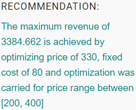
f'The maximum revenue of {opt_Revenue} is achieved by optimizing {var_opt} of {opt_Price}, fixed cost of {var_cost} and optimization was carried for {var_opt} range between {var_range}']
Here is the sample recommendation output:
“Pricing is actually pretty simple…Customers will not pay literally a penny more than the true value of the product.” – Ron Johnson
Key points to note:
As you would have noticed, there are various stages to building a model-driven data app and each of these stages brings its own set of challenges.
Data quality: The efficiency of the ML model depends on the quality of data. Hence, it is important to test the data for any deviation (data drift) from the expected standard. An automated quality checking process helps in identifying any data anomaly and suitable data pre-processing steps should be applied to rectify the deviation.
Model building: A model whether simple or complex needs to be back-tested, validated, and piloted before pushing it for production usage. The model’s performance in production needs to be monitored eg: model size, model response time, accuracy, etc.
Deployment: The model is generally deployed as a service that is consumed by the application and there has to be a seamless integration of various components, data sources, and other systems. Many times, the models are different for every region catering to the demand of that geography, and this results in multiple models, data, and model pipelines.
Model monitoring*: Like every other system, the deployed models also will have to be monitored for deviations (model drift). The models are retrained and deployed at a defined frequency, it can be weekly, monthly, or quarterly, depending on the nature of product/service and business impact.
Note: The model deployment was not covered as a part of this blog. I will plan for a separate blog dedicated to app deployment.
Closing Note:
The objective of the blog was to introduce a very simplistic approach to price optimization and build a web app that can help business users make decisions on the fly. We also touched upon various aspects of building a data app right from data exploration to model building and challenges associated with building, deploying, and maintaining such an app.
- This project setup can be used as a template to quickly replicate it for other use cases.
- you can build a more complex model to optimize any variable of your interest.
- Connect the app to a database and have CRUD operations built on the app.
Hope you liked the blog. Happy Learnings !!!!
You can connect with me – Linkedin
You can find the code for reference – Github
Reference:
https://dash.plotly.com/dash-daq
https://unsplash.com/
The media shown in this article are not owned by Analytics Vidhya and are used at the Author’s discretion.


I have gone through your python application(price optimization application)can anyone please tell how the prices are forecasted? This application studies the dataset and give prediction to the user?
Hi Amit, I liked your Price Recommender App. Do you have any material to build a price function for financial services industry for products like mutual funds, bonds , retirement funds etc where they charge a service fee to customers? Thanks, Shishir