A Complete Guide To Tableau For Beginners in Data Visualization
Overview
Tableau is a well-known data visualization tool widely used in the industry and adopted by major firms like Nike, Coca-Cola, Skype, TCS, Accenture, and various other plethoras of companies both large and small. Tableau provides support across platforms such as Azure, Microsoft, Amazon, Redshift, etc making it a household data visualization tool and well accepted in the analytics community. Tableau is easy to use and versatile and anyone without an analytics or BI background can create awesome visualizations with a bit of guidance and practice.
The key away from this article is to build basic charts on tableau but more importantly understand the nuances of the tool. Instead of jumping directly into building a dashboard, the idea is to get familiarized with the tool and its functionality.
Table Of Contents
- Why is visualization important?
- Basic understanding of tableau products.
-
Step by Step guide to building a simple dashboard using the superstore dataset.
- Let’s Practice.
-
Limitations of the tableau.
-
Tableau certifications.
- Endnotes.
Why is visualization important?
Studies show that humans process complex visual data more efficiently than spreadsheets or text tables. For example, using a line graph to track sales trends is an easy and better way than a stack of numbers in a spreadsheet. Identifying outliers, showcasing correlations and tracking progress are some more examples where visual representation is used. For senior management as well as CXO’s having a dashboard is convenient, helps them keep track of the health of the business and visualize different scenarios and identify factors that benefit the business and address pain points so that operations run smoothly, without any roadblock. For associates or analysts, it provides unique business insights, which can be leveraged to build new product features and can be turned into opportunities for growth. Hence the know-how of visualization tools is an important skill to have.
Basic Understanding Of Tableau Products
Tableau Desktop – Data visualization tool, which helps to create interactive dashboards and stories. It has a 14 days trial version.
Tableau Server – Helps publish, share, administer tableau desktop content and dashboard.
Tableau Online – On cloud tableau analytics platform. Develop dashboards on tableau desktop and upload to tableau online. Link sharing helps colleagues, customers view the dashboard and make adjustments to the view. The dashboard can be accessed on the web as well as a mobile app. Also can be embedded into a website.
Tableau Reader – It’s a reader tool to view the tableau desktop dashboard without downloaded tableau desktop. It doesn’t have the ability to transform or manipulate dashboards.
Tableau Public – Free platform to transform data into beautiful visualization and share the same online on tableau. Tableau Public has a gallery, where every day a new and interesting visualisation is updated, these can be downloaded along with the data to either recreate the same or explore.
Tableau Desktop vs Tableau Public
For individual users, the cost of a tableau desktop license as of Sep/2021 is $70/user/month billed annually and for freelancers, this could be a valuable tool for initial EDA/ Model validation – visually showcase independent vs dependant variables or clusters / provide interactive dashboards. The license can be purchased using this link.
Tableau Public is free to use, anyone can download it and work on it, but here’s the catch. All visualization can only be saved on Tableau Public(online website) and not locally. If data security isn’t an issue and learning is the main focus then tableau public very well is the winner.
Tableau Public Visualizations
Tableau hosts viz of the day on their website. A good place to check out real-world dashboards. A good practice is to download and try to recreate the same dashboard.
Building a simple dashboard on tableau using the superstore dataset
Download Tableau Public:
Use the link to download tableau public. Once the email id is entered, the download will automatically begin.
Download the superstore dataset :
The most commonly used dataset for tableau exercises and tutorials is the superstore dataset. It can be downloaded from here.
Superstore dataset and retail
The superstore dataset is retail transaction data or pos(point of sales) data. Retail data has numerous insights and can be used for exercises such as market basket analysis, or customer lifetime value, or churn analysis. The possibilities are infinite. The current dataset has 3 sheets/tables namely Orders, People, Returns. Orders is the main sheet that will be working with. Orders – contains information about the product bought. Below are the columns :
- Row ID – unique identifier for each transaction.
- Order ID – Order id of each transaction.
- Order Date – Order date.
- Ship Date – Shipping date.
- Ship Mode – Shiping mode (Second Class, Standard Class, First Class, Same Day)
- Customer ID – Unique ID for each customer.
- Customer Name – Customer name.
- Segment – Product segment.
- Country/Region – Shipping country.
- City – Shipping city.
- State – Shipping State.
- Postal Code – Shipping postal code.
- Region – Shipping region.
- Product ID – unique identifier for the product.
- Category – Product category.
- Sub-Category – Product sub-category.
- Product Name – Product name.
- Sales – Net sales amount.
- Quantity – Quantity purchased.
- Discount – Discount applied.
- Profit – Margin or profit.
Connect to Dataset in Tableau
In the free version of tableau, that is tableau public, a total of 11 data connections are available, the most common amount them is Microsoft Excel. The other connections are:
- Text file
- JSON file
- Microsoft access
- PDF file
- Spacial file
- Statistical file
- Google drive
- Google sheets
- OData
- Select Microsoft Excel and then select the superstore dataset from downloads and select OK.
- Drag the orders sheet to the canvas. In the data source pane, all columns and values will be visible.
- Click on “Sheet1” below to move to the workspace area to create a visualization.
- Double click on “Sheet1” and it can be renamed to “bar_graph” or any relevant name.
Workspace, Plotting and Dashboarding in Tableau
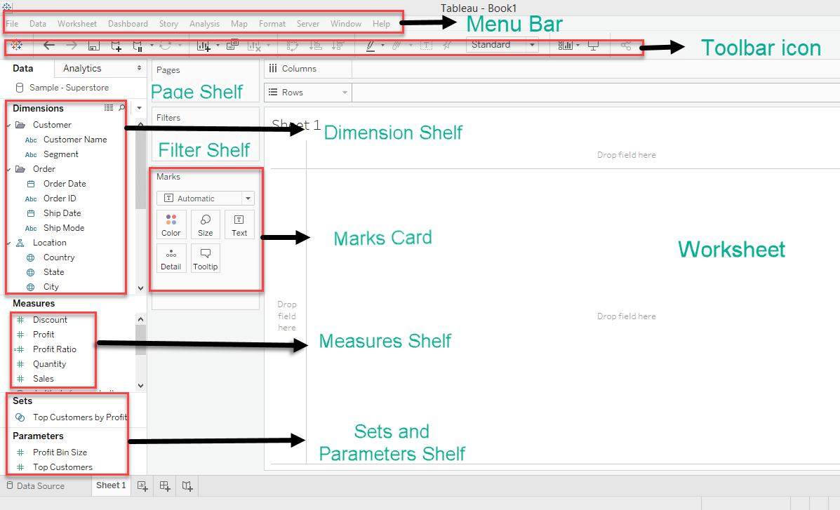
Understanding the tableau workstation and naming conventions will help in not only understanding this guide but also the free tableau video available online.

Data Pane: The data shows all the columns in the data source. The data pane has dimensions which are qualitative and descriptive data for example – Customer name, Segment etc. Measures are quantitative values that can be aggregated using sum/averages etc. Dimensions and measures can be dropped onto the Filter Pane to filter data based on selection.
Fields can be hidden as well, right-click on the field and select HIDE. Fields can be saved to a folder as well – Select the downward-facing triangle beside the search bar on the data pane and select Folder.
Drag and drop fields from the data pane to shelves and cards to create a visualization. Shelves include – marks, filters and pages. Cards include – Columns and rows.
The largest area of the workspace is the view(worksheet), the area where the visualization is visible.
When a field is dropped onto the Columns or Rows it is called a Pill (it’s in the shape of a pill). A blue or green pill. A blue pill is a dimension and the green pill is a measure.
Marks card contains Color, Size, Label, Detail, Tooltip. For all the visualization these tools help to customize the charts. To increase or decrease the bar size, Size can be used. Select edit colors of any chart, select Color and Edit colors. Labels and Tooltip help in creating more informative visualizations by adding text fields or metrics to the visualization.
Let’s create a simple visualization:
Simple Visualization: How to visualize the sum of Discounts across categories.
- First Drag the Category into Columns and then pull up Discounts into Rows.
- A simple bar chart is generated as below.
- Tableau is a simple drag and drop tool and within 2 clicks a beautiful bar chart is generated.
- The Discount is converted to SUM(Discount) as it is a measure and tableau knows to aggregate a measure without specifically asking it to.
Rename the visualization and add legends to each bar in Tableau
- To rename simply double click on the title, or sheet1 and a new dialog box appears. Font, Font size, Font color, alignment can be changed.
- To apply colours based on category, Shift+drag category from the columns pill to the color in Marks shelf, and voila a beautiful new visualisation appears in just 2 clicks. Tableau makes it so easy to add legends to any graph.
- To annotate each bar, Shift+drag SUM(Discount) to the Label in Marks shelf.
Creating visualization using the SHOW ME button on the toolbar: Tableau makes it really simple to create visualizations using already existing dimensions and measures through the SHOW ME tool. It has 24 types of charts and under each chart, it shows the numbers of measures and dimensions needed to create that specific chart.
- Text Tables – 1 or more dimension and measure
- Heat maps – 1 or more dimension and 1 or 2 measure
- Highlight tables – 1 or more dimension and 1 measure
- Symbol maps – 1 geo and 0 or more dimension and 0 to 2 measure
- Maps – 1 geo and 0 or more dimension and 0 or 1 measure
- Pie Chart – 1 or more dimension and 1 or 2 measure
- Horizontal bars – 0 or more dimension and 1 or more measure
- Stacked bars – 1 or more dimension and measure
- Side by side bars – 1 or more dimension and measure
- Treemaps – 1 or more dimension and 1 or 2 measure
- Circle view – 1 or more dimension and measure
- Side by Side circles – 1 or more dimension and measure
- Line chart (Continuous) – 1 date and 0 or more dimension and 1 or more measure
-
Line chart (Discrete) – 1 date and 0 or more dimension and 1 or more measure
-
Dual lines – 1 date and 0 or more dimension and 2 measure
-
Area charts(Continuous) – 1 date and 0 or more dimension and 1 or more measure
-
Area charts(Discrete) – 1 date and 0 or more dimension and 1 or more measure
-
Dual combination – 1 date and 0 or more dimension and 2 measure
-
Scatter plot – 0 or more dimensions and 2 to 4 measures.
-
Histogram – 1 measure
-
Box and whisker plots – 0 or more dimension and 1 or more measure
-
Gnatt – 1 date and 1 or more dimension and 1 to 2 measure
-
Bullet graph – 0 or more dimension and 2 measure
-
Packed bubbles – 1 or more dimensions and 1 to 2 measure
Create a Histogram of Discount using SHOW ME tool in Tableau
- Click on SHOW ME in the toolbar, a histogram needs just one measure.
- Click Discount from the data pane. A text table, horizontal bar and histogram will be highlighted in the SHOW ME tool.
- Select histogram to create a visualization.
Edit histogram bins size
- Bin sizes are selected automatically by tableau. A new dimension is created Discount(Bin) in the data pane when histograms are created.
- Right-click on the Discount(Bin) green pill and then select edit.
- In the dialog box, change the size of the bin to 0.1 or any numbers relevant.
Steps to add filters to visualization in Tableau
- Select the dimension/measure that needs to be a filter and drop it on the Filter pane. For example – Region and shipping mode.
- Right-click on the Region Filter pill and select show filter.
- Repeat the same for Shipping Mode.
- Dimension Filters appear as discrete values, whereas continuous filters appear as a range of values.
Creating a Hierarchy in Tableau
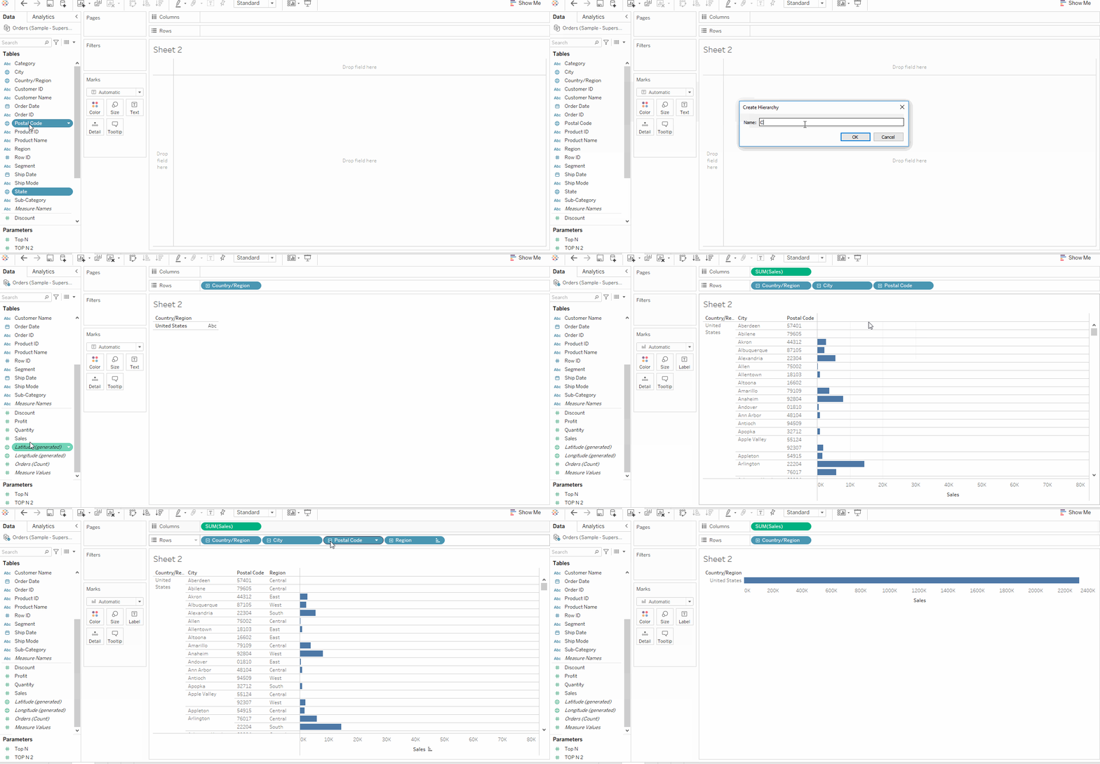
Select the sub-category dimension and drop it above the category dimension to create a hierarchy. Location hierarchy can be created in the same way, select state, city, region and postal code and drop it onto the country. Hierarchies can be used to drill down into lower levels of data.
- Select state, city, region and postal code and drop it onto country and rename the hierarchy to country001.
- Drag the country and then drop it on rows card.
- Drag Profit and drop it on Text in Marks pane.
- A small positive(+) is visible on the Region Pill and negative(-) sign is visible on the blue
- The below table is also called a text table.

Table Calculations in Tableau
A common way to find an aggregate of columns/rows is table calculation. Select Analysis and then select Percentage of to get percentage values or select Total to get total across rows/columns.
- Right-click on SUM(Profit) in the marks pane and select Add Table Calculation.
- In the dialog box, relevant table calculations can be selected.
- For example, % of total needs be added then we can select Percentage of Total and in Compute Using Table (Down)
Calculated Field to create profit percentage:
To create new variables from existing data, calculated fields can be used. A case when statement can be used to segment based on profit values or percentages. Strings can be trimmed and converted to integers, integers can be aggregated, a calculated field can also be used as a filter.
- Select Analysis on the toolbar, then select create calculated field.
- We will use the formula [Profit]/[Sales] as profit ratio.
- Name the calculated field as profit_ratio and click Apply.
- Unlike available columns such as Discount, Profit, profit_ratio has a different symbol.
Practice: Create a calculated field on profit_ratio based on the below code:
Use profit ratio calculated field to segment each transaction into one of the four buckets.
IF  [profit_ratio] < 0 then "poor"
ELSEIF [profit_ratio] > 0 and [profit_ratio] < 0.3 then "average"
ELSEIF [profit_ratio] > 0.3 and [profit_ratio] < 0.6 then "good"
else "excellent"
END
Parameters in Tableau
Tableau parameters help users define values, which then can be processed by a calculated field(can also be used in set, reference line etc). Parameters are sometimes confused as filters, though parameters can act as filters, filters reduce the data points but parameters provide an alternative view and don’t reduce the data points. Defining parameters in itself has no action. They are useful only when combined with calculated fields.
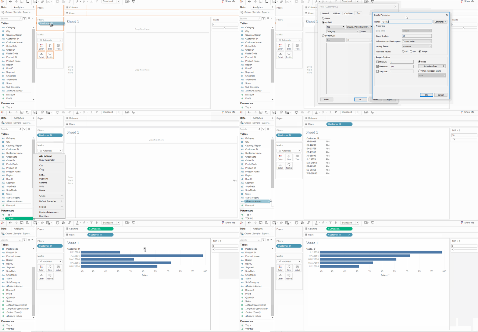
Creating a parameter from a Filter: let’s create a view with Top N customer by sales, with Top N being the user-defined parameter control.
- Drag Customer ID to Filter shelf.
- Right-click on it, and a dialog box appears. Click on Top then select By Field, then select Create New Parameter.
- A new dialog box appears, rename it as Top N. Click OK.
- The Top N parameter will be visible on the parameter shelf.
- Right-click on it, and select Show Parameter.
- Using parameter control, the number of customers shown can be adjusted.

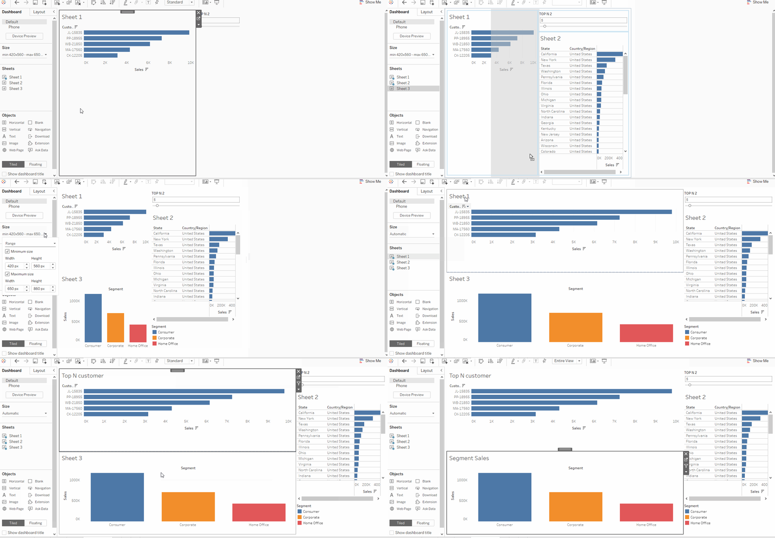
Create a Dashboard in Tableau
- Select Dashboard and New Dashboard from the toolbar.
- Under the dashboard and sheets pane, the existing charts/sheets appear.
- Drag the drop the relevant sheet onto the dashboard.
- To add filters to the dashboard – Select Analysis from the toolbar, under it select Filter, all relevant filters appear. Go ahead and choose the one appropriate for the current dashboard.

Save the dashboard to tableau public: Tableau desktop provides a variety of options to save a dashboard, most commonly used are twb(tableau workbook file) and twbx(tableau packed workbook), the former is the XML version of the dashboard and is intended for collaboration and doesn’t enclose the data, the latter dashboard is inclusive of data and it’s intended for sharing.
In Tableau public, all dashboards including the data need to be saved in the public domain.
- Select File, then Save to tableau Public.
- Login to tableau public profile using the username and password.
- Save the visualisation and share it with friends and colleagues.
Let’s Practice
Unlike machine learning algorithms or theory, where memorizing works, tableau needs hands-on practice to be well versed in it. It’s easy to forget everything that’s been written above and one way to make sure nothing is forgotten is to practice what has just been learnt.
Please download the dashboard from this link, and try to develop the same, it’ll take a while but the learnings will be worth it. The dashboard should look somewhat like this …
.png)
Limitations of Tableau
As an analyst below are the few challenges faced while using tableau:
- Version control – Collaborating with teammates to build a comprehensive dashboard leads to a lot of confusion. Backtracking changes also isn’t possible.
- Lack of connectors in Tableau Public – While desktop support almost all data warehouses and connectors, support for tableau public is limited.
- Need for processed data – Data wrangling in tableau is a time consuming and relatively tough task. So an external data wrangling pipeline is needed to smooth accessibility and usage.
Tableau Certifications:
Tableau certifications are a way to upload and validate tableau expertise. It’s a mix of multiple-choice questions and labs exercises. Currently, there are 6 certifications available :
- Tableau desktop specialist.
- Tableau certified data analyst.
- Tableau desktop certified associate.
- Tableau server certified associate.
- Tableau certified associate consultant.
- Tableau certified associate architect.
The fundamental certificate for any data analyst/data scientist or business analyst is a Tableau desktop specialist. It covers the basics of dashboarding and exploratory data analysis using tableau desktop. Strong conceptual knowledge and a few practice sessions using various freely available datasets will be good enough to crack this exam.
Preparation For Tableau Desktop specialist:
Exam Format:
- Time Limit: 60 minutes
- Question Format: Multiple choice, multiple responses
- Number of Questions: 45 (40 scored, 5 unscored)
- Passing Score: The passing scaled score for this exam is 750.
- Language(s) Offered: English only.
- Exam Delivery Method: Testing centre and online delivery are both available.
End Notes
This article is just the beginning of data visualization using tableau. Speed and agility in building dashboards come with practice and the know-how to building dashboards that AWE the audience comes with domain expertise and experience. So practice and always keep learning.
Good luck! Here is my Linkedin profile in case you want to connect with me. Here’s a link to my Tableau Desktop Specialist Certification. I’ll be happy to be connected with you. Check out my other articles on data science and analytics here.
Image 1 : https://public.tableau.com/en-us/s/download
The media shown in this article are not owned by Analytics Vidhya and are used at the Author’s discretion.


