Advanced Image Contrast – The Pixel Intensity Histogram
This article was published as a part of the Data Science Blogathon
Introduction to Pixel Intensity Histogram
From our previous article, we have gained insight and understanding into the concept of image contrast and we have seen an example of how a Histogram can be plotted to show the number of pixels belonging to specific pixel intensities. This article will introduce us to the full explanations behind the code.
To facilitate this OpenCV learning experience, we shall make use of an image that may be downloaded from this link. Alternatively, you may save the image found below. For the best learning experience, I recommend that you follow along in an IDE/coding environment of your choice.
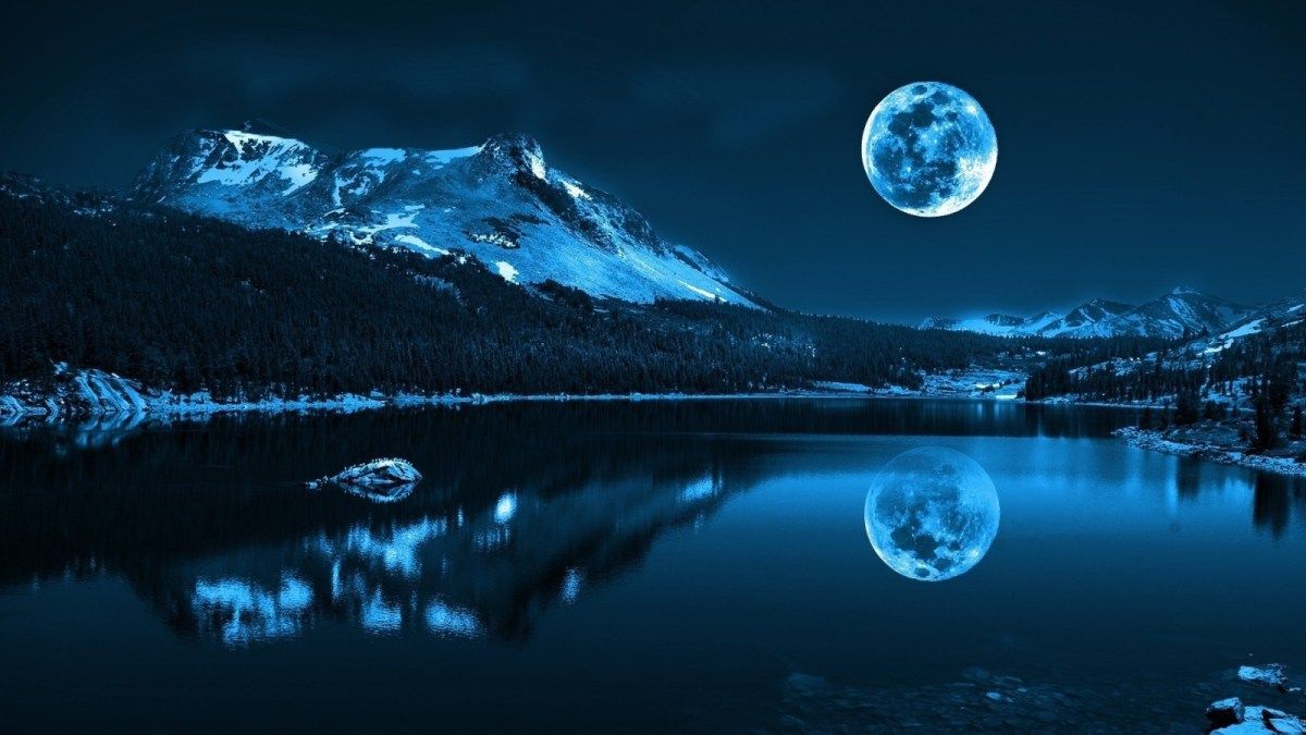
Image 1
Loading The Image for Pixel Intensity Histogram
The first and foremost task to perform is that of loading the image into our system memory. To do this we will be required to import the necessary packages into our script.
import cv2
import numpy as np
import matplotlib.pyplot as plt
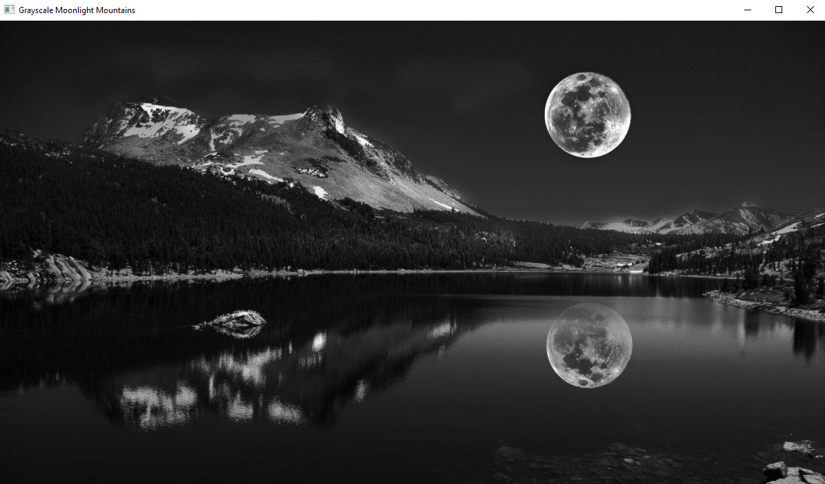
We use the imread() method to load the image into system RAM. We will use the GRAYSCALE color format:
image = cv2.imread(r"C:UsersShivekPictures1360038.jpg", cv2.IMREAD_GRAYSCALE)
We proceed to set up the display configurations:
cv2.imshow("Grayscale Moonlight Mountains", image)
cv2.waitKey(0)
cv2.destroyAllWindows()
The output will display as follows:
Next, we will print the shape of the image to obtain insight into the number of pixels present:
print(image.shape)
print('Total Number Of Pixels In GRAYSCALE Image:', image.shape[0] * image.shape[1])
The output will be seen as below:
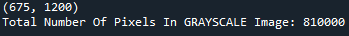
As one can see in the above image, we are working with a large number of pixels.
Plotting The Pixel Intensity Histogram (Of GRAYSCALE Image)
To plot a visual we will use the MatPlotLib Package available in the Python Programming Language. Specifically, we will be using the hist() method that is available to us via the MatPlotLib package. This method accepts several arguments and I highly recommend that you consult the documentation for further reading and exploration. A few of the many parameters are as follows:

Image 2
There are three particular parameters that we will focus on:
- x: This is the parameter that will take in our input array. The array may be 1-Dimensional or Multi-Dimensional (2D+).
- bins: It will accept an integer value that represents the number of bins in the histogram. Every bin will have the same width.
- range: This is the list or tuple containing two values representing the minimum and maximum range of the bins. Essentially what we receive as output is a Histogram in which each bin is a pixel intensity (from 0 to 255), and the height of the bin shows us the number of pixels in the image belonging to that particular intensity value.
By nature in statistics, a Histogram will count the number of values that meet criteria a collectively store them in a vertical bar, called a bin. In our pixel scenario, we are attempting to count the number of pixels that belong to each value from 0 to 255. The visual will find the count of each value in the given range, by counting and incrementing the values from the input array, which is x. Each value will have its own bin in which it will the count will be collected.
To plot our Histogram of Pixel Intensities, we attempt to do so as follows: (you do not need to make the importation again, as we have done so at the beginning of the script):
import matplotlib.pyplot as plt
plt.hist(x=image.ravel(), bins=256, range=[0, 256], color='crimson')
plt.title("Histogram Showing Pixel Intensities And Counts", color='crimson')
plt.ylabel("Number Of Pixels Belonging To The Pixel Intensity", color="crimson")
plt.xlabel("Pixel Intensity", color="crimson")
plt.show()
Line-by-Line explanation of the above code block is as follows:
We first import the required packages/dependencies.
import matplotlib.pyplot as plt
Next, we utilize the hist() method to provide us with a Histogram template. We pass the template an input array, which is the image. But note that we have used the ravel() method available via the NumPy package. The ravel() method will compress a multi-dimensional array (2D+) into a single-dimensional array (1D). We specify the number of bins to 256. Bins range from 0-0.99, 1-1.99, hence the last range would be 255-255.99. The range is specified to be from 0 to 256. For further insight into the methods I recommend you read the documentation notes.
plt.hist(x=image.ravel(), bins=256, range=[0, 256], color='crimson')
We provide a title to the histogram making use of the title() method and specifying a colour of choice. You may type the name in the text form, or provide hexadecimal colour values.
plt.title("Histogram Showing Pixel Intensities And Counts", color='crimson')
We thereafter proceed to provide a label to the y-axis of the graph and specify the desired colour.
plt.ylabel("Number Of Pixels Belonging To The Pixel Intensity", color="crimson")
We attempt to do the same for the x-axis of the graph and specify a colour of choice.
plt.xlabel("Pixel Intensity", color="crimson")
Finally, we display the graph on our screen.
plt.show()
Output to the above code block will show as follows:
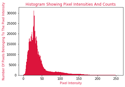
And to back up the histogram, looking at the grayscale image itself, one will find that there is a high concentration of dark shades on the left of the image, which is reflected in the Histogram by the large number of pixels that belong to the lower pixel intensities which as we know, is the color black. Notice that as one moves to the right in the grayscale image, the concentrations of white pixels increase and black pixels decrease. This is shown in the Histogram as well. Notice that towards the left of the Histogram, more pixels are belonging to the shade of white.
Enhancing Image Contrast
To increase the contrast of pixels in an image, we are required to utilize the equalizeHist() method offered by the OpenCV package.
There is one crucial parameter to be specified:
- src: This is the input source image in the form of an array. That is the image whose contrast will be increased.
The equalizeHist() method will normalize (smoothen) the brightness of the image, thereby attempting to increase the contrast of the image.
Following from our task at hand, let us attempt to conduct the process of increasing image contrast:
image_enhanced = cv2.equalizeHist(src=image)
cv2.imshow("Enhanced Contrast", image_enhanced)
cv2.waitKey(0)
cv2.destroyAllWindows()
Output to the above block of code will display as follows:
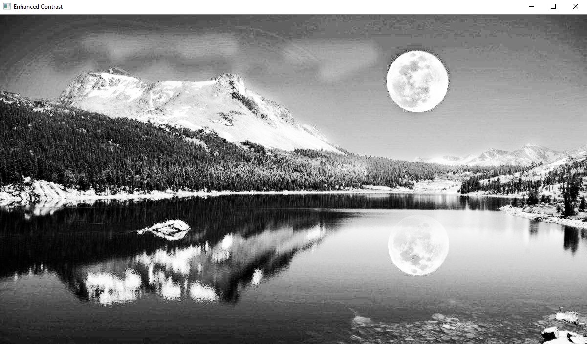
And as one can see in the above image, the contrast of the entire image has been increased. We can confirm that the contrast has been increased by viewing a Pixel Histogram of the Enhanced Contrast image.
plt.hist(image_enhanced.ravel(), 256, [0,256], color="blue")
plt.title("Pixel Intensities And Counts In Enhanced Image", color="crimson")
plt.ylabel("Number Of Pixels Belonging To Pixel Intensity", color="crimson")
plt.xlabel("Pixel Intensity", color="crimson")
plt.show()
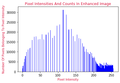
Thus reinforced by our new Histogram of pixel intensities, we can see that the range of pixel intensities has been severely reduced by the technique of Histogram Equalization. The method has effectively normalized the pixels in the image and has limited the intensities of the pixels, thereby causing the colour range of pixels to be constrained. This as we know, has reduced the brightness in the image, and increased the contrast.
This concludes my article on Advanced Image Contrast- The Pixel Intensity Histogram. I do hope that you have enjoyed reading through this article and have learned new concepts about the OpenCV package in Python Programming Langauge.
Please feel free to connect with me on LinkedIn. If you would like to see all the articles that I have composed for Analytics Vidhya, please navigate to my Analytics Vidhya Profile.
Thank you for your time.
References-
- Image 1 – https://wallpaperaccess.com/night-nature
- Image 2 – https://matplotlib.org/stable/api/_as_gen/matplotlib.pyplot.hist.html


