Q-Q plot – Ensure Your ML Model is Based on the Right Distribution
This article was published as a part of the Data Science Blogathon
Introduction
Q-Q plots are also known as Quantile-Quantile plots. As the name suggests, they plot the quantiles of a sample distribution against quantiles of a theoretical distribution. Doing this helps us determine if a dataset follows any particular type of probability distribution like normal, uniform, exponential. Before we dive into the Q-Q plot, let’s discuss some of the probability distributions.
What are probability distributions?
In probability distributions, we represent data using charts where the x-axis represents the possible values of the sample and the y-axis represents the probability of occurrence.
There are various probability distribution types like Gaussian or Normal Distribution, Uniform distribution, Exponential distribution, Binomial distribution, etc.
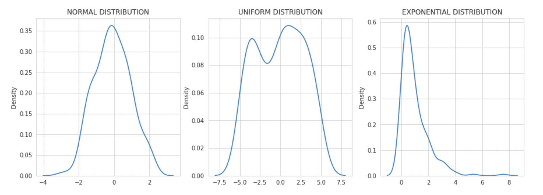
In this blog, we will be looking into three types of distributions namely Normal, Uniform, and Exponential, and how we can identify them using a QQ plot.
-
Normal distributions are the most popular ones. They are a probability distribution that peaks at the middle and decreases at the end of the axis. It is also known as a bell curve or Gaussian Distribution. As normal distributions are central to most algorithms, we will discuss this in detail below.
-
Uniform distribution is a probability distribution type where the probability of occurrence of x is constant. For instance, if you throw a dice, the probability of any number is uniform.
-
Exponential distributions are the ones in which an event occurs continuously and independently at a constant rate. It is commonly used to measure the expected time for an event to occur.
Why are probability distribution types important?
Probability distributions are essential in data analysis and decision-making. Some machine learning models work best under some distribution assumptions. Knowing which distribution we are working with can help us select the best model.
Hence understanding the type of distribution of feature variables is key to building robust machine learning algorithms.
Normal distributions
We regularly make the assumption of normality in our distribution as we perform statistical analysis and build predictive models. Machine learning algorithms like linear regression and logistic regression perform better where numerical features and targets follow a Gaussian or a uniform distribution.
It’s an important assumption as normal distribution allows us to use the empirical rule of 68 – 95 – 99.7 and analysis where we can predict the percentage of values and how far they will fall from the mean.
In regression models, normality gains significance when it comes to error terms. You want the mean of the error terms to be zero. If the mean of error terms is significantly away from zero, it means that the features we have selected may not actually be having a significant impact on the outcome variable. It’s time to review the feature selection for the model.
How Q-Q plots can help us identify the distribution types?
The power of Q-Q plots lies in their ability to summarize any distribution visually.
QQ plots is very useful to determine
-
If two populations are of the same distribution
-
If residuals follow a normal distribution. Having a normal error term is an assumption in regression and we can verify if it’s met using this.
-
Skewness of distribution
In Q-Q plots, we plot the theoretical Quantile values with the sample Quantile values. Quantiles are obtained by sorting the data. It determines how many values in a distribution are above or below a certain limit.
If the datasets we are comparing are of the same type of distribution type, we would get a roughly straight line. Here is an example of normal distribution.
Now let’s look into how we can use the Q-Q plot in Python. To plot it, I have used the stats model library.
Below is the list of libraries that I have imported for this demonstration.
import numpy as np
import pandas as pd
import matplotlib.pyplot as plt
import seaborn as sns
import statsmodels.api as sm
import scipy.stats as stats
-
NumPy – to create data with normal, uniform, exponential distribution
-
Matplotlib & Seaborn to visualize various distributions
-
Statsmodels.api for Q-Q plot
-
SciPy.stats – for statistical functions
Now let’s use a Q-Q plot to analyze various sample distribution types
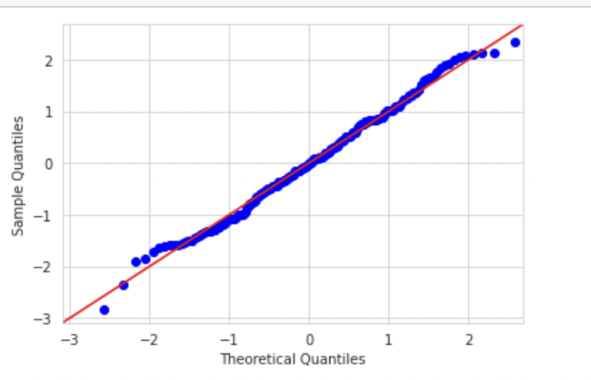
Normal Distribution
We can use the np.random.normal for this. In the below example, I am creating normally distributed data with a mean 0 and a Standard deviation of 1.
np_normal = pd.Series(np.random.normal(0, 1, 200))
Let’s plot this using hist plot to see if it’s normally distributed.
sm.qqplot(np_normal,line='45',fit=True,dist=stats.norm)
Now let's plot the Q_Q plot for this dataset. If the datasets are distributed similarly, we would get a straight line.

We can see that since we are plotting the data with the theoretical quantiles of a normal distribution, we are getting almost a straight line
Uniform Distribution
Now let’s try to plot uniformly distributed data and compare it with normal distribution.
Again, I am using the NumPy library to create sample uniformly distributed data.
np_uniform = pd.Series(np.random.uniform(-5, 5, 200))
Now let’s plot the Q-Q plot. Here we would plot the graph of uniform distribution against normal distribution.
sm.qqplot(np_uniform,line='45',fit=True,dist=stats.norm)
plt.show()
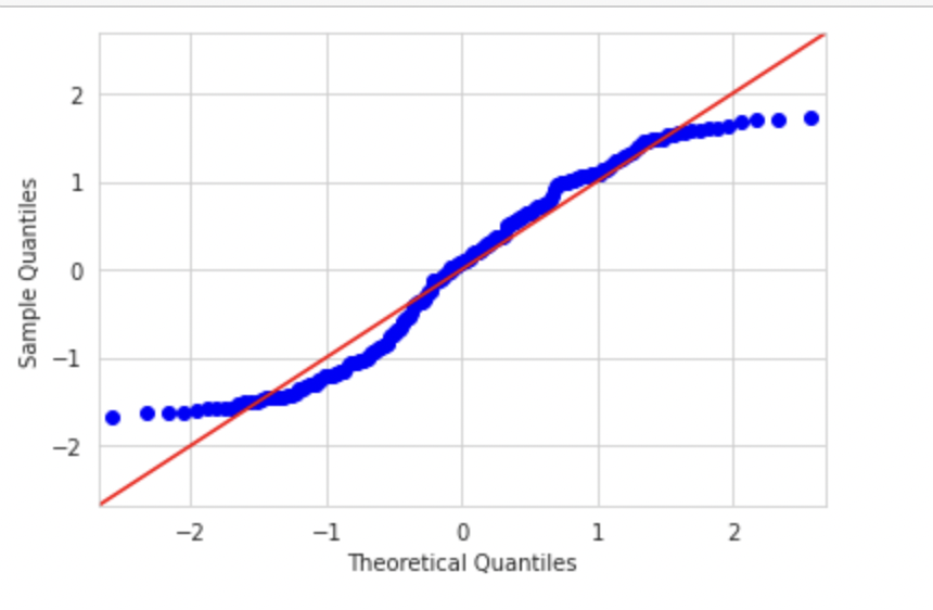
As you can see in the above Q-Q plot since our dataset has a uniform distribution, both the right and left tails are small and the extreme values in the above plot are falling close to the center. In a normal distribution, these theoretical extreme values will fall beyond 2 & -2 sigmas and hence the S shape of the Q-Q plot of a uniform distribution.
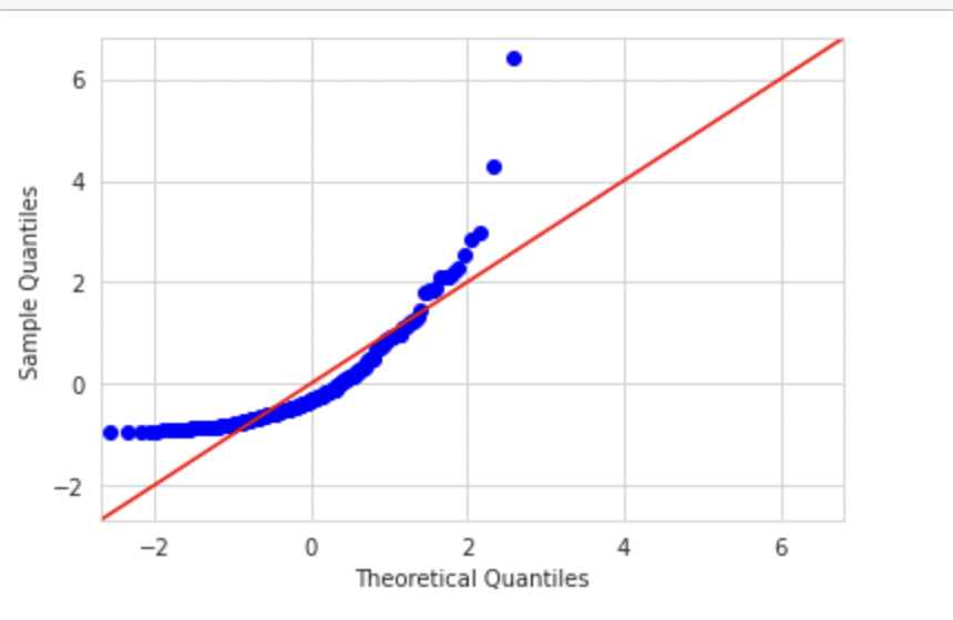
Exponential Distribution
If we plot a variable with exponential distribution with theoretical normal distribution, the graph would look like below. Code can be found in my git repository
sm.qqplot(np_exp,fit=True,line='45',dist=stats.norm)
plt.show()
Q-Q plots and skewness of data
Now let’s see how we can determine skewness using a Q-Q plot
Q-Q plots can be used to determine skewness as well. If the see the left side of the plot deviating from the line, it is left-skewed. When the right side of the plot deviates, it’s right-skewed.
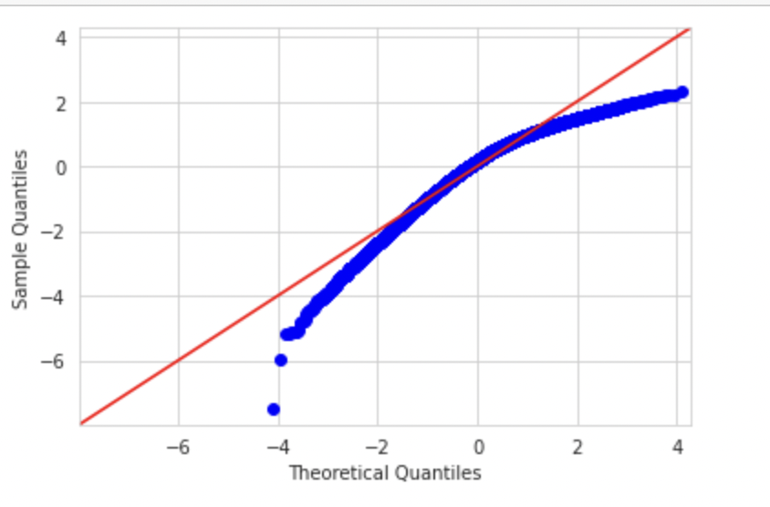
Let’s create a left-skewed distribution using skewnorm from the script library.
from scipy.stats import skewnorm
import matplotlib.pyplot as plt

skewness = -5 #Negative values are left skewed, positive values are right skewed.

random = skewnorm.rvs(a = skewness,loc=1000, size=50000)  #Skewnorm function

random = random - min(random)      #Shift the set so the minimum value is equal to zero.
random = random / max(random)      #Standadize all the vlues between 0 and 1.
random = random * 50000
random = pd.Series(random)
The distribution would look like below:
When we plot Q-Q plot, we should observe deviation on the left side
sm.qqplot(random,fit=True,line='45')
plt.show()
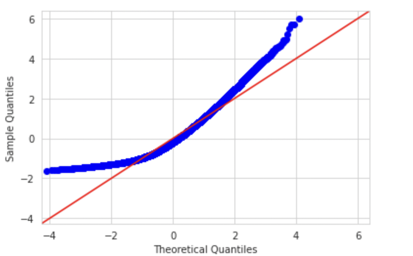
Similarly, a right-skewed distribution would look like below. We can observe deviation on the right side
Conclusion
As you build your machine learning model, ensure you check the distribution of the error terms or prediction error using a Q-Q plot. If there is a significant deviation from the mean, you might want to check the distribution of your feature variable and consider transforming them into a normal shape.
For more information, below is my GitHub link which contains the code used in this blog
https://github.com/akanshakhandelwal/Python-Notebooks/blob/main/Q_QPlot.ipynb


