10 Ideas that every Professional should avoid for Data Visualization

Data is the new oil we have heard it so many times. But can we visualize that data in a proper format? With the amount of data at our disposal today, the need to extract insights from it is more important than ever. Hundreds of visualizations are created every day. Some are appreciated well by the audience while others are just rejected. Why so? Well, the answer lies in creation. Let’s find out the cause and the problem and see how to solve them.
Here, I will be summing up some of the best and worst versions of the charts, so you can stop this if you are doing it.
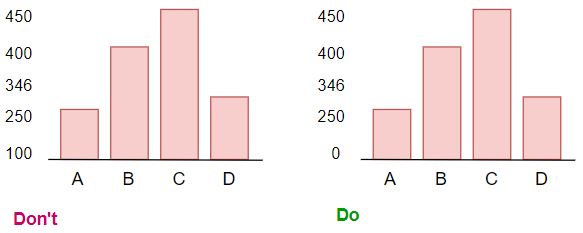
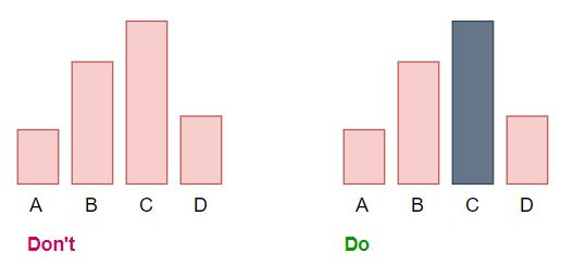
Starting chart with 0 baseline
One of the most common mistakes I have discovered while plotting the charts is not starting the chart with 0 baseline and using some random value.

Use the correct plotting bar chart
We commonly used horizontal or vertical bar charts in data visualization. Sometimes when we use simple bar charts for the comparison well it does convey the message but stacked bar charts in vertical or stacked bar charts in a horizontal manner is better. Let’s see with an example.
Example 1:
We have data of Monthly sales for Females and Males. Both charts show the comparison for the Gender Ratio for every quadrant. We can use the below chart for the comparison.
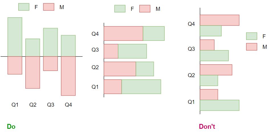
Never plot positive and negative values on the same side of the chart or never plot to comparison features on the same side of the chart it becomes difficult to read the chart.
Multiple colors on the chart
Multiple colors should be used for a reason in the chart. The absurd use of the colors in the chart is a real turn-off while seeing the charts. Mostly used only 2 colors in the charts.
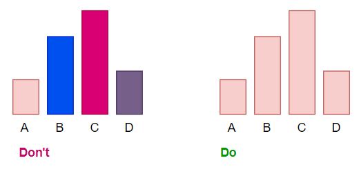
If you have more than 2 charts then separating charts will be a great idea by colors. Let’s see how we can do that.
As we see here each column has its own purpose so giving the same colors won’t look interesting that’s why here I have given the same colors to only charts representing the same purpose.
Emphasis on the Data
Sometimes emphasizing the data also make the charts look nice. At the first glance, we will get that the C value is higher among all the other features we used.
Here we only have 4 features so this little change in the chart will not be that effective but when we are working with 100 features then highlighting the highest value of the feature will help us a lot. Having 100 features and plotting them is a difficult task but at that moment we can pass a condition where suppose top 10 features will be highlighted with grey color and others will have pink color.
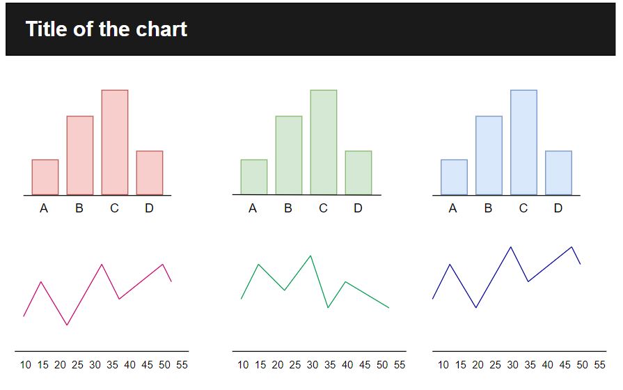
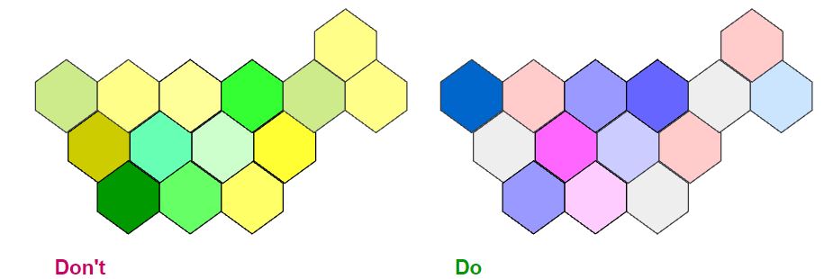
Confusing choice of colors
Fonts, colors, axes all these features carry importance while plotting the charts. Choosing the colors for the charts is a very crucial step because if you have very bright or very light colors on the charts then it will become difficult to read the charts.
In the example, we have 2 different charts showing the highest to lowest sales in the region differentiate on the colors. If we see the chart on the left side different shades of yellow are not visible to the naked eye. On the right side, we have the color scale of blue and pink where we can easily differentiate the shades.
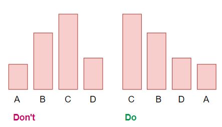
Avoid Randomness on the charts
Always have the bars in ascending or descending order according to their values. Place the largest value on the top for horizontal bar charts and place the largest values on the left for vertical bar charts. This will help the audience to locate the highest and lowest value from the charts.
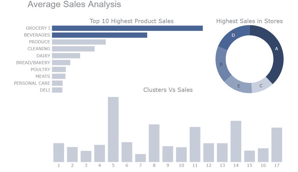
Tell a story or at least answer a question
Most of the starter data visualizers make only single charts like histograms or bars. sometimes combining 2 charts also helps. Let’s see how it’s done.
You can find the data on the Kaggle and Notebook. So here I have made charts for Analysis of the Average Sales of products, stores, and clusters. You can make different charts like pie and bar but I have combined them all in one for an overview of the analysis. Here we can clearly tell that Store A has the highest sales and products which are frequently purchased are grocery and beverages.
Adding context as needed
If you think adding additional text will help the reader to understand the chart better then only add the text. Let’s see with the real example. You can find this chart on Kaggle
The chart tells us about which has the highest rating TV Shows or Movies on Netflix. Here I have added some text like 97% of the audience like Movies rather than TV shows. So when an audience read the chart they will know that audience prefers movies rather than TV Shows and they can compare the rating between the shows.
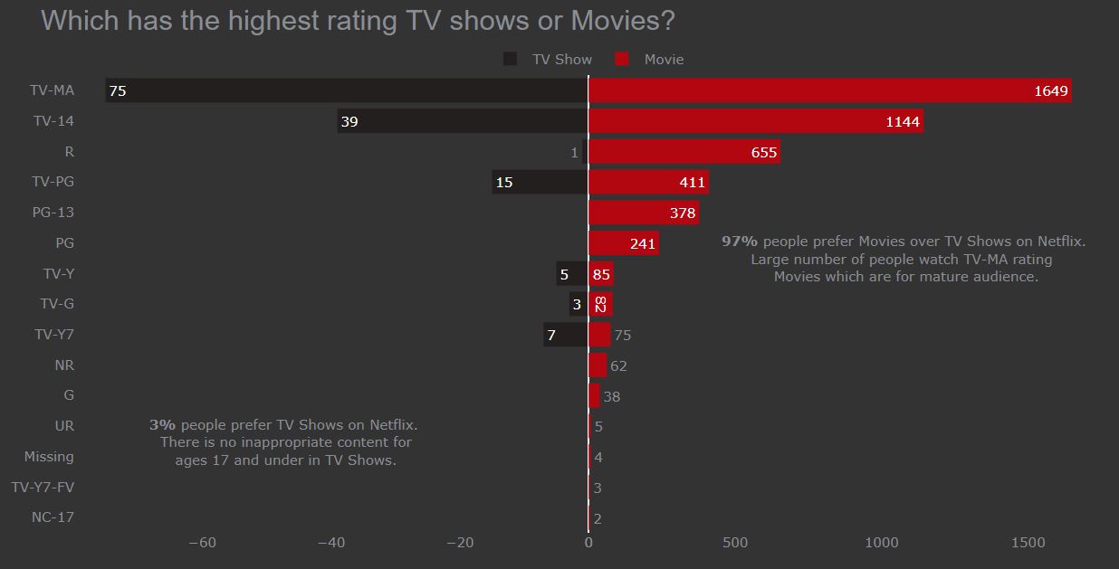
Highlighting some features like changing the color of the bar which has the highest value. Here as we are talking about Netflix so I have chosen the red and black color for the chart rather than the simple white color.
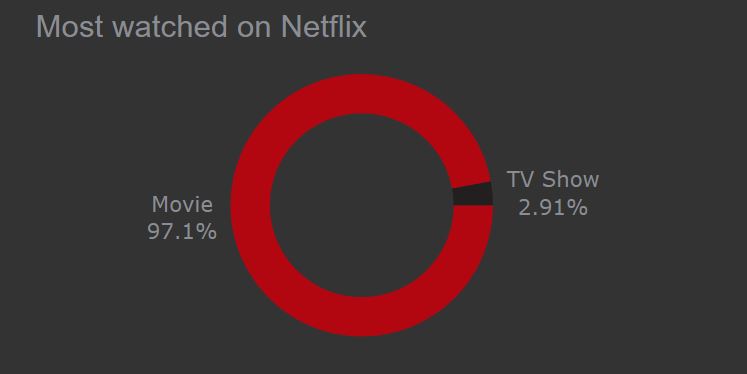
Working with a pie chart
I have seen many people using pie charts in the wrong manner.
Points to remember while working with pie chart
- Never have more than 5 values in the pie chart
- Always give a proper label, no matter how nicely you represented the chart it won’t matter. Labeling directly on the chart is super useful as the audience doesn’t have to look for the legends. Finding the legends requires time and we don’t want our audience to waste time on this.
In the example as we see the ratio of shows watched on Netflix. We can clearly see that Movies are more preferred here.
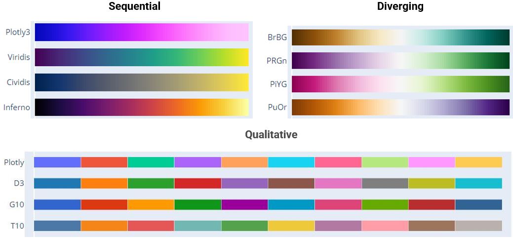
Choosing the color pallet
Color is an integral part of effective data visualization, consider those 3 color palette types when designing:
For Categorical data, a Qualitative color palette works best for the display. Colors assigned should be easily distinct to ensure accessibility.
For Numeric data, a Sequential color palette works best for the display. Because numeric data needs to be placed in a specific order (ascending, descending).
A divergent color palette is a combination of 2 sequential palettes having a central value in the middle usually zero.
The below image is taken for color reference from Plotly.
End Notes
We saw some of the common mistakes in charts and how to overcome them with some examples. If you have any queries you can contact me on any of these media.
Data visualization is an art form that needs to be mastered over time. These data visualization tips and techniques, though aren’t comprehensive, but will surely help you move on the right track. Always remember we make charts or visuals, not for our understanding we make these charts so the audience can understand without going into technical stuff. Understanding the perspective of the audience is the key to creating successful and effective visuals.
It doesn’t matter which tool you used to create elegant and well-mannered charts, it is important that we delivered the essence behind the visuals.
LinkedIn | Kaggle | Medium | Analytics Vidhya
Image Source
- Image 1: https://www.kaggle.com/kashishrastogi/store-sales-forecasting
- Image 2 – https://plotly.com/python/builtin-colorscales/
A student who is learning and sharing with a storyteller to make your life easy.


