Data visualization is the process of finding, interpreting, and comparing data so that it can communicate more clearly complex ideas, thus making it easier to identify once analysis of logical patterns.
Data visualization is important for many analytical tasks including data summaries, test data analysis, and model output analysis. One of the easiest ways to connect with other people is to see good.
Fortunately, Python has many libraries that provide useful tools for extracting data from data. The most popular of these are Matplotlib, Seaborn, Bokeh, Altair, etc.
Introduction
The ways we plan and visualize the details change quickly and become more and more difficult with each passing day. Due to the proliferation of social media, the availability of mobile devices, and the installation of digital services, data is available for any human activity using technology. The information produced is very important and enables us to analyze styles and patterns and to use big data to draw connections between events. Therefore, data recognition can be an effective way to present the end-user with comprehensible details in real-time.
Image 1
Data visualization can be important for strategic communication: it helps us interpret available data; identify patterns, tendencies, and inconsistencies; make decisions, and analyze existing processes. All told, it could have a profound effect on the business world. Every company has data, be it contacting customers and senior management or helping to manage the organization itself. Only through research and interpretation can this data be interpreted and converted into information. This article seeks to guide students through a series of basic indicators to help them understand the perception of data and its components and equips them with the tools and platforms they need to create interactive views and analyze data. It seeks to provide students with basic names and crashes courses on design principles that govern data visibility so that they can create and analyze market research reports.
Table of Contents
What is Data Visualization?
Importance of data visualization
Data Visualization Process
Basic principles for data visualization
Data visualization formats
Data Visualization in Python
Color Schemes for Visualization of Data in Python
Other tools for data visualization
Conclusion
End Notes
What is Data Visualization?
Data visualization is the practice of translating data into visual contexts, such as a map or graph, to make data easier for the human brain to understand and to draw comprehension from. The main goal of data viewing is to make it easier to identify patterns, styles, and vendors in large data sets. The term is often used in a unique way, including information drawings, information visuals, and mathematical diagrams.
Image 2
Data visualization is one of the steps in the data science process, which, once data has been collected, processed, and modeled, must be visualized to conclude. Data detection is also a feature of the broader data delivery (DPA) discipline, which aims to identify, retrieve, manage, format, and deliver data in a highly efficient manner.
Viewing data is important for almost every job. It can be used by teachers to demonstrate student test results, by computer science artificial intelligence (AI) developers, or by information sharing managers and stakeholders. It also plays an important role in big data projects. As businesses accumulated large data collections during the early years of big data, they needed a way to quickly and easily view all of their data. The viewing tools were naturally matched.
Importance of Data Visualization
We live in a time of visual information, and visual content plays an important role in every moment of our lives. Research conducted by SHIFT Disruptive Learning has shown that we usually process images 60,000 times faster than a table or text and that our brains do a better job of remembering them in the future. The study found that after three days, the analyzed studies retained between 10% and 20% of written or spoken information, compared to 65% of visual information.
The human brain can perceive imagery in just 13 milliseconds and store information, as long as it is associated with the concept. Our eyes can capture 36,000 visual messages per hour. 40% of nerve fibers are connected to the retina.
All of this shows that people are better at processing visual information, which is embedded in our long-term memory. As a result, in reports and statements, visual representation using images is a more effective way of communicating information than text or table; and takes up very little space. This means that data visibility is more attractive, easier to interact with, and easier to remember.
Data Visualization Process
Several different fields are involved in the data recognition process, to facilitate or reveal existing relationships or discovering something new in a dataset.
1. Filtering and processing.
Refining and refining data transforms it into information by analyzing, interpreting, summarizing, comparing, and researching.
2. Translation & visual representation.
Creating visual representation by describing image sources, language, context, and word of introduction, all for the recipient.
3. Visualization and interpretation.
Finally, visual acuity is effective if it has a cognitive impact on knowledge construction.
Basic principles for data visualization
The purpose of seeing data is to help us understand something they do not represent. It is a way of telling stories and research results, too as data analysis and testing platform. So, you have a good understanding of how to create data recognition will help us to create meaning as well as easy-to-remember reports, infographics, and dashboards. Creating the right perspective helps us to solve problems and analyze subject material in detail. The first step in representing the information is trying to understand that data perception.
1. Preview: This ensures that viewers have more data comprehension, as their starting point for checking. This means giving them a visual summary of different types of data, describing their relationship at the same time. This strategy helps us to visualize the process of data, in all its different levels, simultaneously.
2. Zoom in and filter: The second step involves inserting the first so that viewers can understand the data basement. Zoom in / out enables us to select available data subsets that meet certain methods while maintaining the concept of position and context.
3. Highly needed data: This makes it possible to choose a small subset of data, enabling the user to participate with information and apply filters by hovering or clicking data for more details. The chart on the right summarizes the main points in it designing such drawings, with a visual eye understanding, so that users can interpret the idea set in the set of physical symptoms. These attributes are structure, position, form size, and color. Used properly, such inventions can be useful tools that present information effectively and mentally.
Data visualization formats
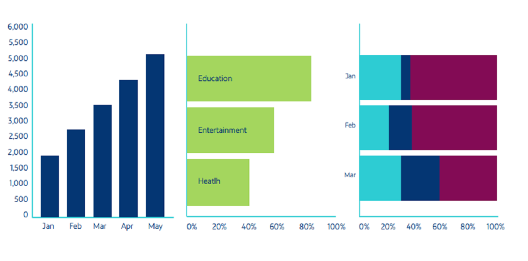
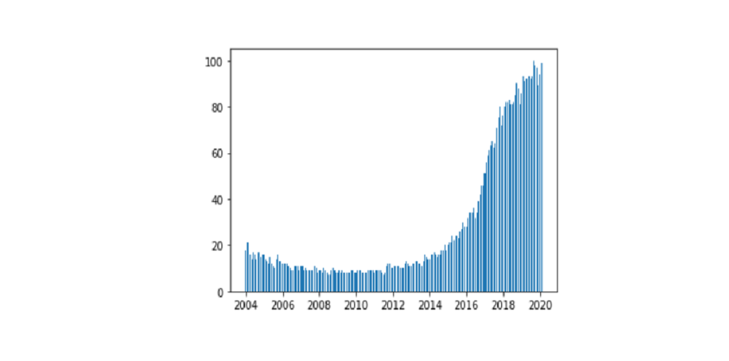
1. Bar Charts
Bar charts are one of the most popular ways to visualize data because it presents quickly set data an understandable format that allows viewers to see height and depth at a glance.
They are very diverse and are often used comparing different categories, analyzing changes over time, or comparing certain parts. The three variations on the bar chart are:
Vertical column: The data is used chronologically, too it should be in left-to-right format.
Horizontal column: It is used to visualize categories
Full stacked column: Used to visualize the categories that together add up to 100%
Source: Netquest- A Comprehensive Guide to Data Visualization (Melisa Matias)
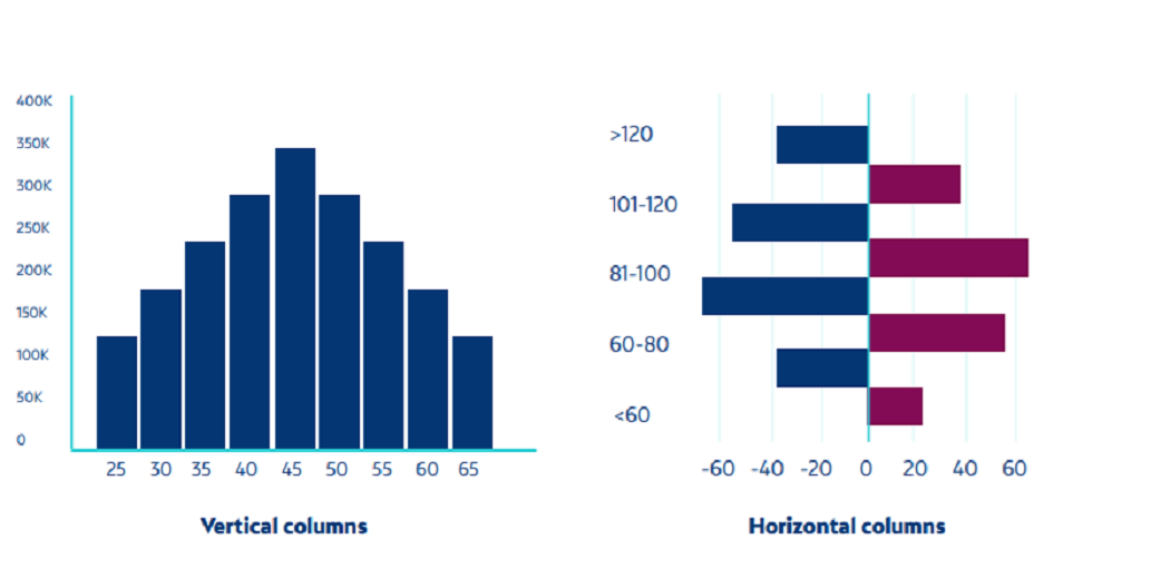
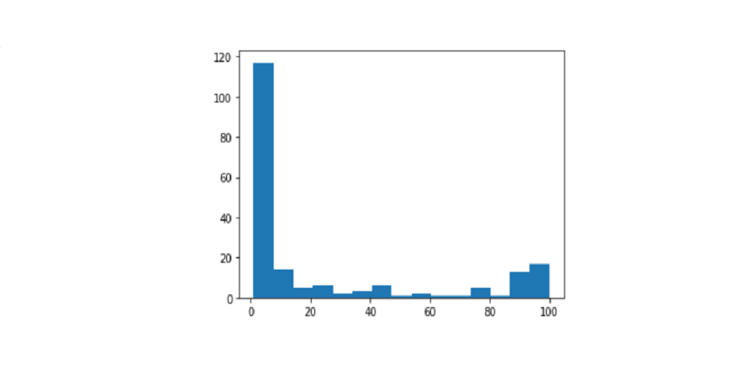
2. Histograms
Histograms represent flexibility in the form of bars, where the face of each bar is equal to the number of values represented. They offer an overview of demographic or sample distribution with a particular aspect. The two differences in the histogram are:
Standing columns
Horizontal columns
Source: Netquest- A Comprehensive Guide to Data Visualization (Melisa Matias)
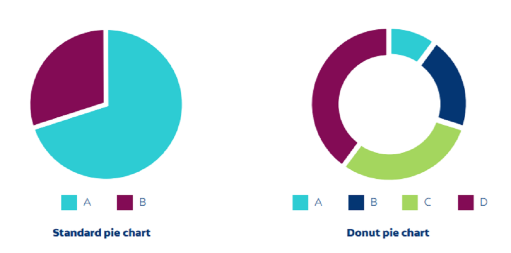
3. Pie charts
The pie chart contains a circle divided into categories, each representing a portion of the theme. They can be divided into no more than five data groups. They can be useful for comparing different or continuous data.
The two differences in the pie chart are:
Standard: Used to show relationships between components.
Donut: A variation of style that facilitates the inclusion of a whole value or design element in the center.
Source: Netquest- A Comprehensive Guide to Data Visualization (Melisa Matias)
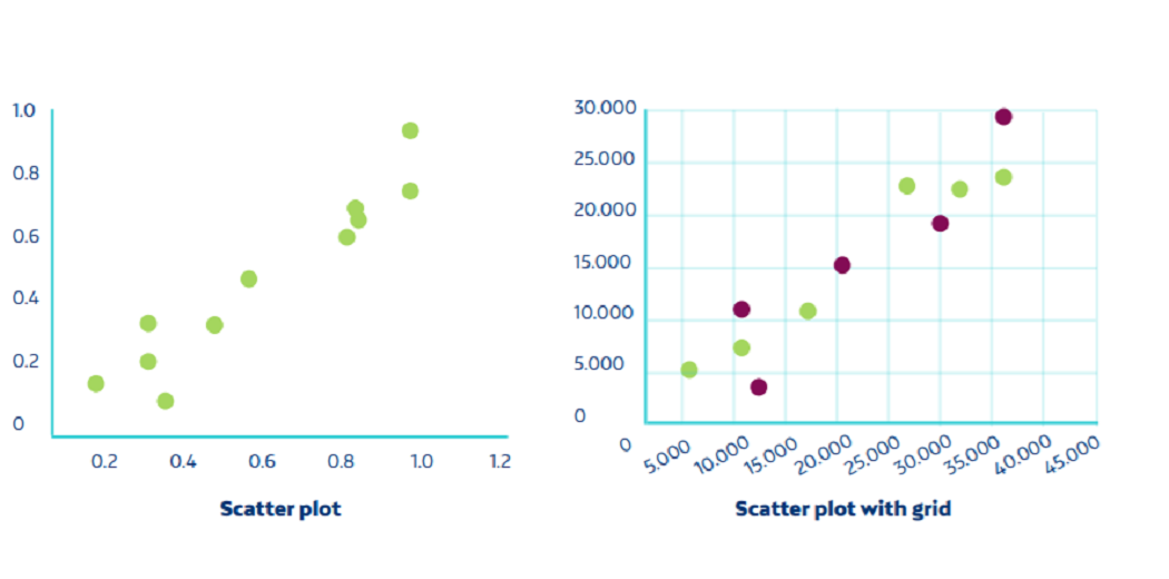
4. Scatter Plot
Scatter plots sites use a point spread over the Cartesian integration plane to show the relationship between the two variables. They also help us determine whether the different data groups are related or not.
Source: Netquest- A Comprehensive Guide to Data Visualization (Melisa Matias)
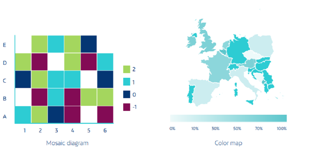
5. Heat Maps
Temperature maps represent individual values from a set of data in the matrix using color variation or color intensity. They often use color to help viewers compare and contrast data at two distinct categories. They are useful for viewing web pages, where the areas most users encounter are represented by “hot” colors, and pages that receive the fewest clicks are displayed in “cold” colors.
Source: Netquest- A Comprehensive Guide to Data Visualization (Melisa Matias)
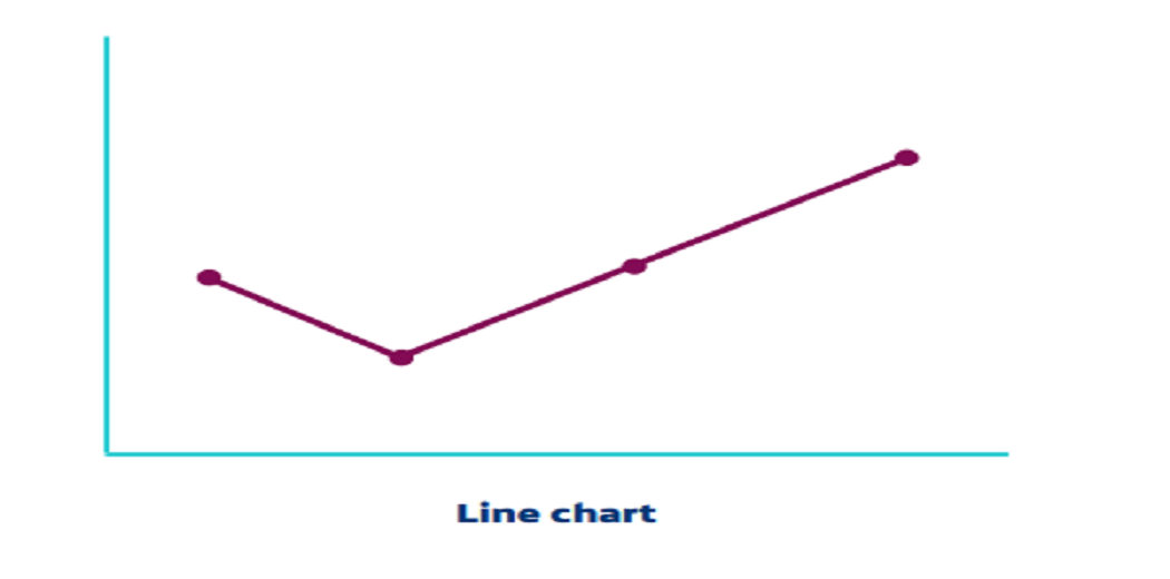
6. Line Plot
This is used to display changes or trends in data over time. They are especially useful in showing relationships, speeding, slowing down, and instability in the data set.
Source: Netquest- A Comprehensive Guide to Data Visualization (Melisa Matias)
Color Schemes for Data Visualization in Python
Color is one of the most powerful data resources visual acuity, and it is important if we are to understand the details correctly. Color can be used to separate elements, balance or represents values, and interacts with cultural symbols associated with a particular color. It rules our understanding again so that we can analyze it, we must first understand its three types:
Hue: This is what we usually think of when we upload a photo color. There is no order of colors; they can only be distinguished by their characteristics (blue, red, yellow, etc.).
Brightness: This is an average measure that describes the amount of light reflected in an object with another. Light is measured on a scale, and we can talk about bright and dark values in one color.
Saturation: this refers to the intensity of a given color. It varies according to light. Dark colors are less saturated, and when color is less saturated, they approach gray. In other words, it comes close to a neutral (empty) color. The following diagram provides a summary of the color application.
Source: Netquest- A Comprehensive Guide
to Data Visualization (Melisa Matias)
Data Visualization in Python
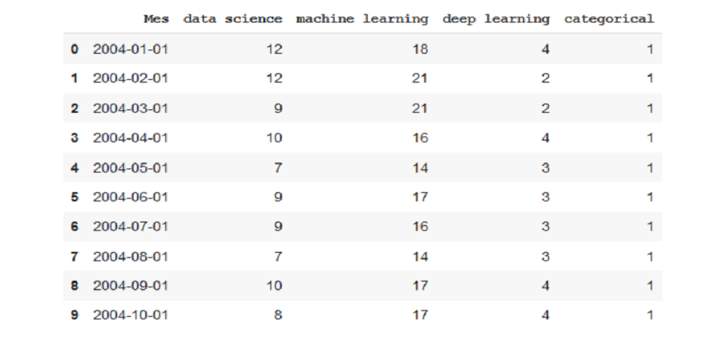
We’ll start with a basic look at the details, then move on to chart planning and finally, we’ll create working charts. We will work with two data shares that will match the display we are showing in the article, data sets can be downloaded here.
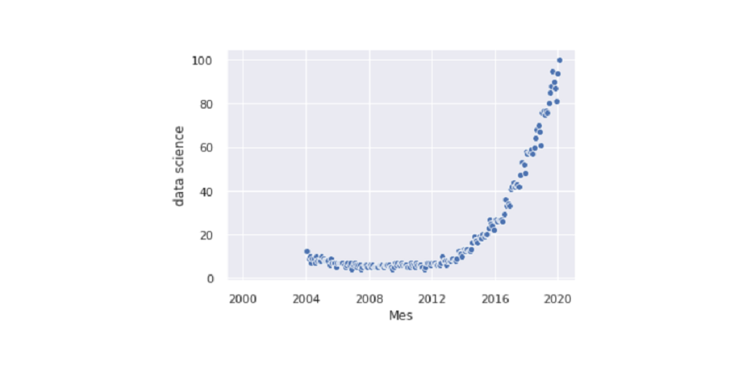
It is a description of the popularity of Internet search in three terms related to artificial intelligence (data science, machine learning, and in-depth learning). They were removed from a popular search engine.
There are two temporal.csv and map.csv files. The first one we will use in most studies includes data on the popularity of three words over time (from 2004 to now, 2020). In addition, I have added category variables (singular and zero) to show the functionality of charts that vary by category.
The map.csv file contains country-class preference data. We will use it in the final section of the article when working with maps.
Before we move on to the more sophisticated methods, let’s start with the most basic way of visualizing data. We will simply use pandas to look at the details and get an idea of how it is being distributed.
The first thing we have to do is visualize a few examples to see which columns, what information they contain, how the numbers are written.
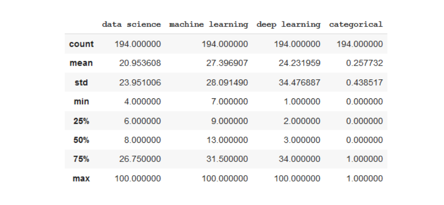
In the descriptive command, we will see how the data is distributed, size, minimum, mean.
df.describe()
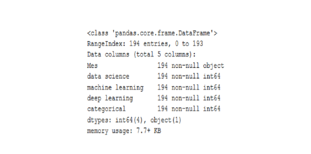
With the information command, we will see what kind of data each column includes. We can find a column case that when viewed with a command of the head appears to be a number but if we look at the data following the values of the string format, the variable will be written as a character unit.
df.info()
Data Visualization in Python using Matplotlib
Matplotlib is the most basic library for viewing information about drawings. It includes as many graphs as we can think of. Just because it is basic does not mean that it is weak, many of the other viewing libraries we will be talking about are based on it.
Matplotlib charts are made up of two main elements, axes (lines separating the chart area) and a number (where we draw the X-axis and Y-axis). Now let’s build the simplest graph:
import matplotlib.pyplot as plt
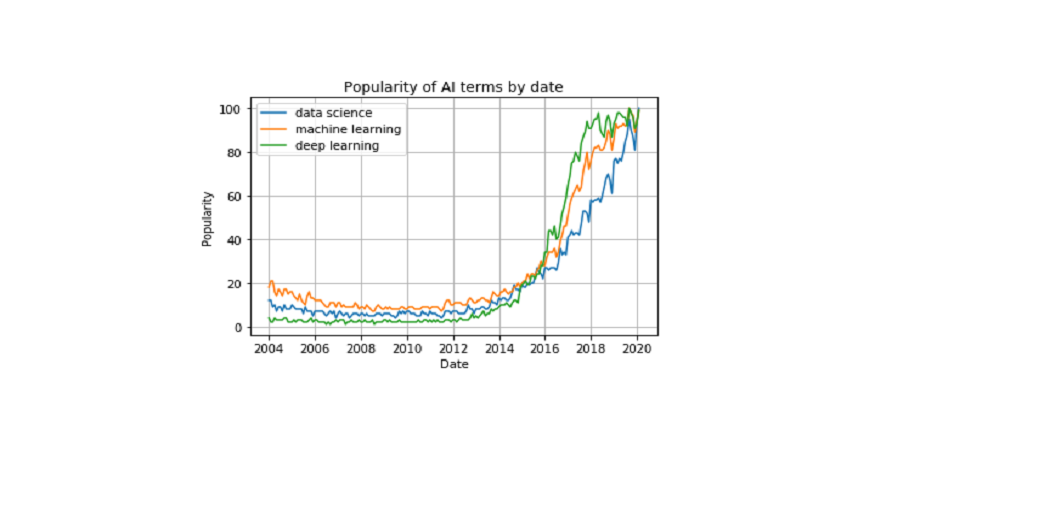
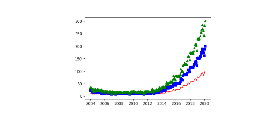
plt.plot(df['Mes'], df['data science'], label='data science')
We can make graphs of many variations on the same graph and compare them.
plt.plot(df['Mes'], df['data science'], label='data science')
plt.plot(df['Mes'], df['machine learning'], label='machine learning')
plt.plot(df['Mes'], df['deep learning'], label='deep learning')
plt.xlabel('Date')
plt.ylabel('Popularity')
plt.title('Popularity of AI terms by date')
plt.grid(True)
plt.legend()
If you are working with Python from a terminal or script, after explaining the graph of the functions listed above use plt.show (). If working from Jupyter notebook, add% matplotlib to the queue at the beginning of the file and run it before creating a chart.
We can do many graphics in one number. This is best done by comparing charts or sharing information from several types of charts easily with a single image.
Seaborn is a library based on Matplotlib. Basically what it offers us are beautiful drawings and works to create complex types of drawings with just one line of code.
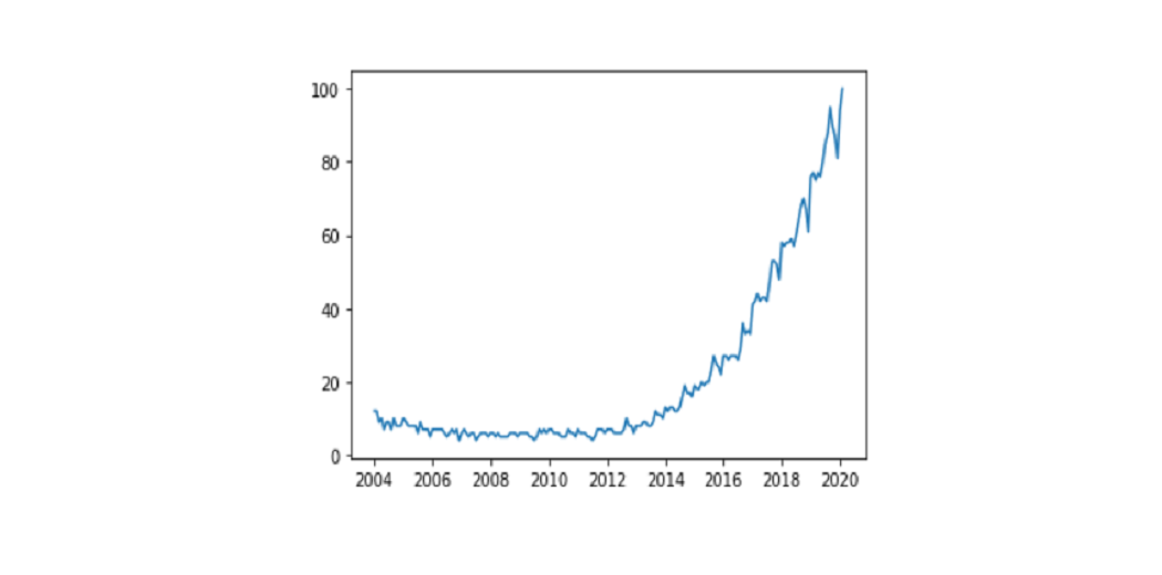
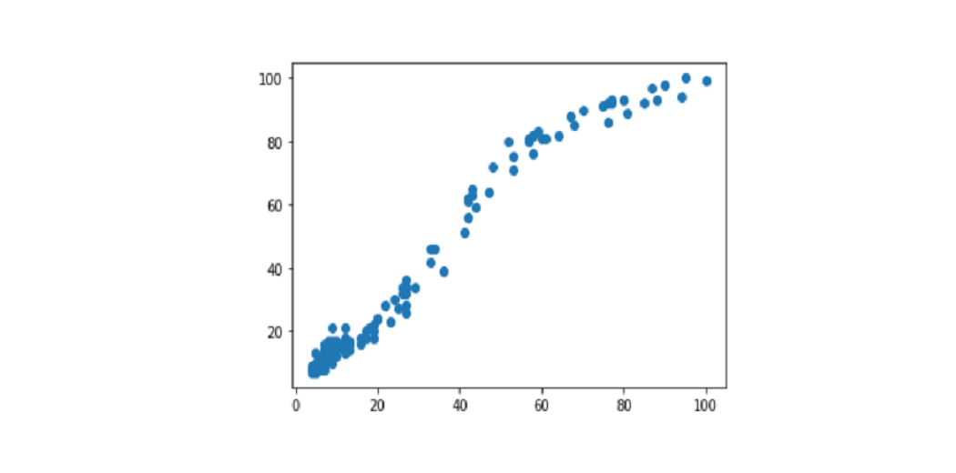
We enter the library and start drawing style with sns.set (), without this command the graphics will still have the same style as Matplotlib. We show you one of the simplest graphics, scatterplot.
import seaborn as sns
sns.set()
sns.scatterplot(df['Mes'], df['data science'])
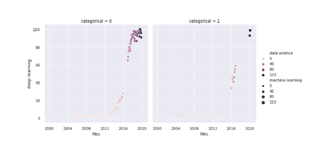
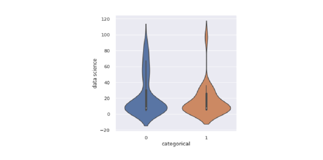
We can add details of more than two changes to the same graph. In this case, we use colors and sizes. We also create a separate graph depending on the category column value:
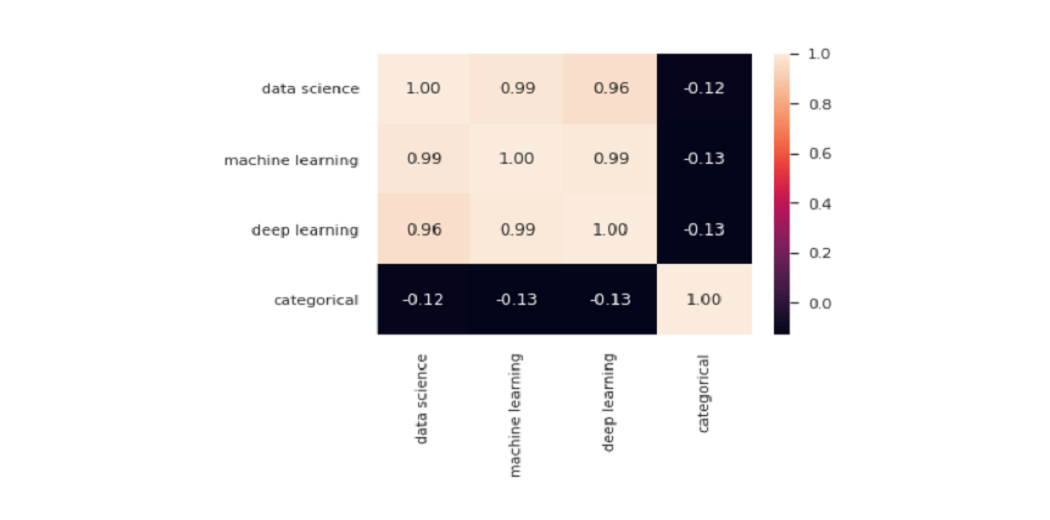
One of the most popular drawings provided by Seaborn is the heatmap. It is very common to use it to show all connections between variables in the dataset:
sns.heatmap(df.corr(), annot=True, fmt='.2f')
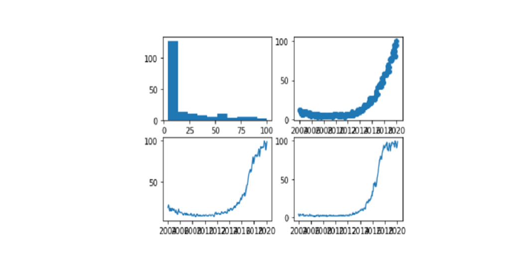
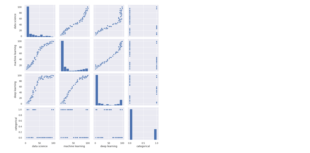
Another favorite is the pair plot which shows the relationship between all the variables. Be aware of this function if you have a large database, as it should show all data points as often as columns, meaning that by increasing the data size, the processing time is greatly increased.
sns.pairplot(df)
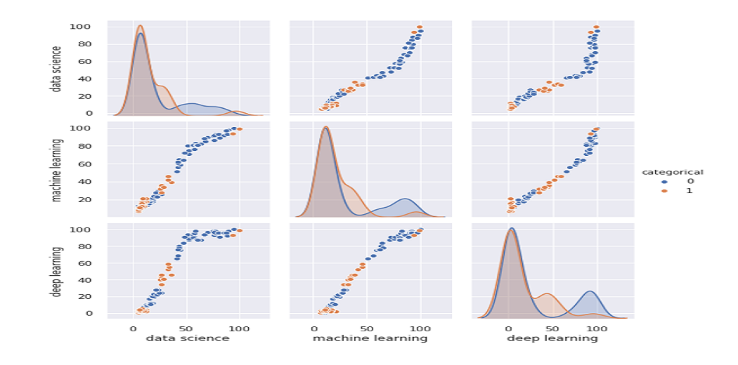
Now let’s make a pair plot showing charts divided into price range by category
sns.pairplot(df, hue='categorical')
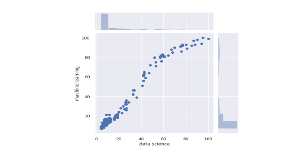
A very informative joint plot graph that allows us to see the spread plot as well as the histogram of two types and see how they are distributed:
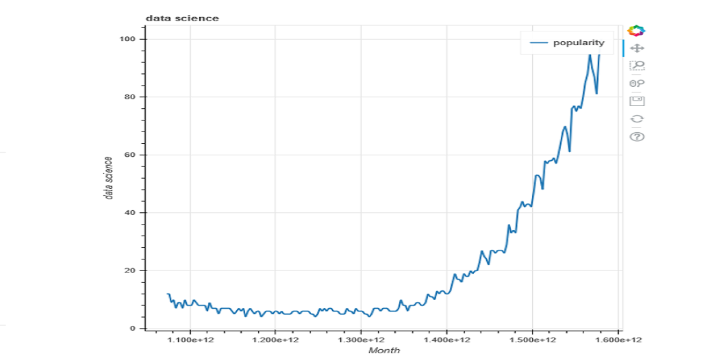
Bokeh is a library that allows you to produce interactive graphics. We can send them to HTML text that we can share with anyone with a web browser.
It is a very useful library where we have the desire to look at things in drawings and want to be able to zoom in on a picture and walk around the picture. Or when we want to share it and allow someone else to test the data.
We start by entering the library and defining the file to save the graph:
from bokeh.plotting import figure, output_file, save
output_file('data_science_popularity.html')
Some data visualization tools help in visualizing the data effectively and faster than the traditional python coding method. These are some of the examples:
Databox
Databox is a data recognition tool used by more than 15,000 businesses and marketing agencies. Databox pulls your data in one place to track real-time performance with attractive displays.
Databox is ideal for marketing groups that want to be quickly set up with dashboards. With a single 70+ combination and no need to code, it is a very easy tool to use.
Zoho Analytics
Zoho Analytics is probably one of the most popular BI tools on this list. One thing you can be sure of is that with Zoho analytics, you can upload your data securely. Additionally, you can use a variety of charts, tables, and objects to transform your data concisely.
Tableau
If you want to easily visualize and visualize data, then Tableau is a tool for visualizing your data. It helps you to create charts, maps, and all other technical graphics. To improve your visual presentation, you can also get a desktop app.
Additionally, if you are experiencing a problem with the installation of any third-party application, then it provides a “lock server” solution to help visualize online and mobile messaging applications.
You can check out my article on Analytics Vidhya for more information on trending Data Visualization Tools. Top 10 Data Visualization Tools.
Conclusion
With all these different libraries you may be wondering which library is right for your project. The quick answer is a library that lets you easily create the image you want.
In the initial stages of the project, with pandas and pandas profiling we will make a quick visualization to understand the data. If we need to visualize more details we can use simple graphs that we can find in the plots such as scatterplots or histograms.
With the advanced stages of the project, we can search the main library galleries (Matplotlib, Seaborn, Bokeh, Altair) with the drawings we like and that fit the project. These diagrams can be used to provide information in reports, generate interaction reports, and search for specific values.
End Notes
In this article, we discussed Data Visualization. Some basic formats of data visualization and some practical implementation of python libraries for data visualization. Finally, we concluded with some tools which can perform the data visualization in python effectively.
If you have any doubt or any feedback feel free to share with us in the comments below. You can check out more articles on Data Visualization on Analytics Vidhya Blog.
Thanks For Reading!
About Me:
Hey, I am Sharvari Raut. I love to write!
Technical Writer | AI Developer | Avid Reader | Data Science | Open Source Contributor
I am Sharvari Raut. I love to write. I am a final year student in Computer Science and Engineering from NCER Pune. I have worked as a freelance technical writer for few startups and companies. Having 2 yrs of experience in Technical Writing I have written over 100+ technical articles which are published till now. Writing for Analytics Vidhya is one of my favourite things to do.
A verification link has been sent to your email id
If you have not recieved the link please goto
Sign Up page again
Loading...
Please enter the OTP that is sent to your registered email id
Loading...
Please enter the OTP that is sent to your email id
Loading...
Please enter your registered email id
This email id is not registered with us. Please enter your registered email id.
Don't have an account yet?Register here
Loading...
Please enter the OTP that is sent your registered email id
Loading...
Please create the new password here
We use cookies on Analytics Vidhya websites to deliver our services, analyze web traffic, and improve your experience on the site. By using Analytics Vidhya, you agree to our Privacy Policy and Terms of Use.Accept
Privacy & Cookies Policy
Privacy Overview
This website uses cookies to improve your experience while you navigate through the website. Out of these, the cookies that are categorized as necessary are stored on your browser as they are essential for the working of basic functionalities of the website. We also use third-party cookies that help us analyze and understand how you use this website. These cookies will be stored in your browser only with your consent. You also have the option to opt-out of these cookies. But opting out of some of these cookies may affect your browsing experience.
Necessary cookies are absolutely essential for the website to function properly. This category only includes cookies that ensures basic functionalities and security features of the website. These cookies do not store any personal information.
Any cookies that may not be particularly necessary for the website to function and is used specifically to collect user personal data via analytics, ads, other embedded contents are termed as non-necessary cookies. It is mandatory to procure user consent prior to running these cookies on your website.