End-to-End Predictive Analysis on Uber’s Data
This article was published as a part of the Data Science Blogathon
Introduction

Uber is an international company located in 69 countries and around 900 cities around the world. Lyft, on the other hand, operates in approximately 644 cities in the US and 12 cities in Canada alone. However, in the US, it is the second-largest passenger company with a market share of 31%.
From booking a taxi to paying a bill, both services have similar features. But there are some exceptions when the two passenger services reach the neck. The same goes for prices, especially Uber’s “surge” and “Prime Time” in Lyft. There are certain limitations that depend on where service providers are classified.
Many articles focus on algorithm/model learning, data purification, feature extraction, and fail to define the purpose of the model. Understanding the business model can help identify challenges that can be solved using analytics and scientific data. In this article, we go through the Uber Model, which provides a framework for end-to-end prediction analytics of Uber data prediction sources.
Table of content
- Uber
- Uber’s Machine Learning Model
- Scaling Machine Learning at Uber
- Uber’s Dynamic Pricing Model
- Business Problem
- Exploratory Data Analysis and Predictive Modelling on Uber Pickups
- Conclusion
- Useful Resources and References
- EndNotes
Overview of Uber

Uber’s Machine Learning Model
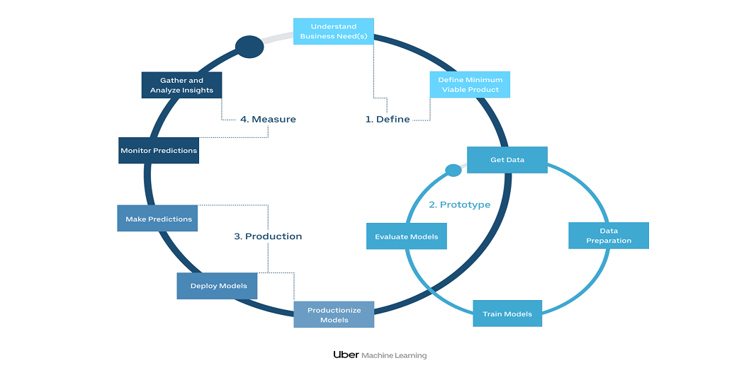
Michelangelo’s “zero-to-one speed” or “value-to-one speed” is crucial to how ML spreads to Uber. In new applications, we focus on reducing barriers to entry by streamlining the workflow of people with different skills and having a consistent flow to achieve a basic model and work with good diversity.
For existing projects, we look at the speed of iteration, which shows how data scientists can quickly and get feedback on their new models or features in offline testing or online testing.
- Solve data problems so that data scientists are not needed.
- Dealing with data access, integration, feature management, and plumbing can be time-consuming for a data expert. Michelangelo’s feature shop and feature pipes are essential in solving a pile of data experts in the head.
- Change or provide powerful tools to speed up the normal flow.
- Make the delivery process faster and more magical.
- Michelangelo hides the details of deploying and monitoring models and data pipelines in production after a single click on the UI.
- Let the user use their favorite tools with small cruft – “Go to the customer”.
- Michelangelo allows for the development of collaborations in Python, textbooks, CLIs, and includes production UI to manage production programs and records.
- Enable interaction and reuse.
- Also, Michelangelo’s feature shop is important in enabling teams to reuse key predictive features that have already been identified and developed by other teams.
- Guide the user through organized workflows.
End-to-end workflow
1. Define
2. Prototype
3. Production
4. Measure
1. Customer Feedback · 2. Customer Sentiments · 3. Side Company Data · 4. Situation Analysis Requires collecting learning information for making Uber more effective and improve in the next update.
Scaling Machine Learning at Uber

Image 4
Organization
Process
Technology
Uber’s Dynamic Pricing Model

How does Uber price work?
If you request a ride on Saturday night, you may find that the price is different from the cost of the same trip a few days earlier. That’s because of our dynamic pricing algorithm, which converts prices according to several variables, such as the time and distance of your route, traffic, and the current need of the driver. In some cases, this may mean a temporary increase in price during very busy times.
Why are Uber rates changing?
Price range
Uber Top Hours
- Friday and Saturday nights
- After-work hour fast
- Major events and celebrations
- Strong prices help us to ensure that there are always enough drivers to handle all our travel requests, so you can ride faster and easier – whether you and your friends are taking this trip or staying up to you.
Business Problem

Depending on how much data you have and features, the analysis can go on and on. The following questions are useful to do our analysis:
a. How many times have I traveled in the past?
b. How many trips were completed and canceled?
c. Where did most of the layoffs take place?
d. What type of product is most often selected?
e. What a measure. fare, distance, amount, and time spent on the ride?
f. Which days of the week have the highest fare?
g. Which is the longest / shortest and most expensive / cheapest ride?
h. What is the average lead time before requesting a trip?
Data visualization is certainly one of the most important stages in Data Science processes. While simple, it can be a powerful tool for prioritizing data and business context, as well as determining the right treatment before creating machine learning models.
Exploratory Data Analysis and Predictive Modelling on Uber Pickups
The day-to-day effect of rising prices varies depending on the location and pair of the Origin-Destination (OD pair) of the Uber trip: at accommodations/train stations, daylight hours can affect the rising price; for theaters, the hour of the important or famous play will affect the prices; finally, attractively, the price hike may be affected by certain holidays, which will increase the number of guests and perhaps even the prices; Finally, at airports, the price of escalation will be affected by the number of periodic flights and certain weather conditions, which could prevent more flights to land and land.
The weather is likely to have a significant impact on the rise in prices of Uber fares and airports as a starting point, as departure and accommodation of aircraft depending on the weather at that time. Different weather conditions will certainly affect the price increase in different ways and at different levels: we assume that weather conditions such as clouds or clearness do not have the same effect on inflation prices as weather conditions such as snow or fog. As for the day of the week, one thing that really matters is to distinguish between weekends and weekends: people often engage in different activities, go to different places, and maintain a different way of traveling during weekends and weekends. With forecasting in mind, we can now, by analyzing marine information capacity and developing graphs and formulas, investigate whether we have an impact and whether that increases their impact on Uber passenger fares in New York City.
You can download the dataset from Kaggle or you can perform it on your own Uber dataset. I have taken the dataset from Felipe Alves Santos Github.
Data Preprocessing:
Python Code:
#Dataset information
rides.info()
RangeIndex: 554 entries, 0 to 553
Data columns (total 13 columns):
# Column Non-Null Count Dtype
— —— ————– —–
0 City 554 non-null int64
1 Product Type 551 non-null object
2 Trip or Order Status 554 non-null object
3 Request Time 554 non-null object
4 Begin Trip Time 554 non-null object
5 Begin Trip Lat 525 non-null float64
6 Begin Trip Lng 525 non-null float64
7 Dropoff Time 554 non-null object
8 Dropoff Lat 525 non-null float64
9 Dropoff Lng 525 non-null float64
10 Distance (miles) 554 non-null float64
11 Fare Amount 554 non-null float64
12 Fare Currency 551 non-null object
dtypes: float64(6), int64(1), object(6)
memory usage: 56.4+ KB
Data Cleaning:
While analyzing the first column of the division, I clearly saw that more work was needed, because I could find different values referring to the same category. After that, I summarized the first 15 paragraphs out of 5.
# Checking categories in product_type column
print(rides.product_type.value_counts())
# Categories reclassification
product_mapping = {'UberX':'UberX','uberX':'UberX','uberX VIP':'UberX','VIP':'UberX','POOL':'Pool','POOL: MATCHED':'Pool','UberBLACK': 'Black',
                   'uberx':'UberX','uberPOOL':'Pool','uberPOOL: MATCHED':'Pool','Pool: MATCHED':'Pool'}
# New categories replacement
rides['product_type'].replace(product_mapping, inplace=True)
# Checking new categories in product_type column
print(rides.product_type.value_counts())
Since most of these reviews are only around Uber rides, I have removed the UberEATS records from my database.
rides = rides[rides.product_type!='UberEATS Marketplace']
The days tend to greatly increase your analytical ability because you can divide them into different parts and produce insights that come in different ways. As shown earlier, our feature days are of object data types, so we need to convert them into a data time format.
# Library for manipulating dates and times
from datetime import datetime
from datetime import timedelta
# Function to convert features to datetime
def date_convertion(df, cols):
  for col in cols:
    df[col] = df[col].apply(lambda x: x.replace(' +0000 UTC', ''))
    df[col] = pd.to_datetime(df[col])
  return df
# Applying date_convertion function to date features
rides = date_convertion(rides, ['request_time', 'begin_time', 'dropoff_time'])
Now, let’s split the feature into different parts of the date. I did it just for because I think all the rides were completed on the same day (believe me, I’m looking forward to that !: D).
rides['year'] = rides.request_time.map(lambda x: datetime.strftime(x,"%Y"))
rides['month'] = rides.request_time.map(lambda x: datetime.strftime(x,"%b"))
rides['weekday'] = rides.request_time.map(lambda x: datetime.strftime(x,"%a"))
rides['time'] = rides.request_time.map(lambda x: datetime.strftime(x,"%H:%M"))
Feature Engineering:
Based on the features of and I have created a new feature called, which will help us understand how much it costs per kilometer.
rides['distance_km'] = round(rides.distance_miles*1.60934,2)
rides['amount_km'] = round(rides.fare_amount/rides.distance_km,2)
Delta time between and will now allow for how much time (in minutes) I usually wait for Uber cars to reach my destination. In this case, it is calculated on the basis of minutes.
rides['request_lead_time'] = rides.begin_time - rides.request_time
rides['request_lead_time'] = rides['request_lead_time'].apply(lambda x: round(x.total_seconds()/60,1))
Similarly, the delta time between and will now allow for how much time (in minutes) is spent on each trip.
rides['trip_duration'] = rides.dropoff_time - rides.begin_time
rides['trip_duration'] = rides['trip_duration'].apply(lambda x: round(x.total_seconds()/60,1))
Since features on Driver_Cancelled and Driver_Cancelled records will not be useful in my analysis, I set them as useless values to clear my database a bit.
rides.loc[(rides.status == 'CANCELED') | (rides.status == 'DRIVER_CANCELED'),'request_lead_time']=np.nan
rides.loc[(rides.status == 'CANCELED') | (rides.status == 'DRIVER_CANCELED'),'amount_km']=np.nan
rides.loc[(rides.status == 'CANCELED') | (rides.status == 'DRIVER_CANCELED'),['begin_time','dropoff_time']]= np.nan
Data Analysis:
In order to better organize my analysis, I will create an additional data-name, deleting all trips with CANCER and DRIVER_CANCELED, as they should not be considered in some queries.
completed_rides = rides[(rides.status!='CANCELED')&(rides.status!='DRIVER_CANCELED')]
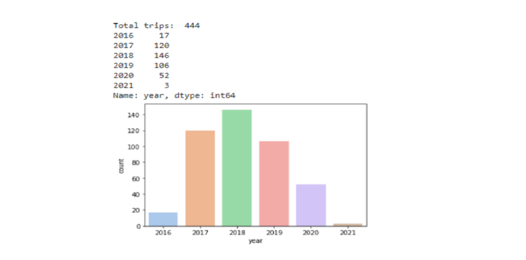
a. How many times have I traveled in the past?
Uber rides made some changes to gain the trust of their customer back after having a tough time in covid, changing the capacity, safety precautions, plastic sheets between driver and passenger, temperature check, etc.
print('Total trips: ', completed_rides.status.count())
print(completed_rides.year.value_counts().sort_index(ascending=True))
sns.countplot(data=completed_rides, x='year',order=['2016','2017','2018','2019','2020','2021'], palette='pastel');
b. How many trips were completed or canceled?
print('Total trips: ', rides.status.count())
print(round(rides.status.value_counts()/rides.status.size*100,1))
#sns.countplot(data=rides, x='year', order=['2015','2016','2017','2018','2019','2020','2021'], hue='status', palette='coolwarm');
rides.groupby(by=['year'])['status'].value_counts(normalize=True).unstack('status').plot.bar(stacked=True);
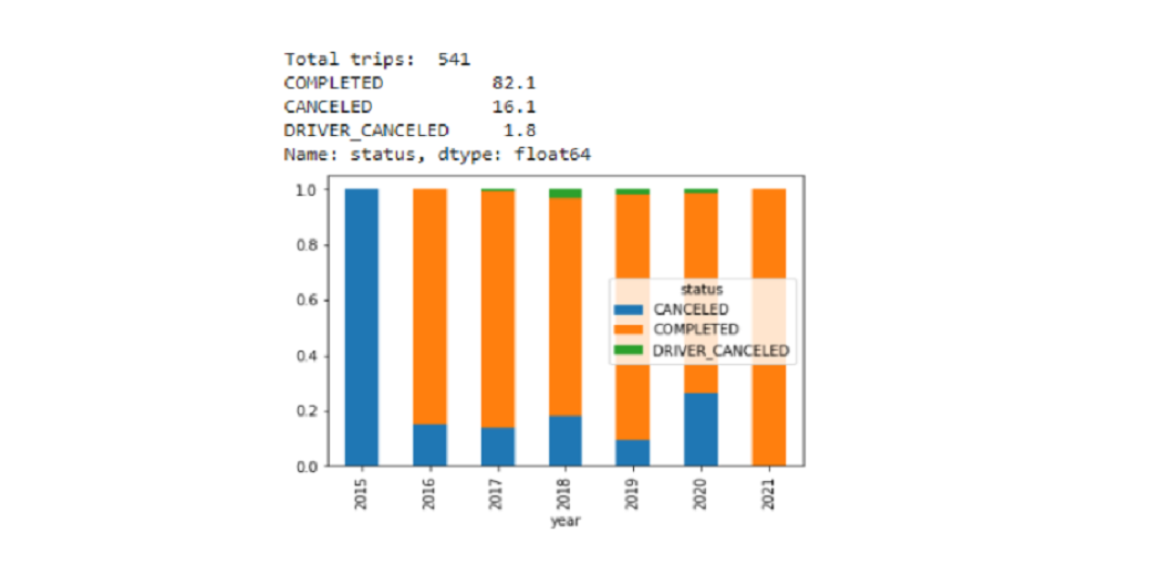
Covid affected all kinds of services as discussed above Uber made changes in their services. High prices also, affect the cancellation of service so, they should lower their prices in such conditions.
c. Where did most of the layoffs take place?
import folium
from folium import plugins
coord=[]
for lat,lng in zip(completed_rides.dropoff_lat.values,completed_rides.dropoff_lng.values):
  coord.append([lat,lng])
map = folium.Map(
    location=[-23.5489,-46.6388],
    tiles='Stamen Terrain',
    zoom_start=7,
    width='80%',
    height='50%',
    control_scale=True)
map.add_child(plugins.HeatMap(coord))
map
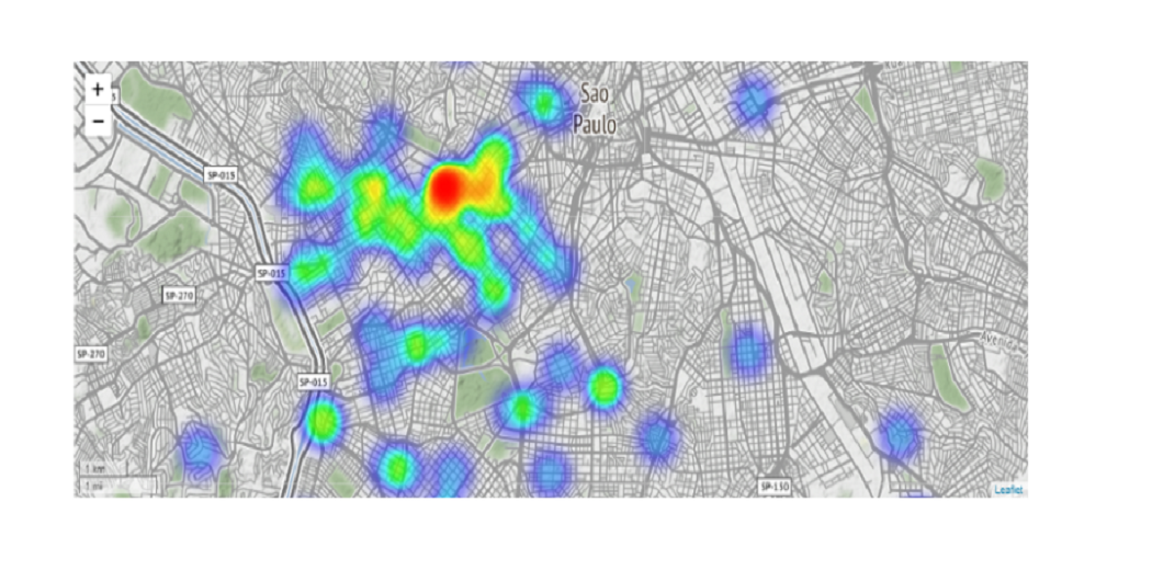
The above heatmap shows the red is the most in-demand region for Uber cabs followed by the green region. Uber should increase the number of cabs in these regions to increase customer satisfaction and revenue.
d. What type of product is most often selected?
# Creating a serie with product types count
pt_rides = pd.Series(completed_rides.product_type.value_counts().sort_index(ascending=False))
# Transforming serie in dataframe
df = pd.DataFrame(pt_rides)
# Including new column with trips portion
df['%'] = (completed_rides.product_type.value_counts().sort_index(ascending=False)/completed_rides.product_type.size*100).round(1)
#Renaming columns labels
df.rename(columns={'product_type':'Total Rides'}, inplace=True)
print(df)
# Plotting product types count
completed_rides['product_type'].value_counts().plot(kind='bar');
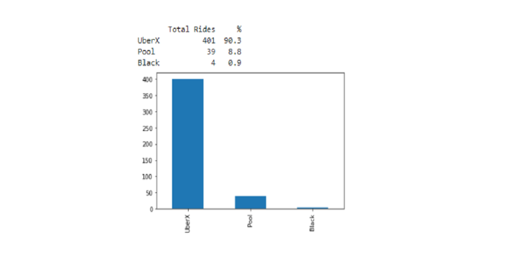
Since not many people travel through Pool, Black they should increase the UberX rides to gain profit. As it is more affordable than others.
e. How much is the fare, distance, amount, and time spent on the ride?
print('Avg. fare:', round(completed_rides.fare_amount.mean(),1),'BRL')
print('Avg. distance:',round(completed_rides.distance_km.mean(),1),'km')
print('Avg. fare/km:',round(completed_rides.fare_amount.sum()/completed_rides.distance_km.sum(),1),'BRL/km')
print('Avg. time spent on trips:',round(completed_rides.trip_duration.mean(),1),'minutes')
print('')
print('Total fare amount:', round(completed_rides.fare_amount.sum(),1),'BRL')
print('Total distance:',round(completed_rides.distance_km.sum(),1),'km')
print('Total time spent on trips:',round(completed_rides.trip_duration.sum()/60,1),'hours')
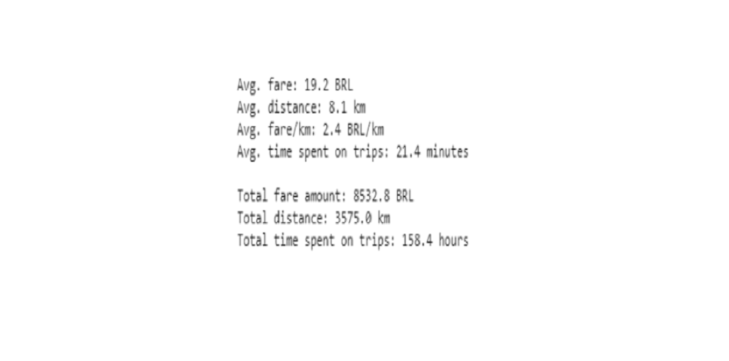
Uber can lead offers on rides during festival seasons to attract customers which might take long-distance rides.
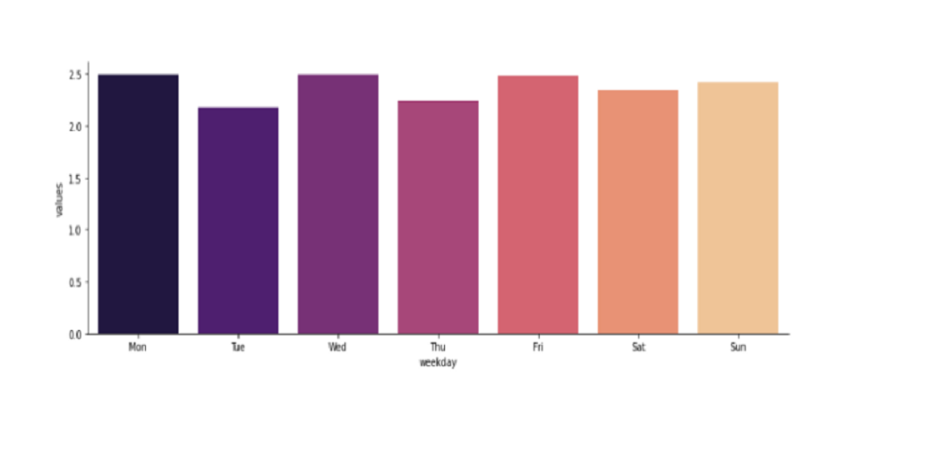
f. Which days of the week have the highest number of rides per kilometer?
#overlapping pivot tables to get weighted average
amount_table = completed_rides.pivot_table(values='fare_amount',aggfunc='sum',columns='weekday', index='year').round(1)
column_order = ['Mon','Tue','Wed','Thu','Fri','Sat','Sun']
amount_table = amount_table.reindex(column_order, axis=1)
distance_table = completed_rides.pivot_table(values='distance_km',aggfunc='sum',columns='weekday', index='year').round(1)
distance_table = distance_table.reindex(column_order, axis=1)
(amount_table/distance_table).round(1)
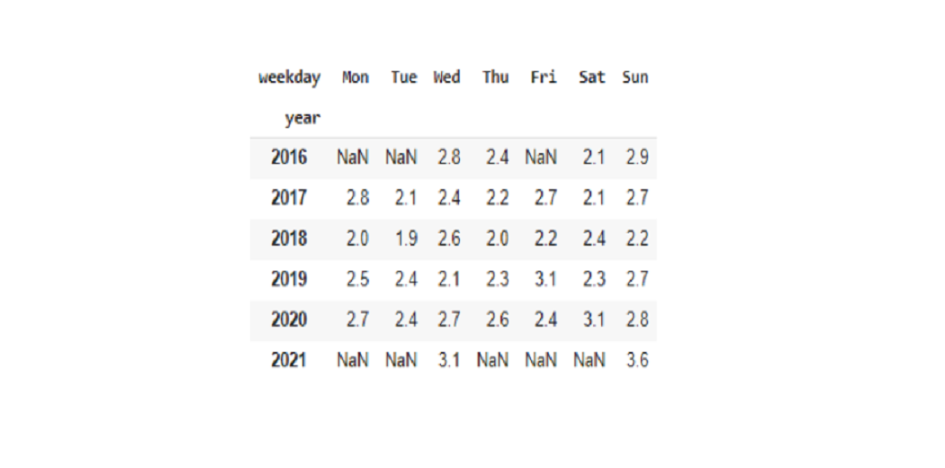
Most of the Uber ride travelers are IT Job workers and Office workers. They prefer traveling through Uber to their offices during weekdays. So, there are not many people willing to travel on weekends due to off days from work.
#creating an auxiliar data frame to be displayed in category plot
aux_serie = round((completed_rides.groupby('weekday')['fare_amount'].sum()/completed_rides.groupby('weekday')['distance_km'].sum()),2)
amount_km_df = pd.DataFrame(aux_serie)
amount_km_df = amount_km_df.reset_index()
amount_km_df.rename(columns={'weekday':'weekday',0:'values'},inplace=True)
sns.catplot(x='weekday', y='values', data=amount_km_df, kind='bar', height=4, aspect=3, order=['Mon','Tue','Wed','Thu','Fri','Sat','Sun'],palette='magma');
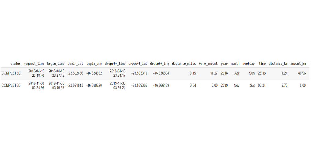
g. Which is the longest / shortest and most expensive / cheapest ride?
rides_distance = rides_distance.append(completed_rides[completed_rides.distance_km==completed_rides.distance_km.min()])
rides_distance
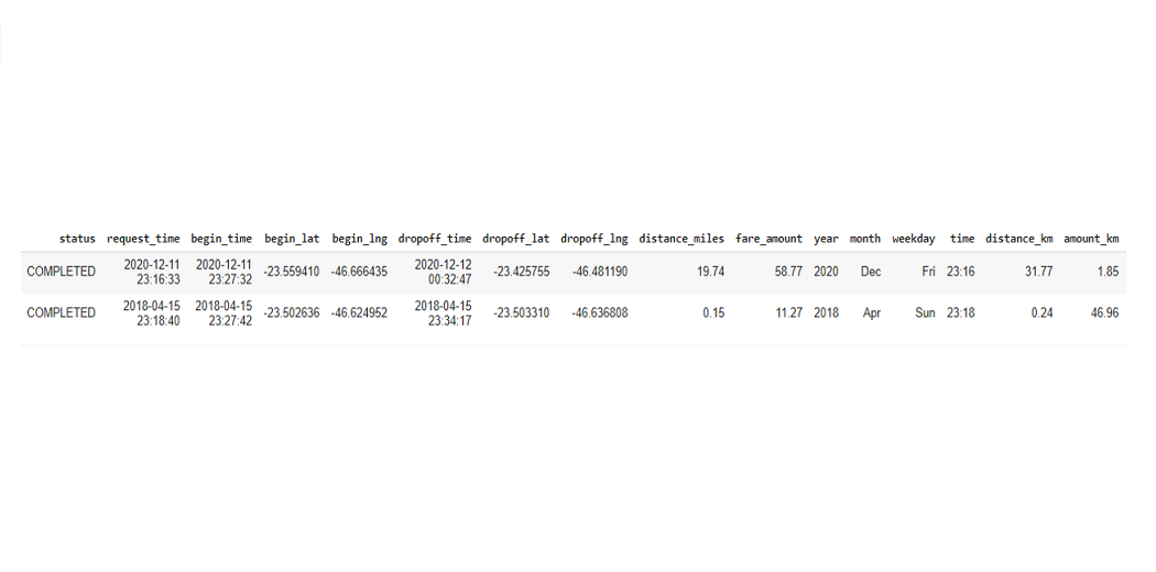
The full paid mileage price we have: expensive (46.96 BRL / km) and cheap (0 BRL / km). Cheap travel certainly means a free ride, while the cost is 46.96 BRL. This result is driven by a constant low cost at the most demanding times, as the total distance was only 0.24km.
rides_amount_km = completed_rides[completed_rides.amount_km==completed_rides.amount_km.max()]
rides_amount_km = rides_amount_km.append(completed_rides[completed_rides.amount_km==completed_rides.amount_km.min()])
rides_amount_km
Short-distance Uber rides are quite cheap, compared to long-distance. Uber can fix some amount per kilometer can set minimum limit for traveling in Uber.
h. What is the average lead time before requesting a trip?
print(round(completed_rides.request_lead_time.mean(),1),'minutes')
4.9 minutes
Conclusion
After analyzing the various parameters, here are a few guidelines that we can conclude. If you were a Business analyst or data scientist working for Uber or Lyft, you could come to the following conclusions:
- Uber is very economical; however, Lyft also offers fair competition.
- People prefer to have a shared ride in the middle of the night.
- People avoid riding when it rains.
- When traveling long distances, the price does not increase by line. However, based on time and demand, increases can affect costs.
- Uber could be the first choice for long distances.
However, obtaining and analyzing the same data is the point of several companies. There are many businesses in the market that can help bring data from many sources and in various ways to your favorite data storage.
Useful Resources and References
- Kaggle – Explanatory Data Analysis
- Analytics Vidhya – Uber and Lyft
- Research Gate – Explanatory Data Analysis
- Medium (towardsdatascience) Felipe Alves Santos – Explanatory Data Analysis and Business Problem
- Uber Blog – Dynamic pricing model
- Unsplash – Images
- Uber Auth – Dataset
- Kaggle – Dataset for New York Pickups
- Uber Blog – Scaling Machine Learning at Uber & Uber’s Machine Learning Model
End Notes
In this article, we discussed Data Visualization. Some basic formats of data visualization and some practical implementation of python libraries for data visualization. Finally, we concluded with some tools which can perform the data visualization effectively.
If you have any doubt or any feedback feel free to share with us in the comments below. You can check out more articles on Data Visualization on Analytics Vidhya Blog.
Thanks For Reading!
About Me:
Hey, I am Sharvari Raut. I love to write!
Technical Writer | AI Developer | Avid Reader | Data Science | Open Source Contributor
Connect with me on:
Twitter: https://twitter.com/aree_yarr_sharu
LinkedIn: https://t.co/g0A8rcvcYo?amp=1
Github: https://github.com/sharur7
Fiverr: https://www.fiverr.com/ssraut
Image Source
- Image 1 – https://unsplash.com/@thoughtcatalog
- Image 2 – https://unsplash.com/@priscilladupreez
- Image 3 – https://eng.uber.com/scaling-michelangelo/
- Image 4 – https://eng.uber.com/scaling-michelangelo/
- Image 5 – https://unsplash.com/@plhnk
- Image 6 – https://unsplash.com/@austindistel
I am Sharvari Raut. I love to write. I am a final year student in Computer Science and Engineering from NCER Pune. I have worked as a freelance technical writer for few startups and companies. Having 2 yrs of experience in Technical Writing I have written over 100+ technical articles which are published till now. Writing for Analytics Vidhya is one of my favourite things to do.


I am iqbal . I love to write. I am a final year student in Computer Science and Engineering from NCER Pune.