Churn Analysis of a Telecom Company
This article was published as a part of the Data Science Blogathon.
Overview
In this article, we will be working on the telecom churn analysis and here we will be doing a complete EDA process to determine if the customer from that particular telecom industry will leave that telecom service or not meanwhile we will draw some insights from data visualization and analysis so that we could get the factors which will affect the output i.e. churn of the customer.

Dataset Info
The dataset is the sample dataset if we know the difference between the sample and the population dataset then we may know that sample is drawn randomly from the population and this sample dataset has the customers who have left the telecom company.
Import the required libraries
import numpy as np
import pandas as pd
import seaborn as sns
import matplotlib.ticker as mtick
import matplotlib.pyplot as plt
%matplotlib inline
Load the data file
telecom = pd.read_csv('WA_Fn-UseC_-Telco-Customer-Churn.csv')
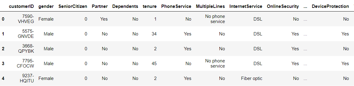
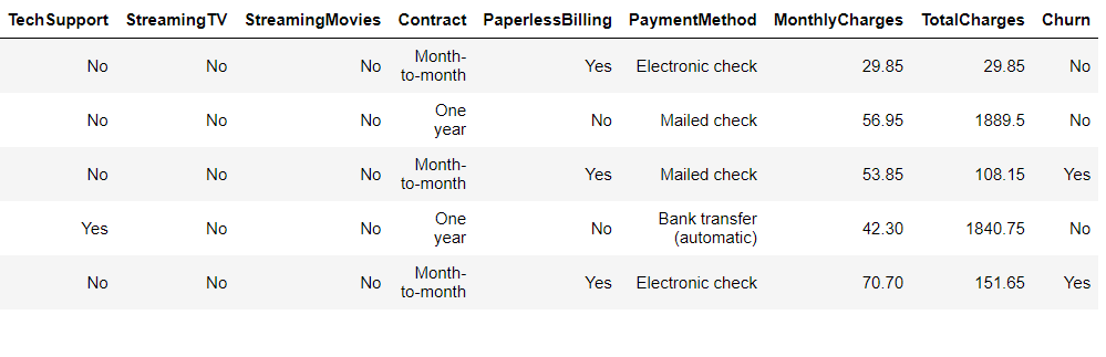
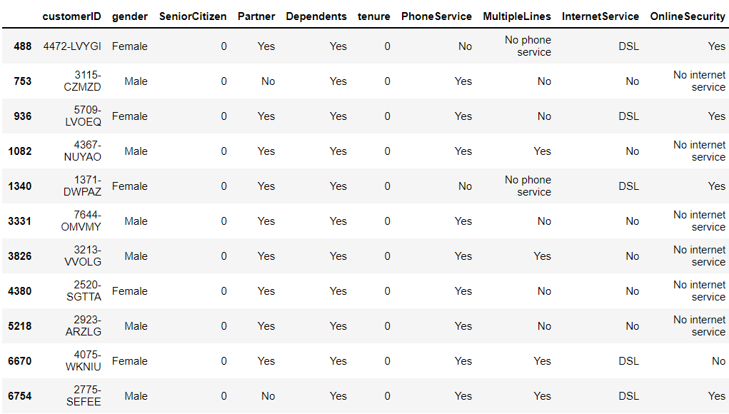
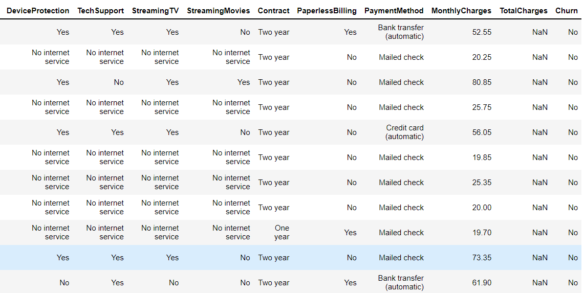
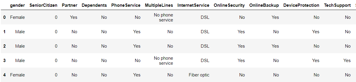
Now while using the head function we can see that beginning records.
telecom.head()
Output:
From the shape attribute, we can see the shape of the data i.e number of records and number of columns in the dataset like (1200,13) so that particular dataset will have 1200 rows and 13 columns.
telecom.shape
Output:
(7043, 21)
Now let’s see the columns in our dataset.
telecom.columns.values
Output:
array(['customerID', 'gender', 'SeniorCitizen', 'Partner', 'Dependents',
       'tenure', 'PhoneService', 'MultipleLines', 'InternetService',
       'OnlineSecurity', 'OnlineBackup', 'DeviceProtection',
       'TechSupport', 'StreamingTV', 'StreamingMovies', 'Contract',
       'PaperlessBilling', 'PaymentMethod', 'MonthlyCharges',
       'TotalCharges', 'Churn'], dtype=object)
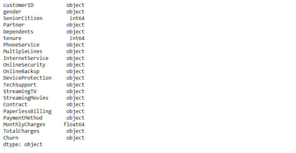
Here we will be checking what type of data our dataset holds.
telecom.dtypes
Output:
Now let’s see the statistics part of our data i.e. mean, standard deviation, and so on.
telecom.describe()
Output:
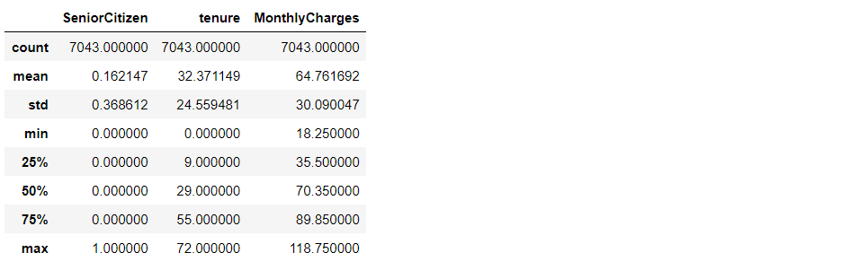
Inference:
- Senior citizen is actually categorical hence the 25%-50%-75% distribution is not proper
- We can also conclude that 75% of people have tenure.
- Average Monthly charges are USD 64.76 whereas 25% of customers pay more than USD 89.85 per month
telecom['Churn'].value_counts().plot(kind='barh', figsize=(8, 6))
plt.xlabel("Count", labelpad=14)
plt.ylabel("Target Variable", labelpad=14)
plt.title("Count of TARGET Variable per category", y=1.02)
Output:
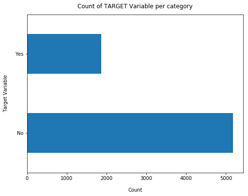
100*telecom['Churn'].value_counts()/len(telecom['Churn'])
Output:
No     73.463013
Yes    26.536987
Name: Churn, dtype: float64
Let’s see the value count of our target variable
telecom['Churn'].value_counts()
Output:
No     5174
Yes    1869
Name: Churn, dtype: int64
Inference: From the above analysis we can conclude that.
- In the above output, we can see that our dataset is not balanced at all i.e. Yes is 27 around and No is 73 around
- So we analyze the data with other features while taking the target values separately to get some insights.
This code will return us valid and valuable information about the dataset also we can see that the verbose mode is on so it will give all the hidden information also.
telecom.info(verbose = True)
Output:
missing = pd.DataFrame((telecom.isnull().sum())*100/telecom.shape[0]).reset_index()
plt.figure(figsize=(16,5))
ax = sns.pointplot('index',0,data=missing)
plt.xticks(rotation =90,fontsize =7)
plt.title("Percentage of Missing values")
plt.ylabel("PERCENTAGE")
plt.show()
Output:
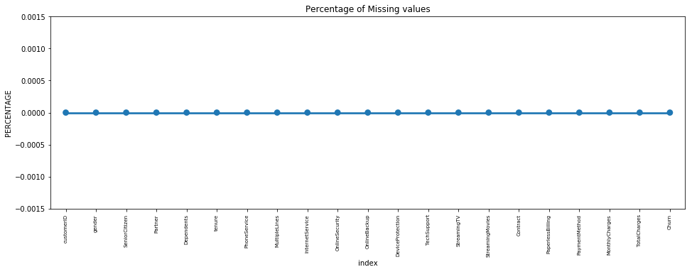
Missing Data – Initial Intuition
Here, we don’t have any missing data.
General Thumb Rules:
- When we see a lot of outliers in the dataset then don’t really use mean because if the dataset has lots of outliers then we would be in the situation where the regression analysis will have drastic changes.
- And if we get features that have a high number of missing values then it’s better to drop them.
- As there’s no thumb rule on what criteria do we delete the columns with a high number of missing values, still one can delete the columns, if you have more than 30-40% of missing values.
Data Cleaning
1. Here we will be copying the telecom data to preprocess it further.
telco_data = telecom.copy()
2. Total Charges should be numeric amounts. So it’s better to convert them to numeral types.
telco_data.TotalCharges = pd.to_numeric(telco_data.TotalCharges, errors='coerce')
telco_data.isnull().sum()
Output:
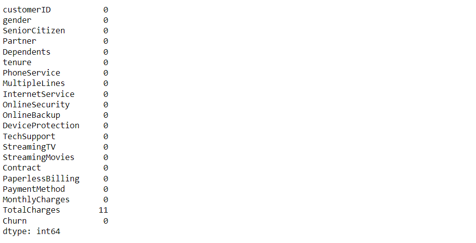
3. Here we can see that there are a lot of missing values in the Total charges column.
telco_data.loc[telco_data ['TotalCharges'].isnull() == True]
Output:
4. Missing Value Treatment
Since the % of these records compared to a total dataset is very low ie 0.15%, it is safe to ignore them from further processing.
Removing missing values
telco_data.dropna(how = 'any', inplace = True)
#telco_data.fillna(0)
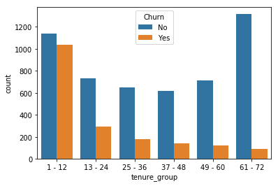
5. Now we will be dividing the persons e.g. for tenure < 12 months: assign a tenure group of 1-12, for tenure between 1 to 2 Yrs, tenure group of 13-24; so on.
Get the max tenure
print(telco_data['tenure'].max())
Output:
72
Here we will try to group the tenures
telco_data['tenure_group'].value_counts()
Output:
1 - 12     2175
61 - 72    1407
13 - 24    1024
49 - 60     832
25 - 36     832
37 - 48     762
Name: tenure_group, dtype: int64
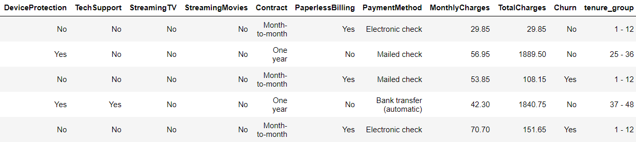
6. Remove columns not required for processing
Drop column customerID and tenure
telco_data.drop(columns= ['customerID','tenure'], axis=1, inplace=True)
telco_data.head()
Output:
Data Exploration
Univariate Analysis
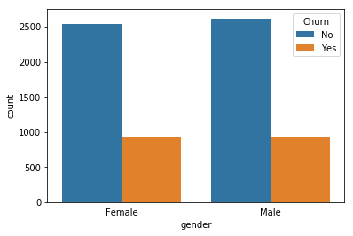
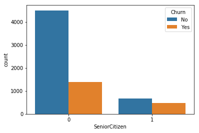
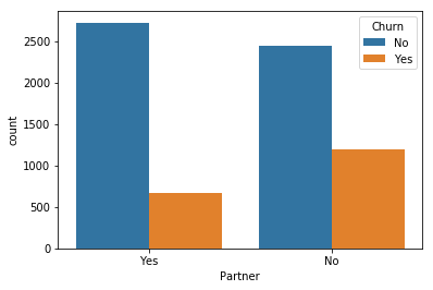
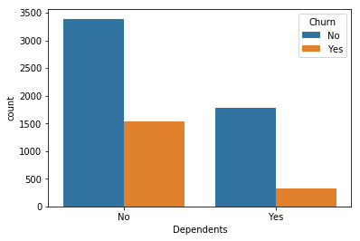
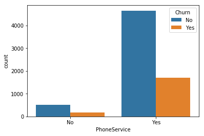
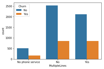
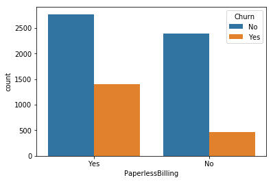
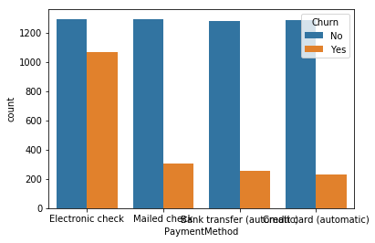
for i, predictor in enumerate(telco_data.drop(columns=['Churn', 'TotalCharges', 'MonthlyCharges'])):
    plt.figure(i)
    sns.countplot(data=telco_data, x=predictor, hue='Churn')
Output:
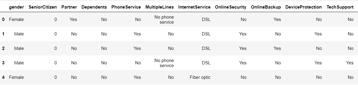
2. Here as we know we can’t have character values for our ML model so hence we should convert it into binary numerical values i.e. Yes=1; No = 0
telco_data['Churn'] = np.where(telco_data.Churn == 'Yes',1,0)
telco_data.head()
Output:
3. Now we have to convert the categorical data into dummy variables with the getting dummies function.
telco_data_dummies = pd.get_dummies(telco_data)
telco_data_dummies.head()
Output:
9. Here we will be making a regression plot between charges.
sns.lmplot(data=telco_data_dummies, x='MonthlyCharges', y='TotalCharges', fit_reg=False)
Output:
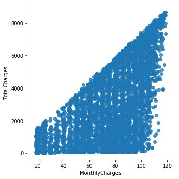
Inference: Here from the above graph it is clear that as the monthly charges are increasing we can experience the total charges also increase which shows the positive correlation too.
10. Measure the churn by charges
Mth = sns.kdeplot(telco_data_dummies.MonthlyCharges[(telco_data_dummies["Churn"] == 0) ],
                color="Red", shade = True)
Mth = sns.kdeplot(telco_data_dummies.MonthlyCharges[(telco_data_dummies["Churn"] == 1) ],
                ax =Mth, color="Blue", shade= True)
Mth.legend(["No Churn","Churn"],loc='upper right')
Mth.set_ylabel('Density')
Mth.set_xlabel('Monthly Charges')
Mth.set_title('Monthly charges by churn')
Output:
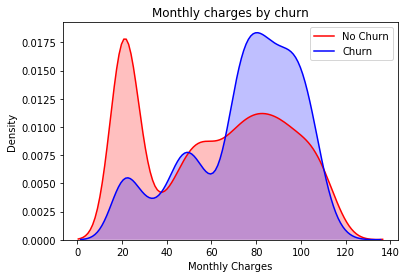
Insight: Here it is evident that when the churn is high then the charges are high.
Tot = sns.kdeplot(telco_data_dummies.TotalCharges[(telco_data_dummies["Churn"] == 0) ],
                color="Red", shade = True)
Tot = sns.kdeplot(telco_data_dummies.TotalCharges[(telco_data_dummies["Churn"] == 1) ],
                ax =Tot, color="Blue", shade= True)
Tot.legend(["No Churn","Churn"],loc='upper right')
Tot.set_ylabel('Density')
Tot.set_xlabel('Total Charges')
Tot.set_title('Total charges by churn')
Output:
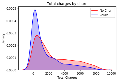
Inference: Here we get the surprising insight that as we can see more churn is there with lower charges.
Tenure, Monthly Charges & Total Charges then the picture is a bit clear:- Higher Monthly Charge at lower tenure results into lower Total Charge. Hence, all these 3 factors viz Higher Monthly Charge, Lower tenure, and Lower Total Charge are linked to High Churn.
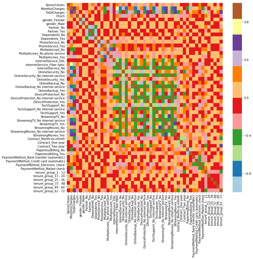
We can also analyze the heat map of our complete dataset.
plt.figure(figsize=(12,12))
sns.heatmap(telco_data_dummies.corr(), cmap="Paired")
Output:
Conclusion
These are some of the quick insights on churn analysis from this exercise:
- Electronic check mediums are the highest churners
- Contract Type – Monthly customers are more likely to churn because of no contract terms, as they are free-to-go customers.
- No Online security, No Tech Support category are high churners
- Non-senior Citizens are high churners
Note: There could be many more such insights, so take this as an assignment and try to get more insights.
Here’s the repo link to this article. Hope you liked my article on churn analysis. If you have any opinions or questions, then comment below.
About Me
Greeting to everyone, I’m currently working in TCS and previously, I worked as a Data Science Analyst in Zorba Consulting India. Along with full-time work, I’ve got an immense interest in the same field, i.e. Data Science, along with its other subsets of Artificial Intelligence such as Computer Vision, Machine Learning, and Deep learning; feel free to collaborate with me on any project on the domains mentioned above (LinkedIn).
Here you can access my other articles, which are published on Analytics Vidhya as a part of the Blogathon (link).
The media shown in this article is not owned by Analytics Vidhya and are used at the Author’s discretion.


Why total charges is taken as "Object" variable instead of numeric or float. In this dataset we have 11 missing values in Total_Charges, but it got ignored in your analysis