A Quick Guide to Bivariate Analysis in Python
Introduction
In all kinds of data science projects across domains, EDA (exploratory data analytics) is the first go-to analysis, without which the analysis is incomplete or almost impossible to do. One of the key objectives in many multi-variate analyses is to understand relationships between variables which helps answer questions for critical objectives. Examples:
- How do sales vary with time of day or day of the week?
- How does the amount of house loan amount issued vary with an individual’s income?
- We observe high fraud in claims for a particular motor part in auto insurance?
- How does mileage vary with the weight of the truckload?
- What keywords are used in positive customer reviews on Facebook vs keywords in negative customer reviews?
To answer these questions, one must grasp how changes in one variable or feature correspond with another. Variables can encompass numerical, categorical, or text data. It’s vital to comprehend which methods and visuals effectively elucidate the relationships or concurrence between variables.
This article was published as a part of the Data Science Blogathon.
Table of contents
What is Bivariate Analysis?
Bivariate analysis is a systematic statistical technique applied to a pair of variables (features/attributes) to establish the empirical relationship between them. In other words, it aims to identify any concurrent relations, typically beyond simple correlation analysis.
In supervised learning, this method aids in determining essential predictors. When conducting bivariate analysis with one variable as the dependent variable (Y) and others as independent variables (X1, X2, etc.), all Y, X pairs are plotted. Essentially, it serves as a method for feature selection and prioritization.
E.g. How does the sale of air conditioners look with the average daily temperature during summers – here, we could plot the daily deals with the daily average temperature to observe patterns, trends, or empirical relations, if any.
Correlation vs Causality
It is a widespread fallacy to assume that if one variable is observed to vary with a change in values of another empirically, then either of them is “causing” the other to change or leading the other variable to change. In bivariate analysis, it might be observed that one variable (especially the Xs) is causing Y to change. Still, in actuality, it might just be an indicator and not the actual driver.
The example below would help grasp this concept and avoid the fallacy during bivariate analysis.
Let us quickly look at the illustration below:

Though it would be seen that both sunburn and ice cream sales are correlated, ice-creams do not cause sunburn (maybe they do the opposite)!
Bivariate Analysis for Each Variable Type
There are essentially two types of variables in data – Categorical and continuous (numerical). So, in the case of bivariate analysis, there could be four combinations of analysis that could be done that is listed in the summary table below:
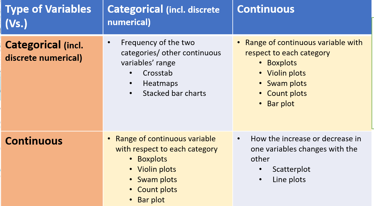
To develop a further hands-on understanding, the following is an example of bivariate analysis for each combination listed above in Python:
Categorical vs Categorical Variables
This is used in case both the variables being analyzed are categorical. In the case of classification, models say, for example, we are classifying a credit card fraud or not as Y variables and then checking if the customer is at his hometown or away or outside the country. Another example can be age vs gender and then counting the number of customers who fall in that category. It is important to note that the visualization/summary shows the count or some mathematical or logical aggregation of a 3rd variable/metric like revenue or cost and the like in all such analyses. It can be done using Crosstabs (heatmaps) or Pivots in Python. Let us look at examples below:
Crosstabs
It is used to count between categories, or get summaries between two categories. Pandas library has this functionality.

Import pandas as pd
Import seaborn as sns
# need to summarize on x and y categorical variables
pd.crosstab(    dd.categ_x, dd.categ_y, margins=True,     values=dd.cust, aggfunc=pd.Series.count)
# 3 any other aggregation function can be used based on column type
# to create a heatmap by enclosing the above in sns.heatmap
sns.heatmap(pd.crosstab(   dd.categ_x, dd.categ_y, margins=True,     values=dd.cust, aggfunc=pd.Series.count),
            cmap="YlGnBu", annot=True, cbar=False)
Pivots
Another useful functionality that can be applied to Pandas dataframes to get Excel like Pivot tables. This can work for 2+ categorical variables when placed in the proper hierarchy.
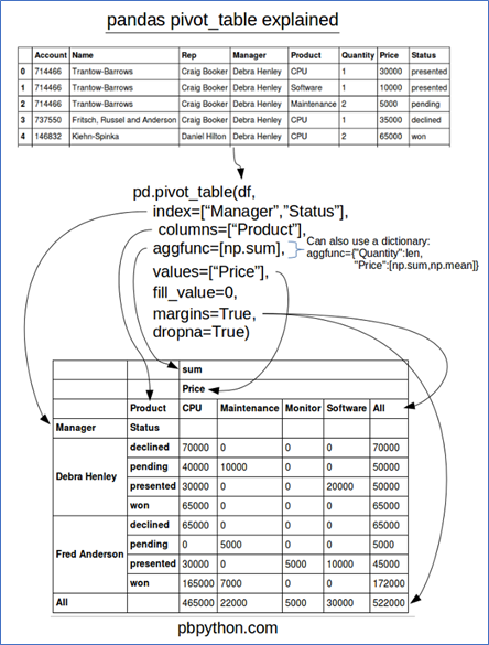
Python code: Assuming the above dataset, just this one line of code can produce the desired bivariate views.
Pd.pivot_table(df,index =[“Manager”,”Status”],columns=[“Product”],aggfunc=[np.sum]Categorical vs continuous (numerical) variables
It is an example of plotting the variance of a numerical variable in a class. Like how age varies in each segment or how do income and expenses of a household vary by loan re-payment status.
Categorical plot for aggregates of continuous variables: Used to get total or counts of a numerical variable eg revenue for each month. PS: This can be used for counts of another categorical variable too instead of the numerical.
Plots used are: bar plot and count plot
sns.barplot(x='sex',y='total_bill',data=t)
sns.countplot(x='sex',data=t)
Plots for distribution of continuous (numerical) variables: Use to see the range and statistics of a numerical variable across categories
Plots used are – box plot, violin plot, swarm plot
sns.boxplot(x='day',y='total_bill',data=t,palette='rainbow')
sns.violinplot(x="day", y="total_bill", data=t,palette='rainbow')
sns.stripplot(x="day", y="total_bill", data=t)
sns.swarmplot(x="day", y="total_bill", data=t)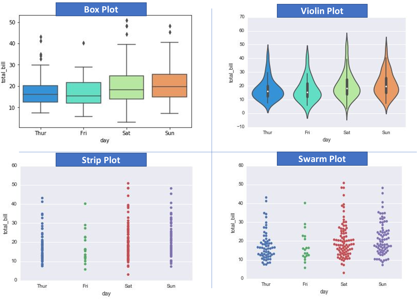
Continuous vs continuous
This is the most common use case of bivariate analysis and is used for showing the empirical relationship between two numerical (continuous) variables. This is usually more applicable in regression cases.
The following plots make sense in this case: scatterplot, regplot.
Code below:
Import seaborn as sns
 Sns.regplot(x=‘a’,y=‘b’,data=df)
Plt.ylim(0,)
Bivariate Analysis at Scale
In case we have large datasets with 30-70+ features (variables), there might not be sufficient time to run each pair of variables through bivariate analysis one by one. We could use the pairplot or pair grid from the seaborn library in such cases. It makes a grid where each cell is a bivariate graph, and Pairgrid also allows customizations. Code snippets and sample outputs below (assuming seaborn is imported and the iris dataset).
Pairplot
g = sns.pairplot(iris, diag_kind="kde", markers="+",
                 plot_kws=dict(s=50, edgecolor="b", linewidth=1),
                 diag_kws=dict(shade=True))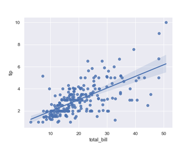
Pairgrid
g = sns.PairGrid(iris)

g = g.map_upper(sns.scatterplot)

g = g.map_lower(sns.kdeplot, colors="C0")

g = g.map_diag(sns.kdeplot, lw=2)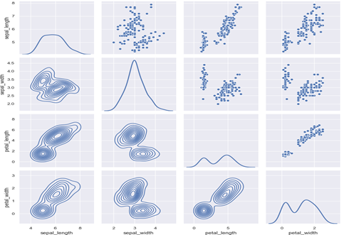
Why not just run a correlation matrix here?
The correlation matrix only provides a single numerical value without providing any information about the distribution which provides an in-depth picture of empirical relationships between variables in the bivariate analysis.
Practical Tips
Please note this only works for numerical variables (to do it for categorical we need to first convert to numerical forms with techniques like one-hot encoding).
For very large datasets, group independent variables into groups of 10/15/20 and then run bivariate for each with respect to the dependent variable.
EDA with one line of code!
The pandas profiling library – a shorthand & quick way for EDA and bivariate analysis – more on this here. It does most of the univariate, bivariate and other EDA analyses.
Conclusion
Bivariate analysis is crucial in exploratory data analysis (EDA), especially during model design, as the end-users desire to know what impacts the predictions and in what way. This can be extended to multi-variate cases, but the human mind is designed to comprehend the 2-D or 3-D world easily. Where there are two variables, it is easier to interpret, gain intuition and take action. Thus, the bivariate analysis goes a long way in defining how a particular variable is empirically related to another and what can we expect if one happens to be in a specific range or have a particular value.
Reiterating that this (correlation) should not be confused with causation (experimentation is better to use in that case).
Hope you liked my article on Bivariate Analysis in Python.
Frequently Asked Questions
A. Bivariate in Python refers to the analysis involving two variables. It uses statistical methods and visualizations to explore the relationship and interactions between these two variables in a dataset.
A. Bivariate analysis studies the relationship between two variables. For example, analyzing the correlation between a person’s study hours and exam scores to understand if study time impacts performance.
A. Multivariate analysis in Python involves studying relationships among multiple variables. Techniques like regression analysis or machine learning algorithms can be employed to simultaneously analyze the impact of several variables on an outcome.
A. Bivariate analysis can be tested using correlation coefficients or regression analysis. These tests help quantify the strength and nature of the relationship between two variables in a dataset.
The media shown in this article is not owned by Analytics Vidhya and are used at the Author’s discretion.


