Data Exploration and Visualisation Using Palmer Penguins Dataset
This article was published as a part of the Data Science Blogathon.
Introduction
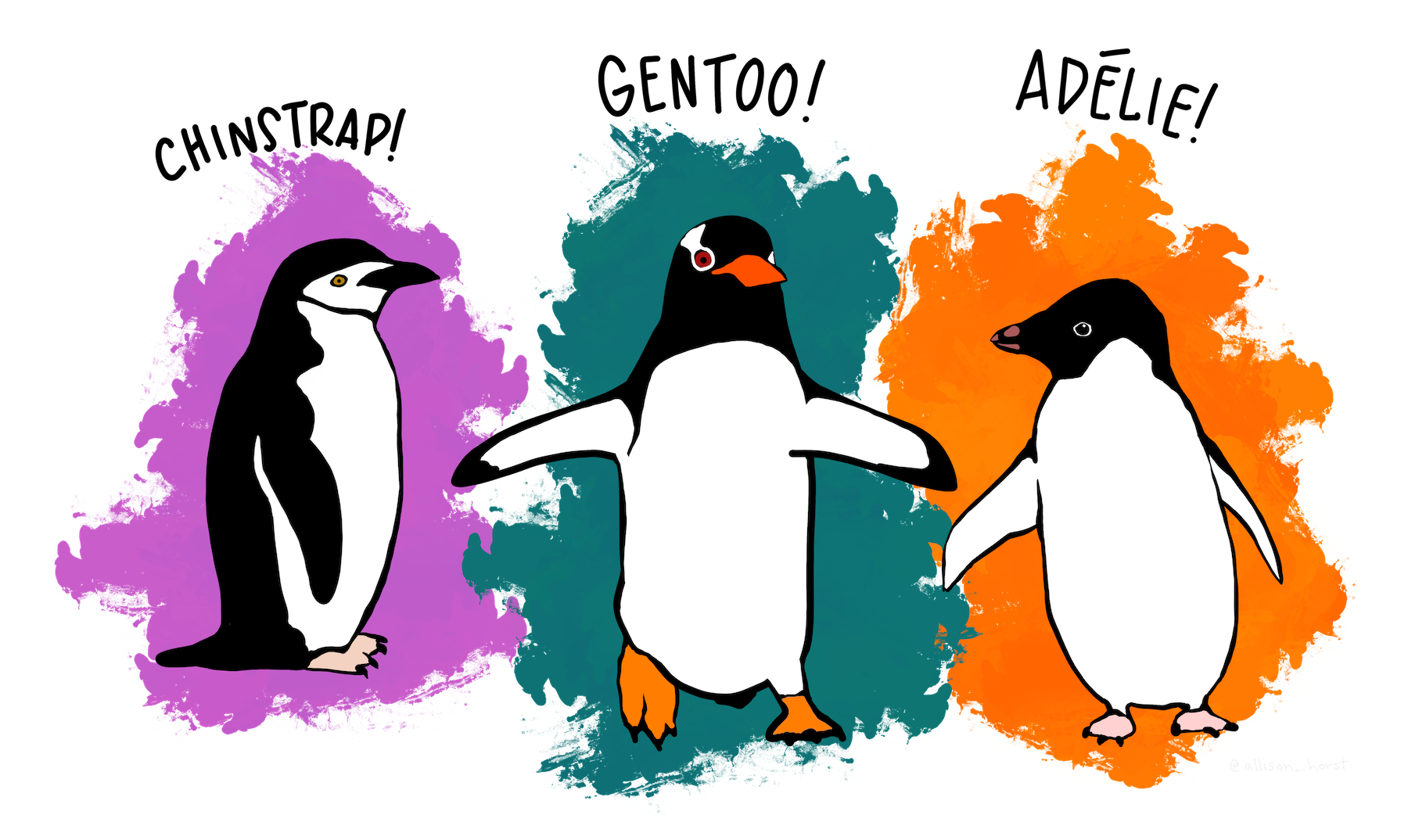
It is almost impossible that you are in data science and haven’t used Iris data as your first data set for data exploration and visualization. And quite rightly so, it is a great dataset to apply the nascent knowledge. There is an interesting alternative to Iris data, which is almost similar to it. It is a dataset comprising various measurements of three different penguin species, namely Adelie, Gentoo, and Chinstrap. Same as Iris data which had measurements of three different species of the Iris flower. Anyway, both are great for what they are made of.
The rigorous study was conducted in the islands of the Palmer Archipelago, Antarctica. These data were collected from 2007 to 2009 by Dr. Kristen Gorman with the Palmer Station Long Term Ecological Research Program, part of the US Long Term Ecological Research Network.
The original GitHub repo contains the source code. You may download the dataset from Kaggle. It has two datasets, each with 344 observations. The dataset we will be using is a curated subset of the raw dataset.
Data Exploration
The first step as usual is importing the necessary libraries. For this article, we will be using Pandas for data exploration and Plotly for data visualisation.
import pandas as pd
import numpy as np
import plotly.express as px
import plotly.graph_objects as go
In the next step, we will be reading our dataset
df = pd,read_csv('/path/....penguins_Size.csv')
dfc = df.copy() #we keep a copy in case we need the original data set
df.head()
.png)
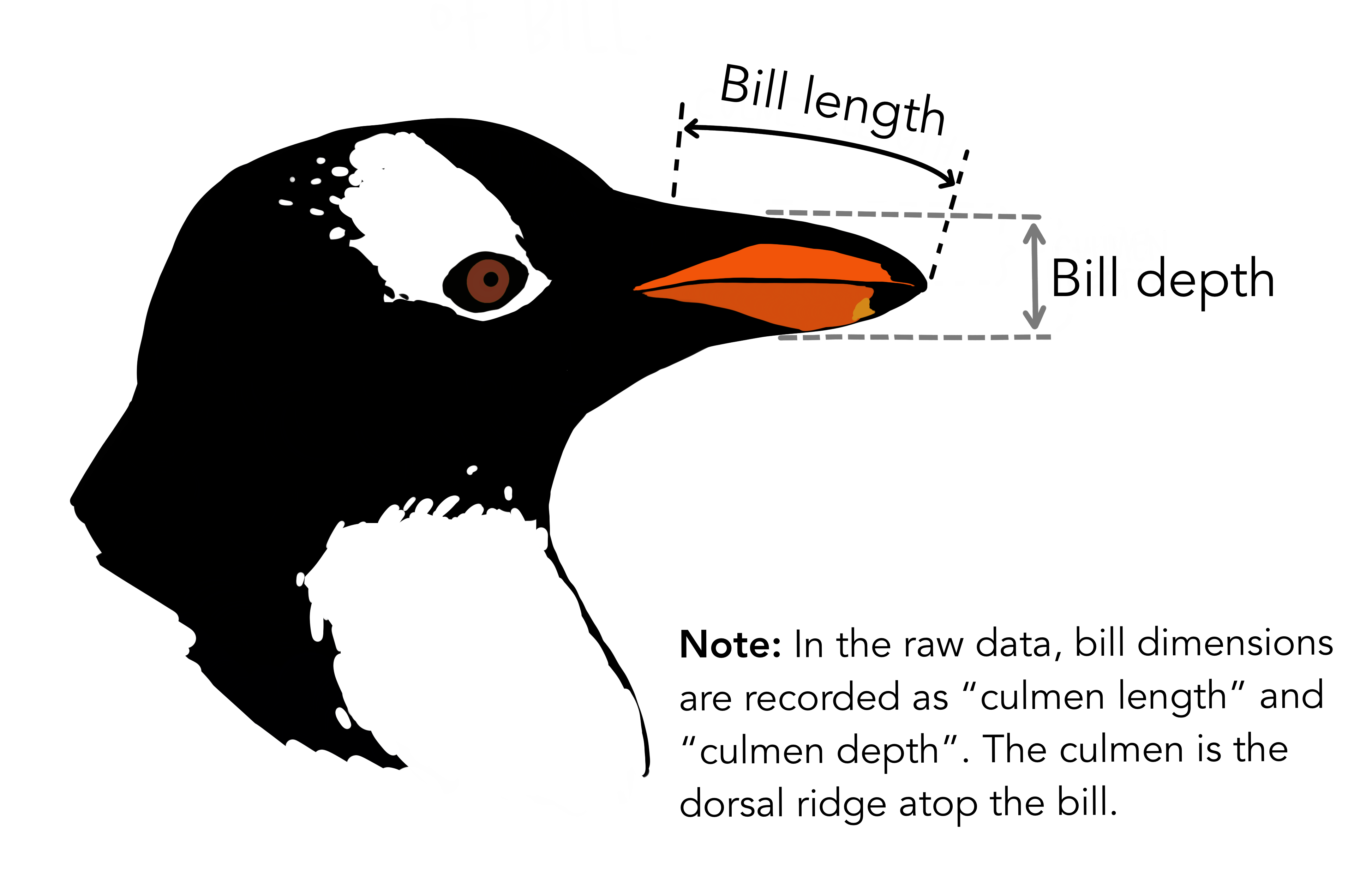
In the above data frame, the culmen refers to the “the upper ridge of a bird’s beak” of the penguin.
Dataset statistics
df.describe()
.png)
Dataset Information
df.info()
.png)
We can observe in the above information that each float category column is missing 2 null observations while the sex column is missing 10 of them.
Checking each object’s columns
for col in df.select_dtypes(include='object').columns:
    print(df[col].value_counts())
.png)
So, there is a ‘ . ‘ in the sex column. As we do not know which sex it belongs to we will assign NaN to it.
df[df['sex'] == '.']
.png)
df['sex'][df['sex'] == '.'] = np.nan
print(df.loc[336])
.png)
Checking all the Null Values
Null values are no good to any data and It is one of the most important parts of data preprocessing to be rid of them or have them treated accordingly. We will get to that in a moment. Let’s first find them.
df.isnull().sum()
.png)
Find out each row with null values
df[df.isnull().any(axis=1)]
.png)
You can see in the above data frame that indexes 3 and 339 are having null values in every column except species and island and in the rest of the observations only gender value is missing.
Treating Null Values
There are different ways we can address the Null values, different ways we can impute appropriate data in place of these null values or we can be rid of them all together but as we do not want to lose out on important data, for this article, we will be using Sklearn’s KNNImpute method for filling null values. As the name suggests the method uses the KNN algorithm to find the appropriate data to fill in. Due to brevity, this is out of the scope of the article. You may follow this link to have an in-depth understanding of the topic.
But before getting to the KNNImpute we have some other concerns to attend to. The KNNIMpute method does not work with ‘object’ datatypes. So, to do that we need to convert all the object data to an integer type via sklearn’s LabelEncoder. As we have null values in the sex column we will omit the NaN values as LabelEncoder does not discriminate between null values and non-null values.
#importing libraries
from sklearn.impute import KNNImputer
from sklearn.preprocessing import LabelEncoder
encode = LabelEncoder()
impute = KNNImputer()
for i in df.select_dtypes(include='object').columns:
    df[i][df[i].notnull()] = encode.fit_transform(dfc[i])
Let’s see how the data is encoded
df.head()
.png)
In the above frame, we may observe all the columns are not scaled properly, which may lead to wrong outcomes. So, to do this we will use again sklearn’s MinMaxScaler method to normalize the variables.
from sklearn.preprocessing import MinMaxScaler
sca = MinMaxScaler()
df_sca = pd.DataFrame(sca.fit_transform(df),columns=dfc.columns)
df_sca.head()
.png)
So now, all done. We may proceed with imputation.
new_df = pd.DataFrame(imp.fit_transform(df_sca), columns=dfc.columns)
new_df.isnull().sum()
.png)
We have taken care of all the null values. Now the only work that remains is to rescale the variables to original values and map the categorical data back to the original.
dt = pd.DataFrame(sca.inverse_transform(new_df),columns=df.columns)

dt['sex'] = dt['sex'].round()

dt['sex'] = dt['sex'].map({0:'Female', 1:'Male'})

dt['species'] = dt['species'].map({0:'Adeile',1:'Chinstrap',2:'Gentoo'})

dt['island'] = dt['island'].map({0:'Biscoe',1:'Dream',2:'Torgersen'})
Finally, it is done. We can move on to the next arena.
Data Visualization
We will be using Plotly Express and Graph Objects for plotting relationships between variables. Plotly Express and Graph objects are related the way seaborn and Matplotlib are related. Plotly Express is built to provide high-quality plots with fewer lines of code. Whereas Graph objects are used for more sophisticated plots. Any Express plots can also be made from Graph objects but it requires a few more lines of code. So, let’s start visualizing relationships and distributions.
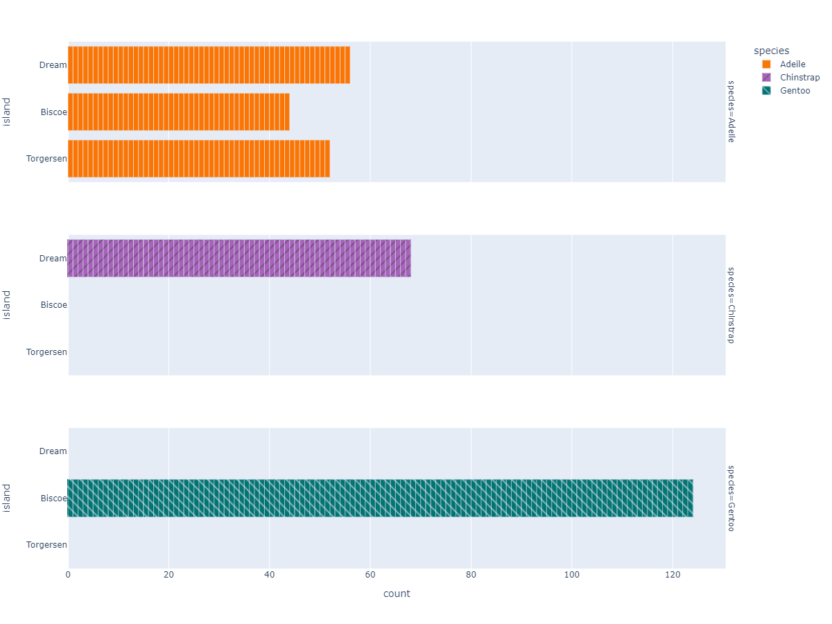
Species Based Island Count Plot
px.bar( data_frame=dt, y = 'island',
        facet_row='species',facet_row_spacing=0.10,
        pattern_shape='species',
        color='species',
        color_discrete_map={'Adeile':'rgb(251,117,4)', 'Chinstrap':'rgb(167,98,188)', 'Gentoo':'rgb(4,115,116)'},
        width=1200,height=900 )
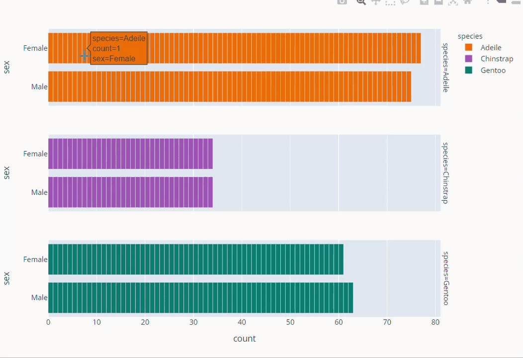
Species Based Gender Count Plot
fig =px.bar( data_frame=dt, y = 'sex',

facet_row='species',facet_row_spacing=0.10,

pattern_shape='species',

color='species',

color_discrete_map={'Adeile':'rgb(251,117,4)', 'Chinstrap':'rgb(167,98,188)', 'Gentoo':'rgb(4,115,116)'},

width=1200,height=500 )

fig.show()
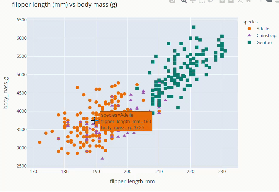
Flipper Length and Body Mass Scatter Plot
fig = px.scatter(data_frame=dt,
           x = 'flipper_length_mm', y = 'body_mass_g',
           color = 'species',
           color_discrete_map={'Adeile':'rgb(251,117,4)', 'Chinstrap':'rgb(167,98,188)', 'Gentoo':'rgb(4,115,116)'},
           symbol='species',
           symbol_map = {'Adeile':'circle', 'Chinstrap':'triangle-up', 'Gentoo':'square'},
           height= 760
           )
fig.update_traces(marker=dict(size=9))
fig.update_layout(title='flipper length (mm) vs body mass (g)',
                  titlefont = dict( color='black', family='Open Sans',),)

fig.show()
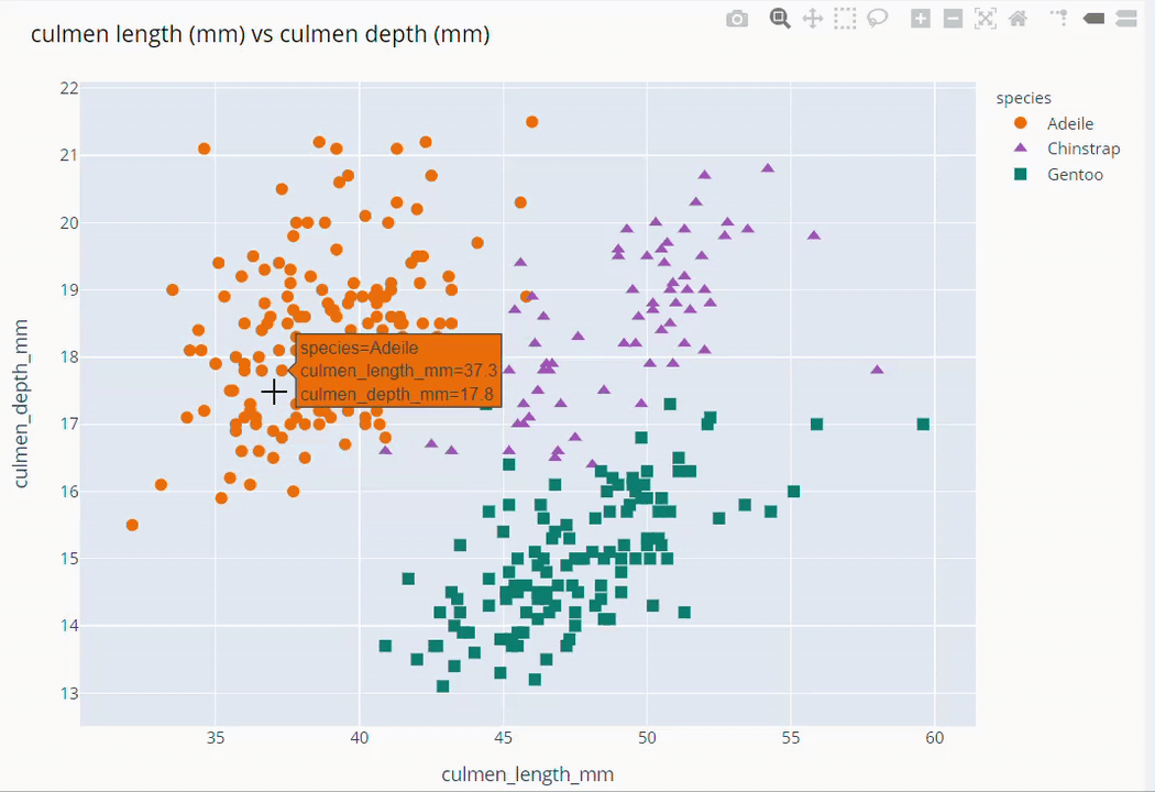
Culmen Length and Culmen Depth Scatter Plot
fig = px.scatter(data_frame=dt,
           x = 'culmen_length_mm', y = 'culmen_depth_mm',
           color = 'species',
           color_discrete_map={'Adeile':'rgb(251,117,4)', 'Chinstrap':'rgb(167,98,188)', 'Gentoo':'rgb(4,115,116)'},
           symbol='species',
           symbol_map = {'Adeile':'circle', 'Chinstrap':'triangle-up', 'Gentoo':'square'},
           height= 760
           )
fig.update_traces(marker=dict(size=9))
fig.update_layout(title='culmen length (mm) vs culmen depth (mm)',
                  titlefont = dict(color='black', family='Open Sans',), )

fig.show()
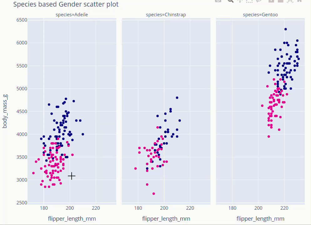
Species Based Gender Scatter Plot
fig = px.scatter(data_frame=dt, x='flipper_length_mm' , y = 'body_mass_g',
                 facet_col='species', color='sex',
                 color_discrete_map={'Male':'darkblue','Female':'deeppink'}
                 )
fig.update_layout(showlegend = False,height=800,title='Species based Gender scatter plot',
                   titlefont = dict(size =36, color='black', family='Open Sans',),
                   font=dict(size=18,color='black'))
fig.show()
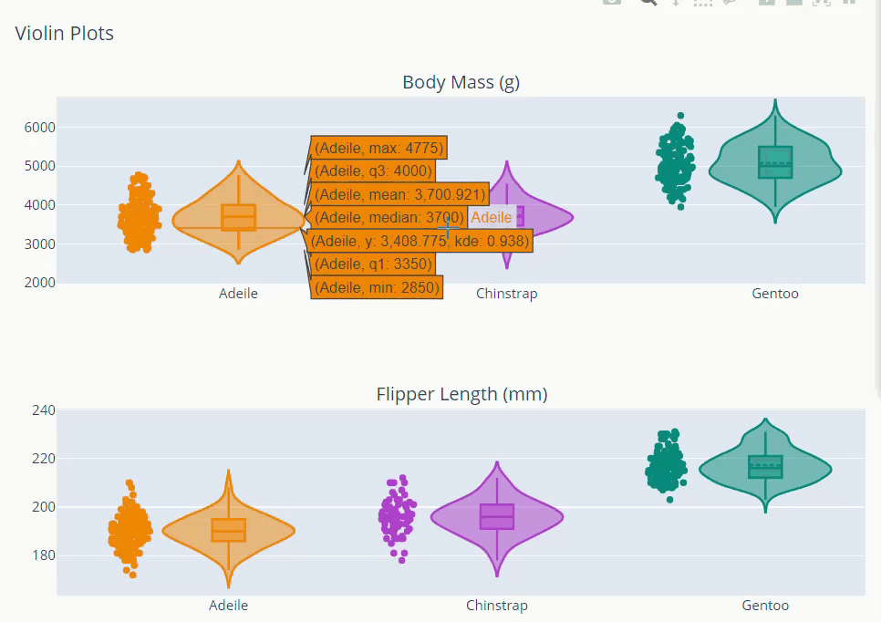
Exploring Distributions
from plotly.subplots import make_subplots
trace_bm = []
color =['darkorange','mediumorchid','teal']
for var,col in zip(dt.species.unique(),color):
    trace = go.Violin(x = dt['species'][dt['species']==var], y =dt['body_mass_g'][dt['species']==var],
                    box_visible=True,
                    meanline_visible=True,
                    points='all',
                    line_color=col,
                    name=var)
    trace_bm.append(trace)
trace_flipper = []
for var,col in zip(dt.species.unique(),color):
    trace2 = go.Violin(x = dt['species'][dt['species']==var], y =dt['flipper_length_mm'][dt['species']==var],
             box_visible=True,
             meanline_visible=True,
             points='all',
             line_color=col,
        )
    trace_flipper.append(trace2)
fig = make_subplots(rows=2, cols=1, subplot_titles=("Body Mass (g)","Flipper Length (mm)"))
for i in trace_bm:
    fig.add_trace(i,row=1,col=1)
for j in trace_flipper:
    fig.add_trace(j,row=2,col=1)
fig.update_layout(showlegend = False, title = 'Violin Plots',height=800)
fig.show()
Principal Component Analysis (PCA)
Often in the case of datasets with a lot of variables visualization becomes challenging. As we cannot plot any data with more than three dimensions. But with the help of PCA, we can reduce the high number of variables into 2,3 principal components with maximum explained variance. These principal components store maximum information regarding the data set. So, let’s understand how PCA is used to visualize the dataset better.
cols = ['culmen_length_mm','culmen_depth_mm','flipper_length_mm','body_mass_g']

x = dt.loc[:,cols].values

y = dt.loc[:,['species']].values

from sklearn.preprocessing import StandardScaler

x = StandardScaler().fit_transform(x)
As you can see for this we will only be using above mentioned four variables. x contains all the necessary data from the dataset. And y is the target variable that contains ‘species’ values. Here, we scaled the data to have 0 mean and unit standard deviation which is an important prerequisite for PCA.
from sklearn.decomposition import PCA
pca = PCA(n_components=4)
pca_x = pd.DataFrame(pca.fit_transform(x),columns=['PC1','PC2','pc3','pc4'])
pca_final = pd.concat([pca_x,dt.species],axis=1)
We created a data frame with PCA transformed values concatenated with target variable y.
fig = px.scatter(data_frame=pca_final,
           x = 'PC1', y = 'PC2',
           color = 'species',
           color_discrete_map={'Adeile':'rgb(251,117,4)', 'Chinstrap':'rgb(167,98,188)', 'Gentoo':'rgb(4,115,116)'},
           symbol='species',
           symbol_map = {'Adeile':'circle', 'Chinstrap':'triangle-up', 'Gentoo':'square'},
           )
fig.update_traces(marker=dict(size=9))
fig.update_layout(title='Principal component 1 vs Principal component 2',
                  titlefont = dict(color='black', family='Open Sans',),
                   )
fig.show()
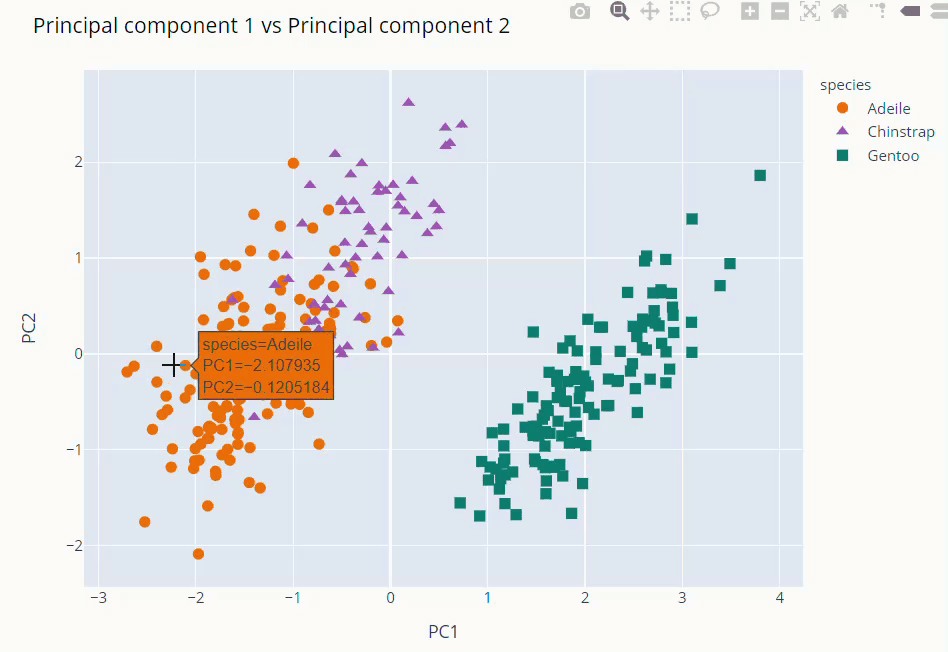
The first and second PCs contribute around 89% to the overall variance. So, we used them to visualize our dataset
As you can see above Gentoo clearly stands out from the other two. Adeile and Chinstrap have more correlation. Mind you again these components are not original variables but linear combinations of them.
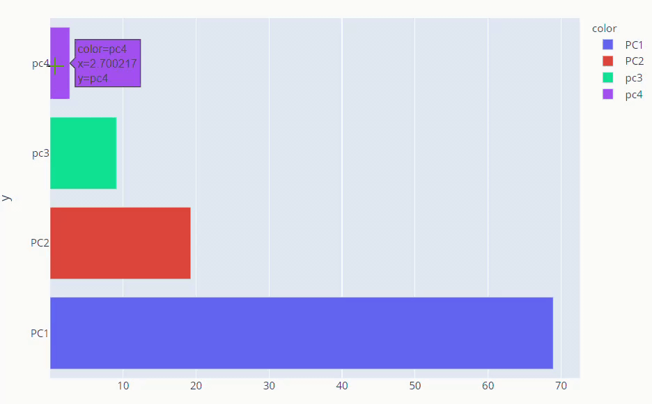
explained_variance_ratio_ method gives us what percentage each component is responsible for overall variance. instead of just numbers, it’s better if we visualize explained variance ratio.
fig = px.bar(y =loadings.columns,x=pca.explained_variance_ratio_ * 100,
color=loadings.columns, orientation='h')
fig.show()
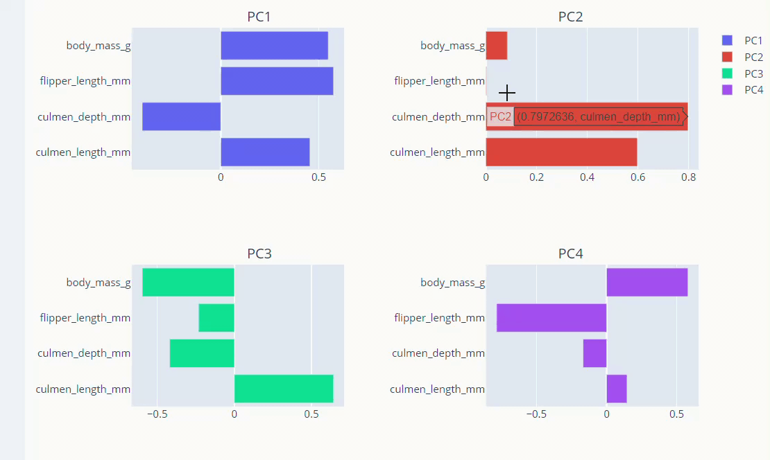
Visualise Loadings
PCA loadings are the coefficients of the linear combination of the original variables from which the principal components (PCs) are constructed.
The principal components in PCA are essentially the linear combinations of original variables. And The coefficients of the original variables in the linear equation for the components are called loadings. The loadings help us analyze the effect of each original variable in every principal component.
loadings = pd.DataFrame(pca.components_.T, columns=['PC1', 'PC2','PC3','PC4'],
                        index=dt.select_dtypes(include='float64').columns)
Let’s visualize the loadings.
from plotly.subplots import make_subplots
fig = make_subplots(rows=2,cols=2,
                    subplot_titles=['PC1','PC2','PC3','PC4'])
fig.add_trace(go.Bar(x=loadings['PC1'],
              y=loadings.index,name='PC1',
              orientation='h'), row=1,col=1)
fig.add_trace(go.Bar(x=loadings['PC2'],
              y=loadings.index,name='PC2',
              orientation='h'), row=1,col=2)
fig.add_trace(go.Bar(x=loadings['pc3'],
              y=loadings.index,name='PC3',
              orientation='h'), row=2,col=1)
fig.add_trace(go.Bar(x=loadings['pc4'],
              y=loadings.index,name='PC4',
              orientation='h'), row=2,col=2)
fig.show()
 Conclusion
So, this was all about data exploration and visualisation of Palmer Penguins’ data. Below are some key takeaways from the above article:
- We applied data exploration methods to understand the dataset better, and used the KNNimputation technique to take care of missing data.
- Used Plotly express and Graph object to plot different interactive plots describing relationships among variables.
- Finally used PCA to find principal components and visualise the loadings.
Hope you liked the article on data exploration and visualisation. Happy Exploring!
The media shown in this article is not owned by Analytics Vidhya and is used at the Author’s discretion.


