An Introduction to Tableau on Making Raw Data Useful
This article was published as a part of the Data Science Blogathon.
Introduction
With this Tableau tutorial, you’ll learn how to visualize data and derive valuable insights from raw data, making dashboards, reports, tables, and more. We will also go through topics like Tableau’s desktop, server, and the various component of Tableau.
Tableau is a useful application for business intelligence and data visualization. It is used extensively for generating and distributing highly interactive and robust reports and dashboards that visually present the data like charts, graphs, plots, and so on. All the leading institutions have been built on data, so it is imperative to them that they make the most of the data sources available to them.
However, the available raw data is complex and hard to interpret, and it provides the solution for this. For acquiring and processing data, Tableau can connect to many files like excel, csv, JSON, etc. it can receive and process all types of data like structured(.csv), unstructured(json), and significant data sources.

Applications of Tableau
Data can be diced and sliced using Tableau’s features, and then we can create appealing representations. If you display the same data in the form of bars, charts, graphs, and plots, you will be able to decipher it. It is possible to detect hidden patterns, relationships, trends, and new meanings so that you can make an informative & valuable business decision. It’s major applications are as follows:
- Come up with quick visualizations and insights on different data sources
- Allows harnessing your databases and maximizing query performance
- Using statistics like trending and forecasting
- Integrate powerful table calculations with computer programming languages like R
- Utilize Tableau dashboards to interact with data in the most intuitive way possible

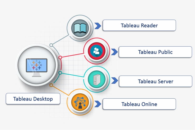
The Components of Tableau
Tableau products work together and help users create data visualizations and generate reports by seamlessly transferring data between the products. Here is a list of the products or components:
Tableau Desktop:
Tableau Desktop lets you import data from different sources and create dashboards, stories, and workbooks. With Tableau Desktop and its website, you can share all the insights with others and publish the workbooks online. Tableau-desktop allows users to run direct queries on datasets without typing in a code. You only need to write the columns you wish to include and add visualizations like charts, tables, graphs, and maps. It can combine many sources of data into one dashboard.
Tableau Server:
It is used for publishing the reports and workbooks created in Tableau Desktop. The user can access workbooks and reports from anywhere. With it, you can access the latest content and workbooks, and reports generated by other users. To maintain security, the Tableau-Server admin has the right to set an authorization on specific projects, views, workbooks, and data sources.
Tableau Reader:
It’s a free application you can install on your desktop and use to view the data visualizations built by users of Tableau Desktop. By using Tableau Reader, you can view, interact, add different types of filters, and drill down into the data without affecting the original datasets and visualizations.
Tableau Public:
Tableau Server lets you create workbooks and reports that can be saved, but anyone can view the workbooks because they are open to everyone.
Tableau Online:
Tableau Online is a platform that makes it easy to publish dashboards and share them with other users. The tool allows you and your colleagues to work on a project together and extract valuable information that can be transformed into visually interactive workbooks. Visuals can be accessed via the website, Desktop, and Mobile.
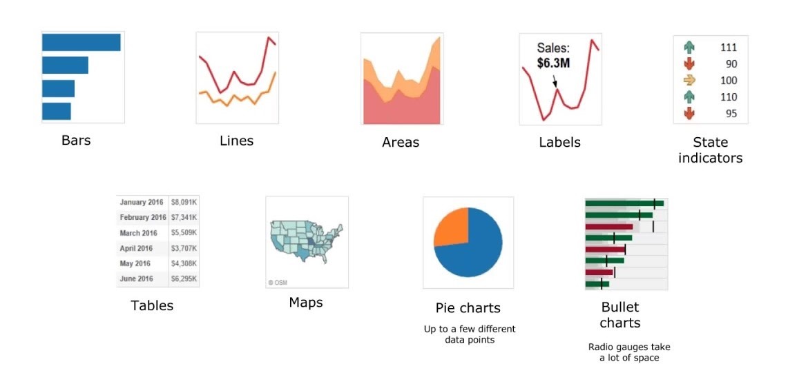
Different Types of Visualizations
The most important visualizations of tableaus that are used widely are as follows:
- Line Graph: Used primarily for constant dimensions
- Bar Graph: For dimensions that are not constant
- Dual Axis Graph: Used to present two different variables or measures at the same time
- Geographical Graph: For measuring sales and plotting other data on geographical maps
- Area graph: Comparing measures
- Tree Map: Nested rectangles are used to present quantities
- Heat Map: The tool is used for measuring differences across different categories
Source: https://www.youtube.com/watch?v=xltFOV_cxHw
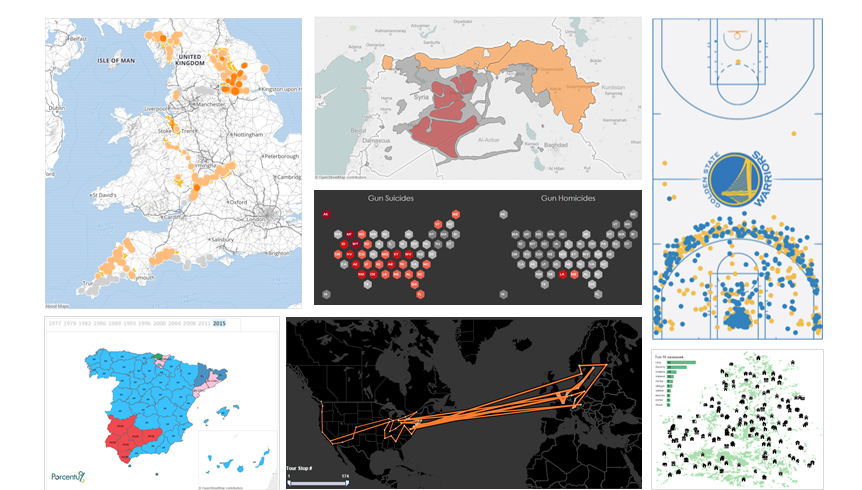
Tableau Maps
The best way to depict geographical data is with Tableau maps. The main purpose of maps is to visualize comparing data in different topographical areas. The following are its various applications of it:
- Proportional Symbol Maps: These maps are mainly used to visualize quantitative data for specific locations. Data of two or more quantities or variables can be added per location. An Earthquake map that shows the magnitude for the previous 10 years can be shown in a proportional symbol map.
- Point distribution Maps: The data point of a specific location is shared. A point distribution map can be used to visualize events that took place at a particular time. To create distribution maps, you need to know the latitude and longitude of your data source.
- Heat Maps: Heat maps visualize large volumes of data and spot trends that help the user make better decisions. You can create a heat map of your site data and see where users are coming from.
- Flow Maps: A flow or path map in Tableau shows the journey of an object from one place to another. An example of this would be a thunderstorm or hurricane. Over time, a hurricane’s flow map shows its path from the origin to the end.
- Spider Map: The origin-destination maps show the path for multiple destinations or a single origin. An example of a spider map would be the visualization of migrant data who moved from one country to another.
Conclusion
Tableau is one of the data visualization technologies growing exponentially, primarily in the business intelligence sector. It is swift to deploy, simple to use, easy to learn, and very intuitive for customers. It aids in converting raw data in an effortless and lucid way. It does data processing quickly and produces dashboard-style graphics. Solutions from Tableau Learning is applicable in many department and industries.
This introductory tutorial is intended for all students who desire to understand the software and operate in the business intelligence industry. Anyone can go through this to understand the basics, whether it is to work in data analytics, data visualization, or business intelligence.
The media shown in this article is not owned by Analytics Vidhya and is used at the Author’s discretion.


