Guide to the Intuitive Confusion Matrix
This article was published as a part of the Data Science Blogathon.
Introduction to Confusion Matrix
Houston, we need a Problem!
# generate the data and make predictions with our two models
n_classes = 3
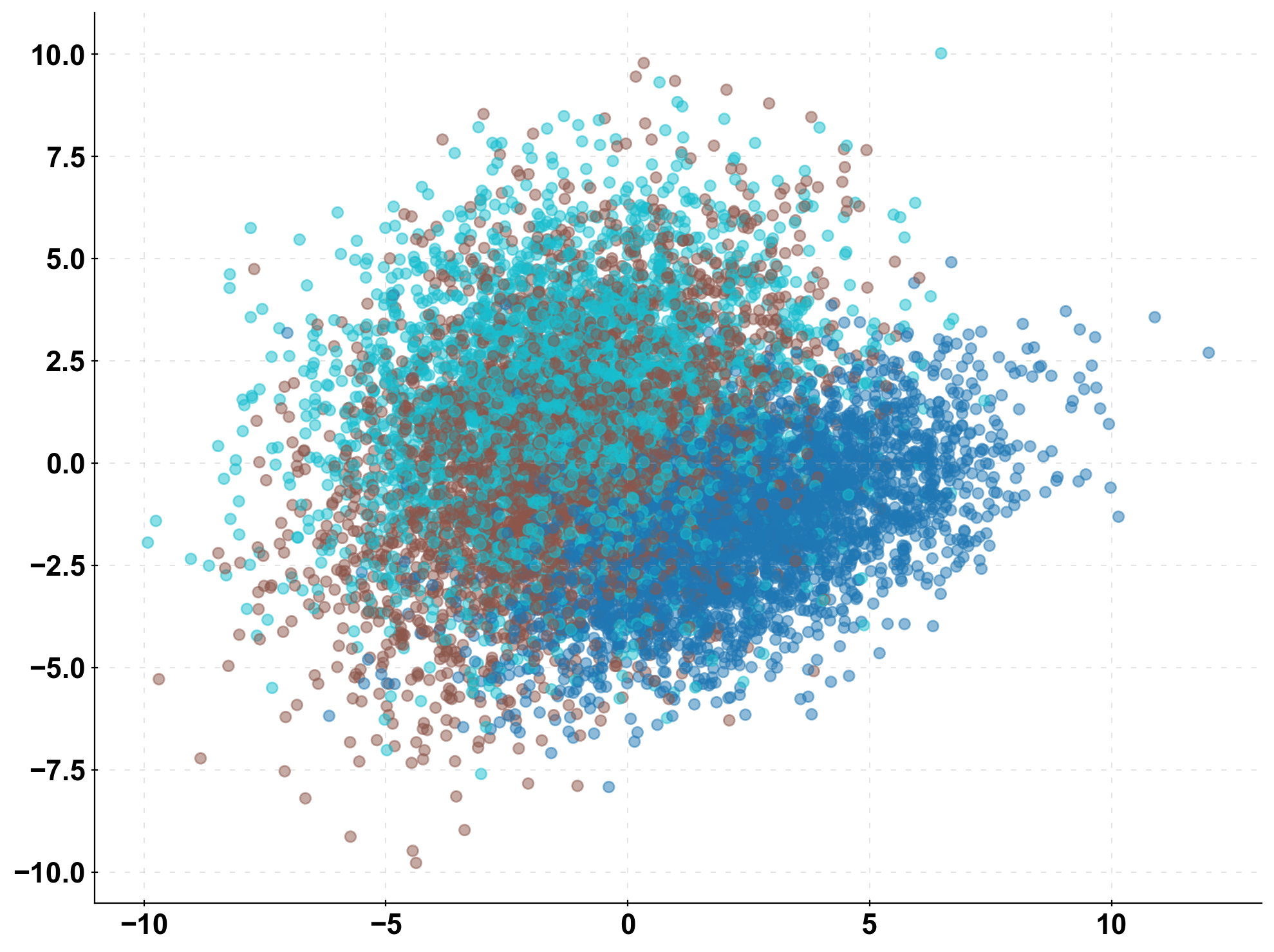
X, y = make_classification(n_samples=10000, n_features=10,
n_classes=n_classes, n_clusters_per_class=1,
n_informative=10, n_redundant=0)
y = y.astype(int)
X_train, X_test, y_train, y_test = train_test_split(X, y, test_size=0.33, random_state=0)
prediction_naive = np.random.randint(low=0, high=n_classes, size=len(y_test))
clf = LogisticRegression().fit(X_train, y_train)
prediction = clf.predict(X_test)
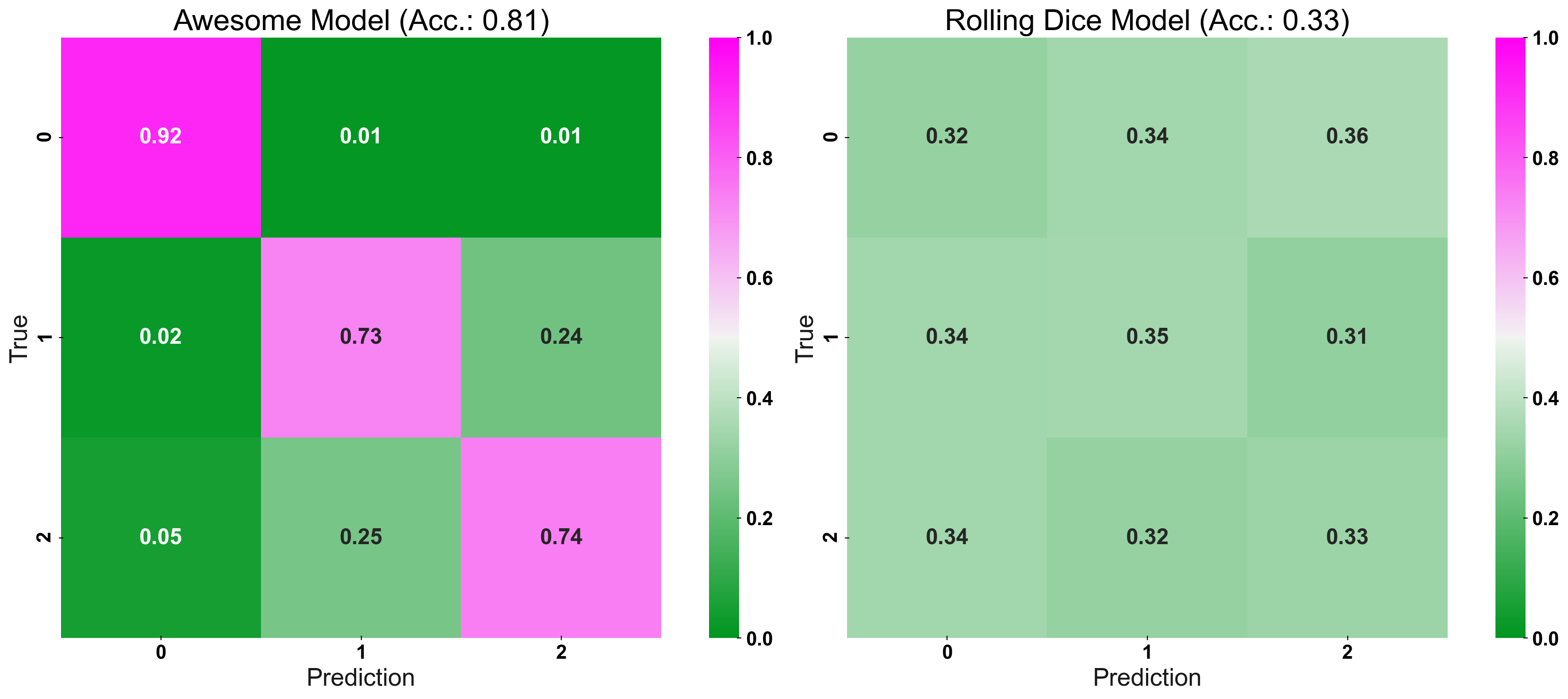
The Standard Confusion Matrix
fig, (ax1, ax2) = plt.subplots(1,2, figsize=(20,8))

plot_cm_standard(y_true=y_test, y_pred=prediction, title="Awesome Model", list_classes=[str(i) for i in range(n_classes)],

normalize="prediction", ax=ax1)

plot_cm_standard(y_true=y_test, y_pred=prediction_naive, title="Rolling Dice Model", list_classes=[str(i) for i in range(n_classes)],

normalize="prediction", ax=ax2)

plt.show()
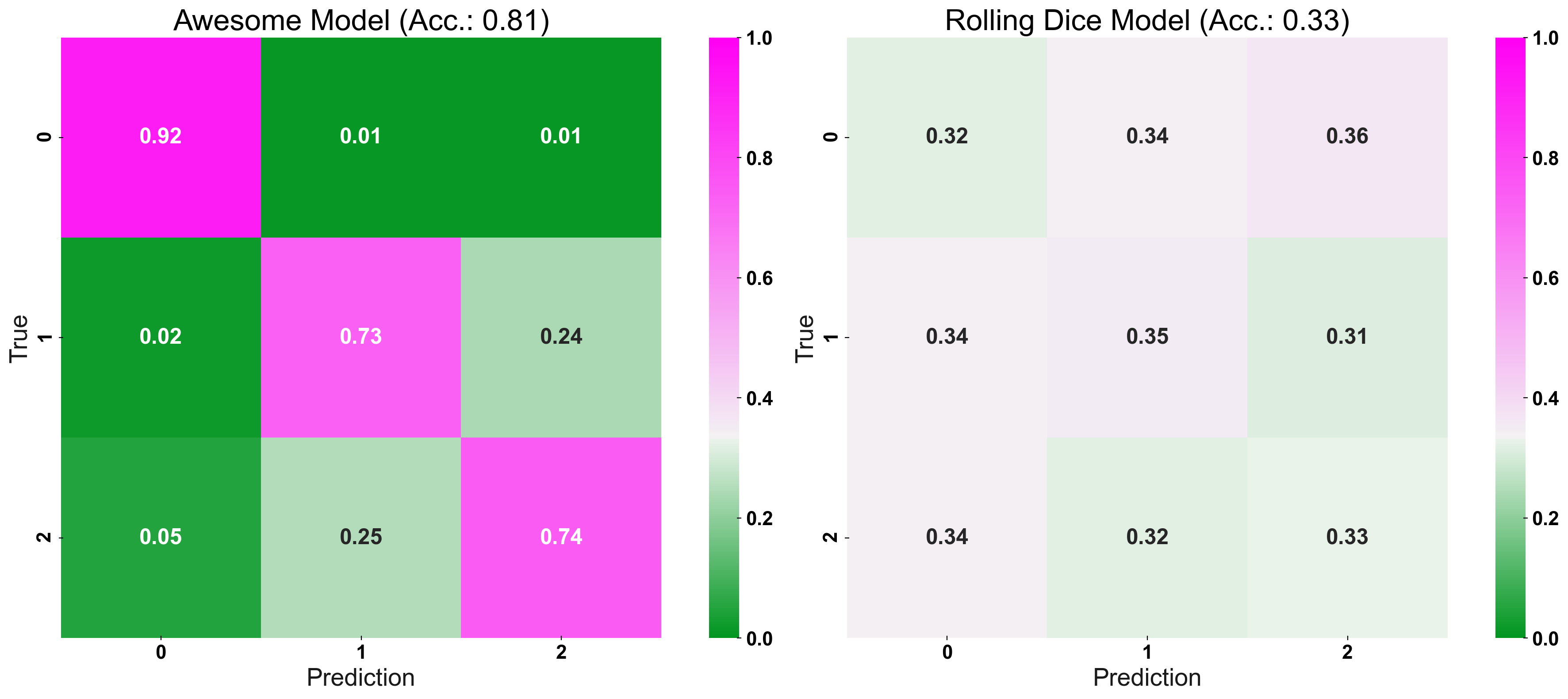
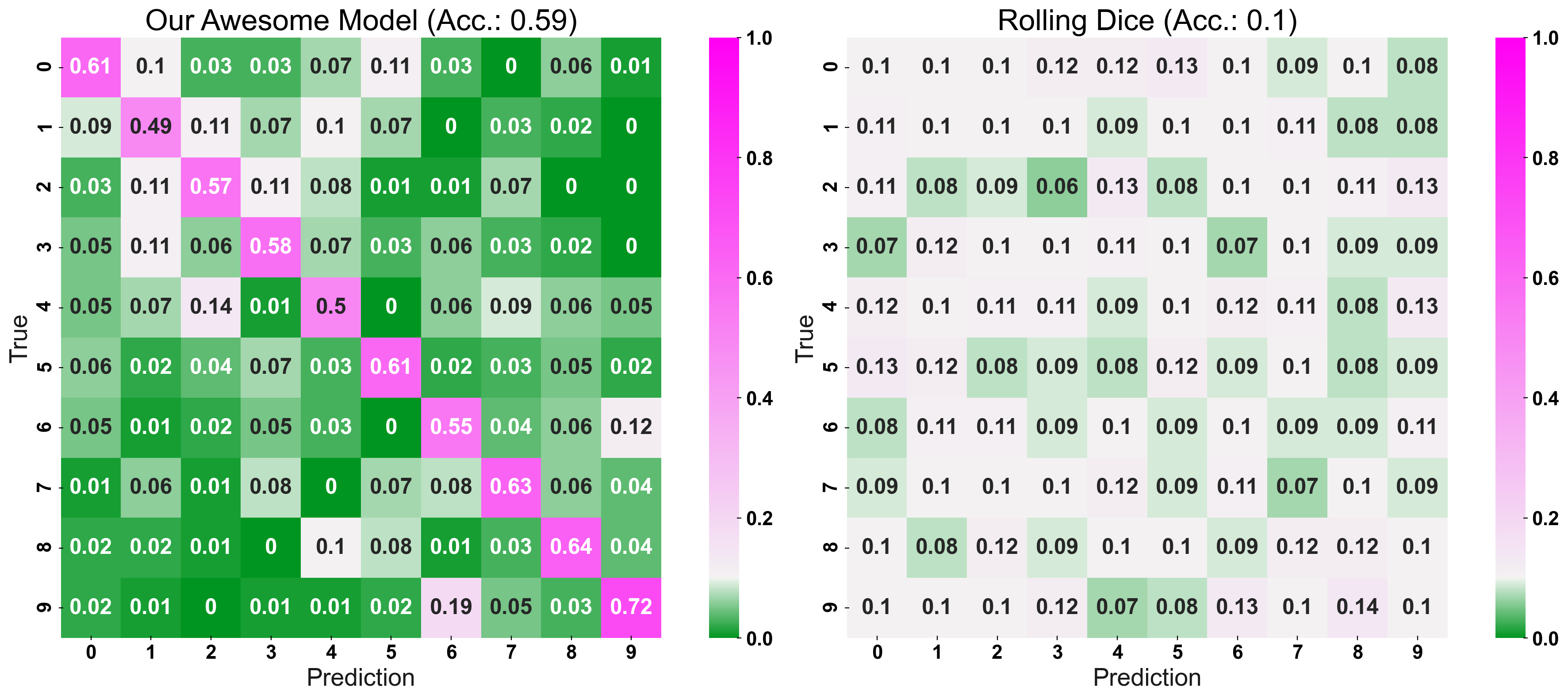
Now, we enter the secret sauce: CM_Norm adjusts the colour-bar, such that its point of origin is equal to the accuracy expected for a random prediction. Essentially, the “naive-prediction accuracy” is our “point of origin” because a model which predicts worse than a coin-flip, is not a helpful model to begin with (hence the name: “coin-flip confusion-matrix”). In other words, we are interested in a models “excess performance”, rather than its “absolute” error rates. To give two examples: For 3 different classes, the “point of origin”, of the colour-bar, would be set at 1/3, or for 10 classes it would be set at 1/10.
Strong Colours Equal a Strong Model!
fig, (ax1, ax2) = plt.subplots(1,2, figsize=(20,8))

plot_cm(y_true=y_test, y_pred=prediction, title="Awesome Model", list_classes=[str(i) for i in range(n_classes)],

normalize="prediction", ax=ax1)

plot_cm(y_true=y_test, y_pred=prediction_naive, title="Rolling Dice Model", list_classes=[str(i) for i in range(n_classes)],

normalize="prediction", ax=ax2)

plt.show()
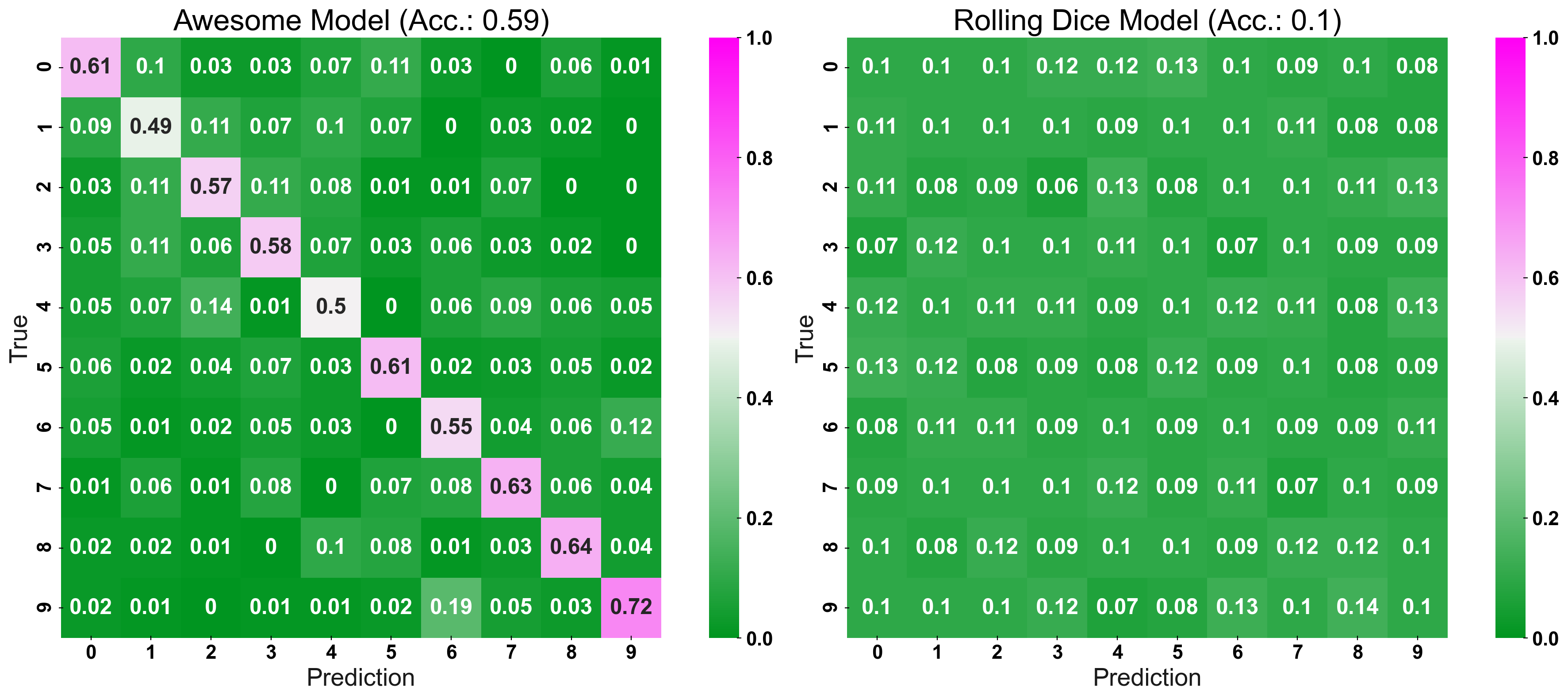
Dial-up the Complexity
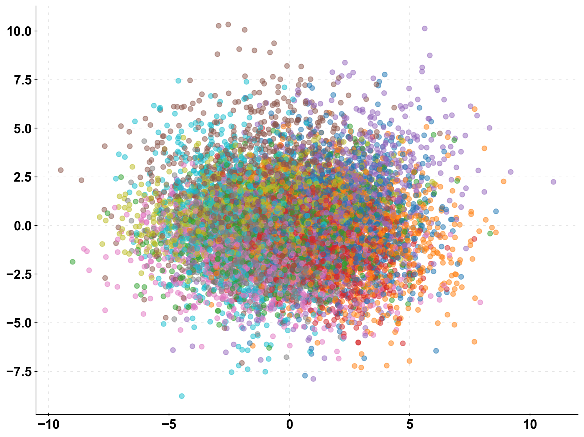
n_classes = 10

X, y = make_classification(n_samples=10000, n_features=10,

n_classes=n_classes, n_clusters_per_class=1,

n_informative=10, n_redundant=0)

X_train, X_test, y_train, y_test = train_test_split(X, y, test_size=0.33, random_state=0)

prediction_naive = np.random.randint(low=0, high=n_classes, size=len(y_test))

clf = LogisticRegression().fit(X_train, y_train)

prediction = clf.predict(X_test)
fig, (ax1, ax2) = plt.subplots(1,2, figsize=(20,8))
plot_cm_standard(y_true=y_test, y_pred=prediction, title="Awesome Model", list_classes=[str(i) for i in range(n_classes)],
        normalize="prediction", ax=ax1)
plot_cm_standard(y_true=y_test, y_pred=prediction_naive, title="Rolling Dice Model", list_classes=[str(i) for i in range(n_classes)],
        normalize="prediction", ax=ax2)
fig, (ax1, ax2) = plt.subplots(1,2, figsize=(20,8))
plot_cm(y_true=y_test, y_pred=prediction, title="Our Awesome Model", list_classes=[str(i) for i in range(n_classes)],
        normalize="prediction", ax=ax1)
plot_cm(y_true=y_test, y_pred=prediction_naive, title="Rolling Dice", list_classes=[str(i) for i in range(n_classes)],
        normalize="prediction", ax=ax2)
plt.show()
Conclusion to Confusion Matrix
I would like to share a few key takeaways from the article:
- Evaluate predictions of classification models with a confusion matrix
- For classifications, it is not only the accuracy matters but also the true positive/negative rate
- Evaluate your model relative to a naive baseline, e.g. a random prediction or a heuristic
- When plotting a confusion matrix, normalise the colour-bar relative to the performance of your naive baseline model
- A CCM lets you assess a model’s performance more intuitively, and is better suited for presentations than a regular confusion matrix
Frequently Asked Questions
A. In machine learning, a confusion matrix is a table that is used to evaluate the performance of a classification model by comparing the predicted class labels to the actual class labels. It summarizes the number of correct and incorrect predictions made by the model for each class.
A. A 4×4 confusion matrix is a table with 4 rows and 4 columns that is commonly used to evaluate the performance of a multi-class classification model that has 4 classes. The rows represent the actual class labels, while the columns represent the predicted class labels. Each entry in the matrix represents the number of samples that belong to a particular actual class and were predicted to belong to a particular predicted class.
The confusion matrix is used to evaluate the performance of a classification model by checking how well it has predicted the class labels of the samples in the test dataset. It provides a way to visualize the performance of the model by summarizing the number of correct and incorrect predictions made by the model.
Thanks for reading! Hope you liked my article on confusion matrix!
The media shown in this article is not owned by Analytics Vidhya and is used at the Author’s discretion.


