Interactive Data Visualization using rbokeh
This article was published as a part of the Data Science Blogathon.
Introduction
Data Visualization is used to present the insights in a given dataset. With meaningful and eye-catching charts, it becomes easier to communicate data analysis findings. Several charts are available for specific purposes, like bar charts to present categorical distribution, line charts to present time series information, etc. When an appropriate plot with a harmonious color palette is used, the charts are convenient and beautiful. Many Python and R libraries are available for data visualization like Altair, ggplot, Bokeh, Holoviews, etc.
Bokeh is a visualization package that provides a declarative framework for producing web-based plots that are both flexible and powerful. Bokeh generates plots using HTML canvas and has several interactive features. Bokeh has Python, Scala, Julia, and now R interfaces. The Bokeh library is built and maintained by the Bokeh Core Team.
What is rbokeh?
rbokeh is an open-source native R plotting package using the Bokeh visualization tool. It gives a flexible declarative interface for dynamic web-based visualizations. Ryan Hafen has developed and currently maintains the rbokeh package. You need to have R and R Studio set up before installing rbokeh. You can also use Kaggle or Google Colab to create rbokeh visualizations.
Why rbokeh?
rbokeh allows you to build various types of interactive graphs. It helps you and your audience to learn more about the data stories by engaging with them. The results can be shared, integrated into HTML documents, or used in online applications.
Installing rbokeh
So, to begin, we will use the R function ‘install. packages()’ to get this package from CRAN.
install.packages("rbokeh")
For importing the rbokeh package, we will use the following command:
library("rbokeh")
Importing the following libraries –
library("tidyverse")
library("ggplot2")
Visualizations using rbokeh
The libraries we imported provide many pre-installed data sets. Run the following command to view the full list of pre-installed datasets:
data()
For this article, we will make use of different pre-installed data sets.
Before proceeding with graph visualizations, it is important to note that rbokeh plots are created by initializing a figure () function. This is similar to an empty canvas that you can lay out and then use a pipe operator for more layers. The data input is x, y, and ly_geom(), which will specify the type of geom used like ly_points, ly_lines, ly_hist, ly_boxplot, etc.
Scatter Plot
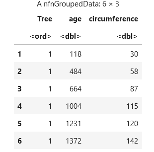
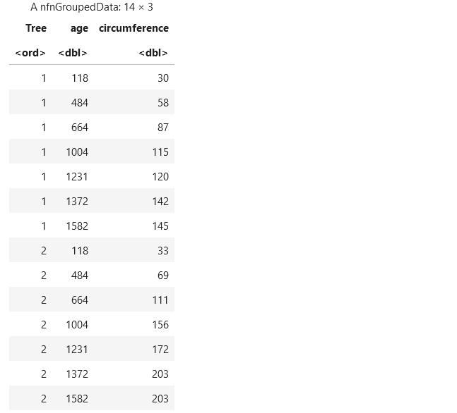
Let us try to build a scatter plot. Let’s take the Orange dataset from the pre-installed datasets. The dataset includes statistics about the different trees, including the age and circumference of the trees. We can print the first few rows of the ‘Orange’ dataset using the following command:
head(Orange)
Suppose we want to see the relation between age and circumference for different trees; a scatter plot will be a good choice to see all the data points. First, we will initialize a ‘figure()’. Then we will create a layer ‘ly_points’ and pass the required arguments: – age on the x-axis – circumference on the y-axis – and the dataset, i.e., Orange, to the data argument.
figure() %>% ly_points(x = age, y = circumference, color=Tree, data = Orange)
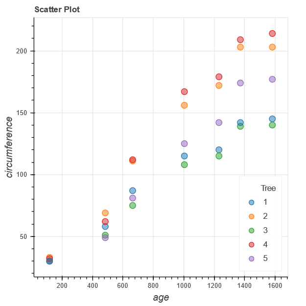
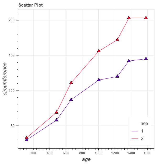
Here the resulting plot includes a point for each tree, and it shows that there could be a relation between the age and the circumference of the tree.
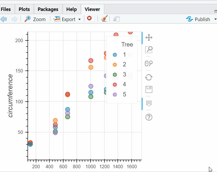
In addition, hovering over points to view the tooltips that we added using the hover function. Other interactive features, such as panning and zooming, are available.
figure() %>% ly_points(x = age, y = circumference, color=Tree,
    data = Orange,hover = c(age, circumference))
Line Chart
Next, we will create a simple line chart using the orange dataset. For the line plot with age versus circumference, we can simply specify the x, y, and data arguments in the ‘ly_lines’ layer as shown below:
line_plot%ly_lines(x=age,y=circumference,color=Tree, data = Orange,width=3)
line_plot
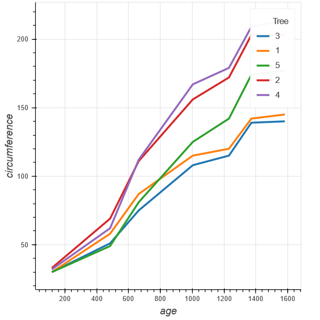
Here we have assigned the resulting figure to ‘line_plot’ and then visualized the chart by writing ‘line_plot’. This is because rbokeh figures are objects that can be saved, retrieved, and modified later. Also, we have set the width of the line to 3 to get thicker lines.
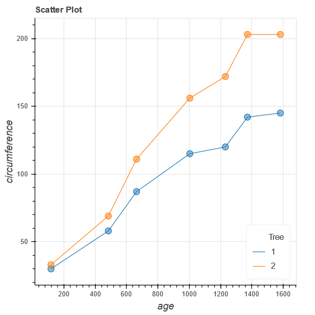
Now we will see how to combine both point and line layers in one figure, i.e., we are visualizing a multi-layer plot. Let’s take the records of Tree 1 and Tree 2 by filtering the Orange dataset using the tree column. The resulting data frame will include the data of the two trees, as shown below.
df % filter(Tree %in% c("1", "2"))
df
Next, we will plot the lines using ‘ly_lines()’ and adding markers using ‘ly_points()’. Note that, in both the layers Tree is mapped to color.
p %
    ly_points(age, circumference, color = Tree, hover=c(age,circumference))%>%
        ly_lines(age, circumference, color = Tree)
p
For all these plots, color is chosen based on the default theme. To get the color of our choice, we can use the ‘set_palette()’ function and pass a vector of colors or a pre-defined palette. As we are dealing with categorical variables, we will use the discrete_color attribute as shown in the code below.
p %
    ly_points(age, circumference, color = Tree,hover=c(age,circumference))%>%
        ly_lines(age, circumference, color = Tree)%>%
            set_palette(discrete_color = pal_color(c("#6200b3", "#ff0831")))
p
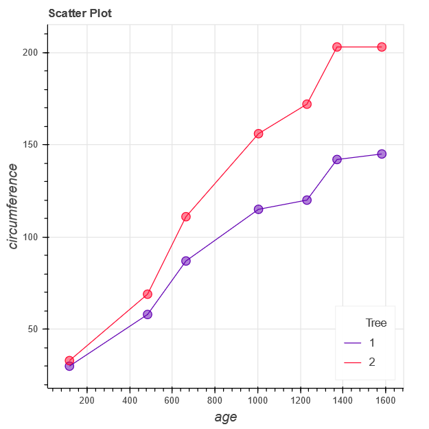
Here we can pass the hex code of the colors or any of the named CSS colors.
Also, we can use different glyphs for our graphs. We will run the following command to view the available possible values for the glyph.:
point_types()
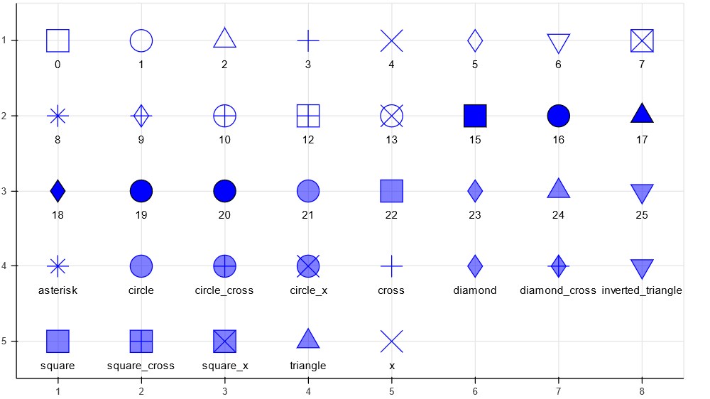
After specifying a numbered glyph in the code, fill and line attributes will be handled accordingly to get the desired result.
p %
    ly_points(age, circumference, color = Tree, hover=c(age,circumference),glyph=17)%>%
        ly_lines(age, circumference, color = Tree)%>%
            set_palette(discrete_color = pal_color(c("#6200b3", "#ff0831")))
p
Histogram
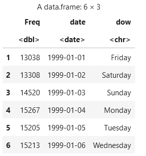
The next plot type we’ll look at is a Histogram. Here we are taking the Flight frequency dataset from the pre-installed datasets. The dataset includes statistics about the frequency of flights for different week dates. We will first few rows of the Flight frequency dataset using the following command:
head(flightfreq)
We can visualize the distribution of values in a certain column of data using a histogram. The flight frequency is shown here using the following code. Here we will use the ly_hist function to look into the distribution of the variables.
h % ly_hist(Freq, data = flightfreq, breaks = 30,
    freq = FALSE)
h
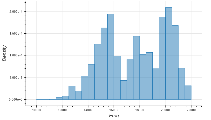
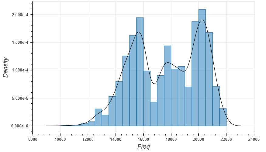
Along with the histogram, we can plot the density plot using the following command:
h % ly_hist(Freq, data = flightfreq,
    breaks = 30, freq = FALSE) %>% ly_density(Freq, data = flightfreq)
h
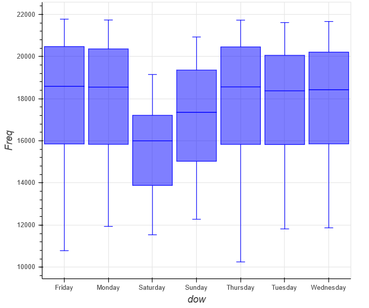
Box plot
Now we are plotting a box plot which is commonly used to determine most of the values of a variable’s concentration. Using the following code, we’ll make a box plot for each day of the week in the flight frequency dataset.
figure(width = 600) %>% ly_boxplot(Freq,dow, data = flightfreq)
Bar Graph
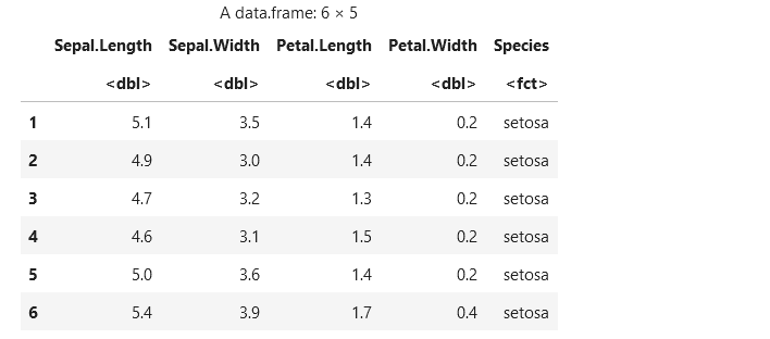
For our next plot, i.e., Bar graph, we are using the Iris dataset that contains the length & width of sepal and petal, respectively, along with the species as shown below:
head(iris)
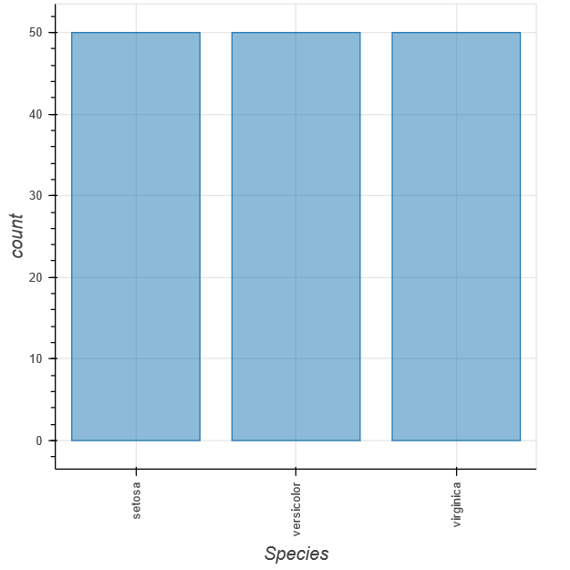
The bar graph representing the number of species in the Iris dataset is plotted using the following code.
bar_chart% ly_bar(Species, data = iris) %>%
    theme_axis("x", major_label_orientation = 90)
bar_chart
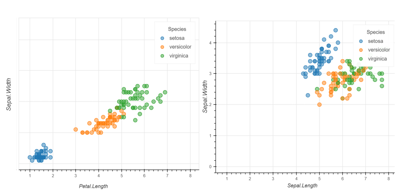
Grid Plot
We can use a grid plot that allows us to put multiple figures in one layout. We can merge figures from different types such as bar charts, line plots, scatter plots, etc. Using the following code, we will create a grid plot.
tools <- c("pan", "wheel_zoom", "box_zoom", "box_select", "reset")
p1 %
ly_points(Sepal.Length, Sepal.Width, data = iris, color = Species)
p2 %
ly_points(Petal.Length, Petal.Width, data = iris, color = Species)
grid_plot(list(p1, p2), same_axes = TRUE, link_data = TRUE)
That’s it! You’ve successfully completed this rbokeh tutorial.
Conclusion
You should now be able to use rbokeh for creating beautiful and interactive visualizations from your data. The code for this tutorial is available on my GitHub repository.
In this rbokeh tutorial, you learned:
- The rbokeh library is a powerful tool to generate dynamic visualizations in R.
- You can create interactive plots from data using the rbokeh package.
- How to install the rbokeh package requires both R and R studio installations.
- How to create plots using rbokeh.
- Organize multiple plots in a grid layout
To explore rbokeh, I recommend reading the official documentation of the library for sample code and inspiration. Hope you found the tutorial interesting. Try this library to create interactive visualizations for your next dashboard or exploratory data analysis.
The media shown in this article is not owned by Analytics Vidhya and is used at the Author’s discretion.


