Explainable AI using OmniXAI
This article was published as a part of the Data Science Blogathon.
Introduction
In the modern day, where there is a colossal amount of data at our disposal, using ML models to make decisions has become crucial in sectors like healthcare, finance, marketing, etc. Many ML models are black boxes since it is difficult to fully understand how they function after training. This makes it difficult to understand and explain a model’s behaviour, but it is important to do so to have trust in its accuracy. So how can we build trust in the predictions of a black box?
The solution to this problem is Explainable AI (XAI). Explainable AI aims to develop explanations for AI models that are too sophisticated for human perception. That means it is a system that understands what the AI algorithm is doing and why it is making that decision. Such information can improve models’ performance, helping ML engineers troubleshoot and making AI systems more convincing and easy to understand.
In this article, we will take a look at how to make use of a python library OmniXAI to get explanations for the decision made by our model.
What is OmniXAI?
OmniXAI is a library that simplifies explainable AI for users who need explanations at many ML stages, including data analysis, feature extraction, model building, and model evaluation. By employing techniques like chi-square analysis and mutual information computation to look at the correlations between the input features and the target variables, it helps in feature selection by identifying key features. Using the data analyzer it offers, we can simply do correlation analysis and find the class imbalances.
OmniXAI can be used on tabular, image, NLP, and time-series data. OmniXAI provides several explanations to give users a detailed understanding of a model’s behaviour. These explanations can be easily visualized with the help of this library. It creates interactive graphs using Plotly, and with only a few lines of code, we can create a dashboard that makes it simple to compare several explanations simultaneously. In a later section of this article, we’ll build one such dashboard to describe a model’s results.
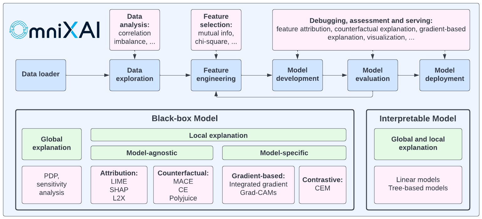
Local and global explanations are mainly two types. Local explanation explains the reasoning behind a certain decision. This kind of explanation is produced using techniques like LIME and SHAP. Global explanation examines the overall behaviour of the model. To generate global explanations, partial dependence plots can be used.
This library uses several model-agnostic techniques, including LIME, SHAP, and L2X. These methods can effectively describe the decisions the model made without knowing the model’s intricacies. Additionally, it generates explanations for a given model using the model-specific approach like Grad-CAM.
After a brief overview of OmniXAI, let’s use it to explain the decisions made by a classifier we will be training.
Implementation
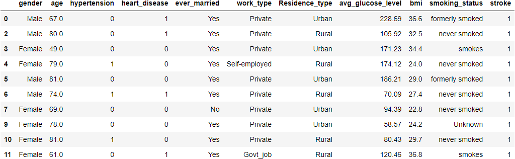
We will use the stroke prediction dataset to create a classifier model. Based on input characteristics, including gender, age, different illnesses and smoking status, this dataset is used to determine whether a patient is likely to get a stroke. We cannot rely on judgments made by a “black box” in the healthcare sector; there must be a justification for the choice. To accomplish so, we will utilise OmniXAI to analyse the dataset and understand the model’s behaviour.
Python Code:
Data Analysis using OmniXAI
We’ll make a tabular dataset to use a Pandas dataframe with OmniXAI. We need to specify the dataframe, the categorical feature names, and the target column name to build a Tabular instance given a pandas dataframe.
feature_names = df.columns
categorical_columns = ['gender','ever_married','work_type','Residence_type','smoking_status']
tabular_data = Tabular(
    df,
    feature_columns=feature_names,
    categorical_columns=categorical_columns,
    target_column='stroke'
)
Now we’ll make a DataAnalyzer explainer to analyze the data.
explainer = DataAnalyzer(
    explainers=["correlation", "imbalance#0", "imbalance#1", "mutual", "chi2"],
    mode="classification",
    data=tabular_data
)
explanations = explainer.explain_global(
    params={"imbalance#0": {"features": ["gender"]},
            "imbalance#1": {"features": ["ever_married"]}
            }
)
Dash is running on http://127.0.0.1:8050/
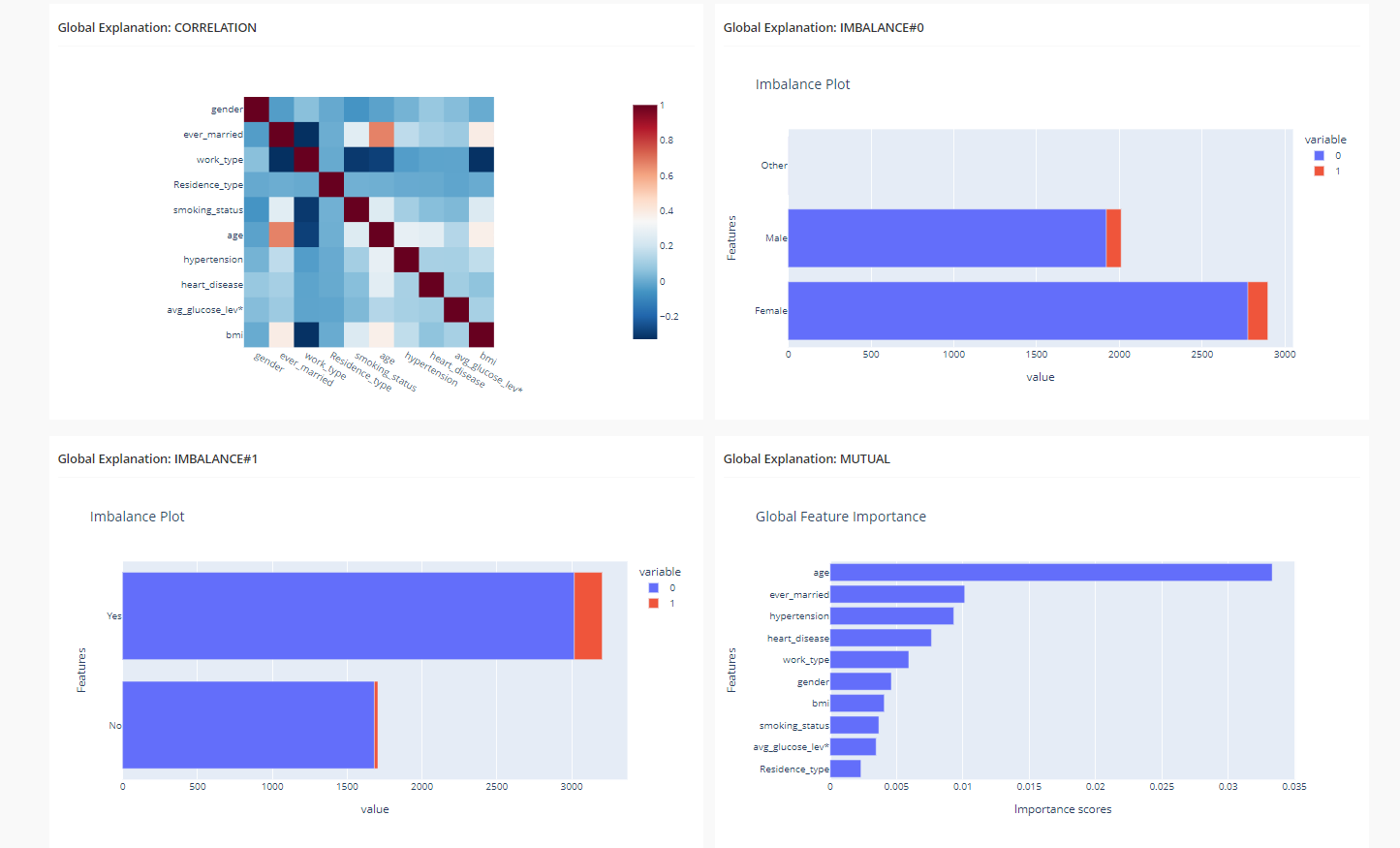
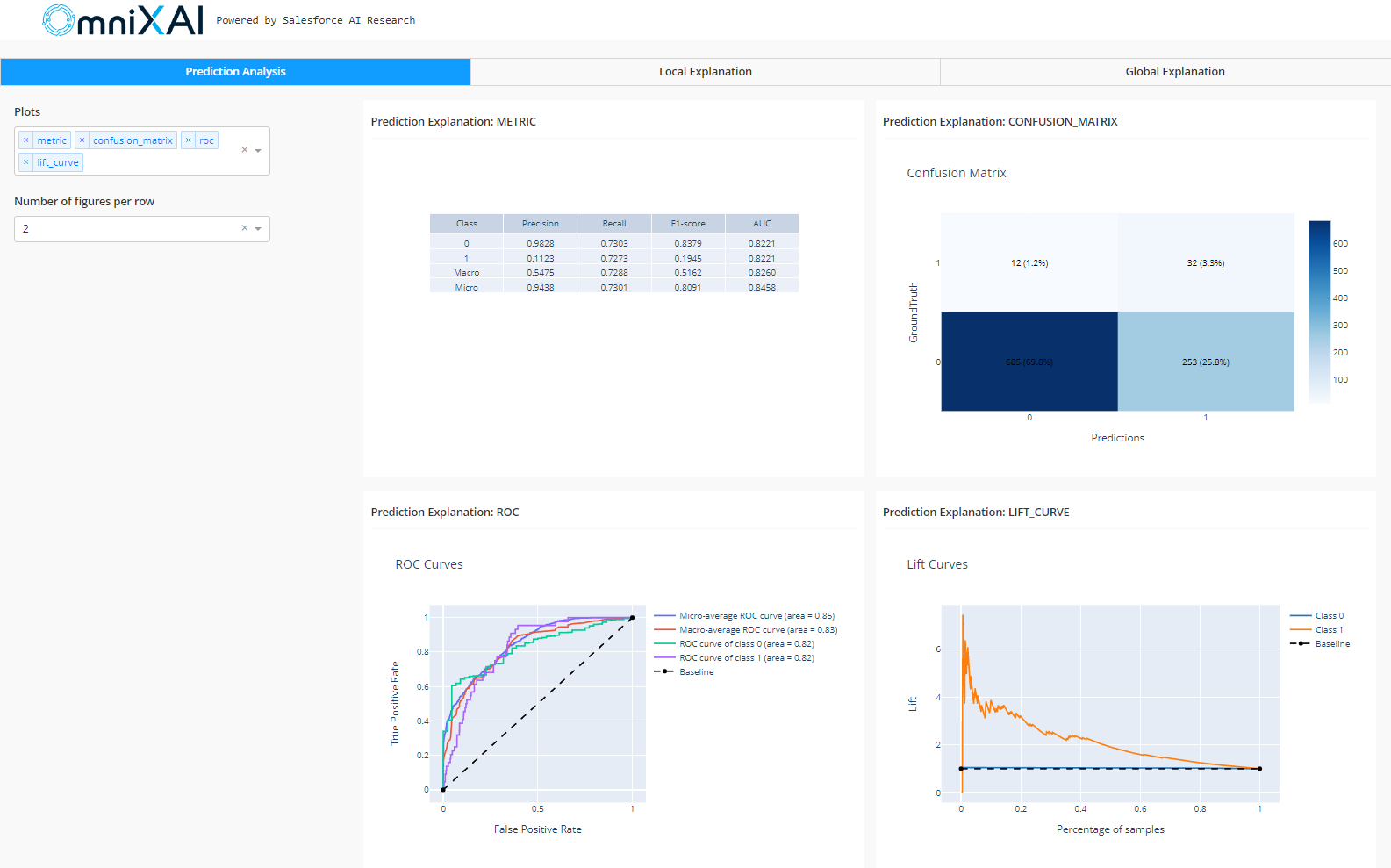
The feature correlation analysis, feature imbalance plots for the gender and ever_married features, and a feature importance plot are all displayed on this dashboard.
Training the Model
Now we’ll apply TabularTransform to our data, transforming a tabular instance into a NumPy array and turning categorical features into one-hot encoding. Next, we will use SMOTE to address the issue of class imbalance by oversampling data from class 1. Then, using a StandardScaler and a LogisticRegression model, we will fit our data into a pipeline.
transformer = TabularTransform().fit(tabular_data)
x = transformer.transform(tabular_data)
train, test, train_labels, test_labels = train_test_split(x[:, :-1], x[:, -1], train_size=0.80)
#balance classes in training set
oversample = SMOTE()
X_train_balanced, y_train_balanced = oversample.fit_resample(train, train_labels)
model = Pipeline(steps = [('scale',StandardScaler()),('lr',LogisticRegression())])
model.fit(X_train_balanced, y_train_balanced)
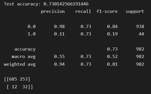
print('Test accuracy: {}'.format(accuracy_score(test_labels, model.predict(test))))
print(classification_report(test_labels,model.predict(test)))
print(confusion_matrix(test_labels,model.predict(test)))
train_data = transformer.invert(X_train_balanced)
test_data = transformer.invert(test)
After our model has been trained, we can proceed further to create explanations for its behaviour.
Creating Local and Global Explanations
Now we will define a TabularExplainer with the parameters given in the code. The parameter “explainers mention the name of the explainers to use.” Preprocessing turns raw data into model inputs. Local explanations are generated by LIME, SHAP, and MACE, whereas PDP generates global explanations. For computing performance metrics for this classifier model, we will define a PredictionAnalyzer by providing it with the testing data.
preprocess = lambda z: transformer.transform(z)
explainers = TabularExplainer(
    explainers=["lime", "shap", "mace", "pdp"],
    mode="classification",
    data=train_data,
    model=model,
    preprocess=preprocess,
    params={
        "lime": {"kernel_width": 4},
        "shap": {"nsamples": 200},
    }
)

test_instances = test_data[10:15]
local_explanations = explainers.explain(X=test_instances)
global_explanations = explainers.explain_global(
    params={"pdp": {"features": ['age', 'hypertension', 'heart_disease', 'ever_married', 'bmi','work_type']}}
)
analyzer = PredictionAnalyzer(
    mode="classification",
    test_data=test_data,
    test_targets=test_labels,
    model=model,
    preprocess=preprocess
)
prediction_explanations = analyzer.explain()
Creating Final Dashboard
After creating the explanations, we will define the dashboard’s parameters, and then the Plotly dash app will be created. We can run this dashboard by copying the local address to our browser’s address bar.
dashboard = Dashboard(
    instances=test_instances,
    local_explanations=local_explanations,
    global_explanations=global_explanations,
    prediction_explanations=prediction_explanations,
    class_names=class_names
)
dashboard.show()
Dash is running on http://127.0.0.1:8050/
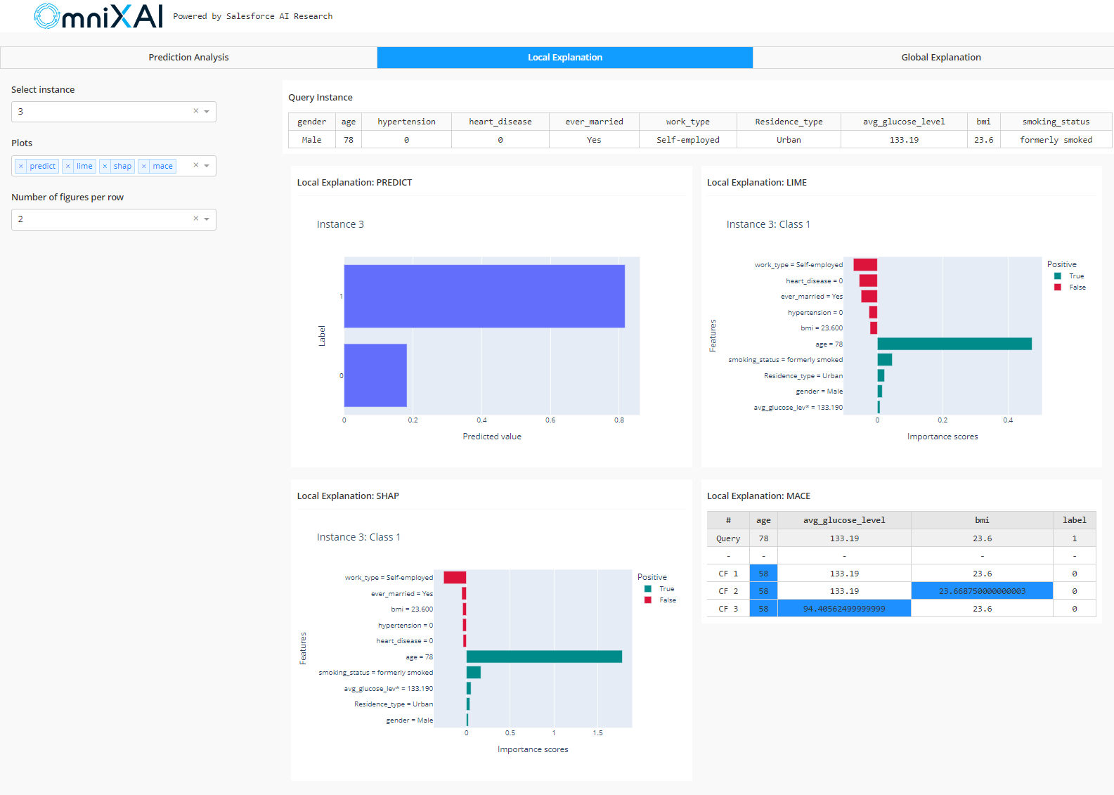
Looking at the LIME and SHAP graphs for the local explanation, we can identify which characteristics of the given input were most crucial to the model’s decisions. As we can see, age significantly impacted the model’s decision in this case. MACE displays what-if situations, such as the individual wouldn’t have suffered a stroke if they were 58 years old instead of 78.
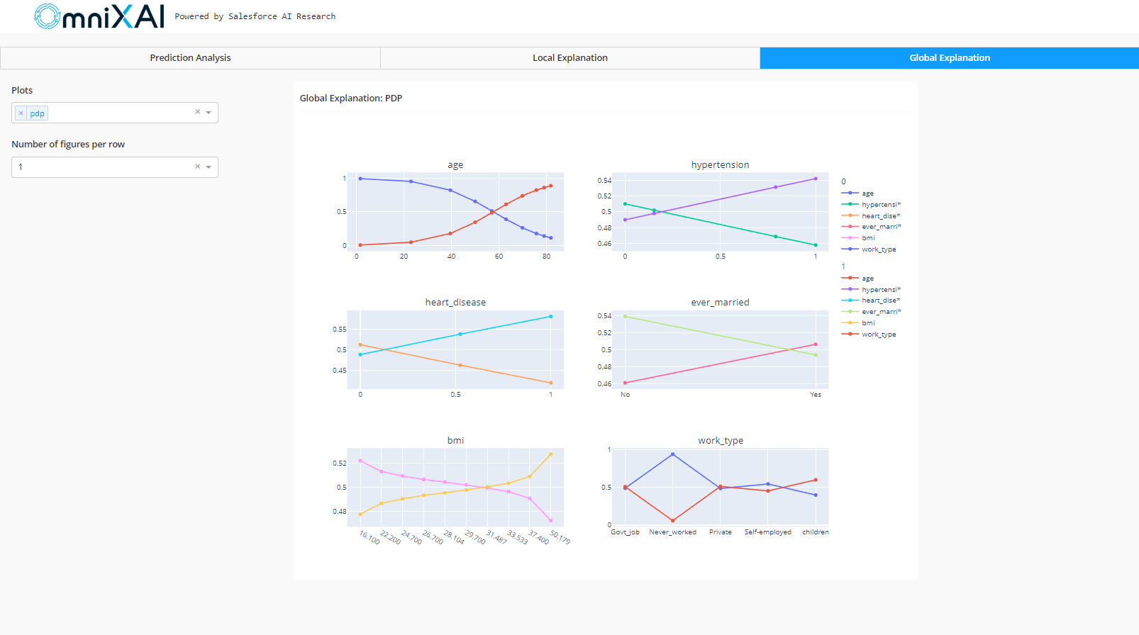
The partial dependency plots (PDP) illustrating the relationship between the target variable and the input features are displayed in the global explanation. As observed in the age plot, as age grows, the value on the y-axis tends to increase in the case of class 1 and decrease in the case of class 0. It indicates that an individual’s older age increases their risk of suffering a stroke. Similarly, if a person has hypertension or heart disease, they are more prone to suffer a stroke.
Conclusion
Even though the decisions made by AI models may have significant effects, the models’ lack of explainability undermines people’s trust in AI systems and prevents their widespread adoption. In this article, we saw the use of an XAI tool, ‘OmniXAI’, to help understand the decision made by a model. Some of the key takeaways are:
- We learned the use of OmniXAI to process tabular data.
- We created a dashboard to analyse the data.
- Finally, we used local and global explanations to explain the model’s behaviour and created a dashboard to visualize the results.
The media shown in this article is not owned by Analytics Vidhya and is used at the Author’s discretion.


