Data Visualization – A Useful tool to Explore Data
This article was published as a part of the Data Science Blogathon
Data visualization and its importance
Let’s see what does technical definition says:
Data visualization is the graphical representation of information and data. By using visual elements like charts, graphs, and maps, data visualization tools provide an accessible way to see and understand trends, outliers, and patterns in data. (Source: What Is Data Visualization? Definition & Examples | Tableau)
In simple words, it is very difficult to gain knowledge from a large amount of data and this is where data visualization comes into the picture. Be it numerical or categorical or mixed type of data, visualization techniques help see the trends, outliers, or any kind of patterns in the data. All this information helps data scientists or anyone in any field of work to make better decisions to achieve their objective.
There is a well-known fact that we can grasp and retain knowledge from pictures and visuals way better than any numbers or text. With the evolution of big data in recent years visualization techniques becomes far more important than ever before because it is almost impossible for anyone to extract any information from terabytes or petabytes of data without using visualization techniques.
Most of the time data scientists deal with structured data in most of their data analysis journey and familiar with the concepts of the structured query language(SQL) tables. SQL tables represent data in terms of rows and columns and make it convenient to explore and apply transformations. Data visualization techniques are also helpful for the feature engineering part in machine learning. In this article, we will be discussing various visualization techniques that we can use in python.
Once you finish the article you will have a pretty good understanding of the following data visualization techniques:
Table of contents
Now we will explore each of the methods in detail.
1. Drawing Plot
Matplotlib is a python 2D plotting library and the most widely used library for data visualization. It provides an extensive set of plotting APIs to create various plots such as scatter, bar, box, and distribution plots with custom styling and annotation. Detailed documentation for matplotlib can be found at https://matplotlib.org/.
Seaborn is also a python data visualization library based on matplotlib. It provides a high-level interface for drawing innovative and informative statical charts(https://seaborn.pydata.org/).
Matplotlib is a library for creating 2D plots of arrays in python.
Matplotlib is written in python and makes use of Numpy arrays. Seaborn which is built on top of matplotlib, is a library for making elegant charts in python and well-integrated with pandas dataframe.
To create graphs and plots, we need to import ‘matplotlib. pyplot’ and ‘seaborn’ modules.
To display the plots on the jupyter Notebook, we need to provide a directive ‘%matplotlib inline’. Only if the directive is provided, the plots will be displayed in the notebook.
import matplotlib.pyplot as plt
import seaborn as sn
%matplotlib inline
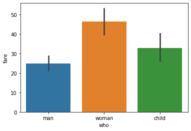
2. Bar Chart
The bar chart is a frequency chart for a qualitative variable. A bar chart can be used to access the most-occurring and least-occurring categories within a dataset.
To draw a bar chart, call ‘barplot()’ of the seaborn library. The Data frame should be passed in the parameter data here.
Dataset:- https://www.kaggle.com/c/titanic/data?select=train.csv
To display the average fare by each category, pass fare as y parameter and who as x parameter.
# importing the required library
import seaborn as sns
import matplotlib.pyplot as plt

# read a titanic.csv file
# from seaborn library
df = sns.load_dataset('titanic')

# who v/s fare barplot
sns.barplot(x = 'who',
            y = 'fare',
            data = df)

# Show the plot
plt.show()
The below figure show, a bar plot created to show the average fare for each category.
3. Histogram
A histogram is a plot that shows the frequency distribution of a set of continuous variables.
The histogram gives an insight into the underlying distribution of the variable, outliers, skewness, etc. To draw a histogram, invoke the ‘hist()’ method of the matplotlib library.
plt.hist(df["fare"])
The following is an example of how to draw a histogram for fare and understand its distribution.
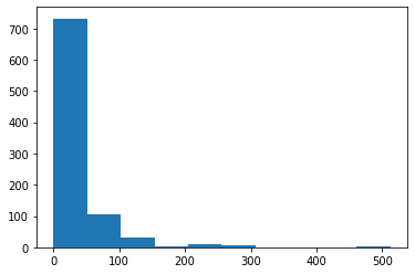
figure:- histogram for fare
4. Distribution or Density plot
A distribution or density plot depicts the distribution of data over a continuous interval. A density plot is like a smoothed histogram and visualizes the distribution of data over a continuous interval. So a density plot also gives into what might be the distribution of the population.
sns.distplot(df["fare"])
To draw the distribution plot, we can use the distplot() of the seaborn library.
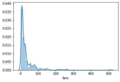
fig. distribution plot for fare
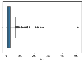
5. Box Plot
Box plot is a graphical representation of numerical data that can be used to understand the variability of the data and the existence of outliers. Box plot is designed by identifying the following descriptive statistics.
1. Lower quartile, median and upper quartile
2. Lowest and highest values
3. Interquartile range(IQR)
Box plot is constructed using IQR, minimum and maximum values. IQR is the distance between the 3rd quartile and 1st quartile. The length of the box is equivalent to IQR.
To draw the box plot, call boxplot() of the seaborn library.
box = sns.boxplot(df['fare'])
The box plot for the fare is shown in the figure and indicates that there are few outliers in the data.
To obtained min, max, 25 percentile(1st quantile), and 75 percentile(3rd quantile) values in the boxplot, the ‘boxplot()’ method of matplotlib library can be used.
box = plt.boxplot(df['fare'])
Let us return the value of boxplot() to a variable box.
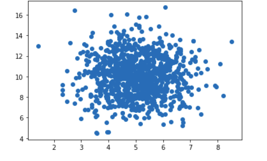
6. Scatter Plot
In a scatter plot, the values of two variables are plotted along two axes and the resulting pattern can reveal correlation present between the variables if any.
A scatter plot is also useful for assessing the strength of the relationship and to find if there are any outliers in the data.
import numpy
import matplotlib.pyplot as plt
x = numpy.random.normal(5.0, 1.0, 1000)
y = numpy.random.normal(10.0, 2.0, 1000)plt.scatter(x, y)
plt.show()The ‘scatter()’ method of matplotlib can be used to draw the scatter plot which takes both the variables.
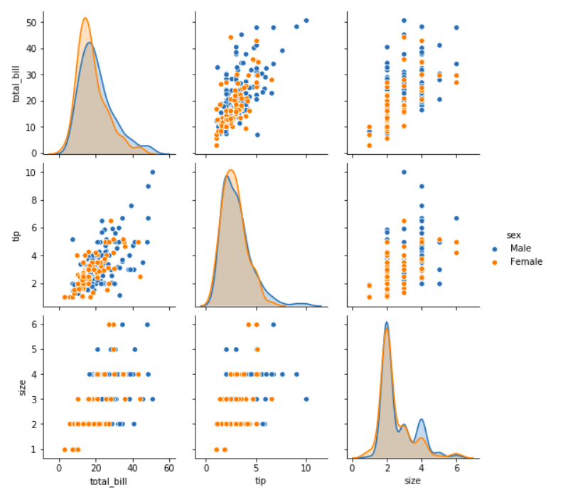
7. Pair Plot
If there are many variables, it is not convenient to draw scatter plots for each pair of variables to understand the relationship. So that we have to use a pair plot to depict the relationship in a single diagram which can be plotted using the ‘pairplot()’ method.
import seaborn
import matplotlib.pyplot as plt
df = seaborn.load_dataset('tips')
seaborn.pairplot(df, hue ='sex')
plt.show()
8. Correlation and HeatMap
Correlation is used for measuring the strength and direction of the linear relationship between two continuous random variables x and y. A positive correlation means the variables increase or decrease together. A negative correlation means if one variable increases then the other decrease.
Correlation values can be computed using the ‘corr()’ method of the DataFrame and rendered using heatmap.
df.corr()
# plotting correlation heatmap
dataplot = sns.heatmap(df.corr(), cmap="YlGnBu", annot=True)

# displaying heatmap
plt.show()
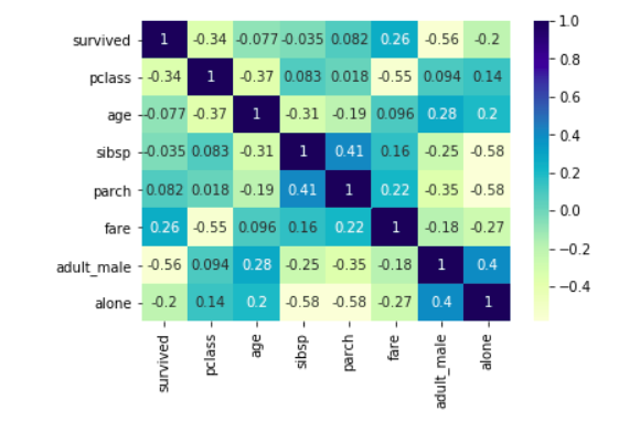
The color map scale is shown along with the heatmap. Setting the ‘annot’ attribute to ‘True’ prints the correlation values in each box of the heatmap and improves the readability of the heatmap.
Conclusion
- The objective of descriptive analytics is simple comprehension of data using summarization basic statistical measures and visualization.
- Matplotlib and seaborn are the two most widely used libraries for creating a visualization.
- Plots like histograms, distribution plots, box plots, scatter plots, pair plots, heatmap, can be created to find insights during exploratory analysis.
FAQs
Data exploration and visualization tools help you analyze and understand data through visual representations. Options include Pandas, Matplotlib, Tableau, Power BI, and D3.js. Choose the tool that suits your experience and needs.
Here are the objectives of data exploration:
1. Understanding data structure and characteristics
2.Identifying patterns and trends
3.Detecting outliers and anomalies
4.Formulating hypotheses and research questions
5.Guiding data cleaning and preparation
6.Informing feature engineering and selection
7.Communicating data insights
About the Author
Hi, I am Kajal Kumari. I have completed my Master’s from IIT(ISM) Dhanbad in Computer Science & Engineering. As of now, I am working as Machine Learning Engineer in Hyderabad. You can also check out few other blogs that I have written here.
The media shown in this article are not owned by Analytics Vidhya and are used at the Author’s discretion.


