How to create compelling analytical stories using infographics?
Let me go back a few years:
After spending slightly more than a year in my previous role, I moved into a new role in my Organization. This new role was my first experience in Customer Management analytics. The amount of data was more than I had handled ever before. The impact I could have on my employers’ profitability was huge.
I worked hard to deliver good quality analysis but the impact from these analysis was lower than what I could have created.
This is a common situation many analysts face during their career.
The transition from being a number cruncher to a story teller (of course, based on numbers) is more difficult than it sounds. Thankfully, Infographic came to my rescue. Although, the purpose of infographics is to share content and increase visibility over the web, they can be used to create stories in effective manner.
You can find various tips on how to create good infographics over web, however the purpose of this article is to tell “How you can use Infographics to create compelling stories from your analysis?”
[stextbox id=”section”]What is an infographic?[/stextbox]
As per Wikipedia:
Information graphics or infographics are graphic visual representations of information, data or knowledge intended to present complex information quickly and clearly. They can improve cognition by utilizing graphics to enhance the human visual system’s ability to see patterns and trends. The process of creating infographics can be referred to as data visualization, information design, or information architecture.
Simply put, you need to answer the following question:
If you had only one page to tell your story, how would you tell it?
[stextbox id=”section”]Elements of an infographic:[/stextbox]
Infographics are important because they change the way people find and experience stories – especially now, when more and more infographics are being used to create editorial content on the web. Infographics create a new way of seeing the world of data, and they help communicate complex ideas in a clear, crisp and beautiful manner.
A good infographic must:
- present complex information quickly and clearly
- integrate words and graphics to reveal information, patterns or trends
- be easier to understand than words alone
- be beautiful and engaging
.
[stextbox id=”section”]How can infographic help you create a story?[/stextbox]
You might almost think that what does an infographic have to do with creating and presenting a story? Well, it does! As a tool, it forces you to create and present your story on a single page. It ensures that you remove all the clutter around the story (in your mind and on paper as well) and present it in simple & graphical manner.
Doesn’t that sound like a story?
One of my mentors used to advice “If you can not present a project in 10 slides, you are not clear about what you have done.” Once I was comfortable creating story in 10 slides, the milestone moved to 3 slides!
With use of infographic, the challenge moves to a single page.
Let us take an example, Economist recently produced an interactive infographic on how Google Chrome has become most widely used browser. This is how it looks:

Now imagine the number of slides you would have required to tell this story?
[stextbox id=”section”]So, how do create a story with an infographic?[/stextbox]
Just follow following steps:
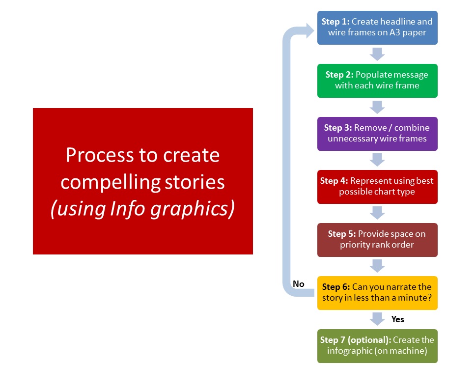
- Create headline and wire frames on a paper (preferably A3): The headline should summarize the project and wire frames should capture the story of the analysis.
- Populate message in each wire frame: In each of the frames, write the message you want to convey through the chart / graphic. Don’t draw the charts yet! Just see if the story is complete from customer / audience point of view.
- Remove / Combine unnecessary wire frames: Next, ask this question for each and every wire frame: “Can I remove this wire frame without impacting the story?” or “Can I narrate my story without this graphic?”. If the answer is “Yes”, then remove them. A few tips to make this easy for you:
- If you have performed an analysis, but it does not fit in the story, remove it.
- There is no rule on minimum number of wire frames. Lower the better! If one chart can tell the entire story, just use one.
- If you can combine multiple charts or frames, combine them. Since you will emphasize on one or two key charts in an infographic, they can be relatively complex. However, remember that complexity should be avoided to the extent possible.
- Represent using best charts: For each of the remaining frames, think hard about what is the best chart / graphic to represent this view. Some of the general guidelines like maximize data-ink ratio, selecting the right chart should be followed during this step. If need be, feel free to use variety of charts like geocharts, Venn diagram, Area chart etc.
- Provide priority wise space: Next, rank order each wire frame in order of importance. Once done, make sure that space allocated to the wire frame is in proportion of its importance. Most important chart in the story deserves the highest area on the paper.
- Narrate story in less than a minute: Speak out the story on this page in less than a minute. If it takes longer or is hard to comprehend, SIMPLIFY and re-structure until you achieve this.
- Create the infographic: Once happy with the story, as an optional step you can actually go ahead and create an infographic. There are multiple tools on the web to create the same.
Using this process, you can use infographics to create stories out of your analytical project. To start with, can you create an infographic summarizing this post?
If you like what you just read & want to continue your analytics learning, subscribe to our emails or like our facebook page
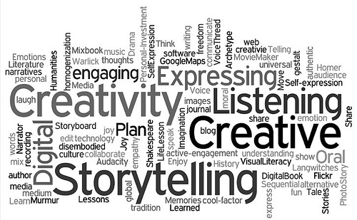
Image 1 credit: residentsvoices.net
Kunal is a post graduate from IIT Bombay in Aerospace Engineering. He has spent more than 10 years in field of Data Science. His work experience ranges from mature markets like UK to a developing market like India. During this period he has lead teams of various sizes and has worked on various tools like SAS, SPSS, Qlikview, R, Python and Matlab.


Hi Kunal, This is great article. Thanks for sharing your thoughts. Thanks Ram
Hi Kunal, Its awesome!!!! Thanks for sharing. Thanks, Deepak Rai
Thanks Kunal...awesome...best content on story writing..