Visualizing PCA in R-Programming with Factoshiny
This article was published as a part of the Data Science Blogathon.
Introduction
Transforming a data set with Principal Component Analysis (PCA) is a short task. However, would the task be effective?
In this article, information is provided to effectively produce visuals from PCA.
Factoshiny can illustrate deeper insights into the data set after a PCA transformation. Read more here to learn why.
Benefits and Learning Outcomes:
- How to visualize PCA with Factoshiny
- Finding additional insights from PCA
- Analyzing PCA graphs produced on a Cartesian Plane
- Applying contextual meaning from PCA
- Helping as a reference guide for educational purposes
Some requirements include:
- Knowledge of separately installing RStudio, R, and library
- R-Programming mechanics
- How to read graphs and their elements
Tips on installing R:
When coding in R-programming, versions used can impact functionality because of compatibility.
Older versions may seem unneeded, although libraries seem to only work with packages installed within an older version of R.
Since CRAN (R-programming website) archives several applications and package versions, libraries may still be possible to run at this moment.
Some quick background information, Principal Component Analysis (PCA) transforms large numbers into condensed numbers on a magnified scale inside the numerically cleaned data set.
First, install the appropriate version of RStudio and R.
If there are multiple versions of R installed on the operating system, select the closest to version 3.6.2 by holding the CTRL and SHIFT keyboard buttons together while clicking on the RStudio icon then release those buttons. This should not be done on a taskbar pinned icon, preferably desktop or the start menu.
Rstudio is installed and uses R version 3.6.2.
Here is what a portion of RStudio should look like in a console:
Second, install packages required to run Factoshiny.
install.package("Factoshiny", dependencies = TRUE)
The image below is how a package installation may appear in RStudio:
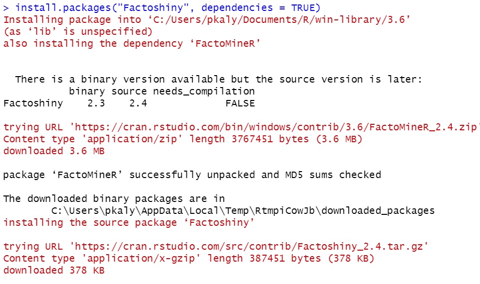
Remember to include the dependencies option and set it to “TRUE” as indicated above.
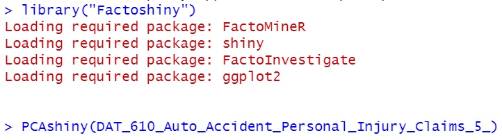
Third, enter the library (“Factoshiny”) into the console.
library("Factoshiny")
The messages shown below are ideal after calling Factoshiny. Then, continue by entering in:
PCAshiny(DAT_610_Auto_Accident_Personal_Injury_Claims_5_) # Include the data set variable inside the brackets or parenthesis.
You may select any data set of your choosing, here is a sample data set saved from a school project. It was about risk assessment and how to distinguish real claims from fraudulent claims.
A general variable overview of the sample data set
Few key variables included: suspicion score, paid amount, claim cost, and 45 claim identifiers.
- Suspicion scores were factored (integer) numbers from 1 to 5 and rated how suspicious the accident claim was at that time.
- Paid amounts were in dollar values.
- Claim costs were in dollar values.
- These claim identifiers were unknown although they were factored numerical values and added to the data set to help rate the suspicion of the accident claim
- Any other variables were discarded and removed as they were ID numbers without any correlation or statistical meaning, such as claim number and policy ID.
Typically, the library can still be functional if the console does not result in error messages:
Fourth, a pop-up window with options will appear to adjust accordingly.
The following images show available options to visualize the transformed data set. With some knowledge in graphing layouts and formatting, it is possible to format visuals to explain an idea.
To the left-hand side of the image below, there is a panel of boxes to adjust the view of the graphs. Each change on the panel can change the appearance of the graphs. Changes can be undone if mistakes occur.
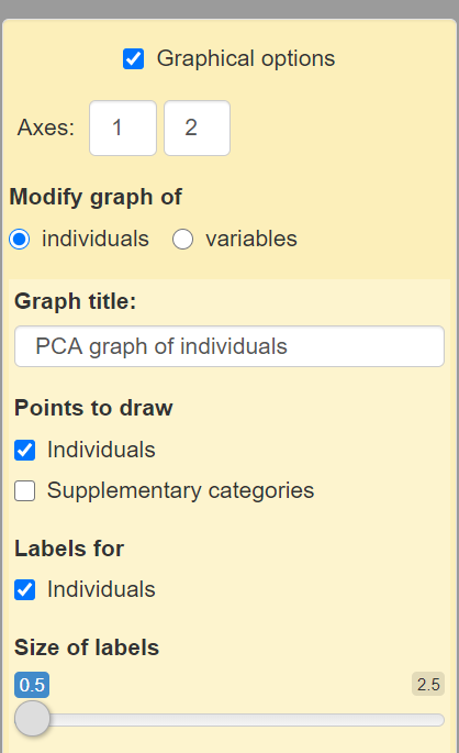
The yellow box is to format the graphs. This means there is an option to add, remove, and/or change labels.
What each option does:
Axes: This is an editable textbox for integers to adjust the number of axes on the graph. This can change the placement of each data point on the graph. Adjusting the placement can also provide more insights. In this data set, the first box can only be set to ‘1’ and the second box can be set to an integer number greater than ‘1’.and less than ’43’. These changes can also make it difficult to see each data point clearly as each label and data point will overlap.
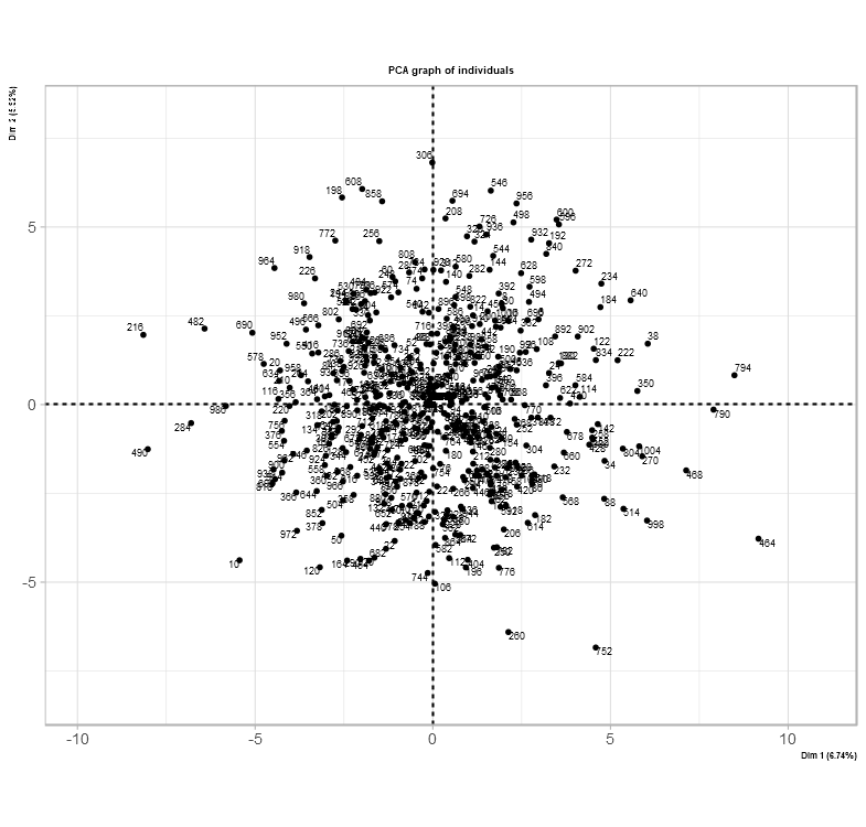
Here is an example of axes set to (1,30)
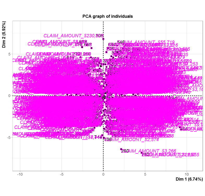
Modify graph of A toggle button where it is possible to adjust each graph separately. Individual for the data points and supplementary categories for the variables.
Graph Title: Every graph has an option of adding a title to express what the graph is about.
Points to draw: Checkbox selections are provided to offer between individuals (otherwise known as data points in the data set) and supplementary categories which adds more labels. Selecting to add more labels might make it difficult to read the graph.
This is what it might look like if supplementary labels are included
Labels for: Checkbox to add each data point index number into the graph.
Size of labels: A slider or a slide bar is available to adjust the size of the labels on the graph.
The image below is simply an option to bring the GUI (Graphical User Interface) or widget views into code.

By clicking the “Get the PCA code” checkbox button, the code appears.
The main difference between many libraries used for PCA is their interpretation of bringing new insights of the data set together. The image below shows a new take and understanding of the data set after its PCA transformation.
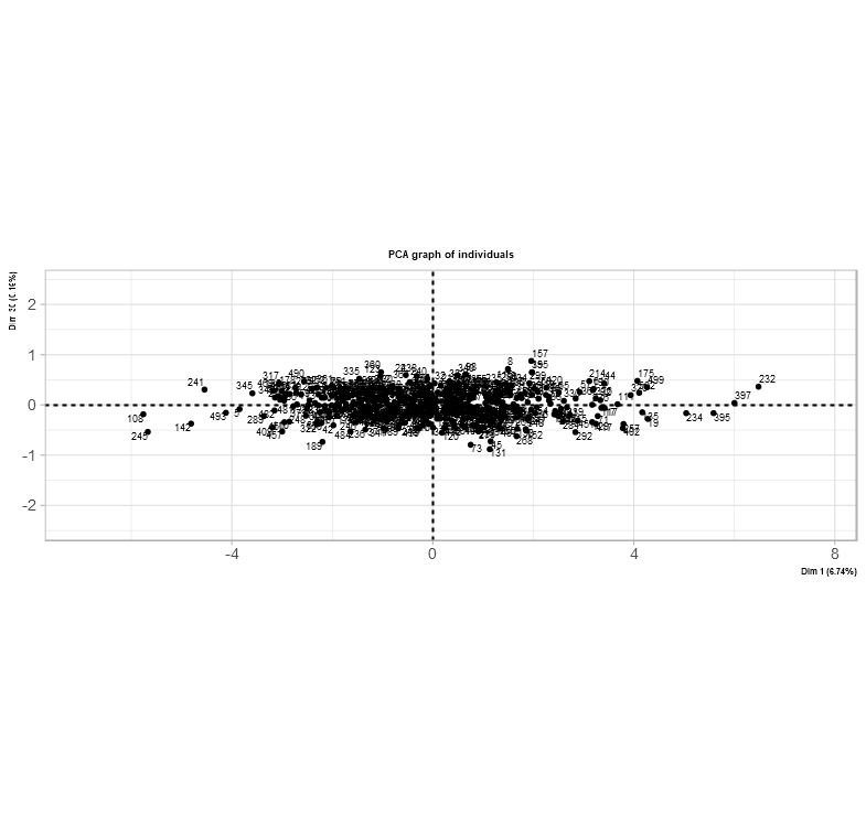
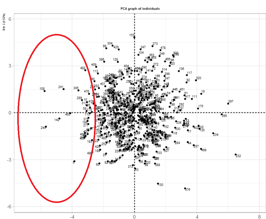
The difference here is an option to place the individual data points into a graph. Based on this data set after PCA transformation, each quadrant holds each data point from less severe to most severe. Severe in this case is the most fraudulent injury claim.
Fifth, analyze insights within context.
As per usual, the cartesian plane is split into four quadrants to indicate locations of data points with x and y coordinates and axes. The concept can be used in many industries such as insurance, health care, and geography. In this case, each coordinate shows the severity of the data points – the fourth quadrant (bottom-right) consists of the worst instances in insurance. Although, the severity or suspicion score was actually based on data points along the x-axis.
For those who prefer to look at the location of the data points before the score
| Location on x-axis | Meaning: usual suspicion score rating |
| Far-left | 1 |
| Between the farthest point to the left and the y-axis (x=0) | 2 |
| Directly on the y-axis (x=0) | 3 |
| Between the farthest point to the right and the y-axis (x=0) | 4 |
| Far-right | 5 |
For those who prefer to look at the suspicion score before the location on the graph
| Suspicion Score Rating | Location on x-axis |
| 1 | Far-left |
| 2 | Between the farthest point to the left and the y-axis (x=0) |
| 3 | Directly on the y-axis (x=0) |
| 4 | Between the farthest point to the right and the y-axis (x=0) |
| 5 | Far-right |
The story and meaning behind this graph sum up the data set and assists in determining if a claim is fraudulent or honest.
Here is one way to interpret the graph.
This is a Cartesian Plane with all the data points placed accordingly. While taking a look at the data set within RStudio in “View()” mode, it is possible to filter a specific data point and identify its associated suspicion score.
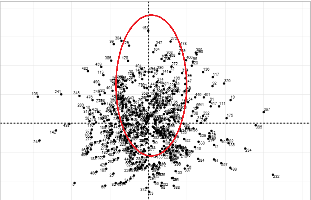
The picture below is a magnified view of the fourth quadrant and the selected points. This does not mean that they are outliers in the data set, they were selected based on their placement on the graph. The red circles indicate where the selected data points are located on the graph.
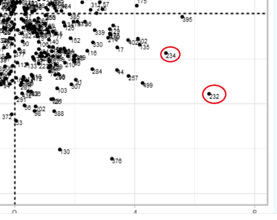
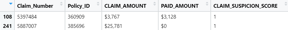
The suspicion score is set to 5 for these two points closer to the right side of the fourth quadrant
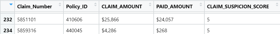
To verify and justify even further, the following snippets of the data set table and the graph will demonstrate how this PCA transformation can help resolve the issue of determining fraudulent claims from honest claims.
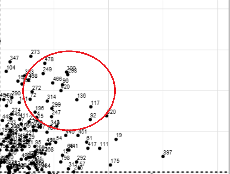
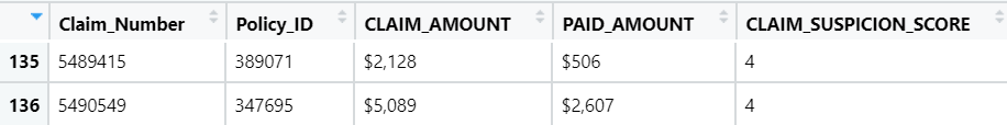
Two randomly selected data points with a suspicion score of 4 are shown on the table and the PCAshiny graph to show its value. The image of the graph is magnified to the first quadrant where the points are located and are between the farthest point to the right and the y-axis (x=0). The red circle indicates where the selected data points are located on the graph. The table verifies the theory that these points have a suspicion score of 4.
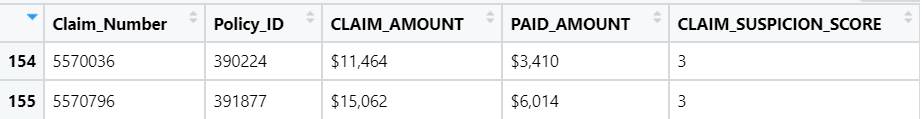
The following are two randomly selected points for a suspicion score of 3. These images show what they look like in the table and where they are on the graph. Referring to the table mentioned before about the suspicion scores and where they are located on a graph, scores of 3 would usually be located near the y-axis (x=0). The table verifies that these two data points have a suspicion score of 3. The red oval indicates where the selected data points are located on the graph.
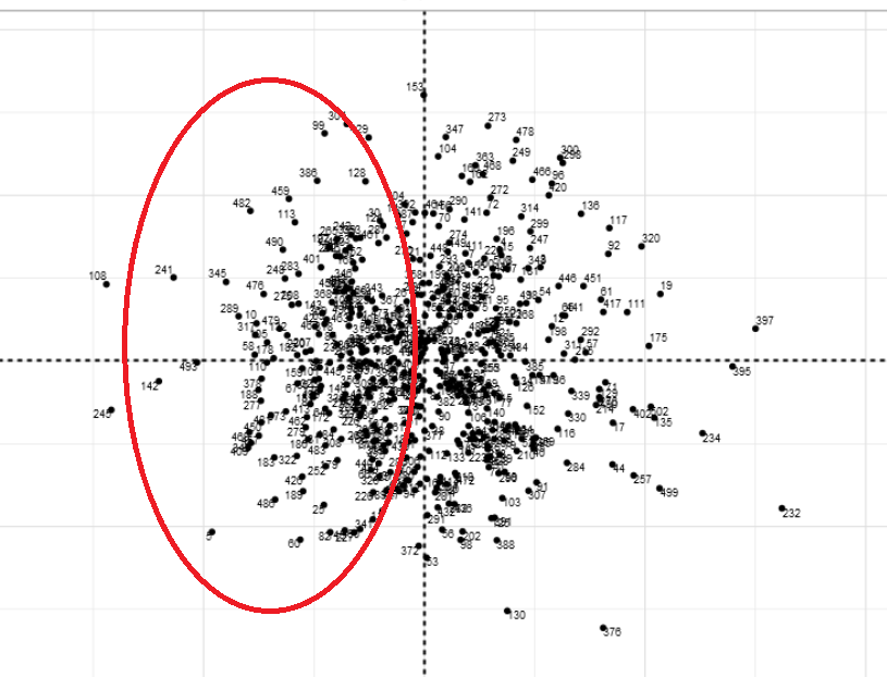
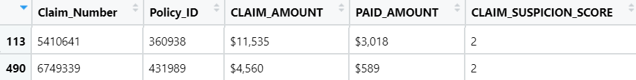
The same concept applies to these two randomly selected data points with a suspicion score of 2. Once again, referring to the table of suspicion scores. Suspicion scores of 2 are between the far-left and the y-axis (x=0). The red oval indicates where the selected data points are located on the graph. The table verifies this theory as the suspicion score has a value of 2.
Two randomly selected data points for a suspicion score of 1. As you follow along with the table explaining each suspicion score, suspicion score number 1 is on the far left of the graph. The red oval indicates where the selected data points are located on the graph. To verify that theory, the suspicion score on the table is also 1.
Main takeaways from the example data set:
Each data point’s location is significant when linking meaning with the overall solution to the issue. The issue was to distinguish each claim as fraudulent or honest.
Tables can be helpful:
| Location on x-axis | Meaning: usual suspicion score rating |
| Far-left | 1 |
| Between the farthest point to the left and the y-axis (x=0) | 2 |
| Directly on the y-axis (x=0) | 3 |
| Between the farthest point to the right and the y-axis (x=0) | 4 |
| Far-right | 5 |
Another way of looking at the graph is the suspicion score before the location on the graph:
| Suspicion Score Rating | Location on x-axis |
| 1 | Far-left |
| 2 | Between the farthest point to the left and the y-axis (x=0) |
| 3 | Directly on the y-axis (x=0) |
| 4 | Between the farthest point to the right and the y-axis (x=0) |
| 5 | Far-right |
Side note: By using multiple visualizations of the data set included tables, theories and interpretations can be understood.
Theories remain theories and do not apply to all claims. However, it does help in remaining highly alert and vigilant.
After using PCA, individual data points without a suspicion score can still be estimated according to the analysis made above. Meaning, individual data points can be placed on a graph and have an estimated suspicion score rating.
Quadrants were used for axes set to (1,2). If the axes were set to (1,30), the quadrants would be ignored and the x-axis will be considered completely instead.
—
Recap and Conclusion
- PCA can bring new insights to a data set.
- Visuals can effectively show perspectives and ideas.
- Each quadrant may hold data set insights
- Libraries are compatible with particular versions of R.
- Combining versions together during installation is a beneficial workaround.
—
Short Author Bio:
My name is Priya Kalyanakrishnan, and I have one Master of Science graduate degree in Data Analytics and one undergraduate 4-year bachelor degree in Business. My Linkedin profile can be found here.
The media shown in this article are not owned by Analytics Vidhya and is used at the Author’s discretion.


