EDA: Exploratory Data Analysis With Python
This article was published as a part of the Data Science Blogathon
Introduction
Exploratory data analysis is the first and most important phase in any data analysis. EDA is a method or philosophy that aims to uncover the most important and frequently overlooked patterns in a data set. We examine the data and attempt to formulate a hypothesis. Statisticians use it to get a bird eyes view of data and try to make sense of it.
In this EDA series we will cover the following points:
1. Data sourcing
2. Data cleaning
3. Univariate analysis
4. Bi-variate/Multivariate analysis
In this tutorial, we will cover the following topics with Examples using Python.
In this tutorial, we use the Kaggle Loan dataset.
So, Ready to explore EDA(Exploratory Data Analysis),..?
Let’s go… Let’s go… Let’s go
Data Sourcing
Data mainly arrives from a variety of sources, and your first responsibility as an analyst is to collect it. Because if you know your data batter then it’s easy to use for further analysis. So, collect the required data.
Public Data
For research reasons, a substantial amount of data collected by the government or other public entities is made available. These data sets are referred to as public data because they do not require specific permission to view. On the internet, public data is available on a variety of platforms. A large number of data sets are available for direct analysis, while others must be manually extracted and translated into an analysis-ready format.
Private Data
Data that is sensitive to organizations and consequently not available in the public domain is referred to as private data. Banking, telecommunications, retail, and the media are just a few of the major commercial sectors that significantly rely on data to make judgments. Many businesses are looking to use data analytics to help them make important choices. As businesses become more customer-centric, they may use data insights to improve the customer experience while also streamlining their daily operations.
Implementation:
import numpy as np
import pandas as pd
import matplotlib.pyplot as plt
%matplotlib inline
from scipy import stats
import re
import seaborn as sns
print('seaborn versiont:',sns.__version__)
import os
import warnings
warnings.filterwarnings('ignore') # if there are any warning due to version mismatch, it will be ignored
So now we ready to load the data set in Data Frame. here we go.,
loan = pd.read_csv('loan.csv',dtype='object')
loan.head(2)
In the above output, you can see we have many rows (but we print only two rows) and 111 columns.
Now we check Columns List & NA value counts more than 30%
NA_col = loan.isnull().sum()
NA_col = NA_col[NA_col.values >(0.2*len(loan))]
plt.figure(figsize=(20,4))
NA_col.plot(kind='bar')
plt.title('Columns List & NA value counts more than 30%')
plt.show()
Hit Run to see the output
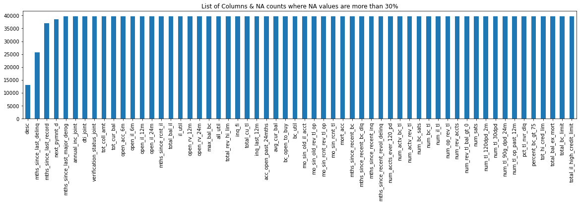
NA_col[NA_col.values >(0.2*len(loan))]
loan.isnull().sum()/len(loan)*100
loan.isnull().sum()
Insights Note: Here we clearly see that from the above plot we have 20+ columns in the dataset where all the values are NA.
Because the dataset has 887379 rows and 74 columns, it will be quite tough to go through each column one by one and discover the NA or missing values. So, let’s look for any columns that have more than a specific percentage of missing values, say 30%. We’ll get rid of such columns because it’s impossible to impute missing values for them.
Data Cleaning
When it comes to data, there are many different sorts of quality issues, which is why data cleansing is one of the most time-consuming aspects of data analysis.
Formatting issues (e.g., rows and columns merged), missing data, duplicated rows, spelling discrepancies, and so on could all be present. These difficulties could make data analysis difficult, resulting in inaccuracies or inappropriate results. As a result, these issues must be addressed before data can be analyzed. Data cleansing is frequently done in an unplanned, difficult-to-define manner. ‘single structured process’.
In the next steps, we’ll look at data cleaning:
1). Checklist for Row Corrections and Columns Corrections
- Delete any incorrect rows: Rows in the header and footer
- Extra rows should be deleted: column number, indicators, blank rows, and the page number.
- If necessary, merge columns to create unique identifiers: E.g. Combine the state and city into a single full address.
- For extra data, split the columns: Split the address into two parts so that the state and city can be examined independently.
- Name the columns: If column names are lacking, add them.
- Consistently rename columns: Columns with abbreviations and encoding
- Delete the following columns: Remove any columns that are no longer needed.
- Align mismatched columns: The columns in the dataset may have shifted.
2). Checklist for Missing Values Corrections
- Set values as missing values: Identify values that suggest missing data but aren’t recognized as such by the software, such as blank strings, “NA,” “XX,” “666,” and so on.
- Exaggerating is harmful while adding is good: You should strive to collect as much information as possible from credible external sources, but if you can’t, it’s best to leave missing data alone rather than embellishing the available rows/columns.
-
Delete rows and columns: If the number of missing values is insignificant, rows can be erased without affecting the analysis. If the number of missing values is considerable, columns may be eliminated.
-
Fill in partial missing values using your best judgment: time zone, century, and so on. These are plainly identifiable values.
3). Checklist for Standardizing Values Corrections
-
Convert lbs to kgs, miles/hr to km/hr, and so on to ensure that all observations under a variable have a common and consistent unit.
-
If necessary, scale the values: Ascertain that the observations under a variable are all on the same scale. For better data display, standardize precision, e.g. 5.5211341 kgs to 5.52 kgs.
- Remove outliers: High and low numbers that have a disproportionate impact on your analysis’ results should be removed.
4). Checklist for Invalid Values Corrections
– Invalid values might appear in numerous forms in a data set.
-
Some of the values may be actually invalid; for example, a string “tr8ml” in a variable containing mobile numbers would be meaningless and should be eliminated.
-
A height of 12 feet, for example, would be an invalid number in a collection of children’s heights.
– Some inaccurate values, on the other hand, can be fixed.
-
For example, a numeric value with a string data type could be changed back to its original numeric type.
-
Issues may emerge as a result of a programming language such as Python or R misinterpreting a file’s encoding, resulting in the display of trash characters where valid characters should be. This can be fixed by defining the encoding appropriately or converting the data set to the correct format before importing it.
5). Checklist for Filter data Corrections
- Data duplication: Remove identical rows and rows with partly identical columns.
- Rows to filter: To retrieve only the rows relevant to the analysis, filter by segment and date period.
- Columns to filter: Columns that are significant to the analysis should be chosen.
- Data in aggregate: Organize by required keys, then combine the rest.
** Some points on how to deal with invalid values **
Tips 1: Unicode should be encoded correctly:
- Change the encoding to CP1251 instead of UTF-8 if the data is being read as trash characters.
Tips 2: Convert data types that aren’t correct:
- For the convenience of analysis, change the wrong data types to the proper data types.
- For example, if numeric values are saved as strings, frequent data type modifications include string to number: “14,500” to “14500”; string to date: “2021-JUN” to “2021/06”; number to a string: “PIN Code 220-001” to “220001”; and so on.
Tips 3: Values that are out of range should be corrected as follows:
- If some of the values are outside the reasonable range, such as temperature less than -263° C, you’ll need to make the necessary adjustments. A closer inspection will reveal whether the value can be corrected or if it needs to be eliminated.
Tips 4: correct values that aren’t on the list include:
- Values that don’t belong in a list should be removed. Strings “E” or “F” are invalid values in a data set comprising blood types of individuals, for example, and can be eliminated.
Tips 5: Correct any errors in the structure:
- Values that do not adhere to a predefined framework can be eliminated. A pin code of 12 digits, for example, would be an invalid value in a data collection including pin codes of Indian cities and would need to be eliminated. A 12-digit phone number, for example, would be an incorrect value.
Tips 6: Internal rules must be verified:
- If there are internal standards, such as the delivery date of a product must be after the order date, they must be correct and consistent.
>>> Find Check List excel workbook on my GitHub Data_Cleaning _Check_List.xlsx
Implementation:
Data Cleaning function for handling nulls and remove Nulls
def removeNulls(dataframe, axis =1, percent=0.3):
    df = dataframe.copy()
    ishape = df.shape
    if axis == 0:
        rownames = df.transpose().isnull().sum()
        rownames = list(rownames[rownames.values > percent*len(df)].index)
        df.drop(df.index[rownames],inplace=True)
        print("nNumber of Rows droppedt: ",len(rownames))
    else:
        colnames = (df.isnull().sum()/len(df))
        colnames = list(colnames[colnames.values>=percent].index)
        df.drop(labels = colnames,axis =1,inplace=True)
        print("Number of Columns droppedt: ",len(colnames))
    print("nOld dataset rows,columns",ishape,"nNew dataset rows,columns",df.shape)
    return df
1. Remove columns where NA values are more than or equal to 30%
loan = removeNulls(loan, axis =1,percent = 0.3)
2. Remove any rows with NA values greater than or equal to 30%.
loan = removeNulls(loan, axis =1,percent = 0.3)
3. Remove all columns with only one unique value.
unique = loan.nunique()
unique = unique[unique.values == 1]
loan.drop(labels = list(unique.index), axis =1, inplace=True)
print("So now we are left with",loan.shape ,"rows & columns.")
4. Employment Term: Replace the value of ‘n/a’ with self-employed.’
There are some values in emp_term which are ‘n/a’, we assume that are ‘self-employed’. Because for ‘self-employed’ applicants, emp_length is ‘Not Applicable’
print(loan.emp_length.unique())
loan.emp_length.fillna('0',inplace=True)
loan.emp_length.replace(['n/a'],'Self-Employed',inplace=True)
print(loan.emp_length.unique())
print(loan.emp_length.unique())
print(loan.zip_code.unique())
5. Remove any columns that aren’t relevant.
Till now we have removed the columns based on the count & statistics. Now let’s look at each column from a business perspective if that is required or not for our analysis such as Unique IDs, URLs. As the last 2 digits of the zip code are masked ‘xx’, we can remove that.
not_required_columns = ["id","member_id","url","zip_code"]
loan.drop(labels = not_required_columns, axis =1, inplace=True)
print("So now we are left with",loan.shape ,"rows & columns.")
6. Convert all continuous variables to numeric values.
Cast all continuous variables to numeric so that we can find a correlation between them
numeric_columns = ['loan_amnt','funded_amnt','funded_amnt_inv','installment','int_rate','annual_inc','dti']
loan[numeric_columns] = loan[numeric_columns].apply(pd.to_numeric)
loan[numeric_columns] = loan[numeric_columns].apply(pd.to_numeric)
# loan rate has diff issue with %

loan.int_rate.unique()

loan['int_rate']=(pd.to_numeric(loan['int_rate'].str.replace(r'%', '')))

loan.int_rate

loan['int_rate_bkp']=loan['int_rate']
7. Loan purpose: Remove records with values less than 0.75%.
We will analyze only those categories which contain more than 0.75% of records. Also, we are not aware of what comes under ‘Other’ we will remove this category as well.
(loan.purpose.value_counts()*100)/len(loan)
loan.purpose.value_counts()
del_loan_purpose = (loan.purpose.value_counts()*100)/len(loan)
del_loan_purpose = del_loan_purpose[(del_loan_purpose < 0.75) | (del_loan_purpose.index == 'other')]
loan.drop(labels = loan[loan.purpose.isin(del_loan_purpose.index)].index, inplace=True)
print("So now we are left with",loan.shape ,"rows & columns.")
print(loan.purpose.unique())
8. Loan Status: Remove all records with a value of less than 1.5%.
As we can see, Other than [‘Current’, ‘Fully Paid’ & Charged off] other loan_status are not relevant for our analysis.
(loan.loan_status.value_counts()*100)/len(loan)
del_loan_status = (loan.loan_status.value_counts()*100)/len(loan)
del_loan_status = del_loan_status[(del_loan_status < 1.5)]
loan.drop(labels = loan[loan.loan_status.isin(del_loan_status.index)].index, inplace=True)
print("So now we are left with",loan.shape ,"rows & columns.")
print(loan.loan_status.unique())
(loan.loan_status.value_counts()*100)/len(loan)
Univariate Analysis
This session focuses on analyzing variables one at a time, as the term “uni-variate” implies. Before analyzing numerous variables together, it’s critical to first analyze each one individually.
Continuous Variables
When dealing with continuous variables, it’s important to know the variable’s central tendency and spread. Statistical metrics visualization methods such as Box-plot, Histogram/Distribution Plot, Violin Plot, and others are used to measure these.
Categorical Variables
We’ll utilize a frequency table to study the distribution of categorical variables. Count and Count percent against each category are two metrics that can be used to assess it. As a visualization, a count-plot or a bar chart can be employed.
Implementation:
The univariate function will plot parameter values in graphs.
def univariate(df,col,vartype,hue =None):
    '''
    Univariate function will plot parameter values in graphs.
    df      : dataframe name
    col     : Column name
    vartype : variable type : continuous or categorical
                Continuous(0)   : Distribution, Violin & Boxplot will be plotted.
                Categorical(1) : Countplot will be plotted.
    hue     : Only applicable in categorical analysis.
    '''
    sns.set(style="darkgrid")
    if vartype == 0:
        fig, ax=plt.subplots(nrows =1,ncols=3,figsize=(20,8))
        ax[0].set_title("Distribution Plot")
        sns.distplot(df[col],ax=ax[0])
        ax[1].set_title("Violin Plot")
        sns.violinplot(data =df, x=col,ax=ax[1], inner="quartile")
        ax[2].set_title("Box Plot")
        sns.boxplot(data =df, x=col,ax=ax[2],orient='v')
    if vartype == 1:
        temp = pd.Series(data = hue)
        fig, ax = plt.subplots()
        width = len(df[col].unique()) + 6 + 4*len(temp.unique())
        fig.set_size_inches(width , 7)
        ax = sns.countplot(data = df, x= col, order=df[col].value_counts().index,hue = hue)
        if len(temp.unique()) > 0:
            for p in ax.patches:
                ax.annotate('{:1.1f}%'.format((p.get_height()*100)/float(len(loan))), (p.get_x()+0.05, p.get_height()+20))
        else:
            for p in ax.patches:
                ax.annotate(p.get_height(), (p.get_x()+0.32, p.get_height()+20))
        del temp
    else:
        exit
    plt.show()
Continuous Variables
Let’s get some insights from loan data
1). Loan Amount
univariate(df=loan,col='loan_amnt',vartype=0)
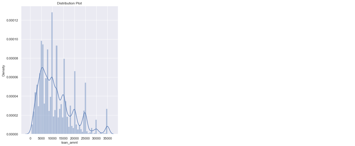
Insights: The majority of the loans range from 8000 to 20000 dollars.
2). Interest Rate
loan['int_rate'] = loan['int_rate'].replace("%","", regex=True).astype(float)
univariate(df=loan,col='int_rate',vartype=0)
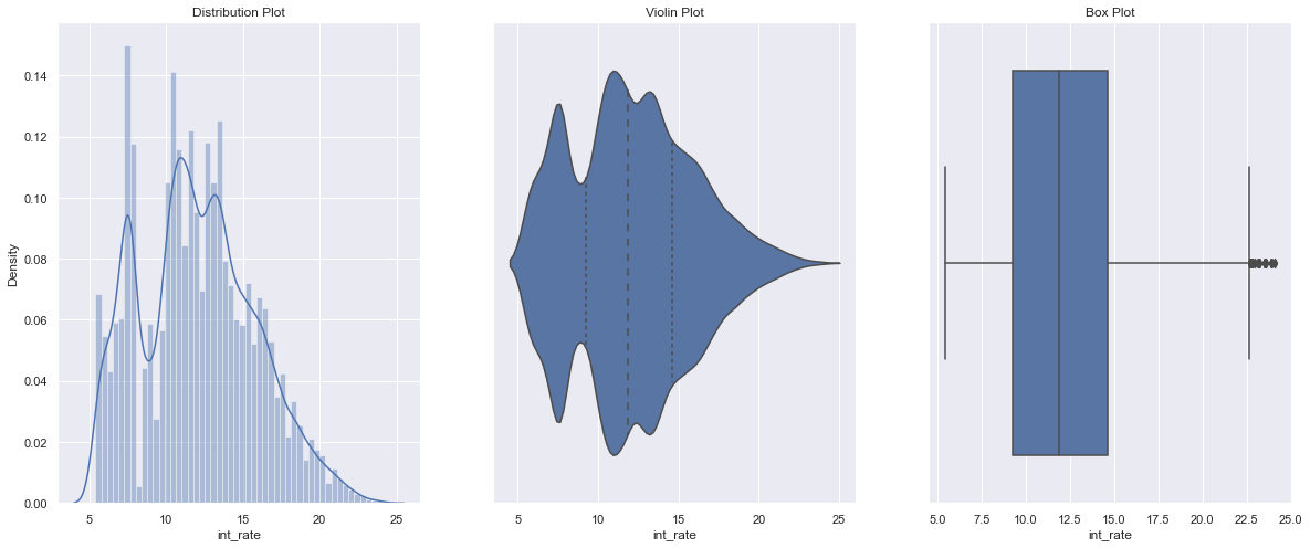
Insights: The majority of the loan interest rates are distributed between 10% to 16%.
3). Annual Income
loan["annual_inc"].describe()
Remove Outliers (values from 99 to 100%)
q = loan["annual_inc"].apply(lambda x: float(x)).quantile(0.995)
loan = loan[loan["annual_inc"].apply(lambda x: float(x)) < q]
loan["annual_inc"].describe()
loan['annual_inc'] = loan['annual_inc'].apply(lambda x: float(x))
univariate(df=loan,col='annual_inc',vartype=0)
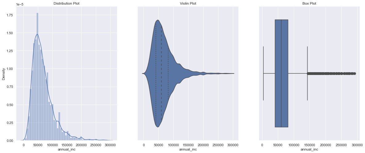
Insights: The majority of the loan applicants earn between 40000 to 90000 USD annually.
Categorical Variables
4). Loan Status
univariate(df=loan,col='loan_status',vartype=1)
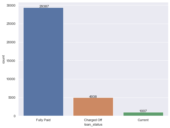
Insights: 5 % Charged off
5). Home Ownership Wise Loan
loan.purpose.unique()
loan.home_ownership.unique()
# Remove rows where home_ownership’==’OTHER’, ‘NONE’, ‘ANY’
rem = ['OTHER', 'NONE', 'ANY']
loan.drop(loan[loan['home_ownership'].isin(rem)].index,inplace=True)
loan.home_ownership.unique()
univariate(df=loan,col='home_ownership',vartype=1,hue='loan_status')
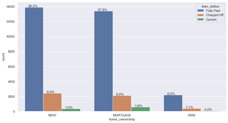
Insights: 40% of applicants live in a rented house, whereas 52% of applicants have a mortgage on their property.
Bi-variate/Multivariate Analysis
The association between two/two or more variables is found using bivariate/multivariate analysis. For every combination of categorical and continuous data, we can perform Bi-variate/Multivariate analysis. Categorical & Categorical, Categorical & Continuous, and Continuous & Continuous are examples of possible combinations.
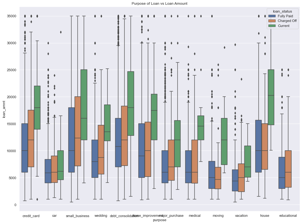
Purpose of Loan / Loan Amount for loan status
plt.figure(figsize=(16,12))
loan['loan_amnt'] = loan['loan_amnt'].astype('float')
sns.boxplot(data =loan, x='purpose', y='loan_amnt', hue ='loan_status')
plt.title('Purpose of Loan vs Loan Amount')
plt.show()
Heat Map for continuous variables
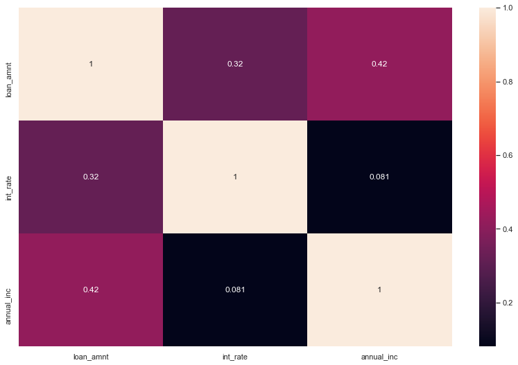
Insights: The Heat map clearly shows how closely ‘loan amount,’ funded amount, and funded amount inc’ are related. As a result, we can use any one of them for our analysis.
Conclusion
So, here we can see this all different aspect to consider Target Variable is Loan Status And top 5 major variables to consider for loan prediction: Purpose of Loan, Employment Length, Grade, Interest Rate, Term. Now we are ready to Train our model and prediction.
In this article, we learned the most important subjects for any type of analysis so far in this module. The following are the details:
Getting to know the domain Getting to know the data and prepare it for analysis
Univariate and segmented uni-variate analysis are two types of univariate analysis.
The bi-variate analysis is a technique for analyzing two variables at the same time.
Creating new metrics based on existing data
EndNote
Thank you for reading!
I hope you enjoyed the article and increased your knowledge.
Please feel free to contact me on Email
Something not mentioned or want to share your thoughts? Feel free to comment below And I’ll get back to you.
About the Author
Hardikkumar M. Dhaduk
Data Analyst | Digital Data Analysis Specialist | Data Science Learner
Connect with me on Linkedin
Connect with me on Github
The media shown in this article are not owned by Analytics Vidhya and are used at the Author’s discretion.


