Welcome to the world of Data Visualization
Data Visualization is an art of presenting the data in a manner that even a non-analyst can understand it. A perfect blend of aesthetic elements like colors, dimensions, labels can create visual masterpieces, hence revealing surprising business insights which in turn helps businesses to make informed decisions.
Data Visualization is an inevitable aspect of business analytics. As more and more sources of data are getting discovered, business managers at all levels embrace data visualization softwares, that allow them to analyze trends visually and take quick decisions. Currently, the most popular tools for visualizations / data discovery are Qlikview and Tableau. We have already published a step by step learning path for Qlikview.
Tableau is one of the fastest evolving Business Intelligence (BI) and data visualization tool. It is very fast to deploy, easy to learn and very intuitive to use for a customer. Here is a learning path to all those people who are new to Tableau. This path will help you to learn Tableau in a structured approach.
Beginners are recommended to follow this path religiously. If you already have some background, or don’t need all the components, feel free to follow your own paths and let us know how did it turn out to be!
Before you dive in, we also recommend going through the below three wonderfully written guides on Tableau:
- Tableau for Beginners
- Tableau for Intermediate Users
- Tableau for Advanced Users
- BONUS: Awesome Tableau Course
Step-0: Why Data Visualization is Important?
Before starting our journey with Tableau, I want to emphasize “Why data visualization is important and how it helps business to take smarter decisions?” Here is a video to whet your appetite:
What’s so cool about Tableau?
There are numerous tools available to perform data visualization, then why Tableau? Check out the video below to get the answer:
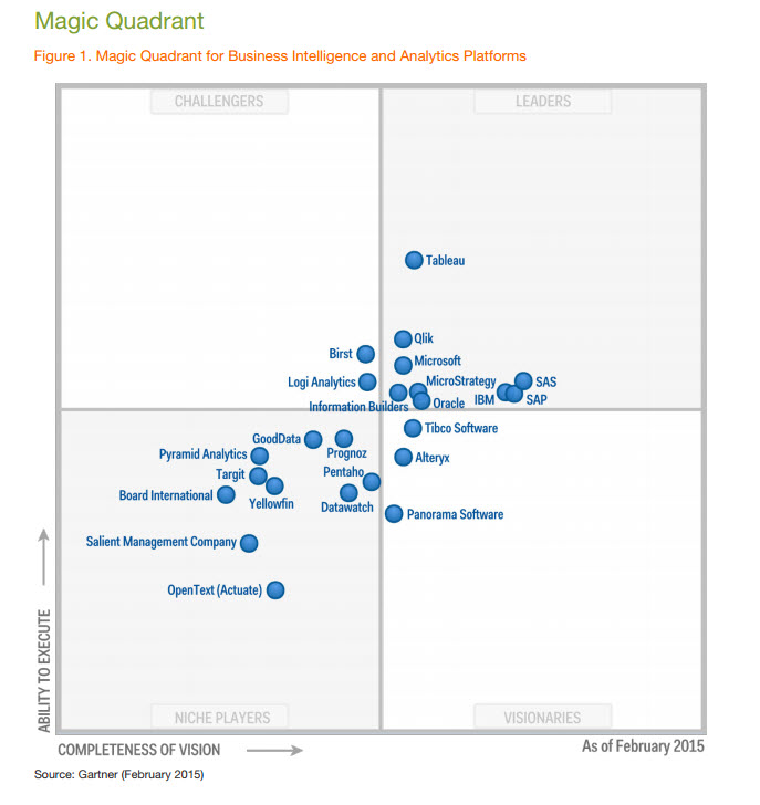
As per Gartner’s magic quadrant 2015, Tableau is a market leader across all the BI products.
Step-1: Time to download & install Tableau
Tableau offers five main products catering to diverse visualization needs for professionals and organizations. They are:
- Tableau Desktop: Made for individual use
- Tableau Server: Collaboration for any organization
- Tableau Online: Business Intelligence in the Cloud
- Tableau Reader: Let you read files saved in Tableau Desktop.
- Tableau Public: For journalists or anyone to publish interactive data online.
Quick Features
- Tableau Public and Tableau Reader are free to use, while both Tableau Server and Tableau Desktop come with a 14 days fully functional free trial period, after which the user must pay for the software.
- Tableau Desktop comes in both a Professional and a lower cost Personal edition. Tableau Online is available with an annual subscription for a single user, and scales to support thousands of users. Tableau have gone through different versions, here we will discuss the learning curve of Tableau Desktop 9.0.
You can download trial version of Tableau Desktop from Tableau website but it is available for 14 days only. Install it in on your machine by following steps and start for your data visualization journey.
After 14 days, you can continue your data visualization journey using Tableau public but it comes with its limitations and you have to share your data publicly.
Step-2: Getting Started with Tableau
Tableau provides Free Online, Live and Classroom (paid) training programs. This is the best place to start your journey. I would recommend you to follow the path below. Here is Free Online training (“On demand”) with additional resources. All these videos contain the data set to explore at your end.
To watch these training videos, first you need to register yourself. Expand the “Getting Started” section and watch available three videos. These videos will talk about connecting with data, data preparation, building views, filters, dashboards, story points and ways to distribute.
Step-3: Connecting With Data
Tableau can connect with various data sources such as text, excel file, databases to big data queries also. In this section, we will look at the basics and advance feature of data connectivity with different sources. Here we will also look at Join types, Data Blending, connection with cubes, custom sql and Google Analytics.
This section has 12 videos and average length of videos are ~5 minutes.
- Connecting with Data
- Tableau 9.0 brings more connections
- Connect Tableau to Any Big Data Source (MongoDB and Salesforce)
- Connectivity using Custom SQL (Resource1, Resource2)
Step-4: Creating Views and Analysis
Tableau has multiple options to represent data in different views, applying filters /drill downs /formatting, creating sets, groups, generating trend lines and performing forecasting. Start exploring !
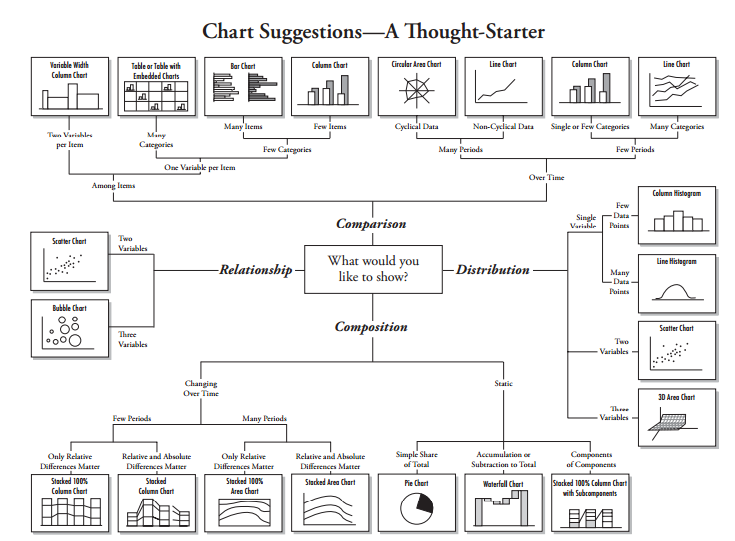
You have now looked at various objects to visualize data. One big dilemma that you will face while creating data visualization is which object should you choose to represent data.
The snapshot below will help you to choose and decide the type of visualization. However, the feature of automatic selection of views available in tableau takes care of this issue largely. This feature automatically activates best views for selected dimension(s) and measure(s). Hence, you need no worry. You are in safe hands !
Step-5: Exercise
Till now, we have looked at data connectivity, various objects and views creation in Tableau. Its time to get your hands dirty with data and generate inferences using different visualization methods:
Kaggle has hosted a data science competition to predict category of crime in San Francisco based on 12 years (From 1934 to 1963) of crime reports from across all of San Francisco’s neighborhoods (time, location and other features are given).
I would encourage you to explore the dataset (train.csv) visually using Tableau (to download data set, you need to register on Kaggle) and unhide hidden trends like:
- Is there specific clusters with higher crime rate
- Is there yearly/ Monthly/ Daily/ Hourly trend
- Crime distribution is even across all geographical areas or different
Please share your visualization on our social media channels and tag us, best visualizations will be rewarded exciting gift vouchers.
Step-6: Time to socialize – Join Community and Groups
Now that you have good understanding of Tableau, it’s time to become a part of Tableau communities. This will help you a lot to enhance your learning, get answers to questions and simplified description for complex topics by bloggers. I am listing some of the most useful resources below:
- Tableau Community: It works on a principle of Learn, Connect and Enjoy. It has forums, groups, ideas, Viz talk and workbook library. Here you can get your questions answered quickly. By using ‘ideas’ section, you can Vote on the Tableau Community’s best product ideas and add your own to the mix.
- Analytics Vidhya Discuss: We are niche in this domain but have tableau experts on board. These experts will answer your questions in detail and in simplistic approach. Our discussion portal already has few questions related to Tableau and a lot of other topics. You should jump in, if you have not already.
- Blogs: Blogs are always helpful to understand detailed content covering basic and advance concept of any complex topic in a more structured and simplistic way.
- Tableau Linkedin/ Facebook Groups: LinkedIn and Facebook has some excellent groups to ask questions and connect with peers or experts, some groups of special interest are:
- Tableau Software: The biggest Tableau group on Facebook, with over ~75k likes.
- Tableau Software Fans & Friends and Tableau Enthusiasts : These two are biggest and active group on LinkedIn having 20 and 6 thousands members respectively.
Step-7: Dashboards & Stories
Tableau ‘Dashboard and Stories’ creation is USP (Unique selling proposition) of the product. The dashboards so created turn out to be amazing and it certainly takes this product to next level. Tableau online training program has a separate section for Dashboards and Stories. This section covers the topic as listed below:
- Dashboard and Story Creation
- Adding views and objects to dashboards
- Applying Filters to dashboard
- Various Layouts and Formatting options
- Interactive Dashboard
- Story Points
Resources:
- Dashboards Tableau Course
- Dashboard and Stories
- Business Dashboard
- 5 best practice for creating effective dashboard
- Creating a Story
- 5 Tips for better Tableau Story Points
Step-8: Advance Expressions
Besides the available measures and dimensions, you can create a calculated expression to develop a new visualization. It may be based on date, mathematical logic, text expressions, input parameters and others. For Data scientists, they can connect tableau with R to enhance the power for analytical inferences.
- Calculations
- Creating Calculated Fields
- Using the TOTAL function to summarize dimensions
- Tableau Essentials: Calculated Fields – Aggregate Functions
Step-9: Advance Visualization Methods
Tableau has awesome features to create advanced visualizations. We can generate advance charts in Tableau by playing with some of the properties of objects. Below is the list of advance visualization methods which helps to represent the data in more effective way:
- Waterfall Charts
- Bump Charts
- Funnel Charts
- Box Plot
- Pareto Charts
- Histograms and Others
You can refer How To section of “On Demand” tableau training to explore these visualization methods.
Step-10: Introduction of Tableau Server and Online
Using Tableau server and Online, you can schedule the tasks and provide authorization to enable data security. It is a job of Tableau administrator but having understanding about these concepts always help you in dashboard development. Below are the resources to understand these two concepts more effectively.
Step-11: Practice makes everyone perfect
By now, I have almost covered most of the concepts you need to create a good dashboard / visualization. Now it’s time to practice more and more such that you get a firm hold of this tool and you feel comfortable with any aspect of Tableau.
All the best
What do you think of the learning path? If you think something should be added / removed, do let us know. We will love to hear it.