An Introduction to Graph Theory and Network Analysis (with Python codes)
Introduction
“A picture speaks a thousand words” is one of the most commonly used phrases. But a graph speaks so much more than that. A visual representation of data, in the form of graphs, helps us gain actionable insights and make better data driven decisions based on them.
But to truly understand what graphs are and why they are used, we will need to understand a concept known as Graph Theory. Understanding this concept makes us better programmers (and better data science professionals!).

Source: Quantdare
But if you have tried to understand this concept before, you’ll have come across tons of formulae and dry theoretical concepts. That is why we decided to write this blog post. We have explained the concepts and then provided illustrations so you can follow along and intuitively understand how the functions are performing. This is a detailed post, because we believe that providing a proper explanation of this concept is a much preferred option over succinct definitions.
In this article, we will look at what graphs are, their applications and a bit of history about them. We’ll also cover some Graph Theory concepts and then take up a case study using python to cement our understanding.
Ready? Let’s dive into it.
Table of Contents
- Graphs and their applications
- History and why graphs?
- Terminologies you need to know
- Graph Theory Concepts
- Getting familiar with Graphs in python
- Analysis on a dataset
Graphs and their applications
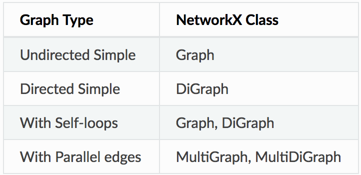
Let us look at a simple graph to understand the concept. Look at the image below –
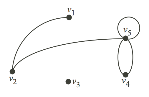
Consider that this graph represents the places in a city that people generally visit, and the path that was followed by a visitor of that city. Let us consider V as the places and E as the path to travel from one place to another.
V = {v1, v2, v3, v4, v5}

E = {(v1,v2), (v2,v5), (v5, v5), (v4,v5), (v4,v4)}
The edge (u,v) is the same as the edge (v,u) – They are unordered pairs.
Concretely – Graphs are mathematical structures used to study pairwise relationships between objects and entities. It is a branch of Discrete Mathematics and has found multiple applications in Computer Science, Chemistry, Linguistics, Operations Research, Sociology etc.
The Data Science and Analytics field has also used Graphs to model various structures and problems. As a Data Scientist, you should be able to solve problems in an efficient manner and Graphs provide a mechanism to do that in cases where the data is arranged in a specific way.
Formally,
- A Graph is a pair of sets.
G = (V,E). V is the set of vertices. E is a set of edges. E is made up of pairs of elements from V (unordered pair) - A DiGraph is also a pair of sets.
D = (V,A). V is the set of vertices. A is the set of arcs. A is made up of pairs of elements from V (ordered pair)
In the case of digraphs, there is a distinction between `(u,v)` and `(v,u)`. Usually the edges are called arcs in such cases to indicate a notion of direction.
There are packages that exist in R and Python to analyze data using Graph theory concepts. In this article we will be briefly looking at some of the concepts and analyze a dataset using Networkx Python package.
from IPython.display import Image
Image('images/network.PNG')
Image('images/usecase.PNG')
From the above examples it is clear that the applications of Graphs in Data Analytics are numerous and vast. Let us look at a few use cases:
- Marketing Analytics – Graphs can be used to figure out the most influential people in a Social Network. Advertisers and Marketers can estimate the biggest bang for the marketing buck by routing their message through the most influential people in a Social Network
- Banking Transactions – Graphs can be used to find unusual patterns helping in mitigating Fraudulent transactions. There have been examples where Terrorist activity has been detected by analyzing the flow of money across interconnected Banking networks
- Supply Chain – Graphs help in identifying optimum routes for your delivery trucks and in identifying locations for warehouses and delivery centres
- Pharma – Pharma companies can optimize the routes of the salesman using Graph theory. This helps in cutting costs and reducing the travel time for salesman
- Telecom – Telecom companies typically use Graphs (Voronoi diagrams) to understand the quantity and location of Cell towers to ensure maximum coverage
History and Why Graphs?
History of Graphs
If you want to know more on how the ideas from graph has been formlated – read on!
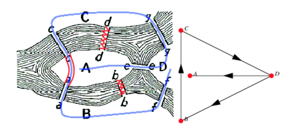
The origin of the theory can be traced back to the Konigsberg bridge problem (circa 1730s). The problem asks if the seven bridges in the city of Konigsberg can be traversed under the following constraints
- no doubling back
- you end at the same place you started
This is the same as asking if the multigraph of 4 nodes and 7 edges has an Eulerian cycle (An Eulerian cycle is an Eulerian path that starts and ends on the same Vertex. And an Eulerian path is a path in a Graph that traverses each edge exactly once. More Terminology is given below). This problem led to the concept of Eulerian Graph. In the case of the Konigsberg bridge problem the answer is no and it was first answered by (you guessed it) Euler.
In 1840, A.F Mobius gave the idea of complete graph and bipartite graph and Kuratowski proved that they are planar by means of recreational problems. The concept of tree, (a connected graph without cycles) was implemented by Gustav Kirchhoff in 1845, and he employed graph theoretical ideas in the calculation of currents in electrical networks or circuits.
In 1852, Thomas Gutherie found the famous four color problem. Then in 1856, Thomas. P. Kirkman and William R.Hamilton studied cycles on polyhydra and invented the concept called Hamiltonian graph by studying trips that visited certain sites exactly once. In 1913, H.Dudeney mentioned a puzzle problem. Eventhough the four color problem was invented it was solved only after a century by Kenneth Appel and Wolfgang Haken. This time is considered as the birth of Graph Theory.
Caley studied particular analytical forms from differential calculus to study the trees. This had many implications in theoretical chemistry. This lead to the invention of enumerative graph theory. Any how the term “Graph” was introduced by Sylvester in 1878 where he drew an analogy between “Quantic invariants” and covariants of algebra and molecular diagrams.
In 1941, Ramsey worked on colorations which lead to the identification of another branch of graph theory called extremel graph theory. In 1969, the four color problem was solved using computers by Heinrich. The study of asymptotic graph connectivity gave rise to random graph theory. The histories of Graph Theory and Topology are also closely related. They share many common concepts and theorems.
Image('images/Konigsberg.PNG', width = 800)
Why Graphs?
Here are a few points that help you motivate to use graphs in your day-to-day data science problems –
- Graphs provide a better way of dealing with abstract concepts like relationships and interactions. They also offer an intuitively visual way of thinking about these concepts. Graphs also form a natural basis for analyzing relationships in a Social context
- Graph Databases have become common computational tools and alternatives to SQL and NoSQL databases
- Graphs are used to model analytics workflows in the form of DAGs (Directed acyclic graphs)
- Some Neural Network Frameworks also use DAGs to model the various operations in different layers
- Graph Theory concepts are used to study and model Social Networks, Fraud patterns, Power consumption patterns, Virality and Influence in Social Media. Social Network Analysis (SNA) is probably the best known application of Graph Theory for Data Science
- It is used in Clustering algorithms – Specifically K-Means
- System Dynamics also uses some Graph Theory concepts – Specifically loops
- Path Optimization is a subset of the Optimization problem that also uses Graph concepts
- From a Computer Science perspective – Graphs offer computational efficiency. The Big O complexity for some algorithms is better for data arranged in the form of Graphs (compared to tabular data)
Terminology you should know
Before you go any further into the article, it is recommended that you should get familiar with these terminologies.
- The vertices
uandvare called theend verticesof the edge(u,v) - If two edges have the same
end verticesthey areParallel - An edge of the form
(v,v)is aloop - A Graph is
simpleif it has no parallel edges and loops - A Graph is said to be
Emptyif it has no edges. MeaningEis empty - A Graph is a
Null Graphif it has no vertices. MeaningVandEis empty - A Graph with only 1 Vertex is a
Trivialgraph - Edges are
Adjacentif they have a common vertex. Vertices areAdjacentif they have a common edge - The degree of the vertex
v, written asd(v), is the number of edges withvas an end vertex. By convention, we count a loop twice and parallel edges contribute separately - Isolated Vertices are vertices with degree 1.
d(1)vertices are isolated - A Graph is Complete if its edge set contains every possible edge between ALL of the vertices
- A
Walkin a GraphG = (V,E)is a finite, alternating sequence of the form ViEiViEi consisting of vertices and edges of the graph G - A Walk is
Openif the initial and final vertices are different. A Walk isClosedif the initial and final vertices are the same - A Walk is a
Trailif ANY edge is traversed atmost once - A Trail is a
Pathif ANY vertex is traversed atmost once (Except for a closed walk) - A Closed Path is a
Circuit– Analogous to electrical circuits
Graph Theory concepts
In this section, we’ll look at some of the concepts useful for Data Analysis (in no particular order). Please note that there are a lot more concepts that require a depth which is out of scope of this article. So let’s get into it.
Average Path Length
The average of the shortest path lengths for all possible node pairs. Gives a measure of ‘tightness’ of the Graph and can be used to understand how quickly/easily something flows in this Network.
BFS and DFS
Breadth first search and Depth first search are two different algorithms used to search for Nodes in a Graph. They are typically used to figure out if we can reach a Node from a given Node. This is also known as Graph Traversal
The aim of the BFS is to traverse the Graph as close as possible to the root Node, while the DFS algorithm aims to move as far as possible away from the root node.
Centrality
One of the most widely used and important conceptual tools for analysing networks. Centrality aims to find the most important nodes in a network. There may be different notions of “important” and hence there are many centrality measures. Centrality measures themselves have a form of classification (or Types of centrality measures). There are measures that are characterized by flow along the edges and those that are characterized by Walk Structure.
Some of the most commonly used ones are:
- Degree Centrality – The first and conceptually the simplest Centrality definition. This is the number of edges connected to a node. In the case of a directed graph, we can have 2 degree centrality measures. Inflow and Outflow Centrality
- Closeness Centrality – Of a node is the average length of the shortest path from the node to all other nodes
- Betweenness Centrality – Number of times a node is present in the shortest path between 2 other nodes
These centrality measures have variants and the definitions can be implemented using various algorithms. All in all, this means a large number of definitions and algorithms.
Network Density
A measure of how many edges a Graph has. The actual definition will vary depending on type of Graph and the context in which the question is asked. For a complete undirected Graph the Density is 1, while it is 0 for an empty Graph. Graph Density can be greater than 1 in some situations (involving loops).
Graph Randomizations
While the definitions of some Graph metrics maybe easy to calculate, it is not easy to understand their relative importance. We use Network/Graph Randomizations in such cases. We calculate the metric for the Graph at hand and for another similar Graph that is randomly generated. This similarity can for example be the same number of density and nodes. Typically we generate a 1000 similar random graphs and calculate the Graph metric for each of them and then compare it with the same metric for the Graph at hand to arrive at some notion of a benchmark.
In Data Science when trying to make a claim about a Graph it helps if it is contrasted with some randomly generated Graphs.
Getting Familiar with Graphs in python
We will be using the networkx package in Python. It can be installed in the Root environment of Anaconda (if you are using the Anaconda distribution of Python). You can also pip install it.
Let us look at some common things that can be done with the Networkx package. These include importing and creating a Graph and ways to visualize it.
Graph Creation
import networkx as nx

# Creating a Graph
G = nx.Graph() # Right now G is empty

# Add a node
G.add_node(1)
G.add_nodes_from([2,3]) # You can also add a list of nodes by passing a list argument

# Add edges
G.add_edge(1,2)

e = (2,3)
G.add_edge(*e) # * unpacks the tuple
G.add_edges_from([(1,2), (1,3)]) # Just like nodes we can add edges from a list
Node and Edge attributes can be added along with the creation of Nodes and Edges by passing a tuple containing node and attribute dict.
In addition to constructing graphs node-by-node or edge-by-edge, they can also be generated by applying classic graph operations, such as:
subgraph(G, nbunch)      - induced subgraph view of G on nodes in nbunch
union(G1,G2)             - graph union
disjoint_union(G1,G2)    - graph union assuming all nodes are different
cartesian_product(G1,G2) - return Cartesian product graph
compose(G1,G2)           - combine graphs identifying nodes common to both
complement(G)            - graph complement
create_empty_copy(G)     - return an empty copy of the same graph class
convert_to_undirected(G) - return an undirected representation of G
convert_to_directed(G)   - return a directed representation of G
Separate classes exist for different types of Graphs. For example the nx.DiGraph() class allows you to create a Directed Graph. Specific graphs containing paths can be created directly using a single method. For a full list of Graph creation methods please refer to the full documentation. Link is given at the end of the article.
Image('images/graphclasses.PNG', width = 400)
Accessing edges and nodes
Nodes and Edges can be accessed together using the G.nodes() and G.edges() methods. Individual nodes and edges can be accessed using the bracket/subscript notation.
G.nodes()
NodeView((1, 2, 3))
G.edges()
EdgeView([(1, 2), (1, 3), (2, 3)])
G[1] # same as G.adj[1]
AtlasView({2: {}, 3: {}})
G[1][2]
{}
G.edges[1, 2]
{}
Graph Visualization
Networkx provides basic functionality for visualizing graphs, but its main goal is to enable graph analysis rather than perform graph visualization. Graph visualization is hard and we will have to use specific tools dedicated for this task. Matplotlib offers some convenience functions. But GraphViz is probably the best tool for us as it offers a Python interface in the form of PyGraphViz (link to documentation below).
%matplotlib inline
import matplotlib.pyplot as plt
nx.draw(G)
You will first have to Install Graphviz from the website (link below). And then pip install pygraphviz --install-option=" <>. In the install options you will have to provide the path to the Graphviz lib and include folders.
import pygraphviz as pgv
d={'1': {'2': None}, '2': {'1': None, '3': None}, '3': {'1': None}}
A = pgv.AGraph(data=d)
print(A) # This is the 'string' or simple representation of the Graph

Output:
strict graph "" {
	1 -- 2;
	2 -- 3;
	3 -- 1;
}
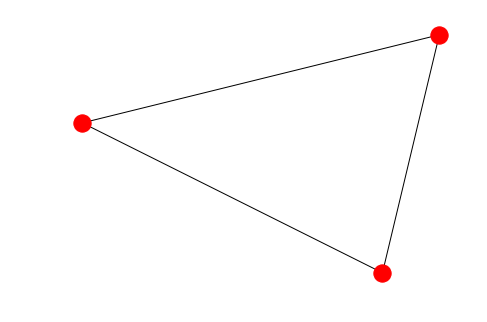
PyGraphviz provides great control over the individual attributes of the edges and nodes. We can get very beautiful visualizations using it.
# Let us create another Graph where we can individually control the colour of each node
B = pgv.AGraph()

# Setting node attributes that are common for all nodes
B.node_attr['style']='filled'
B.node_attr['shape']='circle'
B.node_attr['fixedsize']='true'
B.node_attr['fontcolor']='#FFFFFF'

# Creating and setting node attributes that vary for each node (using a for loop)
for i in range(16):
 B.add_edge(0,i)
 n=B.get_node(i)
 n.attr['fillcolor']="#%2x0000"%(i*16)
 n.attr['height']="%s"%(i/16.0+0.5)
 n.attr['width']="%s"%(i/16.0+0.5)
B.draw('star.png',prog="circo") # This creates a .png file in the local directory. Displayed below.

Image('images/star.png', width=650) # The Graph visualization we created above.
Usually, visualization is thought of as a separate task from Graph analysis. A graph once analyzed is exported as a Dotfile. This Dotfile is then visualized separately to illustrate a specific point we are trying to make.
Analysis on a Dataset
We will be looking to take a generic dataset (not one that is specifically intended to be used for Graphs) and do some manipulation (in pandas) so that it can be ingested into a Graph in the form of a edgelist. And edgelist is a list of tuples that contain the vertices defining every edge
The dataset we will be looking at comes from the Airlines Industry. It has some basic information on the Airline routes. There is a Source of a journey and a destination. There are also a few columns indicating arrival and departure times for each journey. As you can imagine this dataset lends itself beautifully to be analysed as a Graph. Imagine a few cities (nodes) connected by airline routes (edges). If you are an airline carrier, you can then proceed to ask a few questions like
- What is the shortest way to get from A to B? In terms of distance and in terms of time
- Is there a way to go from C to D?
- Which airports have the heaviest traffic?
- Which airport in “in between” most other airports? So that it can be converted into a local hub
import pandas as pd
import numpy as np

data = pd.read_csv('data/Airlines.csv')
data.shape
(100, 16)

data.dtypes
year                int64
month               int64
day                 int64
dep_time          float64
sched_dep_time      int64
dep_delay         float64
arr_time          float64
sched_arr_time      int64
arr_delay         float64
carrier            object
flight              int64
tailnum            object
origin             object
dest               object
air_time          float64
distance            int64
dtype: object
- We notice that origin and destination look like good choices for Nodes. Everything can then be imagined as either node or edge attributes. A single edge can be thought of as a journey. And such a journey will have various times, a flight number, an airplane tail number etc associated with it
- We notice that the year, month, day and time information is spread over many columns. We want to create one datetime column containing all of this information. We also need to keep scheduled and actual time of arrival and departure separate. So we should finally have 4 datetime columns (Scheduled and actual times of arrival and departure)
- Additionally, the time columns are not in a proper format. 4:30 pm is represented as 1630 instead of 16:30. There is no delimiter to split that column. One approach is to use pandas string methods and regular expressions
- We should also note that sched_dep_time and sched_arr_time are int64 dtype and dep_time and arr_time are float64 dtype
- An additional complication is NaN values
# converting sched_dep_time to 'std' - Scheduled time of departure
data['std'] = data.sched_dep_time.astype(str).str.replace('(\d{2}$)', '') + ':' + data.sched_dep_time.astype(str).str.extract('(\d{2}$)', expand=False) + ':00'
# converting sched_arr_time to 'sta' - Scheduled time of arrival
data['sta'] = data.sched_arr_time.astype(str).str.replace('(\d{2}$)', '') + ':' + data.sched_arr_time.astype(str).str.extract('(\d{2}$)', expand=False) + ':00'

# converting dep_time to 'atd' - Actual time of departure
data['atd'] = data.dep_time.fillna(0).astype(np.int64).astype(str).str.replace('(\d{2}$)', '') + ':' + data.dep_time.fillna(0).astype(np.int64).astype(str).str.extract('(\d{2}$)', expand=False) + ':00'
# converting arr_time to 'ata' - Actual time of arrival
data['ata'] = data.arr_time.fillna(0).astype(np.int64).astype(str).str.replace('(\d{2}$)', '') + ':' + data.arr_time.fillna(0).astype(np.int64).astype(str).str.extract('(\d{2}$)', expand=False) + ':00'
We now have time columns in the format we wanted. Finally we may want to combine the year, month and day columns into a date column. This is not an absolutely necessary step. But we can easily obtain the year, month and day (and other) information once it is converted into datetime format.
data['date'] = pd.to_datetime(data[['year', 'month', 'day']])
# finally we drop the columns we don't need
data = data.drop(columns = ['year', 'month', 'day'])
Now import the dataset using the networkx function that ingests a pandas dataframe directly. Just like Graph creation there are multiple ways Data can be ingested into a Graph from multiple formats.
import networkx as nx
FG = nx.from_pandas_edgelist(data, source='origin', target='dest', edge_attr=True,)
FG.nodes()
Output:
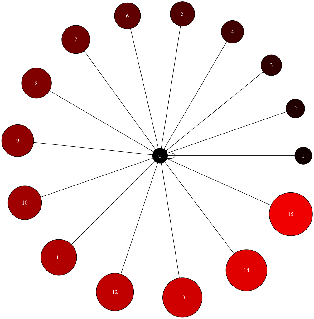
NodeView(('EWR', 'MEM', 'LGA', 'FLL', 'SEA', 'JFK', 'DEN', 'ORD', 'MIA', 'PBI', 'MCO', 'CMH', 'MSP', 'IAD', 'CLT', 'TPA', 'DCA', 'SJU', 'ATL', 'BHM', 'SRQ', 'MSY', 'DTW', 'LAX', 'JAX', 'RDU', 'MDW', 'DFW', 'IAH', 'SFO', 'STL', 'CVG', 'IND', 'RSW', 'BOS', 'CLE'))
FG.edges()
Output:
EdgeView([('EWR', 'MEM'), ('EWR', 'SEA'), ('EWR', 'MIA'), ('EWR', 'ORD'), ('EWR', 'MSP'), ('EWR', 'TPA'), ('EWR', 'MSY'), ('EWR', 'DFW'), ('EWR', 'IAH'), ('EWR', 'SFO'), ('EWR', 'CVG'), ('EWR', 'IND'), ('EWR', 'RDU'), ('EWR', 'IAD'), ('EWR', 'RSW'), ('EWR', 'BOS'), ('EWR', 'PBI'), ('EWR', 'LAX'), ('EWR', 'MCO'), ('EWR', 'SJU'), ('LGA', 'FLL'), ('LGA', 'ORD'), ('LGA', 'PBI'), ('LGA', 'CMH'), ('LGA', 'IAD'), ('LGA', 'CLT'), ('LGA', 'MIA'), ('LGA', 'DCA'), ('LGA', 'BHM'), ('LGA', 'RDU'), ('LGA', 'ATL'), ('LGA', 'TPA'), ('LGA', 'MDW'), ('LGA', 'DEN'), ('LGA', 'MSP'), ('LGA', 'DTW'), ('LGA', 'STL'), ('LGA', 'MCO'), ('LGA', 'CVG'), ('LGA', 'IAH'), ('FLL', 'JFK'), ('SEA', 'JFK'), ('JFK', 'DEN'), ('JFK', 'MCO'), ('JFK', 'TPA'), ('JFK', 'SJU'), ('JFK', 'ATL'), ('JFK', 'SRQ'), ('JFK', 'DCA'), ('JFK', 'DTW'), ('JFK', 'LAX'), ('JFK', 'JAX'), ('JFK', 'CLT'), ('JFK', 'PBI'), ('JFK', 'CLE'), ('JFK', 'IAD'), ('JFK', 'BOS')])
nx.draw_networkx(FG, with_labels=True) # Quick view of the Graph. As expected we see 3 very busy airports
nx.algorithms.degree_centrality(FG) # Notice the 3 airports from which all of our 100 rows of data originates
nx.density(FG) # Average edge density of the Graphs
Output:
0.09047619047619047
nx.average_shortest_path_length(FG) # Average shortest path length for ALL paths in the Graph
Output:
2.36984126984127
nx.average_degree_connectivity(FG) # For a node of degree k - What is the average of its neighbours' degree?
Output:
{1: 19.307692307692307, 2: 19.0625, 3: 19.0, 17: 2.0588235294117645, 20: 1.95}
As is obvious from looking at the Graph visualization (way above) – There are multiple paths from some airports to others. Let us say we want to calculate the shortest possible route between 2 such airports. Right off the bat we can think of a couple of ways of doing it
- There is the shortest path by distance
- There is the shortest path by flight time
What we can do is to calculate the shortest path algorithm by weighing the paths with either the distance or airtime. Please note that this is an approximate solution – The actual problem to solve is to calculate the shortest path factoring in the availability of a flight when you reach your transfer airport + wait time for the transfer. This is a more complete approach and this is how humans normally plan their travel. For the purposes of this article we will just assume that is flight is readily available when you reach an airport and calculate the shortest path using the airtime as the weight
Let us take the example of JAX and DFW airports:
# Let us find all the paths available
for path in nx.all_simple_paths(FG, source='JAX', target='DFW'):
 print(path)
# Let us find the dijkstra path from JAX to DFW.
# You can read more in-depth on how dijkstra works from this resource - https://courses.csail.mit.edu/6.006/fall11/lectures/lecture16.pdf
dijpath = nx.dijkstra_path(FG, source='JAX', target='DFW')
dijpath
Output:
['JAX', 'JFK', 'SEA', 'EWR', 'DFW']
# Let us try to find the dijkstra path weighted by airtime (approximate case)
shortpath = nx.dijkstra_path(FG, source='JAX', target='DFW', weight='air_time')
shortpath
Output:
['JAX', 'JFK', 'BOS', 'EWR', 'DFW']
Conclusion
This article has at best only managed a superficial introduction to the very interesting field of Graph Theory and Network analysis. Knowledge of the theory and the Python packages will add a valuable toolset to any Data Scientist’s arsenal. For the dataset used above, a series of other questions can be asked like:
- Find the shortest path between two airports given Cost, Airtime and Availability?
- You are an airline carrier and you have a fleet of airplanes. You have an idea of the demand available for your flights. Given that you have permission to operate 2 more airplanes (or add 2 airplanes to your fleet) which routes will you operate them on to maximize profitability?
- Can you rearrange the flights and schedules to optimize a certain parameter (like Timeliness or Profitability etc)
If you do solve them, let us know in the comments below!
Network Analysis will help in solving some common data science problems and visualizing them at a much grander scale and abstraction. Please leave a comment if you would like to know more about anything else in particular.
Bibiliography and References
- History of Graph Theory || S.G. Shrinivas et. al
- Big O Notation cheatsheet
- Networkx reference documentation
- Graphviz download
- Pygraphvix
- Star visualization
- Dijkstra Algorithm
About the Author
 Srivatsa currently works for TheMathCompany and has over 7.5 years of experience in Decision Sciences and Analytics. He has grown, led & scaled global teams across functions, industries & geographies. He has led India Delivery for a cross industry portfolio totalling $10M in revenues. He has also conducted several client workshops and training sessions to help level up technical and business domain knowledge.
During his career span, he has led premium client engagements with Industry leaders in Technology, e-commerce and retail. He helped set up the Analytics Center of Excellence for one of the world’s largest Insurance companies.


Hello Srivatsa, That was an awesome introduction to Graph Theory and Visualization. I have a few related questions though. 1. Can a framework be built for representing a criminal network interactively ? 2. How can I make my graph interactive ? Which tools would I require ? 3. How do I predict interactions/activities in the network ? How do I incorporate this predictive feature in the network framework ?
Use Python Bokeh
Hello Srivatsa. Could you please give a link to download the dataset you used in your article.
Can you provide the airlines data in the article so that we can reproduce it completely?
Here is the link to the dataset https://bitbucket.org/dipolemoment/analyticsvidhya/src
Hi, It is a very nice article and a new thing learned. But I am having problem while running the Print(A) statement as below: import pygraphviz as pgv d={'1': {'2': None}, '2': {'1': None, '3': None}, '3': {'1': None}} A = pgv.AGraph(data=d) -----This line gives me valueError: program nop not found----- print(A) # This is the 'string' or simple representation of the Graph Need help on this. Thanks.
Hi Srivatsa, Edges are represented as E = {(v1,v2), (v2,v5), (v5, v5), (v4,v5), (v4,v5)} Guessing this should be E = {(v1,v2), (v2,v5), (v5, v5), (v4,v5), (v4,v4)}
Hi Manu, Thanks for pointing it out. We will update the same
Interesting post. I have few questions: 1) How to decide whether it is unidirectional or bi directional? 2) How are the edges decided? 3) In your data set there is a single entry for origin and destination. What if I have multiple records for the same origin - destination combination. Then how to proceed. Is there a solved case study that i can refer to. Please let me know. thanks.
Hi Srivatsa, Thanks for the introduction to graph theory, can you explain more on how this can be leveraged in pharma domain?
Thank you very much. It will help me a lot with my master thesis.
Hi Srivatsa, Thanks for introducing these concepts. I have a issue with analysis on top of a undirected network graph. I have about 4000 to 5000 nodes which are highly connected. Is there any way I can cluster those nodes?
Imagine you have thousands of CSV files like yours with different carriers, airports, etc. So very different networks. And imagine you have an efficiency metric for each network: let's say, for instance, fuel consumption. Would it be possible to to train a machine learning (random forest, neural networks or whatever) with that data in order to predict the efficiency of a hypothetical network? Would you use graph theory then or just the CSV files?