12 Univariate Data Visualizations With Illustrations in Python
“A picture is worth a thousand words”.
The quote is definitely true of Data visualization as the information conveyed is more valuable than the old saying.
Data visualization is the process of representing data using visual elements like charts, graphs, etc. that helps in deriving meaningful insights from the data. It is aimed at revealing the information behind the data and further aids the viewer in seeing the structure in the data.
Data visualization will make the scientific findings accessible to anyone with minimal exposure in data science and helps one to communicate the information easily. It is to be understood that the visualization technique one employs for a particular data set depends on the individual’s taste and preference. Let’s first understand univariate analysis in python and how to perform univariate analysis in python.
Need for visualizing data :
- Understand the trends and patterns of data
- Analyze the frequency and other such characteristics of data
- Know the distribution of the variables in the data.
- Visualize the relationship that may exist between different variables
The number of variables of interest featured by the data classifies it as univariate, bivariate, or multivariate. For eg., If the data features only one variable of interest then it is a uni-variate data. Further, based on the characteristics of data, it can be classified as categorical/discrete and continuous data.
In this article, the main focus is on univariate data visualization(data is visualized in one-dimension). For the purpose of illustration, the ‘iris’ data set is considered. The iris data set contains 3 classes of 50 instances each, where each class refers to a type of iris plant. The different variables involved in the data set are Sepal Length, Sepal Width, Petal Length, Petal width which is continuous and Variety which is a categorical variable. Though the data set is multivariate in nature, for univariate analysis, we consider one variable of interest at a time.
We proceed by first importing the required libraries and the data set. You can download the python notebook and dataset here.
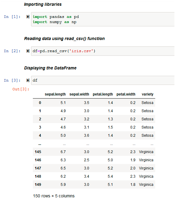
Python Code:
The data set originally in .csv format is loaded into the DataFrame df using the pd.read_csv( ) function of pandas . Then, it displays the DataFrame df.
Before analyzing any data set, inspect the data types of the data variables. Then, one can decide on the right methods for univariate data visualization.
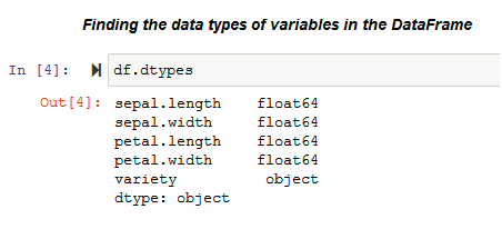
The .dtypes property is used to know the data types of the variables in the data set. Pandas stores these variables in different formats according to their type. Pandas stores categorical variables as ‘object’ and, on the other hand, continuous variables are stored as int or float. The methods used for visualization of univariate data also depends on the types of data variables.
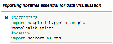
In this article, we visualize the iris data using the libraries: matplotlib and seaborn. We use Matplotlib library to draw basic plots. Seaborn library is based on the matplotlib library and it provides a wide variety of visualization techniques for univariate data.
VISUALIZING UNIVARIATE CONTINUOUS DATA :
Univariate data visualization plots help us comprehend the enumerative properties as well as a descriptive summary of the particular data variable. These plots help in understanding the location/position of observations in the data variable, its distribution, and dispersion. Uni-variate plots are of two types: 1)Enumerative plots and 2)Summary plots
Univariate enumerative Plots :
These plots enumerate/show every observation in data and provide information about the distribution of the observations on a single data variable. We now look at different enumerative plots.
1. UNIVARIATE SCATTER PLOT :
This plots different observations/values of the same variable corresponding to the index/observation number. Consider plotting of the variable ‘sepal length(cm)’ :
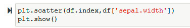
Use the plt.scatter() function of matplotlib to plot a univariate scatter diagram. The scatter() function requires two parameters to plot. So, in this example, we plot the variable ‘sepal.width’ against the corresponding observation number that is stored as the index of the data frame (df.index).
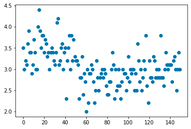
Then visualize the same plot by considering its variety using the sns.scatterplot() function of the seaborn library.

One of the interesting features in seaborn is the ‘hue’ parameter. In seaborn, the hue parameter determines which column in the data frame should be used for color encoding. This helps to differentiate between the data values according to the categories they belong to. The hue parameter takes the grouping variable as it’s input using which it will produce points with different colors. The variable passed onto ‘hue’ can be either categorical or numeric, although color mapping will behave differently in the latter case.
Note:Every function has got a wide variety of parameters to play with to produce better results. If one is using Jupyter notebook, the various parameters of the function used can be explored by using the ‘Shift+Tab’ shortcut.
2. LINE PLOT (with markers) :
A line plot visualizes data by connecting the data points via line segments. It is similar to a scatter plot except that the measurement points are ordered (typically by their x-axis value) and joined with straight line segments.
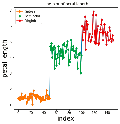
The matplotlib plt.plot() function by default plots the data using a line plot.
Previously, we discussed the hue parameter of seaborn. Though there is no such automated option available in matplotlib, one can use the groupby() function of pandas which helps in plotting such a graph.
Note:In the above illustration, the methods to set title, font size, etc in matplotlib are also implemented.
— Explanation of the functions used :
- plt.figure(figsize=()) : To set the size of figure
- plt.title() : To set title
- plt.xlabel() / plt.ylabel() : To set labels on X-axis/Y-axis
- df.groupby( ) : To group the rows of the data frame according to the parameter passed onto the function
- The groupby() function returns the data frames grouped by the criterion variable passed and the criterion variable.
- The for loop is used to plot each data point according to its variety.
- plt.legend(): Adds a legend to the graph (Legend describes the different elements seen in the graph).
- plt.show() : to show the plot.
The ‘markevery’ parameter of the function plt.plot() is assigned to ‘1’ which means it will plot every 1st marker starting from the first data point. There are various marker styles which we can pass as a parameter to the function.
The sns.lineplot() function can also visualize the line plot.
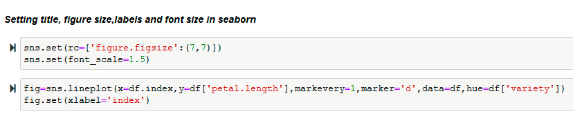
In seaborn, the labels on axes are automatically set based on the columns that are passed for plotting. However if one desires to change it, it is possible too using the set() function.
Note: There are often cases wherein one would want to explore how the distribution of a single continuous variable is affected by a second categorical variable. The seaborn library provides a variety of plots that help perform such types of comparisons between uni-variate distributions. Three such plots are discussed in this article : Strip plot, Swarm plot (under enumerative plots), and Violin plot (under summary plots). The hue parameter mentioned in above plots is also for similar use.
3. STRIP PLOT :
The strip plot is similar to a scatter plot. It is often used along with other kinds of plots for better analysis. It is used to visualize the distribution of data points of the variable.
The sns.striplot ( ) function is used to plot a strip-plot :

It also helps to plot the distribution of variables for each category as individual data points. By default, the function creates a vertical strip plot where the distributions of the continuous data points are plotted along the Y-axis and the categories are spaced out along the X-axis. In the above plot, categories are not considered. Considering the categories helps in better visualization as seen in the below plot.

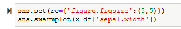
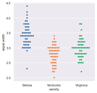
4. SWARM PLOT :
The swarm-plot, similar to a strip-plot, provides a visualization technique for univariate data to view the spread of values in a continuous variable. The only difference between the strip-plot and the swarm-plot is that the swarm-plot spreads out the data points of the variable automatically to avoid overlap and hence provides a better visual overview of the data.
The sns.swarmplot( ) function is used to plot a swarm-plot :
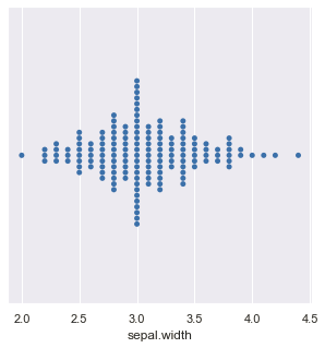
Distribution of the variable ‘sepal.width’ according to the categories :

Uni-variate summary plots :
These plots give a more concise description of the location, dispersion, and distribution of a variable than an enumerative plot. It is not feasible to retrieve every individual data value in a summary plot, but it helps in efficiently representing the whole data from which better conclusions can be made on the entire data set.
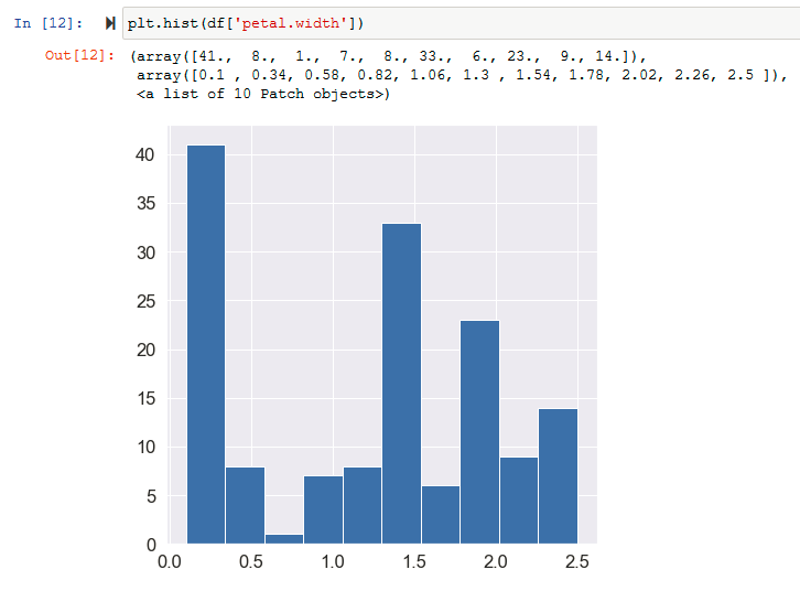
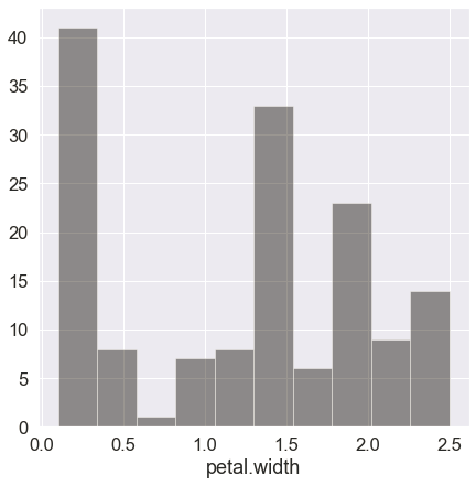
5. HISTOGRAMS :
Histograms are similar to bar charts which display the counts or relative frequencies of values falling in different class intervals or ranges. A histogram displays the shape and spread of continuous sample data. It also helps us understand the skewness and kurtosis of the distribution of the data.
Plotting histogram using the matplotlib plt.hist() function :
The seaborn function sns.distplot() can also be used to plot a histogram.

The kde (kernel density) parameter is set to False so that only the histogram is viewed. There are many parameters like bins (indicating the number of bins in histogram allowed in the plot), color, etc; which can be set to obtain the desired output.
6. DENSITY PLOTS :
A density plot is like a smoother version of a histogram. Generally, the kernel density estimate is used in density plots to show the probability density function of the variable. A continuous curve, which is the kernel is drawn to generate a smooth density estimation for the whole data.
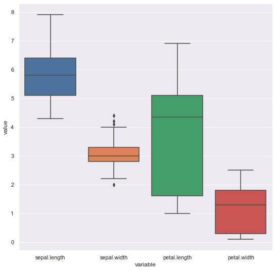
Plotting density plot of the variable ‘petal.length’ :
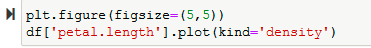
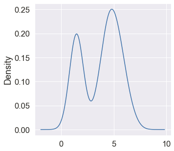
we use the pandas df.plot() function (built over matplotlib) or the seaborn library’s sns.kdeplot() function to plot a density plot . Many features like shade, type of distribution, etc can be set using the parameters available in the functions. By default, the kernel used is Gaussian (this produces a Gaussian bell curve). Also, other graph smoothing techniques/filters are applicable.
7. RUG PLOTS :
A rug plot is a very simple, but also an ideal legitimate, way of representing a distribution. It consists of vertical lines at each data point. Here, the height is arbitrary. The density of the distribution can be known by how dense the tick-marks are.
The connection between the rug plot and histogram is very direct: a histogram just creates bins along with the range of the data and then draws a bar with height equal to the number of ticks in each bin. In a rug plot, all of the data points are plotted on a single axis, one tick mark or line for each one.
Compared to a marginal histogram, the rug plot suffers somewhat in terms of readability of the distribution, but it is more compact in its representation of the data. A rug is a very short, long display of point symbols, one for each distinct value. Often a vertical pipe symbol | is used to minimize overlap. Rug plot may not be considered as a primary plot choice, but it can be a good supporter plot in certain circumstances.
Plotting the rugs of variable ‘sepal .length’ :
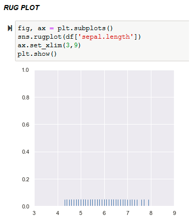
Note :In a few cases, there may be a need to set the range of the values in each axis. In the above illustration, plt.subplots() function that returns a figure object and axes object. Using the axes object ‘ax’ that is passed on to the set_xlim() method, the range of values to be considered on the X-axis is set.
A kernel density estimate can be plotted along with the rugs which can provide a better understanding of the data.
In matplotlib, there is no direct function to create a rug plot. So, scipy.stats module is used to create the required kernel density distribution which is then plotted using the plt.plot() function along with the rugs.
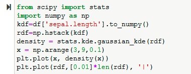
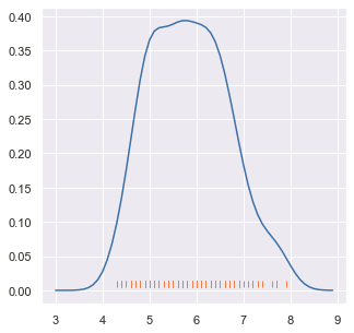
Explanation of the methods used :
The kde.gaussian_kde( ) function generates a kernel-density estimate using Gaussian kernels. In the current case of univariate data, this function takes a 1-D array as an input data set. To get the required 1-D array, firstly the function to_numpy() is used to convert the data frame into numpy array and then use the np.hstack() function to stack the sequence of input arrays horizontally (i.e. column-wise) to make a single array. This 1-D array ‘rdf’ was then passed as input to the kde.gaussian_kde() function. The range of values to be considered along with the step size was specified using the np.arange() function. Then, the plt.plot() is used to obtain the plot.
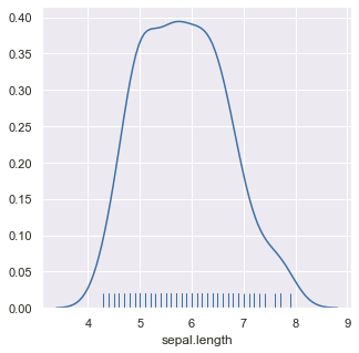
Seaborn library provides a direct and easier function to visualize such a plot with many parameters to play with.

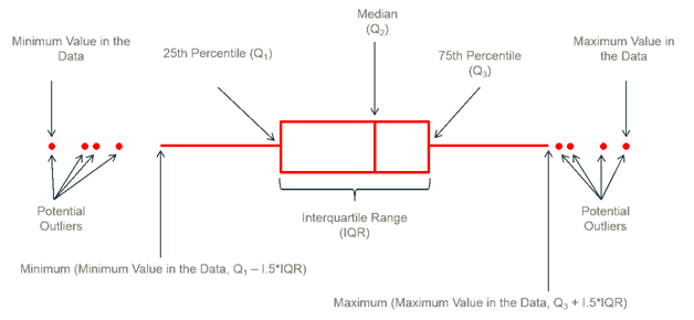
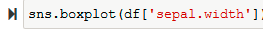
8. BOX PLOTS :
A box-plot is a very useful and standardized way of displaying the distribution of data based on a five-number summary (minimum, first quartile, second quartile(median), third quartile, maximum). It helps in understanding these parameters of the distribution of data and is extremely helpful in detecting outliers.
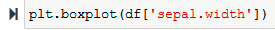
Plotting box plot of variable ‘sepal.width’ :
Plotting box plots of all variables in one frame :
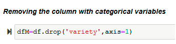
Since the box plot is for continuous variables, firstly create a data frame without the column ‘variety’. Then drop the column from the DataFrame using the drop( ) function and specify axis=1 to indicate it.
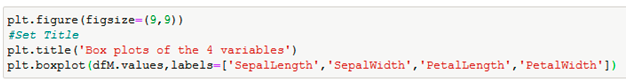
In matplotlib, mention the labels separately to display it in the output.
The plotting box plot in seaborn :
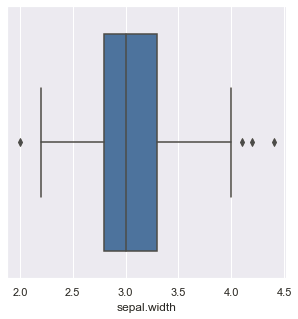
Plotting the box plots of all variables in one frame :

Apply the pandas function pd.melt() on the modified data frame which is then passed onto the sns.boxplot() function.
9. distplot() :
The distplot() function of seaborn library was earlier mentioned under rug plot section. This function combines the matplotlib hist() function with the seaborn kdeplot() and rugplot() functions.
10. VIOLIN PLOTS :
The Violin plot is very much similar to a box plot, with the addition of a rotated kernel density plot on each side. It shows the distribution of quantitative data across several levels of one (or more) categorical variables such that those distributions can be compared.
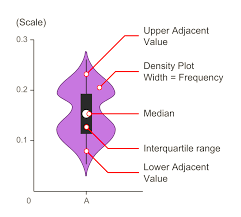
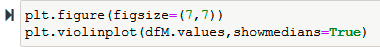
We use plt.violinplot( ) function. The Boolean parameter ‘showmedians’ is set to True, due to which the medians are marked for every variable. The violin plot helps to understand the estimated density of the variable.
In the seaborn library too, the function used to plot a violin plot is similar.
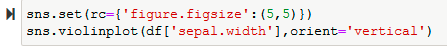
Comparing the variable ‘sepal.width’ according to the ‘variety’ of species mentioned in the dataset :

VISUALIZING CATEGORICAL VARIABLES :
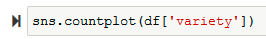
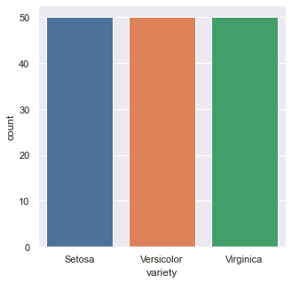
11. BAR CHART :
The bar plot is a univariate data visualization plot on a two-dimensional axis. One axis is the category axis indicating the category, while the second axis is the value axis that shows the numeric value of that category, indicated by the length of the bar.
The plot.bar() function plots a bar plot of a categorical variable. The value_counts() returns a series containing the counts of unique values in the variable.

The countplot() function of the seaborn library obtains a similar bar plot. There is no need to separately calculate the count when using the sns.countplot() function.
Since the variety is equally distributed, we obtain bars with equal heights.
12. PIE CHART :
A pie chart is the most common way used to visualize the numerical proportion occupied by each of the categories.
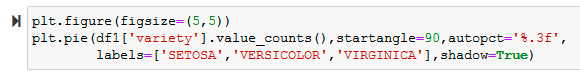
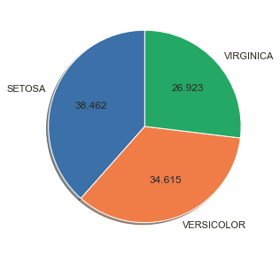
Use the plt.pie() function to plot a pie chart. Since the categories are equally distributed, divide the sections in the pie chart is equally. Then add the labels by passing the array of values to the ‘labels’ parameter.

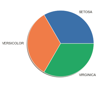
The ‘startangle’ parameter of the pie() function rotates everything counter-clockwise at a specific angle. Further, the default value for startangle is 0. The ‘autopct’ parameter enables one to display the percentage value using Python string formatting.

Most of the methods that help in the visualization of univariate data have been outlined in this article. As stated before the ability to see the structure and information carried by the data lies in its visual presentation.
Frequently Asked Questions
A. In Python, univariate analysis refers to the examination and exploration of a single variable in a dataset. It involves generating summary statistics, visualizations (e.g., histograms, box plots), and understanding the distribution and characteristics of that specific variable. Univariate analysis helps to gain insights into the variable’s behavior and is often the first step in data exploration and preprocessing.
A. The five concepts of univariate analysis are:
1. Central Tendency: Measures like mean, median, and mode to understand the center of the data distribution.
2. Dispersion: Measures such as range, variance, and standard deviation to assess the spread or variability of the data.
3. Distribution: Understanding the shape of the data through histograms, box plots, and probability plots.
4. Outliers: Identification and treatment of extreme values that deviate significantly from the rest of the data.
5. Summary Statistics: Providing a concise overview of the data through quantiles, percentiles, and other statistical measures.
References :
- https://www.rpubs.com/harshaash/Univariate_analysis
- https://www.wikipedia.org/ (For basic material on each plot)
- https://matplotlib.org/
- https://seaborn.pydata.org/
About the Author

Sruthi Sudheer
Sruthi Sudheer is a second-year Computer Science and Engineering student at Gayatri Vidya Parishad College of Engineering (Autonomous), Visakhapatnam, and a member of ACM.
Interests include Data Science, Cyber Security, and AR/VR. Enthusiastic in applying the techniques learned to different areas of Technology.


Thanks so much for this awesome article
Beautifully and logically well explained all data graphs. Thanks