Extracting knowledge from the data has always been an important task, especially when we want to make a decision based on data. But as we are going through forwards, the data is becoming larger, so we cannot analyze it with our bare eye. Therefore, we need tools that can handle such tasks efficiently, and one of them is called machine learning.
Machine learning is a method to learn patterns in data. By using it, we can automate tasks or discover hidden pieces of knowledge from it. There are many types of learning, but I want to specify only unsupervised learning.
Unsupervised learning is a learning method for unlabeled data. The main point of it is to extract hidden knowledge inside of the data. Clustering is one of them, where it groups the data based on its characteristics.
In this article, I want to show you how to do clustering analysis in Python. For this, we will use data from the Asian Development Bank (ADB). In the end, we will discover clusters based on each countries electricity sources like this one below-
I will divide the article into the following sections-
The problem that we want to solve is to cluster nations based on their electricity source and what characteristics describe each group. In this case, we will analyze data from the Asian Development Bank (ADB).
The data is from a publication called Key Indicators for Asia and the Pacific 2020. It comprises of statistics that range from economic, social, environmental, government, and many more. Also, It divides the data based on goals on the Sustainable Development Goals (SDGs).
In this case, we will specify the problem only to analyze statistics from the energy sector on every ADB members in the year 2017. To access the dataset, you can go to this link here.
For the dataset, we will use only four columns. They are-
Right after we download the dataset, we can load it to our code or notebook like this,
Now, we can move forward to the next step.
Right after we download and combine the dataset, there are several assumptions to meet. They are,
The reason we have to check those assumptions is to make sure that we can use the machine learning model to the data. To know if the data fulfills the assumptions, we have to explore it visually. We can visualize each column using a histogram. The code looks like this,
# Import libraries
import matplotlib.pyplot as plt
import seaborn as sns# Visualize the plot
fig, ax = plt.subplots(1, 3, figsize=(15,5))
sns.distplot(combine.fuel_energy, ax=ax[0])
sns.distplot(combine.solar_energy, ax=ax[1])
sns.distplot(combine.hydro_fuel, ax=ax[2])
plt.tight_layout()
plt.show()
And here is the result,
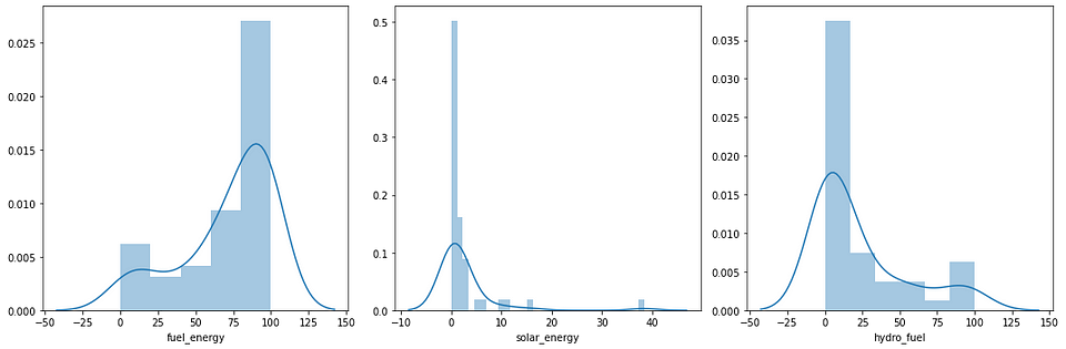
As we can see above, those variables have skewed distributions. The fuel_energy column has a slightly left-skewed distribution and the rest have a right-skewed distribution. Therefore, we have to transform their distributions.
There are many transformation types that we can apply to the distribution, for example, logarithmic transform, cubic root transform, power transform, and many more. In this case, we will use the Yeo-Johnson transformation to each column. The code looks like this,
# Import the library
from sklearn.preprocessing import power_transform# Extract the specific column and convert it as a numpy array
X = combine[['fuel_energy', 'solar_energy', 'hydro_fuel']].values# Transform the data
X_transformed = power_transform(X, method='yeo-johnson')
After we apply the function, the distribution on each column will look like this,
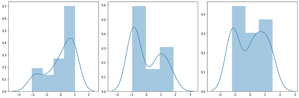
As we can see above, the distribution on each column is closer to a normal one although there’s a bimodal distribution to it. But no problem, we can use this transformation to the next step.
After we transform the data, the next step is to normalize the variance of each column. This step makes each column have the value range. The reason for doing that is to avoid any dominance from each column so it could create any bias on the result.
In Python, we can use the MinMaxScaler object from the sklearn library to do this for us. After we initialize that object, we can fit the data and transform it using the fit_transform method. The code looks like this,
# Import the library
from sklearn.preprocessing import MinMaxScaler# Instantiate the object
scaler = MinMaxScaler()# Fit and transform the data
X_transformed = scaler.fit_transform(X_transformed)
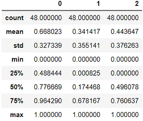
If we see the statistical summary, we can see that the minimum value is 0 and the maximum is 1. To proof that we can look at the statistical summary of it. Here is the result,
Based on that summary, we can move to the next step, which is the modeling section.
In this section, we will apply our transformed data into an algorithm called K-Means. Let me explain to you about this algorithm.
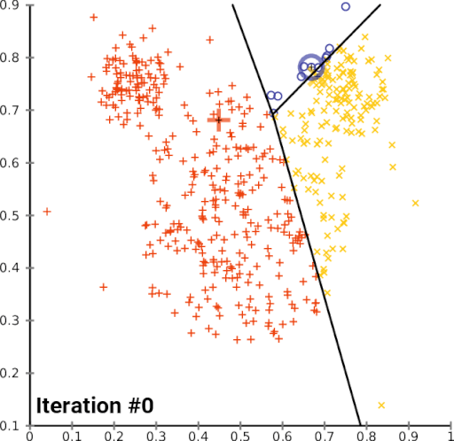
First, the algorithm will initialize several centroids. Then, each observation will pick the nearest centroid and join that cluster. The centroid will change over time, and it will iterate those steps until there are no significant changes on the centroid. Here is the illustration of the algorithm,
Let’s start applying this algorithm. The first thing that we have to do is to pick the best number of clusters that fit the data. To determine that, we have to do a step called hyperparameter tuning.
Hyperparameter tuning is where we run our model through different parameters, which in this case is the number of clusters, to pick the best model.
To know whether which one is the best model, we will evaluate the model based on their sum of squared error and visualize it with a line chart. Based on that chart, we will pick the number of the cluster that the error starts to decrease not significantly. We call the evaluation of the elbow method.
For doing this, we run the code that looks like this,
# Import the library
from sklearn.cluster import KMeans# To make sure our work becomes reproducible
np.random.seed(42)inertia = []# Iterating the process
for i in range(2, 10):
  # Instantiate the model
    model = KMeans(n_clusters=i)
  # Fit The Model
    model.fit(X_transformed)
  # Extract the error of the model
    inertia.append(model.inertia_)# Visualize the model
sns.pointplot(x=list(range(2, 10)), y=inertia)
plt.title('SSE on K-Means based on # of clusters')
plt.show()
Here is the visualization from the code,
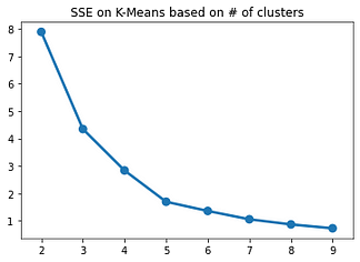
As we can see above, number 5 is the best parameter for our model. The reason for that is because the error starts to decrease slowly. Therefore, we will use number 5 as the number for our cluster. Now, we can apply the model to our data and save the clustering result to our data frame.
The code looks like this,
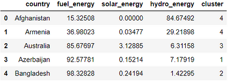
# To make sure our work becomes reproducible
np.random.seed(42)# Instantiate the model
model = KMeans(n_clusters=5)# Fit the model
model.fit(X_transformed)# Predict the cluster from the data and save it
cluster = model.predict(X_transformed)# Add to the dataframe and show the result
combine['cluster'] = cluster
combine.head()
Here is the table looks like,
With that data, now we can analyze the result!
We have done our modeling section. Now, we can analyze the result. By doing this, we will know some interesting patterns, the characteristics, and the members of each cluster. So, here we go!
First, we can summarize who is a member of each cluster. To do this, we can run code that looks like this,
for i in range(5):
    print("Cluster:", i)
    print("The Members:", ' | '.join(list(combine[combine['cluster'] == i]['country'].values)))
    print("Total Members:", len(list(combine[combine['cluster'] == i]['country'].values)))
    print()
Here is the result,
Cluster: 0
The Members: Cook Islands | Kiribati | Korea, Rep. of | Maldives | Marshall Islands, Republic of the | Micronesia, Fed. States of | Nauru | Niue | Solomon Islands | Tonga | Tuvalu
Total Members: 11Cluster: 1
The Members: Azerbaijan | Cambodia | Indonesia | Kazakhstan | Malaysia | Pakistan | Papua New Guinea | Uzbekistan
Total Members: 8Cluster: 2
The Members: Bangladesh | Brunei Darussalam | Hong Kong, China | Mongolia | Palau | Singapore | Timor-Leste | Turkmenistan
Total Members: 8Cluster: 3
The Members: Australia | China, People's Rep. of | India | Japan | Philippines | Samoa | Sri Lanka | Thailand | Vanuatu
Total Members: 9Cluster: 4
The Members: Afghanistan | Armenia | Bhutan | Fiji | Georgia | Kyrgyz Republic | Lao PDR | Myanmar | Nepal | New Zealand | Tajikistan | Viet Nam
Total Members: 12
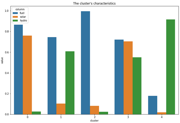
Second, we can interpret the characteristics of each cluster. To do this, we will analyze each of them and create a bar chart. The code for doing this looks like this,
# Importing libraries
import seaborn as sns
import matplotlib.pyplot as plt# Create the dataframe to ease our visualization process
visualize = pd.DataFrame(model.cluster_centers_) #.reset_index()
visualize = visualize.T
visualize['column'] = ['fuel', 'solar', 'hydro']
visualize = visualize.melt(id_vars=['column'], var_name='cluster')
visualize['cluster'] = visualize.cluster.astype('category')# Visualize the result
plt.figure(figsize=(12, 8))
sns.barplot(x='cluster', y='value', hue='column', data=visualize)
plt.title('The cluster\'s characteristics')
plt.show()
Here is the result from it,
Finally, we can create a geospatial visualization using Plotly. What makes Plotly great for visualizing this is, it adds interactivity to our result. Therefore, we can analyze it even further. To do this, we can run the code looks like this,
# Import the libraries
import plotly.express as px# Set the column as categorical value
combine['cluster'] = combine.cluster.astype('category')# Put the country code into the variable
code = ['AFG', 'ARM', 'AUS', 'AZE', 'BGD', "BTN",
        "BRN", "KHM", "CHN", "COK", "FJI", "GEO",
        "HKG", "IND", "IDN", "JPN", "KAZ", "KIR",
       "KOR", "KGZ", "LAO", "MYS", "MDV",
        "MHL", "FSM", "MNG", "MMR",
        "NRU", "NPL", "NZL", "NIU", "PAK", "PLW", "PNG",
       "PHL", "WSM", "SGP", "SLB", "LKA", "TJK",
        "THA", "TLS", "TON", "TKM", "TUV", "UZB", "VUT", "VNM"]combine['code'] = code# Visualize the result
fig = px.choropleth(combine, locations="code", color="cluster", hover_name="country", title="The Visualization of Clusters Based on Their Electricity Sources", center={"lat": 11.7827365, "lon": 91.5183827})
fig.show()
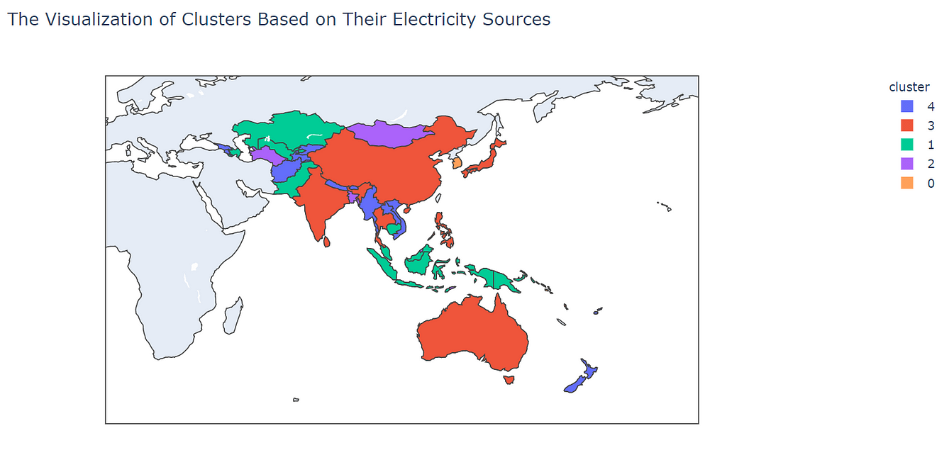
After we run the code, the result will look like this,
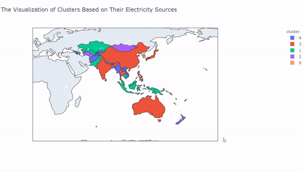
So, what can we interpret from those results? We can see that each cluster has a unique pattern on it.
On cluster 0, we can see that the member on that cluster is from countries that belong to the Pacific Region and also the Maldives. In this cluster, mostly electricity sources rely on fuel and solar. It makes sense because mostly those countries were always getting sun exposure.
In cluster 1, we can see that the member that cluster comes from South East Asia, Central Asia, and also Papua New Guinea. This cluster mostly uses fuel and water as their sources of electricity.
In cluster 2, the countries that belong to this cluster come from small-sized and densely populated countries, for example, Hong Kong and Singapore. But there is an exception like Mongolia, Turkmenistan that gets into this cluster. The countries in this cluster mostly use fuel as their source of electricity.
In cluster 3, the countries that belong to this cluster mostly from eastern Asia. For example, Japan, India, China, Thailand, and many more. They are using all of the electricity sources with almost the same proportion to it.
Finally, cluster 4 comes from countries that mostly use water as their source of energy. The countries that belong to this cluster are Vietnam, Myanmar, Lao, Georgia, Armenia, and many more. It makes sense for some countries that are landlocked for using water as their electricity source.
This marks the end of this article. I hope that you found clustering useful, and thank you for reading my article. If you found this article interesting, follow my Medium, and connect with me on LinkedIn here.
[1] https://scikit-learn.org/stable/modules/clustering.html#k-means
[2] https://plotly.com/python/choropleth-maps/
[3] https://www.adb.org/publications/key-indicators-asia-and-pacific-2020

Irfan Khalid
I’m a 21 years old undergraduate student at IPB University with a major in Computer Science, and I’m from Pekanbaru, Indonesia. I have a huge interest in machine learning, software engineering, and data science regardless of domain knowledge, whether it’s economics, environment, industry, aviation, etc. I’m interested in machine learning because of the capabilities to uncover information and to predict things accurately.
Previously, I was active at Himpunan Mahasiswa Ilmu Komputer IPB University as an education staff and taking responsibility for the Data Mining Community. And also, I was a project officer of IT Today 2019 that held seminars and competitions at the national level. Now, I am staff on IEEE IPB University Student Branch. Besides that, I am really active in writing about Data Science and Machine Learning.
I describe myself as a curious person, always wanting to learn, belief in a growth mindset, and always keep in mind that impact really matters.
Lorem ipsum dolor sit amet, consectetur adipiscing elit,


love the article, however, I'm running into a few issues with the following piece of code. np.random.seed(42)inertia = []# Iterating the process File "", line 3 np.random.seed(42)inertia = []# Iterating the process ^ SyntaxError: invalid syntax could you help with this bit? thanks