A Complete Beginner’s Guide to Data Visualization
Introduction
In the era of big data, the ability to visualize and communicate data findings is a crucial skill. Data visualization is a powerful tool that allows us to understand complex data sets and communicate data-driven findings effectively. This guide will take you on a journey through the world of data visualization and big data. We’ll start by understanding what data visualization is and why it’s important. We’ll then delve into the intersection of data visualization and big data, exploring various types of data visualizations and tools. We’ll also look at an exploratory analysis of Haberman’s Survival Data, discuss best practices and tips, and highlight common mistakes to avoid while visualizing data. Finally, we’ll point you towards more resources and courses where you can continue your learning journey.
This article was published as a part of the Data Science Blogathon.
Table of contents
What is Data Visualization?
Data visualization is the graphical representation of information and data. It uses visual elements like charts, graphs, and maps to provide an accessible way to see and understand trends, outliers, and patterns in data.
Why Visualize Data?
Data visualization is a way you can create a story through your data. When data is complex and understanding the micro-details is essential, the best way is to analyze data through visuals.
Visuals can be used for two purposes:
- Exploratory data analysis: This is used by data analysts, statisticians, and data scientists to better understand data. As it is rightly called, it is used to explore the hidden trends, patterns in data.
- Explanatory data analysis: Once the analysts understand the data and find their results, the best way to convey their ideas and findings is through visuals! This is used to craft a story that will appeal to the viewer offering deeper insights.
Top 20 Data Visualization Examples
Data visualization and big data
Data visualization and big data are two interrelated concepts that have gained significant attention in the digital age. Let’s break down these concepts and understand their importance.
What is Big Data?
Big data refers to extremely large datasets that are often beyond the ability of traditional data-processing software to handle. These datasets can come from various sources such as social media, business transactions, or machine-to-machine data. Big data is characterized by its volume, variety, velocity, and veracity (the 4Vs).
The Intersection of Big Data and Data Visualization
The sheer volume and complexity of big data make it challenging to extract meaningful insights. This is where data visualization comes in. By transforming big data into visual formats, data visualization tools allow us to comprehend complex data and make data-driven decisions effectively.
Here are some key points on how data visualization aids in understanding big data:
- Simplification: Big data is complex. Data visualization simplifies this complexity by representing data in a more digestible format.
- Quick Insights: Visual data allows for faster absorption of information, enabling quick identification of patterns and trends that might go unnoticed in text-based data.
- Better Decision Making: By making data more understandable, data visualization supports better decision-making, allowing businesses to act on insights more quickly.
- Interactive Exploration: Many data visualization tools offer interactive features that allow users to manipulate variables and explore different views of the data.
- Storytelling: Data visualization can turn data into a story, making the information more engaging and easier to remember.
Remember, while data visualization is a powerful tool, it’s also important to use it responsibly. Misleading visuals can distort data interpretation, so always strive for accuracy and clarity in your data visualizations.
Types of data visualizations
Data visualization encompasses a wide array of techniques and methods to represent data visually. Here are some common types of data visualizations:
- Line Chart: Line charts are used to display trends over time. They are effective for showing changes in data points continuously and are commonly used in financial analysis, tracking stock prices, and analyzing trends in scientific data.
- Bar Chart: Bar charts represent data with rectangular bars, where the length of each bar corresponds to the value it represents. They are ideal for comparing data across different categories or groups, such as sales figures by region or population by country.
- Pie Chart: Pie charts display data as a circular graph divided into slices, with each slice representing a proportion of the whole. They are useful for illustrating the composition of a dataset and showing the relative sizes of different categories.
- Histogram: Histograms are similar to bar charts but are specifically used to represent the distribution of numerical data. They display the frequency of data points within specified intervals, making them valuable for understanding the distribution of data and identifying patterns.
- Scatter Plot: Scatter plots represent individual data points as dots on a two-dimensional graph, with one variable plotted on the x-axis and another on the y-axis. They are useful for visualizing the relationship between two variables and identifying correlations or clusters within the data.
- Heatmap: Heatmaps use color gradients to represent data values across a two-dimensional grid. They are particularly effective for visualizing large datasets and identifying patterns or trends, especially in geospatial data analysis or in representing matrices of values.
- Tree Map: Tree maps visualize hierarchical data structures by dividing a rectangle into smaller rectangles, with each rectangle representing a category or sub-category. The size of each rectangle corresponds to a quantitative value, making it easy to compare the relative sizes of different categories within the hierarchy.
- Bubble Chart: Bubble charts are similar to scatter plots but include an additional dimension by varying the size of the data points (bubbles) to represent a third variable. They are useful for visualizing relationships between three variables simultaneously.
- Choropleth Map: Choropleth maps use color shading or patterns to represent spatial data on a map, with different shades or patterns indicating variations in data values across geographic regions. They are commonly used for visualizing demographic data, election results, or other geospatial phenomena.
- Sankey Diagram: Sankey diagrams depict the flow of data or resources between different stages or categories. They are particularly useful for illustrating processes, such as energy flow in a system, customer journeys in marketing, or the distribution of funds in financial transactions.
Open-source visualization tools: What are they?
Open-source visualization tools are software applications that are freely available for use and modification. They allow users to create visual representations of data, such as graphs, charts, and maps. These tools are particularly useful for making sense of large datasets, as they can highlight trends, patterns, and outliers in the data.
Here are some examples of open-source visualization tools:
- Candela: Candela is an open-source suite of interoperable web visualization components.
- Redash: Redash is a cloud-based and open-source data visualization and analytics tool. It runs on an SQL server and sports an online SQL editor.
- Charted: Charted is an open-source data visualization tool that runs on the MIT license.
- Apache Superset™: Apache Superset™ is an open-source modern data exploration and visualization platform.
Exploratory analysis of Haberman’s Survival Data
The dataset contains cases from a study that was conducted between 1958 and 1970 at the University of Chicago’s Billings Hospital on the survival of patients who had undergone surgery for breast cancer.
The attributes include:
- Age of patient at the time of operation (numerical)
- Patient’s year of operation (year – 1900, numerical)
- Number of positive axillary nodes detected (numerical)
- Survival status (class attribute)
1 = the patient survived 5 years or longer
2 = the patient died within 5 year
Let’s first start by using statistics to understand data:
We see there are 306 rows and 4 columns. Further upon seeing the attributes, we understand how data is distributed. To further find out how many examples of each class we have, we can use a bar chart.
We see that the data is imbalanced with more survivors than those who couldn’t survive. To further scan the data, let’s see different plots.
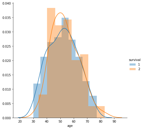
Probability Density Function

- A large portion i.e from 30 to 80 years overlaps between the two classes.
- People in the age group of 20-40 are more likely to survive,40-60 are more likely to not survive,60-80 age groups have equal chances of survival and death, and >80 have higher chances of not surviving.
- Age alone cannot distinguish if a person will survive or not.
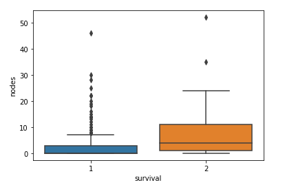
Box-Plot

Box-plots tell us about the distribution of data and scan for outliers. Notice that the survivors have fewer nodes than those who could not survive. Interesting! Isn’t it. Also notice that even though the number of nodes is a more useful feature, there is some overlap with both the classes.
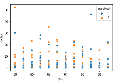
Scatter-Plot

We see from the scattered points that irrespective of the year, the number of patients having 0 nodes have been survivors. Does this mean that 0 nodes ensure survival? See the violin plot!
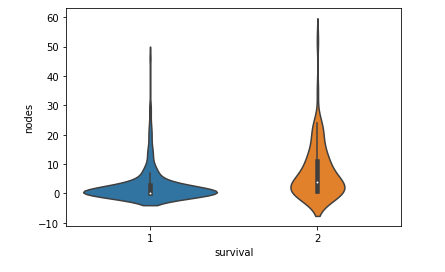
Violin-Plot

From the plot above, we see that there are non-survivors with 0 nodes! Violin plots enable us to view the distribution and box plots in one visual. Useful! Isn’t it? There is so much we can learn from the visuals. Visualize to understand. Visualize to explain your understanding. I have compiled a few tips and tools to get you started.
Data Visualization Tools
- Tableau: Simple to use, effective and secure. It’s very popular and used to pre-process and visualize data effectively. Data sharing is also possible.
- Microsoft Power BI: Data Visualization platform focused on creating data-driven solutions for business problems. It is used to pre-process, analyze and share meaningful insights with ease. Other tools include FusionCharts, Dash, Plotly, QlikView.
- MS Excel: This is the most common tool used by analysts to quickly handle data, sort, visualize and perform preprocessing on data.
Best Practices and Tips
Use a consistent coloring scheme for your visuals: While color adds meaning and beauty to a chart, it is often best to use colors for highlighting important details and not merely for attractiveness. Too many colors will destroy the purpose of coloring while using a single color or too many shades of one color can confuse viewers. Also, take into consideration the visually impaired while designing visuals. Use colors intuitively. For example: for sentiment analysis, we can use green color for positive emotions, red for negative emotions, and green for neutrals.
Make use of size, shape, and format to convey semantics: Using size, shape like circles, squares may add semantic meaning and thus help viewers absorb the data with ease. Also, notice that sometimes arranging bar graphs in ascending order makes more sense (in the case of ordinal data) rather than arranging it alphabetically or randomly.
Use legends, words to properly annotate data: Use labels wherever required but don’t clutter the graph with text. Use text data wisely. Place the visual data in a manner that is easy to grasp.
Use Interactive plots: Race graphs, interactive plots add value and help viewers engage with the data in greater depths.
Remove junk from the chart: Remove unnecessary junk from the chart that may distract the viewers. Don’t combine multiple views in a single visual to such an extent that it makes it difficult to comprehend. Use the scales to tell the real picture.
Labeling the data: Label the data accurately. Don’t over-label. Make sure the labels are visible and oriented properly. Don’t add dimensions to visuals that may lead to skewness.
Craft out a complete story: Focus on the bigger picture you are trying to capture. Do not provide inaccurate or misleading visuals. Use the visual tools wisely to speak more than the text would do.
Common Mistakes to Avoid While Visualizing Data
- Using a visual when it might not be needed: If data can be communicated effectively with statistics, we don’t need to create visuals. Visuals make it easier to analyze what numbers cannot convey. Thus, choose wisely when to use a visual tool.
- Are you really sure about what you are trying to convey? : Correlation does not imply causation. We need to ensure our results are backed up by proper research and experiments before jumping to causals.
- Use of 3-D visuals: Ensure that the 3-D view does not hide a part of the data or distort the data. Use 3-D graphics with utmost care. Don’t add orientations that may fool the viewer and destroy the purpose of visualization.
Where to Look for More Resources & Courses?
There are a lot of courses, blogs, and books out to help us understand visualization in depth.
For wonderful blog websites: https://www.tableau.com/learn/articles/best-data-visualization-blogs, Visualising Data, and Reddit being my favorite.
For free courses: Tableau provides free courses for data visualization that are a must-do. Kaggle also has free courses for basic data visualization with hands-on exercises. There are several courses available on Analytics Vidhya, Coursera, Udemy, Udacity which aid in learning.
For books: Refer to this curated list of books https://www.tableau.com/learn/articles/books-about-data-visualization with my favorite ones being The Visual Display of Quantitative Information by Edward Tufte and Storytelling with Data by Cole.
Conclusion
Data visualization is more than just creating pretty graphics for reports; it’s about effectively communicating complex data sets and making data-driven decisions. As we generate more and more data, the importance of being able to visualize that data will only increase. Whether you’re a data scientist, a business analyst, or just someone interested in visualizing data, there’s a lot to learn from this guide. Remember, the best data visualization is one that effectively communicates the story behind the data. So, keep exploring, keep learning, and most importantly, have fun visualizing!
The media shown in this article are not owned by Analytics Vidhya and is used at the Author’s discretion.
Frequently Asked Questions
A. The main purpose of data visualization is to represent data visually in a way that facilitates understanding, analysis, and decision-making. By transforming raw data into graphical or interactive visualizations, complex datasets can be communicated more effectively, revealing patterns, trends, and insights that might otherwise be difficult to discern from raw data alone.
A. The five steps in data visualization typically involve:
Identifying the data: Understanding the data you have available and the questions you want to answer.
Cleaning and organizing the data: Preparing the data for visualization by removing errors, handling missing values, and formatting it appropriately.
Choosing the right visualization: Selecting the most suitable chart types or graphical representations to effectively convey the insights in the data.
Creating the visualization: Building the visualizations using appropriate tools or software, focusing on clarity, accuracy, and visual appeal.
Interpreting and communicating the insights: Analyzing the visualizations to extract meaningful insights and communicating these findings to stakeholders or decision-makers.
A. Data visualization is used in various fields and industries, including:
Business and finance: Analyzing sales data, market trends, and financial performance.
Science and research: Visualizing experimental results, scientific data, and trends in research findings.
Healthcare: Exploring patient data, medical records, and epidemiological trends.
Education: Presenting educational materials, interactive learning experiences, and statistical concepts.
Government and public policy: Communicating demographic data, economic indicators, and policy implications.
Technology: Monitoring system performance, analyzing user behavior, and visualizing network data.
A. There are various types of data visualization techniques, including:
Bar charts: Representing categorical data with rectangular bars of lengths proportional to the values they represent.
Line charts: Displaying data points connected by straight lines, commonly used to show trends over time.
Pie charts: Dividing a circle into sectors to represent proportions of a whole.
Scatter plots: Showing the relationship between two variables by plotting points on a Cartesian plane.
Heatmaps: Using colors to represent the magnitude of values in a matrix or table.
Histograms: Displaying the distribution of numerical data through bars of varying heights.
Tree maps: Visualizing hierarchical data structures using nested rectangles.
Bubble charts: Representing data points with bubbles of varying sizes, often used to compare relationships between three variables.


A valuable article. I make use of data visualization in my guided surgery and patient's reaction are con-sistently positive.