
Image Source: Author
Introduction:
Diabetes is a serious disease affecting millions of people across the entire world. Thus, correct and timely prediction of this disease is very important due to the complications it can have in the case of other life-threatening diseases. The high blood sugar level is the primary cause mostly seen in this disease. The objective of this project is to construct a prediction model for predicting diabetes using Pycaret. PyCaret, an open-source library consists of multiple classifiers and regressors for quickly selecting best-performing algorithms. This allows you to prepare and deploy your model within minutes in your choice of notebook environment.
Dataset Used:
The dataset used for this project is Pima Indians Diabetes Dataset from Kaggle. This original dataset has been provided by the National Institute of Diabetes and Digestive and Kidney Diseases. Both dataset and code for this project are available on my GitHub repository. This dataset is used to predict whether a patient is likely to get diabetes based on the input parameters like Age, Glucose, Blood pressure, Insulin, BMI, etc. Each row in the data provides relevant information about the patient. It is to be noted that all patients here are females minimum 21 years old belonging to Pima Indian heritage.
Features of the dataset:
The dataset contains 768 individuals data with 9 features set. The detailed description of all the features are as follows:
Pregnancies: indicates the number of pregnancies
Glucose: indicates the plasma glucose concentration
Blood Pressure: indicates diastolic blood pressure in mm/Hg
Skin Thickness: indicates triceps skinfold thickness in mm
Insulin: indicates insulin in U/mL
BMI: indicates the body mass index in kg/m2
Diabetes Pedigree Function: indicates the function which scores likelihood of diabetes based on family history
Age: indicates the age of the person
Outcome: indicates if the patient had a diabetes or not (1 = yes, 0 = no)
Know your data with EDA:
To begin with, let us import all required libraries and the dataset.
import pandas as pd
import numpy as np
import matplotlib.pyplot as plt
%matplotlib inline
import seaborn as sns
import plotly.offline as py
import plotly.express as px
import plotly.io as pio
import plotly.graph_objs as go
import math
from scipy.stats import norm, skew

import warnings
warnings.filterwarnings('ignore')
After importing the dataset, we can now perform the EDA (Exploratory Data Analysis).
Getting basic information on the dataset
Python Code:
import pandas as pd
df_diab = pd.read_csv("diabetes.csv")
print(df_diab.info())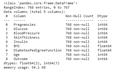
The dataset has about 35% entries with a likelihood of getting diabetes.
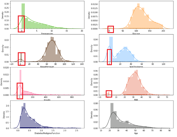
Let’s visualize these 8 features provided in the dataset –
fig, axs = plt.subplots(4, 2, figsize=(15,12))
axs = axs.flatten()
sns.distplot(df_diab['Pregnancies'],rug=True,color='#38b000',ax=axs[0])
sns.distplot(df_diab['Glucose'],rug=True,color='#FF9933',ax=axs[1])
sns.distplot(df_diab['BloodPressure'],rug=True,color='#522500',ax=axs[2])
sns.distplot(df_diab['SkinThickness'],rug=True,color='#66b3ff',ax=axs[3])
sns.distplot(df_diab['Insulin'],rug=True,color='#FF6699',ax=axs[4])
sns.distplot(df_diab['BMI'],color='#e76f51',rug=True,ax=axs[5])
sns.distplot(df_diab['DiabetesPedigreeFunction'],color='#03045e',rug=True,ax=axs[6])
sns.distplot(df_diab['Age'],rug=True,color='#333533',ax=axs[7])
plt.show()
Preprocessing the dataset:
This dataset contains zeros and some invalid values i.e., values that are logically impossible like glucose, insulin, BMI, or blood pressure value of 0. It is possible to either drop and ignore such inconsistent values while cleaning the dataset or replacing them with a more appropriate range of values. Since there are many zeros in columns ‘Skin Thickness’ and ‘Insulin levels’; deleting those would result in a much smaller dataset. Hence, for this project, let us replace the NaN values with the mean so that the size of the dataset stays the same. Also, the ‘replacing by mean value’ approach works well for features ‘BMI’, ‘glucose’ or ‘Blood pressure’.
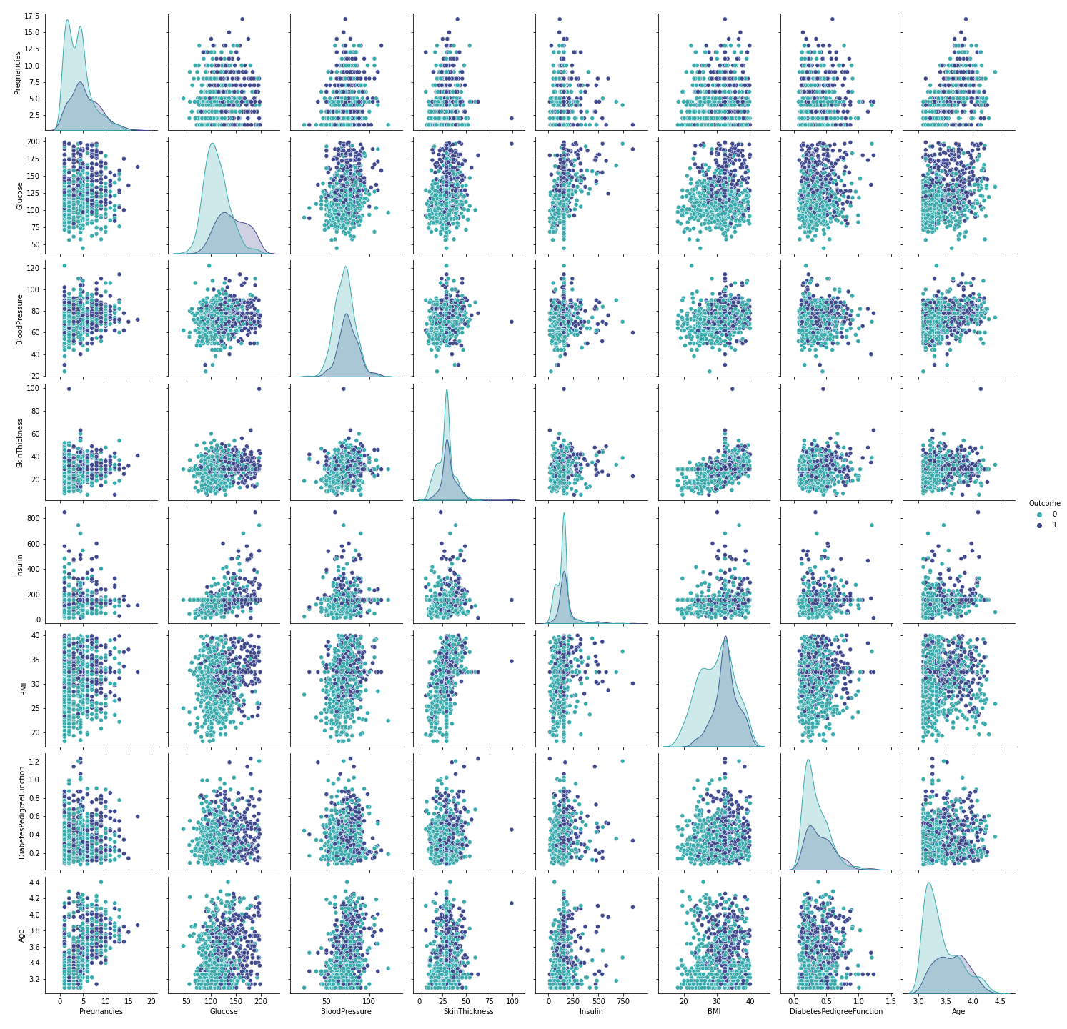
With the seaborn pair plot, we can see that this dataset consists of a few outliers, especially in the BMI feature. Let’s see how many outliers we have and whether it is possible to delete them.
bmi_outliers=df_diab[df_diab['BMI']>40]
bmi_outliers['BMI'].shape

Since the count of outliers is >10% of the total samples, we will not remove them. Rather let us replace the BMI outliers (BMI>40) with the mean value.
df_diab["BMI"] = df_diab["BMI"].apply(lambda x: df_diab.BMI.mean() if x>40 else x)
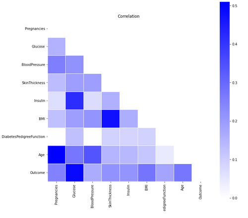
Using a correlation matrix, we get a complete picture of the dependencies amongst the variables and their effect on the outcome. Here, we can see that the feature ‘glucose’ has a high correlation with the outcome which is expected. Other than that, none of the parameters seems to bear a very strong correlation to each other. This is why it might not be possible to drop certain features while training the model.
Setting up the model in PyCaret:
Now that we have completed the preprocessing of the dataset, let us set up the models in PyCaret. To start with, let us install PyCaret. Installing PyCaret is very simple and takes only a few minutes by running the command ‘pip install pycaret’ in a virtual environment.
The ‘setup’ is the first and the only mandatory step for using the PyCaret library. This step takes care of all the data preparation required before training models. After initializing the setup, it lists all the data types of input features. If the data types of the features are correct, you have to just press ‘Enter’ to proceed.
PyCaret uses a 70:30 split ratio by default for the train-test split which can be modified by passing a parameter ‘train-size’ while setting up the models. It might be interesting to see the model performance for a different split ratio.
As there are different scales in the features of the dataset, so there is definitely a need to normalize the dataset to ensure a better result while training & testing the model. Let us set ‘normalize=True’ so that PyCaret will do the Normalization.
diab = setup(data = df_diab,target = 'Outcome',normalize=True, session_id=1)
Also, the ‘outcome’ variable displays a slight imbalance in the predicted classes ‘0’ and ‘1’ amongst the total of 768.
This skew could be adjusted using a sampling technique like SMOTE to improve the model in the future.
Now we can start the training process by using the ‘compare_models’ function. This function will train all the algorithms available in the library and will list out multiple performance metrics.
compare_models()
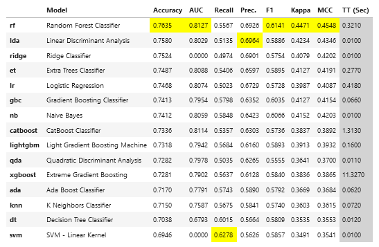
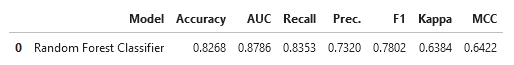
Since the Random Forest Classifier was evaluated to have a comparatively better accuracy as compared to other classifiers, let us build the model using Random Forest Classifier. Here you can define the number of folds using the ‘fold’ parameter and you can tune your model by the ‘tune_model’ statement.
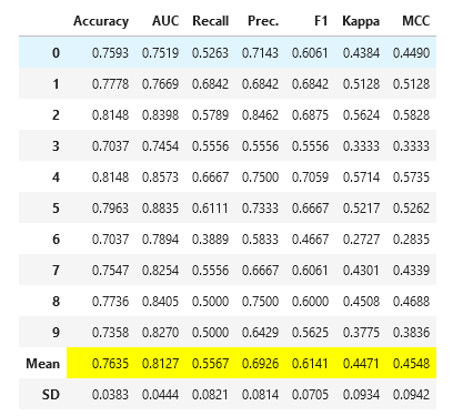
rf = create_model('rf', fold = 10)
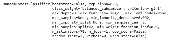
By printing the ‘tuned_rf’ statement, you can get the best hyper-parameters you need.
tuned_rf = tune_model(rf)
tuned_rf
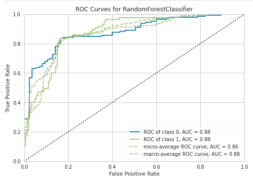
Plotting AUC-ROC Curve:
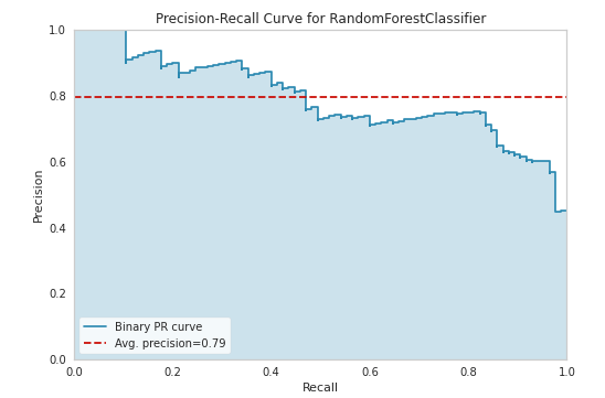
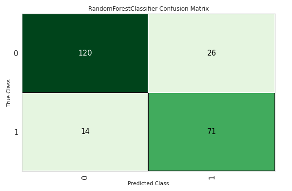
The PyCaret library not only provides you, different models, with performance metrics but also Class Prediction error, Confusion matrix, precision-recall curve and many other options for your model
plot_model(tuned_rf, plot = 'auc')
plot_model(tuned_rf, plot = 'pr')
plot_model(tuned_rf, plot = 'confusion_matrix')
The model can be easily interpreted by a single line of code in PyCaret with SHAP values and a correlation plot.
interpret_model(tuned_rf)
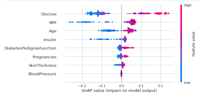
The above plot shows us the SHAP values. The color indicates the impact i.e dark pink means higher impact and light blue means lower impact. To understand it further we can see that the Glucose variable has a high impact on diabetes and BMI has a low and negative impact on diabetes.
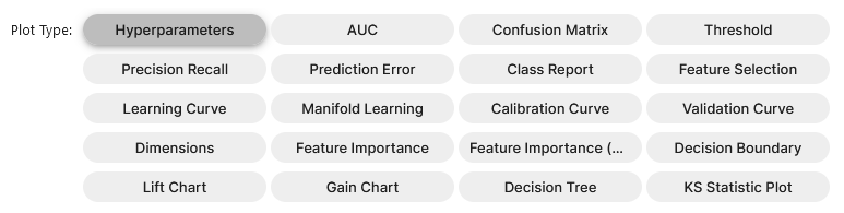
To visualize the model in all the possible ways, we can use PyCaret ‘evaluate_model’ function which will give you all options in one single window.
evaluate_model(tuned_rf)
predict_model(tuned_rf);
Results & Conclusion:
With Random Forest Classifier giving a reasonably well accuracy of close to 82.68%, this approach and the ML model look promising in assisting healthcare professionals to provide a prediction. Moreover, before finalizing a health situation diagnosis based on ML models, it is essential to place a greater focus on interpreting the confusion matrix as False positives – False negatives can be risky.
Thus, overall PyCaret simplifies the work of applying different classifiers on a healthcare dataset with a few lines of code and allows Machine Learning Engineers & Enthusiasts to select the best model for ensuring high performance each time.
References:
Author Bio:
Devashree has an M.Eng degree in Information Technology from Germany and a Data Science background. As an Engineer, she enjoys working with numbers and uncovering hidden insights in diverse datasets from different sectors to build beautiful visualizations to try and solve interesting real-world machine learning problems.
In her spare time, she loves to cook, read & write, discover new Python-Machine Learning libraries or participate in coding competitions.
You can follow her on LinkedIn, GitHub, Kaggle, Medium, Twitter.
Devashree has an M.Eng degree in Information Technology from Germany and a Data Science background. As an Engineer, she enjoys working with numbers and uncovering hidden insights in diverse datasets from different sectors to build beautiful visualizations to try and solve interesting real-world machine learning problems.
In her spare time, she loves to cook, read & write, discover new Python-Machine Learning libraries or participate in coding competitions.