A Comprehensive Tutorial on Microsoft Excel for Data Analysis
Excel is a naturally powerful tool for data analysis that enables users to manipulate, analyze, and visualize large amounts of data quickly and easily. With its built-in features such as pivot tables, data tables, and various statistical functions, Excel is widely used in many industries, from finance and accounting to marketing and sales. This article highlights the essential role of Excel in data analysis and its significance in today’s data-driven world. For those looking to enhance their Excel skills further, explore this comprehensive Excel Tutorial available on YouTube. It covers a wide range of topics and provides valuable insights and techniques for mastering the art of “Excel for data analysis.” Feel free to check out the guide below.
This article was published as a part of the Data Science Blogathon.
Table of contents
- What is Data Analysis?
- Introduction to Excel for Data Analysis
- 15 Essential Excel Data Analysis Functions
- Some of the Methods for Data Analysis in Excel
- 2. Data Cleaning – Text Functions, Dates and Times
- 3. Conditional Formatting
- 4. Sorting and Filtering
- 5. Subtotals with Ranges
- 6. QuickAnalysis
- 7. Understanding Lookup Functions
- 8. PivotTables
- 9. Data Visualization in Excel
- 10. Data Validation
- 11. Financial Analysis
- 12. Working with Multiple Worksheets
- 13. Formula Auditing
- 14. What-if Analysis
- STEP 4 – PIVOT TABLES
- Simple Linear Regression Model in Microsoft Excel
- Dataset in Excel for Data Analysis
- Conclusion
- Frequently Asked Questions
What is Data Analysis?
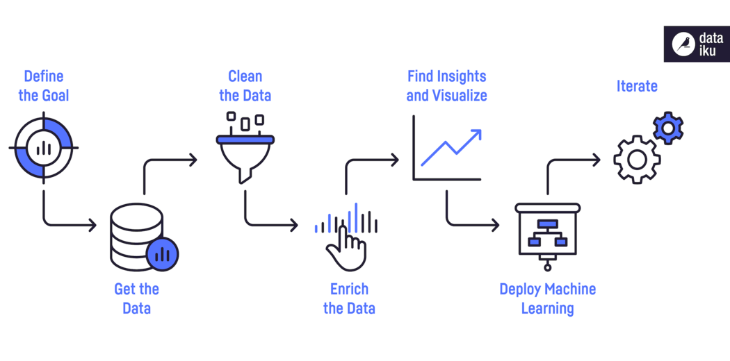
Data analysis is a naturally integral process of cleansing, transforming, and analyzing raw data to obtain usable, relevant information that can assist businesses in making educated decisions. By giving relevant insights and data, which are commonly presented in charts, photos, tables, and graphs, the technique helps to lessen the risks associated with decision-making. When it comes to implementing effective data analysis for Excel, the robust capabilities of the software enhance the entire process. Excel’s features, including pivot tables, data tables, and various statistical functions, play a vital role in streamlining and optimizing data analysis for Excel. This synergy between data analysis and Excel empowers users to navigate and derive meaningful insights from complex datasets naturally.

Data analytics encompasses not just data analysis, but also data collecting, organization, storage, and the tools and techniques used to delve deeper into data, as well as those used to present the findings, such as data visualization tools. On the other hand, data analysis is concerned with the process of transforming raw data into meaningful statistics, information, and explanations.
Data visualization is an interdisciplinary field concerned with the depiction of data graphically. When the data is large, such as in a time series, it is a very effective manner of conveying.
The mapping establishes how these components’ characteristics change in response to the data. A bar chart, in this sense, is a mapping of a variable’s magnitude to the length of a bar. Mapping is a basic component of Data visualization since the graphic design of the mapping can negatively affect the reading of a chart.
The iterative Data Analysis Process is comprised of the following phases:
- Specification of Data Requirements
- Data Gathering
- Data Processing
- Data Cleaning
- Data Analysis
- Data Communication
Introduction to Excel for Data Analysis
Data analysis is a naturally valuable skill that can help you make better judgments. Microsoft Excel is one of the most used programs for data analysis, with the built-in pivot tables being the most popular analytic tool. Excel for data analysis provides a user-friendly platform where individuals can efficiently organize and interpret data sets. Whether you are working in finance, marketing, or any other industry, mastering the intricacies of Excel for data analysis can significantly enhance your ability to derive meaningful insights and inform strategic decision-making.
Microsoft Excel allows you to examine and interpret data in a variety of ways. The information could come from several different places. A variety of formats and conversions are available for the data. Conditional Formatting, Ranges, Tables, Text functions, Date functions, Time functions, financial functions, Subtotals, Quick Analysis, Formula Auditing, Inquire Tool, What-if Analysis, Solvers, Data Model, PowerPivot, PowerView, PowerMap, and other Excel commands, functions, and tools can all be used to analyse it.

15 Essential Excel Data Analysis Functions
Excel has hundreds of functions and trying to match the proper formula with the right kind of data analysis can be overwhelming. It is not necessary for the most valuable functions to be difficult. You’ll wonder how you ever lived without fifteen easy functions that will increase your ability to interpret data.
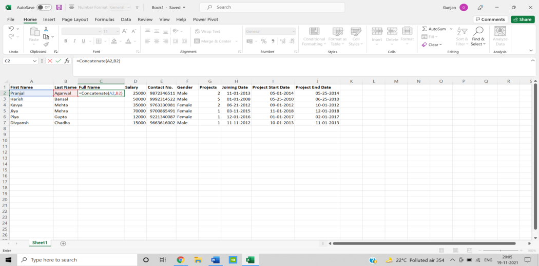
1. Concatenate
When conducting data analysis, the formula =CONCATENATE is one of the simplest to understand but most powerful. Text, numbers, dates, and other data from numerous cells can be combined into a single cell.
SYNTAX = CONCATENATE (text1, text2, [text3], …)
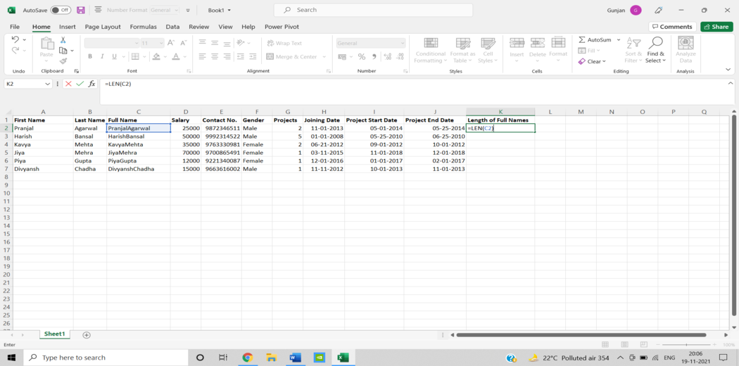
2. Len ()
In data analysis, LEN is used to show the number of characters in each cell. It’s frequently utilised when working with text that has a character limit or when attempting to distinguish between product numbers.
SYNTAX = LEN (text)
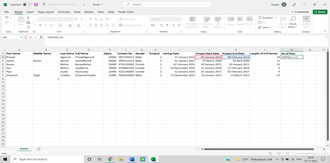
3. Days ()
The number of calendar days between two dates is calculated using this function = DAYS.
SYNTAX =DAYS (end_date, start_date)
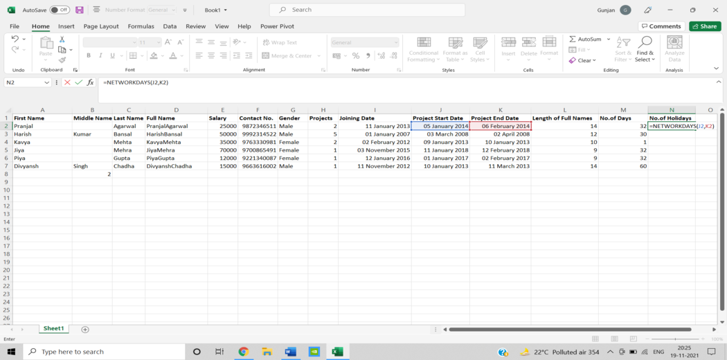
4. Networkdays
The number of weekends is automatically excluded when using the function. It’s classified as a Date/Time Function in Excel. The net workday’s function is used in finance and accounting for determining employee benefits based on days worked, the number of working days available throughout a project, or the number of business days required to resolve a customer problem, among other things.
SYNTAX = NETWORKDAYS (start_date, end_date, [holidays])
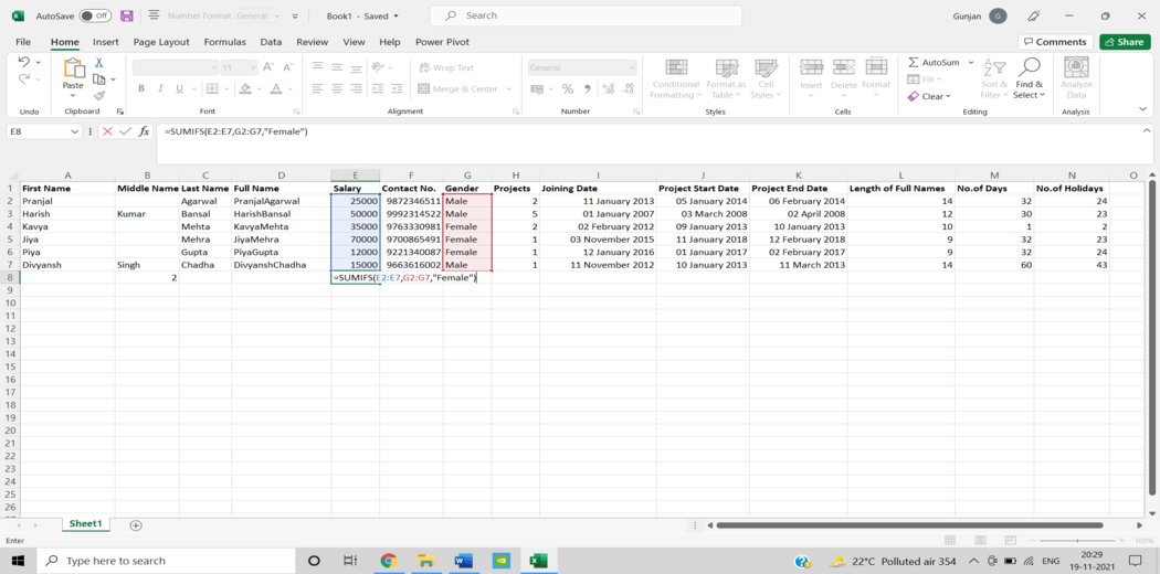
5. Sumifs()
One of the “must-know” formulas for a data analyst is =SUMIFS. =SUM is a familiar formula, but what if you need to sum data based on numerous criteria? It’s SUMIFS.
SYNTAX = SUMIFS (sum_range, range1, criteria1, [range2], [criteria2], …)
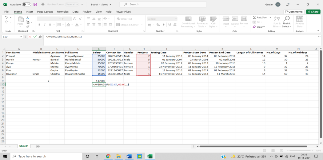
6. Averageifs()
AVERAGEIFS, like SUMIFS, lets you take an average based on one or more parameters.
SYNTAX = AVERAGEIFS (avg_rng, range1, criteria1, [range2], [criteria2], …)
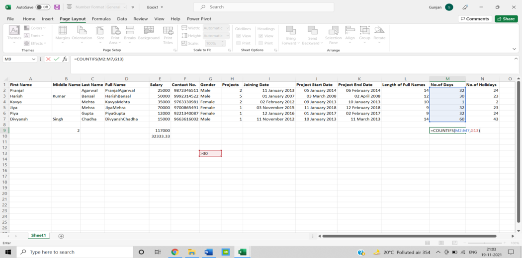
7. Countsifs()
The COUNTIFS function is yet another powerful Excel data analysis tool. It’s a lot like the SUMIFS function. The COUNTIFS function counts the number of values that satisfy a set of conditions. As a result, it doesn’t need a sum range like SUMIFS.
SYNTAX = COUNTIFS (range, criteria)
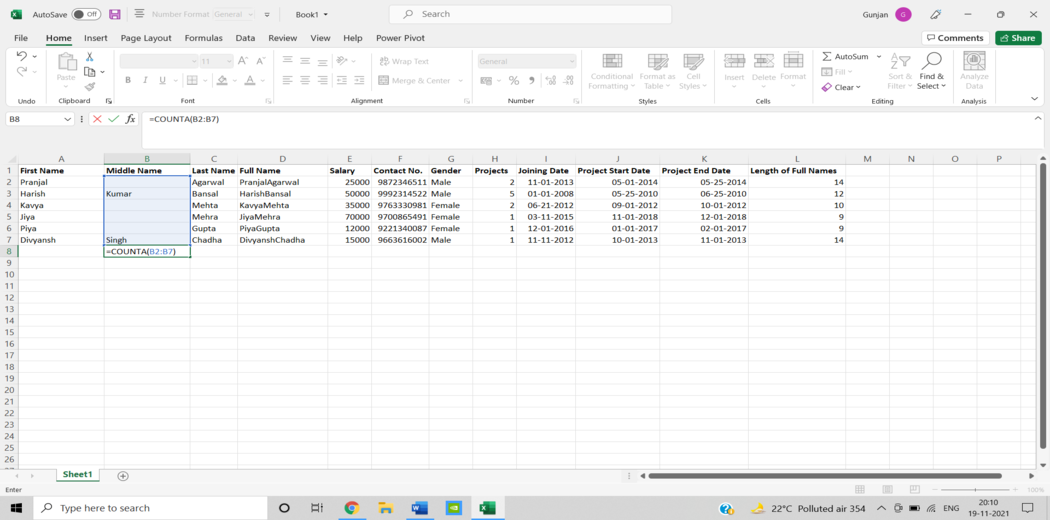
8. Counta()
COUNTA determines whether a cell is empty or not. You’ll come across incomplete data sets daily as a data analyst. Without needing to restructure the data, COUNTA will allow you to examine any gaps in the dataset.
SYNTAX = COUNTA (value1, [value2], …)
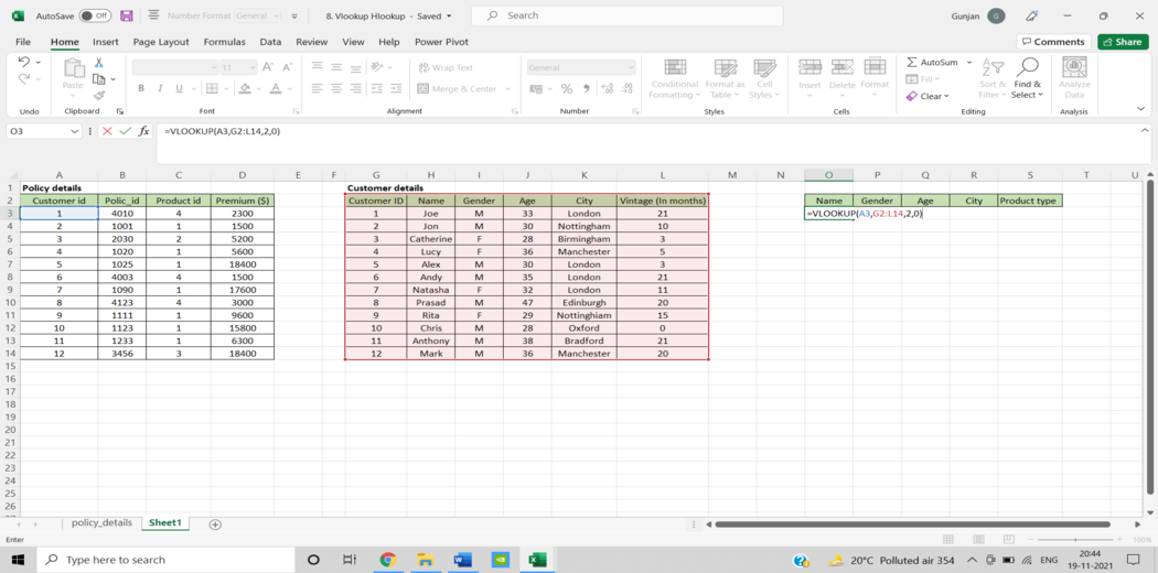
9.Vlookup()
The acronym VLOOKUP stands for ‘Vertical Lookup.’ It’s a function that tells Excel to look for a specific value in a column (the
so-called ‘table array’) to return a value from another column in the same row.
SYNTAX = VLOOKUP (lookup_value, table_array, column_index_num, [range_lookup])
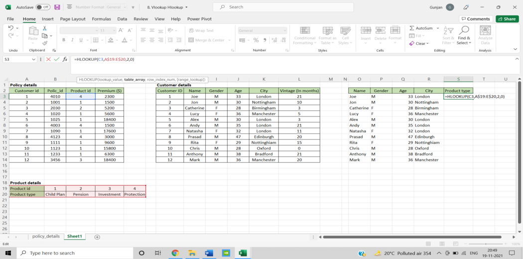
10. Hlookup()
“Horizontal” is represented by the letter H in HLOOKUP. It looks for a value in the top row of a table or an array of values, then returns a value from a row you specify in the table or array in the same column. When your comparison values are in a row across the top of a data table and you wish to look down a specific number of rows, use HLOOKUP. When your comparison values are in a column to the left of the data you wish to find, use VLOOKUP.
SYNTAX = HLOOKUP (lookup_value, table_array, row_index, [range_lookup])
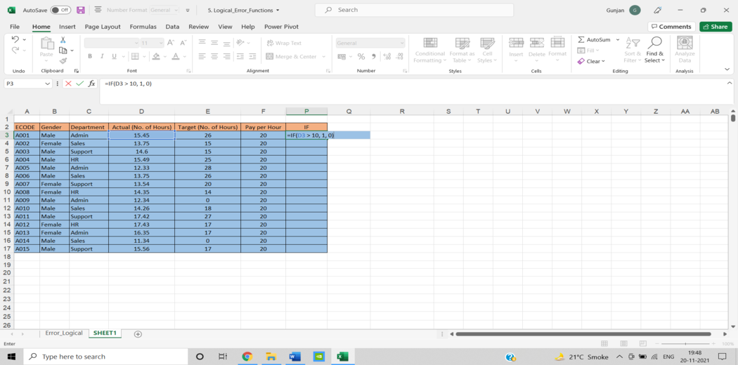
11. If ()
The IF function comes in handy a lot. We can use this function to automate decision-making in our spreadsheets. We could use IF to make Excel conduct a different computation or show a different value based on the results of a logical test (a decision). The IF function will ask you to run a logical test, as well as what action to take if the test is true and what action to take if the test is false.
SYNTAX = IF (logical_test, [value_if_true], [value_if_false])
12. Iferror()
We could display a more informative error than Excel does, or even execute an alternative computation, by using IFERROR. Two things are required for the IFERROR function to work. What value should be checked for an error and what action should be taken instead.
SYNTAX = IFERROR (value, value_if_error)
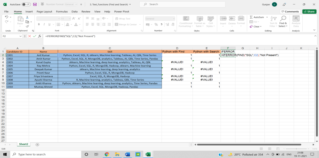
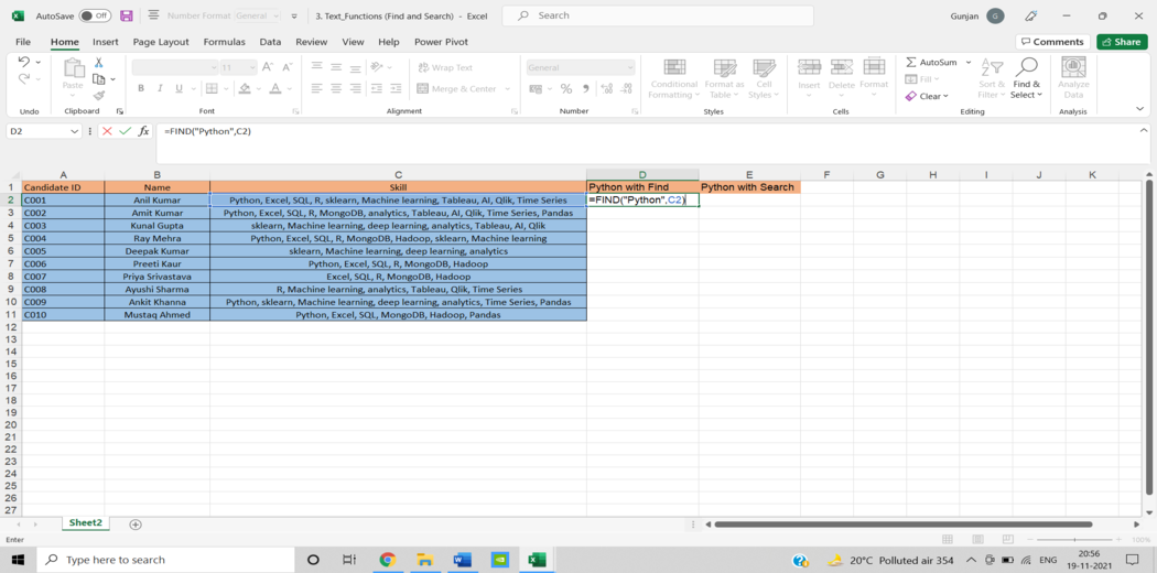
13. Find/Search
The FIND function in Excel returns the position of one text string within another (as a number). FIND delivers a #VALUE error if the text cannot be located.
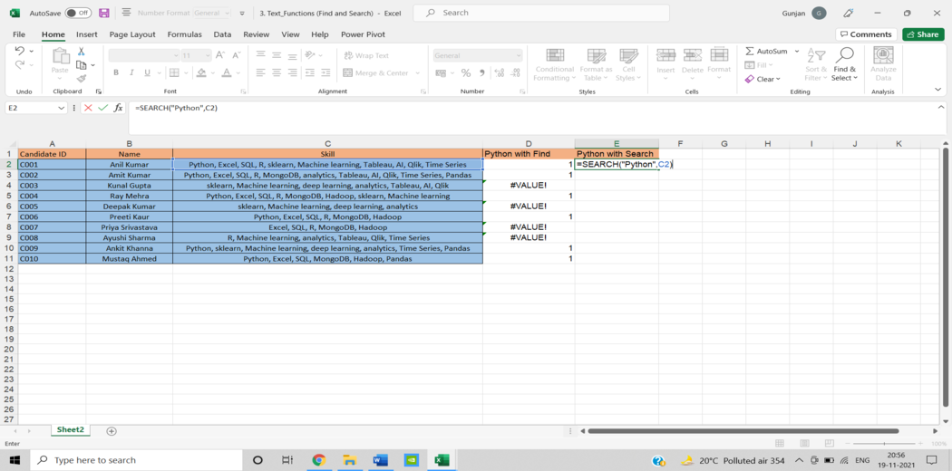
However, a =SEARCH for “Bigger” will return results for Bigger or bigger, broadening the scope of the query. This is very helpful when searching for anomalies or unique identifiers.
SYNTAX = FIND (find_text, within_text, [start_num])
SYNTAX = SEARCH (find_text, within_text, [start_num])
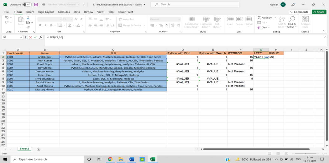
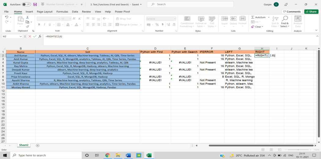
14. Left/Right
=LEFT and =RIGHT are simple and efficient ways for retrieving static data from cells. =RIGHT returns the “x” number of characters from the cell’s end, while =LEFT returns the “x” number of characters from the cell’s beginning. In the sample below, the consumer’s area code is extracted from their phone number using =LEFT, while the last four digits are extracted using =RIGHT.
SYNTAX = LEFT (text, [num_chars])
SYNTAX = RIGHT (text, [num_chars])
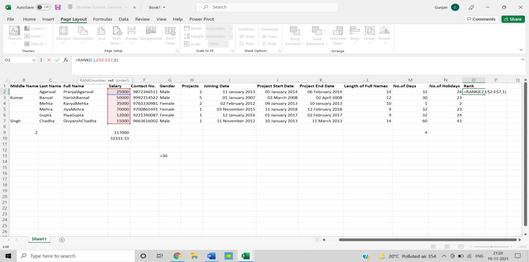
15. Rank()
Even though =RANK is an old Excel function, it is nevertheless useful for data analysis. =RANK is a quick way to show how values in a dataset rank in ascending or descending order. RANK is being utilised in this case to determine which clients order the most stuff.
SYNTAX = RANK (number, ref, [order])
Some of the Methods for Data Analysis in Excel
1. Ranges and Tables
The information you have can be in the form of a table or a range. Whether the data is in a range or a table, certain actions can be performed on it. Certain procedures, however, are more successful when data is stored in tables rather than ranges. There are some operations that are only applicable to tables. You will also gain an understanding of how to analyze data in ranges and tables. You’ll learn how to name ranges, how to utilise them, and how to manage them. The same may be said for table names.
2. Data Cleaning – Text Functions, Dates and Times
Before moving on to data analysis, you must clean and organize the data you’ve gathered from multiple sources. The following approaches can be used to clean data in Excel.
- With Text Functions
- Containing Date Values
- Containing Time Values
3. Conditional Formatting
Conditional formatting instructions in Excel allow you to colour cells or fonts, as well as place symbols next to values in cells, based on predetermined criteria. This aids in visualizing the most important values.
It allows you to highlight cells with a different colour depending on the value you set to them. Rules, data bars, colour scales, icon Sets, finding duplicates, shading alternate rows, comparing two lists, conflicting rules, checklists, and creating Heat Maps all benefit from conditional formatting.
4. Sorting and Filtering
You may need to sort and/or filter your data to prepare for data analysis and/or to display specific critical data. You can perform the same thing in Excel using the simple sorting and filtering options. Sort and Filter are the most used Excel functions. Within columns, sorting can be done in ascending or descending order. Lists can be sorted by colour, reversed, or randomly generated. Filters are used to display data that meets requirements. Number and Text Filters, Date Filters, Advanced Filter, Data Form, Remove Duplicates, Outlining Data, and Subtotal are some of the options.
5. Subtotals with Ranges
PivotTables are commonly used to summarize data, as you are aware. However, Subtotals with Ranges is another Excel function that allows you to group/ungroup data and summarize data in ranges in a few simple steps.
6. QuickAnalysis
You can quickly execute numerous data analysis activities and create quick representations of the results with Excel’s Quick Analysis function.
7. Understanding Lookup Functions
Excel Lookup Functions allow you to search through a large amount of data for data values that fit a set of criteria. Vlookup and Hlookup are two different types of lookup engines. Analysts use Vlookup and Hlookup to discover a value in a database and retrieve other values that correspond to that value. Data analysts frequently use it to integrate and consolidate useful data from several excel sheets.
8. PivotTables
PivotTables allow you to summarise data and create dynamic reports by modifying the PivotTable’s contents. You can use pivot tables to extract important data from a vast dataset. This is the most practical method of data analysis. After inserting a Pivot Table, you can drag fields, sort, filter, or change the summary calculation. Two-dimensional Pivot Tables are also possible. Group Pivot Table Items, Multi-level Pivot Table, Frequency Distribution, Pivot Chart, Slicers, Update Pivot Table, Calculated Field/Item, and GetPivotData are all important functions.
9. Data Visualization in Excel
Charts are simple to make and display data in a variety of ways, making them more helpful than a sheet. You can make a chart, modify its type, adjust the row or column, the legend location, and the data labels. Column Chart, Line Chart, Pie Chart, Bar Chart, Area Chart, Scatter Plot are some of the different types of charts provided in Microsoft Excel.
10. Data Validation
Only valid values may need to be entered into cells. Otherwise, they risk producing erroneous results. Using data validation commands, you can rapidly set up data validation values for a cell, an input message prompting the user on what should be typed in the cell, validate the values provided against the supplied criteria, and display an error message in the case of incorrect entries. It may be necessary to insert only valid values into cells. Otherwise, they could result in inaccurate calculations. You may quickly set up data validation values for a cell, an input message prompting the user on what should be typed in the cell, validate the values entered against the given criteria, and display an error message in the case of wrong entries using data validation commands.
11. Financial Analysis
Excel has several financial features. However, you may learn to employ a combination of these functions to solve common situations that need financial analysis.
12. Working with Multiple Worksheets
It’s possible that you’ll need to run multiple identical calculations in different worksheets. Instead of duplicating these calculations in each worksheet, you can complete them in one and have them display in all of the others. You may also use a report worksheet to compile the data from the multiple worksheets.
13. Formula Auditing
When you utilise formulas, you should double-check that they are working correctly. Formula Auditing commands in Excel assist you in tracing previous and dependent variables as well as error checking.
14. What-if Analysis
You can extract critical data from a large dataset using pivot tables. This form of data analysis is the most practical. You can drag fields, sort, filter, and adjust the summary calculation after a Pivot Table has been inserted. Pivot Tables can also be made in two dimensions. The functions of Group Pivot Table Items, Multi-level Pivot Table, Frequency Distribution, Pivot Chart, Slicers, Update Pivot Table, Calculated Field/Item, and GetPivotData are all essential.
Data Analysis with Microsoft Excel
Step 1 – DATA CLEANING USING TEXT TO COLUMN
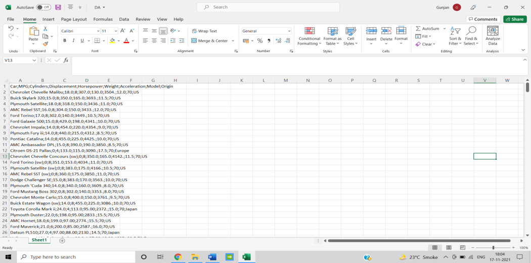
Select first column and then go to the data and select “text to column”. Select delimited from the appearing window and press next.
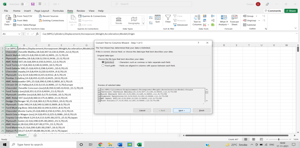
Then, to separate the data, select delimitor/Seperator in accordance with the dataset requirements. The required delimitor for the given dataset was “ ; “.
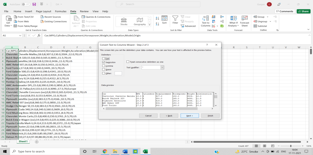
After cleaning the dataset, check for the data preview and finish the process.
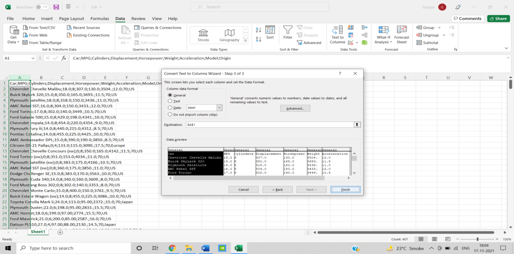
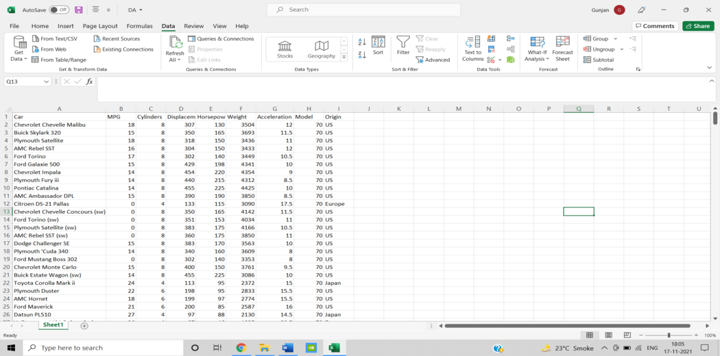
Finally, you Will be able to get the cleaned data.
STEP 2- CONDITIONAL FORMATING
By using Rules, you can specify any number of formatting conditions.
• Highlight cells rules can help you find the rules that are appropriate for you.
• Rules for the top and bottom
You can even make up your own set of rules. You can
• Add a rule
•You can remove rule that already exists by locating the rule in your settings or preferences and then selecting the option to delete or disable it.
• Keep track of these defined rules.
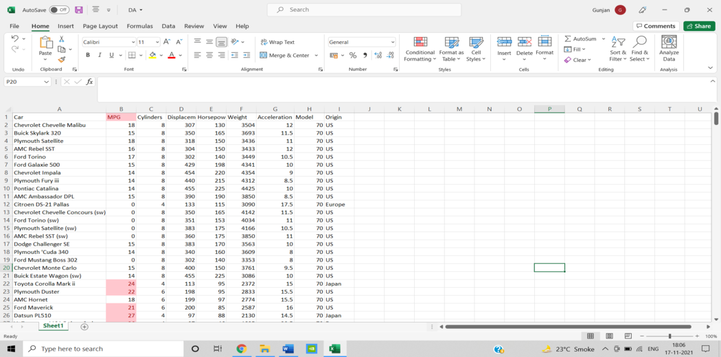
Select the column for conditional formatting and then select “conditional formatting” option from the home tab.ManyrulesWillbe visible under conditional formatting, so select the rule you want to apply to the column.
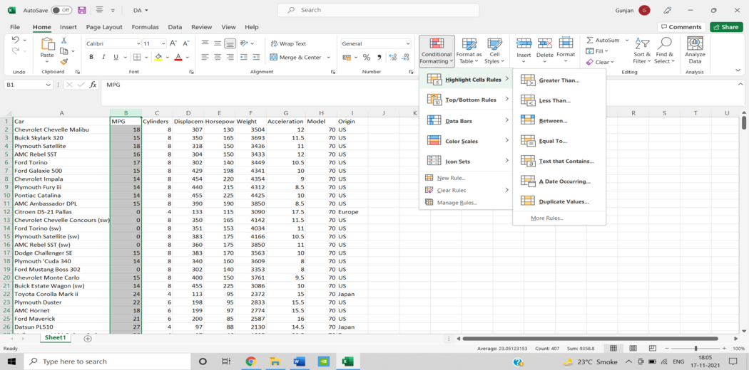
Select the required value and the color to be applied on the cells, after satisfying the rule.
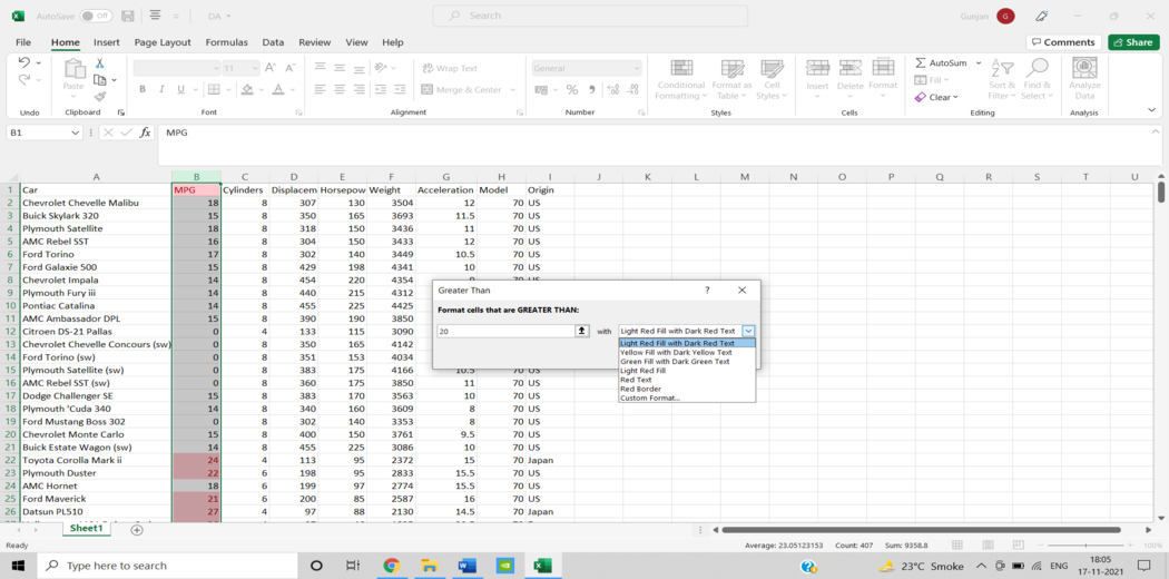
Click finish when you’ve completed all of the required details.
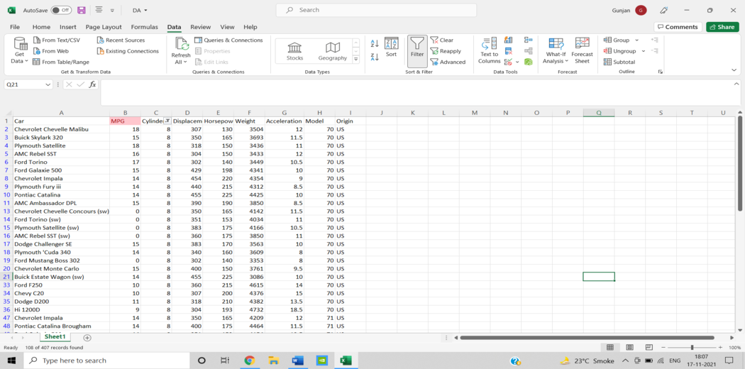
Step 3 – SORTING AND FILTERING
For adding filter to a column select the column, then select the filter option present under data.
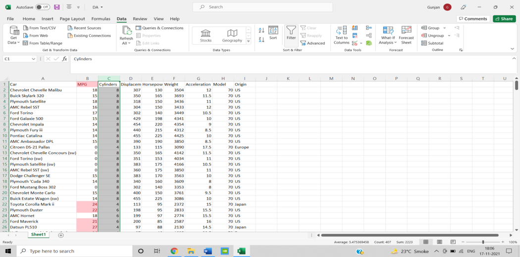
Now you will have a dropdown option for that column after adding the filter option to that column. Click on that dropdown menu to see all of the available options. You can select the required filter for the column as well as you can sort the column. This is a handy feature to manage your data effectively, especially when following an Excel tutorial.

FOR EXAMPLE, IF YOU ONLY WANT CARS WITH EIGHT CYLINDERS, THEN TO DO SO, FROM THE DROPDOWN OPTION, SELECT “8” AND CLICK OK TO COMPLETE.
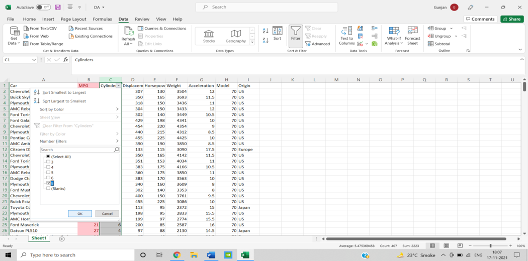
YOU WILL BE ABLE TO SEE CARS WITH 8 CYLINDERS AFTER SELECTING THE FILTER CONDITION.
EXAMPLE: NOW WE NEED TO ORDER THE CARS IN ASCENDING ORDER BASED ON THEIR WEIGHT.
TO DO SO, SELECT “SORT SMALLEST TO LARGEST” FROM THE DROPDOWN OPTION.
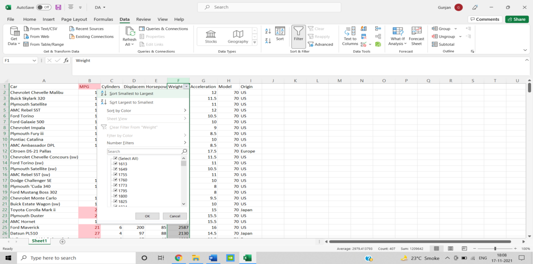
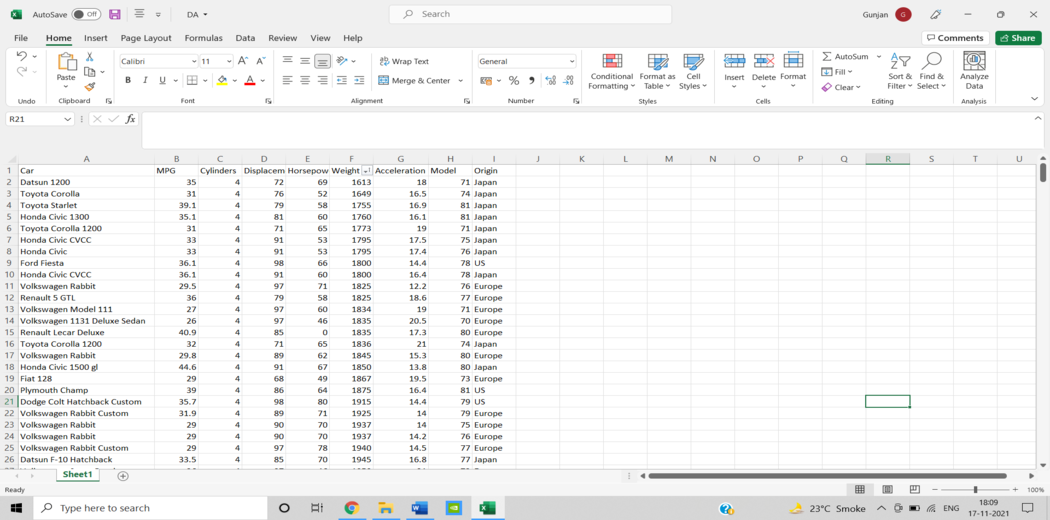
THE CARS ARE NOW ORDERED IN ASCENDING ORDER BASED ON THEIR WEIGHT.
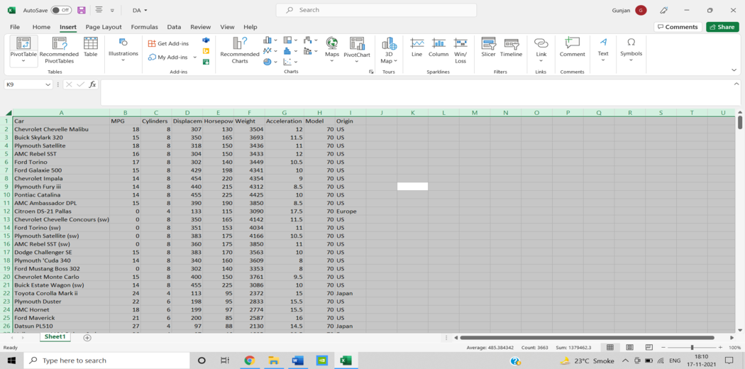
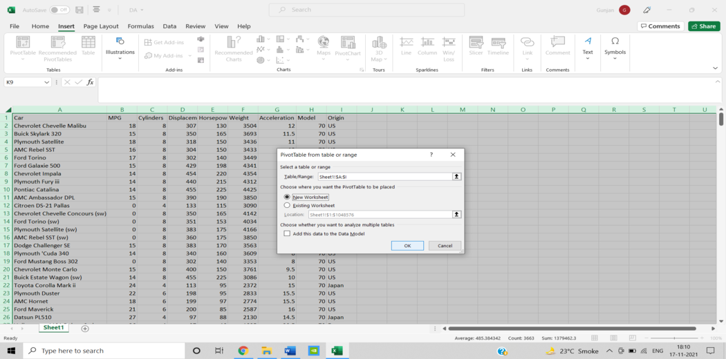
STEP 4 – PIVOT TABLES
Press cntrl-a, then go to insert and click on the pivot table option. A dialogue box will open under which you must select “new worksheet” for the pivot table to be placed, followed by clicking ok. This excel tutorial guides you through the process step by step.
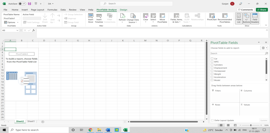
After completing the above step, your excel fileWillinclude a new sheet like this. Fields from your data and options for pivot table, such as filters, rows, values, and columns, are on the right side of the sheet. This pivot table functionality enhances your excel tutorial, empowering you to analyze and visualize your data effectively.
Drag and drop the required fields as per the options provided by the pivot table feature to make the pivot table. For example, we would like to check the sum of cylinders for all the cars that are differentiated by their origin. If you’re new to pivot tables, don’t worry! Check out our Excel tutorial for step-by-step guidance on how to create and use pivot tables effectively.
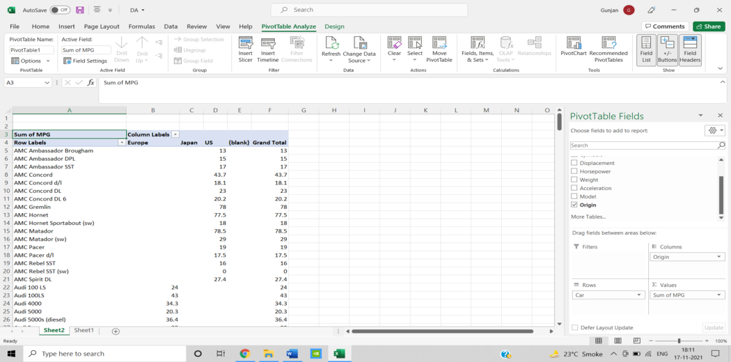
FOR EXAMPLE, WE WOULD LIKE TO CHECK THE “SUM OF HORSEPOWER” FOR ALL THE CYLINDERS BASED ON THEIR ORIGIN.
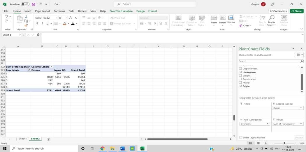
We can deduct the following from the above step: –
- A cars with 3 cylinders are originated only in Japan• the maximum horsepower of the cars with 4 cylinders is originated from “us.”
- In Europe, cars with 5 cylinders originate exclusively.
- The maximum horsepower of the cars with 6 cylinders is originated from “us.”
- Cars with 8 cylinders are originated only in “us”.
Simple Linear Regression Model in Microsoft Excel
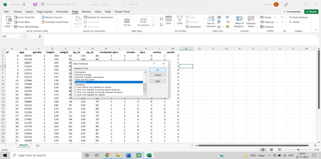
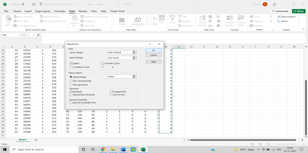
4. In the Regression dialogue box, pick the dependent variable data in the “Input Y Range” box (cardio column).
5. Select the independent variable data in the “Input X Range” box.
6. Select “Labels” from the drop-down menu
7. Select the output range by clicking in the Output Range box.
8. Select “Residuals” from the drop-down menu
9. To complete the process, click OK
10. Finally, you’ll obtain an excel spreadsheet with a simple linear regression model. You can now evaluate the results.
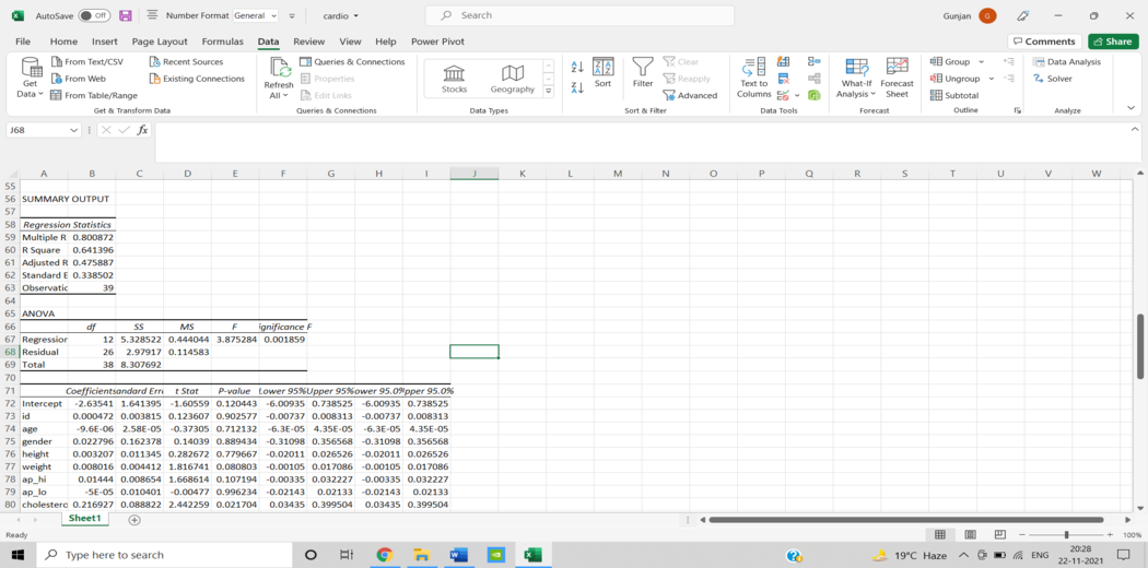
The R2 number, also known as the coefficient of determination, naturally indicates how well the regression model fits the data by measuring the proportion of variance in the dependent variable explained by the independent variable. Data analysis in Excel often involves closely examining the R2 value, a numerical representation that ranges from 0 to 1, with a higher number suggesting a better match between the model and the data. Additionally, the p-value, also known as the probability value, plays a crucial role in Excel tutorial. This numeric measure ranges from 0 to 1 and provides insights into the significance of a test. Contrary to the R2 value, a smaller p-value is preferred, as it indicates a stronger likelihood of correlation between the dependent and independent variables. Understanding these metrics is essential for proficient data analysis in Excel.
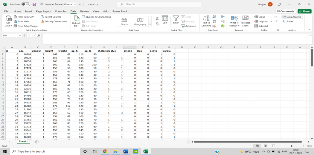
Dataset in Excel for Data Analysis
- Dataset used for Data Analysis in Microsoft Excel
It’s a dataset of roughly 400 cars with eight different attributes, including car name, mpg, cylinders, displacement, horsepower, acceleration, weight, origin, and model. You can Click here to know more dataset in excel
- Dataset used for Simple Linear Regression Model in Microsoft Excel
It’s a dataset of cardiovascular patients with eleven different independent variables, including gender, age, height, weight etc. Also , You can Check here for Simple Linear Regression and more about Excel tutorial
Conclusion
Excel is a naturally crucial tool for data analysis, and it offers a range of features that enable users to manipulate and analyze large amounts of data efficiently. With our BlackBelt Data Science program, you can learn advanced techniques for data analysis in Excel, including data visualization, machine learning, and statistical modeling specifically tailored for “Excel for data analysis.” The program provides practical training that allows you to apply these techniques to real-world problems, making you a naturally proficient expert in data analysis. Enroll now!
The media shown in this article is not owned by Analytics Vidhya and are used at the Author’s discretion
Frequently Asked Questions
A. Yes, Excel is suitable for data analysis. Its features make it a powerful tool for data manipulation, analysis, and visualization, including data tables, pivot tables, and various statistical functions.
A. MS Excel has several data analysis tools, including:
1. Data tables: used to analyze and compare multiple sets of data.
2. Pivot tables: used to summarize and analyze large amounts of data.
3. Solver: used to find an optimal solution to a complex problem.
4. Analysis ToolPak: used to perform advanced statistical analysis, including regression analysis and hypothesis testing.
A. Commonly used Excel formals are SUM, AVERAGE, MAX, MIN, COUNT, IF, VLOOKUP, and INDEX-MATCH. They can manipulate and summarize data, perform calculations, and make decisions based on specific criteria.
A. One can practice Excel for data analysis using various online platforms that provide courses and projects to help improve Excel skills, including Coursera, Udemy, LinkedIn Learning, and Excel Easy. Additionally, one can practice using Excel for data analysis by working on real-world projects and challenges, such as analyzing business data or financial statements.
I am Data Science Fresher. And I'm open to work.


Great, and informative to learn
Nice! Very informative
Thanks Arif 😊 Glad you liked it !
I am interested in learning data science
Thank you so much for this tutorial, it has been extremely helpful!
Glad you liked it Mona 😊
It is a good and easy content to understand.
Comments are Closed