The main objective of this article is to cover the steps involved in Data pre-processing, Feature Engineering, and different stages of Exploratory Data Analysis, which is an essential step in any research analysis. Data pre-processing, Feature Engineering, and EDA are fundamental early steps after data collection. Still, They do not limit themselves to simply visualizing, plotting, and manipulating data without any assumptions to assess data quality and build models. This article will tell you about the how you can perform Exploratory data analysis using Python.
Table of contents
- What is Exploratory Data Analysis?
- How to Perform EDA Using Python?
- Step 1: Import Python Libraries
- Step 2: Reading Dataset
- Step 3: Data Reduction
- Step 4: Feature Engineering
- Step 5: Creating Features
- Step 6: Data Cleaning/Wrangling
- Step 7: EDA Exploratory Data Analysis
- Step 8: Statistics Summary
- Step 9: EDA Univariate Analysis
- Step 10: Data Transformation
- Step 12: EDA Bivariate Analysis
- Step 13: EDA Multivariate Analysis
- Step 14: Impute Missing values
- Exploratory Data Analysis in Python
- Conclusion
- Frequently Asked Questions
What is Exploratory Data Analysis?
Exploratory Data Analysis (EDA) is a method of analyzing datasets to understand their main characteristics. It involves summarizing data features, detecting patterns, and uncovering relationships through visual and statistical techniques. EDA helps in gaining insights and formulating hypotheses for further analysis.
You can read more about EDA in the following article: Exploratory Data Analysis (EDA) and How Does it Work
How to Perform EDA Using Python?
Step 1: Import Python Libraries
The first step involved in ML using python is understanding and playing around with our data using libraries. Here is the link to the dataset.
Import all libraries required for our analysis, such as those for data loading, statistical analysis, visualizations, data transformations, and merging and joining.
Pandas and Numpy have been used for Data Manipulation and numerical Calculations
Matplotlib and Seaborn have been used for Data visualizations.
import pandas as pd
import numpy as np
import matplotlib.pyplot as plt
import seaborn as sns
#to ignore warnings
import warnings
warnings.filterwarnings('ignore')
Step 2: Reading Dataset
The Pandas library offers a wide range of possibilities for loading data into the pandas DataFrame from files like .json, .csv, .xlsx, .sql, image file extensions etc.
Most of the data are available in a tabular format of CSV files. It is trendy and easy to access. Using the read_csv() function, data can be converted to a pandas DataFrame.
The data to predict used car price is being used as an example. In this dataset, we are trying to analyze the used car’s price and how EDA focuses on identifying the factors influencing the car price. We have stored the data in the DataFrame data.
data = pd.read_csv("used_cars.csv")Analyzing the Data
Before we make any inferences, we listen to our data by examining all variables in the data.
The main goal of data understanding is to gain general insights about the data, which covers the number of rows and columns, values in the data, datatypes, and Missing values in the dataset.
shape – shape will display the number of observations(rows) and features(columns) in the dataset
There are 7253 observations and 14 variables in our dataset
head() will display the top 5 observations of the dataset
data.head()
tail() will display the last 5 observations of the dataset
data.tail()info() helps to understand the data type and information about data, including the number of records in each column, data having null or not null, Data type, the memory usage of the dataset

data.info()data.info() shows the variables Mileage, Engine, Power, Seats, New_Price, and Price have missing values. Numeric variables like Mileage, Power are of datatype as float64 and int64. Categorical variables like Location, Fuel_Type, Transmission, and Owner Type are of object data type.
Check for Duplication
nunique() based on several unique values in each column and the data description, we can identify the continuous and categorical columns in the data. Duplicated data can be handled or removed based on further analysis
data.nunique()
Missing Values Calculation
isnull() is widely been in all pre-processing steps to identify null values in the data
In our example, data.isnull().sum() is used to get the number of missing records in each column
data.isnull().sum()
The below code helps to calculate the percentage of missing values in each column
(data.isnull().sum()/(len(data)))*100
The percentage of missing values for the columns New_Price and Price is ~86% and ~17%, respectively.
Step 3: Data Reduction
Some columns or variables can be dropped if they do not add value to our analysis.
In our dataset, the column S.No have only ID values, assuming they don’t have any predictive power to predict the dependent variable.
# Remove S.No. column from data
data = data.drop(['S.No.'], axis = 1)
data.info()
We start our Feature Engineering as we need to add some columns required for analysis.
Step 4: Feature Engineering
Feature engineering refers to the process of using domain knowledge to select and transform the most relevant variables from raw data when creating a predictive model using machine learning or statistical modeling. The main goal of Feature engineering is to create meaningful data from raw data.
Step 5: Creating Features
We will play around with the variables Year and Name in our dataset. If we see the sample data, the column “Year” shows the manufacturing year of the car.
It would be difficult to find the car’s age if it is in year format as the Age of the car is a contributing factor to Car Price.
Introducing a new column, “Car_Age” to know the age of the car
from datetime import date
date.today().year
data['Car_Age']=date.today().year-data['Year']
data.head()
Since car names will not be great predictors of the price in our current data. But we can process this column to extract important information using brand and Model names. Let’s split the name and introduce new variables “Brand” and “Model”
data['Brand'] = data.Name.str.split().str.get(0)data['Model'] = data.Name.str.split().str.get(1) + data.Name.str.split().str.get(2)data[['Name','Brand','Model']]
Step 6: Data Cleaning/Wrangling
Some names of the variables are not relevant and not easy to understand. Some data may have data entry errors, and some variables may need data type conversion. We need to fix this issue in the data.
In the example, The brand name ‘Isuzu’ ‘ISUZU’ and ‘Mini’ and ‘Land’ looks incorrect. This needs to be corrected
print(data.Brand.unique())
print(data.Brand.nunique())
searchfor = ['Isuzu' ,'ISUZU','Mini','Land']
data[data.Brand.str.contains('|'.join(searchfor))].head(5)
data["Brand"].replace({"ISUZU": "Isuzu", "Mini": "Mini Cooper","Land":"Land Rover"}, inplace=True)We have done the fundamental data analysis, Featuring, and data clean-up. Let’s move to the EDA process
Read about the article Fundamentals of Exploratory Data Analysis
Voila!! Our Data is ready to perform EDA.
Step 7: EDA Exploratory Data Analysis
Exploratory Data Analysis refers to the crucial process of performing initial investigations on data to discover patterns to check assumptions with the help of summary statistics and graphical representations.
- EDA can be leveraged to check for outliers, patterns, and trends in the given data.
- EDA helps to find meaningful patterns in data.
- EDA provides in-depth insights into the data sets to solve our business problems.
- EDA gives a clue to impute missing values in the dataset
Step 8: Statistics Summary
The information gives a quick and simple description of the data.
Can include Count, Mean, Standard Deviation, median, mode, minimum value, maximum value, range, standard deviation, etc.
Statistics summary gives a high-level idea to identify whether the data has any outliers, data entry error, distribution of data such as the data is normally distributed or left/right skewed
In python, this can be achieved using describe()
describe()– Provide a statistics summary of data belonging to numerical datatype such as int, float
data.describe().T
From the statistics summary, we can infer the below findings :
- Years range from 1996- 2019 and has a high in a range which shows used cars contain both latest models and old model cars.
- On average of Kilometers-driven in Used cars are ~58k KM. The range shows a huge difference between min and max as max values show 650000 KM shows the evidence of an outlier. This record can be removed.
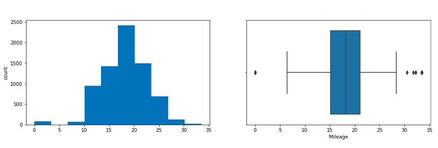
- Min value of Mileage shows 0 cars won’t be sold with 0 mileage. This sounds like a data entry issue.
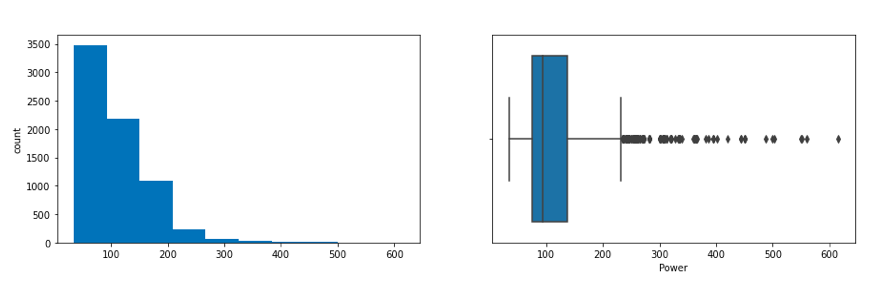
- It looks like Engine and Power have outliers, and the data is right-skewed.
- The average number of seats in a car is 5. car seat is an important feature in price contribution.
- The max price of a used car is 160k which is quite weird, such a high price for used cars. There may be an outlier or data entry issue.
describe(include=’all’) provides a statistics summary of all data, include object, category etc
data.describe(include='all').T
Before we do EDA, lets separate Numerical and categorical variables for easy analysis
cat_cols=data.select_dtypes(include=['object']).columns
num_cols = data.select_dtypes(include=np.number).columns.tolist()
print("Categorical Variables:")
print(cat_cols)
print("Numerical Variables:")
print(num_cols)
Read more: Standard Deviation in Excel and Sheets
Step 9: EDA Univariate Analysis
Analyzing/visualizing the dataset by taking one variable at a time:
Data visualization is essential; we must decide what charts to plot to better understand the data. In this article, we visualize our data using Matplotlib and Seaborn libraries.
Matplotlib is a Python 2D plotting library used to draw basic charts we use Matplotlib.
Seaborn is also a python library built on top of Matplotlib that uses short lines of code to create and style statistical plots from Pandas and Numpy
- Univariate analysis can be done for both Categorical and Numerical variables.
- Categorical variables can be visualized using a Count plot, Bar Chart, Pie Plot, etc.
- Numerical Variables can be visualized using Histogram, Box Plot, Density Plot, etc.
In our example, we have done a Univariate analysis using Histogram and Box Plot for continuous Variables.
In the following figure, a histogram and box plot is used to show the pattern of the variables, as some variables have skewness and outliers.
for col in num_cols:
    print(col)
    print('Skew :', round(data[col].skew(), 2))
    plt.figure(figsize = (15, 4))
    plt.subplot(1, 2, 1)
    data[col].hist(grid=False)
    plt.ylabel('count')
    plt.subplot(1, 2, 2)
    sns.boxplot(x=data[col])
    plt.show()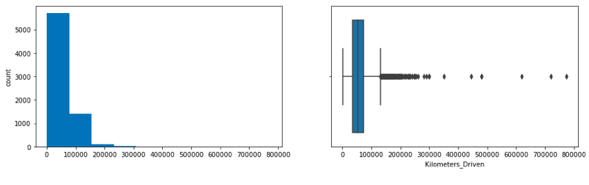
Price and Kilometers Driven are right skewed for this data to be transformed, and all outliers will be handled during imputation
Categorical variables are being visualized using a count plot. Categorical variables provide the pattern of factors influencing car price
fig, axes = plt.subplots(3, 2, figsize = (18, 18))
fig.suptitle('Bar plot for all categorical variables in the dataset')
sns.countplot(ax = axes[0, 0], x = 'Fuel_Type', data = data, color = 'blue',
              order = data['Fuel_Type'].value_counts().index);
sns.countplot(ax = axes[0, 1], x = 'Transmission', data = data, color = 'blue',
              order = data['Transmission'].value_counts().index);
sns.countplot(ax = axes[1, 0], x = 'Owner_Type', data = data, color = 'blue',
              order = data['Owner_Type'].value_counts().index);
sns.countplot(ax = axes[1, 1], x = 'Location', data = data, color = 'blue',
              order = data['Location'].value_counts().index);
sns.countplot(ax = axes[2, 0], x = 'Brand', data = data, color = 'blue',
              order = data['Brand'].head(20).value_counts().index);
sns.countplot(ax = axes[2, 1], x = 'Model', data = data, color = 'blue',
              order = data['Model'].head(20).value_counts().index);
axes[1][1].tick_params(labelrotation=45);
axes[2][0].tick_params(labelrotation=90);
axes[2][1].tick_params(labelrotation=90);
From the count plot, we can have below observations
- Mumbai has the highest number of cars available for purchase, followed by Hyderabad and Coimbatore
- ~53% of cars have fuel type as Diesel this shows diesel cars provide higher performance
- ~72% of cars have manual transmission
- ~82 % of cars are First owned cars. This shows most of the buyers prefer to purchase first-owner cars
- ~20% of cars belong to the brand Maruti followed by 19% of cars belonging to Hyundai
- WagonR ranks first among all models which are available for purchase
Step 10: Data Transformation
Before we proceed to Bi-variate Analysis, Univariate analysis demonstrated the data pattern as some variables to be transformed.
Price and Kilometer-Driven variables are highly skewed and on a larger scale. Let’s do log transformation.
Log transformation can help in normalization, so this variable can maintain standard scale with other variables:
# Function for log transformation of the column
def log_transform(data,col):
    for colname in col:
        if (data[colname] == 1.0).all():
            data[colname + '_log'] = np.log(data[colname]+1)
        else:
            data[colname + '_log'] = np.log(data[colname])
data.info()log_transform(data,['Kilometers_Driven','Price'])#Log transformation of the feature 'Kilometers_Driven'
sns.distplot(data["Kilometers_Driven_log"], axlabel="Kilometers_Driven_log");

Step 12: EDA Bivariate Analysis
Now, let’s move ahead with bivariate analysis. Bivariate Analysis helps to understand how variables are related to each other and the relationship between dependent and independent variables present in the dataset.
For numerical variables, you can widely use pair plots and scatter plots to perform bivariate analysis.
You can use a stacked bar chart for categorical variables when the output variable is a classifier. Use bar plots if the output variable is continuous.
In our example, we use a pair plot to show the relationship between two categorical variables.
plt.figure(figsize=(13,17))
sns.pairplot(data=data.drop(['Kilometers_Driven','Price'],axis=1))
plt.show()
Pair Plot provides below insights:
- The variable Year has a positive correlation with price and mileage
- A year has a Negative correlation with kilometers-Driven
- Mileage is negatively correlated with Power
- As power increases, mileage decreases
- Car with recent make is higher at prices. As the age of the car increases price decreases
- Engine and Power increase, and the price of the car increases
A bar plot can be used to show the relationship between Categorical variables and continuous variables
fig, axarr = plt.subplots(4, 2, figsize=(12, 18))
data.groupby('Location')['Price_log'].mean().sort_values(ascending=False).plot.bar(ax=axarr[0][0], fontsize=12)
axarr[0][0].set_title("Location Vs Price", fontsize=18)
data.groupby('Transmission')['Price_log'].mean().sort_values(ascending=False).plot.bar(ax=axarr[0][1], fontsize=12)
axarr[0][1].set_title("Transmission Vs Price", fontsize=18)
data.groupby('Fuel_Type')['Price_log'].mean().sort_values(ascending=False).plot.bar(ax=axarr[1][0], fontsize=12)
axarr[1][0].set_title("Fuel_Type Vs Price", fontsize=18)
data.groupby('Owner_Type')['Price_log'].mean().sort_values(ascending=False).plot.bar(ax=axarr[1][1], fontsize=12)
axarr[1][1].set_title("Owner_Type Vs Price", fontsize=18)
data.groupby('Brand')['Price_log'].mean().sort_values(ascending=False).head(10).plot.bar(ax=axarr[2][0], fontsize=12)
axarr[2][0].set_title("Brand Vs Price", fontsize=18)
data.groupby('Model')['Price_log'].mean().sort_values(ascending=False).head(10).plot.bar(ax=axarr[2][1], fontsize=12)
axarr[2][1].set_title("Model Vs Price", fontsize=18)
data.groupby('Seats')['Price_log'].mean().sort_values(ascending=False).plot.bar(ax=axarr[3][0], fontsize=12)
axarr[3][0].set_title("Seats Vs Price", fontsize=18)
data.groupby('Car_Age')['Price_log'].mean().sort_values(ascending=False).plot.bar(ax=axarr[3][1], fontsize=12)
axarr[3][1].set_title("Car_Age Vs Price", fontsize=18)
plt.subplots_adjust(hspace=1.0)
plt.subplots_adjust(wspace=.5)
sns.despine()
Observations
- The price of cars is high in Coimbatore and less price in Kolkata and Jaipur
- Automatic cars have more price than manual cars.
- Diesel and Electric cars have almost the same price, which is maximum, and LPG cars have the lowest price
- First-owner cars are higher in price, followed by a second
- The third owner’s price is lesser than the Fourth and above
- Lamborghini brand is the highest in price
- Gallardocoupe Model is the highest in price
- 2 Seater has the highest price followed by 7 Seater
- The latest model cars are high in price
Step 13: EDA Multivariate Analysis
As the name suggests, Multivariate analysis looks at more than two variables. Multivariate analysis is one of the most useful methods to determine relationships and analyze patterns for any dataset.
A heat map is widely been used for Multivariate Analysis
Heat Map gives the correlation between the variables, whether it has a positive or negative correlation.
In our example heat map shows the correlation between the variables.
plt.figure(figsize=(12, 7))
sns.heatmap(data.drop(['Kilometers_Driven','Price'],axis=1).corr(), annot = True, vmin = -1, vmax = 1)
plt.show()
From the Heat map, we can infer the following:
- The engine has a strong positive correlation to Power 0.86
- Price has a positive correlation to Engine 0.69 as well Power 0.77
- Mileage has correlated to Engine, Power, and Price negatively
- Price is moderately positive in correlation to year.
- Kilometer driven has a negative correlation to year not much impact on the price
- Car age has a negative correlation with Price
- Car age positively correlates with kilometers driven, as the age of the car increases, the kilometers driven also increase. In contrast, car age negatively correlates with mileage, which makes sense.
Step 14: Impute Missing values
Missing data arise in almost all statistical analyses. There are many ways to impute missing values; we can impute the missing values by their Mean, median, most frequent, or zero values and use advanced imputation algorithms like KNN, Regularization, etc.
We cannot impute the data with a simple Mean/Median. We must need business knowledge or common insights about the data. If we have domain knowledge, it will add value to the imputation. Some data can be imputed on assumptions.
In our dataset, we have found there are missing values for many columns like Mileage, Power, and Seats.
We observed earlier some observations have zero Mileage. This looks like a data entry issue. We can fix this by filling null values with zero and then using the mean value of Mileage, since the mean and median values are nearly the same for this variable. Therefore, you choose the mean to impute the values.
data.loc[data["Mileage"]==0.0,'Mileage']=np.nan
data.Mileage.isnull().sum()data['Mileage'].fillna(value=np.mean(data['Mileage']),inplace=True)Similarly, imputation for Seats. As we mentioned earlier, we need to know common insights about the data.
Let’s assume some cars brand and Models have features like Engine, Mileage, Power, and Number of seats that are nearly the same. Let’s impute those missing values with the existing data:
data.Seats.isnull().sum()
data['Seats'].fillna(value=np.nan,inplace=True)
data['Seats']=data.groupby(['Model','Brand'])['Seats'].apply(lambda x:x.fillna(x.median()))
data['Engine']=data.groupby(['Brand','Model'])['Engine'].apply(lambda x:x.fillna(x.median()))
data['Power']=data.groupby(['Brand','Model'])['Power'].apply(lambda x:x.fillna(x.median()))
In general, there are no defined or perfect rules for imputing missing values in a dataset. Each method can perform better for some datasets but may perform even worse. Only practice and experiments give the knowledge which works better.
Exploratory Data Analysis in Python
Exploratory data analysis (EDA) is a critical initial step in the data science workflow. It involves using Python libraries to inspect, summarize, and visualize data to uncover trends, patterns, and relationships. Here’s a breakdown of the key steps in performing EDA with Python:
1. Importing Libraries:
- pandas (pd): For data manipulation and analysis.
- NumPy (np): For numerical computations.
- Matplotlib.pyplot (plt): For basic plotting functionalities.
- Seaborn (sns): A built-on top of Matplotlib, providing high-level visualization.
2. Loading the Data:
- Use
pd.read_csv()for CSV files, similar functions exist for other data formats (e.g.,.xlsx,.json).
3. Initial Inspection:
- Get an overview of the data using
df.head(),.tail(), and.info(). - Check data types with
df.dtypes.
4. Data Cleaning:
- Identify and handle missing values using methods like
df.isnull().sum(). - Find and address duplicates with
df.duplicated().sum().
5. Univariate Analysis:
- Analyze single variables at a time.
- Use descriptive statistics with
df.describe()for numerical data. - Create histograms, box plots, and density plots to visualize distributions.
6. Bivariate Analysis:
- Explore relationships between two variables.
- Create scatter plots to identify trends and potential correlations.
7. Visualization:
- Effective visualizations are crucial for understanding data.
- Use various plots like bar charts, pie charts, and heatmaps to represent categorical data.
Conclusion
Exploratory Data Analysis (EDA) is crucial for understanding datasets, identifying patterns, and informing subsequent analysis. Data pre-processing and feature engineering are essential steps in preparing data for analysis, involving tasks such as data reduction, cleaning, and transformation. Python libraries offer powerful tools for executing these steps efficiently.Also, in the article we talk about how eda using python and you can make to it we showed a complete guide for that.
Also,In this article, we tried to analyze the factors influencing the used car’s price.
- Data Analysis helps to find the basic structure of the dataset.
- Dropped columns that are not adding value to our analysis.
- Performed Feature Engineering by adding some columns which contribute to our analysis.
- Data transformations normalize the columns.
- We used different visualizations for Exploratory data analysis (EDA) like Univariate, Bi-Variate, and Multivariate Analysis.
Through EDA, we got useful insights, and below are the factors influencing the price of the car and a few takeaways:
- Most of the customers prefer 2 Seat cars hence the price of the 2-seat cars is higher than other cars.
- The price of the car decreases as the Age of the car increases.
- Customers prefer to purchase the First owner rather than the Second or Third.
- Due to increased Fuel price, the customer prefers to purchase an Electric vehicle.
- Automatic Transmission is easier than Manual.
This way, we perform EDA on the datasets to explore the data and extract all possible insights, which can help in model building and better decision making.
However, this was only an overview of how EDA works; you can go deeper into it and attempt the stages on larger datasets.
If the EDA process is clear and precise, our model will work better and gives higher accuracy!
This article was published as a part of the Data Science Blogathon.
Frequently Asked Questions
Q1. What is EDA with Python?
A. Exploratory Data Analysis (EDA) with Python involves analyzing and summarizing data to gain insights and understand its underlying patterns, relationships, and distributions using Python programming language.
Q2. How to make EDA in Python?
A. To perform EDA in Python, you can use libraries like Pandas, NumPy, Matplotlib, and Seaborn. These libraries provide functions and tools for data manipulation, visualization, and statistical analysis, which facilitate the process of exploring and understanding the data.
Q3. Which is the best EDA tool Python?
A. The choice of the best EDA tool in Python depends on your specific requirements and preferences. Some popular EDA tools include Jupyter Notebook (with the aforementioned libraries), Plotly, Tableau, and Power BI. Each tool offers unique features and capabilities, so it’s advisable to explore them and choose the one that suits your needs best.
Q4. How to perform EDA in machine learning?
A. Performing EDA in machine learning typically involves preprocessing the data by handling missing values, outliers, and feature scaling. employ various statistical and visual techniques to analyze the relationships between variables, identify patterns, and assess the relevance of features. This helps in gaining a better understanding of the data before building a machine learning model.
A passionate data science professional who is interested on the discovery, the insights, and the innovation of data since the world is revolving around the data.I am using the skills to solve various business problems by using machine learning, data mining, and other types of data analytics and data visualization tools such as, Python,SQL,
, Tableau,,etc. I have more than 10 years of experience in data warehouse , data mining and predictive modeling.


Hello mahadevan, Such a great blog very informative.
Hello mahadevan, Such a great blog very informative. The multivariase part is little bit vague other than that i like it.
Great blog! Boon for new entrants to data science domain.