Stock Market Analysis with Pandas – DataReader and Plotly for Beginners
This article was published as a part of the Data Science Blogathon
Introduction
You must have come across news articles, updates of stock markets rallying, stocks falling, and so on. Stock markets are volatile. Stock prices daily go up and down. Keeping a track of such changes and trends can be tedious for a data professional. In this article, we will perform a stock market analysis of a few popular internet tech companies.
Analysing the stock prices demands a dataset that is continuously updating. In such scenarios, pandas have a special library called pandas-datareader. Pandas-datareader helps us import data from the internet. Do check out more about the pandas data-reader library from here.
We will use Yahoo Finance to import stock market data for our analysis. We’ll study stocks of popular 5 tech companies. The list of stocks for the analysis is as below:
- Amazon
- Microsoft
- Apple
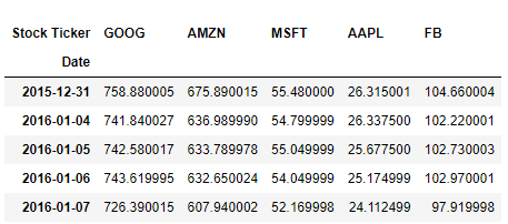
Let’s take a look at the data from the last 5 years to have an understanding of how stocks have behaved. First, we will search for tickers of the above companies on Yahoo. Ticker is a unique stock symbol with a series of letters assigned to a particular stock for trading purposes.
tickers = ['GOOG','AMZN','MSFT','AAPL', 'FB']
Now, we will import pandas-datareader and necessary libraries. If you haven’t installed it, then install it in your notebook with the below command.
!pip install pandas-datareader
Then, we import the necessary libraries.
import pandas_datareader as data
import pandas as pd
Getting the Data
We get our data from Yahoo for the last 5 years. For each stock, we import data separately. We concat all the stocks data into a single dataframe for our analysis.
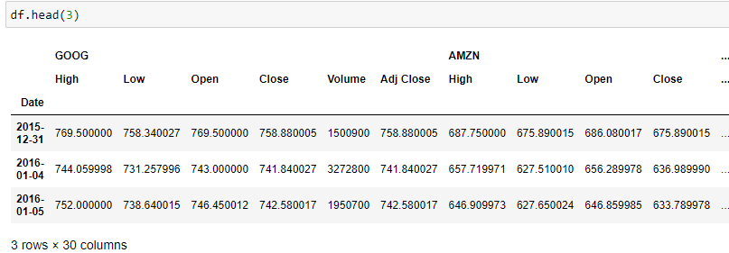
We give names to our columns for better data interpretation.
df.columns.names = ['Stock Ticker', 'Stock Info']
df.head()
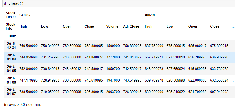
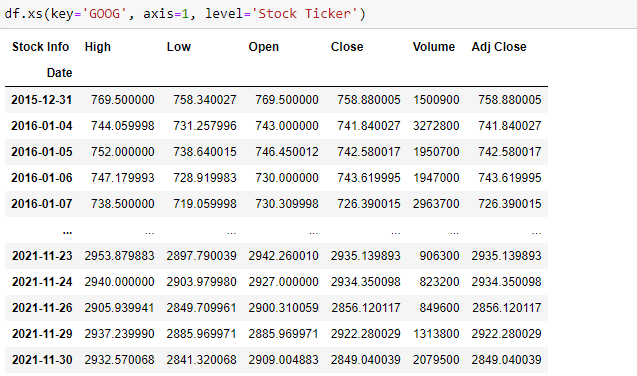
Our data is in multi-index format. We have to take a cross-section of the data for analysis. Read more about dealing with multilevel indexing here.
df.xs(key='GOOG', axis=1, level='Stock Ticker')
Data Visualisation
We will use the cross-section to pull stock data and visualise stock movements in the last 5 years. We will use graphic charts to understand the stock movements.
For visualisations, we will use a library called Plotly. Plotly is a graphing library popular for creating interactive charts. With Plotly, we can understand the stock movement in real-time.
Let’s import the necessary visualisation libraries below:
import matplotlib.pyplot as plt
import plotly.express as px
import plotly.graph_objects as go
%matplotlib inline
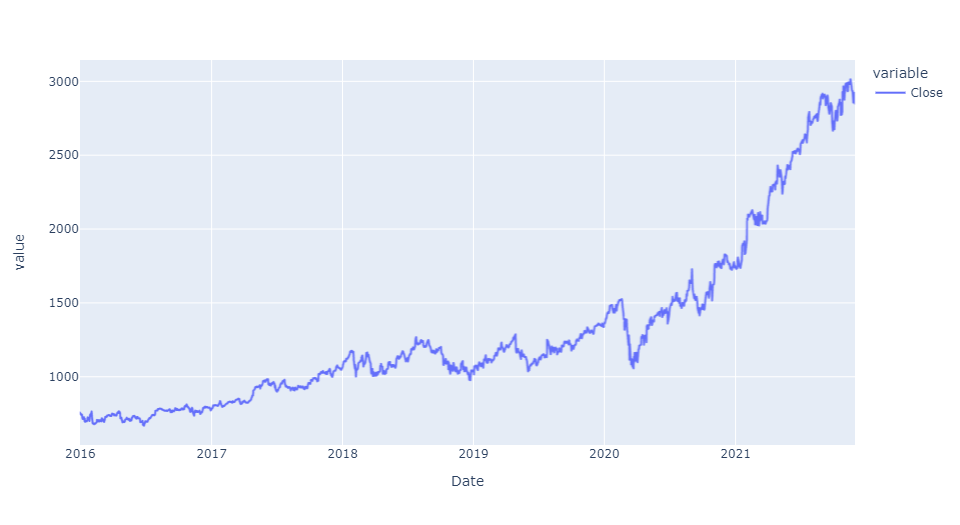
We analyse Google’s closing price over the last 5 years with the below code.
px.line(df.xs(key='GOOG', axis=1, level='Stock Ticker')['Close'])
Let’s see stock movement for a specific time period and analyse price fluctuations in that particular period.
px.line(df.xs(key='GOOG', axis=1, level='Stock Ticker')['Close'], range_x=['2020-01-01','2020-12-31'])
.png)
Comparisons between two stocks can be helpful to understand which stock is performing better. We compare Google and Amazon stocks below.
px.line(df.xs(key='Close', axis=1, level='Stock Info')[['GOOG', 'AMZN']])
.png)
After analysing each stock, we can analyse all of them by taking a cross-section of their closing price or opening price.
df.xs(key='Close', axis=1, level='Stock Info').head()
c = df.xs(key='Close', axis=1, level='Stock Info')
c.head()
Let’s look at the chart containing all stocks movement for the given time period.
plt.figure(figsize=(20,10))
fig = px.line(c)
fig.show()
.png)
We understand each stock behaviour separately with the below chart. This helps us differentiate between underperforming stocks and better-performing ones.
plt.figure(figsize=(20,10))
fig = px.area(c, facet_col='Stock Ticker', facet_col_wrap=3)
fig.show()
.png)
Amazon and Google are clearly outperforming other stocks. There is consistent growth in both stocks over the last 5 years.
Specify the time period for which you want to see the stock performance. During the Covid-19 outbreak, we can see stocks crashing and then recovering after a certain time.
fig = px.line(c, range_x=['2020-01-01','2020-12-31'])
fig.show()
.png)
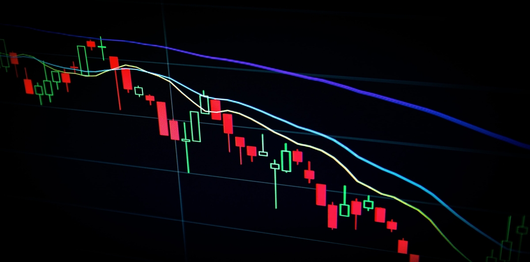
Candlestick Charts:
Candlestick charts are popular in stock market analysis. They are helpful in understanding the past stock movements. Candlestick charts give us insights into stock’s open, close, high, low prices. Green candlesticks show positive movement and red shows a decline in the stock.
A candlestick has a body in the middle and sticks at its ends. The body showcases the opening and closing price of the stock. Two ends which are called shadows represent the high and low values of the day respectively for a particular stock.
Let’s look at the code for creating a candlestick chart for Google:
plt.figure(figsize=(24,16))
fig = go.Figure(data=[go.Candlestick(x=df.index,
                open=df['GOOG']['Open'],
                high = df['GOOG']['High'],
                low = df['GOOG']['Low'],
                close = df['GOOG']['Close'])])
fig.update_layout(xaxis_rangeslider_visible=False)
fig.show()
.png)
For a visually appealing candlestick chart, we can use cufflinks. Cufflinks is a library that connects Plotly to pandas for better visuals. Let’s import Cufflinks and create a candlestick chart for the year 2021.
import cufflinks
.png)
 as cf
cf.go_offline()
google = df['GOOG'][['Open', 'High', 'Low', 'Close']].loc['2021-01-01':'2021-11-30']
google.iplot(kind='candle')
Conclusion:
And just like that, we completed our stock market analysis. First, we imported the pandas-DataReader library. We mentioned the source of our data, time period, and stocks list for analysis. We imported stocks data and created a separate dataframe. The data has multilevel indexing. We took a cross-section of the dataframe to analyse each stock and its movement.
We created interactive visualisation charts with Plotly and compared a few stocks for a specific time period. Candlestick charts are important to get a better understanding of the past stock movements. Plotly and Cufflinks can be used to create visually appealing Candlestick graphs. With this article hope you’re now equipped to do stock analysis on your own. Good luck!
Image credit: Photo by Maxim Hopman on Unsplash


Datareader can't fetch data from yahoo. Response Text: \n Will be right back...\n Thank you for your patience.\n Our engineers are working quickly to resolve the issue.\n \n \n \n '
This is nice blog to help in share market investement