Build a Step-by-step Machine Learning Model Using R
Introduction to Machine Learning Model
Machine learning is changing the approach of businesses in the world. Every company, large or small, aspires to find insight from the large amounts of data it stores and processes regularly. The desire to predict the future motivates the work of business analysts and data scientists in domains ranging from marketing to healthcare. In this article, we will use R to create our first machine learning model for classification.
Why R?
R is a popular open-source data science programming language. It has strong visualization features, which are necessary for exploring data before applying any machine learning algorithm and evaluating its output. Many R packages for machine learning are commercially accessible, and many modern statistical learning methods are implemented in R.
Exploratory Data Analysis (EDA)
We will use a dataset that contains information on patients who are at risk of having a stroke and those who are not. Here we are using the Stroke Prediction Dataset from Kaggle to make predictions. Our task is to examine existing patient records in the training set and use that knowledge to predict whether a patient in the evaluation set is likely to have a stroke or not.
The dataset includes a variety of medical data for our analysis:
- id: represents the unique id
- gender: indicates the gender of the person (“Male”, “Female” or “Other”)
- age: indicates the age of the person
- hypertension: indicates if the person has hypertension (1 = yes, 0 = no)
- heart_disease: indicates if the person has any heart diseases (1 = yes, 0 = no)
- ever_married: indicates the marital status of the person (“No” or “Yes”)
- work_type: indicates the work type of person (“children”, “Govt_job”, “Never_worked”, “Private” or “Self-employed”)
- Residence_type: indicates the type of residence of the person (“Rural” or “Urban”)
- avg_glucose_level: indicates the average glucose level in the blood of the person
- bmi: the body mass index of the person
- smoking_status: indicates the smoking status of the person (“formerly smoked”, “never smoked”, “smokes”, or “Unknown” *) *Unknown in smoking_status means that the information is unavailable for this patient
- stroke: is the variable we are trying to predict. It is a logical value that is TRUE if the patient is likely to suffer a stroke and FALSE if he or she does not.
Let us first load the required libraries. For this tutorial, Rstudio has been used. You can also use the R environment in Kaggle or Google Colab. We use the command library() in R. In case you are missing any of the below libraries, you can install them using the install.packages(‘name of the library’) command as shown below.
#Installing Packages

install.packages("tidyverse")

install.packages("caret")

install.packages("randomForest")
Once installed, we can proceed to import the libraries using the following commands:
#importing libraries
library(tidyverse)
library(caret)
library(randomForest)
The next step is to import and preview our data using the following command –
#Read Data
df_stroke<-read.csv("../input/stroke-prediction-dataset/healthcare-dataset-stroke-data.csv")
#Describing Data
glimpse(df_stroke)
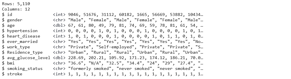
Our data glimpse shows that we have 5110 observations and 12 variables. Next, we will use the ‘summary()’ function, which will give us a nice overall perspective of our data’s statistical distribution.
summary(df_stroke)
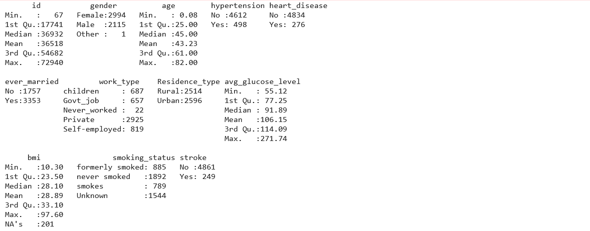
Since the summary shows there is only one row for the ‘Other’ gender, we can drop the row for this observation using –
# Drop the column with 'other'.(Since there is only 1 row)
df_stroke = df_stroke[!df_stroke$gender == 'Other',]
Our findings show that the bmi variable has missing data (NA’s). Finding the total number of missing values in data can also be done using the following –
#check missing values
sum(is.na(df_stroke))
Although bmi values can be estimated using a person’s height and weight, these parameters are not provided in this dataset. However, removing or replacing the missing bmi values would be better. Because 201 missing values represent 5% of the total entries in the column, it could be beneficial to replace the missing values with a mean value, assuming that the mean values would not change the findings. We will use the following syntax to replace missing values in a bmi column:
#imputing dataset
df_stroke$bmi[is.na(df_stroke$bmi)]<- mean(df_stroke$bmi,na.rm = TRUE)
Checking again using the ‘is.na’ command to confirm there are no more missing values in the dataset. Because the data frame has columns of various data types, let us use the following code to convert all of its character columns to factors:
df_stroke$stroke<- factor(df_stroke$stroke, levels = c(0,1), labels = c("No", "Yes"))
df_stroke$gender<-as.factor(df_stroke$gender)
df_stroke$hypertension<- factor(df_stroke$hypertension, levels = c(0,1), labels = c("No", "Yes"))
df_stroke$heart_disease<- factor(df_stroke$heart_disease, levels = c(0,1), labels = c("No", "Yes"))
df_stroke$ever_married<-as.factor(df_stroke$ever_married)
df_stroke$work_type<-as.factor(df_stroke$work_type)
df_stroke$Residence_type<-as.factor(df_stroke$Residence_type)
df_stroke$smoking_status<-as.factor(df_stroke$smoking_status)
df_stroke$bmi<-as.numeric(df_stroke$bmi)
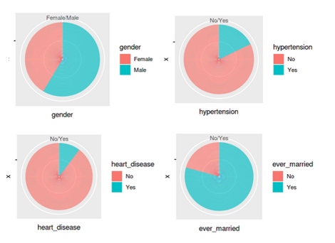
Since the missing values and data types have been properly configured, it is time to generate some graphs from the data to gain insights. We will plot the distribution for features – gender, hypertension,heart_disease and ever_married.
p1 <- ggplot(df_stroke, aes(x="", y=gender, fill=gender)) + geom_bar(stat="identity", width=1)  + coord_polar("y", start=0)
p2 <-ggplot(df_stroke, aes(x="", y=hypertension, fill=hypertension)) + geom_bar(stat="identity", width=1)  + coord_polar("y", start=0)
p3 <-ggplot(df_stroke, aes(x="", y=heart_disease, fill=heart_disease)) + geom_bar(stat="identity", width=1)  + coord_polar("y", start=0)
p4 <-ggplot(df_stroke, aes(x="", y=ever_married, fill=ever_married)) + geom_bar(stat="identity", width=1)  + coord_polar("y", start=0)
grid.arrange(p1,p2,p3,p4 ,ncol= 2)
Further, we can visualize the distribution of the next set of features – residence_type, and stroke.
ggplot(df_stroke, aes(x="", y=Residence_type, fill=Residence_type)) + geom_bar(stat="identity", width=1)+ coord_polar("y", start=0)
ggplot(df_stroke, aes(x="", y=stroke, fill=stroke)) + geom_bar(stat="identity", width=1)+ coord_polar("y", start=0)
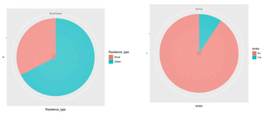
All these graphs and charts provide a lot of useful information about the dataset, such as –
- Less than 10% of people have hypertension
- Around 5% of people in the dataset have heart disease
- Equal split for the feature ‘residence type’, i.e., 50% of the population comes from rural regions and 50% from urban
- 57 per cent of people are working in the private sector & more than 65 percent are married
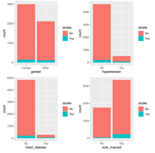
We can create a few additional bar charts to see how each of these variables relates to the target variable, which is the stroke possibility for the individual.
library(gridExtra)
p1 <- ggplot(data = df_stroke) +geom_bar(mapping = aes(x = gender,fill=stroke))
p2 <-ggplot(data = df_stroke) +geom_bar(mapping = aes(x = hypertension,fill=stroke))
p3 <-ggplot(data = df_stroke) +geom_bar(mapping = aes(x = heart_disease,fill=stroke))
p4 <-ggplot(data = df_stroke) +geom_bar(mapping = aes(x = ever_married,fill=stroke))
grid.arrange(p1,p2,p3,p4 ,ncol= 2)
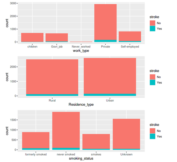
p5 <- ggplot(data = df_stroke) +geom_bar(mapping = aes(x = work_type,fill=stroke))
p6 <-ggplot(data = df_stroke) +geom_bar(mapping = aes(x = Residence_type,fill=stroke))
p7 <-ggplot(data = df_stroke) +geom_bar(mapping = aes(x = smoking_status,fill=stroke))
grid.arrange(p5,p6,p7 ,ncol= 1)
Model Building and Prediction
After the Exploratory Data Analysis (EDA), the next step is to split our data into training and test datasets. We use the following code –
#Lets split the final dataset to training and test data
n_obs <- nrow(df_stroke)
split <- round(n_obs * 0.7)
train <- df_stroke[1:split,]
# Create test
test <- df_stroke[(split + 1):nrow(df_stroke),]
dim(train)
dim(test)
We use Random Forest algorithm for this problem as it is normally used in supervised learning since our problem has only two possible outcomes. To set up the model, we will first use ‘set.seed’ to select a random seed and make the model reproducible. Next, we call the randomForest classifier and point it to ‘stroke’ column for the outcome and provide the ‘train’ set as input.
#Modeling
set.seed(123)
rf_model<-randomForest(formula= stroke~.,data = train)
rf_model
Running the above code trains the model. Since this is a small data set, training should be fairly quick. You can easily look at the results of the model for our training set –
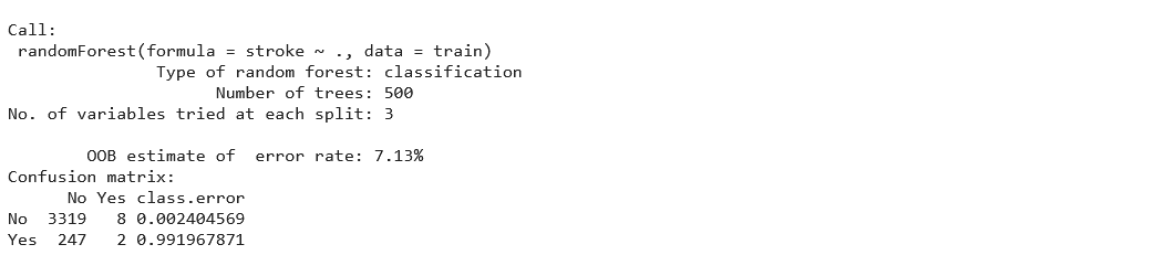
We get the information from the confusion matrix, and Out-of-Bag (OOB) estimate of error rate (7.13%), the number of trees (500), the variables at each split (3), and the function used to build the classifier (randomForest). We must evaluate the model’s performance on similar data once trained on the training set. We will make use of the test dataset for this. Let us print the confusion matrix to see how our classification model performed on the test data –
confusionMatrix(predict(rf_model, test), test$stroke)
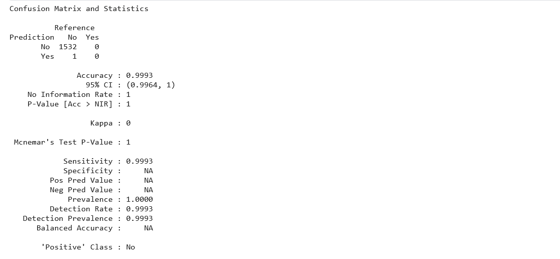
We can see that the accuracy is nearly 100% with a validation dataset, suggesting that the model was trained well on the training data.
Conclusion to Machine Learning Model
In this article, we learned a step-by-step approach to getting started with R for Machine Learning and built a simple stroke disease prediction model. We covered end-to-end settings for the model, from loading the data to generating predictions. This way, one can easily get familiar with a new data science tool.
Here are some key takeaways from this article –
- The R language is an equally powerful and popular open-source tool as Python.
- R is preferred by a significant number of Data Scientists for its statistical capabilities
- R syntax is different than Python, but the code is easier to understand for beginners.
- We could quickly build a machine learning model for classification using Random Forest in R.
That’s it! If you are a beginner, I hope you found the article on the machine learning model interesting. Go ahead and build a classification model using the code mentioned in this article. You can find the complete code for this tutorial on my GitHub repository.
The media shown in this article is not owned by Analytics Vidhya and is used at the Author’s discretion.


