This article was published as a part of the Data Science Blogathon.
Introduction to Confusion Matrix
In a situation where we want to make discrete predictions, we often wish to assess the quality of our model beyond simple metrics like the model’s accuracy, especially if we have many classes. Oftentimes, we turn to plots of confusion matrices for this purpose. However, colour scales can be misleading, and unintuitive. Here, we augment the normal confusion matrices, such that you can communicate your results at first glance. To improve readability, we name this “augmented” confusion matrix the “coin-flip confusion-matrix” (CCM).
A classic tool, to evaluate our model in more detail, is the confusion matrix. When we are in a situation where we have to communicate our results in a more simple way, we can alter the regular matrix, e.g., by normalising its colour-scale, to make the results more intuitive.
Houston, we need a Problem!
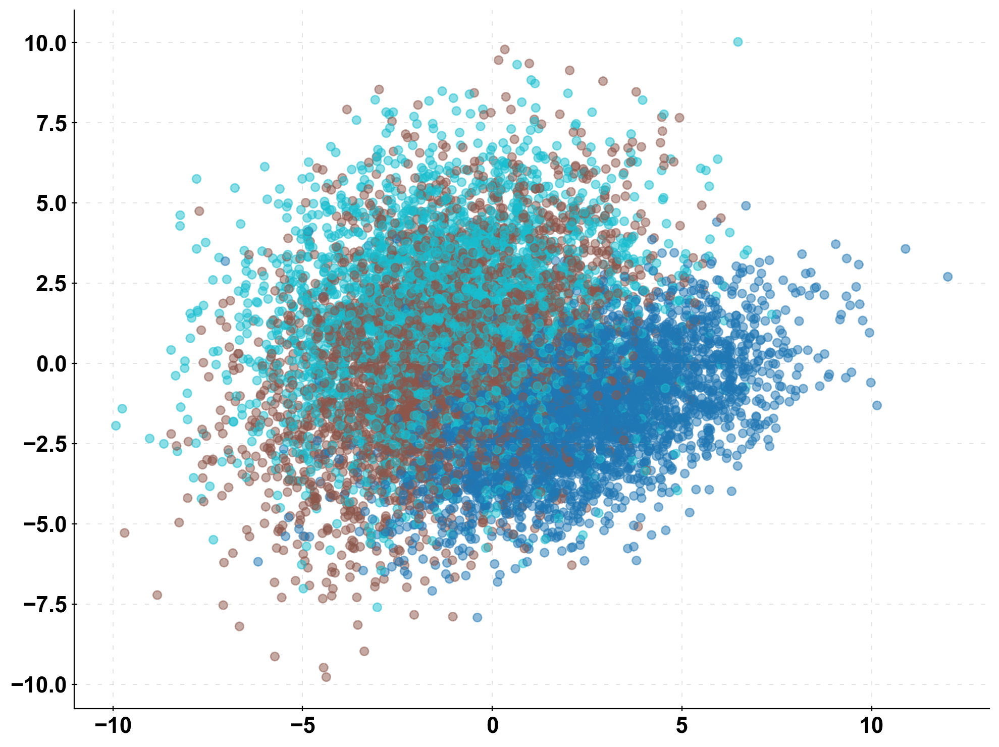
First, we simulate some toy data. To keep it simple, we start off with 3 classes, i.e., 3 different possible labels for our data (n_classes = 3). Below, I visualised the data set in 2d-space.
Second, we split the data into train and test sets and estimate two models on the data: A logistic regression model and a “dummy model”. The dummy model makes a random prediction. This “dummy model” is a baseline to compare our logistic regression to and has no predictive power.
# generate the data and make predictions with our two models
n_classes = 3
X, y = make_classification(n_samples=10000, n_features=10,
                           n_classes=n_classes, n_clusters_per_class=1,
                           n_informative=10, n_redundant=0)
y = y.astype(int)
X_train, X_test, y_train, y_test = train_test_split(X, y, test_size=0.33, random_state=0)
prediction_naive = np.random.randint(low=0, high=n_classes, size=len(y_test))
clf = LogisticRegression().fit(X_train, y_train)
prediction = clf.predict(X_test)
The Standard Confusion Matrix
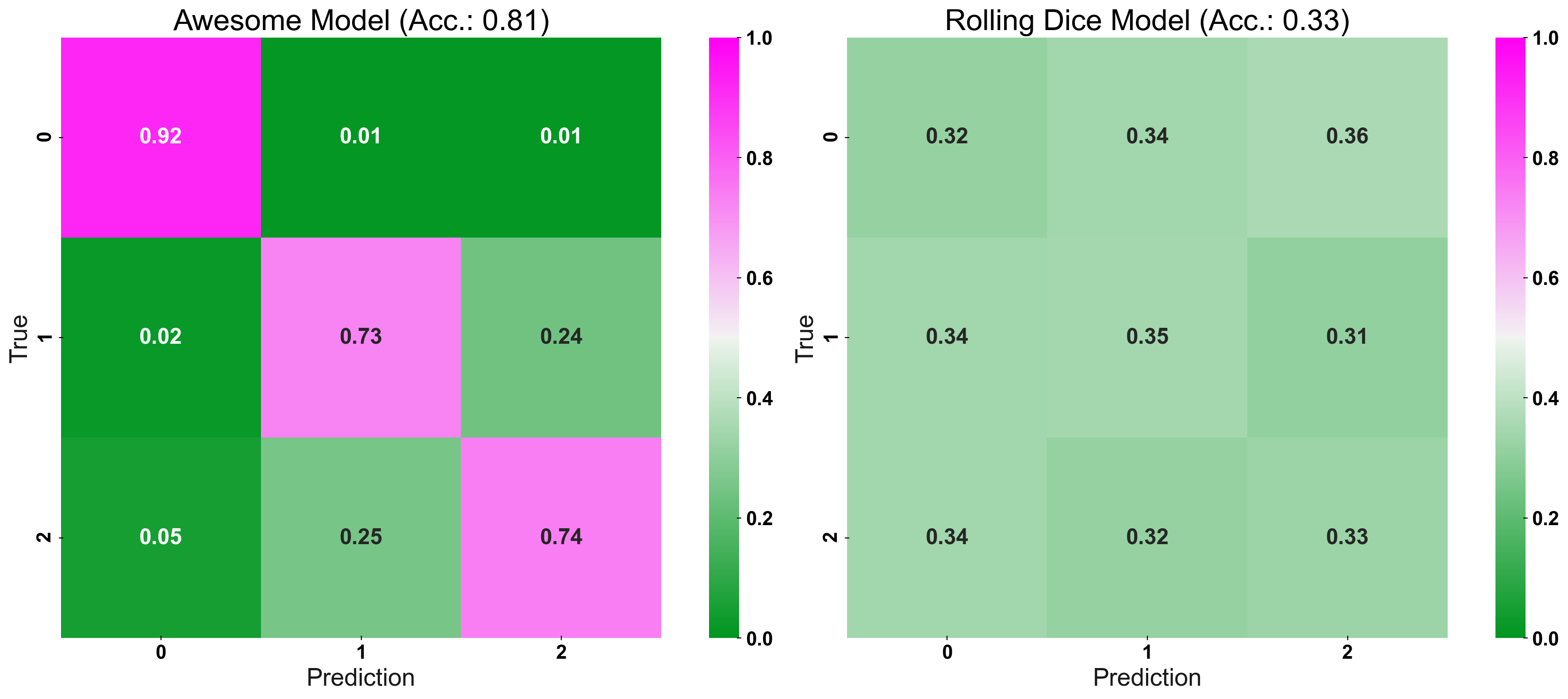
Now we have two models’ predictions. Which model performs better? To give a more refined answer to that, we compute a confusion matrix.
First, I plot the confusion matrix, with a default colour-bar. Its colour-map is centred around 0.5 (white) and ranges from 0 (green) to 1 (pink). We can see that we have a difference in “hue” (i.e., pink vs. green) for the good model and no difference between the main-diagonal and the off-diagonal for the bad model. However, we do not get a very detailed idea of the model’s properties! A false-positive rate (FPR) of 25% is shaded in green on the off-diagonal – but is this really an improvement over the naive prediction? What about an FPR of 40%? This higher FPR would be coloured in a light-green too. However, this prediction would be worse, than that from a randomly made forecast!
fig, (ax1, ax2) = plt.subplots(1,2, figsize=(20,8))

plot_cm_standard(y_true=y_test, y_pred=prediction, title="Awesome Model", list_classes=[str(i) for i in range(n_classes)],

normalize="prediction", ax=ax1)

plot_cm_standard(y_true=y_test, y_pred=prediction_naive, title="Rolling Dice Model", list_classes=[str(i) for i in range(n_classes)],

normalize="prediction", ax=ax2)

plt.show()
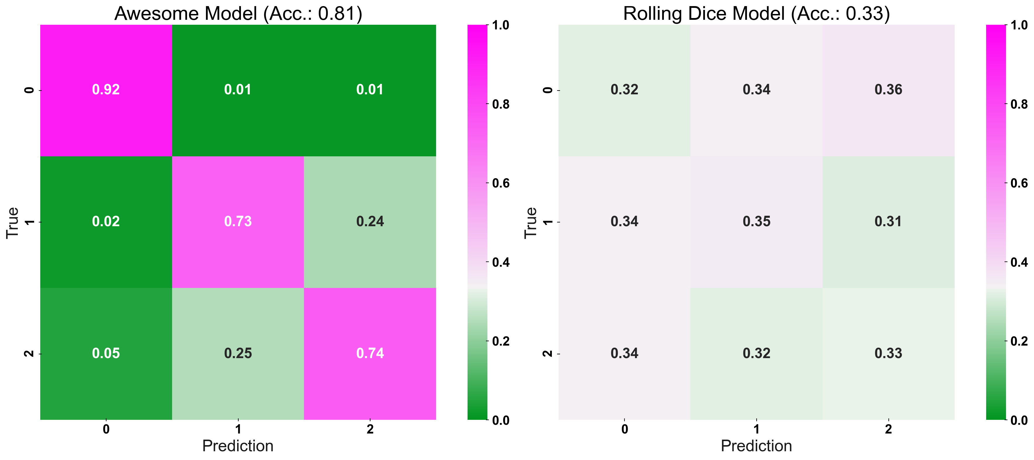
Now, we enter the secret sauce: CM_Norm adjusts the colour-bar, such that its point of origin is equal to the accuracy expected for a random prediction. Essentially, the “naive-prediction accuracy” is our “point of origin” because a model which predicts worse than a coin-flip, is not a helpful model to begin with (hence the name: “coin-flip confusion-matrix”). In other words, we are interested in a models “excess performance”, rather than its “absolute” error rates. To give two examples: For 3 different classes, the “point of origin”, of the colour-bar, would be set at 1/3, or for 10 classes it would be set at 1/10.
The normalisation leads to the following: Brighter colours signal worse performance and darker colours represent a better performance. This property holds for the main-diagonal (true positive rate: Values closer to 1 are better) or the off-diagonals (false positive rate: Values closer to 0 are better). The standard confusion matrix, does not differentiate this granularly between the two types of error rates!
Strong Colours Equal a Strong Model!
In the following plot, we compare our logistic regression with its dummy counter-part: The vibrant colours of the “great” model’s confusion matrix immediately suggest its high true positive and low false-positive rates!
fig, (ax1, ax2) = plt.subplots(1,2, figsize=(20,8))

plot_cm(y_true=y_test, y_pred=prediction, title="Awesome Model", list_classes=[str(i) for i in range(n_classes)],

normalize="prediction", ax=ax1)

plot_cm(y_true=y_test, y_pred=prediction_naive, title="Rolling Dice Model", list_classes=[str(i) for i in range(n_classes)],

normalize="prediction", ax=ax2)

plt.show()
Dial-up the Complexity
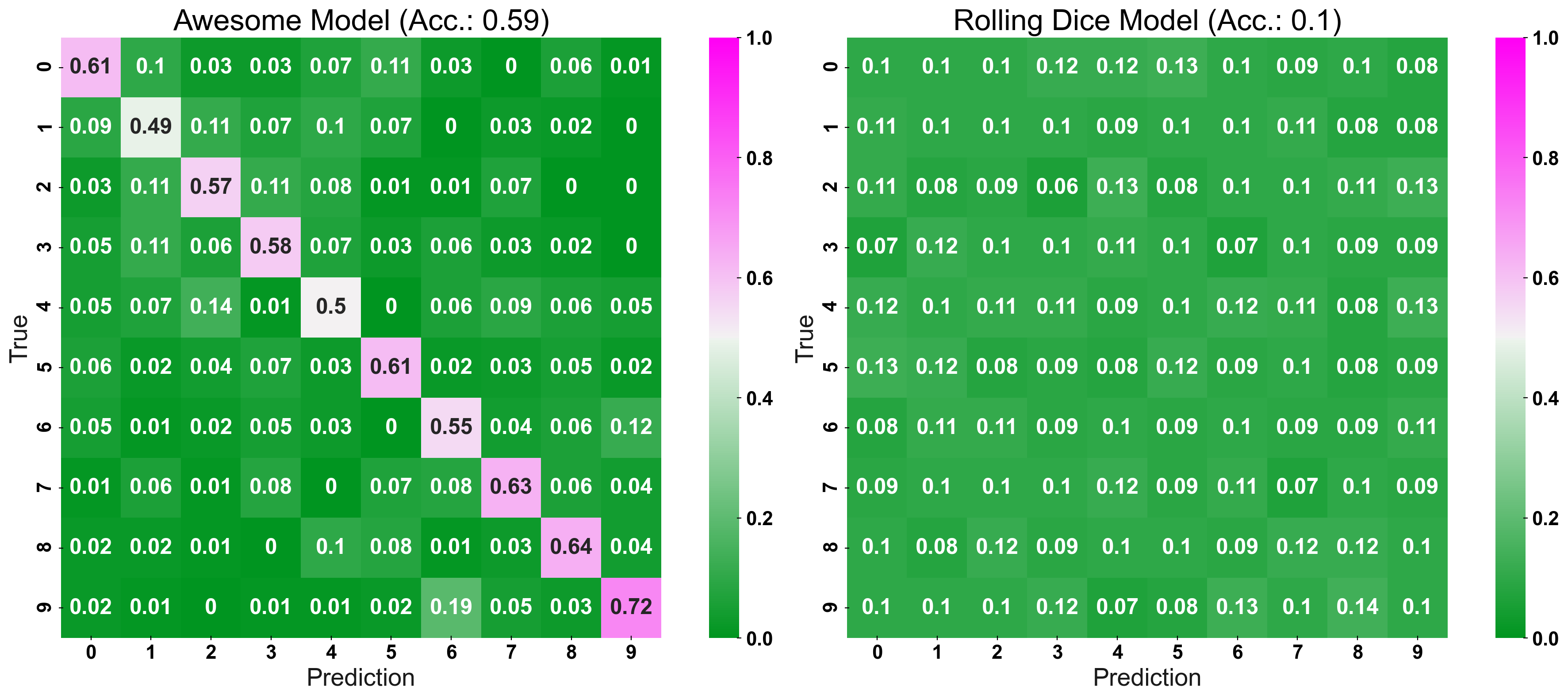
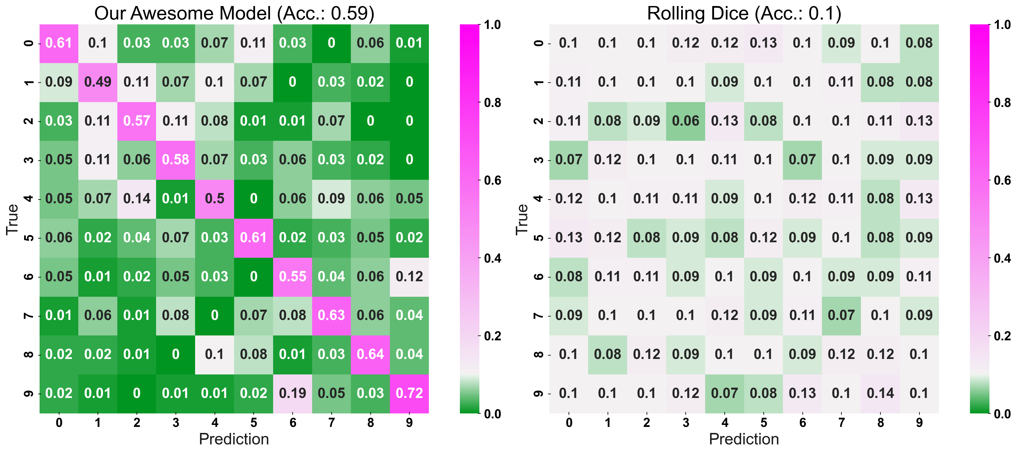
More complex classification problems exacerbate the problem of unintuitive confusion matrices. When we are dealing with more classes, the CCM really starts to shine: Despite the more extensive confusion matrix, you can still compare the two model’s performance at a glance!
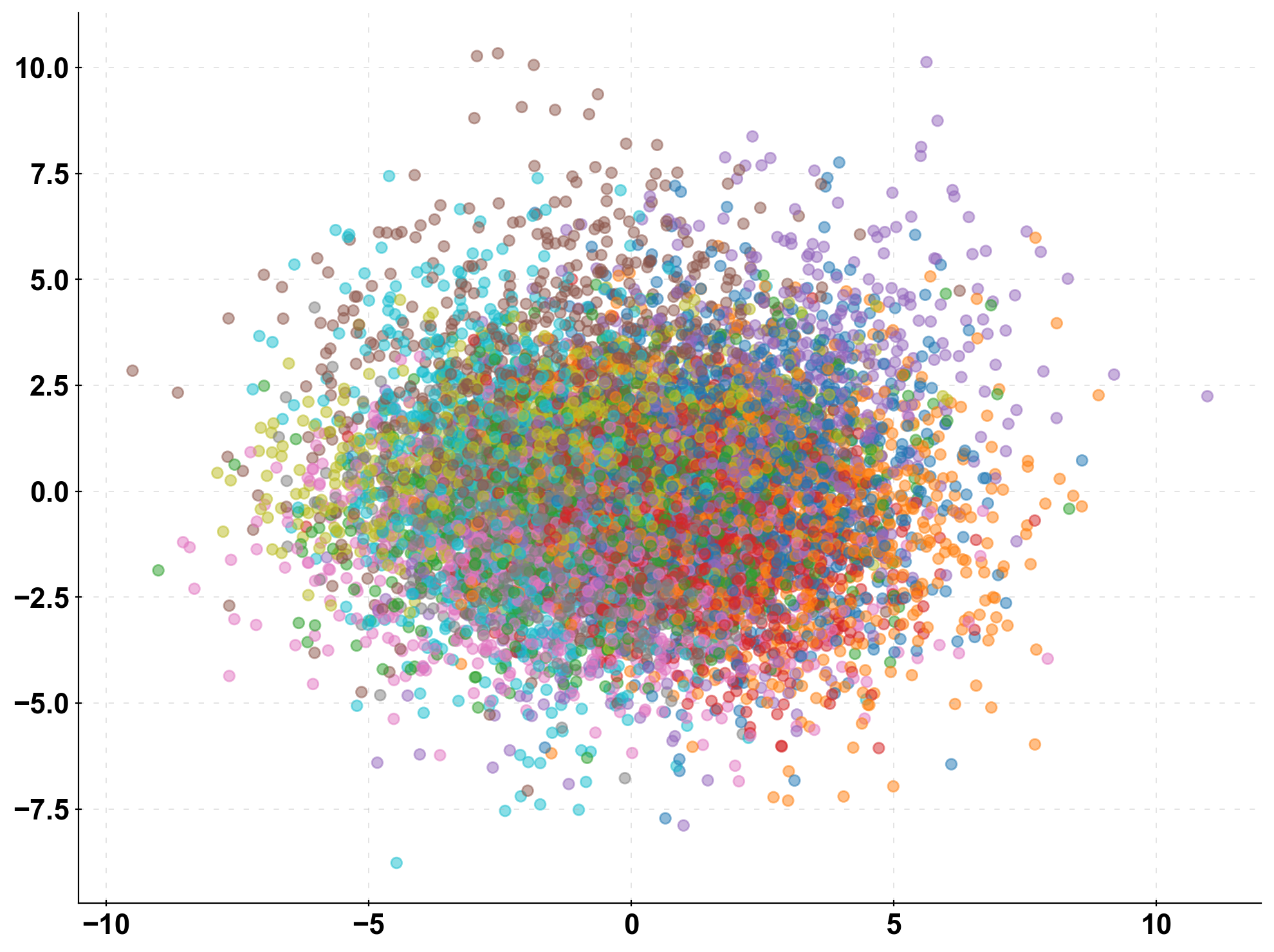
To illustrate this more intuitive visualisation, we simulate a discrete prediction problem with 10 classes:
n_classes = 10

X, y = make_classification(n_samples=10000, n_features=10,

n_classes=n_classes, n_clusters_per_class=1,

n_informative=10, n_redundant=0)

X_train, X_test, y_train, y_test = train_test_split(X, y, test_size=0.33, random_state=0)

prediction_naive = np.random.randint(low=0, high=n_classes, size=len(y_test))

clf = LogisticRegression().fit(X_train, y_train)

prediction = clf.predict(X_test)
Now, compare the classic confusion matrix with the CCM. The “normal” confusion matrix does not provide a very sophisticated visualisation, as we can only tell which model is “better”, due to the pink main diagonal (good model) vs. the green main diagonal (dummy model). However, we would have no way of intuitively comparing the two models regarding their FPR. Furthermore, comparing two models with similar performance would come down to comparing individual cells, which is too cumbersome when presenting your results to an audience.
The CCM provides us with a more detailed colour scheme: Despite more cells, we can still “glimpse” that the logistic regression is the better model, as it consists of strong greens and pink, compared to the dummy model’s matrix of light greens and whites: Strong colours, strong performance. On top of being able to choose the stronger model, we also get an indication of the logistic regressions strengths and weaknesses. For example, we see that when the model predicts “class 1”, it ends up wrong more often than for any other prediction, or that the true “class 1” never gets predicted to be “class 9”.
fig, (ax1, ax2) = plt.subplots(1,2, figsize=(20,8))
plot_cm_standard(y_true=y_test, y_pred=prediction, title="Awesome Model", list_classes=[str(i) for i in range(n_classes)],
        normalize="prediction", ax=ax1)
plot_cm_standard(y_true=y_test, y_pred=prediction_naive, title="Rolling Dice Model", list_classes=[str(i) for i in range(n_classes)],
        normalize="prediction", ax=ax2)
fig, (ax1, ax2) = plt.subplots(1,2, figsize=(20,8))
plot_cm(y_true=y_test, y_pred=prediction, title="Our Awesome Model", list_classes=[str(i) for i in range(n_classes)],
        normalize="prediction", ax=ax1)
plot_cm(y_true=y_test, y_pred=prediction_naive, title="Rolling Dice", list_classes=[str(i) for i in range(n_classes)],
        normalize="prediction", ax=ax2)
plt.show()
Conclusion to Confusion Matrix
I would like to share a few key takeaways from the article:
- Evaluate predictions of classification models with a confusion matrix
- For classifications, it is not only the accuracy matters but also the true positive/negative rate
- Evaluate your model relative to a naive baseline, e.g. a random prediction or a heuristic
- When plotting a confusion matrix, normalise the colour-bar relative to the performance of your naive baseline model
- A CCM lets you assess a model’s performance more intuitively, and is better suited for presentations than a regular confusion matrix
Frequently Asked Questions
Q1. What is meant by confusion matrix in ML?
A. In machine learning, a confusion matrix is a table that is used to evaluate the performance of a classification model by comparing the predicted class labels to the actual class labels. It summarizes the number of correct and incorrect predictions made by the model for each class.
Q2. What is a 4*4 confusion matrix?
A. A 4×4 confusion matrix is a table with 4 rows and 4 columns that is commonly used to evaluate the performance of a multi-class classification model that has 4 classes. The rows represent the actual class labels, while the columns represent the predicted class labels. Each entry in the matrix represents the number of samples that belong to a particular actual class and were predicted to belong to a particular predicted class.
Q3. What is confusion matrix used to check?
The confusion matrix is used to evaluate the performance of a classification model by checking how well it has predicted the class labels of the samples in the test dataset. It provides a way to visualize the performance of the model by summarizing the number of correct and incorrect predictions made by the model.
Thanks for reading! Hope you liked my article on confusion matrix!
The media shown in this article is not owned by Analytics Vidhya and is used at the Author’s discretion.


