Recently I came across this article from Software Advice, a website that reviews business intelligence tools, called “Winning Dashboard Creation Tips from the Qlikview Open Data Challenge Champion“. While the article is from the winner of the Qlikview challenge, Mr. Alexandre Perrot, the tips which he has provided apply to any dashboard you create.
The following were three main takeaways for me:
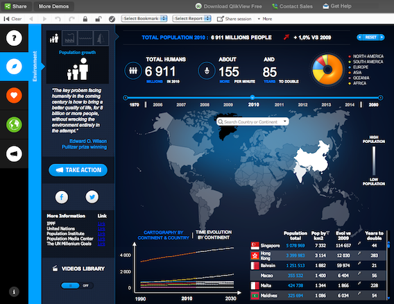
1. Importance of structuring and creating layout / structure before you dive in your data. I had mentioned a similar practice in one of my previous articles here.
2. Importance on visuals and use of colours, especially to highlight the changes.
3. Keeping it simple and effective.
You can read the entire article on dashboard creation tips here.
Thanks Software Advice for conducting the interview and sharing the tips!
If you like what you just read & want to continue your analytics learning, subscribe to our emails or like our facebook page.
Kunal Jain is the Founder and CEO of Analytics Vidhya, one of the world's leading communities of Al professionals. With over 17 years of experience in the field, Kunal has been instrumental in shaping the global Al landscape. His expertise spans diverse markets, from developed economies like the UK to emerging ones like India, where he has successfully led and delivered complex data-driven solutions. As a recognized thought leader, Kunal has empowered countless individuals to realize their Al ambitions through his visionary approach to Al education and community building. Before founding Analytics Vidhya, Kunal earned both his undergraduate and postgraduate degrees from IIT Bombay and held key roles at Capital One and Aviva Life Insurance across multiple geographies. His passion lies at the intersection of analytics, Al, and fostering a thriving community of data science professionals.


Really such an amazing dashboard, I would ike to implement similar geogrphy information can you help me with this. Regards, Preethi