Data visualization guide for SAS
Introduction
A picture is worth a thousand words!
In today’s competitive environment, companies want faster decision making process, thus ensuring they stay ahead in the race.
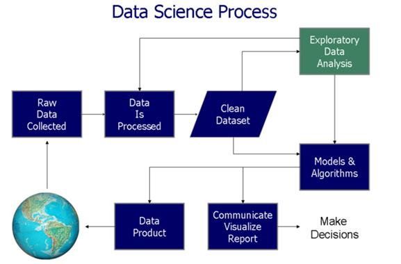
Data Visualisation helps at two critical stages in data based decision process (as shown in the figure below):
- During exploratory data analysis
- To communicate the results and findings
In this article, we’ll explore the 4 applications of data visualization and their implementation in SAS. For better understanding, we have taken sample data sets to create these visualization. Below are the major aspects of data visualization:
- Doing Comparison: It includes Bar Chart, Line Chart, Bar Line Chart, Column Chart, Clustered Bar Column Chart.
- Studying Relationship: It includes Bubble Chart, Scatter Plot
- Studying Distribution: It includes Histogram, Scatter Plot,
- Understanding Composition: It includes Stacked Column Chart

Let’s get started!
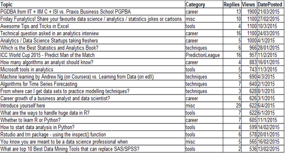
For purpose of the illustration, we will use a dataset ‘discuss’ taken from the Analytics Vidhya Discuss. The data contains the topic of discussion, category, number of replies to the post and the total number of Views. The data contains the top 20 topics:
1. Doing Comparison
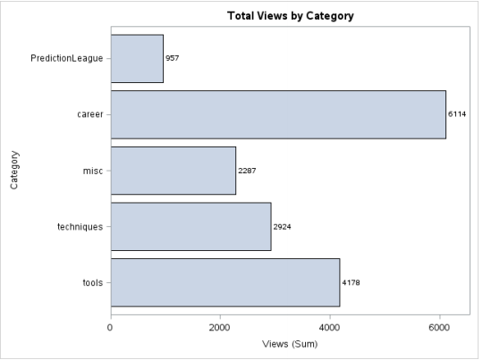
a) Bar Chart
A bar chart, also known as bar graph represents grouped data using rectangular bars with lengths proportional to the values that they represent. The bars can be plotted vertically or horizontally. A vertical bar chart is sometimes called a column bar chart.
Illustration
Objective: We want to know the number of views of each category represented graphically through a bar chart.
Code:
proc sgplot data = discuss;
     hbar category/response = views stat = sum
                           datalabel datalabelattrs=(weight=bold);
     title 'Total Views by Category';
run;
Output:
b) Column Chart
Column Charts are often self-explanatory. They are simply the vertical version of a Bar Chart where length of the bars equals the magnitude of value they represent. Here’s a maneuver: Rotate the chart shown above by -90 degrees, it’ll get converted into a column chart.
Code:
proc sgplot data = discuss;
     hbar category/response = views stat = sum
                    datalabel datalabelattrs=(weight=bold) barwidth = 0.5; /* Assign width to bars*/
    title 'Total Views by Category';
run;
Output:
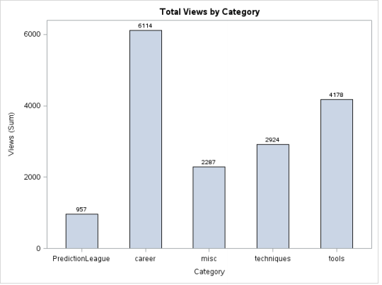
–> Code explanation for Bar Chart and Column Chart:
- Category : the variable according to which the data has to be grouped.
- Response = views: the statistics specified by the stat = option is calculated for the variable views grouped by category variable.
- Datalabel option specifies that we want the values calculated to be displayed for each bar.
- Weight = bold option specifies that the datalabels for each bar are to be displayed in bold.
- The bar width option is used to assign width to the bars.The default value is 0.8 and the range is 0.1-1.
c) Clustered Bar Chart / Column Chart
This type of representation is useful when we want to visualize the distribution of data across two categories.
Objective: We want to analyze the total views of topics in the discussion forum by category and date posted.
Code:
data discuss_date;
set discuss;
month = month(DatePosted);
month_name=PUT(DatePosted,monname.);
  put month_name= @;
run;
proc sgplot data=discuss_date;
    vbar category/ response=views group=month_name groupdisplay=cluster
                 datalabel datalabelattrs = (weight = bold) dataskin=gloss; yaxis grid;
run;
Output:
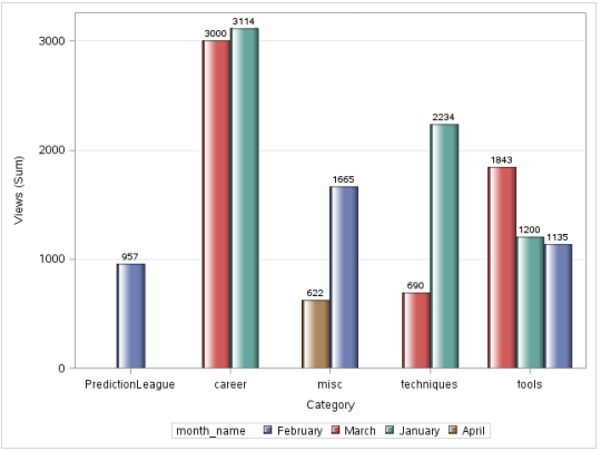
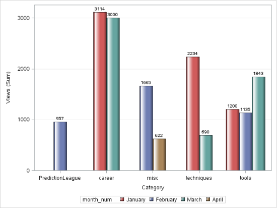
However, there is a problem with this image, the months are not in chronological order. In order to solve for this, we use PROC FORMAT.
Code with PROC FORMAT:
data discuss_date;
set discuss;
month = month(DatePosted);
month_num = input(month,5.);
run;
PROC FORMAT;
   VALUE monthfmt
        1 = 'January'
        2 = 'February'
        3 = 'March'
        4 = 'April';
RUN;
proc sgplot data=discuss_date;
  vbar category/ response=views group = month_num groupdisplay=cluster datalabel
                    datalabelattrs = (weight = bold) dataskin=gloss grouporder= ascending;
   format month_num monthfmt.;
  yaxis grid;
run;
Output:
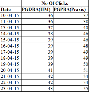
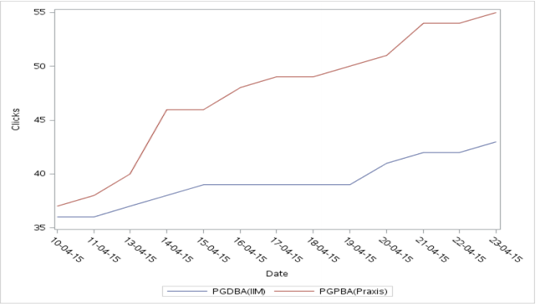
d) Line Chart
A line chart or line graph is a type of chart which displays information as a series of data points called ‘markers’ connected by straightline segments. A line chart is often used to visualize trends in data over intervals of time – a time series – thus the line is often drawn chronologically. In these cases they are known as run charts.
For this illustration, we will be using a data from PGDBA from IIT + IIM C + ISI vs. Praxis Business School PGPBA.
Code:
proc sgplot data = clicks;
     vline date/response = PGDBA_IIM_ ;
     vline date/response = PGPBA_Praxis_;
     yaxis label = "Clicks";
run;
Output:
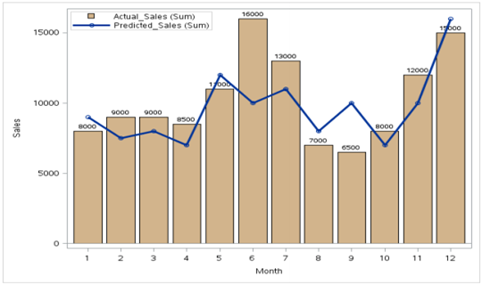
e) Bar-Line Chart
This combination chart combines the features of the bar chart and the line chart. It displays the data using a number of bars and/or lines, each of which represent a particular category. A combination of bars and lines in the same visualization can be useful when comparing values in different categories.
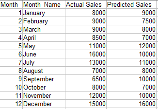
Objective: We want to compare the projected sales with the actual sales for different time periods.
Code:
proc sgplot data=barline;
  vbar month/ response=actual_sales datalabel datalabelattrs = (weight = bold)
                   fillattrs= (color = tan);
  vline month/ response=predicted_sales
                 lineattrs =(thickness = 3) markers;
  xaxis label= "Month";
  yaxis label = "Sales";
  keylegend / location=inside position=topleft across=1;
  run;
Note : The data needs to be sorted by the x-axis variable.
Output:
2) Studying relationship
a) Bubble Chart
A bubble chart is a type of chart that displays three dimensions of data. Each entity with its triplet (v1, v2, v3) of associated data is plotted as a disk that expresses two of the vi values through the disk’s xy location and the third through its size. – Source: Wikipedia.
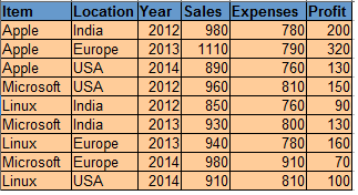
Data for OS:
Code:
proc sgplot data = os;
     bubble X=expenses Y=sales size= profit
     /fillattrs=(color = teal) datalabel = Location;
run;
Output:
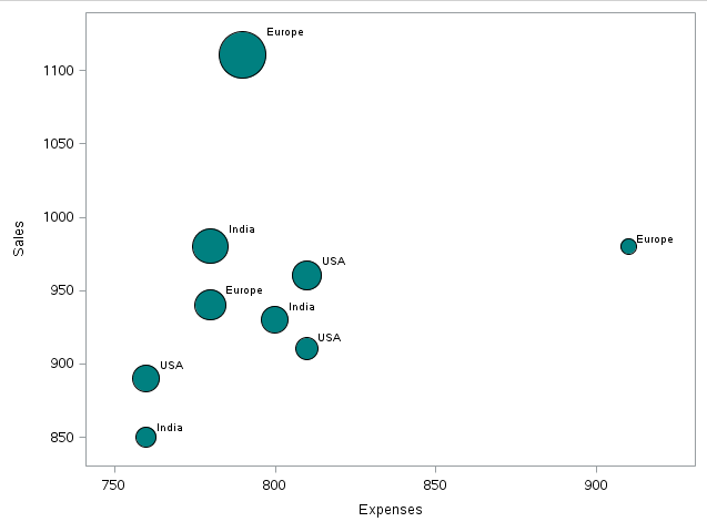
As we can see,there is a record for which the Sales and Profit are maximum whereas the comparative expenses are less than some other data points.
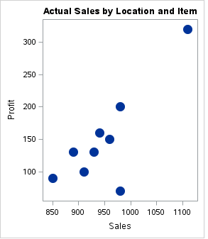
b) Scatter Plot for Relationship
A simple scatter plot between two variables can give us an idea about the relationship between them-linear, exponential etc. This information can be helpful during further analysis.
Code:
proc sgplot data = os;
    title 'Relationship of Profit with Sales';
    scatter X= sales Y = profit/
                     markerattrs=(symbol=circlefilled size=15);
run;
Output:
3. Studying Distribution
a) Histogram
A histogram is a graphical representation of the distribution of numerical data. It is an estimate of the probability distribution of a continuous variable To construct a histogram, the first step is to “bin” the range of values—that is, divide the entire range of values into a series of small intervals—and then count how many values fall into each interval.The bins are usually specified as consecutive, non-overlapping intervals of a variable. The bins (intervals) must be adjacent, and usually equal size. The rectangles of a histogram are drawn so that they touch each other to indicate that the original variable is continuous.
Code:
proc sgplot data = sashelp.cars;
     histogram msrp/fillattrs=(color = steel)scale = proportion;
     density msrp;
run;
Output:
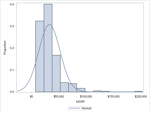
We have used the sashelp.mtcars dataset here.A histogram of the MSRP variable gives us the above figure.This tells us that the variable MSRP is skewed to the right indicating that most of the data points are below $50,000.These kind of simple but meaningful insights can be found out from histograms.
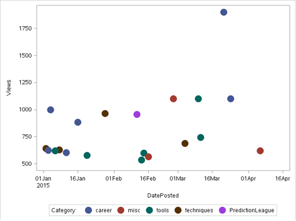
b) Scatter Plot
In a scatter plot the data is displayed as a collection of points, each having the value of one variable determining the position on the horizontal axis and the value of the other variable determining the position on the vertical axis.It can be used both to see the distribution of data and accessing the relationship between variables.
Note: For Illustration, we will use a dataset ‘discuss’ taken from the Analytics Vidhya Discuss
Code:
proc sgplot data = discuss;
     scatter X= dateposted Y = views/group=category
                    markerattrs=(symbol=circlefilled size=15);
run;
Output:
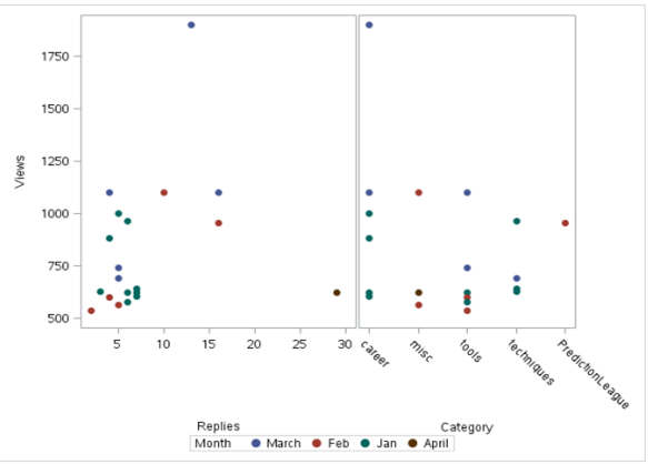
The SGSCATTER Procedure can also be used for scatter plots.It has the advantage of being able to produce multiple scatter plots. Below is the output using sgcscatter:
Code:
proc sgscatter data = discuss;
     compare y = views  x = (replies category)
               /group = month markerattrs=(symbol = circlefilled size = 10);
run;
Output:
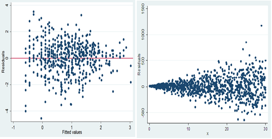
An important use of scatter plot is the interpretation of residuals of linear regression. A scatter plot of the residuals vs the predicted values of the predicted variable helps us in determining whether the data is heteroskedastic or homoskedastic.
HOMOSKEDASTIC HETEROSKEDASTIC
4) Composition
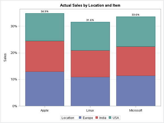
a) Stacked Column Chart:
In a stacked bar chart, the stacked bars represent different groups on top of each other. The height of the resulting bar shows the combined result of the groups.
For example,if we want to see the total sales per Item grouped by Location across the total data of the OS dataset, we can use the stacked column chart. Below is the illustration:
Code:
proc sgplot data=os;
  title 'Actual Sales by Location and Item';
  vbar Item / response=Sales group=Location stat=percent datalabel;
  xaxis display=(nolabel);
  yaxis grid  label='Sales';
run;
Output:
End Notes:
Visualizations become a natural way of understanding data in huge volume. They convey information in a simple manner and make it easy to share ideas with others. In this article, we looked at a few basic visualizations that can be done through base SAS. These can be a great way to summarize our data, gain insights, find relationships etc.
Did you find this article useful? Are there any other visualisation you have used, which you can share with our audience? Please feel free to share them through comments below.
If you like what you just read & want to continue your analytics learning, subscribe to our emails, follow us on twitter or like our facebook page.
I am Shuvayan Das, a B.Tech graduate having 4 years of experience in TCS as an SQL Server Developer/DBA. I am an analytics enthusiast. I began my journey in Analytics through a course in Jigsaw. A self - learner who believes that there just isn't enough time to learn but nevertheless we gotta keep trying . I have worked on SAS/R/SQL and currently I am focused on gaining extensive knowledge and experience in Analytics because "In god we trust,all others must bring data"-W.Edwards Deming.


Really liked the examples and the granularity that you showcased as examples Shuvayan :) Let me go through in depth by trying the same in SAS and get back to you.
Like this article. Good to have all of these codes and graphs at one place. Now I a looking forward to extension as well with some more graphs.
Oh boy! Should business users remember these codes...when it comes to visualization and ease of developing visualization, no other tool is any where close to Tableau(though Base SAS is not meant for high end data visualization)
Hello , Can someone let me know where i can download the DISCUSS dataset used in the above SAS Code samples. Thanks.
Hi Prashant, You can go to AnalyticsVidhya Discuss and sort the items by Views(in descending order) and then create the data from there.
This blog is really helpful for me & other freshers who are looking into SAS graphs............ a heart ful thanks to Shuvayan......................