Interactive Data Visualization using Bokeh (in Python)
Introduction
Recently, I was going through a video from SciPy 2015 conference, “Building Python Data Apps with Blaze and Bokeh“, recently held at Austin, Texas, USA. I couldn’t stop thinking about the power these two libraries provide to data scientists using Python across the globe. In this article, I will introduce you to the world of possibilities in data visualization using Bokeh and why I think this is a must learn/use library for every data scientist out there.
 Source: bokeh.pydata.org
What is Bokeh?
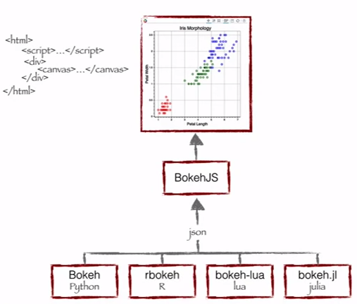
Bokeh is a Python library for interactive visualization that targets web browsers for representation. This is the core difference between Bokeh and other visualization libraries. Look at the snapshot below, which explains the process flow of how Bokeh helps to present data to a web browser.
 Source: Continuum Analytics
As you can see, Bokeh has multiple language bindings (Python, R, lua and Julia). These bindings produce a JSON file, which works as an input for BokehJS (a Javascript library), which in turn presents data to the modern web browsers.
Bokeh can produce elegant and interactive visualization like D3.js with high-performance interactivity over very large or streaming datasets. Bokeh can help anyone who would like to quickly and easily create interactive plots, dashboards, and data applications.
What does Bokeh offer to a data scientist like me?
I started my data science journey as a BI professional and then worked my way through predictive modeling, data science and machine learning. I have primarily relied on tools like QlikView & Tableau for data visualization and SAS & Python for predictive analytics & data science. I had near zero experience of using JavaScript.
So, for all my data products or ideas, I had to either outsource the work or had to pitch my ideas through wire-frames, both of which are not ideal for building quick prototypes. Now, with Bokeh, I can continue to work in Python ecosystem, but still create these prototypes quickly.
Benefits of Bokeh:
- Bokeh allows you to build complex statistical plots quickly and through simple commands
- Bokeh provides you output in various medium like html, notebook and server
- We can also embed Bokeh visualization to flask and django app
- Bokeh can transform visualization written in other libraries like matplotlib, seaborn, ggplot
- Bokeh has flexibility for applying interaction, layouts and different styling option to visualization
Challenges with Bokeh:
- Like with any upcoming open source library, Bokeh is undergoing a lot of development. So, the code you write today may not be entirely reusable in future.
- It has relatively less visualization options, when compared to D3.js. Hence, it is unlikely in near future that it will challenge D3.js for its crown.
Given the benefits and the challenges, it is currently ideal to rapidly develop prototypes. However, if you want to create something for production environment, D3.js might still be your best bet.
To install Bokeh, please follow the instruction given here.
Visualization with Bokeh
Bokeh offers both powerful and flexible features which imparts simplicity and highly advanced customization. It provides multiple visualization interfaces to the user as shown below: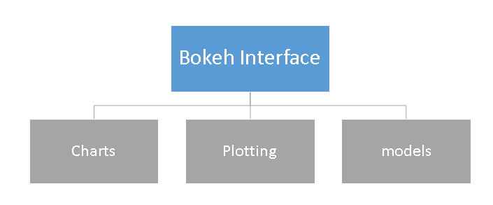
- Charts: a high-level interface that is used to build complex statistical plots as quickly and in a simplistic manner.
- Plotting: an intermediate-level interface that is centered around composing visual glyphs.
- Models: a low-level interface that provides the maximum flexibility to application developers.
In this article, we will look at first two interfaces charts & plotting only. We will discuss models and other advance feature of this library in next post.
Charts
As mentioned above, it is a high level interface used to present information in standard visualization form. These forms include box plot, bar chart, area plot, heat map, donut chart and many others. You can generate these plots just by passing data frames, numpy arrays and dictionaries.
Let’s look at the common methodology to create a chart:
- Import the library and functions/ methods
- Prepare the data
- Set the output mode (Notebook, Web Browser or Server)
- Create chart with styling option (if required)
- Visualize the chart
To understand these steps better, let me demonstrate these steps using example below:
Charts Example-1: Create a bar chart and visualize it on web browser using Bokeh
We will follow above listed steps to create a chart:
#Import library
from bokeh.charts import Bar, output_file, show #use output_notebook to visualize it in notebook
# prepare data (dummy data)
data = {"y": [1, 2, 3, 4, 5]}
# Output to Line.HTML
output_file("lines.html", title="line plot example") #put output_notebook() for notebook
# create a new line chat with a title and axis labels
p = Bar(data, title="Line Chart Example", xlabel='x', ylabel='values', width=400, height=400)
# show the results
show(p)
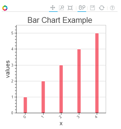
In the chart above, you can see the tools at the top (zoom, resize, reset, wheel zoom) and these tools allows you to interact with chart. You can also look at the multiple chart options (legend, xlabel, ylabel, xgrid, width, height and many other) and various example of charts here.
Chart Example-2: Compare the distribution of sepal length and petal length of IRIS data set using Box plot on notebook
To create this visualization, firstly, I’ll import the iris data set using sklearn library. Then, follow the steps as discussed above to visualize chart in ipython notebook.
#IRIS Data Set
from sklearn.datasets import load_iris
import pandas as pd
iris = load_iris()
df=pd.DataFrame(iris.data)
df.columns=['petal_width','petal_length','sepal_width','sepal_length']
#Import library
from bokeh.charts import BoxPlot, output_notebook, show
data=df[['petal_length','sepal_length']]
# Output to Notebook
output_notebook()
# create a new line chat with a title and axis labels
p = BoxPlot(data, width=400, height=400)
# show the results
show(p)
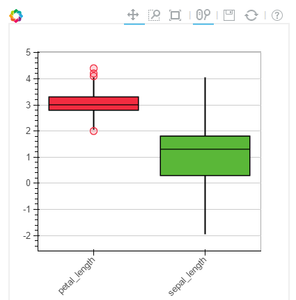
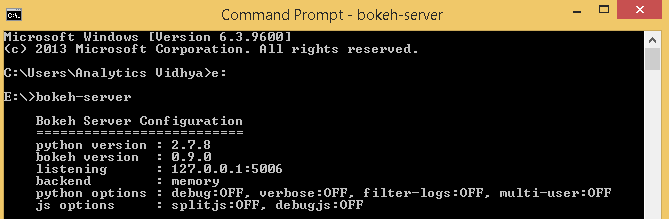
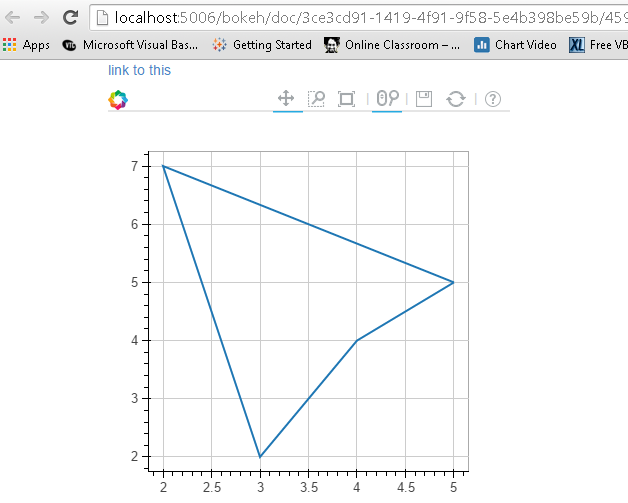
Chart Example-3: Create a line plot to bokeh server
Prior to plotting visualization to Bokeh server, you need to run it.
If you are using a conda package, you can use run command bokeh-server from any directory using command. Else, python ./bokeh-server command should work in general. For more detail on this please refer this link “Deploying Bokeh Server“.
There are multiple benefits of Plotting visualization on Bokeh server:
- Plots can be published to larger audience
- Visualize large data set interactively
- Streaming data to automatically updating plots
- Building dashboards and apps
To start plotting on Bokeh server, I have executed the command bokeh-server to initialize it followed by the commands used for visualization.
from bokeh.plotting import figure, output_server, show
output_server("line")
p = figure(plot_width=400, plot_height=400)
# add a line renderer
p.line([5, 2, 3, 4, 5], [5, 7, 2, 4, 5], line_width=2)
show(p)
Plotting
Plotting is an intermediate-level interface that is centered around composing visual glyphs. Here, you create a visualization by combining various visual elements (dot, circles, line, patch & many others) and tools (hover tool, zoom, Save, reset and others).
Bokeh plots created using the bokeh.plotting interface comes with a default set of tools and visual styles. For plotting, follow the below steps:
- Import library, methods or functions
- Select the output mode (notebook, web browser, server)
- Activate a figure (similar like matplotlib)
- Perform subsequent plotting operations, it will affect the generated figure.
- Visualize it
To understand these steps better, let me demonstrate these steps using examples below:
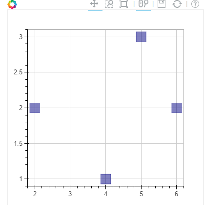
Plot Example-1: Create a scatter square mark on XY frame of notebook
from bokeh.plotting import figure, output_notebook, show

# output to notebook
output_notebook()
p = figure(plot_width=400, plot_height=400)
# add square with a size, color, and alpha
p.square([2, 5, 6, 4], [2, 3, 2, 1, 2], size=20, color="navy")
# show the results
show(p)
Similarly, you can create various other plots like line, wedges & arc, ovals, images, patches and many others, refer this link to see various example.
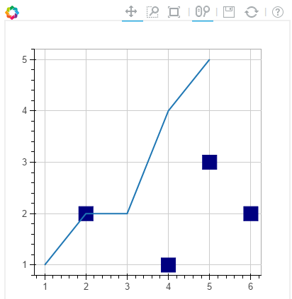
Plot Example-2: Combine two visual elements in a plot
from bokeh.plotting import figure, output_notebook, show
# output to notebook
output_notebook()
p = figure(plot_width=400, plot_height=400)
# add square with a size, color, and alpha
p.square([2, 5, 6, 4], [2, 3, 2, 1, 2], size=20, color="navy")
p.line([1, 2, 3, 4, 5], [1, 2, 2, 4, 5], line_width=2) #added a line plot to existing figure
# show the results
show(p)
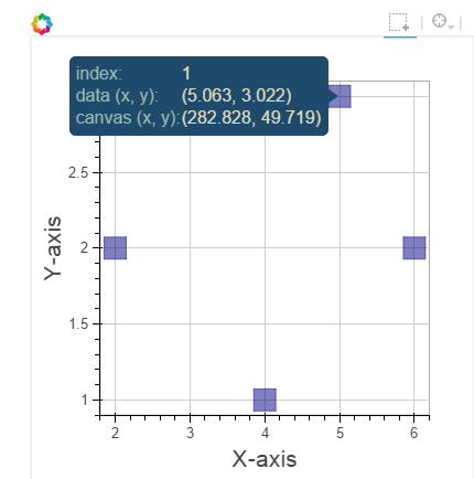
Plot Example-3: Add a hover tool and axis labels to above plot
from bokeh.plotting import figure, output_notebook, show
from bokeh.models import HoverTool, BoxSelectTool #For enabling tools
# output to notebook
output_notebook()
#Add tools
TOOLS = [BoxSelectTool(), HoverTool()]
p = figure(plot_width=400, plot_height=400, tools=TOOLS)
# add a square with a size, color, and alpha
p.square([2, 5, 6, 4], [2, 3, 2, 1, 2], size=20, color="navy", alpha=0.5)
#Visual Elements
p.xaxis.axis_label = "X-axis"
p.yaxis.axis_label = "Y-axis"
# show the results
show(p)
For more details on visual attributes and tools refer these links:
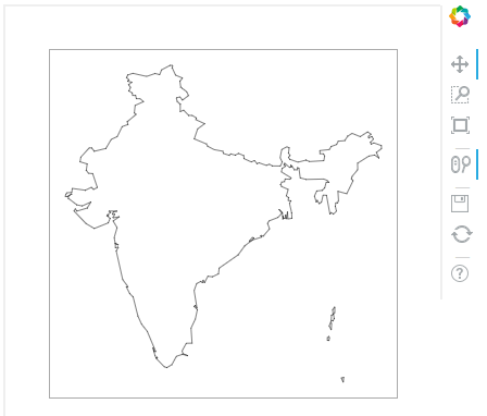
Plot Example-4: Plot map of India using latitude and longitude data for boundaries
Note: I have data for polygon of latitude and longitude for boundaries of India in a csv format. I will use that for plotting.
Here, we will go with patch plotting, let’s look at the commands below:
#Import libraries
import pandas as pd
from bokeh.plotting import figure, show, output_notebook
#Import Latitude and lanogitude co-ordinates
India=pd.read_csv('E:/India.csv')
del India['ID']
India.index=['IN0','IN1','IN2','IN3','IN4','IN5']
#Convert string values to float as co-ordinates in dataframe are string
for j in range(0,len(India)):
 a = India['lats'][j]
 India['lats'][j] = [float(i) for i in a[1:len(a)-1].split(",")]
for j in range(0,len(India)):
 a = India['lons'][j]
 India['lons'][j] = [float(i) for i in a[1:len(a)-1].split(",")]
# Output option
output_notebook()
# Create your plot
p = figure(plot_height=400, plot_width=400, toolbar_location="right",x_axis_type=None, y_axis_type=None)
p.patches(xs=India['lons'], ys=India['lats'], fill_color="white",line_color="black", line_width=0.5)
#Visualize your chart
show(p)
End Notes
In this article, we looked at creating visualizations using Bokeh and methods to present them on notebooks, html and bokeh-server. We also looked at the methods to create customized visualization using plotting, here you can combine multiple visual elements to represent information.
In my next post on Bokeh, I will discuss about models and more interactive features of visualization. For example, I have co-ordinates boundaries for each country across the world. Now, I want to create a visualization to represent each country map in a cycle (loop). It starts plotting with a country map and wait for a 3 sec and iterates for all countries. Sounds interesting! Isn’t it?
Did you find this article useful? Do let us know your thoughts about this article in the comments section below.
If you like what you just read & want to continue your analytics learning, subscribe to our emails, follow us on twitter or like our facebook page.
I am a Business Analytics and Intelligence professional with deep experience in the Indian Insurance industry. I have worked for various multi-national Insurance companies in last 7 years.


Very useful info and example. Sunil, Could you please provide some example on R as well? Is installation of Bokeh server mandatory for R. I tried to run some samples in R studio and display this in R studio viewer, but got into error. Not had enough time to explore more to resolve issues. Some examples in R will definitely of great help.
This appears to be a good overview article. I did not know that this product existed. How does Bokeh compare with the R-version called "Shiny"? Also, like Arvind above, I would like to see an R example also using ggplot2 . Thanks,
Hi Sunil, Very useful article. Thanks for it. Did you also write your next post on Bokeh related to models and data visualization? I am now very interested in how we change both x and y interactively. Thanks.