Introduction
I can’t imagine where we would be without maps today (both literally and figuratively!). Maps are the guiding force for us to explore the world and get to our destinations every day, and they have helped us explore and evolve our understanding of the world.
I personally love using location data to map out places of interest. This strategy is widely used in the industry these days, from marketing campaigns to applications like Uber and Zomato. So the question is, how do we get started using location data to perform geospatial analysis?
I started exploring the different Folium Python libraries and packages available for performing geospatial analysis. I discussed Uber’s kepler.gl here in that regard. During this wonderful journey, I came across Folium – a wonderful Python library used for plotting maps.

In this article, we’ll learn how we can use Folium for creating maps in Python with two wonderful projects:
- Visualizing COVID-19 Cases in India over time
- Visualizing bus traffic in New York City
Table of contents
- Introduction
- What is Folium?
- Installing Folium on our Machine
- Plotting Maps with Folium
- Layers and Tiles in Folium
- Plotting Markers on the Map
- Plotting Paths using Folium Python
- Plugins in Folium
- Folium Project #1: Visualizing COVID-19 Hotspots in India
- Folium Project #2: Visualizing Bus Traffic in New York City
- Conclusion
- Frequently Asked Questions
What is Folium?
So the million-dollar question first – what in the world is Folium?
Folium is a Python library used for visualizing geospatial data. It is easy to use and yet a powerful library. Python Folium is wrapper for Leaflet.js which is a leading open-source JavaScript library for plotting interactive maps.

Folium combines the power of Leaflet.js with the simplicity of Python, making it an excellent tool for plotting maps. It is designed with simplicity, performance, and usability in mind. Folium works efficiently, can be extended with many plugins, and has a beautiful and easy-to-use API.
Installing Folium on our Machine
Folium comes installed on Google Colab and Kaggle kernels. But, if you don’t have Folium installed by default on your system, you can install it using the following command:
pip install foliumFor this article, I am using Folium 0.10.1, which is the latest version of python Folium at the time of writing this article. I suggest you use the same version as me so that all your code works properly. You can install this specific version by running the below command:
pip install folium == 0.10.1Right, let’s start plotting maps!
Plotting Maps with Folium
Plotting maps with Folium is easier than you think. Folium provides the folium.Map() class, which takes location parameters in terms of latitude and longitude and generates a map around it. So, let’s plot a map of Delhi with latitude and longitude as 28.644800 and 77.216721, respectively:

These interactive maps can be zoomed in and out by clicking the positive and negative buttons in the top-left corner. You can also drag the map to see different regions.
Let’s try to customize this map now. First, we’ll reduce its height and width, and then we’ll change the zoom level.
We can resize our map by using the branca library in Python. It is a spinoff from Folium that hosts the non-map specific features. We can use its Figure class for resizing our maps and pass the desired width and height in pixels:
Next, let’s move to our second problem and change the zoom level. By default, you can zoom in and out as much as you want. However, the starting zoom level is fixed to 10 (the map is plotted with a 10x zoom). Now, you might be thinking—how can this be a problem?
Well, imagine you want to plot a map of a small area. Here, you need to mention the appropriate starting zoom level so that the map focuses only on that region. Also, if you don’t want them to zoom in or out much and lose focus on the map, you can restrict it. Folium Map gives us three parameters for doing this: zoom_start, min_zoom, and max_zoom.
So, let us again plot the map of Delhi but this time of fixed size and with a restricted zoom level:

You can see here that I cannot zoom in and out after a certain level. Notice that you need to pass the map as a child to the fig object to resize it.
Layers and Tiles in Folium
A tileset is a collection of raster and vector data broken up into a uniform grid of square tiles. Each tileset represents data differently in the map. Folium allows us to create maps with different tiles, such as Stamen Terrain, Stamen Toner, Stamen Water Color, CartoDB Positron, and many more. By default, the tiles are set to OpenStreetMap.
Each tileset shows different features of a map and is suitable for different purposes. For example, Stamen Terrain features hill shading and natural vegetation colors. It showcases advanced labeling and linework generalization of dual-carriageway roads. And, CartoDB Dark Matter shows the CartoDB Positron map in dark mode.
Since now we know that each tileset provides information in a different way and serves a different purpose, we can layer them over one another to get more information by just plotting a single map. We can do this by adding different layers of tiles to a single map:

Here, you can see that I have added five different tile layers to a single map, which now has six different layers of tilesets. I have also added LayerControl() to the map, which provides an icon at the top-right corner for switching between the different layers.
We can also layer other objects over a single map. Later in this article, we’ll layer paths of three different vehicles on a single map.
Plotting Markers on the Map
Markers are the items used for marking a location on a map. For example, when you use Google Maps for navigation, your location is marked by a marker and your destination is marked by another marker. Markers are among the most important and helpful things on a map.
Folium Python gives a folium. The Marker() class is for plotting markers on a map. Just pass the location’s latitude and longitude, mention the popup and tooltip, and add it to the map.
Plotting markers is a two-step process. First, you need to create a base map on which your markers will be placed, and then add your markers to it:

Here, I have created three markers on the Delhi map. The text when you hover over a marker is known as a tooltip, and the content when you click on a marker is known as a popup. If you look closely here, you will see that I have customized the tooltips and popups of markers 2 and 3. You can also customize them according to your needs by passing the content as HTML to the class.
Now, normally when we book a ride on Uber or order food from Zomato, we see very different and beautiful markers. How can we create something like that?
You can customize two things to change a marker’s appearance: its icon and shape. Folium gives the folium.Icon() class, which can be used to create custom icons for markers. You can choose icons from a wide range of options.
Icon() takes three arguments: color, prefix, and icon. Color is used to change the marker’s color, the prefix is used to select the icon provider (fa for Fontawesome and glyphicon for Glyphicons), and the icon is used to select the icon name.
Now, let’s learn how you can change the shape of the marker. Folium map has the folium.features.CustomIcon() class that can be used for creating custom markers. It takes the path of the image and icon size in pixels as arguments and creates an icon object. This icon object can be passed to the folium.Icon() class as an icon for creating custom markers:

Here, you can see that I have created a marker without any icon. I have done this by setting the icon parameter to none. I have also created a custom marker for the shape of the Analytics Vidhya logo. Similarly, you can create a marker of any image you want.
Plotting Paths using Folium Python
As I said earlier, we’ll plot the path of 3 vehicles on the Folium map. We have three arrays for three vehicles containing latitudes and longitudes of their paths and Geospatial Analysis using Folium:
We’ll plot paths for the three vehicles using these latitudes and longitudes. Here’s how we’ll do Geospatial Analysis using Folium:
- Create a base map
- Create a feature group for each vehicle
- Then, create paths and add them to the feature groups
- Finally, add these feature groups and layer control to the map
Let’s do it:
Now, what is a feature group? A feature group is something where we can put things and treat them as a single layer. It can be created using the folium.FeatureGroup() class. We’ll put our paths in these feature groups.
Next, I’ll draw vehicle paths and add them to the feature groups. For this, I’ll use the PolyLine class from the vector_layers of Folium. The vector_layers wraps the Polyline, Polygon, Rectangle, Circle, and CircleMarker features of Leaflet.js, which are used to create different shapes on the map.
The Polyline class is used to create polyline overlays on the map, and we’ll do the same with it. It takes the array of latitudes and longitudes, popup, tooltip, color, and weight as arguments and draws a polyline on the map.
Weight determines how thick or thin the polyline will be. There are also other arguments related to plotting a path, which you can read about here.
Next, we’ll add these feature groups to our base map and we’ll also add layer control for controlling the layers:

We can clearly see the paths of all three vehicles. Notice that at the top-right corner, we have the layer control option, through which we can switch between different layers. We can see information about each path by clicking on it. You can also try other functions of the vector_layers and create different overlays on maps.
Plugins in Folium
If Folium is Thanos, then plugins are the infinity stones. Similar to how Infinity Stones took the power of Thanos to another level, plugins do the same for Geospatial Analysis using Folium.

Folium’s plugins wrap some of the most popular Leaflet.js external plugins, making it very powerful. There are many plugins for Folium, like AntPath, MeasureControl, and Draw, which make mapping a piece of cake.
We’ve covered a lot of theoretical aspects so far with a bit of code thrown in. It’s time to get our hands dirty and fire up Python. Here’s a spoiler – we’ll use the TimeSliderChoropleth and HeatMapWithTime plugins for Folium in the real-world projects we’ll work on.
Folium Project #1: Visualizing COVID-19 Hotspots in India
COVID-19 is the most challenging crisis humanity has faced since the Second World War. We have seen how it has affected everyone’s life. Almost no country is left untouched by the COVID-19 outbreak. Due to the lack of making the right decision at the right time, many countries have already faced the wrath of this invisible enemy, and many more will in the upcoming weeks.

Although India took the right decision & locked down the whole country in the early stages, the number of cases has risen. Therefore, in this project, we’ll visualize the COVID-19 hotspot states in India using Folium.
Setting up the Problem Statement
Before starting any project, it is important to clear the problem statement in our mind. It helps make the problem unambiguous and solve it in the best possible way. Therefore, let’s first take a look at the problem statement:
Problem Statement: “ To visualize the COVID-19 affected states & UTs of India through time.”
This Geospatial Analysis using Folium will help us distinguish between states that are COVID-19 hotspots and states that are not. It will also help us understand how conditions changed throughout the country.
Understanding the data
For this project, Geospatial Analysis using Folium, I have taken two datasets. First is the COVID-19 Coronavirus India Dataset I’ve taken from here, and second is the GeoJSON of India taken from here.
The COVID-19 dataset contains the state-wise count of COVID-19 patients, including the count of dead and recovered patients, from 29 January 2020 to 2 June 2020. GeoJSON is a format for encoding geographic data structures; therefore, it contains geographical information about states and UTs of India in terms of polygons and multi-polygons.
So, let’s start our project by importing the required libraries:
Let’s import the COVID-19 dataset and take a look at it:

As we can see here the dataset contains 9 columns, which contain information like date, name of the state or UT, count of infected, dead, and recovered patients.
Now, let’s take a look at our GeoJSON dataset. For this, I am using the geopandas library. It is an amazing and powerful library for working with geographical data in Python. Geopandas combines many amazing libraries like NumPy, pandas, shapely, fiona, pyproj, descartes, geopy, matplotlib, and many others, making working with geospatial data very easy.

As you can see, GeoJSON contains geographical data of different states and UTs of India in the form of polygons and multi-polygons. A polygon represents a single entity, such as states such as Bihar, while multi-polygons represent states and UTs that are divided into various parts on a geographic level.
Let’s check if the data is correct by plotting it. Plotting a GeoJSON is very easy using geopandas, you just need to call the plot() function:

Yeah! Our data is correct. The above figure clearly shows the boundaries of all the states and UTs. Now, let’s move to the data pre-processing section.
Pre-processing datasets
In this project, Geospatial Analysis using Folium, our end goal is to visualize the change in the condition of COVID-19 cases in India’s different states and UTs. For this, we will use the TimeSliderChoropleth plugin of Folium. This is a great plugin that helps visualize changes over time. It provides a slider on the top of the choropleth map, which you can slide to visualize the change in a quantity over a period of time.
For plotting the map using this plugin, we require two things – the GeoJSON of the place and the data. But here is a catch, it requires the data only in a specific format. The GeoJSON must be string serialized according to the area name, and the data must be given as dictionary in the following format:
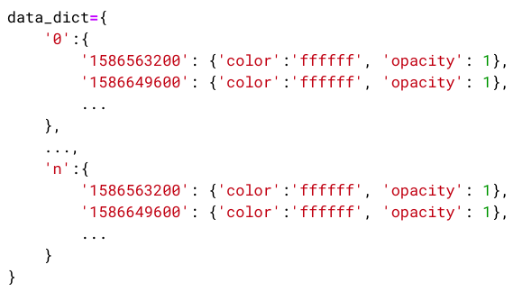
Take a look below – I have simplified the meaning of each term in the dictionary:

Now, you know that before plotting the map, we need to convert our data to this format. So, let’s start pre-processing the data.
First, we’ll pre-process the COVID-19 dataset and then we’ll move to the GeoJSON. Let’s start by checking if our dataset contains any null values:

Great! We do not have any null values in our dataset. Next, let’s take a look at the data type of columns in this dataset:

Everything seems to be correct but the ‘Date’ column is of type object. Let’s convert it to DateTime. One more thing – the dates mentioned in the dataset are the dates on which the information was updated (not the dates on which data was collected). Therefore, we’ll shift all the dates one day back:
The column containing the name of states and UTs is very important for plotting so let’s take a look at the contents of the ‘Name of State / UT’ column:

There are a few things wrong in the name of the states and UTs. First, the Union Territory of Ladakh and Ladakh are both present in the dataset, but in reality, both are the same. Similar is the case with Jammu and Kashmir and Chandigarh. Second, the spelling of Telangana is incorrect. Also, the name of Dadar and Nagar Haveli is wrong. Let’s correct these mistakes:
Here, I have used lambda functions and regular expressions to correct the names of states & UTs. If you want to learn more about lambda functions and regular expressions, you can read the below articles:
- What are Lambda Functions? A Quick Guide to Lambda Functions in Python
- Beginners Tutorial for Regular Expressions in Python
As we saw earlier, we must transform our data into a specific format. For that, we have to create an area-name-indexed dictionary. But I have found that TimeSliderChoropleth does not work well with area name indexes containing whitespaces. Therefore, I have prepared a dictionary to label the states and UTs. I will use this dictionary and map the ‘Name of State / UT’ column to a number:
In this project, we are visualizing the change in COVID-19 cases in different states and UTs of India. Therefore, the number of active cases is a better measure for this purpose. We can calculate the number of active cases in a state or UT on a particular day by subtracting the number of dead and recovered patients from the total number of confirmed cases:

Now, let’s assign a color to each day of every state and UTs based on the total number of active cases. For this, I’ll divide the range between minimum and maximum active cases into 10 equal parts and assign each part a color:

In this project, Geospatial Analysis using Folium, I am using the red color for marking the states with active COVID-19 cases and green color for those states and UTs which previously had active COVID-19 cases but do not have any on that particular day. Keep in mind the red color becomes darker with the increasing number of active COVID-19 cases:
We require only three columns of the dataset for further analysis. Therefore, I am dropping other columns and considering only Date, state_id and color column:

Now, we have successfully color-coded all the states and UTs. But, you have missed something here. Can you guess it?
If you have read the previous sections carefully, then you know that our dataset contains data only about the states and UTs that have the COVID-19 cases. It does not include the information about states and UTs which never had any cases of COVID-19.
We can add this information by finding the set difference between the set of states having COVID-19 cases on a particular date and the set of total states. We’ll represent states and UTs without any previous cases of COVID-19 cases using blue color:

I mentioned earlier that TimeSliderChoropleth takes time in milliseconds and also takes the whole dataset in the form of an area name indexed dictionary. That’s what we’ll do next:
Let’s take a look at the dictionary for a state:

Finally, we have successfully pre-processed the COVID-19 virus dataset. Now, it is time to pre-process the GeoJSON. We don’t have to do much here. Similar to what we did with the previous dataset, we just need to label encode the column containing states and UTs names:

Hurray! We have pre-processed both the datasets. Now, let’s move to the next section and plot these datasets and see the results.
Plotting changes in COVID-19 cases in India using TimeSliderChoropleth plugin
Your wait is finally over! The process of plotting a map using this plugin is very easy and requires only three steps:
- Import the plugin
- Create a base map
- Add the plugin to map
So, let’s import the TimeSliderChoropleth plugin. You can read more about it here.
Now, let’s create a basemap of India. I have used CartoDB positron tileset here because it a very clean tileset and the colors of states and UTs will be in contrast to it:
Let’s add our plugin to the map and see the results:

We can clearly see that as of 2nd June 2020, Lakshadweep and Daman and Diu never had any cases of COVID-19. There is also some good news from Andaman and Nicobar Islands. Earlier they had few cases of COVID-19 but there are no more new cases and now it is clean.
But don’t start celebrating yet. Conditions in all other states and UTs have deteriorated over time. Especially in states like Maharashtra, Tamil Nadu and Delhi, conditions have become worse. These are the major hotspots of COVID-19 in India with the highest number of COVID-19 cases. Rajasthan, Madhya Pradesh, Uttar Pradesh, and Gujarat will join Delhi and Maharashtra in the upcoming days if the trend continues.
Great! You completed the first project of this article. Now, let’s move on to our second project where we’ll visualize bus traffic in New York City using Folium.
Folium Project #2: Visualizing Bus Traffic in New York City
In today’s world, the human population is increasing day by day and with this increasing population, the number of vehicles is also growing. This rise in the number of vehicles on the road has created many new challenges for governments worldwide.
Let’s just talk about New York here. New York City is one of the world’s leading metropolises for art, fashion, food, and theater. It is situated on one of the world’s largest natural harbors. New York City comprises five boroughs – Brooklyn, Queens, Manhattan, the Bronx, and Staten Island, each of which is a county of the State of New York. But it is the most densely populated major city in the United States.

Due to its high population, it has become the third most congested city in the world in terms of traffic and the second-worst in the United States. Road accidents have shot up in the past few years, and travel time has increased drastically.
Therefore, it becomes important for the government and road planning authorities to do the analysis of traffic on roads. In this project, we’ll visualize the traffic in New York due to buses using Folium.
Understanding the Problem Statement
Before moving further, let’s first understand our problem statement:
Problem Statement: “To visualize the traffic due to buses in New York City throughout the day.”
It is a very important analysis of road traffic. This Geospatial Analysis using Folium will help us identify areas of high and low traffic at different times. It will also help us understand the flow of traffic on public transport in New York City. Government and road planning authorities can use the results of this visualization to make better decisions and improve the structure of roads.
Understanding the Data
For this project, I’m leveraging Python Folium with the New York City Bus Data sourced here. The dataset provides bus locations every 10 minutes, alongside departure and arrival times, next stops, and time to destination. Recorded between June and September 2017, it offers latitude and longitude details.
Let’s take a look at our dataset for Geospatial Analysis using Folium:

This is the dataset for June 2017 only. It contains 17 columns and more than 6.7 million rows. We’ll use this dataset for our analysis but first, we need to pre-process what we have.
Pre-processing the Dataset
In this project, Geospatial Analysis using Folium, we’ll visualize the change in road traffic conditions in New York City due to buses throughout the day. We can do this using a heatmap. Heatmaps are a great tool for visualizing the density of a quantity in an area through the change in intensity of a color. But we want to visualize the traffic over time.
Do you know how can we do this?
We can do this by using the HeatMapWithTime plugin of Folium Python. It is a great plugin that helps in creating heatmaps for a period of time. It creates an animation of heatmaps that we can pause, play, loop and also play at different speeds. So, let’s pre-process our data.
Here, we’ll only take data for one day of the month – 1 June 2017. We are doing this because we want to visualize the traffic throughout a day not throughout a month:

Our dataset contains 17 columns and more than 0.24 million rows. Also for plotting heatmaps, we only need information such as data recording time, latitude, and longitude of buses and vehicle reference numbers for selecting a vehicle. Therefore, I am dropping other columns of the dataset:

Now, let’s check if our dataset contains any redundant rows because it can affect the results of our analysis:

We can see that our dataset contains many redundant rows. So let’s drop these duplicate rows and keep only the first one:
Next, let’s check if there are any null values present in our dataset:

Great! We do not have any null values. Now, let’s add another column to our dataset containing the hour because we want to generate a heatmap for every hour.

There is a problem here – not all buses have their locations recorded at the same point in time. We can tackle this problem by taking the last recorded position of every bus in an hour. For this, we can first find the last location recorded time of a bus in an hour, and then we can find the latitudes and longitudes for these timestamps. So, let’s find the last recorded time for every bus in an hour:

We have the last recorded time for every bus in an hour. Let’s find the location of buses for these timestamps. We can do this by joining df2 and df together on hour, VehicleRef and RecordedAtTime columns.
If you want to know more about joining dataframes in Pandas, you can read this article: Joins in Pandas: Master the Different Types of Joins in Python.

There is just one more thing left to do before we move onto the next section. The HeatMapWithTime plugin takes the data in a specific format. It takes the latitudes and longitudes in the form of nested arrays:

Let’s convert the position of buses into this format:
Hurray! We have successfully pre-processed our dataset. Now, it is time to move to the next section of the tutorial where we’ll visualize the bus traffic in New York City.
Visualizing Bus Traffic through the HeatMapWithTime Plugin
Finally, we have arrived at the much-awaited section of the project. In this, we’ll visualize the bus traffic in New York City. Similar to COVID-19 project’s TimeSliderChoropleth plugin, plotting through HeatMapWithTime is a three-step process:
- Import the plugin
- Create a base map
- Add the plugin to map
So, let’s import the plugin and create our base map:
Here, I haven’t mentioned the tileset therefore, it will be OpenStreetMap. Now, let’s add our plugin to this Folium map:

We can see that after 10:00 PM, the traffic starts to reduce in New York City but the city again becomes crowded at 8:00 AM. Also, the buses run 24/7. Manhattan is the most crowded borough of New York followed by Brooklyn. Staten Island is the borough with the least traffic in New York.
You can always save your maps by using the save() function:
Congratulations! You have completed your second project and are mastering Folium.
Conclusion
Folium in Python is a handy tool for making interactive maps. It’s great for showing data visually. From marking spots to drawing paths, Folium makes it easy. Whether you’re tracking COVID-19 hotspots or bus traffic, Folium maps help understand information better.
You are now familiar with the concepts of Folium. You can leverage its power to create beautiful maps. Start by adding a legend to the COVID-19 TimeSliderChoropleth map, and then proceed from there.
Frequently Asked Questions
Q1. What is folium used for?
A. Folium is a Python library for visualizing geospatial data. It creates interactive maps with features such as markers, polygons, and overlays, allowing users to render data on various map tiles like OpenStreetMap and Mapbox.
Q2. Does Folium need Internet?
A. Folium does not inherently require an internet connection if local map tiles are available. However, it typically fetches map tiles from online sources like OpenStreetMap or Mapbox, so an internet connection is usually needed for complete functionality.
Q3. For what is folium primarily used?
A. Folium is primarily used for creating interactive maps and visualizing geospatial data in web-based applications. It integrates with Python data analysis tools, enabling users to display geographic information with various interactive elements like markers, pop-ups, and overlays.
Abhishek Sharma
26 Jun, 2024
He is a data science aficionado, who loves diving into data and generating insights from it. He is always ready for making machines to learn through code and writing technical blogs. His areas of interest include Machine Learning and Natural Language Processing still open for something new and exciting.


Hi Abhishek, Very nice technical blog. I'm getting an error with your code Covid problem. g = TimeSliderChoropleth( Indian_States.set_index('state_id').to_json(), styledict=covid_dict ).add_to(m6) m6 TypeError: '<' not supported between instances of 'float' and 'str'
Hi, Ashwini. Thank you for your appreciation. The code is working fine. You should recheck your code. Also, The COVID-19 dataset is regularly updated. So there are chances that they may have changed something in the new version. You'll need to check for the null values if they are getting generated at any stage of the process.
Hey! did you resolved the issue? I am getting the same error
I am following your Guide to Getting Started with Geospatial Analysis using Folium; nice job But in custom markers ( for m4), I am trying to replicate in my own environment, and cannot find the source file named "av.png" nor can I find the code to create this in your tutorial. Perhaps it is using the Icon() or CustomIcon() methods? Any suggestions?
Hi James, "av.png" is the path of the logo. You can use any image here.
Hi, when I try running folium-tutorial-26.py, I get the following error: ----> 2 df_covid['Date']=(df_covid['Date'].astype(int)// 10**9).astype('U10') ... cannot astype a datetimelike from [datetime64[ns]] to [int32] All prior py steps in the tutorial worked OK and compared to output examples in the tutorial. I made sure to rerun all cells in the notebook. Am running Python 3.7 in latest Anaconda distribution, and with manually installed geopandas binaries (with dependent binaries also). any suggestions?
Hi, I was struggling against this a lot and found a way. Replace "astype(int)" for astype(np.int64). Hope it helps you, it worked for me.
I got folium-tutorial-26.py to work by using this df_covid[‘Date’]=(df_covid[‘Date’].astype(np.int64)// 10**9).astype(‘U10’) i.e. replaced type "int" with "np.int64". Results seem to look ok to my eye.
good day sir, the explanations are very clear, i really enjoyed the lessons. i am having trouble getting geopandas installed on my machine. expecially gdal and fiona. how do i go about it sir.
Hey there, Nice work on the India COVID-19 map. Is there a way to sync in the data such that it can get automatically updated with the source file that you have provided in the link?
Hi Abhishek, first of all thanks for this excellent walk through! I have a question that might not be directly related, but still: I am trying to create a web map and upload several GeoJSON files. I have a file of state boundaries (polygons), and roads (lines). I want the user to be able to select a state, and then see all the roads ONLY within that state. Is that possible with folium? If not, is there more appropriate library to do such thing? Thanks!
Hi Abhishek, first of all thanks for this excellent walk through! I have a question that might not be directly related, but still: I am trying to create a web map and upload several GeoJSON files. I have a file of state boundaries (polygons), and roads (lines). I want the user to be able to select a state, and then see all the roads ONLY within that state. Is that possible with folium? If not, is there more appropriate library to do such thing? Thanks!
Hi , Can we also find some points of interest through folium. For example if I plot some points on the Delhi Map , can I find out the nearby petrol pumps to that specific point. Is something like this possible in folium??
I would love to know how the route data arrays of latitude and longitude were generated for the data used in "Plotting Paths using Folium". Thanks in advance.
hello abhishek nice stuff, i have a problem in my code , i want interconnect the location of a particular vehicle so how can i do it ?
Thanks a lot. After many attempts to understand folium, I found this remarkable explanation. Best regards
Hello Abhishek, thanks for the tuto. It is well explained. Unfortunately, while trying to use it, I got an error on folium-tutorial-31.py. - OverflowError: Maximum recursion level reached when it comes to india_geojson.set_index('state_id').to_json() - I went through Google but got nothing useful. Do you have any idea about how I can fix this, please ?
Hi Abhishek, I'm wondering if you know if there are tile that can be used that show climate zones? Like the Koppen-Geiger classifications? Thanks
Hi, How can I calculate the shortest distance from each marker to selected hubs and assign points to the nearest hub in folium? Foreaxple if I have point on the map for crime locations i need to assign each to the nearest police station?
Hi Abhishek, thank you for putting this together. I have a similar choropleth map working, but I'm trying to figure out if you can add a tooltip to the polygons that update as you move the slider across the screen. Do you know if this is possible? It doesn't look like the TimeSliderChoropleth module has a 'tooltip' argument, but I'm wondering if you can 'add_child' or something similar to be able to see the values for each polygon for each time period. Thank you.
Hi, what changes must be done if I need to see one continent only once in my map
Hi Abhishek, Thank you for sharing that. As far as you know, Is It possibile ti create and interactive Bubbles Map with circles, where te radius of every circle varies Reading radius of every circle from a dataset? I tried with TimestampedGeoJson tò create a time slidere but i cannot manage dimensione of circles