Introduction
There are almost 100 python packages being created each day. On PyPI, at the time of writing this article, there are 254,216 projects. So how do you know which packages are most useful? This article hopes to address that issue, by presenting 7 awesome python packages, example use cases, and example code.
This list is mostly geared towards data science, with an emphasis on python packages that make cool projects easy to do.

Slacker — easy to use Slack API
I love Slack’s easy to use API. Slack makes it super easy to make automated bots, to increase the productivity of your team. Simply, we can use Slack bots to send alerts, such as algorithm performance over time. More complex apps can be made that take inputs from a user via a modal which can trigger a job.
The Slacker package can be found here, and a great example of complex apps can be found on Glitch.
Example — using Slacker to send alerts and files
Slacker is super simple to use and combined with automation, can be very useful. Let’s say you want to use it to connect to SQL every morning to get a daily sales snapshot and send a graph to a channel:
from slacker import Slacker
import matplotlib.pyplot as plt
import tempfile
from pathlib import Path# input slack credentials
slack = Slacker('<your-slack-api-token-goes-here>')# plot graph of sales by day
fig = plt.figure(figsize=(15,10))plt.plot(y=orders_df['sales'],
             x=orders_df['date'],
             color = '#2ae8bf',
             linewidth = 2,
             label='Total Orders by day',
             alpha=0.2)

# use a temporary directory to send the graph to slack
with tempfile.TemporaryDirectory() as td:
    local_path = Path(td, f"output graph {psku}.png")
    plt.savefig(local_path, pad_inches=1)
            # send graph to slack
    slack.files.upload(file=local_path.as_posix(),
                    title='Daily Sales',
                    initial_comment='Sales by day')
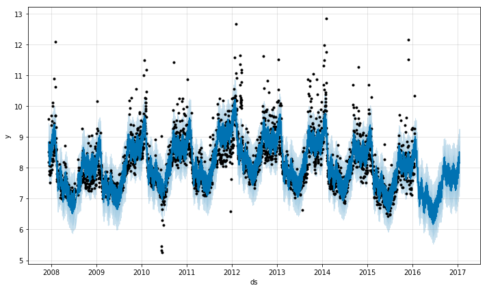
Prophet — Simple Time Series Forecasting
While there are definitely more complex time series forecasting methods, such as using LSTM Neural Networks, a great place to start when first beginning a time series forecasting project is with Facebook’s open-source package called Prophet.
Prophet is a procedure for forecasting time series data. It is based on an additive model where non-linear trends are fit with yearly, weekly, and daily seasonality, plus holiday effects. It works best with time series that have strong seasonal effects and several seasons of historical data. Prophet is robust to missing data and shifts in the trend, and typically handles outliers well.
Prophet makes it easy to generate forecasts using time-series data. In our last example, we sent a graph to Slack with daily sales updates. In this example, we’ll use Prophet to forecast sales over the next year.
Using Prophet to forecast Sales
import pandas as pd
from fbprophet import Prophet# the first thing we need to do is change the column names such that the "date" variable is "ds" and the sales variable is "y"orders_df = orders_df.rename(columns={'date':'ds',
                                      'sales':'y'})# fit the model by instantiating a new Prophet object
m = Prophet()
m.fit(orders_df)# when then need to create a future dataframe, that is just the date variable for the number of days we want to forecast into the future (in this case, 365 days)future_df = m.make_future_dataframe(periods=365)# use the predict call to make a prediction! This returns a dataframe that includes the prediction, as well as lower and upper bounds.forecast_df = m.predict(future_df)# you can plot the forecast:
forecast_plot = m.plot(forecast_df)# you can also plot the individual components
m.plot_components(forecast_df)
Spotipy — Access Rich Spotify Data
If you love listening to music, you should try it using the Spotipy package. With Spotipy you get full access to all of the music data provided by the Spotify API.
An amazing example project that uses Spotipy is What’s Spinning. This project uses the Spotify API to send customized emails to subscribers based on the playlists they follow — introducing them to new artists and artwork that they may like. The Spotify API helps to get playlist songs, album artwork, genres, and artist information to generate highly customized newsletters.
The Spotipy library makes it simple to access Spotify data. In this example from Spotipy, we retrieve audio samples and cover art of the top 10 songs by Travis Scott:
import spotipy
from spotipy.oauth2 import SpotifyClientCredentials

artist_uri = 'spotify:artist:36QJpDe2go2KgaRleHCDTp'

spotify = spotipy.Spotify(client_credentials_manager=SpotifyClientCredentials())
results = spotify.artist_top_tracks(artist_uri)

for track in results['tracks'][:10]:
    print('track    : ' + track['name'])
    print('audio    : ' + track['preview_url'])
    print('cover art: ' + track['album']['images'][0]['url'])
    print()
Results:
track    : TKN (feat. Travis Scott)
audio    : https://p.scdn.co/mp3-preview/3b011ea2f3a0b6faf549e21faf6d5ca5aa6f74fc?cid=94579f8ccd0a49feb4904ccee6acfcf3
cover art: https://i.scdn.co/image/ab67616d0000b2732a3d01289b78099e4508ba0e

track    : THE SCOTTS
audio    : https://p.scdn.co/mp3-preview/36bf1375c8d3f3925556744935f234b5e060e0cc?cid=94579f8ccd0a49feb4904ccee6acfcf3
cover art: https://i.scdn.co/image/ab67616d0000b27311d6f8c713ef93a9bb64ddfe

track    : goosebumps
audio    : https://p.scdn.co/mp3-preview/d6d1ec9bfc82463707878d5e36d15e7b8a364069?cid=94579f8ccd0a49feb4904ccee6acfcf3
cover art: https://i.scdn.co/image/ab67616d0000b273f54b99bf27cda88f4a7403ce

track    : HIGHEST IN THE ROOM
audio    : https://p.scdn.co/mp3-preview/d9b90990dab9d8376d05c5d4a6b7ac3e99c03763?cid=94579f8ccd0a49feb4904ccee6acfcf3
cover art: https://i.scdn.co/image/ab67616d0000b273e42b5fea4ac4c3d6328b622b

track    : SICKO MODE
audio    : https://p.scdn.co/mp3-preview/1c3c01c64477b356e28a652b6447f4ef96689a71?cid=94579f8ccd0a49feb4904ccee6acfcf3
cover art: https://i.scdn.co/image/ab67616d0000b273072e9faef2ef7b6db63834a3

track    : OUT WEST (feat. Young Thug)
audio    : https://p.scdn.co/mp3-preview/e27985662ccbc644b64f49042d3d2b73b0bfc4e4?cid=94579f8ccd0a49feb4904ccee6acfcf3
cover art: https://i.scdn.co/image/ab67616d0000b273dfc2f59568272de50a257f2f

track    : BUTTERFLY EFFECT
audio    : https://p.scdn.co/mp3-preview/ca4f131887eae894020e48ea809af1186c95f542?cid=94579f8ccd0a49feb4904ccee6acfcf3
cover art: https://i.scdn.co/image/ab67616d0000b273072e9faef2ef7b6db63834a3

track    : STARGAZING
audio    : https://p.scdn.co/mp3-preview/d2d23f9ea674dffde91d99783732b092655ccaf6?cid=94579f8ccd0a49feb4904ccee6acfcf3
cover art: https://i.scdn.co/image/ab67616d0000b273072e9faef2ef7b6db63834a3

track    : CAN'T SAY
audio    : https://p.scdn.co/mp3-preview/5cf7091a2bbb9811838dcba614b8dd4b57a17447?cid=94579f8ccd0a49feb4904ccee6acfcf3
cover art: https://i.scdn.co/image/ab67616d0000b273072e9faef2ef7b6db63834a3

track    : YOSEMITE
audio    : https://p.scdn.co/mp3-preview/93e6cdc0f8d46ff0d4dc1b9325f4a064ba32c5c8?cid=94579f8ccd0a49feb4904ccee6acfcf3
cover art: https://i.scdn.co/image/ab67616d0000b273072e9faef2ef7b6db63834a3
There are tons of cool additional use cases of the Spotify API on their developer page.
Textpack — group similar text
This one may seem out of place — but it is SO useful. Textpack allows you to group similar text-based values in a column and is fast, accurate, and highly customizable.
Example Use Case
Textpack is really neat. Under the hood, it uses cosine similarity and fast matrix multiplication to calculate the similarity between text documents.
We use Textpack to group similar news articles together and calculate their similarity. For example, we use this to decide which content to serve to users, and limit duplicate topics:
from textpack import tp# Instantiate textpack and group find the similarity between the column "article_text" from news_data:tp_init = tp.TextPack(df=news_data,
                      columns_to_group=['article_text'],
                      match_threshold=0.6,
                      ngram_remove=r'[,-./]',
                      ngram_length=2)# run the analyzer
tp_init.run()# get the similarity dataframe
similarity_df = tp_init.df
VADER — easy and customizable sentiment analysis
VADER is an awesome sentiment analysis tool, specifically tuned for social media slang. It’s also really good at detecting tricky sentence sentiment, like negations (“Learning python is neither boring nor hard”) or emphasis (“I LOVE python!!”).
VADER Sentiment Analysis. VADER (Valence Aware Dictionary and sEntiment Reasoner) is a lexicon and rule-based sentiment analysis tool that is specifically attuned to sentiments expressed in social media, and works well on texts from other domains.
Since we tune VADER for social media analysis, a great idea would be to use it to analyze the sentiment of tweets from Twitter. We can see that right out of the box in just a few lines of code, VADER outputs really accurate sentiment scores:
from vaderSentiment.vaderSentiment import SentimentIntensityAnalyzer# example tweets
sentences = ["Learning python is neither boring nor hard",
            "I LOVE python!!",
            "I wear grey shirts.",
            "I really hate sitting in traffic!"]analyzer = SentimentIntensityAnalyzer()
for sentence in sentences:
    vs = analyzer.polarity_scores(sentence)
    print("{:-<65} {}".format(sentence, str(vs)))
Output:
Learning python is neither boring nor hard----------------------- {'neg': 0.149, 'neu': 0.611, 'pos': 0.24, 'compound': 0.1884}
I LOVE python!!-------------------------------------------------- {'neg': 0.0, 'neu': 0.266, 'pos': 0.734, 'compound': 0.7592}
I wear grey shirts.---------------------------------------------- {'neg': 0.0, 'neu': 0.714, 'pos': 0.286, 'compound': 0.0516}
I really hate sitting in traffic!-------------------------------- {'neg': 0.461, 'neu': 0.539, 'pos': 0.0, 'compound': -0.6468}
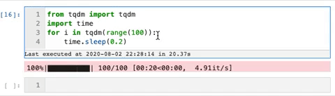
TQDM — smart progress bars
We use the tqdm package to make loops show a smart progress bar. All you need to do is wrap any iterable with tqdm(iterable), and the progress bar will display!
This package can really help visualize how long a for-loop will take.
Here is an example gif from the tqdm GitHub that shows the progress bars:
Streamlit — instantly build data apps
Streamlit is simply incredible — it really deserves an article of its own. If you have never tried it out, I highly recommend it. It makes building beautiful data web-apps and dashboards extremely easy.
With streamlit, you can build something simple like a graph or map, or take it to the next level with real-time self-driving car image recognition.
Check out Streamlit’s awesome website for example.
That’s All for Now
Thanks for reading! To learn more about python and python packages, try building an image displaying app using jupyter widgets or pick up my favorite book on ML and Deep Learning.
About the Author

Spencer Nelson – Data Scientist (TechStyle Fashion Group )
Spencer is currently a data scientist at TechStyle Fashion Group in Los Angeles, California. He is an expert at media attribution modeling, recommendation algorithms, python, and e-commerce. He graduated from UCLA with a Statistics degree and also has a huge passion for music. When he isn’t working his data science job or writing blog posts, he works on his side project, What’s Spinning (https://whats-spinning.life), which is a unique approach to music discovery and newsletters using AI.


