This article was published as a part of the Data Science Blogathon.
Introduction
In this project, we made an attempt to evaluate the education system of India and categorize states based on parameters of evaluation.
India is a huge country with numerous states so different states will have different issues. So a common solution cannot solve all the problems here so categorizing states and looking at the problems of each category separately can bring a huge improvement in the education system.
Note: This blog only contains explanation. The detailed notebook with well-explained code is given as link at the end of the blog. I didn't put codes here so that readers can grasp the concept well first and then see the code.
We will use a clustering approach to categorize/cluster states based on 7 education related parameters :
- Percentage of Schools with Drinking Water Facility
- Gross Enrolment Ratio
- Drop-out rate
- Percentage of Schools with Computers
- Percentage of Schools with Electricity
- Schools with Boys Toilet
- Schools with Girls Toilet
DataSet
The dataset is collected from this link.
The dataset for each of the above parameters contained data for every state of India for 3 years 2013-14 to 2015-16. We took the latest data (2015-16) for our analysis. If there are missing values for some state then we take the values from previous year(2014-15 or 2013-14). If all the values are missing for that particular state then we impute it with the mean value of all states for that particular parameter/column. So in this way after selecting recent data and imputing missing values we come up with a new CSV file d_c__.csv which we will use for clustering.
Clustering is the technique of grouping related data together.
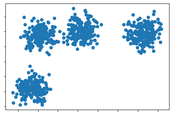
In the above fig, we can see that there are 4 clusters. So each cluster is referred to as each of the 4 blobs formed by the concentration of the blue dots together.
Procedure
-
Analyzing the Dataset
First, let’s look at the dataset we will be working with.
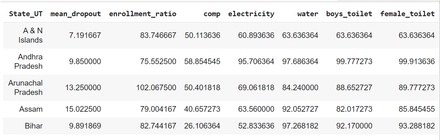
Here all the features/parameter names are self-explanatory except ‘comp‘ which means Percentage of Schools with Computers.
Now let’s look at the summary statistics of this dataset.
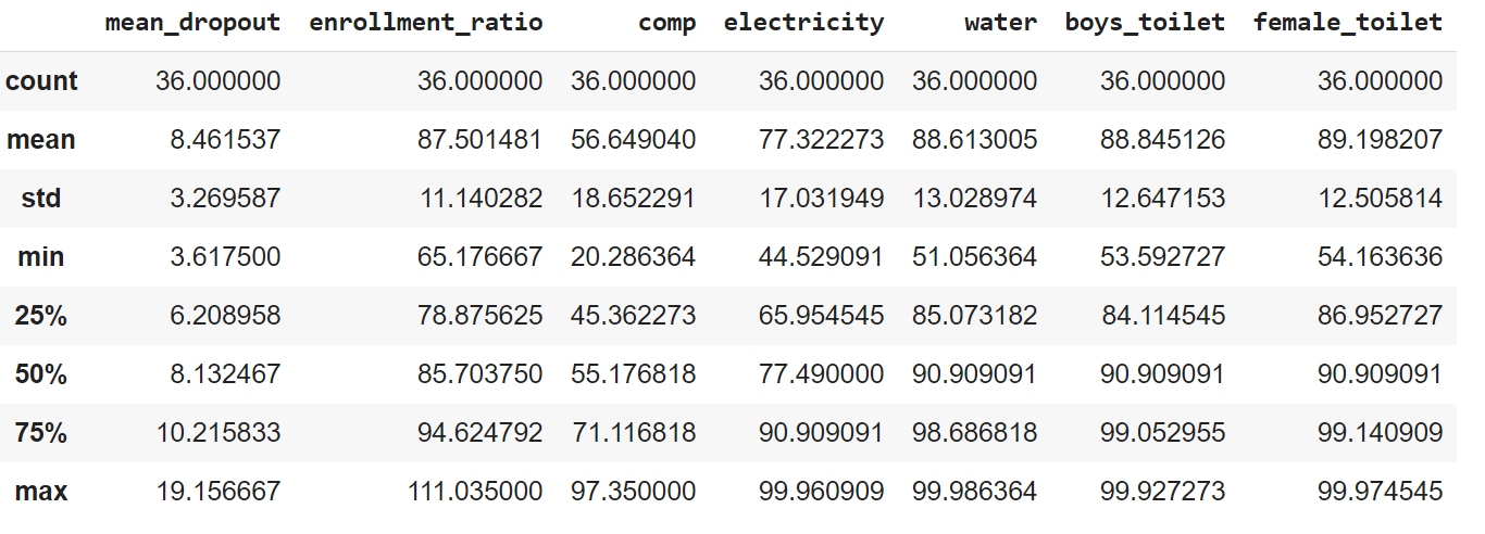 We can see that we have data for 36 States and Union Territories of India. The range of mean_dropout feature is from 3.7-19.5 whereas others are above 40-100(enrollment-ratio even crosses 100). Also, the mean values of some of them significantly different from others. This varying range of data among features may bias the result towards higher-ranged parameters in the case of clustering algorithms which uses Euclidean Distance to calculate the distance between points. So we will first normalize them all between 0 & 1 using MinMaxScaling().
-
Finding Optimal Cluster Number
After normalizing our dataset, we will use KMeans Clustering to group/cluster similar education data. K-Means Algorithm works by grouping together two data points that have the least Euclidean Distance.
We don’t know the number of clusters beforehand. We will determine it in the case of the KMeans Clustering algorithm using Elbow Method. This is called Elbow Method because we will choose the cluster at that point of the graph from where it stops falling steeply(just like an elbow of hand). It is the point where the WCSS(Within Cluster Sum of Squares) decreases very slowly.
WCSS is the distance between points in a cluster.
.png)
From the above plot, we can see 2 or 3 could be the ideal number of clusters.
To choose specifically among 2 and 3, the ideal number of clusters we will use some metrics as discussed below:
- Silhouette Score- It ranges from -1 to 1. The higher the value better our clusters are. Closer to 1 means perfect clusters. 0 means the point lies at the border of its cluster. A negative value means that the point is classified into the wrong cluster.
- Calinski-Harabasz Index denotes how the data points are spread within a cluster. The higher the score, the denser is the cluster thus the cluster is better. It starts at 0 and has no upper limit.
- Davies Boulden Index measures the average similarity between cluster using the ratio of the distance between a cluster and its closest point & the average distance between each data point of a cluster and its cluster center. The closer the score is to 0, the better our clusters areas it indicates clusters are well separated.
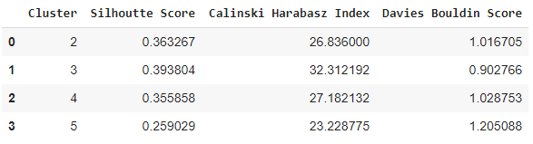
Let’s check the values of these metrics to find out the ideal number of the cluster for our KMeans algorithm on the scaled data. We already concluded before that 2 or 3 would be the ideal number of clusters but we will also test with 4 or 5 just for the purpose of demonstration.
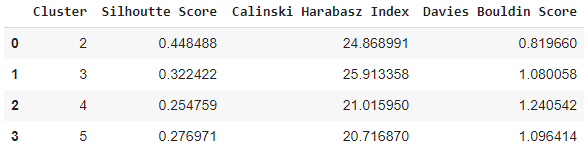
As expected from Elbow Method, 2 has the best Silhouette Score and Davies Bouldin Score, and second-best Calinski Harabasz Score. So 2 numbers of the cluster can be an ideal choice.
Though we have discussed that, we should always normalize our data to a similar range before applying a distance-based clustering algorithm, but let’s also check the metrics values using the KMeans algorithm on unnormalized data. Remember that it’s always good to perform experimentation for better understanding and results.
We can see that the best cluster number, in this case, is 3. But both the Silhouette Score and Davies Bouldin Score deteriorated than 2-clusters we evaluated before though Calinski Harabarz score improved a bit. Overall, the model performance deteriorated a bit. So as mentioned before, normalizing data points before clustering do give good results.
Next, we will use a Hierarchical Clustering technique called Agglomerative Clustering. It is a bottom-up clustering approach where each data point is first considered as an individual cluster and then merges closest points according to a distance metric until a single cluster is obtained.
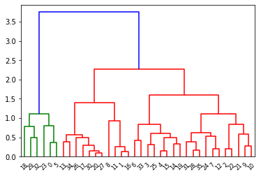
The Hierarchical Clustering can be visualized using a dendrogram as shown below. The suitable number of clusters for this data is shown as 2 in the dendrogram(red & green).
From the dendrogram we saw that the ideal number of clusters for the dataset is 2, the KMeans algorithm also found the same. We will again use Silhouette Score, Calinski Harabarz Index, and Davis Bouldin Score to validate this.
Different Types of Linkage(the metric/criteria to merge two clusters to form a bigger cluster) Functions:
- Single Cluster: It combines clusters by taking into account the closest(minimum) points between two clusters. min( Dist-a – Dist-b). Cluster pairs having minimum distance between pair of points distance gets merged.
- Complete Cluster: cluster-based on the farthest(maximum) distance between a pair of points between two clusters. Cluster pairs having maximum distance between pair of points distance gets merged. max(Dist-a – Dist-b)
- Ward Linkage: Finds the minimum squared distance between a pair of points between two clusters. Cluster pairs having the lowest squared distance between pair of points distance get merged.
- Average Linkage: Merges clusters based on the average distance of all points in one cluster from the points in other clusters. Cluster pairs having the lowest average distance get merged.
Performing Agglomerative Clustering on normalized data:
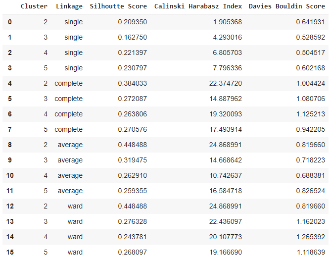
As observed from the output table, the ideal number of clusters is indeed 2 with linkage methods ‘average‘ or ‘ward‘.
Now let’s use Agglomerative Clustering(ward linkage) for unnormalized data and check how it performs.
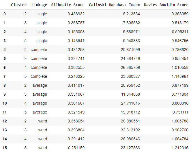
In the case of an unnormalized dataset, 2 clusters with complete linkage are the best. But in the case of a normalized dataset, the performance is better. There the Silhouette Score and Calinski Harabarz Score performance are better though the Davies Bouldin score performance is a bit lower.
2 Clusters for both algorithms KMeans and Agglomerative on normalized datasets have the same performance. Let’s see how the values for each feature/parameter vary across the two clusters for both the algorithms.
-
Checking Distribution of Values of Parameters across Each Cluster
The cluster division for each feature/parameter for the KMeans algorithm:
https://colab.research.google.com/drive/1dv4ezgfaIg8vPCdLtdoK0FtHuYnjiFw1#scrollTo=O2IlTbyHc1oM&line=1&uniqifier=1 <- If this image is unclear, click here to see the real one.

The cluster division for each feature/parameter for Agglomerative Clustering Algorithm:
https://colab.research.google.com/drive/1dv4ezgfaIg8vPCdLtdoK0FtHuYnjiFw1#scrollTo=pon-1LEBCQ9Y&line=1&uniqifier=1 <- If this image is unclear, click here to see the real one.
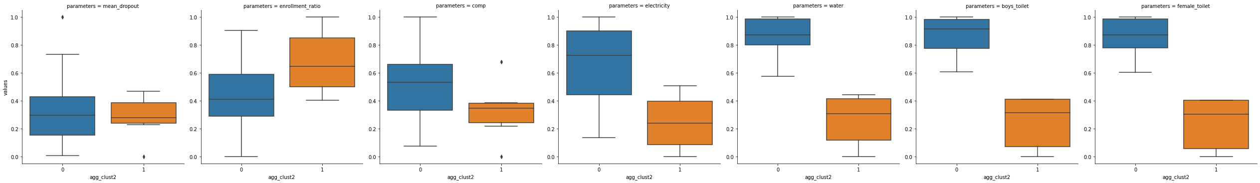
We see that both the KMeans and Agglomerative Clustering have the value range of each of the feature/category across clusters exactly the same.
Based on careful observations of the boxplots we can conclude that category-0/cluster-0 has higher values for comp, electricity, water, and the features of the toilet. So we can say the states falling in cluster-0 has much better infrastructure than schools of cluster-1. On the other hand, the dropout rate is almost the same for both groups with cluster-0 has higher variability. While the enrollment ratio is good for cluster-1.
So we can call group/cluster-0 as Higher Infrastructure, Lesser Enrollment-Ratio, and group/cluster 1 as Less-Infrastructure, Better Enrollment-Ratio.
Let’s check which states fall in cluster 1 :
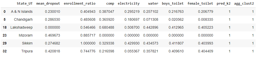
We can see states/UTs Andaman & Nicobar Islands, Chandigarh, Lakshadweep, Mizoram, Sikkim, and Tripura falls in cluster-1 i.e, they have less infrastructure in schools but better enrollment ratio than cluster-0.
-
Plotting the 2 Clusters across States on Map
Now we will use the shapefile of Indian states for plotting the clusters on the map. It is a vector map representation where places are represented as a collection of discrete objects using points, lines & polygons, multi-polygons.
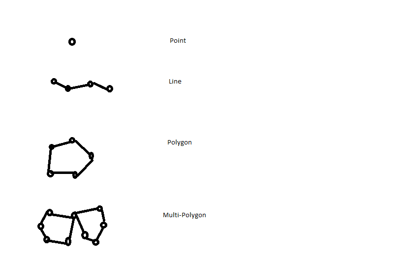
The outline of states of any country is formed by polygons or multi-polygons and each polygon/multi-polygons are made of points and lines.
We used the Geopandas library in Python to import the shapefile of Indian states into the tabular format as shown below.
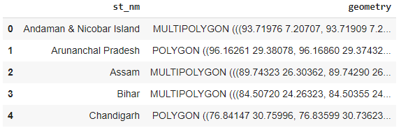
The numbers inside POLYGON or MULTIPOLYGON of ‘geometry’ column denotes coordinates(lat & long) of each point that forms the shape of the states. Now we will color the states of India according to the clusters they fall into:
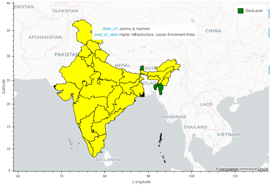
Only 6 districts got classified in one cluster and the rest 30 in others. We need finer categorization or grouping for finer analysis of schools across groups. So we will increase the number of clusters to 3. Though according to the clustering algorithm, 2 is the most valid choice of the number of clusters, we can really modify the results for the sake of our end goal if needed. The map-plot is interactive for easy visualization and interpretation.
-
Trying with 3 Clusters for Finer Grouping
Agglomerative Clustering Algorithm on Normalized Data with 3 clusters: https://colab.research.google.com/drive/1dv4ezgfaIg8vPCdLtdoK0FtHuYnjiFw1#scrollTo=NUR0U3ngX1LS&line=2&uniqifier=1 <- If this image is unclear, click here to see the real one.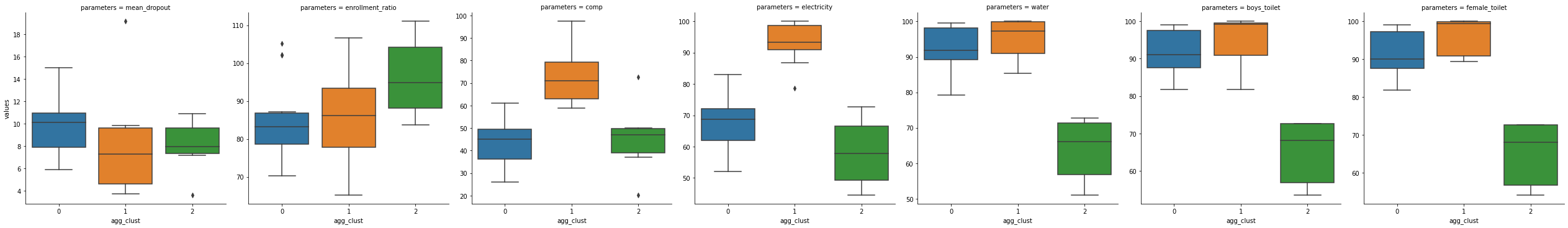
If we see the boxplots carefully we will find that in terms of infrastructure comp(computer), electricity, water, and toilets have the highest range for cluster-1(though the difference is not much great for water and the toilets), so it’s the best cluster in terms of infrastructure. Then comes cluster-0 and lastly cluster-2 has the poorest range of values for infrastructure. The enrollment ratio is highest in the case of cluster-2. Cluster-0 and 1 have almost similar enrollment ratios with cluster-1, with the latter has higher variability in its high range of values. In terms of dropout ratio, cluster-0 has a higher range of values than others.
Thus we name the clusters as:
- 0: Good Infrastructure, less enrollment ratio, high dropout
- 1: Best infrastructure, Good enrollment ratio, low dropout
- 2: Inadequate Infrastructure, Best Infrastructure Ratio, medium dropout
Note: Best > Good
High > Medium > Low
Now let’s look the same for KMeans Clustering(normalized data):
https://colab.research.google.com/drive/1dv4ezgfaIg8vPCdLtdoK0FtHuYnjiFw1#scrollTo=NUR0U3ngX1LS&line=2&uniqifier=1 <- If this image is unclear, click here to see the real one.
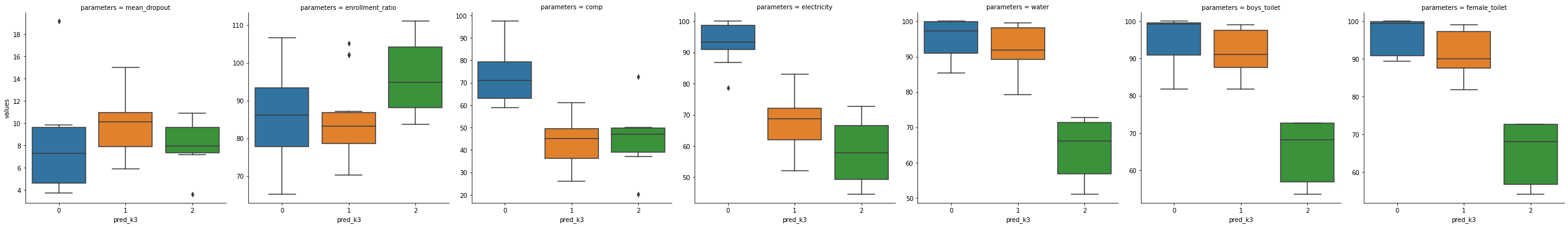
When checked carefully, we will find that the results are very similar to Agglomerative Clustering only cluster-0 in the former is represented as cluster-1 in the latter.

We can see that in cluster-0 there are 16 states, 14 states in cluster-1, and 6 states in cluster-2.
Basically cluster-0 in a 2-clustered algorithm that had 30 states is divided into cluster-0 & 1 in the ratio 16:14 in a 3-clustered algorithm.
-
Plotting the 3 Clusters across States on Map
Now let’s show the states based on these 3 clusters on the map:
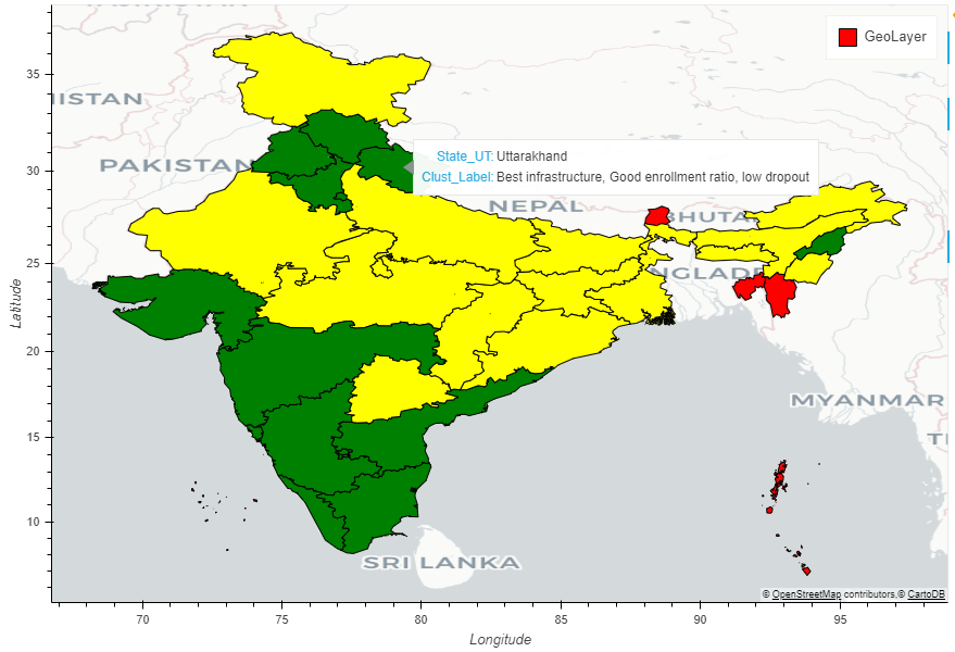
So as we can see the states are colored according to the clusters they fall into.
Conclusion
Thus we successfully grouped Indian states into various clusters. This will help the Education Department/Government to plan improvement schemes for each cluster specifically which will result in greater progress in the field of education in India.
Code Link: https://drive.google.com/drive/folders/1W1_NuTVHuscoG4abQv5oY1n5E5P7QJiQ?usp=sharing
Masters's Student at a University. My area of specialization is Data Science. Interested in doing quality research work in this field. I love to spread the knowledge I learn to the audience through blogs and articles.


well articulated, very useful for policy maker to understand the neaunhaces for the AI/ML