This article was published as a part of the Data Science Blogathon.
Introduction
Here in this article, I share five highly recommended data analyst skills, curated after interactions with experts in the field, many interviews, and some of the suggestive articles. While the article may be anecdotal, I believe it shares notable perspectives.
These tools and skillset may not have any close relation to Machine Learning and Deep Learning. Presently, there is a higher demand for skill sets that are used in pre and post modeling stages. I refrained from referring to information from job posting because in my experience there seems to be a very evident disconnect between what’s written in the job descriptions and what’s actually done on the job.
Without further delay, here are the five highly recommended skills for being a Data Analyst. You may see they overlap with the skills of a Data Scientist, Data Engineer, or for that matter Business Intelligence (BI) Developer. But not everything is disjointed in terms of present demand.
1) MS Excel

Call it a manager’s tool, MS Excel is easily an enabler of analytics amongst a group of people who may or may not belong to the core data world. Does not matter how many programming languages or visualization tools you end up learning and applying. You will majorly be required to submit the results in an Excel spreadsheet.
The ease and penetration of MS Excel cannot be contested. From providing insights to contributing to decision making mastering the right Excel functions will undoubtedly excel your productivity and enable you to communicate with a non-tech audience.
Benefits and Uses
MS Excel is probably the most well-known tool for working with data. Almost everyone knows it, and everyone has their part of love and hate with the tool. But MS Excel in Data Science, when we are surrounded by Jupyter notebooks and Big Data? Let me pen down my opinions from my experiences
a) Easy edits on data: if you notice Excel has had the same layout over years, I think that enables the user to easily edit, format, clean, and share data. Google sheets are a replication of Excel layout and design but can be easily scaled for multiple users and integrated with multiple platforms.
b) Make visualizations: with a simple press of a key, the data can be easily turned into charts. Perhaps the start of visualization I believe in most of our careers was enabled by Excel.
c) Platform for analytics: from features such as filters, slicers, and formulas to Analysis ToolPak to unleash some advanced analytics functionalities. Excel provides an easy interface to perform analysis and do reporting. ToolPak provides the feature to run a regression, correlation, ANOVA, etc.
Challenges
While Excel is an incredibly robust program, the spreadsheets although can be fragile. Since the data accuracy will also be determined to a great extent by the person entering the data. As in addition to using an incorrect formula, the data would also be prone to simple entry mistakes such as clicking the wrong cell or making a simple copy-paste error for that matter.
Also, the tool was never designed to handle the volume of data that we now deal with presently. But is the most acceptable and highly used for small surveys limiting the limit to 10,48,576 rows across 16,384 columns. Also comes in handy for ad-hoc reporting after extracting a portion of data from a larger database.
Another challenge often faced by the user using the tool is lack of error control, specifically in terms of the format. The date may come in different formats, you may see the same entered as 1-1-21, 1-01-2021 10:00, 1-Jan. Which then needs to be brought into a uniform format using functions like VALUE or DATEVALUE.
Automation, Scalability and Security are some other often talked about challenges of the tool. But needless to say, strengthening our existing skills and learning new approaches simultaneously is always an option. It may be challenging in some areas but the acceptability and comprehension cannot be contested, across practice groups and professions.
Resources – https://blog.hubspot.com/marketing/learn-excel-resources
2) SQL

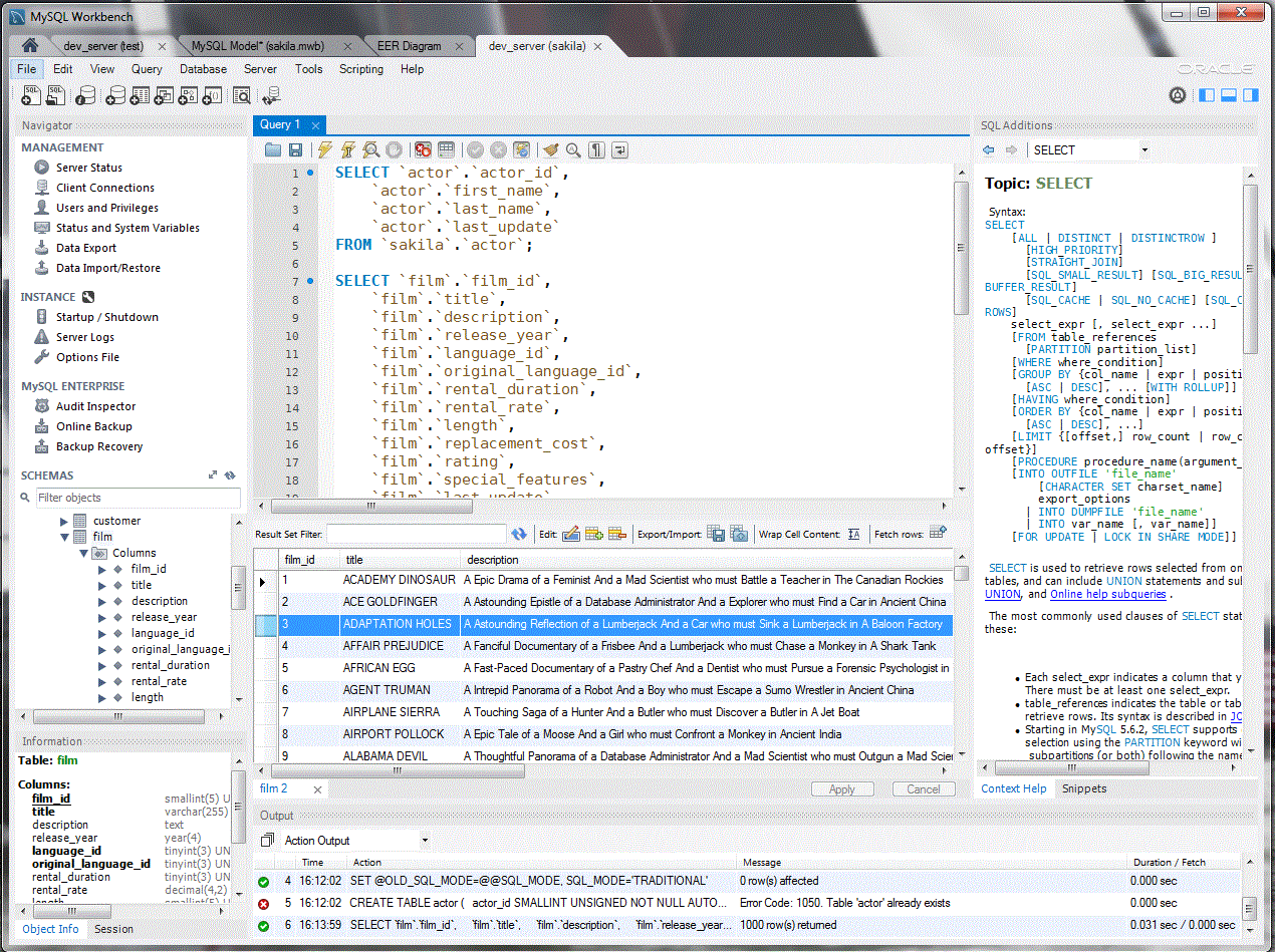
Image by mysql.com
Structured Query Language, really a cliche in the world of data. In absolute simple terms, it is used to extract data from a database, create pipelines and even for that matter manipulate data to some extent.
Doesn’t matter if you are a Data Engineer, Data Scientist, BI Developer, or Data Analyst you’ll need to be hands-on with SQL. Strong command in the language will allow you to make your analyses and especially modeling strong. The data is no more a static block rather a digital stream, hence the requirement to write optimized and efficient SQL queries is absolutely essential.
Benefits and Uses
Started in the 70s, SQL has become an indispensable tool in the data science toolkit. Since it helps in communicating with the database, it works as a gateway to accessing, inserting, and manipulating data. To talk about a few points on why SQL is needed to succeed in the data science career from my experience
a) Essential to understanding your dataset: as a professional in the data world, the first thought would be is to able to understand the dataset. What indicators, data points, etc does the dataset holds within. SQL allows the flexibility to sufficiently investigate the dataset. It enables the user to identify outliers, find NULLS, and even format the dataset to an extent.
b) Allows the user to manage huge volumes of data: thinking of data in terms of the spreadsheet, and the ability to integrate them, and making them talk to each other is doable in Excel. But as the volume of data increases, so increases the complexity. This is when SQL provides a solution, allowing the user to work on pools of data in relational databases.
c) It really is a gateway to the Data world: for most data science, data analysis jobs proficiency in SQL is a prerequisite. Think of it in a way, if one does not know the language to communicate with data, it questions sustainability. SQL can very easily be integrated with many database management systems like Oracle database, MySQL and as a matter forms the basis of large data lake platforms such as AWS Redshift. Therefore, SQL will provide one with the ability to be sought-after and useful in organizations that need data analysts or scientists. Since SQL is here to stay.
Basic commands in SQL
a) SELECT: it determines which columns of data to show in the results, accompanied by FROM statement to determine the table,
example
SELECT column1, column2, ...

FROM table_name;
b) CREATE: it allows one to create a database or a table. Often followed by the columns and formats that will form the structure of the database or the table,
example
CREATE table_name (column1 datatype, column2 datatype, ...) ;
c) WHERE: it limits the number of rows to be returned in a query
example

SELECT column1

FROM table_name

WHERE (column1 = x or column1 between x AND y);
d) GROUP BY it allows combining rows and form aggregates
example
SELECT column1, COUNT(*)

FROM table_name

GROUP BY column1;
e) HAVING: it allows to filter the aggregated data by the GROUP BY to limit the set of records
example
SELECT column1, COUNT(*)

FROM table_name

GROUP BY column1

HAVING COUNT(*) < value;
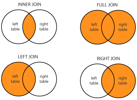
f) JOINS: it allows a combination of data from two tables, JOIN operator is used to combining rows from two or more tables based on the relationship between certain columns in the tables. Types of JOIN (inner, left, right, outer or full)

by Stackoverflow
In conclusion, SQL forms the foundation of data science. It integrates easily with many scripting languages, establishes communication with the relational databases, and is indeed a gateway to the data world. The interface may be something to adjust to but even a short query allows to get insights from a large volume of data.
Resources – https://popsql.com/learn-sql
3) Python
Moving on to programming language, Python has now become the go-to language from a Data Analyst, to Data Scientist to even a BI Developer. With libraries allowing the integration of the language with the visualization tools, to perform various data manipulations, to numerical expressions. It is now becoming an indispensable part of your portfolio if you are in the data world.
The majority are now using Python, over R. Does not render the importance of R but emphasizes the ease, usability, and wide range of packages and libraries available in Python. It has now also become a key language along with C++ and Java even in Google, Facebook and YouTube.
Why and How Python?
As per 2018, KDnuggets Software Poll, 66% of participants reported using Python for their daily reporting and analytics.
To learn Python there are tons of courses available all over the internet, you’ll want to choose the right one that fits your requirement. To breakdown the process into simple steps
Step 1: Getting the fundamentals right. One of the important tools is Jupyter Notebook (https://www.dataquest.io/blog/jupyter-notebook-tips-tricks-shortcuts/), which comes prepackaged with a few libraries. It is also important to join a community and engage with like-minded people to increase learning opportunities.
Step 2: Practicing Python projects. Building small projects using Python and applying what has been taken up in Step 1 will boost the morale and help set-up the foundation for a portfolio. Here’s a list of some projects (https://www.kdnuggets.com/2016/11/top-20-python-machine-learning-open-source-updated.html).
Step 3: Moving to specific Data Science Libraries. The two most important libraries for data science are Pandas and NumPy. These are exclusively for exploring and playing with data. Here’s a list of some libraries (https://www.dataquest.io/blog/15-python-libraries-for-data-science/).
Step 4: Having a portfolio. Portfolios land jobs and are a must in this day and age. One can breakdown the type of projects to show into cleaning, visualization, advanced analytics, etc. But being clear while presenting the output is the key.
Benefits and Uses
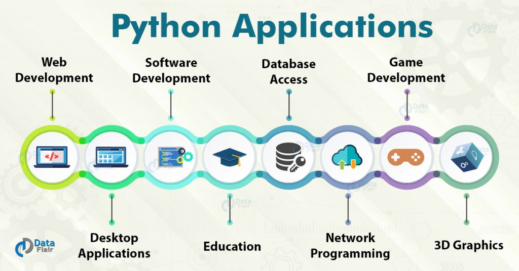
Python has a diverse portfolio of applications, it is used in software development, to create web frameworks, for graphic designing, not to miss analytics and data science, etc. It really requires a separate blog to talk about the benefits and uses of Python but in an attempt to talk about some specific benefits and uses of the language, here are a few
a) Flexibility and Scalability: python is a free and open-source language and has a huge online community. It can be scaled swiftly among many other available languages. You can find Python being used across multiple industries, accelerating and empowering the development and analytics.
b) Libraries: Due to the wide usage, Python has hundreds of libraries and frameworks that work as a great addition to the development process. As a data analyst or data scientist, you will often find yourself using the following libraries
Pandas- primary for data analysis, it used for manipulation and well suited for different data structure such as tabular, time series, etc
NumPy- stands for Numerical Python and is essential for numerical computing. It is one of the core libraries for Data Science, allowing the user to perform various mathematical operations
Matplotlib- it is a powerful visualization library in the language. It provides a variety of graphs, from histograms to line charts and even heat maps
Scikit- essentially for machine learning, it contains a lot of tools such as classification, clustering, regression, etc
SciPy- stands for Scientific Python, is built on NumPy and used for various high-level engineering modules
c) Automation and reporting: the reports that are usually made on a monthly or weekly basis can be automated using Python. By importing Pandas library along with loading the data, easy custom pivots can be made. Which can then be easily exported into an Excel file. Python also allows beautifying the report along with automation, by adding formatting to the titles, subtitles, making colorful charts, etc. Then finally the whole workflow can be automated.
However, like any other thing Python also has its share of shortcomings. It may lack speed and requires using custom runtimes sometime. Also lacks some built-in features in comparison to other high-level languages, but the plethora of libraries and frameworks more than compensates for that limitation.
Resources – https://www.fullstackpython.com/best-python-resources.html
4) Data Wrangling
Call it Data transformation, Data Munging, or Data Wrangling, it is the part of the data analysis process that sits between acquiring the data and conducting exploratory data analysis as one of the core skills for a Data Analyst or a Data Scientist to possess. It can be defined as a set of tasks you would do to understand your data and preparing your data for literally any analytics.
It is a known fact for the process to take up a sizeable percentage of time spent on any project by a data analyst or a data scientist. Talking about characteristics, knowing how to integrate information from multiple data sources, transformation, cleansing, and dealing with quality issues are essential to be a good wrangler.
The process may seem not as high profile as other steps in the data science process is of the essence to progress in a meaningful way. The importance cannot be overlooked and outputs are mostly dependent on this step being completed successfully.
Processes and Steps in Data Wrangling
Although there is no setlist of the order of operations and processes, the goal is to make data usable for our use case. But to breakdown, the concept into three simple steps
a) Extracting or gathering the data: depending on the use case or project, the required data could be extracted from a single source or may even require gathering from various sources (tables, files, databases). Now the data may or may not be in the format, specifically in terms of data format.
b) Cleaning the data: the very first step is to clean the data. In other words, remove and fix the incorrect, corrupt, duplicate, inconsistent, and missing values. Computers cannot make the decision for us if the data point makes no sense.
It essentially is the starting point of data wrangling in my opinion. Here’s a list of some data cleaning techniques
- Normalization
- Data Imputation
- Spell Check
- Syntax errors
- Filters
- Direct removal of missing, duplicate, and irrelevant values
c) Transformation on data: often the next step is to transform the structure of the data for making it compatible with our use case and analysis to follow. Mostly data is either in tall format or wide format, both have their merits, demerits.
.png)
The tall format will have a row for each observation for each variable. This isn’t the ideal format of data for presentation but is easy to create visualizations on and insert data to. It can be achieved by transposing columns into one column with each value as the name of previous columns against each value.
The wide-format will have each row represent an observation of variables as a column. Ideal to use when comparing variables across observations. The format makes it easy to get summary statistics, perform various operations and ultimately present the findings.
To conclude, the quality and structure of the data are the two most important aspects to be taken care of, since it directly impacts the quality of results. As it is often said Garbage In Garbage Out (GIGO). Data wrangling is often an iterative process, and it is always a good idea to assess, re-assess the data ensuring quality and structure.
Pick from the list of tools and learn – https://www.gartner.com/reviews/market/data-preparation-tools
5) Data Visualization and Storytelling
Visual analytics creates an interactive view of data that reveals the pattern within it, enabling everyone to become analysts. It is no more confined to ‘a’ job role but has sort of diffused into the majority of roles in the data world.
Bringing together computer science, information visualization, cognitive and perceptual science, Data Visualization has emerged as an important segment of Analytics. It has proven to ease the process of decision-making from complex and bulk datasets and enables the consumer to under data much more quickly. It enables the developer to easily sell to an audience that isn’t technology savvy.
Whichever tool you may use, Tableau, PowerBI, Google Data Studio, Python, R, etc it is the idea of aggregating the bulk data into a scalable and optimized model that ultimately lets you convert it into a visual.
Benefits and Uses
Data Visualization is now being viewed as an essential step to complete the whole data lifecycle. To point out a few of many benefits and uses of the skill
- It makes it easier to detect patterns, trends, and even outliers in a lot of data
- In-process monitoring, and helps in tweaking processes to ensure performance
- Helps direct the attention of the audience to the areas that require it the most
- Creates an easy way to convey results to a non-tech audience, irrespective of the volume of data
- Helps to tell a story out of data, visual representation has been proven to make sense easily
Examples of widely used Data Visualizations by nature of data
Here I curate some of the most widely used data visualizations by the data that they are often used to represent.
Change over time: to represent time series data over indicators that may change over or with time. Following are the three widely used visualizations to represent change over time in my opinion
- Bar chart- to show with only one variable of data at a time
- Area chart- good to represent changes over time to totals
- Line chart- extremely standard and often adopted way to show time-series data
- Other types- slope charts, calendar charts
.png)
Part to Whole: to represent elements of a single entity or a whole. examples can be budgets, academic results. Following are the three widely types
- Treemap- often used to show hierarchal relationships, although can be difficult to read if segments are more than 3-5
- Stacked chart- comes handy to show size and proportion of a variable at the same time
- Donut chart- essentially belongs to the family of pie, leaving center empty allows some breathing room to the consumer
- Other types- pie chart, waterfall
.png)
Magnitude: to represent comparisons of variables in terms of size, can be relative, can be absolute. Following are the three widely used types to represent data by size
- Column chart- standard way
- Radial chart/ Radar chart- essentially a space-efficient way to show the comparable sizes
- Paired column chart- allows multiple series to be represented
- Other types- lollipop chart, grouped-bar chart
.png)
Correlation: to represent the relationship between two or more indicators/variables. examples include demand-supply, inflation-unemployment, etc.
- Scatter plot/Bubble chart- standard and most widely used way
- Column + line chart- can be used to show proportion and whole, or maybe cost and rate
- Other types- heatmap
.png)
Data Visualization can become a valuable addition to a presentation and a real quick way to understand the data. Besides the technical aspects, the process is enjoyable as well as mentally stimulating mostly.
Pick from the list of tools and learn – https://www.gartner.com/reviews/market/analytics-business-intelligence-platforms
In conclusion, tools can be learnt in a short span of time however what holds precedence over technological stack is the business acumen. Every piece of data, every piece of information is as meaningful as the knowledge of the domain. In totality, everything comes down to decision matrix and ability to choose the right metric.
Thanks for reading, If you enjoyed reading this article, or believe someone else might, please show support by sharing. Please also feel free to drop a comment(s).
The media shown in this article are not owned by Analytics Vidhya and is used at the Author’s discretion.

.png)


An absolutely helpful blog! The article successfully painted a bigger picture of the Data Science arena and important skills required to excel in the field of DS, especially for beginners. Thank you!