
Introduction
AutoML (Automated Machine Learning) platforms are getting more and more popular these days, as they allow us to automate the process of applying machine learning end-to-end. This offers the additional advantages of producing quicker and more straightforward solutions and models that quite often outperform hand-designed models.
There are several such paid and open-source AutoML platforms in the market like H2O, Data Robot, Google AutoML, TPOT, Auto-Sklearn, etc. All of them come with their pros and cons, and I don’t get into the debate of which one is the best of all. Instead, this article focuses on one of the latest features I observed in H2O AutoML — “Model Explainability”.
I also briefly explain various terms like SHAP Summary, Partial Dependence Plots, and Individual Conditional Expectation which, along with Variable importance, form the critical components of H2O AutoML’s model explainability interface.
Note: I have no personal bias towards H2O. It just happens to be the one I generally use.
Background
Automated Machine Learning (AutoML)
We cannot introduce AutoML without mentioning the machine learning project’s life cycle, including data cleaning, feature selection/engineering, model selection, parameter optimization, and finally, model validation. Even with the latest technology advancements, traditional data science projects still incorporate many manual processes and remain repetitive and time-consuming.
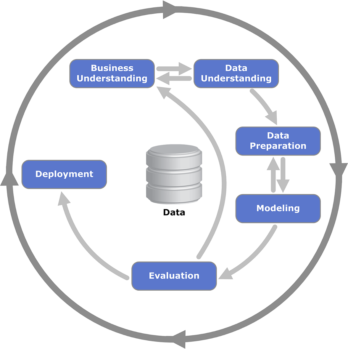
CRoss-Industry Standard Process for Data Mining (CRISP-DM)
AutoML was introduced to automate the entire process from data cleaning to parameter optimization. It provides enormous value for machine learning projects in terms of both performance and time-saving.
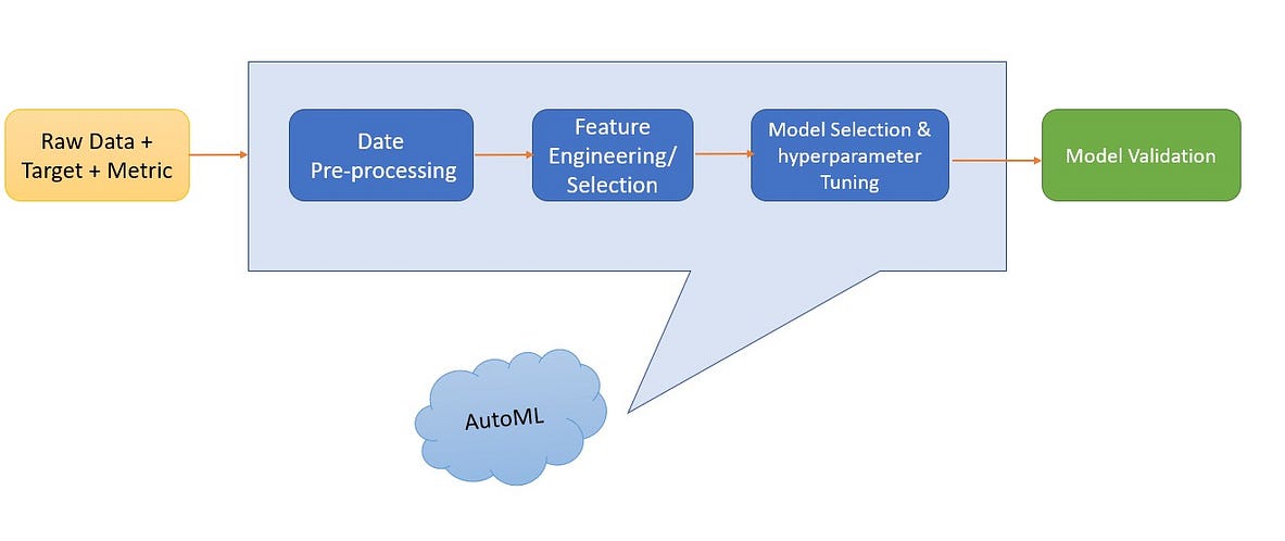
Image by Author
H20 AutoML Explainability Interface
We use the famous Teleco Churn Dataset from Kaggle to explain the explainability interface. Dataset has a mix of numeric and categoric variables & our variable of interest is ‘Churn’ which identifies customers who left within the last month. We use the dataset in raw format as our focus is on explaining the model and not the model performance.
1. Variable Importance of Top Base Model
This plot shows the relative importance of the most important variables in the model. H2O displays each feature’s importance after scaling between 0 and 1.
Variable importance is calculated by the relative influence of each variable, mainly for tree-based models like Random Forest: whether that variable was picked to split while building the tree, and how much the squared error (overall trees) improved (reduced) as a result.
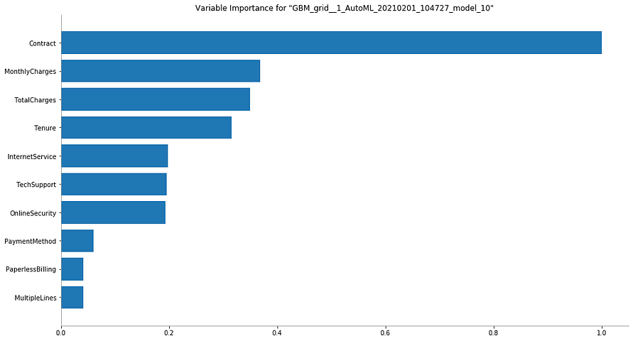
Image by Author
Interpretation:
It is straightforward to interpret this graph. Variable with the longest bar (aka the topmost one) is the most important and the one with the shortest bar (aka the bottom-most one) is the least important.
In this case, ‘Çontract’ is the most important variable, while ‘MultipleLines’ is the least important one when it comes to predicting the churn.
2. Variable Importance Heatmap
Variable importance heatmap shows important variables across multiple models. By default, the models and variables are ordered by their similarity.

Image by Author
Interpretation:
We can see that all the GBM models are stacked together in the x-axis and are the same as the deep learning models. Darker (red) the color, the higher the importance of the variable for that corresponding model.
i.e. ‘Contract’ variable is highly important for all the GBM models while it is not important for any Deep Learning model. Similarly ‘PaymentMethod’ is not important for most GBM models while it is somewhat important for all Deep Learning models.
3. Model Correlation Heatmap
This plot shows the correlation between the model predictions. For classification tasks, the frequency of identical predictions is used. By default, models are ordered by their similarity (as measured by hierarchical clustering). Interpretable models, such as GAM, GLM, and RuleFit are highlighted using red-colored text.
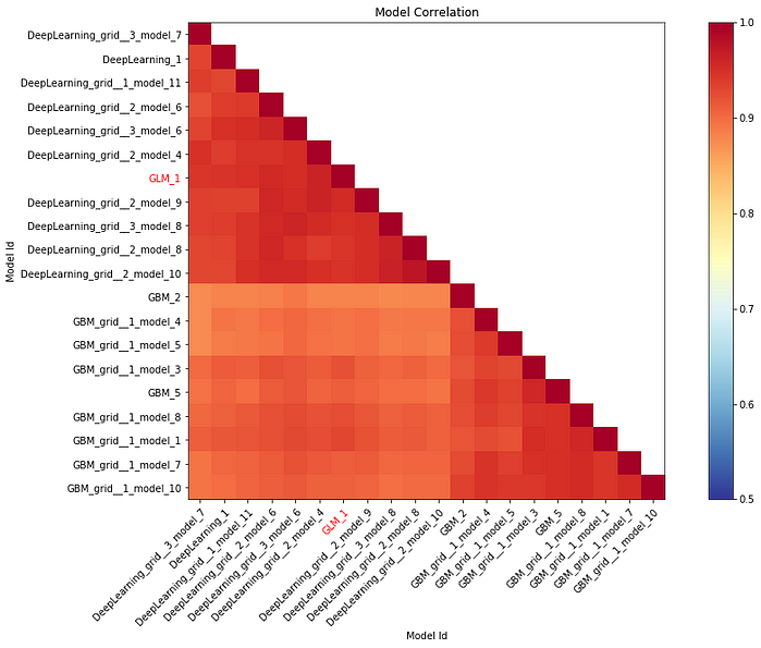
Image by Author
Interpretation:
We can see that models belonging to the same family have strong correlations with each other. Darker (red)the color, the stronger the correlation between the two models.
i.e. GBM models have a much stronger correlation among themselves than with Deep Learning models. GLM model seems to be correlated more with Deep Learning models than with GBM ones.
4. SHAP Summary Plot
SHAP value which is an acronym for SHapley Additive exPlanations interprets the impact of having a particular value for a given variable compared to the prediction we would make if that variable took some baseline value instead.
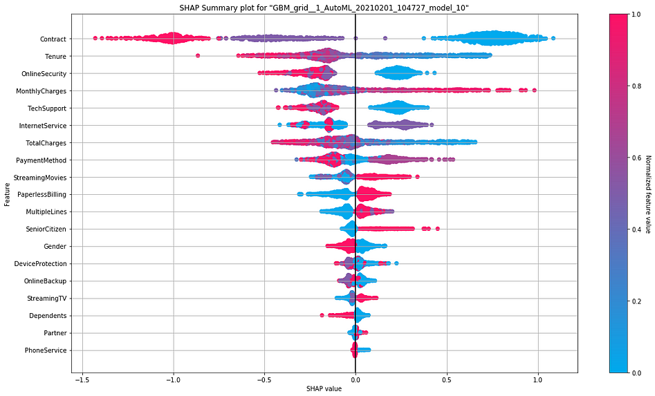
Interpretation:
- The y-axis indicates the variable name, usually in the descending order of importance from top to bottom.
- SHAP value on the x-axis indicates the change in log-odds. From this value, we can extract the probability of an event (churn in this case).
- Gradient color indicates the original value for that variable. In binary classification problems(as in our case), it will take two colors, but it can contain the whole spectrum for numeric target variables(regression problems).
- Each point in the plot represents a record from the original dataset.
We can see that a higher monthly charge is associated with a large and positive(supporting) impact on the churn. Here high comes from the color (red) and large positive (long tail to the base axis’s right at 0.0) from the x value.
i.e. Customers with higher monthly charges tend to churn more.
On the other side, having online security is associated with a medium and negative (opposing) impact on the churn. Here having comes from the color (red is yes and blue is no), and medium negative comes from the (medium tail to the left of the base axis at 0.0) from the x value.
i.e. Customers who have opted for online security tends to churn lesser.
However, the impact of having a high monthly charge is more substantial than having online security, as we see from the spread of the SHAPvalues.
Please refer to this medium article for a simple yet clear interpretation of SHAP values.
5. Partial Dependence Plots (PDP)
While variable importance shows what variables affect predictions the most, partial dependence plots show how a variable affects predictions. For those familiar with linear or regression models, PD plots can be interpreted similarly to the coefficients in those regression models. The effect of a variable is measured in a change in the mean response. It assumes independence between the feature for which PDP is computed and the rest.
This is useful to answer questions like:
- Controlling for all other house features, what impact do latitude and longitude have on personal loan interest rates? To restate this, how would similarly earning individuals be charged in different areas?
- Are predicted response rate differences between the two marketing audience groups due to differences in their communication channel or other factors?
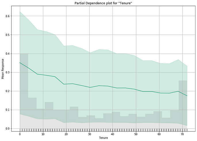
Image by Author
Interpreting the Plot
- The y axis is interpreted as a change in the prediction from what would be predicted at the baseline or leftmost value.
- A green shaded area indicates the confidence interval.
We can see a downward trend in the above graph, indicating a drop in churn rate associated with a longer tenure.
6. Individual Conditional Expectation (ICE) Plots
An Individual Conditional Expectation (ICE) plot gives a graphical depiction of a variable’s marginal influence on the response. ICE plots are similar to partial dependence plots (PDP); PDP shows the average effect of a variable while ICE plot shows the impact for a single instance. This function will plot the impact for each decile.
While PDPs are simple and easy to understand, this simplicity hides potentially interesting relationships among individual instances. For e.g., if the feature values of a subset of instances trend negative but another subset trend positive, then the averaging process might cancel them out.
ICE plots solve this problem. An ICE plot unwraps the curve, which is the result of the aggregation process in PDP. Instead of averaging the prediction, each ICE curve shows the predictions of varying the feature value for an instance. When presented together in a single plot, it shows relationships between subsets of the instances and differences in how individual instances behave.
Unfortunately, H2O didn’t create ICE plots for this dataset (not sure why!). So I use an ICE plot from another use case to explain.
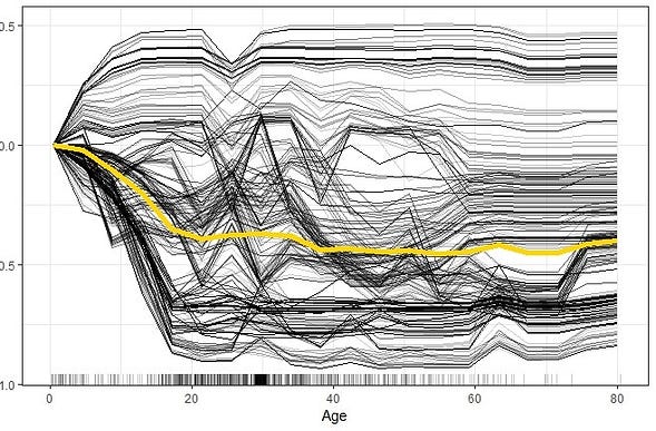
Interpretation:
- ICE plot of survival probability by Age. The yellow line which represents the average of the individual lines is thus equivalent to the respective PDP.
- The individual conditional relationships show that there might be underlying heterogeneity in the underlying data.
i.e. the survivability predictions for most of the passengers drops as age increases. However, there are several passengers with opposite predictions.
Conclusion
In this article, we explored different features of H2O’s model explainability interface, which appears to be promising but still in infancy, as we have few options to customize the visuals. However, it is appreciable that AutoML platforms are coming up with such model explainability features that will help them gradually get rid of the ‘Black Box’ tag. I hope they will keep developing the platforms to accommodate more features from this perspective.
It is to be noted that the onus is on us data guys to properly interpret these results and utilize them appropriately for the intended data science use cases.
As always, feedback and comments are most welcome 🙂
Please feel free to stay connected with me on Linkedin
About the Author

Sreenath Acharath
Data Analytics professional with 12+ years of experience. PG Diploma in Data Analytics from IIIT Bangalore and Masters in Data Science from University of Glasgow, UK. Currently Senior Data Scientist at Cancer Council NSW, Australia.
The media shown in this article are not owned by Analytics Vidhya and is used at the Author’s discretion.